8437520ab6c88c0bd465403b76fdd360.ppt
- Количество слайдов: 128
 Year 1 Unit 1 Strand 2: Concept 1 Data Analysis
 Strand 2: Concept 1 Data Analysis (Statistics) PO 1. Formulate questions to collect data in contextual situations. PO 2. Organize collected data into an appropriate graphical representation. PO 3. Display data as lists, tables, matrices, and plots. PO 4. Construct equivalent display of the same data. PO 5. Identify graphic misrepresentations and distortions of sets of data. PO 6. Identify which of the measures of central tendencies is most appropriate in a given situation. PO 7. Make reasonable predictions based upon linear patterns in data sets or scatter plots. PO 8. Make reasonable predictions for a set of data, based on patterns. PO 9. Draw inferences from charts, tables, graphs, plots, or data sets. PO 10. Apply the concepts of mean, median, mode, range, and quartiles to summarize data sets. PO 11. Evaluate the reasonableness of conclusions drawn from data analysis. PO 12. Recognize and explain the impact of interpreting data (making inferences or drawing conclusions) from a biased sample. PO 13. Draw a line of best fit for a scatterplot. PO 14. Determine, whether a displayed data has positive, negative or no correlation. PO 15. Identify a normal distribution. PO 16. Identify differences between sampling and census. PO 17. Identify differences between biased and unbiased samples.
 Statistics in your daily lives • For example: • “In a poll of 1000 U. S. Citizens, 47% were in favor of immigration reform. ” • “The unemployment rate in May 2005 was 9. 3%. ” • “Two out of three dentists recommend Crest. ”
 • Agriculture • What varieties of wheat are best suited for the Canadian prairies? What are the best combinations of inputs (such as fertilizer and herbicides)? • Archaeology • How old is an archaeological site? How should the overlapping claims by First Nations be resolved based upon evidence of habitation. • Biology • How many northern spotted owls are present in the old growth forests of BC? How many black bears are there in the interior of BC? Are they endangered?
 Business • How does ICBC decide upon the price of insurance for a particular make and model of car and driver class? What type of students are most likely to default upon their student loans? Do inducements (e. g. prizes) to open bank accounts produce any long term business? Is it true that the companies most likely to be taken over are those that have been achieving poor returns? How is the consumer price index determined? • Discrimination • How are claims of discrimination in the workforce resolved? How are claims of `equal pay for work of equal value' resolved? • Environmental studies • What impact will a proposed industrial plant have on the surrounding ecology? Is there an increase in birth defects near nuclear power plants? Do strong electric or magnetic fields induce higher cancer rates among people living close to them?
 • Fisheries • How many salmon return to spawn in the Fraser River? How many salmon should be caught? • Forestry • How much wood is there in a forest due to be felled? When should we fell trees in order to maximize economic return? • Genetics • Does the data support genetic theories about how various characteristics are inherited? Is there evidence for or against theories expounded in the book The Bell Curve that certain racial groups have lower or higher IQs?
 • Industry • How should inspection plans be implemented for quality control? How should processes by modified to reduce defectives? • Medicine • What are the important risk factors for heart disease? Does drinking coffee increase your cancer risk? Does diet affect intelligence? Does Vitamin C prevent colds? • Marketing • What makes advertisements irritating? Is an irritating ad a bad ad? Why was `New Coke' launched?
 1. 1 Measures of Center • Mean, Median, Mode and Range are referred to as measures of central tendency. • They can also be referred to as averages.
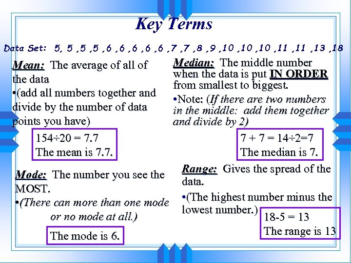 Key Terms Data Set: 5, 5 , 5 , 6 , 6 , 6 , 7 , 8 , 9 , 10 , 11 , 13 , 18 Median: The middle number when the data is put IN ORDER from smallest to biggest. • Note: (If there are two numbers in the middle: add them together and divide by 2) 7 + 7 = 14÷ 2=7 The median is 7. Mode: The number you see the Range: Gives the spread of the data. MOST. • (There can more than one mode • (The highest number minus the lowest number. ) or no mode at all. ) 18 -5 = 13 The range is 13 The mode is 6. Mean: The average of all of the data • (add all numbers together and divide by the number of data points you have) 154÷ 20 = 7. 7 The mean is 7. 7.
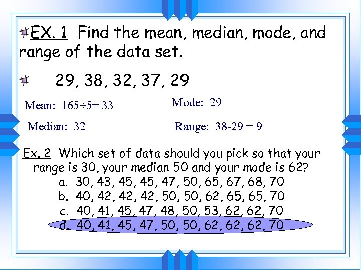 EX. 1 Find the mean, median, mode, and range of the data set. 29, 38, 32, 37, 29 Mean: 165÷ 5= 33 Mode: 29 Median: 32 Range: 38 -29 = 9 Ex. 2 Which set of data should you pick so that your range is 30, your median 50 and your mode is 62? a. 30, 43, 45, 47, 50, 65, 67, 68, 70 b. 40, 42, 42, 50, 62, 65, 70 c. 40, 41, 45, 47, 48, 50, 53, 62, 70 d. 40, 41, 45, 47, 50, 62, 62, 70
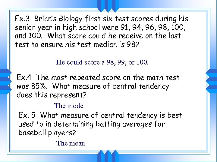 Ex. 3 Brian’s Biology first six test scores during his senior year in high school were 91, 94, 96, 98, 100, and 100. What score could he receive on the last test to ensure his test median is 98? He could score a 98, 99, or 100. Ex. 4 The most repeated score on the math test was 85%. What measure of central tendency does this represent? The mode Ex. 5 What measure of central tendency is best used to in determining batting averages for baseball players? The mean
 1. 2 Box and Whisker Plots • Box and Whisker Plots are also called Box Plots or Five number Summaries. • There are two parts: The box and the whiskers. Let’s examine them more closely.
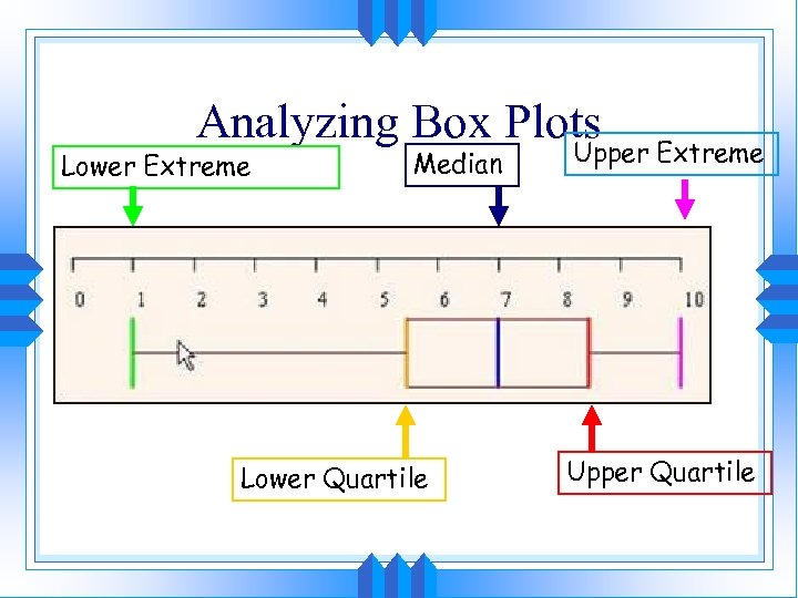 Analyzing Box Plots Lower Extreme Median Lower Quartile Upper Extreme Upper Quartile
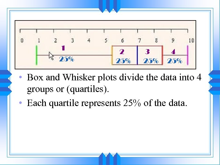 1 25% 2 25% 3 25% 4 25% • Box and Whisker plots divide the data into 4 groups or (quartiles). • Each quartile represents 25% of the data.
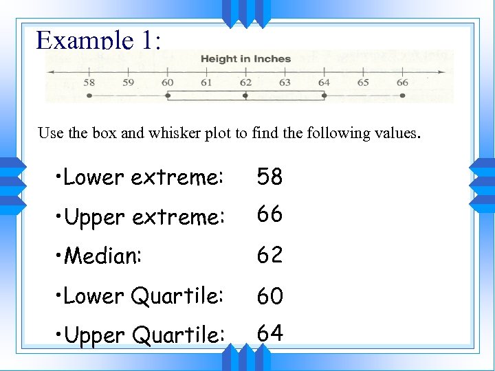 Example 1: Use the box and whisker plot to find the following values. • Lower extreme: 58 • Upper extreme: 66 • Median: 62 • Lower Quartile: 60 • Upper Quartile: 64
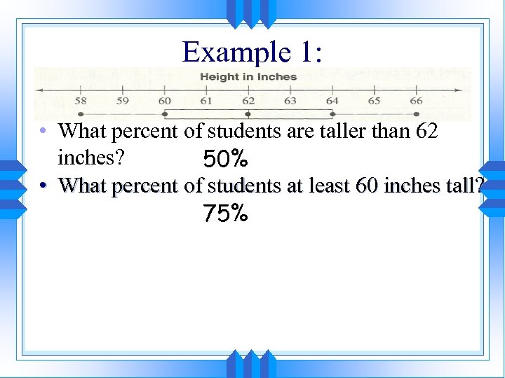 Example 1: • What percent of students are taller than 62 inches? 50% • What percent of students at least 60 inches tall? 75%
 Five Number Summary • Upper Extreme (UE): The biggest number. • Lower Extreme (LE): The smallest number. • Median: the middle number • Upper Quartile (UQ): The median of the numbers bigger than THE MEDIAN. • Lower Quartile (LQ): The median of the numbers less than THE MEDIAN.
 Other Key Terms • Interquartile Range (IQR): The UQ minus the LQ. Gives the size of the box. • Outlier: any number that is far away from the rest of your data
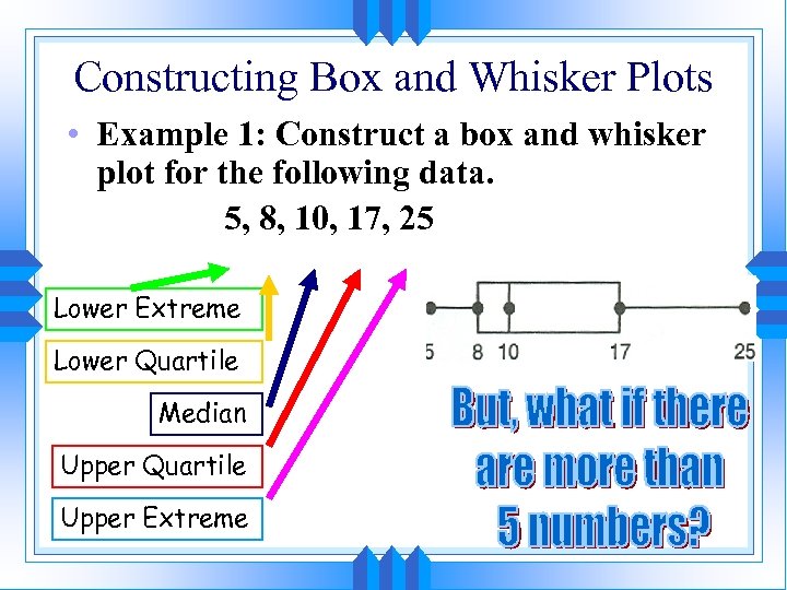 Constructing Box and Whisker Plots • Example 1: Construct a box and whisker plot for the following data. 5, 8, 10, 17, 25 Lower Extreme Lower Quartile Median Upper Quartile Upper Extreme
 What is a quartile? • Take your strip of paper and fold it into four. • What value do you think represents the median? • The LE and UE? • The LQ and UQ?
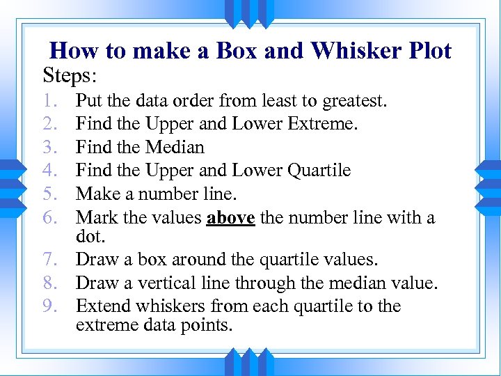 How to make a Box and Whisker Plot Steps: 1. 2. 3. 4. 5. 6. Put the data order from least to greatest. Find the Upper and Lower Extreme. Find the Median Find the Upper and Lower Quartile Make a number line. Mark the values above the number line with a dot. 7. Draw a box around the quartile values. 8. Draw a vertical line through the median value. 9. Extend whiskers from each quartile to the extreme data points.
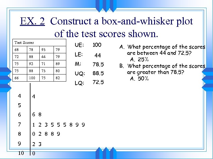 EX. 2 Construct a box-and-whisker plot of the test scores shown. Test Scores UE: 100 68 78 93 79 72 88 44 79 LE: 44 75 92 71 89 M: 78. 5 75 88 73 80 66 100 75 82 UQ: 88. 5 LQ: 72. 5 4 4 5 6 6 8 7 1 2 3 5 5 5 8 9 9 8 0 2 8 8 9 9 2 3 10 0 A. What percentage of the scores are between 44 and 72. 5? A. 25% B. What percentage of the scores are greater than 78. 5? A. 50%
 • Stem-and-Leaf Plots: A convenient method to display every piece of data by showing the digits of each number. In a stem-and leaf plot, the greatest common place value of the data is used to form stems. The numbers in the next greatest placevalue position are then used to form the leaves.
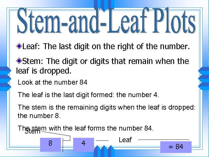 Leaf: The last digit on the right of the number. Stem: The digit or digits that remain when the leaf is dropped. Look at the number 84 The leaf is the last digit formed: the number 4. The stem is the remaining digits when the leaf is dropped: the number 8. The stem with the leaf forms the number 84. Stem Leaf 8 4 = 84
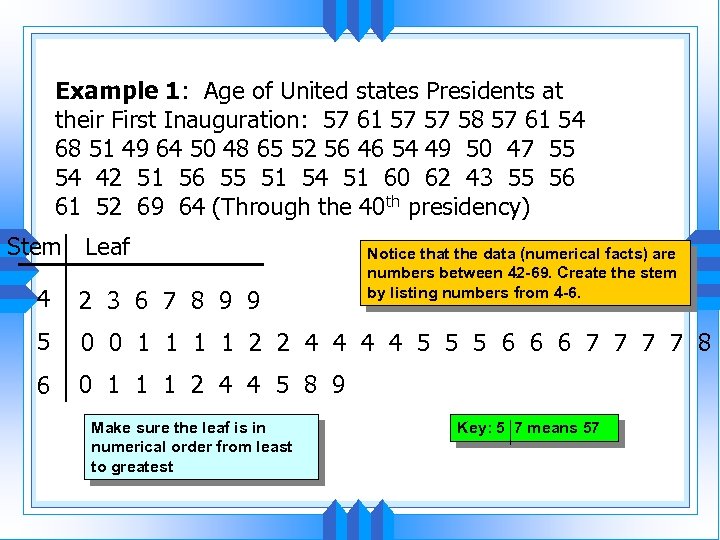 Example 1: Age of United states Presidents at their First Inauguration: 57 61 57 57 58 57 61 54 68 51 49 64 50 48 65 52 56 46 54 49 50 47 55 54 42 51 56 55 51 54 51 60 62 43 55 56 61 52 69 64 (Through the 40 th presidency) Stem Leaf Notice that the data (numerical facts) are numbers between 42 -69. Create the stem by listing numbers from 4 -6. 4 2 3 6 7 8 9 9 5 0 0 1 1 2 2 4 4 5 5 5 6 6 6 7 7 8 6 0 1 1 1 2 4 4 5 8 9 Make sure the leaf is in numerical order from least to greatest Key: 5 7 means 57
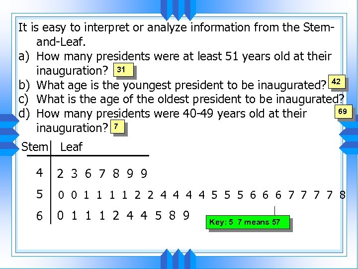 It is easy to interpret or analyze information from the Stemand-Leaf. a) How many presidents were at least 51 years old at their inauguration? 31 b) What age is the youngest president to be inaugurated? 42 c) What is the age of the oldest president to be inaugurated? 69 d) How many presidents were 40 -49 years old at their inauguration? 7 Stem Leaf 4 2 3 6 7 8 9 9 5 0 0 1 1 2 2 4 4 5 5 5 6 6 6 7 7 8 6 0 1 1 1 2 4 4 5 8 9 Key: 5 7 means 57
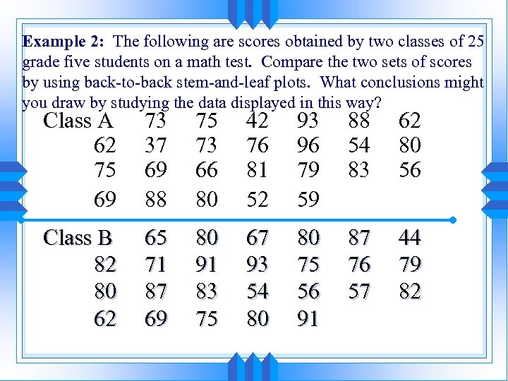 Example 2: The following are scores obtained by two classes of 25 grade five students on a math test. Compare the two sets of scores by using back-to-back stem-and-leaf plots. What conclusions might you draw by studying the data displayed in this way? Class A 62 75 69 73 37 69 88 75 73 66 80 42 76 81 52 93 96 79 59 88 54 83 62 80 56 Class B 82 80 62 65 71 87 69 80 91 83 75 67 93 54 80 80 75 56 91 87 76 57 44 79 82
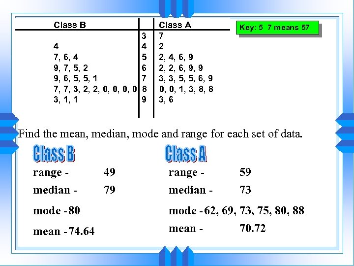 Class B 3 4 4 7, 6, 4 5 9, 7, 5, 2 6 9, 6, 5, 5, 1 7 7, 7, 3, 2, 2, 0, 0 8 3, 1, 1 9 Class A 7 2 2, 4, 6, 9 2, 2, 6, 9, 9 3, 3, 5, 5, 6, 9 0, 0, 1, 3, 8, 8 3, 6 Key: 5 7 means 57 Find the mean, median, mode and range for each set of data. range median mode -80 mean -74. 64 49 79 range median - 59 73 mode -62, 69, 73, 75, 80, 88 mean 70. 72
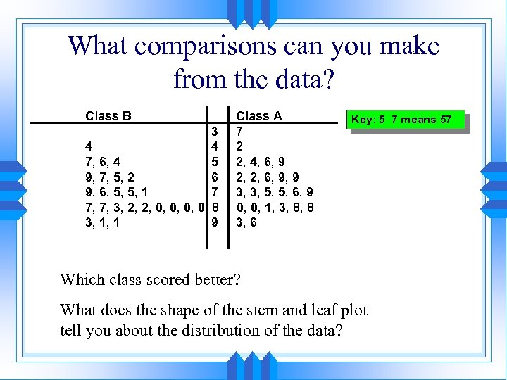 What comparisons can you make from the data? Class B 3 4 4 7, 6, 4 5 9, 7, 5, 2 6 9, 6, 5, 5, 1 7 7, 7, 3, 2, 2, 0, 0 8 3, 1, 1 9 Class A 7 2 2, 4, 6, 9 2, 2, 6, 9, 9 3, 3, 5, 5, 6, 9 0, 0, 1, 3, 8, 8 3, 6 Key: 5 7 means 57 Which class scored better? What does the shape of the stem and leaf plot tell you about the distribution of the data?
 1. 4 Histograms • The histogram is a graph that displays the data by using vertical bars of various heights to represent the frequencies.
 How is a Histogram like a stem and leaf plot? Here is a stem and leaf plot for a group of 52 pennies sorted by mint year.
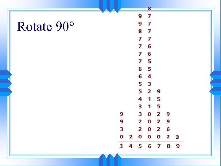 Rotate 90
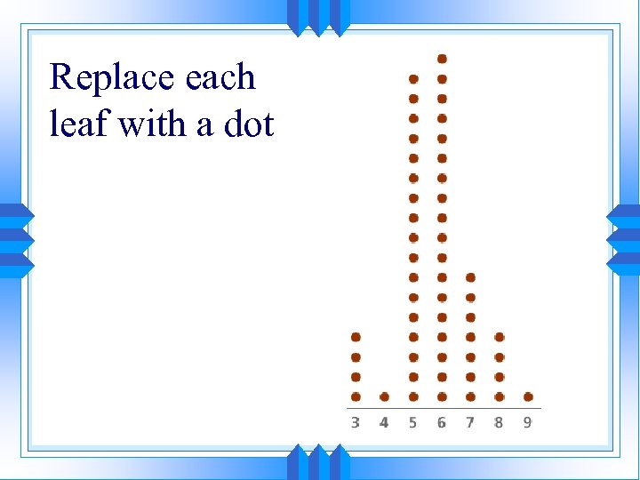 Replace each leaf with a dot
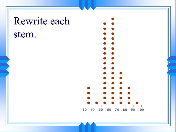 Rewrite each stem.
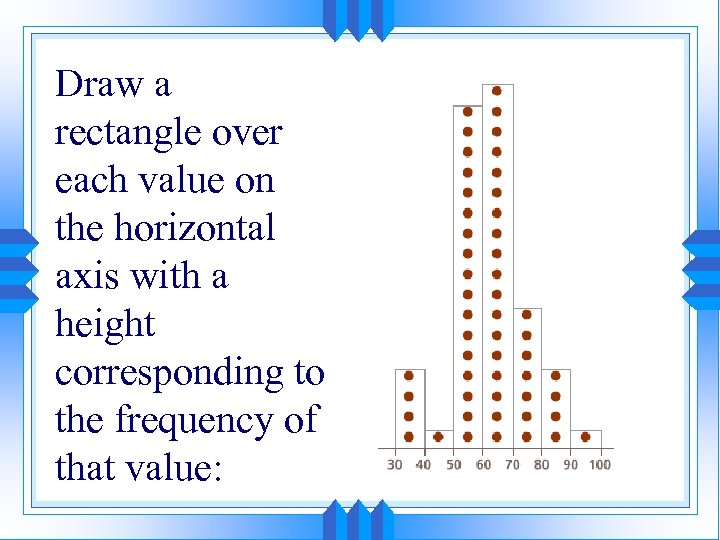 Draw a rectangle over each value on the horizontal axis with a height corresponding to the frequency of that value:
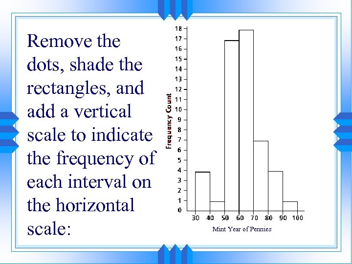 Remove the dots, shade the rectangles, and add a vertical scale to indicate the frequency of each interval on the horizontal scale: Mint Year of Pennies
 How to Make a Histogram Step 1: Make a Frequency Table 1. Put the data in order from least to greatest 2. Find the range (highest number – lowest number) 3. Pick your intervals (must be even). Try to have 4 -6 intervals. 4. Tally the data.
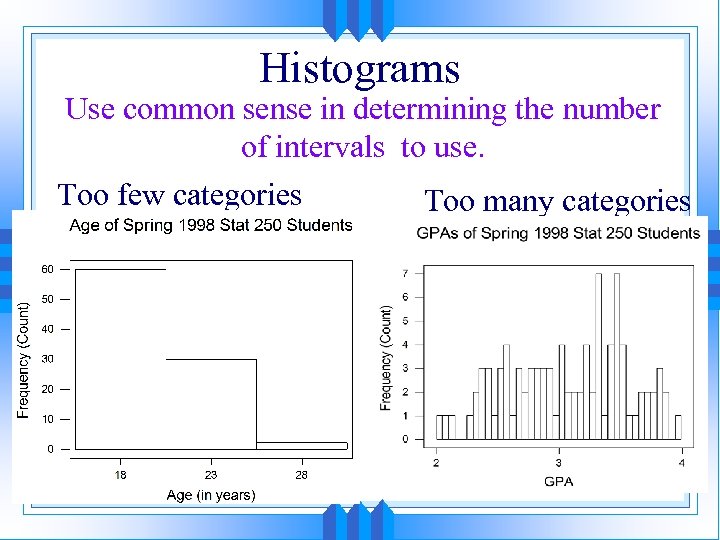 Histograms Use common sense in determining the number of intervals to use. Too few categories Too many categories
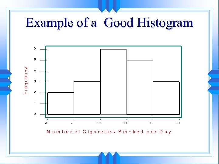 Example of a Good Histogram 6 F re q u e n cy 5 4 3 2 1 0 5 8 11 14 17 N u m b e r o f C ig a r e tte s S m o k e d p e r D a y 20
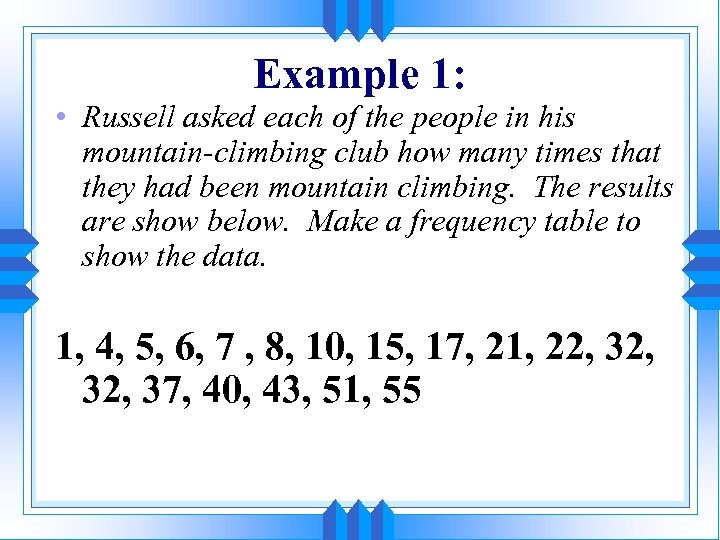 Example 1: • Russell asked each of the people in his mountain-climbing club how many times that they had been mountain climbing. The results are show below. Make a frequency table to show the data. 1, 4, 5, 6, 7 , 8, 10, 15, 17, 21, 22, 32, 37, 40, 43, 51, 55
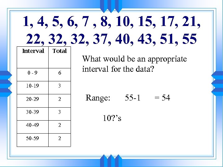 1, 4, 5, 6, 7 , 8, 10, 15, 17, 21, 22, 32, 37, 40, 43, 51, 55 Interval Total 0 -9 6 10 -19 3 20 -29 2 30 -39 3 40 -49 2 50 -59 2 What would be an appropriate interval for the data? Range: 10? ’s 55 -1 = 54
 Step 2: Making the histogram 1. Draw your x and y-axis. 2. Label the horizontal axis to show the intervals. 3. Label the vertical axis to show frequency 4. Draw your bars. All bars must have the same width. The height of the bar shows the frequency for the given interval.
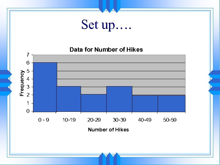 Set up…. Data for Number of Hikes 7 Frequency 6 5 4 3 2 1 0 0 -9 10 -19 20 -29 30 -39 Number of Hikes 40 -49 50 -59
 1. 5 Scatter Plots • Scatter Plot: A scatter plot shows the relationship between TWO data sets. • This relationship is also called correlation. • There are three types of correlation: • Positive Correlation • Negative Correlation • No Correlation
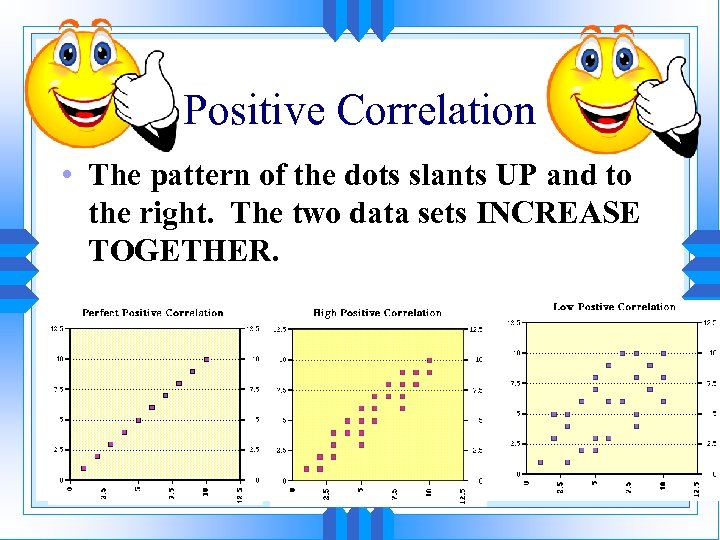 Positive Correlation • The pattern of the dots slants UP and to the right. The two data sets INCREASE TOGETHER.
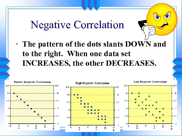 Negative Correlation • The pattern of the dots slants DOWN and to the right. When one data set INCREASES, the other DECREASES.
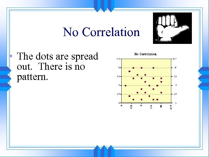 No Correlation • The dots are spread out. There is no pattern.
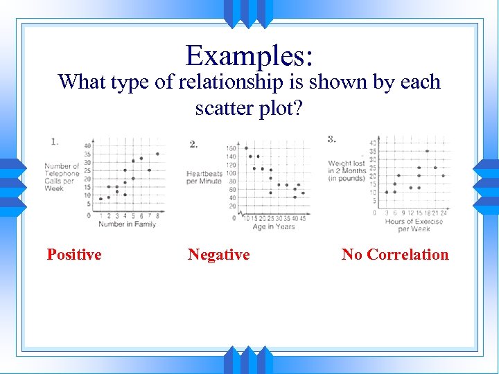 Examples: What type of relationship is shown by each scatter plot? Positive Negative No Correlation
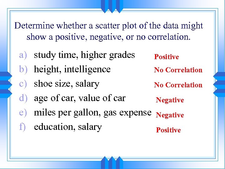 Determine whether a scatter plot of the data might show a positive, negative, or no correlation. a) b) c) d) e) f) study time, higher grades Positive height, intelligence No Correlation shoe size, salary No Correlation age of car, value of car Negative miles per gallon, gas expense Negative education, salary Positive
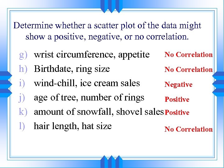 Determine whether a scatter plot of the data might show a positive, negative, or no correlation. g) h) i) j) k) l) No Correlation wrist circumference, appetite Birthdate, ring size No Correlation wind-chill, ice cream sales Negative age of tree, number of rings Positive amount of snowfall, shovel sales Positive hair length, hat size No Correlation
 NOTE: Correlation versus Causation • You already know that if two data sets are related, there is a correlation between them. • Sometimes correlation can be confused with causation, which is when two variables are related because one CAUSES the other. • If two variables are highly related, you cannot assume that one causes the other. • In other words correlation DOES NOT imply causation.
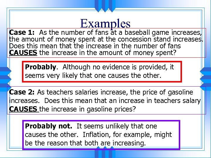 Examples Case 1: As the number of fans at a baseball game increases, the amount of money spent at the concession stand increases. Does this mean that the increase in the number of fans CAUSES the increase in the amount of money spent? Probably. Although no evidence is provided, it seems very likely that one causes the other. Case 2: As teachers salaries increase, the price of gasoline increases. Does this mean that an increase in teachers salary CAUSES the increase in gasoline prices? Probably not. It seems unlikely that one causes the other. Inflation, for example, might be the reason that both are increasing.
 Making a Scatter Plot: 1) Decide which data you will put on the x axis and the y axis. 2) Look at the values for the data you will put on the x-axis. Decide what your scale will be. Label this. 3) Look at the values for the data you will put on the y-axis. Decide what your scale will be. Label this. 4) Plot your points.
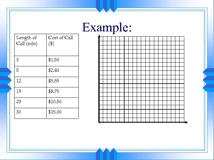 Example: Length of Call (min) Cost of Call ($) 3 $1. 50 5 $2. 40 12 $5. 55 19 $8. 70 23 $10. 50 30 $15. 00
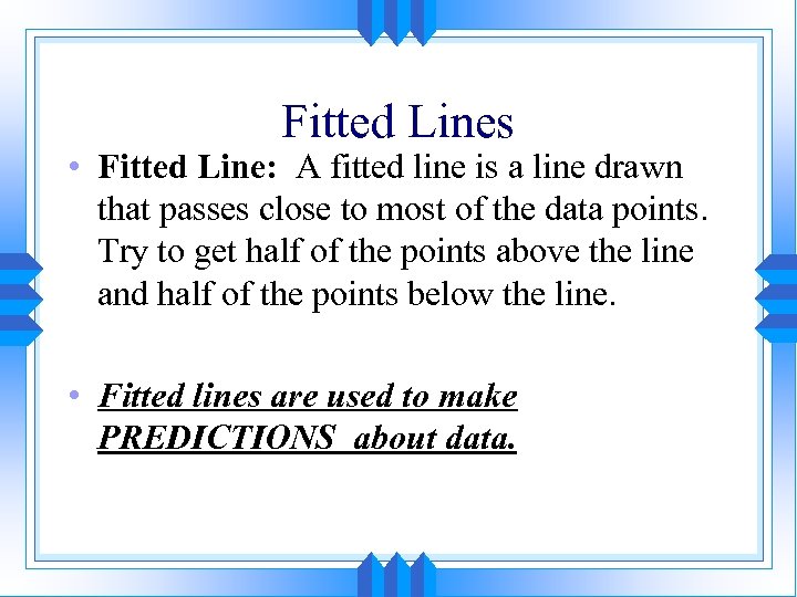 Fitted Lines • Fitted Line: A fitted line is a line drawn that passes close to most of the data points. Try to get half of the points above the line and half of the points below the line. • Fitted lines are used to make PREDICTIONS about data.
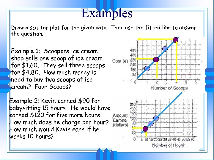 Examples Draw a scatter plot for the given data. Then use the fitted line to answer the question. Example 1: Scoopers ice cream shop sells one scoop of ice cream for $1. 60. They sell three scoops for $4. 80. How much money is need to buy two scoops of ice cream? Four Scoops? Example 2: Kevin earned $90 for babysitting 15 hours. He would have earned $120 for five more hours. How much does he charge per hour? How much would Kevin earn if he works 10 hours?
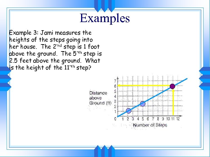 Examples Example 3: Jami measures the heights of the steps going into her house. The 2’nd step is 1 foot above the ground. The 5’th step is 2. 5 feet above the ground. What is the height of the 11’th step?
 1. 6 Circle Graphs
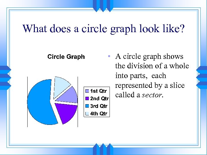 What does a circle graph look like? • A circle graph shows the division of a whole into parts, each represented by a slice called a sector.
 To make a circle graph: • Find the percent of the data for each section. • Find the percent of the total measures of the circle graph (360 ). Take the percent (as a decimal) times 360.
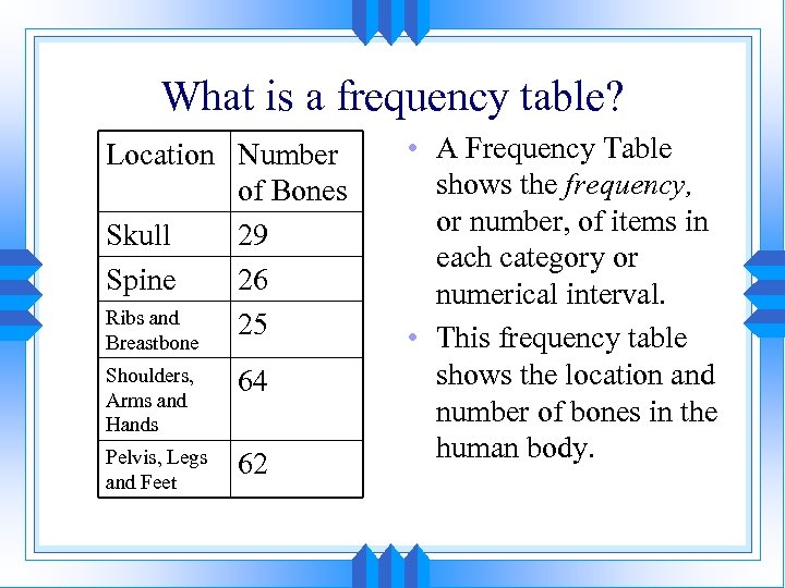 What is a frequency table? Location Number of Bones Skull 29 Spine 26 Ribs and 25 Breastbone Shoulders, Arms and Hands 64 Pelvis, Legs and Feet 62 • A Frequency Table shows the frequency, or number, of items in each category or numerical interval. • This frequency table shows the location and number of bones in the human body.
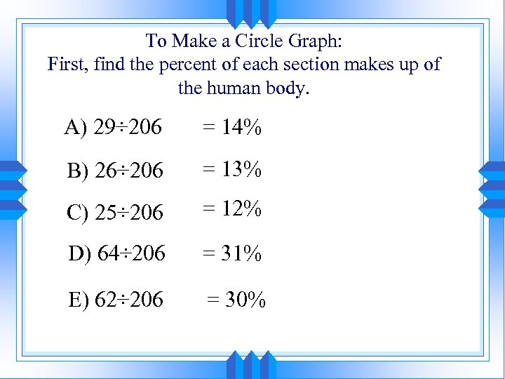 To Make a Circle Graph: First, find the percent of each section makes up of the human body. A) 29÷ 206 = 14% B) 26÷ 206 = 13% C) 25÷ 206 = 12% D) 64÷ 206 = 31% E) 62÷ 206 = 30%
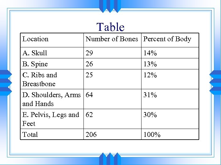 Table Location Number of Bones Percent of Body A. Skull B. Spine C. Ribs and Breastbone 29 26 25 14% 13% 12% D. Shoulders, Arms 64 and Hands 31% E. Pelvis, Legs and 62 Feet 30% Total 100% 206
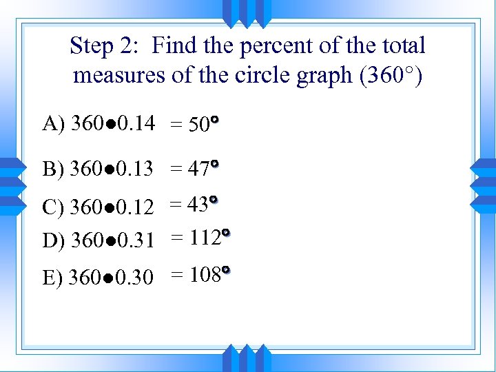 Step 2: Find the percent of the total measures of the circle graph (360 ) A) 360● 0. 14 = 50 B) 360● 0. 13 = 47 C) 360● 0. 12 = 43 D) 360● 0. 31 = 112 E) 360● 0. 30 = 108
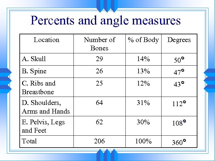 Percents and angle measures Location % of Body Degrees A. Skull Number of Bones 29 14% 50 B. Spine 26 13% 47 C. Ribs and Breastbone D. Shoulders, Arms and Hands E. Pelvis, Legs and Feet 25 12% 43 64 31% 112 62 30% 108 Total 206 100% 360
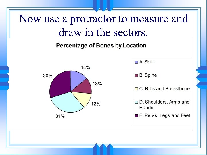 Now use a protractor to measure and draw in the sectors.
 1. 7 Collecting Data • You can use a census or a sample to collect data. • CENSUS: a census includes ALL members of a population • SAMPLE: a sample includes SOME, but usually not all, members of a population. Since a sample only includes some of the population, it is not as accurate as a census. The sample should be random. • The larger the sample size, the better it represents the population.
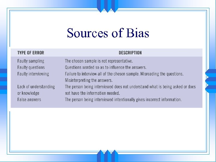 Sources of Bias
 Example 1: You want to find the average height of the students in your gym class. What is the population? What is a sample? Is a census or sample better to use? • The population consists of ALL students in your gym class. A sample consists of only some of the students in your gym class. It is very easy to find the height of each student in you gym class. Therefore, a census is better to use.
 Example 2: IF you want to find out the percentage of Arizona tenth graders who like to camp, is better to use a census or a sample? • It is almost impossible to survey ALL the tenth graders in Arizona to ask them if they like camp. A sample is better to use. The following are some possible samples to represent the population of all Arizona tenth graders. • The students in your tenth grade history class. • The tenth grade students in your entire school • The tenth grade students in Maricopa county.
 Random Versus Biased Samples • Random Sample: a random sample is unbiased: every individual in the population has an equal chance of being selected. When the sample size is large and random, the data gathered from that sample will better represent the entire population. • Biased Sample: a biased sample is less random and favors certain outcomes. The data gathered from a biased sample is usually not very accurate.
 Example 3: You want to find the favorite sport of the junior high school and the high school students in your school district. To create a sample, you decide to ask high school girls who play volleyball. • This sample is biased for three reasons: • It does not include students from the junior high schools • It does not include boys • It only includes volleyball players
 Samples and Bias • For population analysis, in most cases it is impossible to gather data on every individual in the population. • In these cases a sample is taken and results are extrapolated to the population in general. • This sampling process provides many ways for manipulation of the results. Such manipulation of the sampling process is called bias.
 How could you make this sample less biased? • Introduce a random element. Maybe you can have a person stand outside the main entrance of each school on the same day at the same time and survey every fifth student. The sample is now less biased since the participants are randomly selected.
 Normal Distribution • Normal Distribution of data: has the same number of values less than the mean as greater than the mean. A normal distribution is symmetric about the mean.
 Example 4: Does the following set of data represent a normal distribution? • 19, 14, 15, 8, 21, 20, 7, 12, 17, 27 The mean of the data set is 16. There are 5 values below 16 and 5 values above 16. Since there an equal number of values below the mean as above the mean, the distribution is normal. Any value that is equal to the mean is not counted.
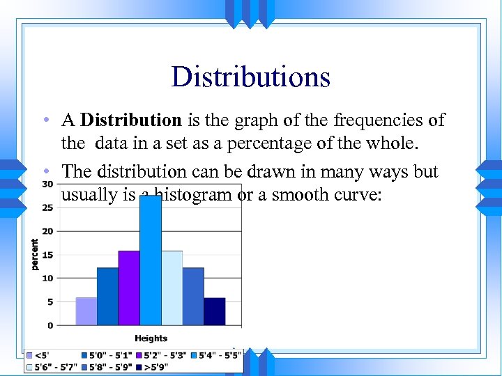
 Distributions • A Distribution is the graph of the frequencies of the data in a set as a percentage of the whole. • The distribution can be drawn in many ways but usually is a histogram or a smooth curve:
 Distributions • A Distribution is the graph of the frequencies of the data in a set as a percentage of the whole. • The distribution can be drawn in many ways but usually is a histogram or a smooth curve:
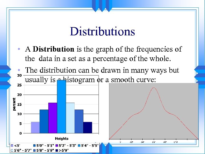 Distributions • A Distribution is the graph of the frequencies of the data in a set as a percentage of the whole. • The distribution can be drawn in many ways but usually is a histogram or a smooth curve:
 The Normal Distribution—Bell Curve • For many reasons, the Normal Distribution (or the bell curve) is used all over the place in many different applications.
 The Normal Distribution—Bell Curve • For many reasons, the Normal Distribution (or the bell curve) is used all over the place in many different applications. • The distribution is symmetric about the mean which is also the median and the mode:
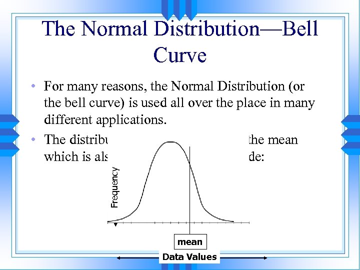 The Normal Distribution—Bell Curve Frequency • For many reasons, the Normal Distribution (or the bell curve) is used all over the place in many different applications. • The distribution is symmetric about the mean which is also the median and the mode: mean Data Values
 1. 8 Choosing a Data Display Which graph to use? • Depends on type of data • Depends on what you want to illustrate
 1. 2. 3. 4. 5. 6. 7. 8. Summary: Types of Graphs Bar Graph Box and Whisker Plot Circle Graph Dot Plot Histogram Line Graph Scatter Plot Stem and leaf Plot
 Bar Graph • Summarizes data into categories. • Shows the differences in counts between categories. Box and Whisker Plot • Divides the data into quartiles. • Used to show data is clustered.
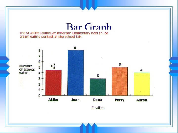 Bar Graph
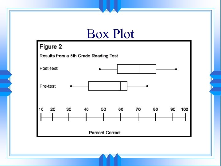 Box Plot
 Circle Graph • Divide data up into equal-sized categories. • Divides a whole into parts called sectors. Dot Plot • Summarizes data on a line. • Plots one dot for each data point. • Shows how data is clustered
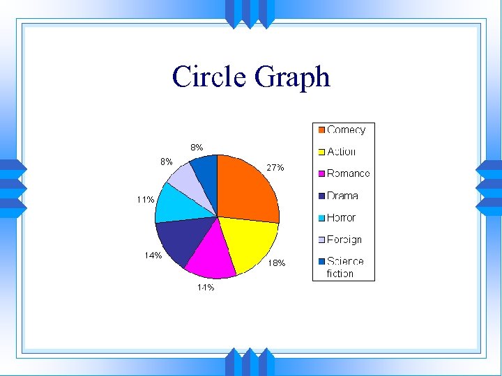 Circle Graph
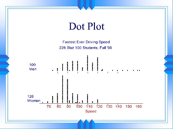 Dot Plot
 Histogram • Divide data up into equal-sized intervals. • Determine number of data points falling into each interval. Line Graph • Shows how data values change over time
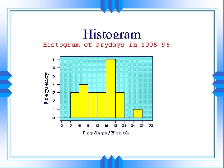 Histogram
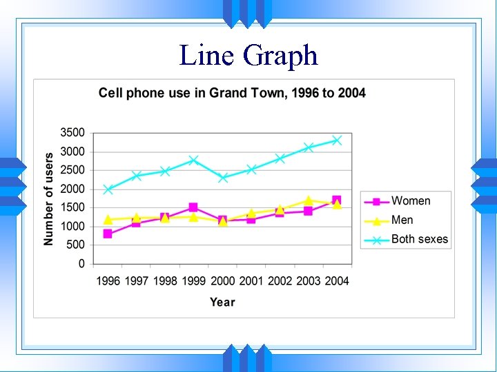 Line Graph
 Scatter Plots • Summarizes the relationship between two variables. Stem-and-Leaf Plot • Show each value in a data set and groups the data into intervals. Shows how data is clustered
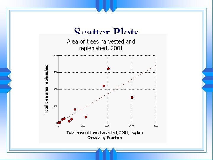 Scatter Plots
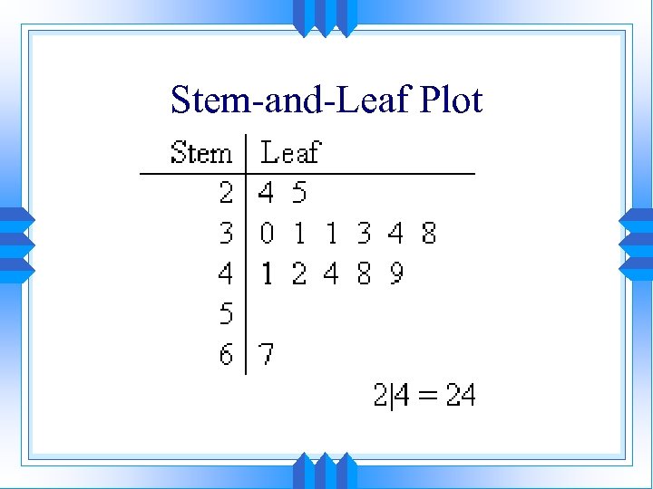 Stem-and-Leaf Plot
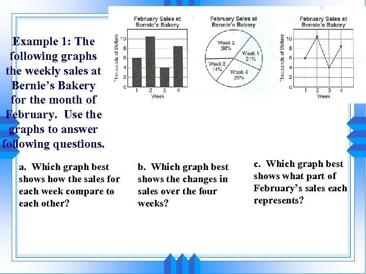 Example 1: The following graphs the weekly sales at Bernie’s Bakery for the month of February. Use the graphs to answer following questions. a. Which graph best shows how the sales for each week compare to each other? b. Which graph best shows the changes in sales over the four weeks? c. Which graph best shows what part of February’s sales each represents?
 What graph would best display… a) b) c) d) e) f) g) h) i) j) Average temperature in Flagstaff for each month of the year. Average temperature in January for five Arizona cities. Land area of the continents Percentages of land area for each continent represents Number of DVD player sold from 1996 -2006 Weight of a baby each month from birth to one year old Height of the five tallest buildings in the world. Smith family budget Average weekly attendance for five movie theaters Percentages of sources of fuel for the United States
 • Write a question you would ask to collect data for the given display. • Circle graph • Box and Whisker Plot • Scatter Plot
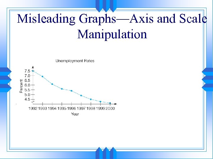
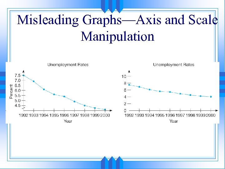
 Hints Avoiding Misleading Graphs 1. Labels: • A graph or chart should be complete. All graphs must have a title, all axes must be labeled including units. 2. Scale: • The graph should have an appropriate scale. • Make sure the values are not crowded into one corner, or spread too far apart. • The scale must be constant across the graph; don't change the intervals. • Most people read increasing scales from left to right and from bottom to top.
 Hints Avoiding Misleading Graphs 3. Zero: • Graphs usually have axes intersecting at zero, but this is not necessary if the starting point is clearly marked. • Most people assume that the zero point is at the bottom of the graph. This can give a very misleading impression of the amount of change present in a data series. 4. Type: • Wrong choice of chart type. Make sure your graph displays the information you want to convey. If the horizontal axis is time, a line graph is almost always better. 5. Size of Bars, sectors:
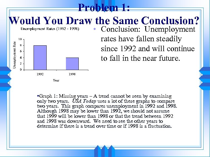 Problem 1: Would You Draw the Same Conclusion? • Conclusion: Unemployment rates have fallen steadily since 1992 and will continue to fall in the near future. • Graph 1: Missing years – A trend cannot be seen by examining only two years. USA Today uses a lot of these graphs to compare two years. This graph compares unemployment in 1992 and 1998. Although 1998 may be lower than 1992, we should not assume that 1999 will be lower than 1998 or that the trend between 1992 and 1998 was downward. We need to see the other years to determine if there is a trend over time or if 1998 is a fluctuation.
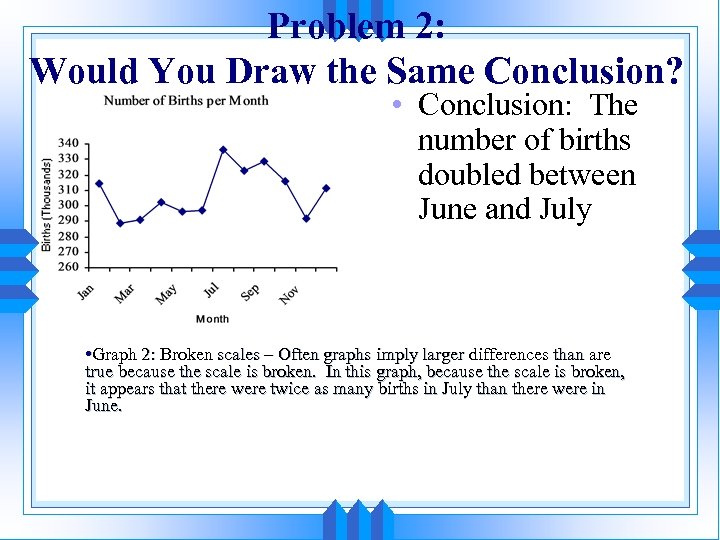 Problem 2: Would You Draw the Same Conclusion? • Conclusion: The number of births doubled between June and July • Graph 2: Broken scales – Often graphs imply larger differences than are true because the scale is broken. In this graph, because the scale is broken, it appears that there were twice as many births in July than there were in June.
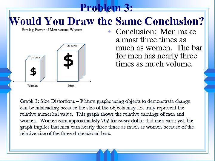 Problem 3: Would You Draw the Same Conclusion? • Conclusion: Men make almost three times as much as women. The bar for men has nearly three times as much volume. Graph 3: Size Distortions – Picture graphs using objects to demonstrate change can be misleading because the size of the objects may not truly represent the relative numerical value. This graph shows the relative earnings of men and women. Women earn approximately 70¢ for every dollar that men earn; yet, the graph implies that men earn nearly three times as much as women because of the relative size of the three-dimensional bars.
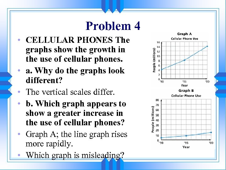 Problem 4 • CELLULAR PHONES The graphs show the growth in the use of cellular phones. • a. Why do the graphs look different? • The vertical scales differ. • b. Which graph appears to show a greater increase in the use of cellular phones? • Graph A; the line graph rises more rapidly. • Which graph is misleading?
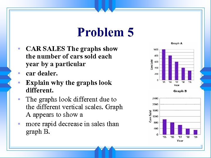 Problem 5 • CAR SALES The graphs show the number of cars sold each year by a particular • car dealer. • Explain why the graphs look different. • The graphs look different due to the different vertical scales. Graph A appears to show a • more rapid decrease in sales than graph B.
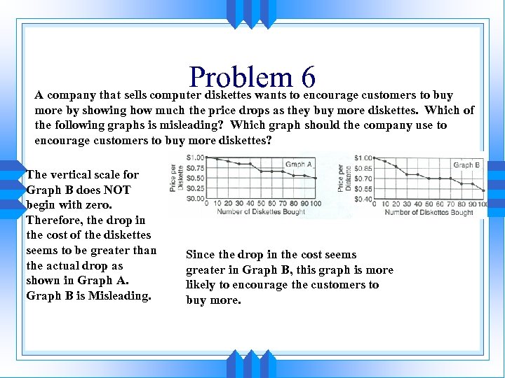 Problemto 6 customers to buy A company that sells computer diskettes wants encourage more by showing how much the price drops as they buy more diskettes. Which of the following graphs is misleading? Which graph should the company use to encourage customers to buy more diskettes? The vertical scale for Graph B does NOT begin with zero. Therefore, the drop in the cost of the diskettes seems to be greater than the actual drop as shown in Graph A. Graph B is Misleading. Since the drop in the cost seems greater in Graph B, this graph is more likely to encourage the customers to buy more.
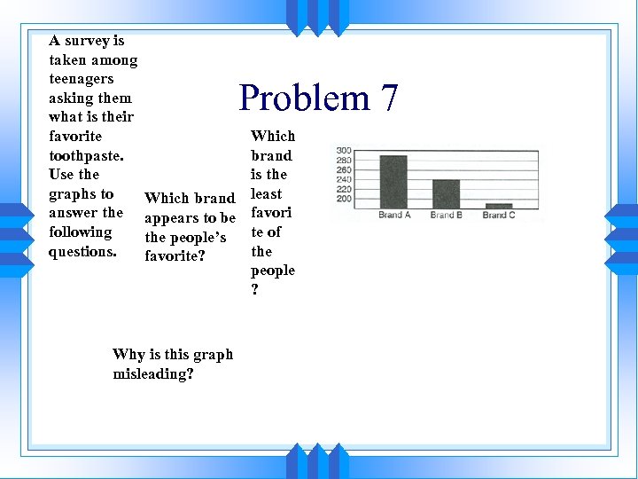 A survey is taken among teenagers asking them what is their favorite toothpaste. Use the graphs to answer the following questions. Problem 7 Which brand is the Which brand least appears to be favori te of the people’s the favorite? people ? Why is this graph misleading?
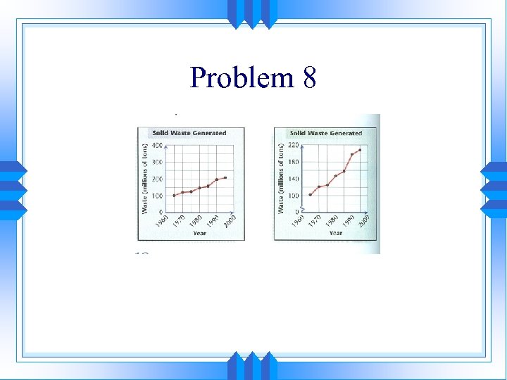 Problem 8
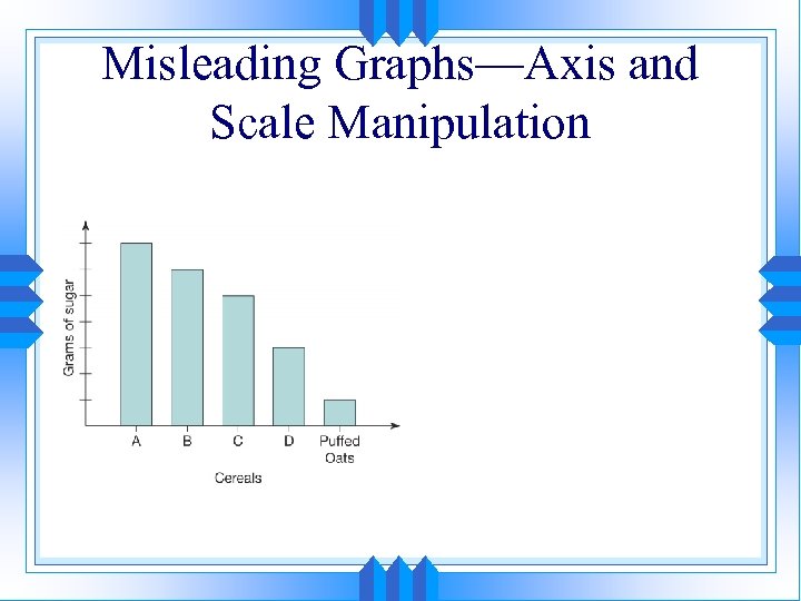 Misleading Graphs—Axis and Scale Manipulation
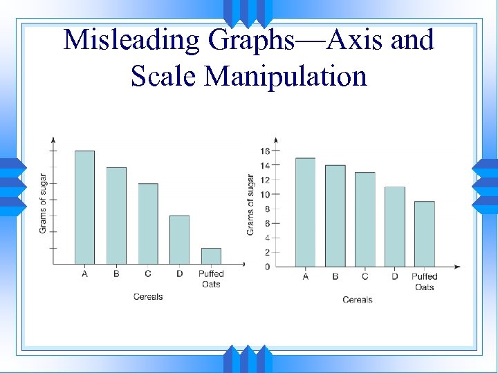 Misleading Graphs—Axis and Scale Manipulation
 Misleading Graphs—Axis and Scale Manipulation
 Misleading Graphs—Axis and Scale Manipulation
 Objective: S 3 -C 3 PO 13: Add, subtract and perform scalar multiplication with matrices.
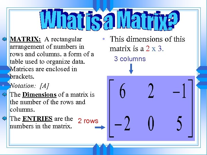 MATRIX: A rectangular • This dimensions of this arrangement of numbers in matrix is a 2 x 3. rows and columns. a form of a 3 columns table used to organize data. Matrices are enclosed in brackets. • Notation: [A] The Dimensions of a matrix is the number of the rows and columns. The ENTRIES are the 2 rows numbers in the matrix.
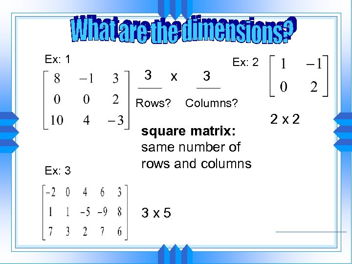 Ex: 1 3 x Rows? Ex: 3 3 Ex: 2 Columns? square matrix: same number of rows and columns 3 x 5 2 x 2
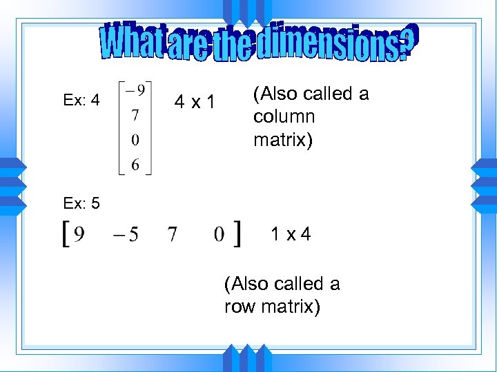 Ex: 4 4 x 1 (Also called a column matrix) Ex: 5 1 x 4 (Also called a row matrix)
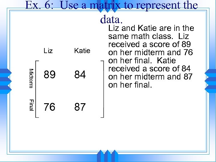 Ex. 6: Use a matrix to represent the data. Liz Katie Midterm 89 84 Final 76 87 Liz and Katie are in the same math class. Liz received a score of 89 on her midterm and 76 on her final. Katie received a score of 84 on her midterm and 87 on her final.
 Operations with Matrices • Adding/Subtracting Matrices: You can only add or subtract matrices that have the same dimensions. You add/subtract the corresponding entry of each matrix to form your new matrix.
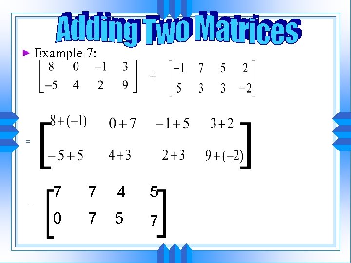 Example 7: = = 7 7 4 5 0 7 5 7
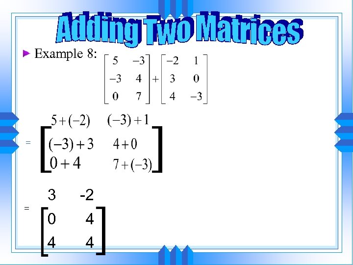 Example 8: = = 3 -2 0 4 4 4
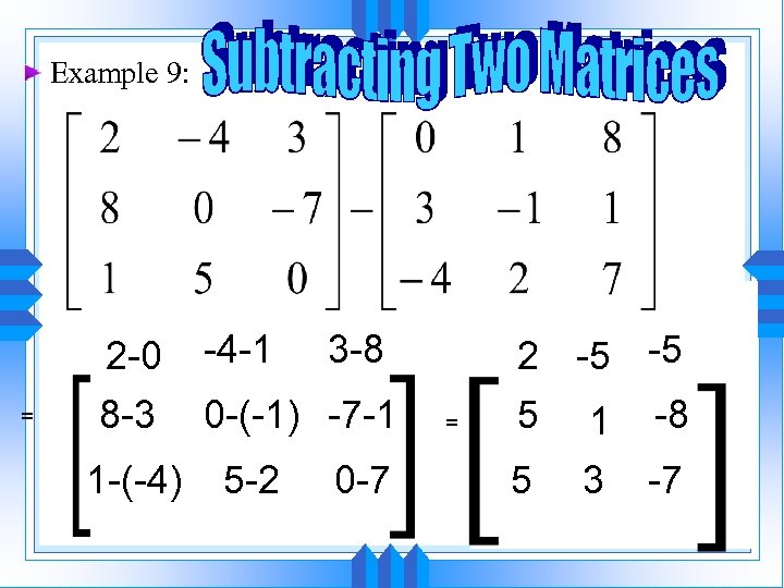 Example 9: = 2 -0 8 -3 1 -(-4) -4 -1 3 -8 0 -(-1) -7 -1 5 -2 0 -7 = 2 -5 -5 5 1 -8 5 3 -7
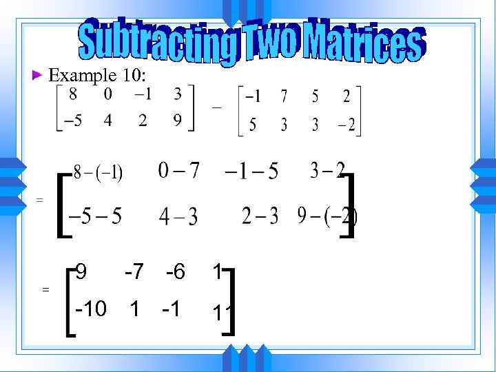 Example 10: = = 9 -7 -6 -10 1 -1 1 11
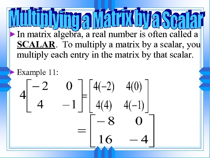 In matrix algebra, a real number is often called a SCALAR. To multiply a matrix by a scalar, you multiply each entry in the matrix by that scalar. Example 11:
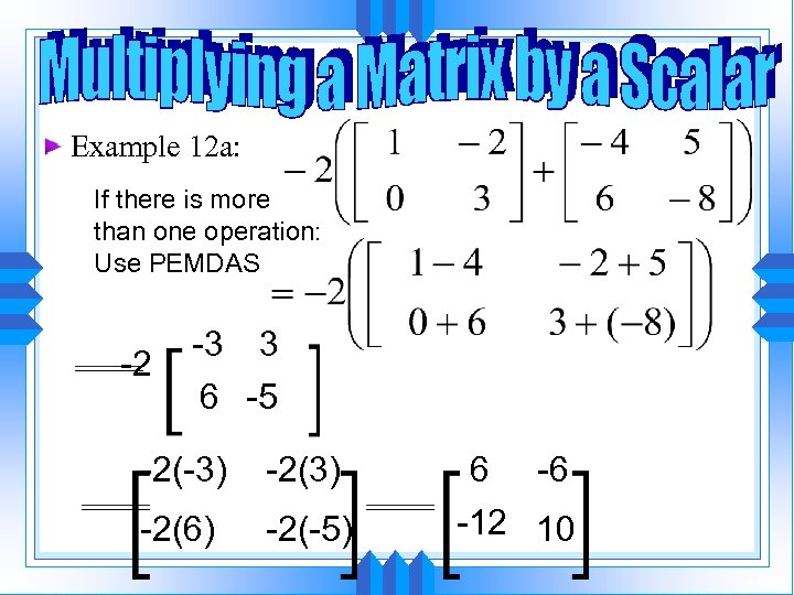 Example 12 a: If there is more than one operation: Use PEMDAS -2 -3 3 6 -5 -2(-3) -2(6) -2(-5) 6 -6 -12 10
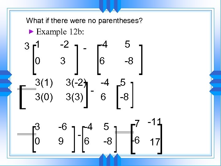 What if there were no parentheses? Example 12 b: 3 1 0 3(1) 3(0) 3 0 -2 3 -4 5 6 - -8 3(-2) -4 3(3) 6 -6 9 -4 6 5 -8 7 -11 -6 17
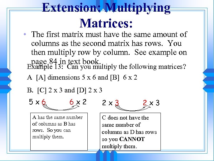 Extension: Multiplying Matrices: • The first matrix must have the same amount of columns as the second matrix has rows. You then multiply row by column. See example on page 84 in text book. Example 13: Can you multiply the following matrices? A [A] dimensions 5 x 6 and [B] 6 x 2 B. [C] 2 x 3 and [D] 2 x 3 5 x 6 6 x 2 A has the same number of columns as B has rows. So you can multiply them. 2 x 3 C does not have the same number of columns as D has rows so you CANNOT multiply them.
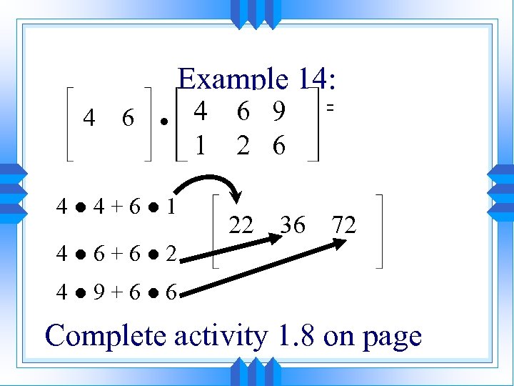 Example 14: 4 6 ● 4● 4+6● 1 4 1 6 9 2 6 22 36 = 72 4● 6+6● 2 4● 9+6● 6 Complete activity 1. 8 on page


