Windows Presentation Foundation (WPF) What is Windows Presentation

23138-lektsiya27_wpf.ppt
- Количество слайдов: 57
 Windows Presentation Foundation (WPF)
 What is Windows Presentation Foundation (WPF) ? WPF Architecture - Markup and Code-Behind - The Application Class WPF Controls Data Binding Graphics Video and Audio Text and Typography Customizing WPF Applications
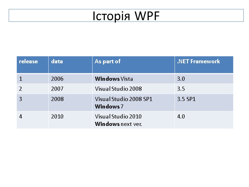
 Історія WPF
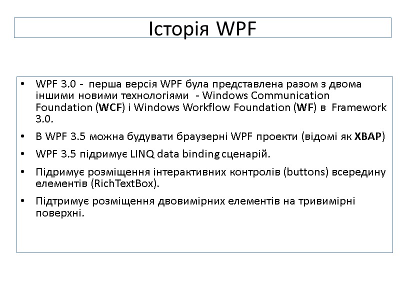
 Історія WPF WPF 3.0 - перша версія WPF була представлена разом з двома іншими новими технологіями - Windows Communication Foundation (WCF) і Windows Workflow Foundation (WF) в Framework 3.0. В WPF 3.5 можна будувати браузерні WPF проекти (відомі як XBAP) WPF 3.5 підримує LINQ data binding сценарій. Підримує розміщення інтерактивних контролів (buttons) всередину елементів (RichTextBox). Підтримує розміщення двовимірних елементів на тривимірні поверхні.
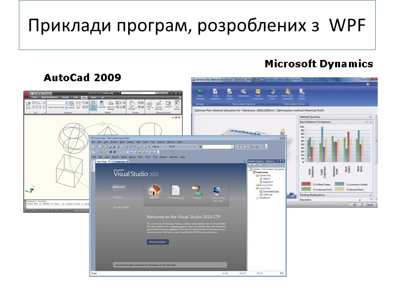
 Приклади програм, розроблених з WPF AutoCad 2009 Microsoft Dynamics
 WPF: a high-level API WPF надає нові можливості для побудови програм для Windows: Web-like model of the layout. НЕ фіксує координати контролів. A rich drawing model. Замість малювати по пікселях, WPF працює з примітивами, прозорими контролами, вбудованою трьох-вимірною графікою. Rich text model. WPF може відображати всі можливості шрифтів, стилізованих в будь-якому місці UI. WPF Animation – вбудована частина WPF (без таймера!). Support for audio and video.
 Styles and templates. Styles дають змогу стандартизувати форматування і повторно його використовувати. Templates дозволяють змінювати стандартний вміст контрола. Commands. Declarative user interface. Можемо розробляти дизайн WPF вікон в коді . Вміст кожного вікна сериалізується як XML-опис в документі XAML. User interface повністю відділено від коду і дизайнери можуть використовувати професійні інструменти для редагування XAML файлів, покращуючи вигляд програми. Pages based application. Використовуючи WPF, можна будувати browser-like програми з навігацією по сторінках. WPF: a high-level API
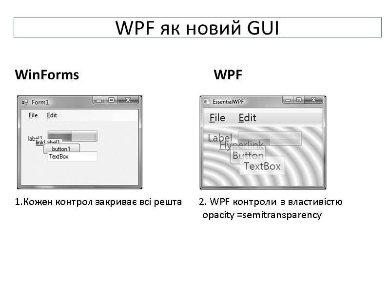
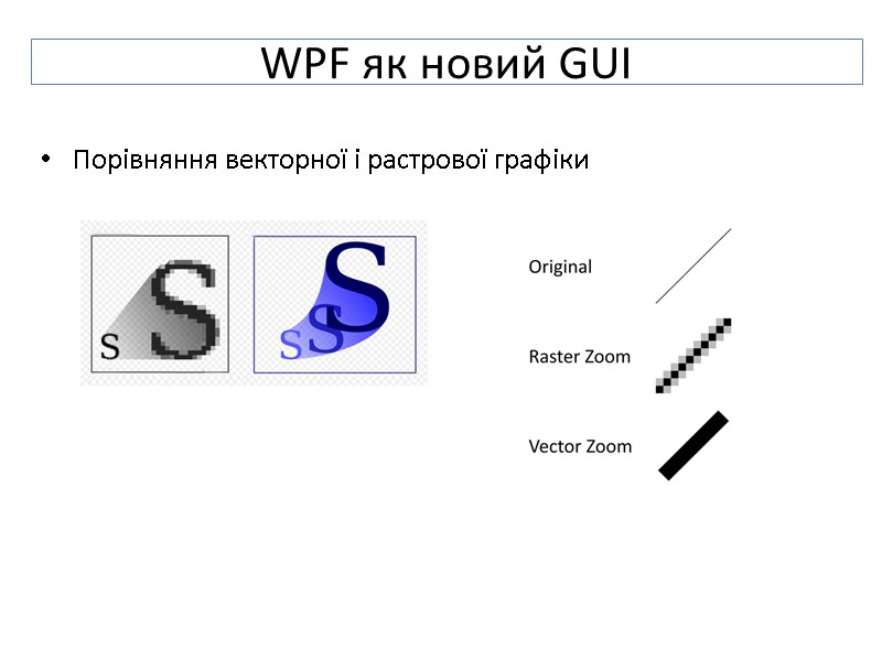
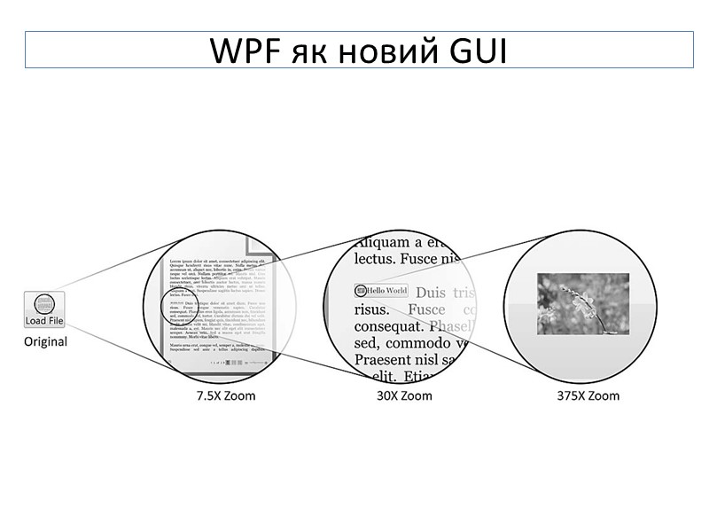
 WPF як новий GUI Починаючи з Win 3.0 UI-програми для Windows базувалися на двох фундаментальних частинах OS Windows: User32 , - забезпечує вигляд і поведінку UI -елементів: windows, buttons, text fields, etc.; GDI/GDI+ забезпечує малювання (shapes, text, images …). API-interfaces змінювались, але Visual Basic 6 або C++ з MFC, .Net з WinForms використовували ті самі частини Windows системи – User32 і GDI Windows Presentation Foundation (WPF) – повністю нова система для відображення графіки для Windows: vector graphics – основна технологія в WPF
 WinForms WPF 1.Кожен контрол закриває всі решта 2. WPF контроли з властивістю opacity =semitransparency WPF як новий GUI
 Порівняння векторної і растрової графіки WPF як новий GUI
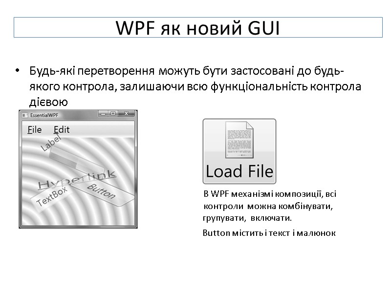
 Будь-які перетворення можуть бути застосовані до будь-якого контрола, залишаючи всю функціональність контрола дієвою В WPF механізмі композиції, всі контроли можна комбінувати, групувати, включати. Button містить і текст і малюнок WPF як новий GUI
 WPF як новий GUI
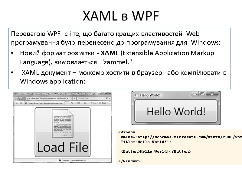
 Перевагою WPF є і те, що багато кращих властивостей Web програмування було перенесено до програмування для Windows: Новий формат розмітки - XAML (Extensible Application Markup Language), вимовляється "zammel." XAML документ – можемо хостити в браузері або компілювати в Windows application: XAML в WPF
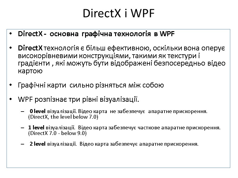
 DirectX і WPF DirectX - основна графічна технологія в WPF DirectX технологія є більш ефективною, оскільки вона оперує високорівневими конструкціями, такими як текстури і градієнти , які можуть бути відображені безпосередньо відео картою Графічні карти сильно різняться між собою WPF розпізнає три рівні візуалізації. 0 level візуалізації. Відео карта не забезпечує апаратне прискорення. (DirectX, the level below 7.0) 1 level візуалізації. Відео карта забезпечує часткове апаратне прискорення. (DirectX 7.0 - below 9.0) 2 level візуалізації. Відео карта забезпечує апаратне прискорення.
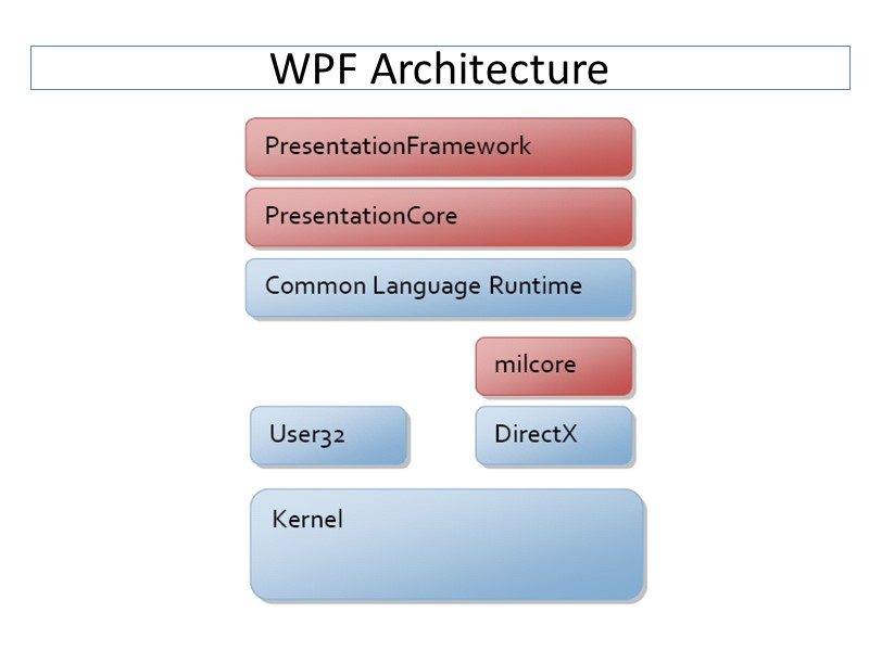
 WPF Architecture
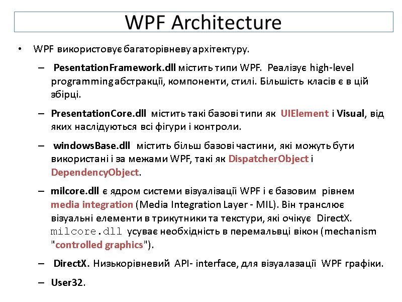
 WPF Architecture WPF використовує багаторівневу архітектуру. PesentationFramework.dll містить типи WPF. Реалізує high-level programming абстракції, компоненти, стилі. Більшість класів є в цій збірці. PresentationCore.dll містить такі базові типи як UIElement і Visual, від яких наслідуються всі фігури і контроли. windowsBase.dll містить більш базові частини, які можуть бути використані і за межами WPF, такі як DispatcherObject і DependencyObject. milcore.dll є ядром системи візуалізації WPF і є базовим рівнем media integration (Media Integration Layer - MIL). Він транслює візуальні елементи в трикутники та текстури, які очікує DirectX. milcore.dll усуває необхідність в перемальвці вікон (mechanism "controlled graphics"). DirectX. Низькорівневий API- interface, для візуалазації WPF графіки. User32.
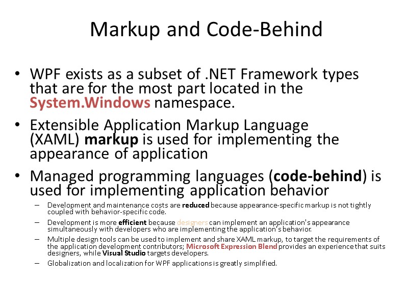
 Markup and Code-Behind WPF exists as a subset of .NET Framework types that are for the most part located in the System.Windows namespace. Extensible Application Markup Language (XAML) markup is used for implementing the appearance of application Managed programming languages (code-behind) is used for implementing application behavior Development and maintenance costs are reduced because appearance-specific markup is not tightly coupled with behavior-specific code. Development is more efficient because designers can implement an application's appearance simultaneously with developers who are implementing the application's behavior. Multiple design tools can be used to implement and share XAML markup, to target the requirements of the application development contributors; Microsoft Expression Blend provides an experience that suits designers, while Visual Studio targets developers. Globalization and localization for WPF applications is greatly simplified.
 Markup and Code-Behind
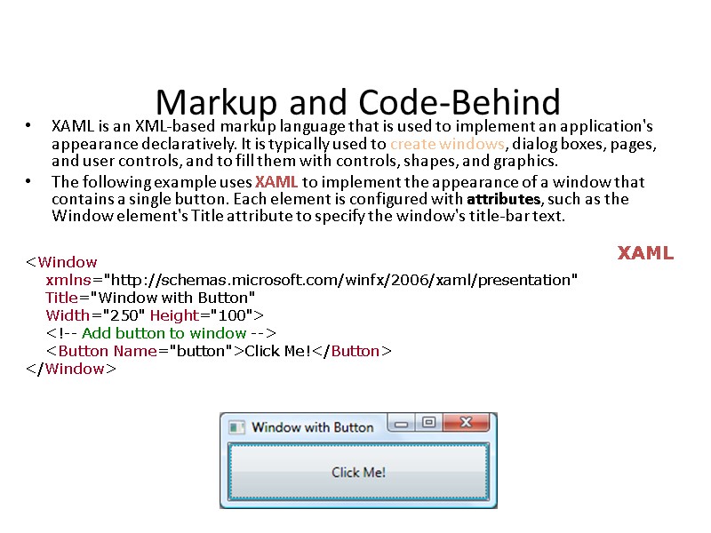
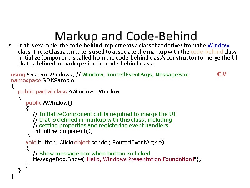
 Markup and Code-Behind XAML is an XML-based markup language that is used to implement an application's appearance declaratively. It is typically used to create windows, dialog boxes, pages, and user controls, and to fill them with controls, shapes, and graphics. The following example uses XAML to implement the appearance of a window that contains a single button. Each element is configured with attributes, such as the Window element's Title attribute to specify the window's title-bar text.
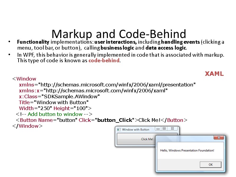
 Markup and Code-Behind Functionality implementations: user interactions, including handling events (clicking a menu, tool bar, or button), calling business logic and data access logic. In WPF, this behavior is generally implemented in code that is associated with markup. This type of code is known as code-behind.
 Markup and Code-Behind In this example, the code-behind implements a class that derives from the Window class. The x:Class attribute is used to associate the markup with the code-behind class. InitializeComponent is called from the code-behind class's constructor to merge the UI that is defined in markup with the code-behind class. using System.Windows; // Window, RoutedEventArgs, MessageBox namespace SDKSample { public partial class AWindow : Window { public AWindow() { // InitializeComponent call is required to merge the UI // that is defined in markup with this class, including // setting properties and registering event handlers InitializeComponent(); } void button_Click(object sender, RoutedEventArgs e) { // Show message box when button is clicked MessageBox.Show("Hello, Windows Presentation Foundation!"); } } } C#
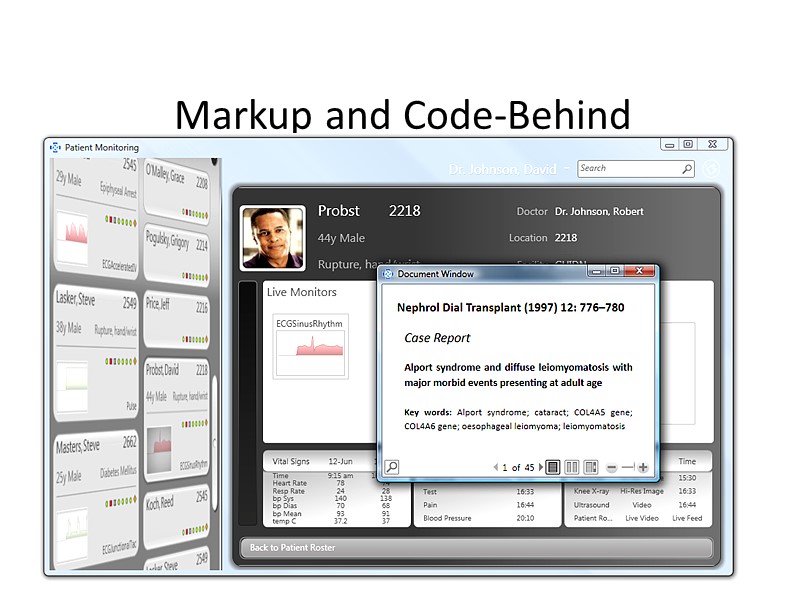
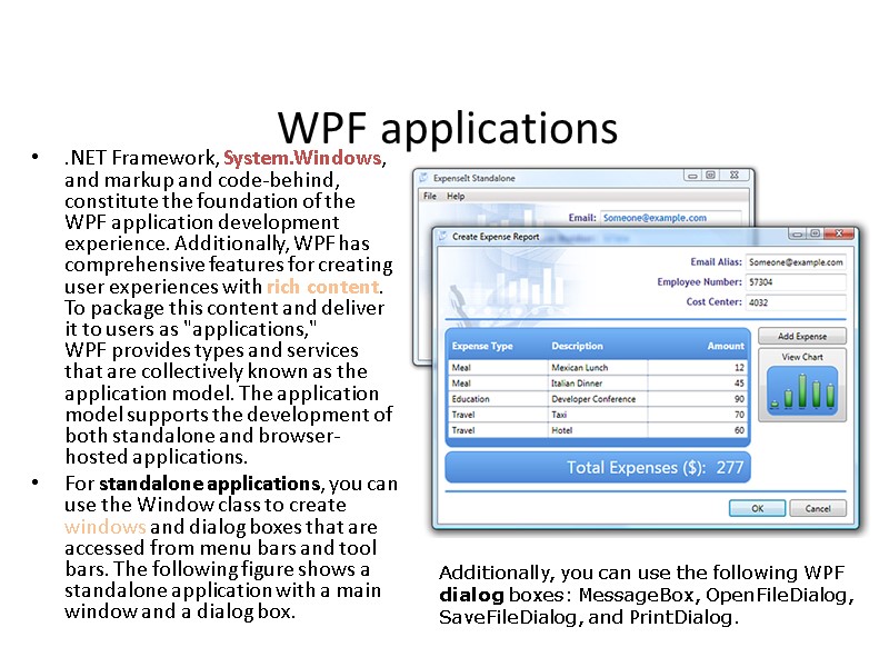
 WPF applications .NET Framework, System.Windows, and markup and code-behind, constitute the foundation of the WPF application development experience. Additionally, WPF has comprehensive features for creating user experiences with rich content. To package this content and deliver it to users as "applications," WPF provides types and services that are collectively known as the application model. The application model supports the development of both standalone and browser-hosted applications. For standalone applications, you can use the Window class to create windows and dialog boxes that are accessed from menu bars and tool bars. The following figure shows a standalone application with a main window and a dialog box. Additionally, you can use the following WPF dialog boxes: MessageBox, OpenFileDialog, SaveFileDialog, and PrintDialog.
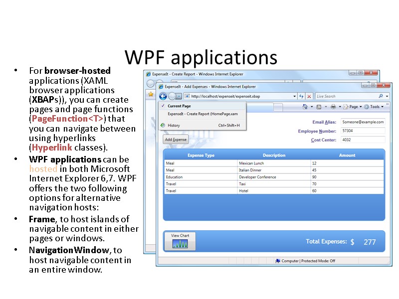
 WPF applications For browser-hosted applications (XAML browser applications (XBAPs)), you can create pages and page functions (PageFunction
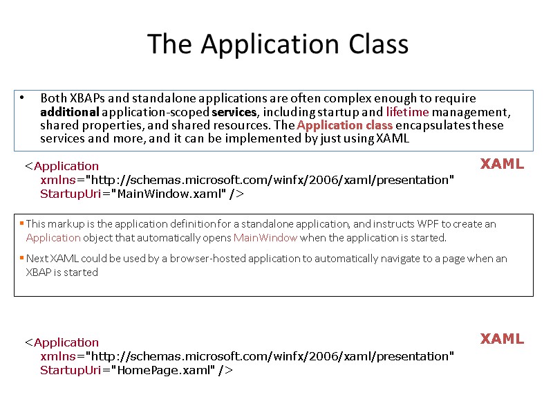
 The Application Class Both XBAPs and standalone applications are often complex enough to require additional application-scoped services, including startup and lifetime management, shared properties, and shared resources. The Application class encapsulates these services and more, and it can be implemented by just using XAML
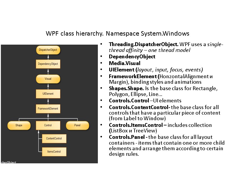
 Threading.DispatcherObject. WPF uses a single-thread affinity – one thread model DependencyObject Media.Visual UIElement (layout, input, focus, events) FrameworkElement (HonzontalAlignment и Margin), binding styles and animations Shapes.Shape. Is the base class for Rectangle, Polygon, Ellipse, Line… Controls.Control –UI elements Controls.ContentControl- the base class for all controls that have a particular piece of content (from Label to Window) Controls.ItemsControl – includes collection (ListBox и TreeView) Controls.Panel - the base class for all layout containers - items that contain one or more child elements and arrange them according to certain design rules. WPF class hierarchy. Namespace System.Windows
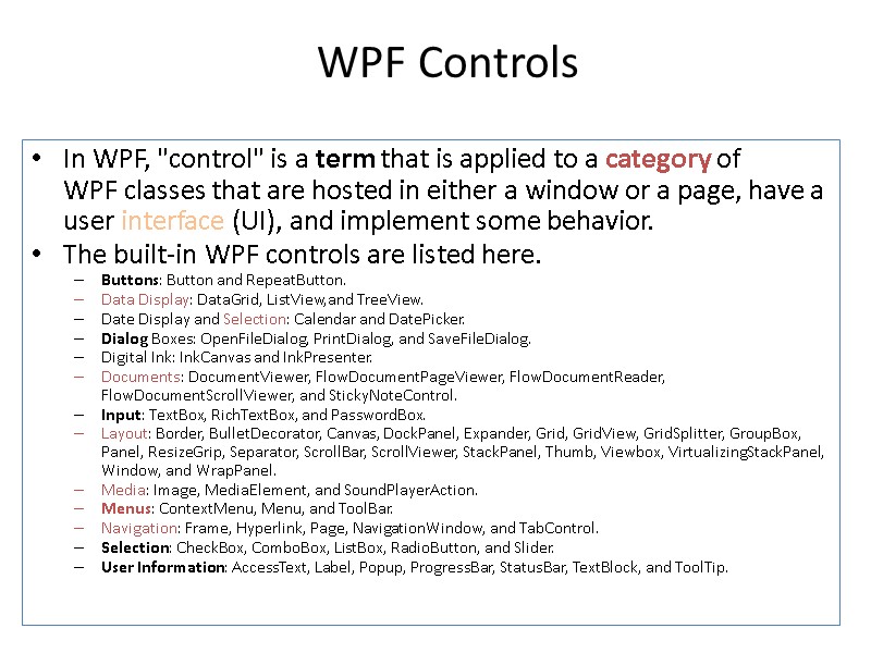
 WPF Controls In WPF, "control" is a term that is applied to a category of WPF classes that are hosted in either a window or a page, have a user interface (UI), and implement some behavior. The built-in WPF controls are listed here. Buttons: Button and RepeatButton. Data Display: DataGrid, ListView,and TreeView. Date Display and Selection: Calendar and DatePicker. Dialog Boxes: OpenFileDialog, PrintDialog, and SaveFileDialog. Digital Ink: InkCanvas and InkPresenter. Documents: DocumentViewer, FlowDocumentPageViewer, FlowDocumentReader, FlowDocumentScrollViewer, and StickyNoteControl. Input: TextBox, RichTextBox, and PasswordBox. Layout: Border, BulletDecorator, Canvas, DockPanel, Expander, Grid, GridView, GridSplitter, GroupBox, Panel, ResizeGrip, Separator, ScrollBar, ScrollViewer, StackPanel, Thumb, Viewbox, VirtualizingStackPanel, Window, and WrapPanel. Media: Image, MediaElement, and SoundPlayerAction. Menus: ContextMenu, Menu, and ToolBar. Navigation: Frame, Hyperlink, Page, NavigationWindow, and TabControl. Selection: CheckBox, ComboBox, ListBox, RadioButton, and Slider. User Information: AccessText, Label, Popup, ProgressBar, StatusBar, TextBlock, and ToolTip.
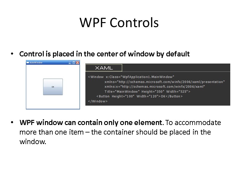
 Control is placed in the center of window by default WPF window can contain only one element. To accommodate more than one item – the container should be placed in the window. WPF Controls
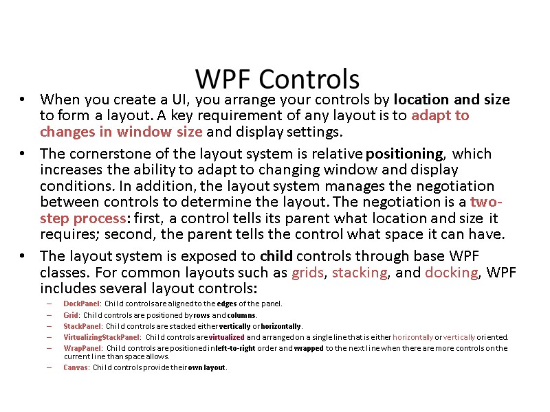
 WPF Controls When you create a UI, you arrange your controls by location and size to form a layout. A key requirement of any layout is to adapt to changes in window size and display settings. The cornerstone of the layout system is relative positioning, which increases the ability to adapt to changing window and display conditions. In addition, the layout system manages the negotiation between controls to determine the layout. The negotiation is a two-step process: first, a control tells its parent what location and size it requires; second, the parent tells the control what space it can have. The layout system is exposed to child controls through base WPF classes. For common layouts such as grids, stacking, and docking, WPF includes several layout controls: DockPanel: Child controls are aligned to the edges of the panel. Grid: Child controls are positioned by rows and columns. StackPanel: Child controls are stacked either vertically or horizontally. VirtualizingStackPanel: Child controls are virtualized and arranged on a single line that is either horizontally or vertically oriented. WrapPanel: Child controls are positioned in left-to-right order and wrapped to the next line when there are more controls on the current line than space allows. Canvas: Child controls provide their own layout.
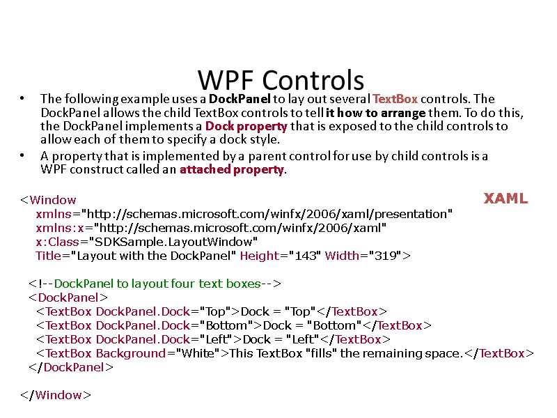
 WPF Controls The following example uses a DockPanel to lay out several TextBox controls. The DockPanel allows the child TextBox controls to tell it how to arrange them. To do this, the DockPanel implements a Dock property that is exposed to the child controls to allow each of them to specify a dock style. A property that is implemented by a parent control for use by child controls is a WPF construct called an attached property.
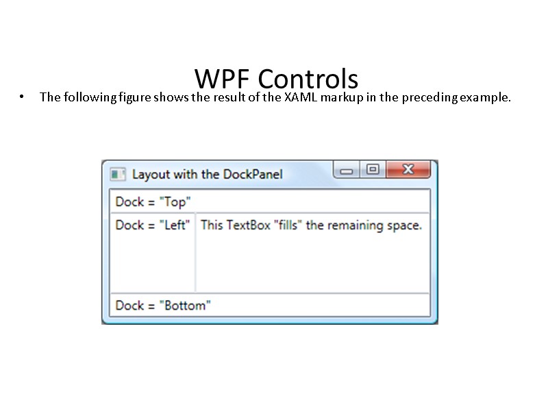
 WPF Controls The following figure shows the result of the XAML markup in the preceding example.
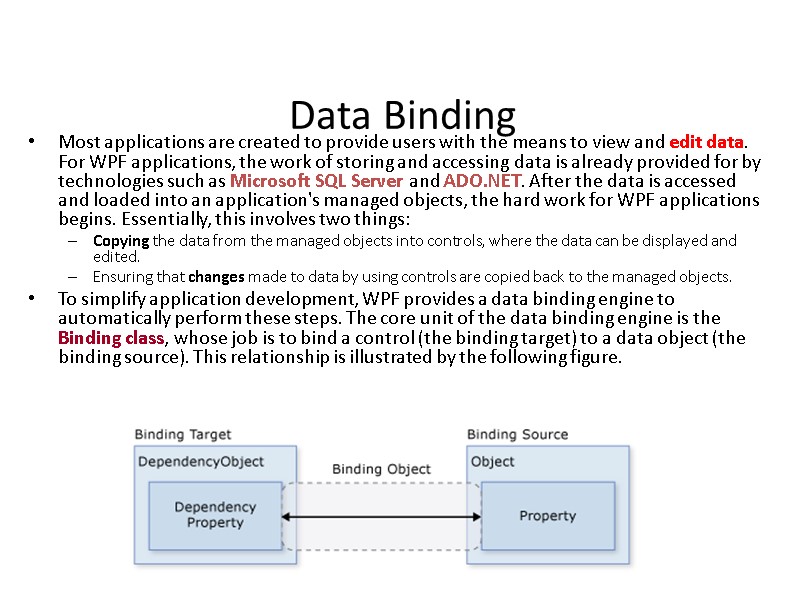
 Data Binding Most applications are created to provide users with the means to view and edit data. For WPF applications, the work of storing and accessing data is already provided for by technologies such as Microsoft SQL Server and ADO.NET. After the data is accessed and loaded into an application's managed objects, the hard work for WPF applications begins. Essentially, this involves two things: Copying the data from the managed objects into controls, where the data can be displayed and edited. Ensuring that changes made to data by using controls are copied back to the managed objects. To simplify application development, WPF provides a data binding engine to automatically perform these steps. The core unit of the data binding engine is the Binding class, whose job is to bind a control (the binding target) to a data object (the binding source). This relationship is illustrated by the following figure.
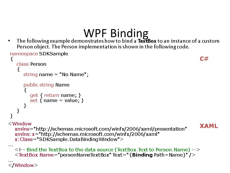
 WPF Binding The following example demonstrates how to bind a TextBox to an instance of a custom Person object. The Person implementation is shown in the following code. namespace SDKSample { class Person { string name = "No Name"; public string Name { get { return name; } set { name = value; } } } }
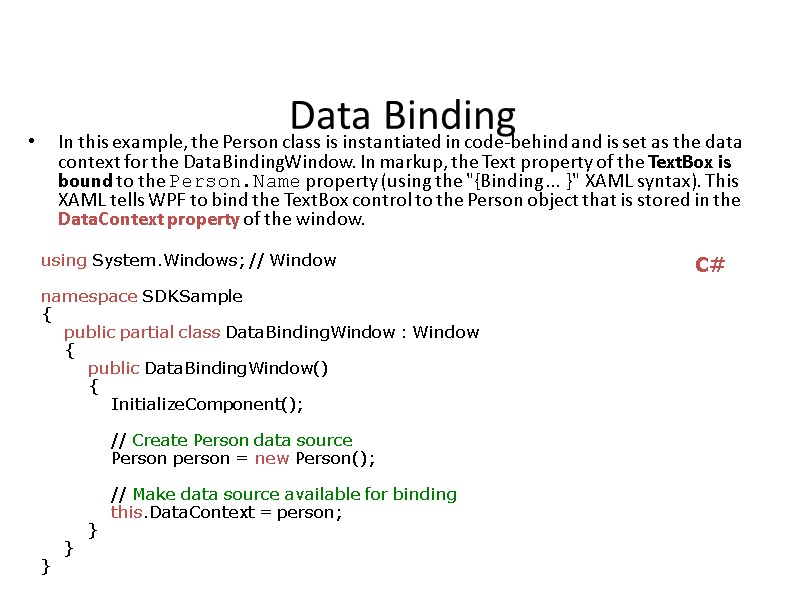
 Data Binding In this example, the Person class is instantiated in code-behind and is set as the data context for the DataBindingWindow. In markup, the Text property of the TextBox is bound to the Person.Name property (using the "{Binding ... }" XAML syntax). This XAML tells WPF to bind the TextBox control to the Person object that is stored in the DataContext property of the window. using System.Windows; // Window namespace SDKSample { public partial class DataBindingWindow : Window { public DataBindingWindow() { InitializeComponent(); // Create Person data source Person person = new Person(); // Make data source available for binding this.DataContext = person; } } } C#
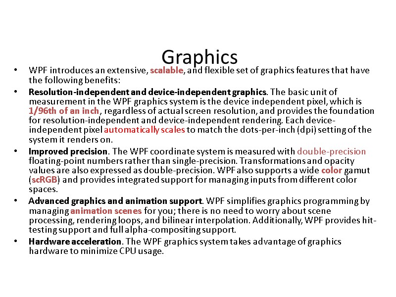
 Graphics WPF introduces an extensive, scalable, and flexible set of graphics features that have the following benefits: Resolution-independent and device-independent graphics. The basic unit of measurement in the WPF graphics system is the device independent pixel, which is 1/96th of an inch, regardless of actual screen resolution, and provides the foundation for resolution-independent and device-independent rendering. Each device-independent pixel automatically scales to match the dots-per-inch (dpi) setting of the system it renders on. Improved precision. The WPF coordinate system is measured with double-precision floating-point numbers rather than single-precision. Transformations and opacity values are also expressed as double-precision. WPF also supports a wide color gamut (scRGB) and provides integrated support for managing inputs from different color spaces. Advanced graphics and animation support. WPF simplifies graphics programming by managing animation scenes for you; there is no need to worry about scene processing, rendering loops, and bilinear interpolation. Additionally, WPF provides hit-testing support and full alpha-compositing support. Hardware acceleration. The WPF graphics system takes advantage of graphics hardware to minimize CPU usage.
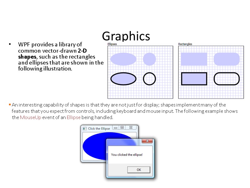
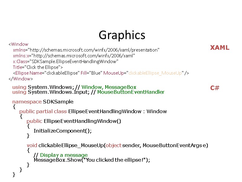
 Graphics WPF provides a library of common vector-drawn 2-D shapes, such as the rectangles and ellipses that are shown in the following illustration. An interesting capability of shapes is that they are not just for display; shapes implement many of the features that you expect from controls, including keyboard and mouse input. The following example shows the MouseUp event of an Ellipse being handled.
 Graphics
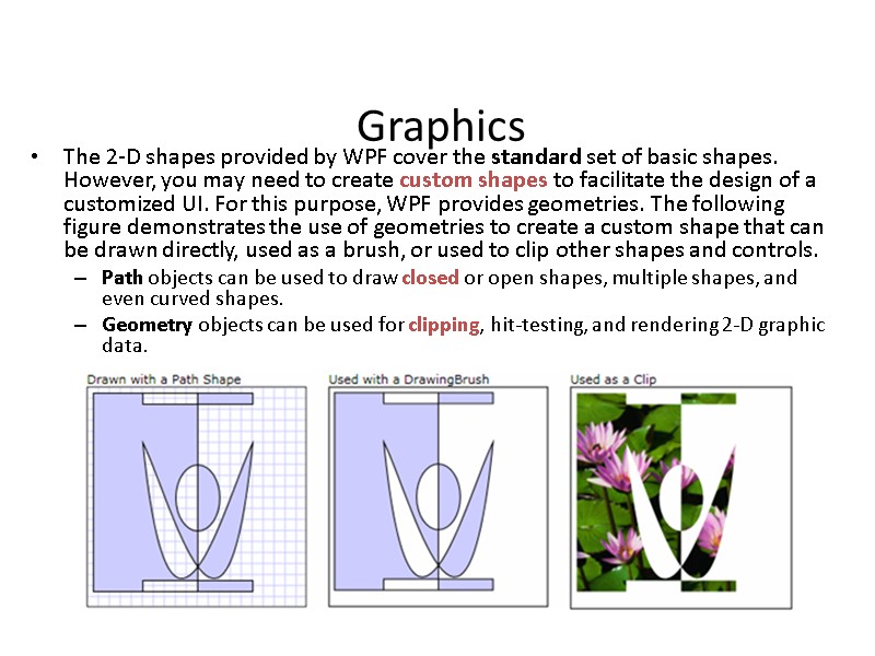
 Graphics The 2-D shapes provided by WPF cover the standard set of basic shapes. However, you may need to create custom shapes to facilitate the design of a customized UI. For this purpose, WPF provides geometries. The following figure demonstrates the use of geometries to create a custom shape that can be drawn directly, used as a brush, or used to clip other shapes and controls. Path objects can be used to draw closed or open shapes, multiple shapes, and even curved shapes. Geometry objects can be used for clipping, hit-testing, and rendering 2-D graphic data.
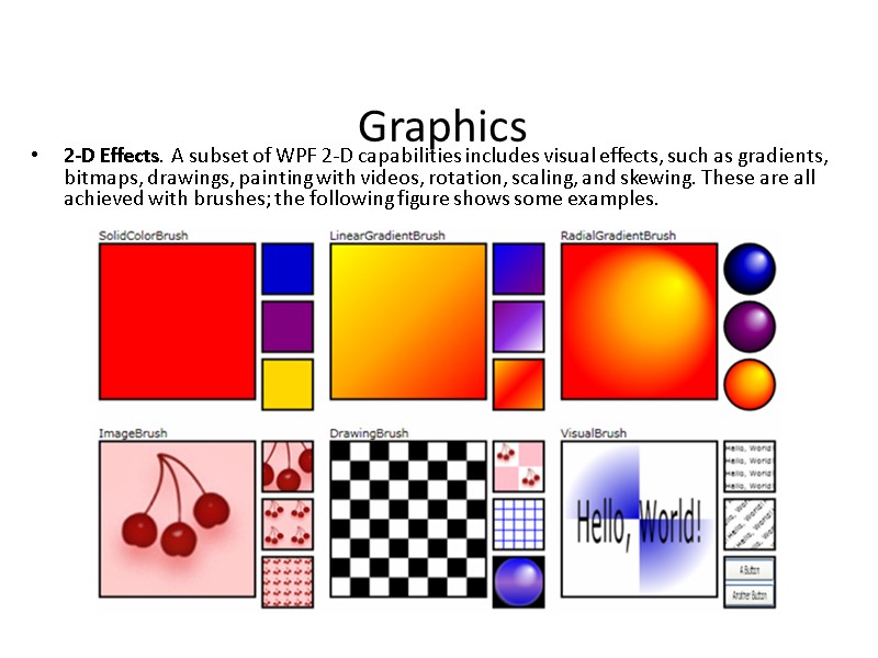
 Graphics 2-D Effects. A subset of WPF 2-D capabilities includes visual effects, such as gradients, bitmaps, drawings, painting with videos, rotation, scaling, and skewing. These are all achieved with brushes; the following figure shows some examples.
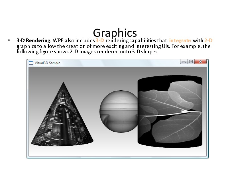
 Graphics 3-D Rendering. WPF also includes 3-D rendering capabilities that integrate with 2-D graphics to allow the creation of more exciting and interesting UIs. For example, the following figure shows 2-D images rendered onto 3-D shapes.
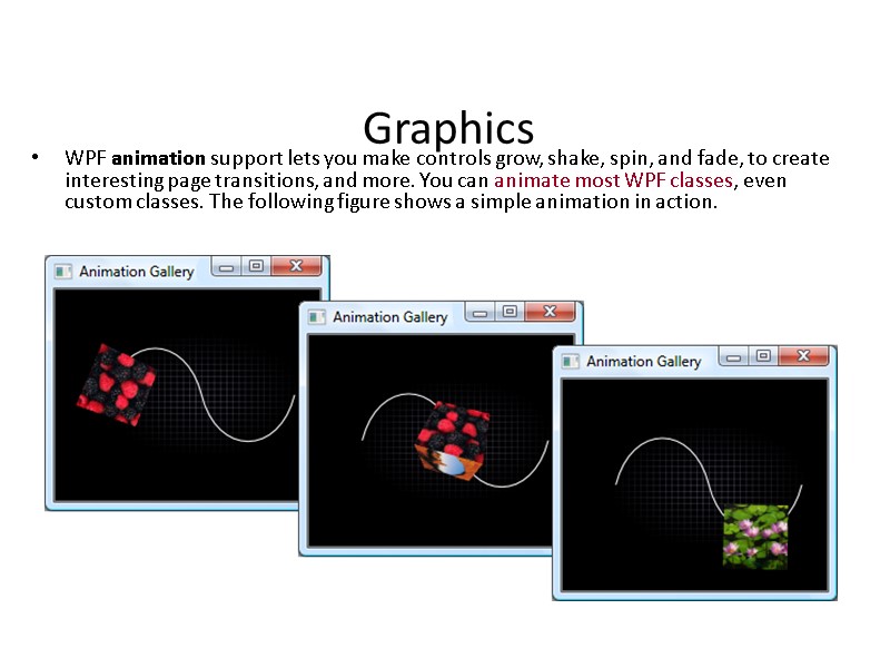
 Graphics WPF animation support lets you make controls grow, shake, spin, and fade, to create interesting page transitions, and more. You can animate most WPF classes, even custom classes. The following figure shows a simple animation in action.
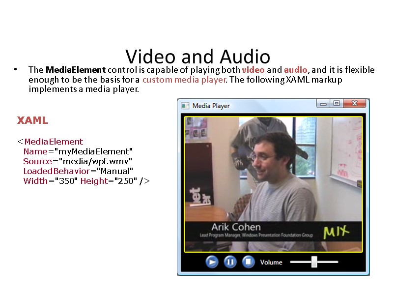
 Video and Audio The MediaElement control is capable of playing both video and audio, and it is flexible enough to be the basis for a custom media player. The following XAML markup implements a media player.
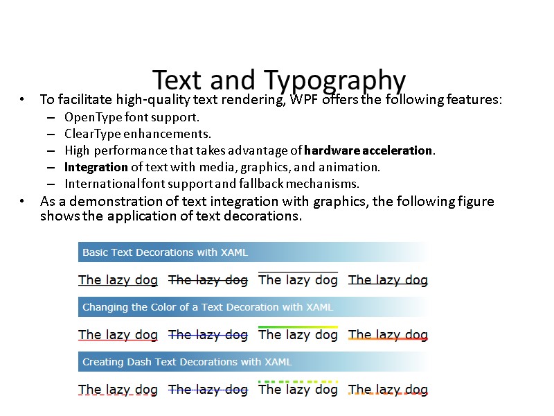
 Text and Typography To facilitate high-quality text rendering, WPF offers the following features: OpenType font support. ClearType enhancements. High performance that takes advantage of hardware acceleration. Integration of text with media, graphics, and animation. International font support and fallback mechanisms. As a demonstration of text integration with graphics, the following figure shows the application of text decorations.
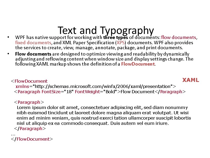
 Text and Typography WPF has native support for working with three types of documents: flow documents, fixed documents, and XML Paper Specification (XPS) documents. WPF also provides the services to create, view, manage, annotate, package, and print documents. Flow documents are designed to optimize viewing and readability by dynamically adjusting and reflowing content when window size and display settings change. The following XAML markup shows the definition of a FlowDocument.
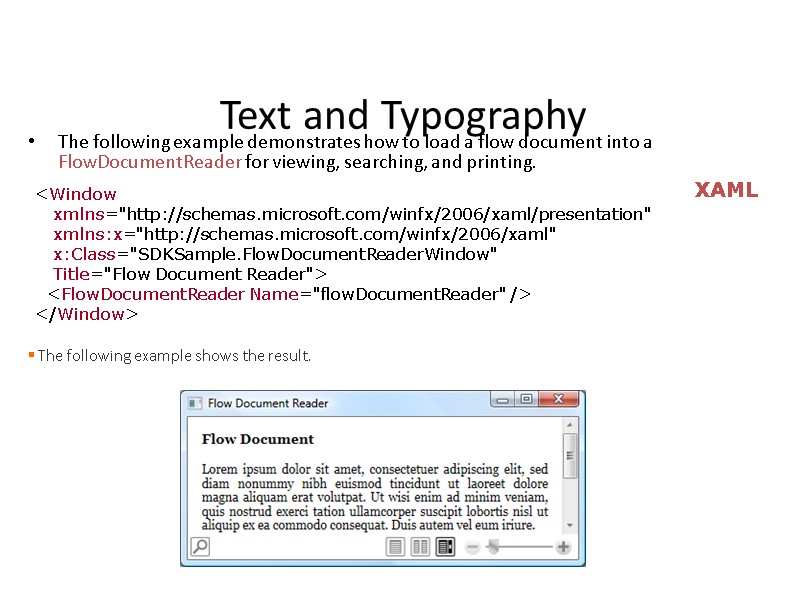
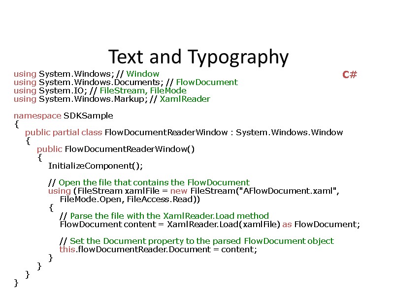
 Text and Typography The following example demonstrates how to load a flow document into a FlowDocumentReader for viewing, searching, and printing.
 Text and Typography using System.Windows; // Window using System.Windows.Documents; // FlowDocument using System.IO; // FileStream, FileMode using System.Windows.Markup; // XamlReader namespace SDKSample { public partial class FlowDocumentReaderWindow : System.Windows.Window { public FlowDocumentReaderWindow() { InitializeComponent(); // Open the file that contains the FlowDocument using (FileStream xamlFile = new FileStream("AFlowDocument.xaml", FileMode.Open, FileAccess.Read)) { // Parse the file with the XamlReader.Load method FlowDocument content = XamlReader.Load(xamlFile) as FlowDocument; // Set the Document property to the parsed FlowDocument object this.flowDocumentReader.Document = content; } } } } C#
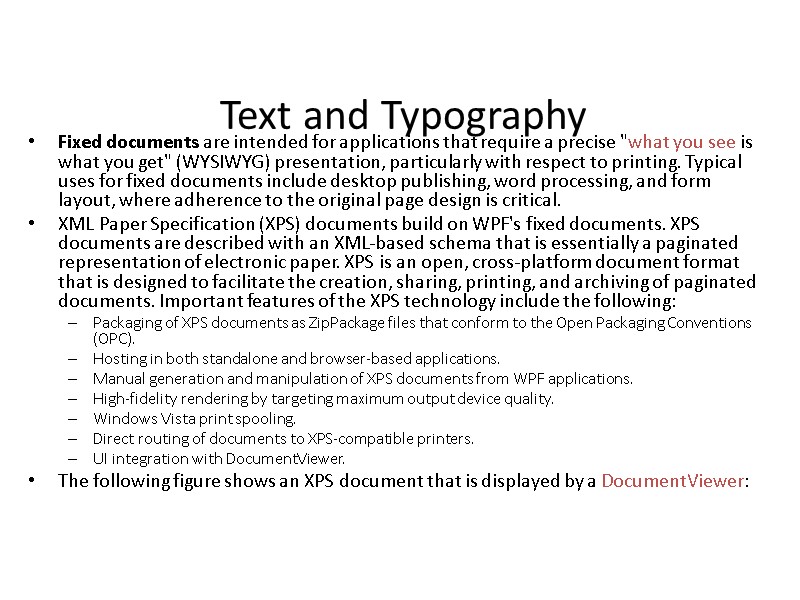
 Text and Typography Fixed documents are intended for applications that require a precise "what you see is what you get" (WYSIWYG) presentation, particularly with respect to printing. Typical uses for fixed documents include desktop publishing, word processing, and form layout, where adherence to the original page design is critical. XML Paper Specification (XPS) documents build on WPF's fixed documents. XPS documents are described with an XML-based schema that is essentially a paginated representation of electronic paper. XPS is an open, cross-platform document format that is designed to facilitate the creation, sharing, printing, and archiving of paginated documents. Important features of the XPS technology include the following: Packaging of XPS documents as ZipPackage files that conform to the Open Packaging Conventions (OPC). Hosting in both standalone and browser-based applications. Manual generation and manipulation of XPS documents from WPF applications. High-fidelity rendering by targeting maximum output device quality. Windows Vista print spooling. Direct routing of documents to XPS-compatible printers. UI integration with DocumentViewer. The following figure shows an XPS document that is displayed by a DocumentViewer:
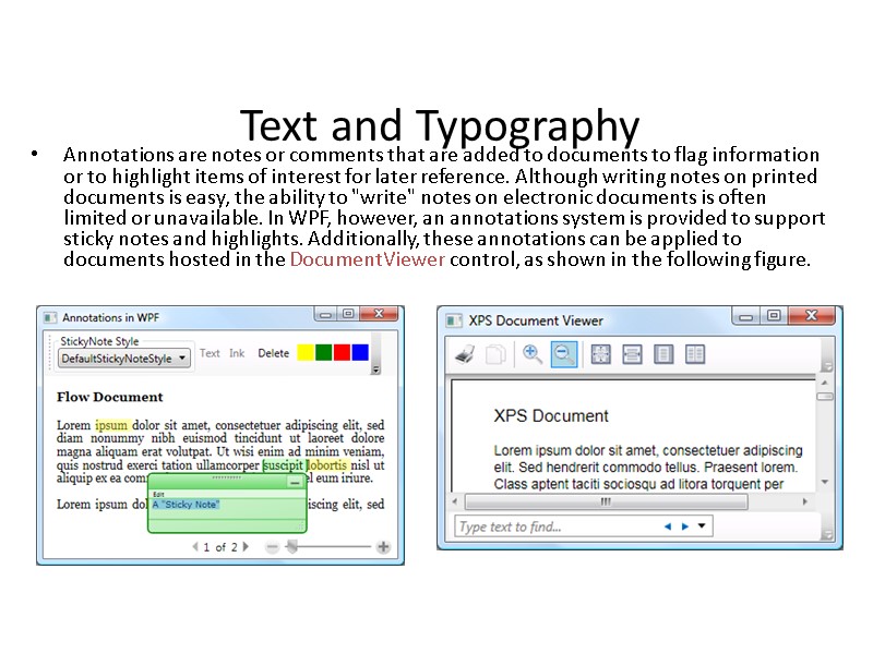
 Text and Typography Annotations are notes or comments that are added to documents to flag information or to highlight items of interest for later reference. Although writing notes on printed documents is easy, the ability to "write" notes on electronic documents is often limited or unavailable. In WPF, however, an annotations system is provided to support sticky notes and highlights. Additionally, these annotations can be applied to documents hosted in the DocumentViewer control, as shown in the following figure.
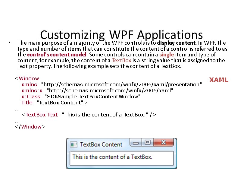
 Customizing WPF Applications The main purpose of a majority of the WPF controls is to display content. In WPF, the type and number of items that can constitute the content of a control is referred to as the control's content model. Some controls can contain a single item and type of content; for example, the content of a TextBox is a string value that is assigned to the Text property. The following example sets the content of a TextBox.
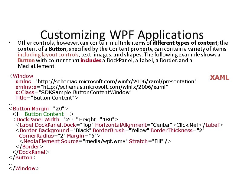
 Customizing WPF Applications Other controls, however, can contain multiple items of different types of content; the content of a Button, specified by the Content property, can contain a variety of items including layout controls, text, images, and shapes. The following example shows a Button with content that includes a DockPanel, a Label, a Border, and a MediaElement. XAML
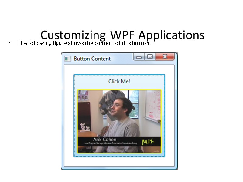
 Customizing WPF Applications The following figure shows the content of this button.
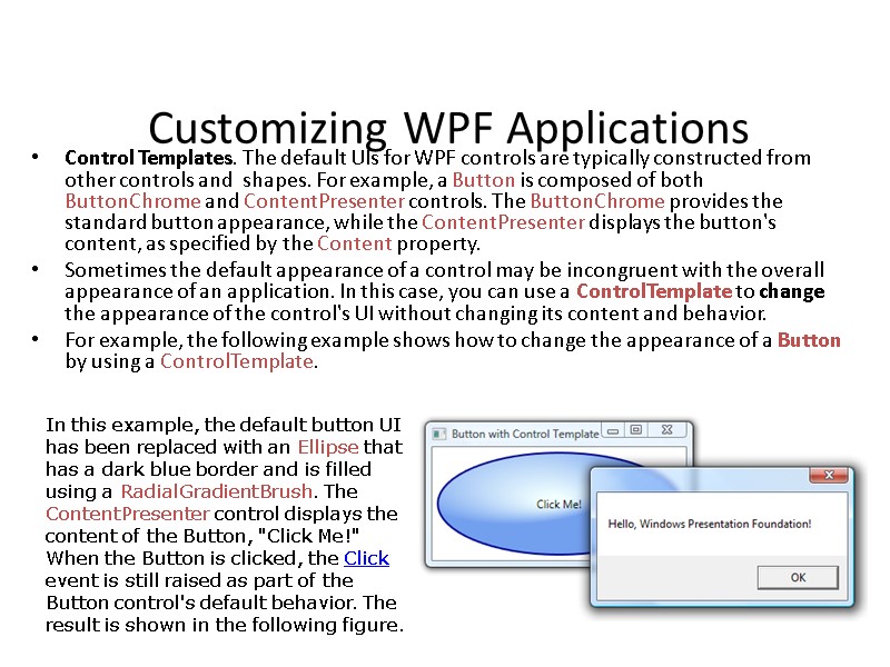
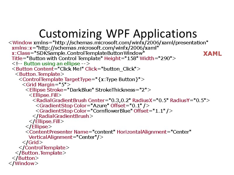
 Customizing WPF Applications Control Templates. The default UIs for WPF controls are typically constructed from other controls and shapes. For example, a Button is composed of both ButtonChrome and ContentPresenter controls. The ButtonChrome provides the standard button appearance, while the ContentPresenter displays the button's content, as specified by the Content property. Sometimes the default appearance of a control may be incongruent with the overall appearance of an application. In this case, you can use a ControlTemplate to change the appearance of the control's UI without changing its content and behavior. For example, the following example shows how to change the appearance of a Button by using a ControlTemplate. In this example, the default button UI has been replaced with an Ellipse that has a dark blue border and is filled using a RadialGradientBrush. The ContentPresenter control displays the content of the Button, "Click Me!" When the Button is clicked, the Click event is still raised as part of the Button control's default behavior. The result is shown in the following figure.
 Customizing WPF Applications
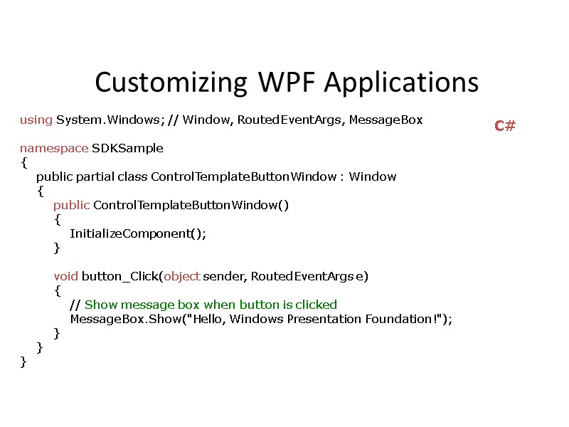
 Customizing WPF Applications using System.Windows; // Window, RoutedEventArgs, MessageBox namespace SDKSample { public partial class ControlTemplateButtonWindow : Window { public ControlTemplateButtonWindow() { InitializeComponent(); } void button_Click(object sender, RoutedEventArgs e) { // Show message box when button is clicked MessageBox.Show("Hello, Windows Presentation Foundation!"); } } } C#
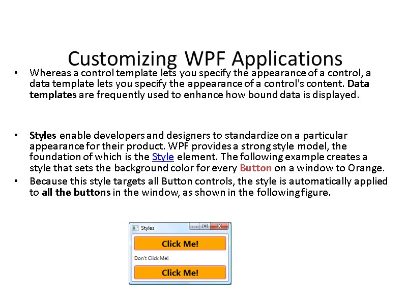
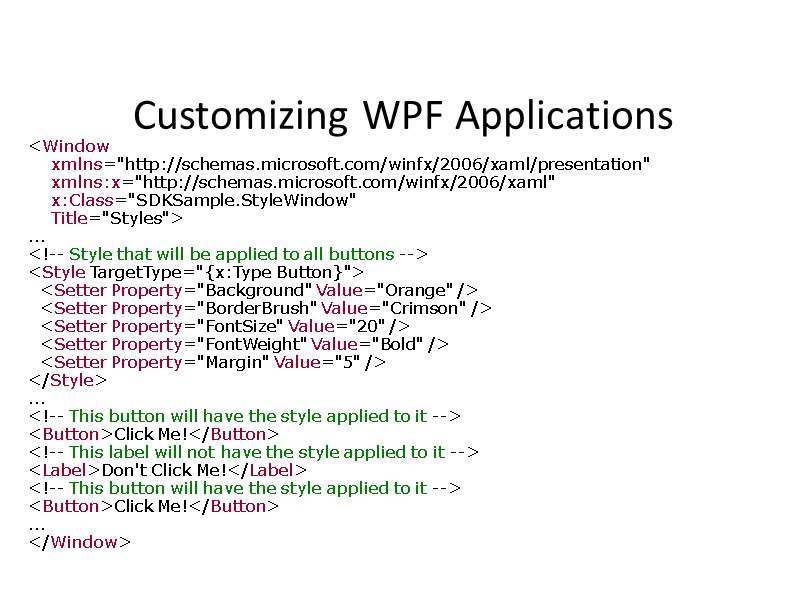
 Customizing WPF Applications Whereas a control template lets you specify the appearance of a control, a data template lets you specify the appearance of a control's content. Data templates are frequently used to enhance how bound data is displayed. Styles enable developers and designers to standardize on a particular appearance for their product. WPF provides a strong style model, the foundation of which is the Style element. The following example creates a style that sets the background color for every Button on a window to Orange. Because this style targets all Button controls, the style is automatically applied to all the buttons in the window, as shown in the following figure.
 Customizing WPF Applications
 Questions?
 Thank You! www.softservecom.com Copyright © 2010 SoftServe, Inc. Contacts Europe Headquarters 52 V. Velykoho Str. Lviv 79053, Ukraine Tel: +380-32-240-9090 Fax: +380-32-240-9080 E-mail: [email protected] US Headquarters 13350 Metro Parkway, Suite 302 Fort Myers, FL 33966, USA Tel: 239-690-3111 Fax: 239-690-3116 E-mail: [email protected]

