

ead34e27e27186431ef012992c8eed98.ppt
- Количество слайдов: 73
 Where we left off • Color –
 Where we left off • Color – working between color and grayscale
 Good or Bad?
 Good or Bad?
 Good or Bad?
 Good or Bad?
 Good or Bad?
 Good or Bad?
 Good or Bad?
 Good or Bad?
 Good or Bad?
 Good or Bad?
 Keys for conversion • Large variation in lightness
 Keys for conversion • Large variation in lightness • Grayscale printers are better than copiers • Copiers can reliably only produce about 4 gray levels: white, lt. Gray, dk. Gray, black…
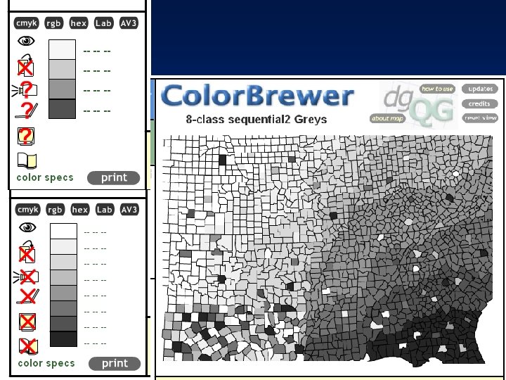
 Tips for conversion • If your map will be reproduced: test it on a copier (design for medium!) • The risk is illegibility
 Tips for conversion • Sequential schemes usually perform ok
 Tips for conversion • Sequential schemes usually perform ok
 Tips for conversion • Diverging schemes do poorly
 Tips for conversion • Diverging schemes do • The dark ends of the poorly scheme lose the contrast created by different hues • After conversion, these maps simply emphasize deviation from the middle
 Tips for conversion • Binary Schemes do okay
 Tips for conversion • Binary Schemes do okay
 Tips for conversion • Qualitative Schemes?
 Tips for conversion • Qualitative Schemes do poorly • Inevitable light-to-dark ordering suggests a hierarchy • Unrelated classes end up with similar grays
 Tips for conversion • Design for medium: will your map be printed/reproduced? • Lightness variation is the key to a good grayscale color scheme • Limit the number of classes for copiers (4 or 5 at most • Ideally, your colors will perform in both color and gray
 The end of color 1. Describe the hue, lightness, and saturation of colors 2. Plan and produce a color scheme with hue, lightness, and saturation suited to mapped data characteristics 3. Categorize color schemes as sequential, diverging, or qualitative 4. Adjust map colors for colorblind readers
 The end of color 5. Adjust map colors for black and white reproduction 6. Adjust map colors to avoid misinterpretation caused by simultaneous contrast 7. Specify colors in CMYK 8. Specify colors in RGB
 Midterm Review
 What is the midterm • All lectures, readings, and labs up through today’s lecture • Format: – Definitions – T/F – multiple choice – short answer – sketching
 What lectures? What reading? • Lectures: • Intro/history • Principles of map design • Layout and Hierarchy • Typography • Color • • • Readings: Chapter 1 Chapter 4 Chapter 11 Chapter 5
 Sample questions: • Define: Resolution
 Sample questions: • Define: Resolution • T or F – you can adjust type weight to imply feature hierarchy
 Sample questions: • The CMY value for the red color at the top of this scheme is – A: 215 25 10 – B: 0 85 40 – C: 15 95 80 – D: 45 100 20 – E: 25 215 10
 Sample questions: • The RGB value for the red color at the top of this scheme is – A: 215 25 28 – B: 90 75 15 – C: 95 15 75 – D: 33 210 115 – E: 25 215 10
 Sample questions: • Describe some problems with this map?
 Sample questions: • What is the difference between general reference and thematic maps? Give examples of each.
 General-reference maps versus Thematic maps
 General-reference maps • Emphasize location of spatial phenomena • Examples include: – Topo maps – Road maps
 General-reference maps are literal
 • General-reference maps usually represent things we can see and touch • Gen-ref maps are offer congruent representations of geographic space
 The thematic map • Also called the “statistical map, ” “singletopic map, ” or the “special-purpose” map • Less literal than a general-reference map • Two groups of thematic maps: qualitative and quantitative
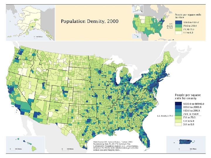
 The 2 kinds of thematic maps • Quantitative thematic maps – Spatial aspects of numerical data • • Corn yield Per Capita Income Number of Tornadoes Population Density – These maps are concerned with amounts, or quantities – Can you tell the difference? – Is the attribute a quantity or a quality?
 This here is a Thematic map: Lung cancer in white males, by Brewer Qualitative or Quantitative?
 Qualitative or Quantitative?
 Some famous old generalreference maps
 Some early thematic maps
 What’s the point of Map Design? • The point of map design is to facilitate the communication of geographic information • Good map design is like good writing – Eloquent – Efficient – Informative – Pleasing – Well-structured
 Brewer’s 5 Questions 1. What information is being mapped? 2. Who will be reading the map? 3. Is the map content coordinated with written content or other graphics? 4. What size and medium will be used to display the map? 5. What are the time & budget and constraints on map production?
 Who will be reading the map? • AUDIENCE!! – If you were to write a book how would audience influence your writing? – Know your audience • • Are they novices? Are they experts? Maps to see (simpler) Maps to read (complex)
 Audience and Design
 • Map for experts – More symbols – Hydrants, meters, fittings, valves, laterals, road centerlines and edges, and sewage mains – A map to “Read” • Map for novices or busy folks – Reduced info content – Simplified, shows only hydrants and water mains – A map to “See” Examples from Brewer
 Perceptual Salience • In a map context, perceptual salience refers to graphic prominence or obviousness • What sticks out to a map-reader • The most prominent features on the map are said to be “salient”
 prove that novice map-readers extract") Perceptual Salience and Novices • Recent studies (Lowe, 1999) prove that novice map-readers extract information based on graphic prominence as opposed to relevance • Perceptual Salience and Thematic Relevance – Good map design pairs thematically relevant features with graphically prominent symbols – Bad map design often emphasizes irrelevant features, or fails to emphasize relevant features
Perceptual Salience and Novices • Recent studies (Lowe, 1999) prove that novice map-readers extract information based on graphic prominence as opposed to relevance • Perceptual Salience and Thematic Relevance – Good map design pairs thematically relevant features with graphically prominent symbols – Bad map design often emphasizes irrelevant features, or fails to emphasize relevant features
 Salience and Relevance: please consider your purpose and your audience
 What size and medium will be used to display the map? • How will you present your map? • Some examples of map media: • Computer screen, projected display for hundreds of viewers, color laser prints for a small group, b&w print for a town meeting, large plot for a wall, glossy magazine, backdrop for a tradeshow, television news map, 2 -inch PDA screen, etc.
 Resolution defined • Resolution measures the smallest marks we are able to create within a display. • It varies significantly across media • Commonly expressed as dpi (dots per inch)
 Match these media with their resolutions: • • Computer screen 27 -inch color tv Laser printer Litho plate on an offset printer • • 12000 dpi 72 dpi 600 dpi 26 dpi
 Viewing Distance • Common sense: Features need to be enlarged to be legible from a distance • Imagine these map-viewing scenarios & their viewing distances – – Poster maps Projected displays In-car-navigation systems 8. 5 by 11 inch printed map • Consider viewing distance in the design phase
 Which map for which distance? What’s different?
 Layout and Hierarchy The foundations of smart, clean maps
 Map Layout • The organization of your total map presentation • Important objects should be more prominently displayed • Layout the arrangement of “map elements”
 The Elite 8 1. 2. 3. 4. 5. 6. 7. 8. Frame line and neat line Mapped area Insets Title/subtitle Legend Data source / author Scale Orientation
 Frame line and neat line
 The mapped area
 Insets
 TITLE: An empty Title is a Bad Title
 The Elite 8 1. 2. 3. 4. 5. 6. 7. 8. Frame line and neat line Mapped area Insets Title/subtitle Legend Data source / author Scale Orientation
 Legends • Symbols on the left – definitions on the right – Just like the dictionary • Symbol Organization – By groups – Points, lines, areas
 The Elite 8 1. 2. 3. 4. 5. 6. 7. 8. Frame line and neat line Mapped area Inset Title/subtitle Legend Data source / author Scale Orientation
") Types of scales • 3 ways to express map scale: – Representative Fraction (RF) • 1: 24, 000 – “Verbal Scale” • One inch equals 2, 000 feet – Bar Scale • Called a scale bar…
Types of scales • 3 ways to express map scale: – Representative Fraction (RF) • 1: 24, 000 – “Verbal Scale” • One inch equals 2, 000 feet – Bar Scale • Called a scale bar…
 This is Cluttered and BAD! Handout Why?
 Hierarchy and Emphasis 1 set of elements, multiple potential themes