ef694310d82e6a3d488348548ba6d578.ppt
- Количество слайдов: 42
Week 1 Understanding the Web Design Environment
HTML: Then and Now • HTML is an application of the Standard Generalized Markup Language • Intended to represent simple document structure • Uses hypertext to link related topics • Designed for use over the Internet • The Web has outgrown the capabilities of HTML 1 -2
HTML and the World Wide Web Consortium • The World Wide Web Consortium (W 3 C) is the standards organization for the Web • Founded in 1994 at MIT • The W 3 C looks to expand set standards for the many new Web technologies 1 -3
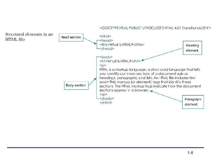
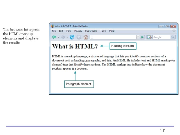
Using HTML for Structure • HTML is a structured markup language that lets you identify common sections of a document • The HTML markup tags indicate how the document sections appear in a browser • The browser interprets the HTML markup elements and displays the results, hiding the actual markup tags from the user 1 -4
Using HTML for Structure (continued) • HTML is an open, nonproprietary, crossplatform compatible language • HTML is not a What You See Is What You Get (WYSIWYG) layout tool • HTML was intended only to express logical document structure, not display characteristics 1 -5
1 -6
1 -7
Using Style Sheets for Presentation • Style sheets let you separate display information from content • Separating display information lets you repurpose your content for multiple destinations 1 -8
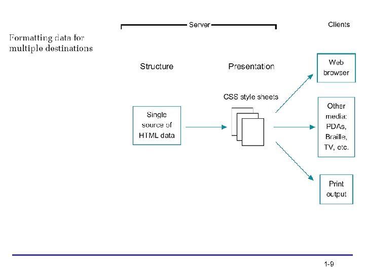
1 -9
Using Style Sheets for Presentation (continued) • Cascading Style Sheets (CSS) is a powerful display language for HTML • CSS lets you state style rules in an external style sheet that is linked to every page on a Web site • CSS lets you easily control the display characteristics of your Web site • Newer browsers offer more complete CSS support 1 -10
Organizing Information with Hypertext • Information is linked on the Web using hypertext, a nonlinear way of organizing information • Web users can quickly jump from one related topic to another • As a hypertext author, you determine which terms to create as hypertext links 1 -11
Moving from HTML to XHTML 1 -12
A Brief Introduction to XML • XML has no predefined elements such as <h 1> or <p> • XML is a metalanguage – a language that lets you create your own markup elements to meet your information needs • XML code looks very similar to HTML code 1 -13
Benefits of Moving to XHTML • XHTML is a reformulation of HTML 4. 01 in XML • Brings data-handling benefits of XML to HTML • Style sheets are required • Stricter syntax rules • 3 “flavors”: Strict, Transitional, Frameset 1 -14
XHTML Syntax Rules • • • Documents must be well-formed Elements must nest correctly XHTML is case sensitive End tags are required Empty elements are signified by a closing slash • Attribute values must be quoted 1 -15
Style Sheets are Required • Because XHTML is an application of XML, you must use style sheets to render presentation information in XHTML • The following two style sheet languages are currently available for use with XML or XHTML: – Cascading Style Sheets (CSS) – Extensible Style Language (XSL) 1 -16
Migrating from HTML to XHTML • • • Evaluate existing code Evaluate existing display information Create coding conventions Start using CSS Test for backward compatibility 1 -17
Choosing an HTML Editor (continued) • You can create or generate HTML code to build Web pages in many ways • Many sites on the Web are coded using simple text editing tools such as Notepad • Many different HTML editing programs are available 1 -18

Using Good Coding Practices 1 -19
Stick to the Standards • Follow the standards set by the World Wide Web Consortium • Separate content structure from presentation information • Content that is designed to standards displays more consistently in multiple browsers 1 -20
Use Semantic Markup • Semantic markup is descriptive markup that identifies the intended use of different document sections • Semantic markup accurately describes each piece of content – a <p> signifies a paragraph, a <blockquote> is for a lengthy quotation, and so on 1 -21

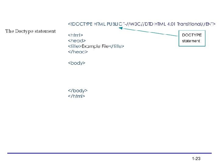
Choose the Correct Document Type • When you choose a document type, you are pointing to a set of rules called Document Type Definition (DTD) • DTDs contain all the elements, attributes, and usage rules for the markup language you are using • Three document types, or “flavors, ” of both HTML and XHTML are available: – Strict – Transitional – Frameset 1 -22
1 -23
Validate Your Code • Valid code conforms to the rules of the W 3 C • Valid code enhances browser compatibility, accessibility, and exchange of data • Use a software program called a validator to read your code and compare it to the rules in the DTD 1 -24
Validate Your Code (continued) • The most common mistakes that make your code invalid include: – No doctype declaration – Missing closing tags, most commonly on paragraphs – Missing alt attributes in <img> elements – Incorrect tag nesting – Unquoted attributes 1 -25
Browser Compatibility Guidelines • • Follow W 3 C standards Validate your code Know your audience Test your work in multiple browsers 1 -26
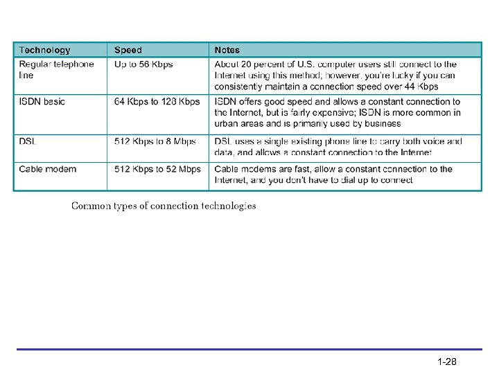
Considering Connection Speed Differences • A majority of U. S. computer users now have high-speed access to the Web • Approximately one-quarter still access the Web with a dial-up modem • Strive to keep page designs simple enough for the pages to load quickly • The number of graphics on your Web pages is the single biggest factor influencing the speed at which pages are rendered 1 -27
1 -28
Working with the Cache to Improve Download Time • The cache is the temporary storage area for Web pages and images • The browser always tries to load images and files from the cache • Make use of the cache by reusing images as much as possible 1 -29
Coding for Multiple Screen Resolutions • A computer monitor’s screen resolution is the horizontal and vertical width and height of the computer screen in pixels • The most common screen resolution (traditionally expressed as width x height) is 1024 x 768 • User screen resolution is a factor over which you have no control 1 -30
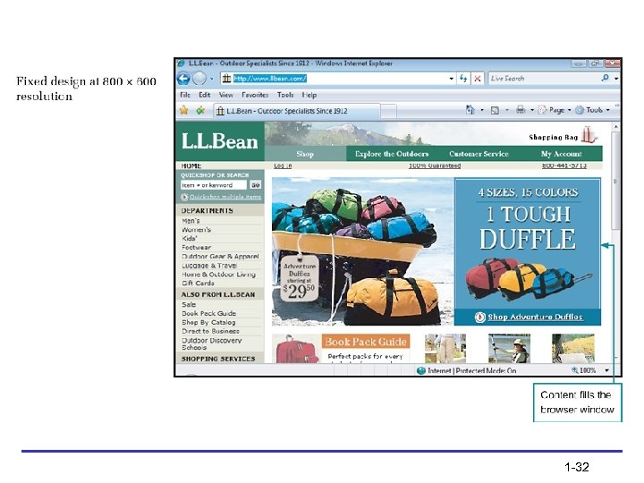
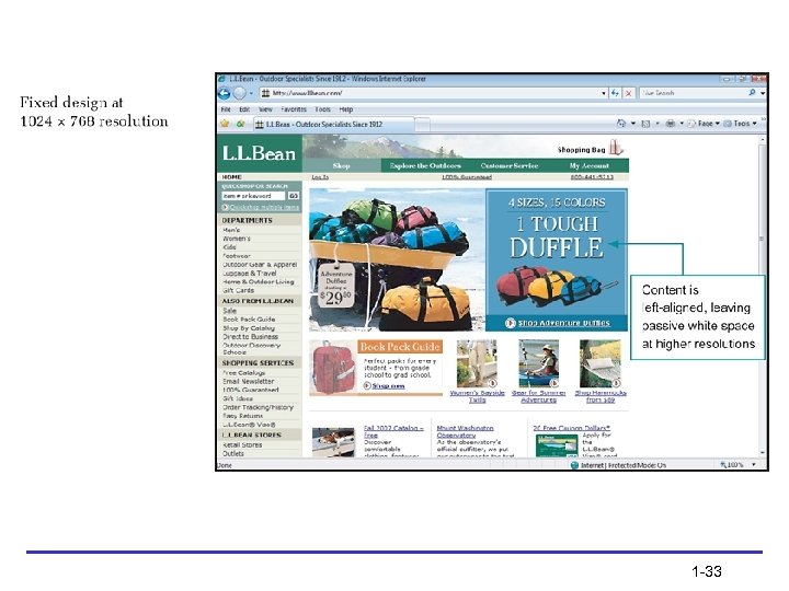
Fixed Design • As the screen resolution changes, the content remains aligned to the left side of the page 1 -31
1 -32
1 -33
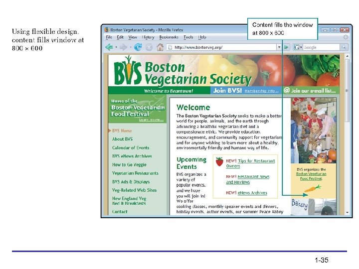
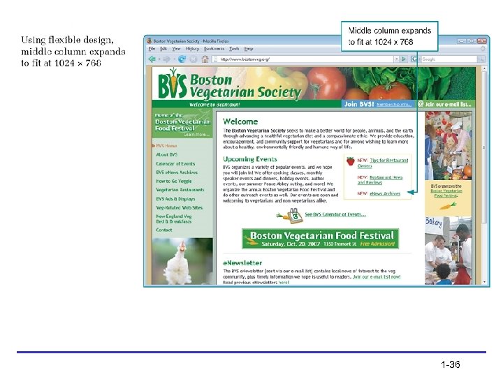
Flexible Design • As the screen resolution changes, the content expands to accommodate the varying screen width 1 -34
1 -35
1 -36
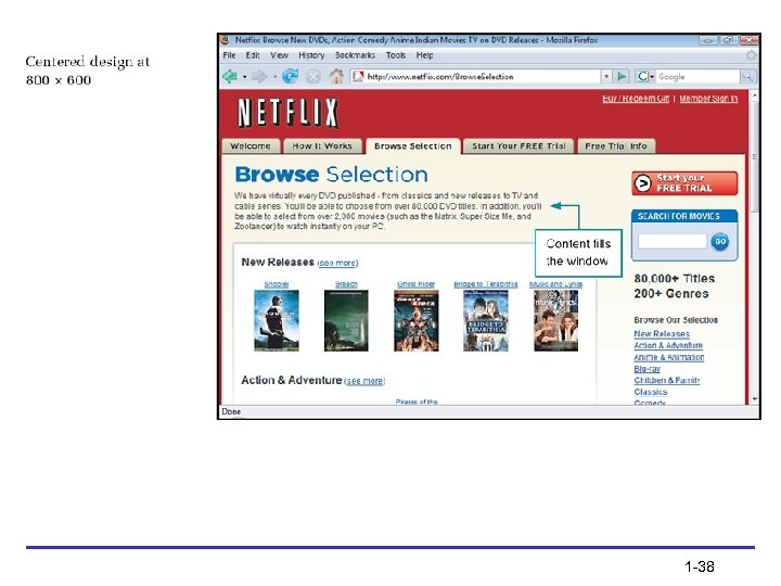
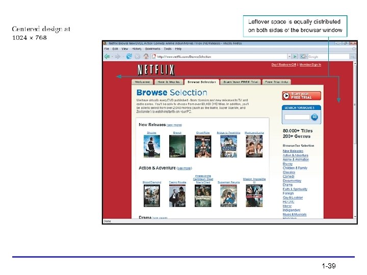
Centered Design • As the screen resolution changes, the Web page stays centered in the browser window, splitting the remaining space into equal amounts on the left and right side of the browser window 1 -37
1 -38
1 -39
Operating System Issues • Monitors and displays software • Browser versions • Font choices 1 -40
Summary • Use Cascading Style Sheets • Decide whether to code to the XHTML standard • Use good coding practices • Choose the type of editing tool you will use to create your code • Choose the suite of browsers you will use to test your site 1 -41
Summary (continued) • Decide how browser-specific your site will be • Resolve to continually test your work as you build your site • Test with multiple browsers, at different screen resolutions, and at different connection speeds • If you can, try to view your site on multiple platforms such as PC and Macintosh as well 1 -42
ef694310d82e6a3d488348548ba6d578.ppt