b6eb1c7249308fa105446a1c900ce041.ppt
- Количество слайдов: 49
Web Standards XHTML and CSS
Today’s Show ► Discuss web standards ► XHTML ► Layout Without Tables ► CSS ► Why Web Standards?
Web Standards ► What are “web standards”? ► Web Standards consist of these W 3 C recommendations § XHTML 1. 0 or Higher § CSS Level 1 and CSS Level 2 § DOM Level 1 and DOM Level 2 § ECMAScript 262 (The Language formerly known as Java. Script
XHTML? ► XHTML is the “new” version of HTML. § It’s more strict and is an extension of XML § It has its own specifications just like HTML ►XHTML Strict ►XHTML Transitional ►XHTML Frameset
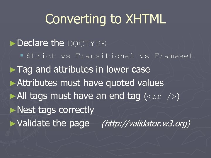
Converting to XHTML ► Declare the DOCTYPE § Strict vs Transitional vs Frameset ► Tag and attributes in lower case ► Attributes must have quoted values ► All tags must have an end tag ( ) ► Nest tags correctly ► Validate the page (http: //validator. w 3. org)
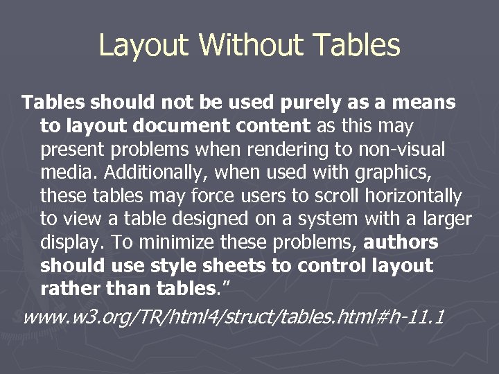
Layout Without Tables should not be used purely as a means to layout document content as this may present problems when rendering to non-visual media. Additionally, when used with graphics, these tables may force users to scroll horizontally to view a table designed on a system with a larger display. To minimize these problems, authors should use style sheets to control layout rather than tables. ” www. w 3. org/TR/html 4/struct/tables. html#h-11. 1
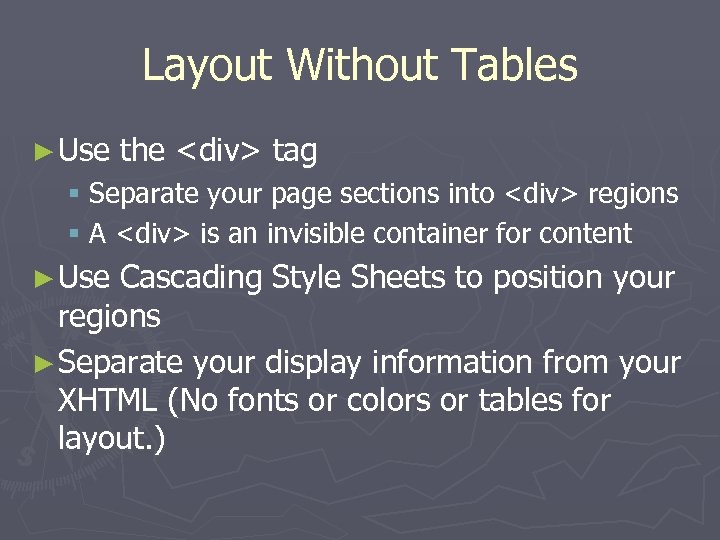
Layout Without Tables ► Use the <div> tag § Separate your page sections into <div> regions § A <div> is an invisible container for content ► Use Cascading Style Sheets to position your regions ► Separate your display information from your XHTML (No fonts or colors or tables for layout. )
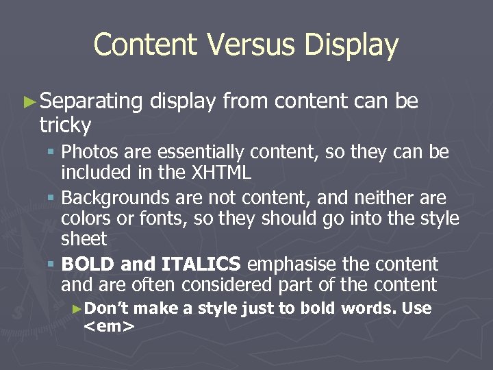
Content Versus Display ► Separating tricky display from content can be § Photos are essentially content, so they can be included in the XHTML § Backgrounds are not content, and neither are colors or fonts, so they should go into the style sheet § BOLD and ITALICS emphasise the content and are often considered part of the content ►Don’t make a style just to bold words. Use <em>
Layout Without Tables (Continued) ► Separate your page into important regions § Banner area (Title, banner graphic) § Menu or navigation § Content ►Columns? Sidebar? § Footer ► DO NOT WORRY ABOUT POSITIONING YET! § You’re not doing layout in XHTML!!!
Layout Without Tables (Continued) ► Once your structure is defined, start thinking about the “skins” of the page ► The style sheet is your skin § You can use more than one “skin” for your page. § Because your “look and feel” is separated from your content, changing your design is easy § PDAs, phones, and even printers can have their own style sheets.
IDs and Classes ► Placing IDs as attributes of your elements identifies them as unique. You can use the IDs in your ECMAScript or your style sheet to manipulate the element. ► Classes are applied to elements in order to group the elements § Not unique, but similar ► Assign IDs to the “regions” of your page (layout) ► Assign CLASSES to sub-regions of your page (look and feel)
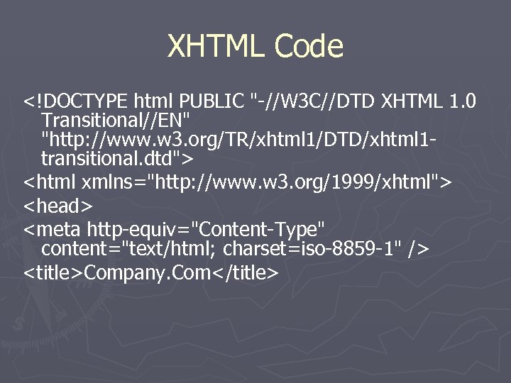
XHTML Code <!DOCTYPE html PUBLIC "-//W 3 C//DTD XHTML 1. 0 Transitional//EN" "http: //www. w 3. org/TR/xhtml 1/DTD/xhtml 1 transitional. dtd"> <html xmlns="http: //www. w 3. org/1999/xhtml"> <head> <meta http-equiv="Content-Type" content="text/html; charset=iso-8859 -1" /> <title>Company. Com</title>
XHTML Code <link rel="stylesheet" type="text/css" href="layout. css" title="default" media="screen" /> <link rel="stylesheet" type="text/css" href="style. css" title="default" media="screen" /> <link rel="stylesheet" type="text/css" href="pda. css" title="pda" media="handheld" /> <link rel="stylesheet" type="text/css" href="print. css" title="print" media="print" /></head> <body>
XHTML – IMPORTANT STEP <div id="web. Standards. Alert"> <p>This browser does not support basic Web standards, preventing the display of our site's intended design. May we suggest that you <a href="http: //webstandards. org/upgrade/">upgrad e your browser</a>? </p> </div> ► We’ll hide this from the newer browsers later!
XHTML Code <div id="page"> <div id="banner"> <div id="textbanner">Company. Com</div> <div id="graphicbanner"”></div> <div id="navigation"> <ul> <li><a href="#">News</a></li> <li><a href="#">Products</a></li> <li><a href="#">Support</a></li> <li><a href="#">Contact Us</a></li> </ul> </div>
XHTML Code <div id="sidebar"> <div id="announcements" class="box"> <div class="title">Announcements</div> <div class="content"> This is where my announcements are going </div> <div id="main"> <div class="box"> <div class="title">News</div> <div class="content"> Main content will go here </div>
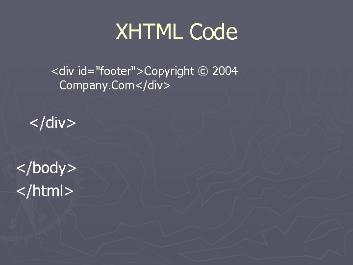
XHTML Code <div id="footer">Copyright © 2004 Company. Com</div> </body> </html>
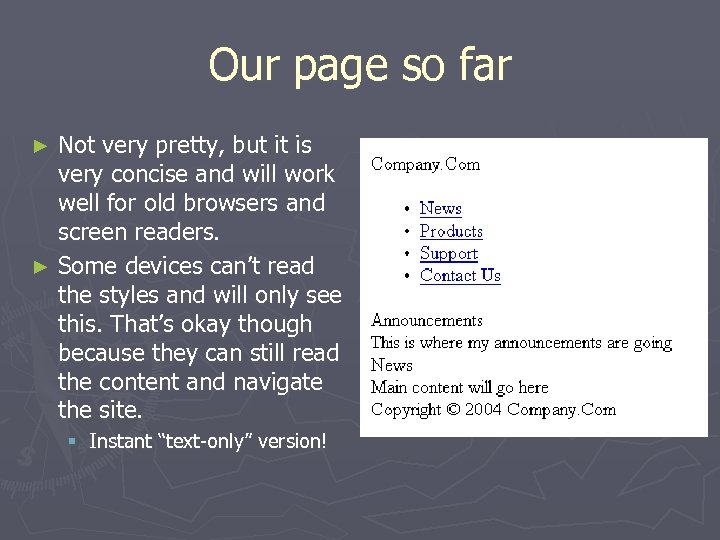
Our page so far Not very pretty, but it is very concise and will work well for old browsers and screen readers. ► Some devices can’t read the styles and will only see this. That’s okay though because they can still read the content and navigate the site. ► § Instant “text-only” version!
Round 2: CSS Style sheets for a skinnable website: 1. Layout. CSS – simple structure 2. Style. css – colors and fonts (optional) 3. Printer Friendly CSS
That’s A Lot of CSS! ► This structure will § Make old browsers play along § Keeps the layout separate from the colors § Makes it easy to adjust fonts § Makes it really easy to have a “printer friendly version” without doing a lot of additional work.
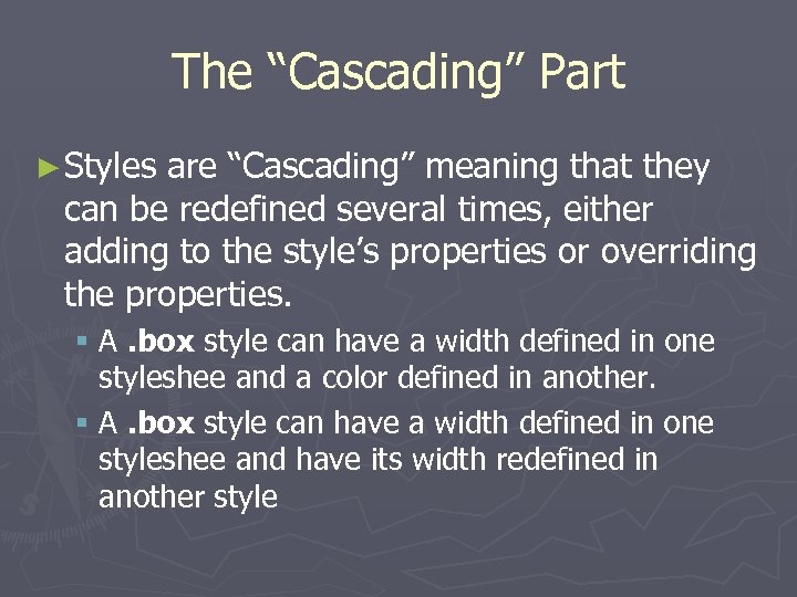
The “Cascading” Part ► Styles are “Cascading” meaning that they can be redefined several times, either adding to the style’s properties or overriding the properties. § A. box style can have a width defined in one styleshee and a color defined in another. § A. box style can have a width defined in one styleshee and have its width redefined in another style
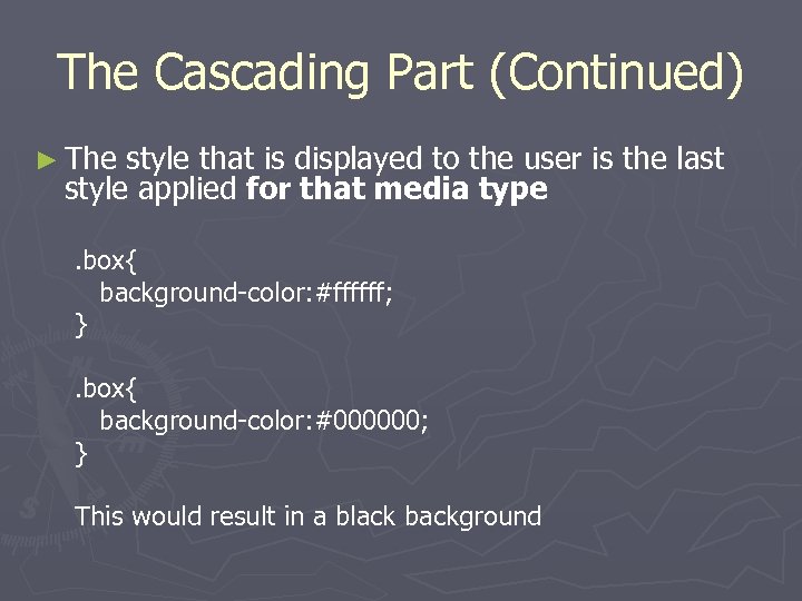
The Cascading Part (Continued) ► The style that is displayed to the user is the last style applied for that media type. box{ background-color: #ffffff; }. box{ background-color: #000000; } This would result in a black background
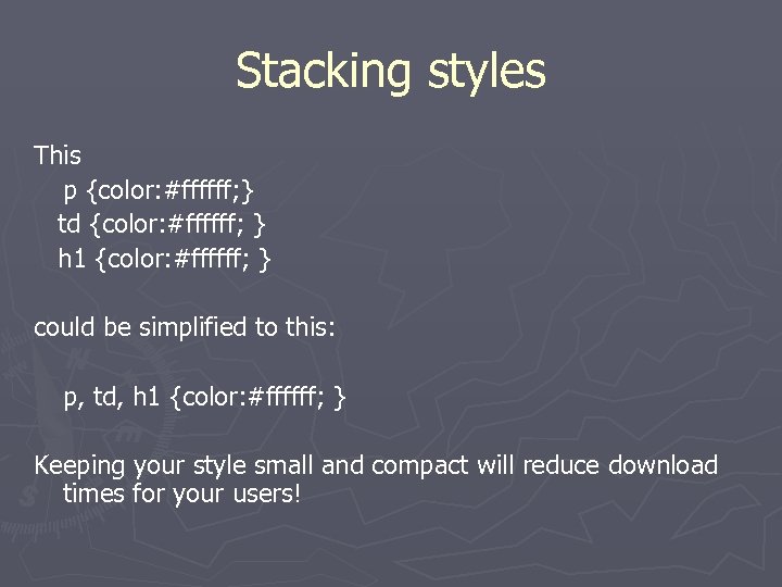
Stacking styles This p {color: #ffffff; } td {color: #ffffff; } h 1 {color: #ffffff; } could be simplified to this: p, td, h 1 {color: #ffffff; } Keeping your style small and compact will reduce download times for your users!
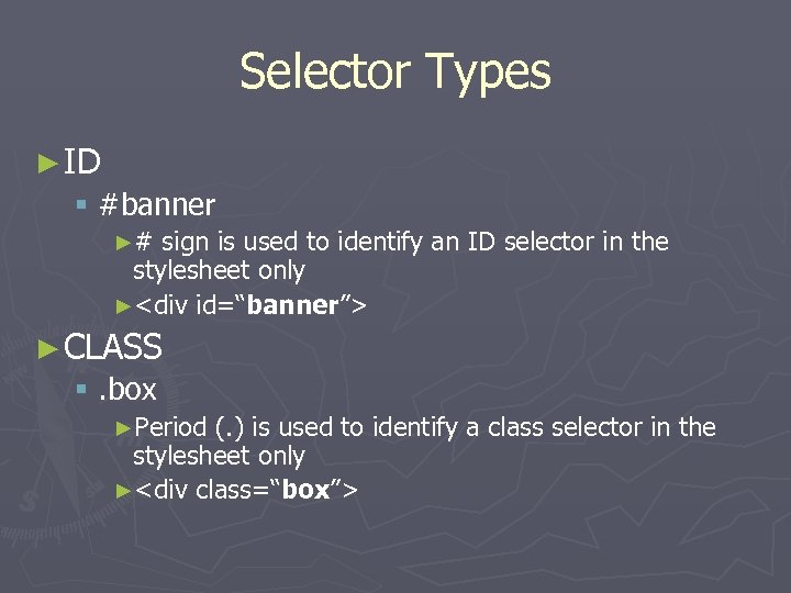
Selector Types ► ID § #banner ►# sign is used to identify an ID selector in the stylesheet only ►<div id=“banner”> ► CLASS §. box ►Period (. ) is used to identify a class selector in the stylesheet only ►<div class=“box”>
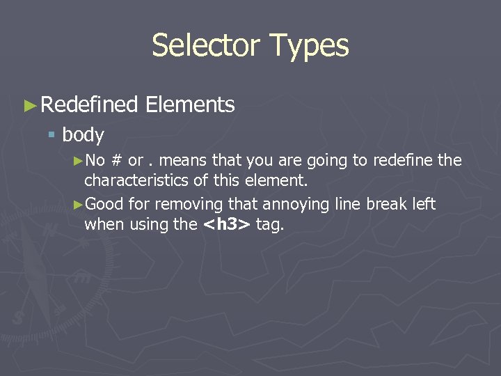
Selector Types ► Redefined Elements § body ►No # or. means that you are going to redefine the characteristics of this element. ►Good for removing that annoying line break left when using the <h 3> tag.
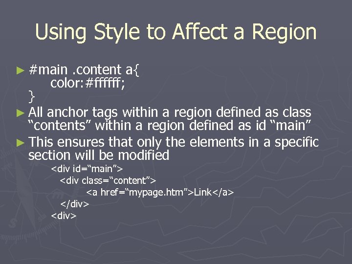
Using Style to Affect a Region ► #main . content a{ color: #ffffff; } ► All anchor tags within a region defined as class “contents” within a region defined as id “main” ► This ensures that only the elements in a specific section will be modified <div id=“main”> <div class=“content”> <a href=“mypage. htm”>Link</a> </div> <div>
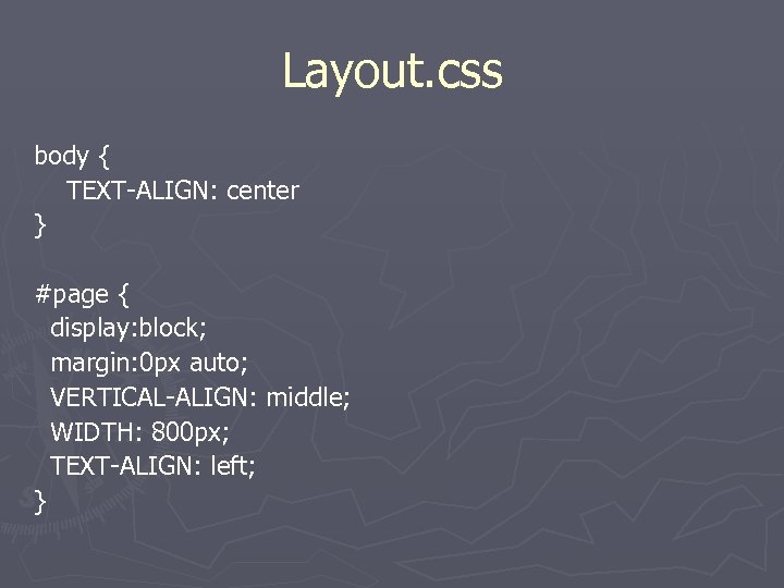
Layout. css body { TEXT-ALIGN: center } #page { display: block; margin: 0 px auto; VERTICAL-ALIGN: middle; WIDTH: 800 px; TEXT-ALIGN: left; }
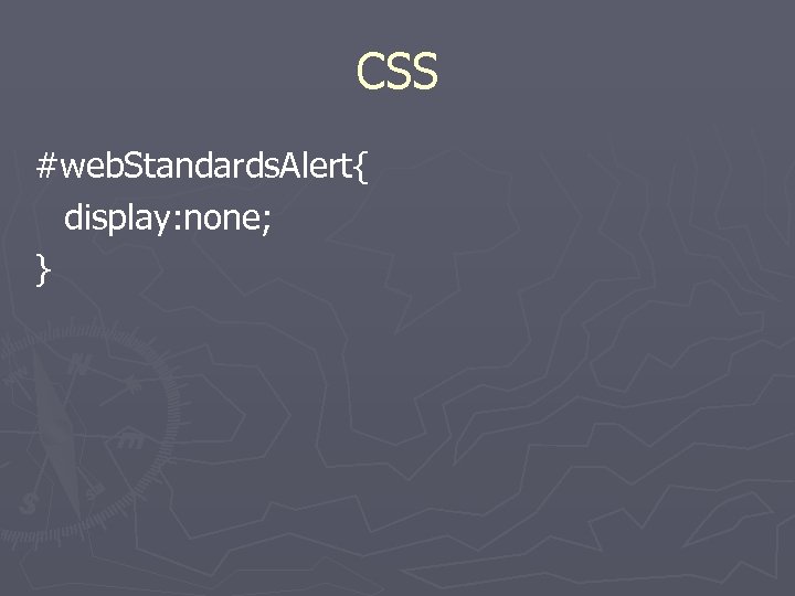
CSS #web. Standards. Alert{ display: none; }
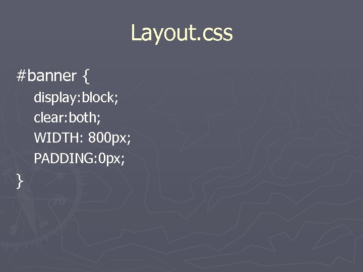
Layout. css #banner { display: block; clear: both; WIDTH: 800 px; PADDING: 0 px; }
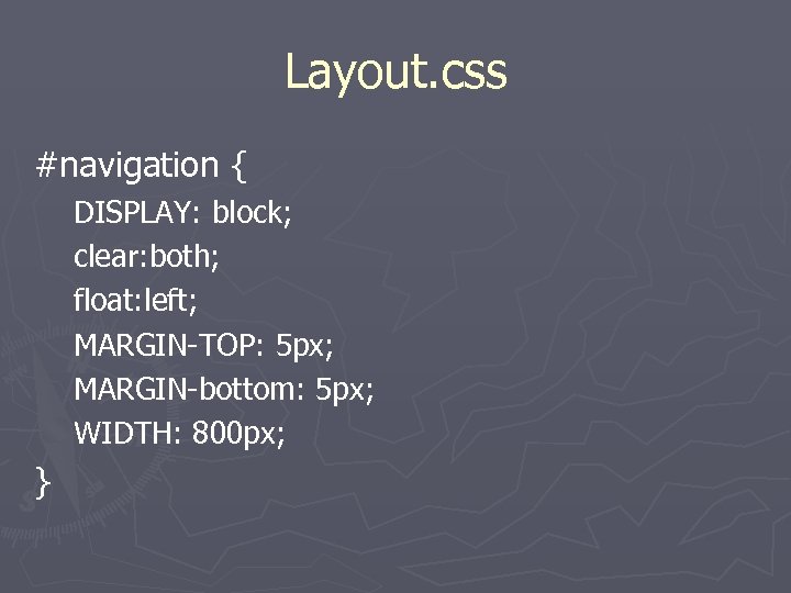
Layout. css #navigation { DISPLAY: block; clear: both; float: left; MARGIN-TOP: 5 px; MARGIN-bottom: 5 px; WIDTH: 800 px; }
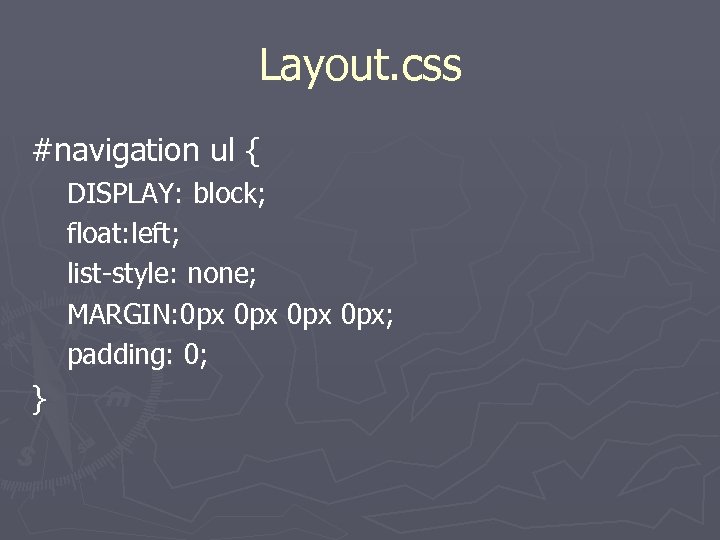
Layout. css #navigation ul { DISPLAY: block; float: left; list-style: none; MARGIN: 0 px 0 px; padding: 0; }
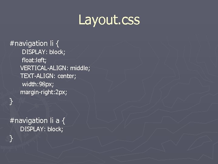
Layout. css #navigation li { DISPLAY: block; float: left; VERTICAL-ALIGN: middle; TEXT-ALIGN: center; width: 98 px; margin-right: 2 px; } #navigation li a { DISPLAY: block; }
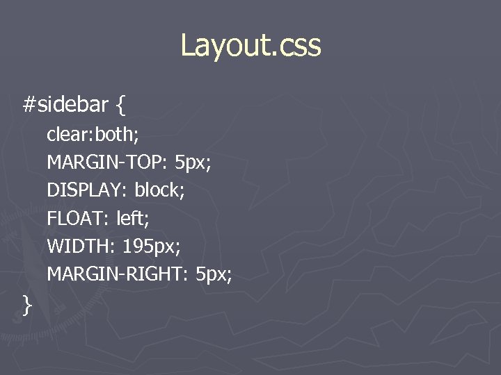
Layout. css #sidebar { clear: both; MARGIN-TOP: 5 px; DISPLAY: block; FLOAT: left; WIDTH: 195 px; MARGIN-RIGHT: 5 px; }
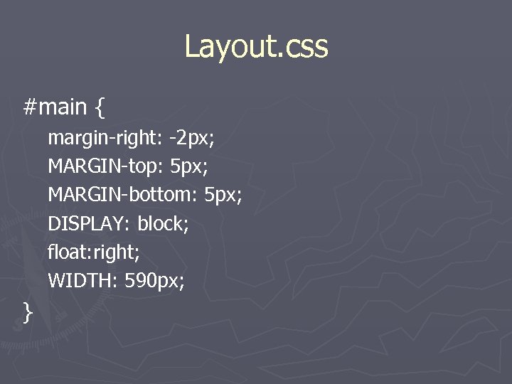
Layout. css #main { margin-right: -2 px; MARGIN-top: 5 px; MARGIN-bottom: 5 px; DISPLAY: block; float: right; WIDTH: 590 px; }
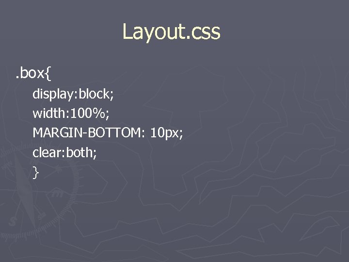
Layout. css. box{ display: block; width: 100%; MARGIN-BOTTOM: 10 px; clear: both; }
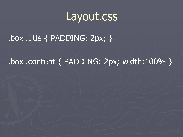
Layout. css. box. title { PADDING: 2 px; }. box. content { PADDING: 2 px; width: 100% }
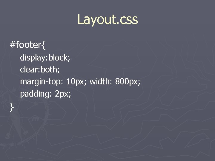
Layout. css #footer{ display: block; clear: both; margin-top: 10 px; width: 800 px; padding: 2 px; }
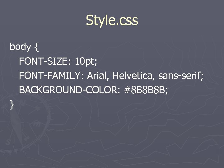
Style. css body { FONT-SIZE: 10 pt; FONT-FAMILY: Arial, Helvetica, sans-serif; BACKGROUND-COLOR: #8 B 8 B 8 B; }
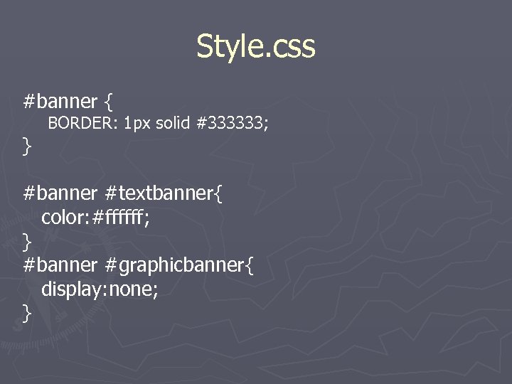
Style. css #banner { } BORDER: 1 px solid #333333; #banner #textbanner{ color: #ffffff; } #banner #graphicbanner{ display: none; }
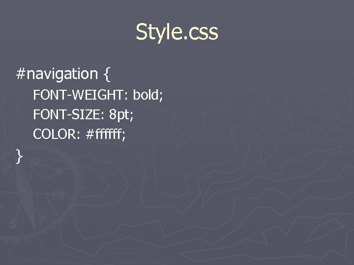
Style. css #navigation { FONT-WEIGHT: bold; FONT-SIZE: 8 pt; COLOR: #ffffff; }
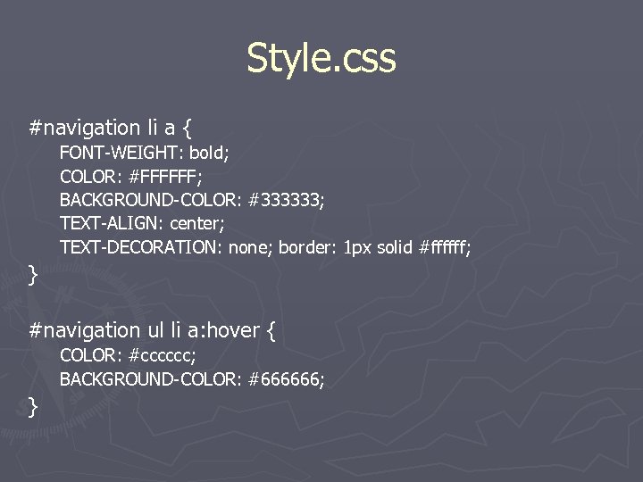
Style. css #navigation li a { FONT-WEIGHT: bold; COLOR: #FFFFFF; BACKGROUND-COLOR: #333333; TEXT-ALIGN: center; TEXT-DECORATION: none; border: 1 px solid #ffffff; } #navigation ul li a: hover { COLOR: #cccccc; BACKGROUND-COLOR: #666666; }
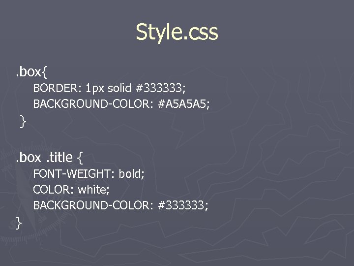
Style. css. box{ BORDER: 1 px solid #333333; BACKGROUND-COLOR: #A 5 A 5 A 5; }. box. title { FONT-WEIGHT: bold; COLOR: white; BACKGROUND-COLOR: #333333; }
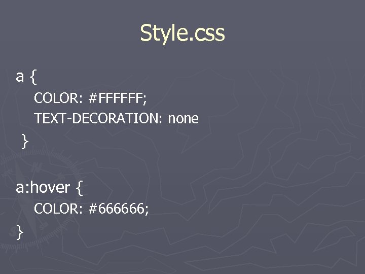
Style. css a{ COLOR: #FFFFFF; TEXT-DECORATION: none } a: hover { COLOR: #666666; }
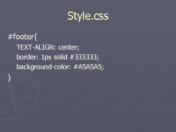
Style. css #footer{ TEXT-ALIGN: center; border: 1 px solid #333333; background-color: #A 5 A 5 A 5; }
Why Are We Doing This? ► Separating layout from content § Makes pages more accessible ►Text-only ►PDA ►Printer-friendly § Makes download times smaller ►Large bandwidth reduction because CSS is cached ►We can now use more graphics
Print. css ► Coming in a later version of this presentation. Please keep checking back.
Why? ► Interoperability § Standards-based browsers show the same thing on all platforms ► Easy design changes § We can make design changes much faster! ►http: //www. csszengarden. com/
Resources http: //glish. com/css/ ► http: //www. mezzoblue. com/zengarden/resources/ ► http: //www. meyerweb. com/ ► http: //www. alistapart. com/ ► http: //www. zeldman. com/dwws/ ► http: //www. w 3. org/TR/xhtml 1/ ► http: //www. w 3. org/Style/CSS/ ► http: //www. mozilla. org/products/firefox/ ► http: //www. westciv. com/style_master/house/inde x. html ►

Questions? ► Email at hoganbp@uwec. edu ► Visit web at http: //www. bphogan. com/ § Slides will be posted.
b6eb1c7249308fa105446a1c900ce041.ppt