539f24fb359c6fbbf4cb4c8d593ade8b.ppt
- Количество слайдов: 86
 Unit Two: Population & Migration © 2014 Pearson Education, Inc.
 © 2014 Pearson Education, Inc.
 © 2014 Pearson Education, Inc.
 © 2014 Pearson Education, Inc.
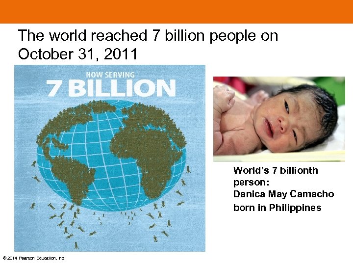 The world reached 7 billion people on October 31, 2011 World’s 7 billionth person: Danica May Camacho born in Philippines © 2014 Pearson Education, Inc.
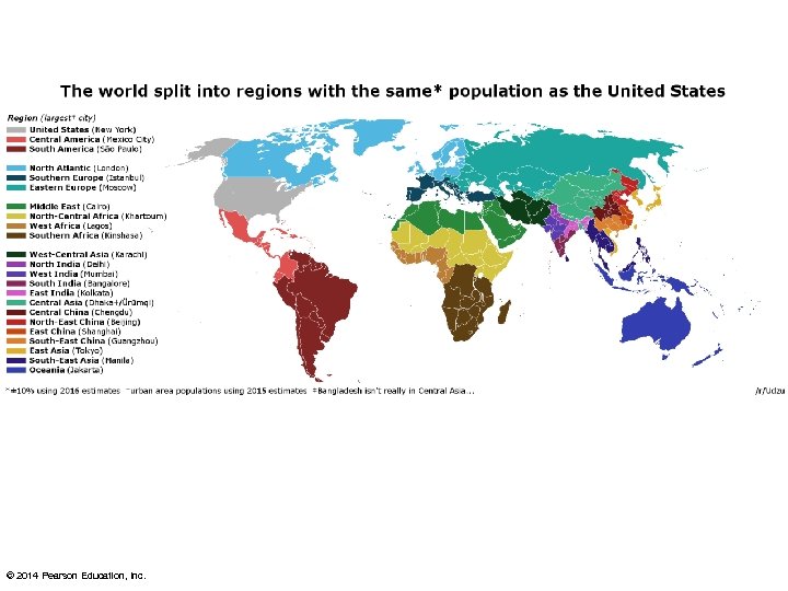
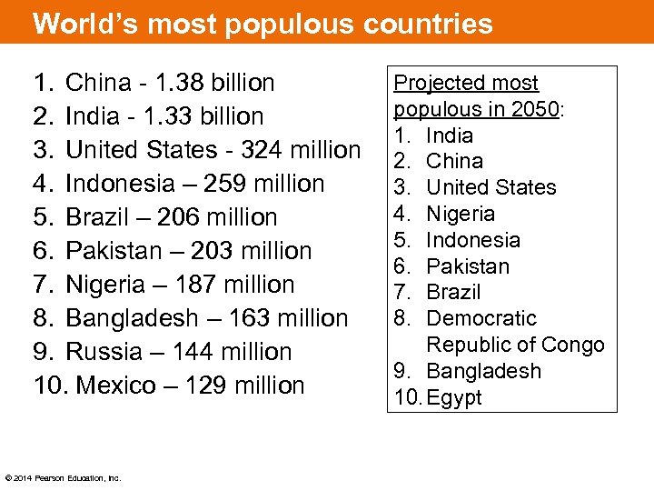 World’s most populous countries 1. China - 1. 38 billion 2. India - 1. 33 billion 3. United States - 324 million 4. Indonesia – 259 million 5. Brazil – 206 million 6. Pakistan – 203 million 7. Nigeria – 187 million 8. Bangladesh – 163 million 9. Russia – 144 million 10. Mexico – 129 million © 2014 Pearson Education, Inc. Projected most populous in 2050: 1. India 2. China 3. United States 4. Nigeria 5. Indonesia 6. Pakistan 7. Brazil 8. Democratic Republic of Congo 9. Bangladesh 10. Egypt
 Key Issues 1. Where is the world’s population distributed? 2. Why is global population increasing? 3. Why does population growth vary among regions? 4. Why do some regions face health threats? © 2014 Pearson Education, Inc.
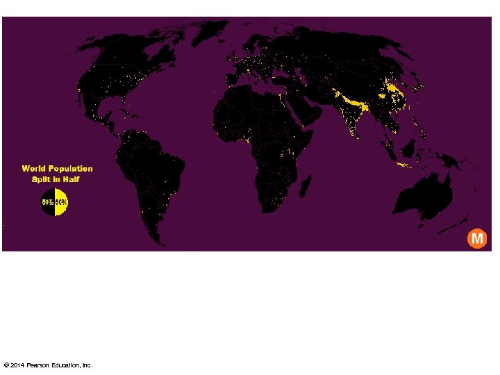
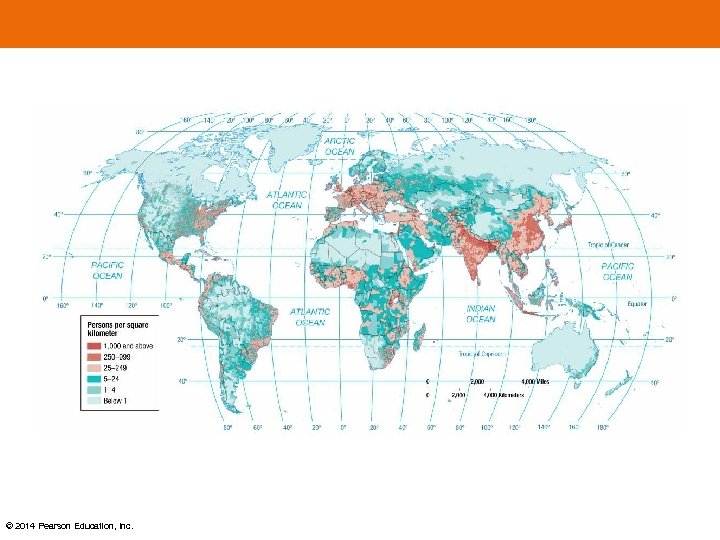
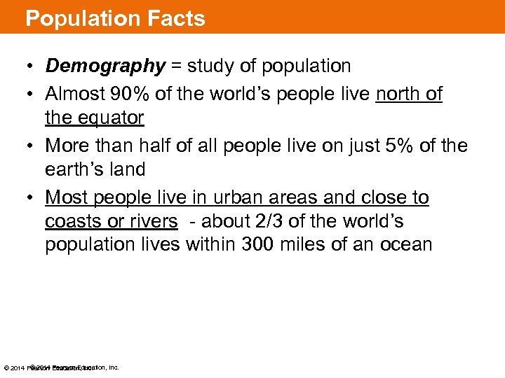 Population Facts • Demography = study of population • Almost 90% of the world’s people live north of the equator • More than half of all people live on just 5% of the earth’s land • Most people live in urban areas and close to coasts or rivers - about 2/3 of the world’s population lives within 300 miles of an ocean © 2014 Pearson Education, Inc.
 KEY ISSUE 1: WHERE IS THE WORLD’S POPULATION DISTRIBUTED? © 2014 Pearson Education, Inc.
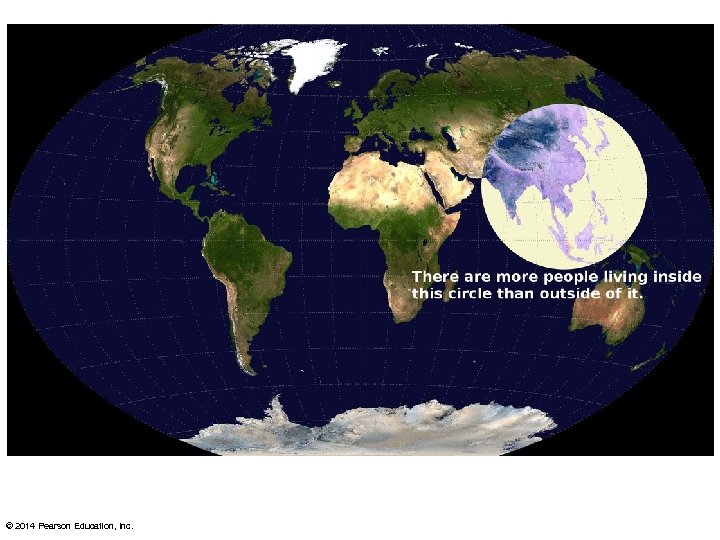
 Where Is the World’s Population Distributed? Population Concentrations 2/3 of the world’s people are clustered in four regions: 1. East Asia – mostly rural 2. South Asia – mostly rural 3. Southeast Asia – mostly rural 4. Europe – mostly urban The other two most populous regions are: 1. Western Africa (rural) 2. Northeastern United States (urban) © 2014 Pearson Education, Inc.
 Site and Situation of Population Clusters: Site: Low-lying areas with fertile soil and temperate climate Situation: Near an ocean or near a river with easy access to an ocean. © 2014 Pearson Education, Inc.
 © 2014 Pearson Education, Inc.
 Where Is the World’s Population Distributed? • Places of permanent human settlement are called the ecumene. • Humans avoid living in regions that are the nonecumene: 1. Too dry 2. Too wet 3. Too cold 4. Too high of elevation Places considered too harsh to live in have diminished over time due to technology. © 2014 Pearson Education, Inc.
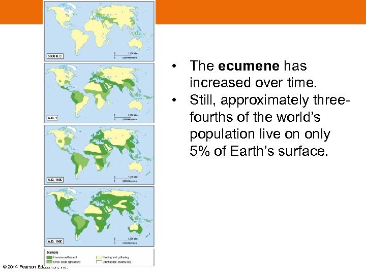 • The ecumene has increased over time. • Still, approximately threefourths of the world’s population live on only 5% of Earth’s surface. © 2014 Pearson Education, Inc.
 Where Is the World’s Population Distributed? • Population Density can be computed in three ways for a place: 1. Arithmetic Density – Total number of people per unit of land – Computation: Divide the population by the land area © 2014 Pearson Education, Inc.
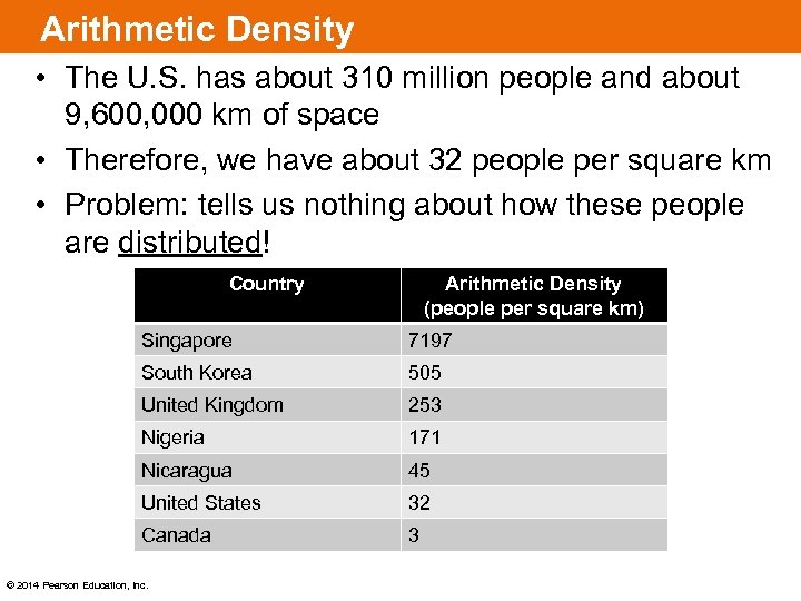 Arithmetic Density • The U. S. has about 310 million people and about 9, 600, 000 km of space • Therefore, we have about 32 people per square km • Problem: tells us nothing about how these people are distributed! Country Arithmetic Density (people per square km) Singapore 7197 South Korea 505 United Kingdom 253 Nigeria 171 Nicaragua 45 United States 32 Canada 3 © 2014 Pearson Education, Inc.
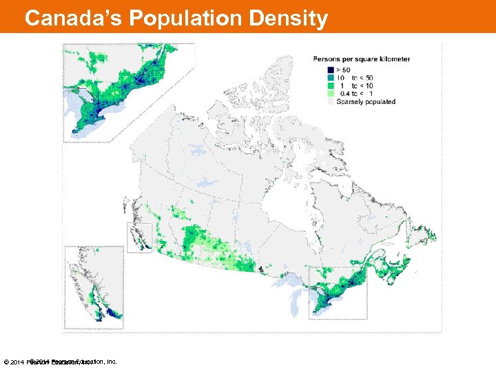 Canada’s Population Density © 2014 Pearson Education, Inc.
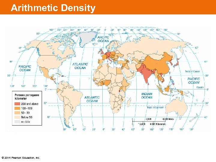 Arithmetic Density © 2014 Pearson Education, Inc.
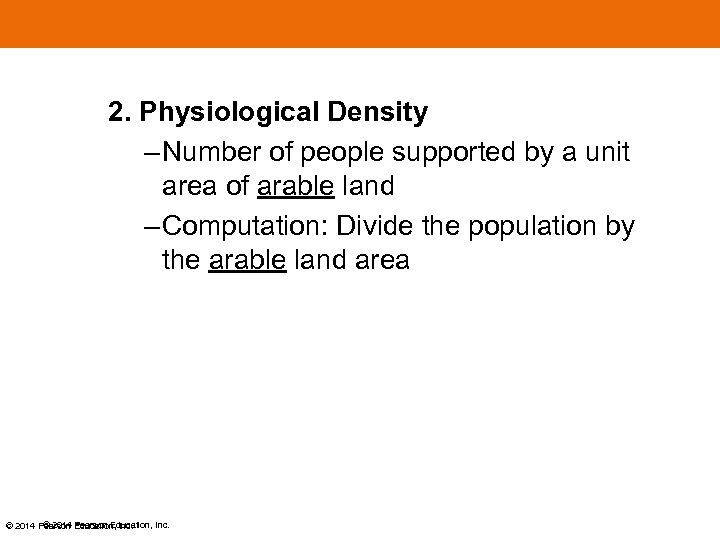 2. Physiological Density – Number of people supported by a unit area of arable land – Computation: Divide the population by the arable land area © 2014 Pearson Education, Inc.
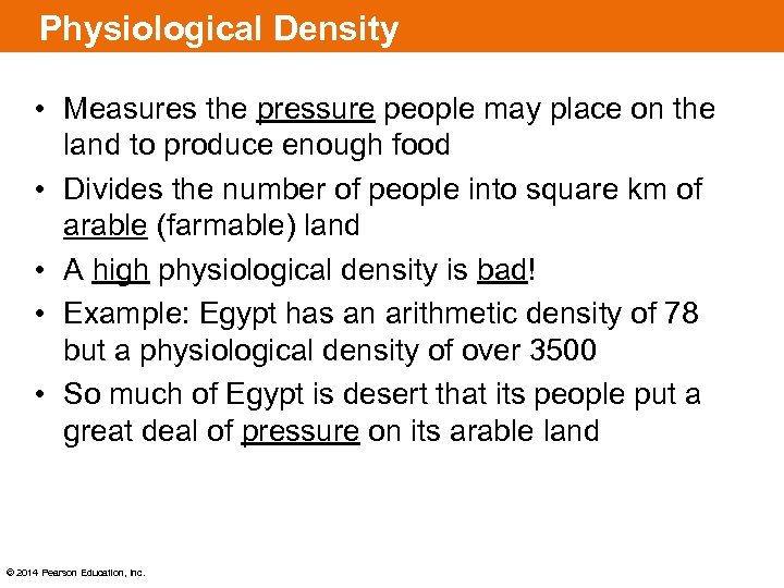 Physiological Density • Measures the pressure people may place on the land to produce enough food • Divides the number of people into square km of arable (farmable) land • A high physiological density is bad! • Example: Egypt has an arithmetic density of 78 but a physiological density of over 3500 • So much of Egypt is desert that its people put a great deal of pressure on its arable land © 2014 Pearson Education, Inc.
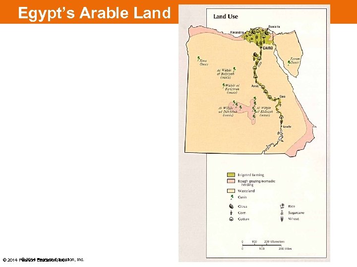 Egypt’s Arable Land © 2014 Pearson Education, Inc.
 Carrying Capacity • Overpopulation results in too many people for the land to support • Carrying capacity is the number of people an area can support for a long period of time • A region where farmers use irrigation and fertilizers can support more people and thus has a higher carrying capacity • Japan imports a lot of food and therefore is an example of a small country with a large carrying capacity © 2014 Pearson Education, Inc.
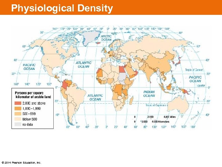 Physiological Density © 2014 Pearson Education, Inc.
 3. Agricultural Density – Ratio of the number of farmers to amount of arable land – Computation: Divide the population of farmers by the arable land area © 2014 Pearson Education, Inc.
 Agricultural Density • Number of farmers compared to arable land • Developed countries have lower agricultural densities, because technology allows a few people to farm extensive land areas and feed many people. • The highest agricultural densities are found in Asia and sub-Saharan Africa (many subsistence farmers per square km) © 2014 Pearson Education, Inc.
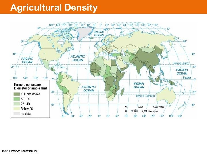 Agricultural Density © 2014 Pearson Education, Inc.
 KEY ISSUE 2: WHY IS GLOBAL POPULATION INCREASING? © 2014 Pearson Education, Inc.
 Why Is Global Population Increasing? Components of Population Growth: – Geographers measure population change in a country or the world as a whole by using three measures: 1. Crude Birth Rate (CBR) – total number of live births in a year for every 1, 000 people 2. Crude Death Rate (CDR) – total number of deaths in a year for every 1, 000 people 3. Natural Increase Rate (NIR) – percentage by which a population grows in a year. © 2014 Pearson Education, Inc.
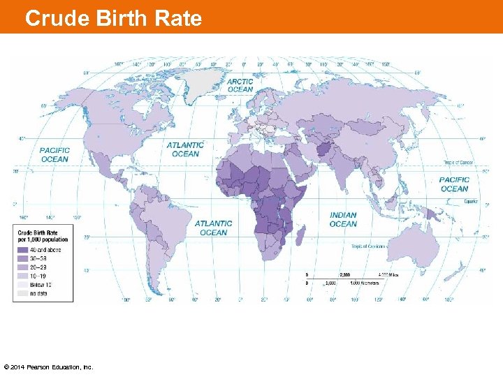 Crude Birth Rate © 2014 Pearson Education, Inc.
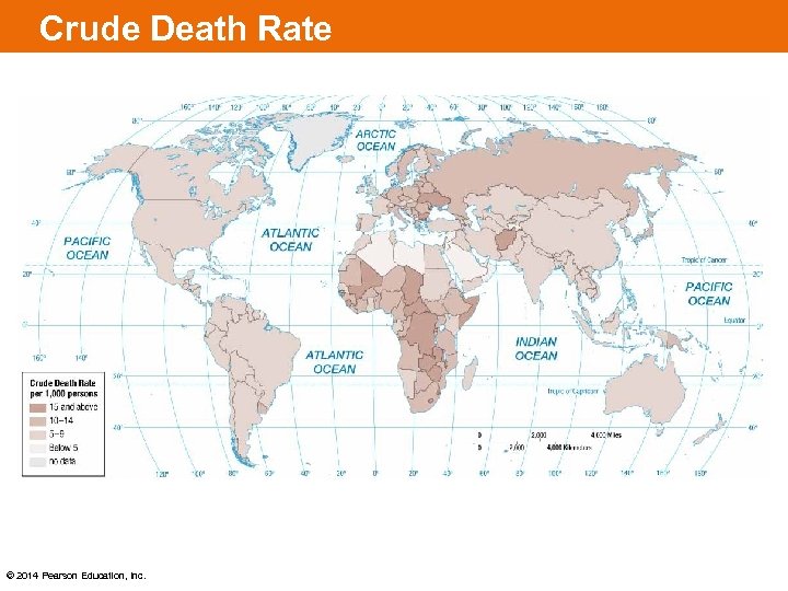 Crude Death Rate © 2014 Pearson Education, Inc.
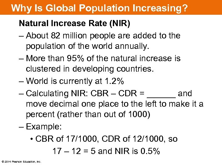 Why Is Global Population Increasing? Natural Increase Rate (NIR) – About 82 million people are added to the population of the world annually. – More than 95% of the natural increase is clustered in developing countries. – World is currently at 1. 2% – Calculating NIR: CBR – CDR = ______ and move decimal one place to the left to make it a percent (rather than out of 1000) – Example: • CBR of 17/1000, CDR of 12/1000, so 17 – 12 = 5 and NIR is 0. 5% © 2014 Pearson Education, Inc.
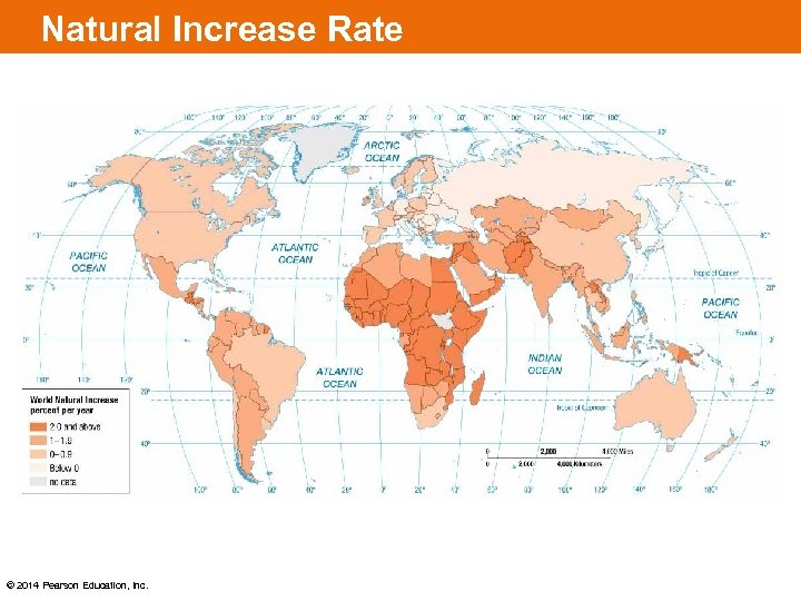 Natural Increase Rate © 2014 Pearson Education, Inc.
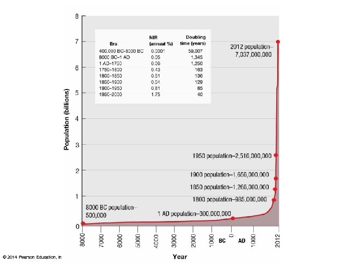
 Doubling Time 4. Doubling Time – Number of years needed to double the population, assuming a constant rate of natural increase. – Doubling time is calculated by dividing 70 by the natural increase rate – Example: • 70 divided by 0. 5 = 140 • This means a country with a NIR of 0. 5% would take 140 years to double its population, if all other things remain constant © 2014 Pearson Education, Inc.
 © 2014 Pearson Education, Inc.
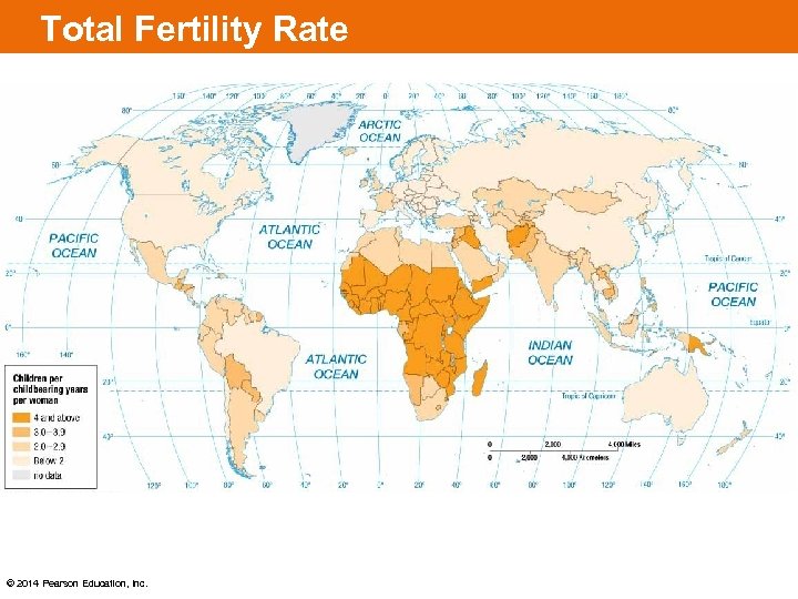
 Why Is Global Population Increasing? 5. Total Fertility Rate (TFR) • Defined as the average number of children a woman will have throughout her childbearing years (15 - 49) • TFR for world is 2. 42 • TFR exceeds 5 in sub-Saharan Africa • TFR is 2 or less in nearly all European countries. • TFR of 2. 1 is needed to keep a population stable • United States’ TFR is 1. 87 yet our population is growing due to 1 million immigrants per year © 2014 Pearson Education, Inc.
 Total Fertility Rate © 2014 Pearson Education, Inc.
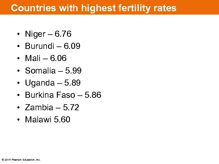 Countries with highest fertility rates • • Niger – 6. 76 Burundi – 6. 09 Mali – 6. 06 Somalia – 5. 99 Uganda – 5. 89 Burkina Faso – 5. 86 Zambia – 5. 72 Malawi 5. 60 © 2014 Pearson Education, Inc.
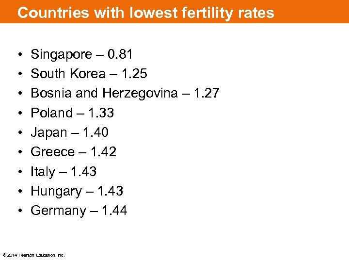 Countries with lowest fertility rates • • • Singapore – 0. 81 South Korea – 1. 25 Bosnia and Herzegovina – 1. 27 Poland – 1. 33 Japan – 1. 40 Greece – 1. 42 Italy – 1. 43 Hungary – 1. 43 Germany – 1. 44 © 2014 Pearson Education, Inc.
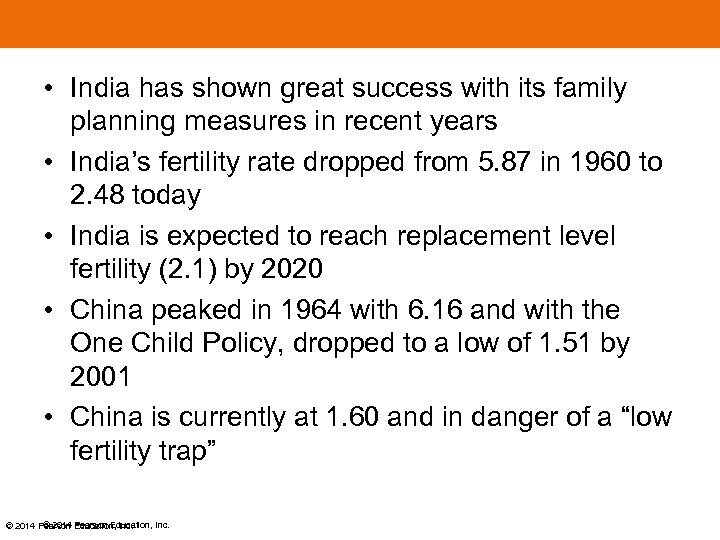 • India has shown great success with its family planning measures in recent years • India’s fertility rate dropped from 5. 87 in 1960 to 2. 48 today • India is expected to reach replacement level fertility (2. 1) by 2020 • China peaked in 1964 with 6. 16 and with the One Child Policy, dropped to a low of 1. 51 by 2001 • China is currently at 1. 60 and in danger of a “low fertility trap” © 2014 Pearson Education, Inc.
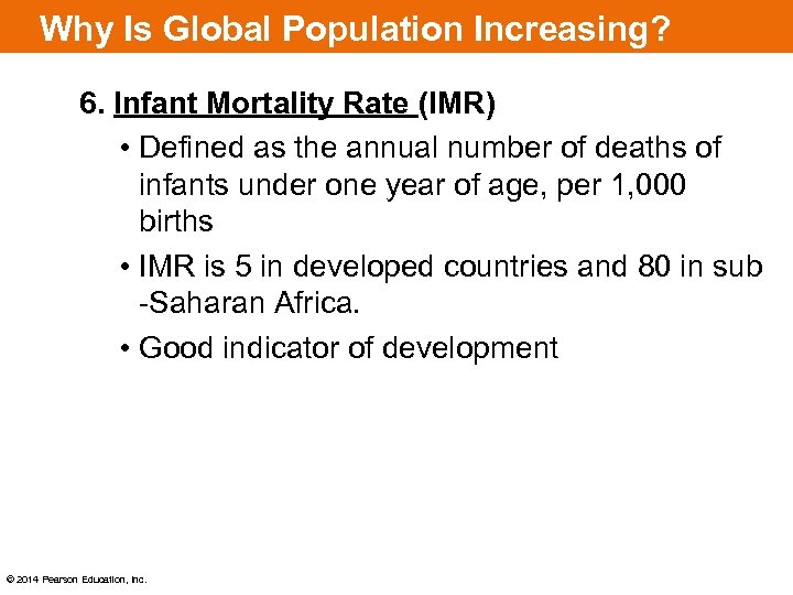 Why Is Global Population Increasing? 6. Infant Mortality Rate (IMR) • Defined as the annual number of deaths of infants under one year of age, per 1, 000 births • IMR is 5 in developed countries and 80 in sub -Saharan Africa. • Good indicator of development © 2014 Pearson Education, Inc.
 Why Is Global Population Increasing? Developed countries generally have lower – Natural increase rates – Crude birth rates – Total fertility rates – Infant mortality rates Developing countries generally have higher rates of these same measurements Why is Crude Death Rate NOT a good indicator of development? © 2014 Pearson Education, Inc.
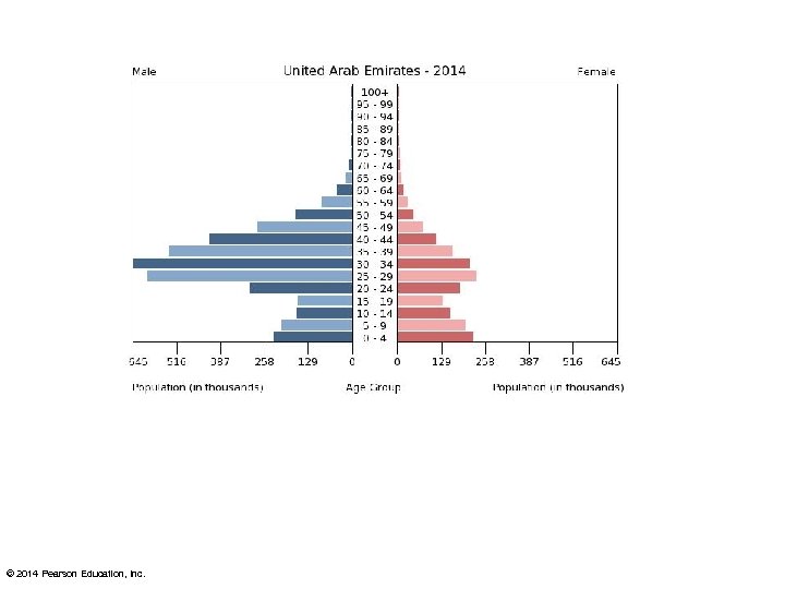
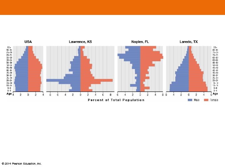
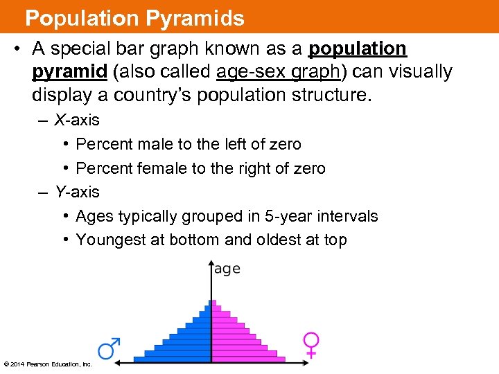 Population Pyramids • A special bar graph known as a population pyramid (also called age-sex graph) can visually display a country’s population structure. – X-axis • Percent male to the left of zero • Percent female to the right of zero – Y-axis • Ages typically grouped in 5 -year intervals • Youngest at bottom and oldest at top © 2014 Pearson Education, Inc.
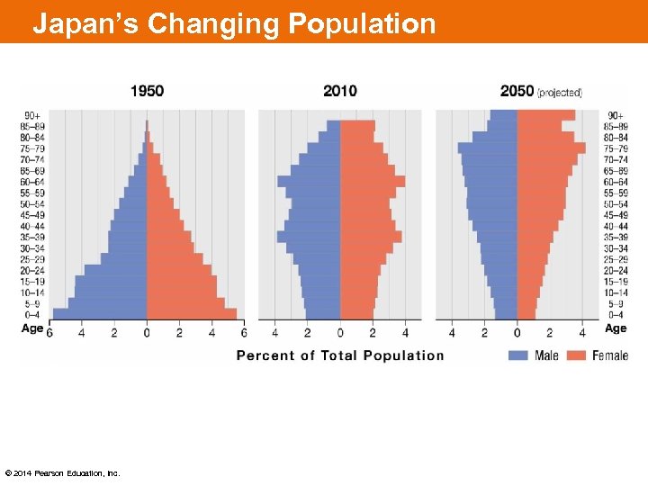 Japan’s Changing Population © 2014 Pearson Education, Inc.
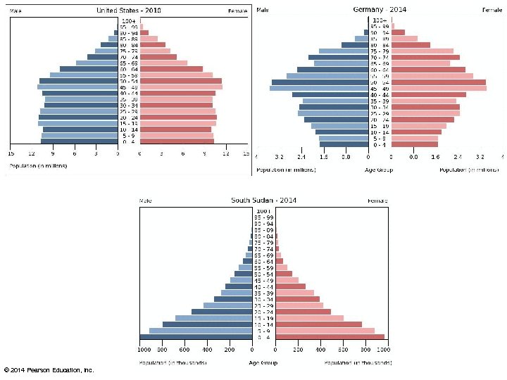 © 2014 Pearson Education, Inc.
 © 2014 Pearson Education, Inc.
 © 2014 Pearson Education, Inc.
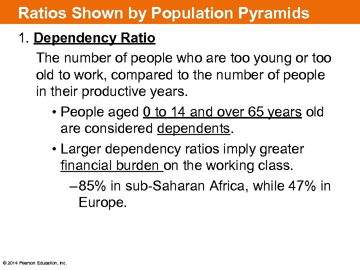 Ratios Shown by Population Pyramids 1. Dependency Ratio The number of people who are too young or too old to work, compared to the number of people in their productive years. • People aged 0 to 14 and over 65 years old are considered dependents. • Larger dependency ratios imply greater financial burden on the working class. – 85% in sub-Saharan Africa, while 47% in Europe. © 2014 Pearson Education, Inc.
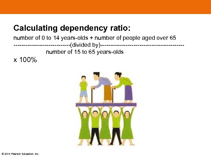 Calculating dependency ratio: number of 0 to 14 years-olds + number of people aged over 65 ---------------(divided by)--------------------- number of 15 to 65 years-olds x 100% © 2014 Pearson Education, Inc.
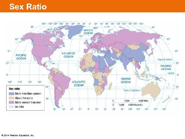
 Why Is Global Population Increasing? 2. Sex Ratio • Defined as the number of males per 100 females in the population – Worldwide 101 males to 100 females – Developed countries have more females than males, because females tend to live longer. – China has 114 males for every 100 females, due to One Child Policy – This translates to 13 million more men than women in China! © 2014 Pearson Education, Inc.
 Sex Ratio © 2014 Pearson Education, Inc.
 Aging countries animated map © 2014 Pearson Education, Inc.
 KEY ISSUE 3: WHY DOES POPULATION GROWTH VARY AMONG REGIONS? © 2014 Pearson Education, Inc.
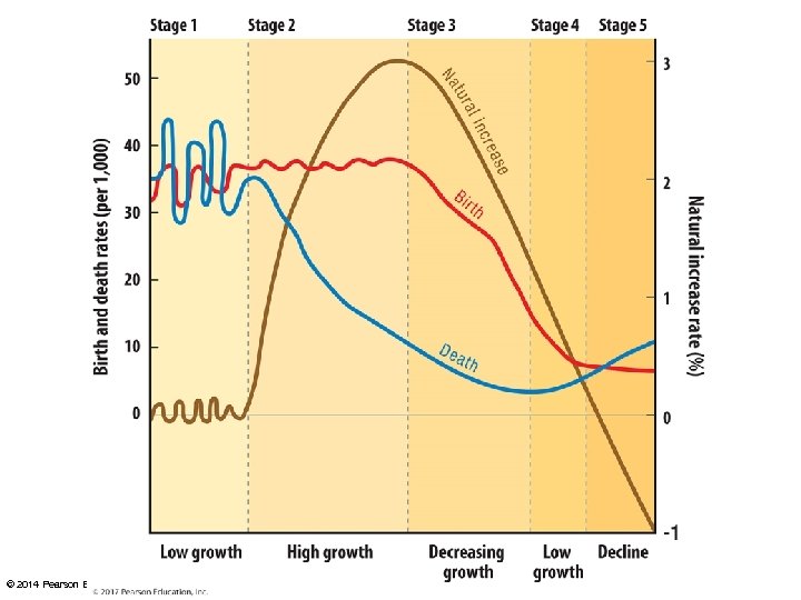
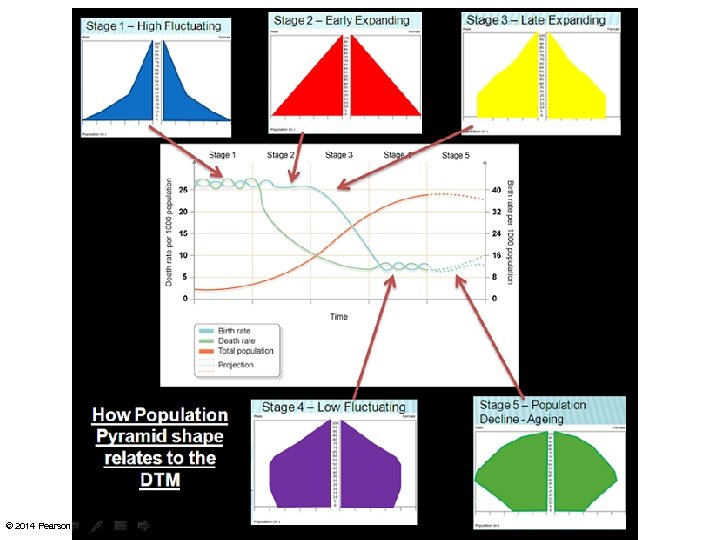
 Why Does Population Growth Vary among Regions? The Demographic Transition Model – Consists of four (possibly five) stages that help to explain the rising and falling population over time in a country. – Historically, no country has ever reverted back to a previous stage. • Thus, the model can be thought to have a beginning, middle, and an end. © 2014 Pearson Education, Inc.
 © 2014 Pearson Education, Inc.
 Stage 1: Low Growth • Very high CBR • Very high CDR • Very low NIR • Considered “pre-industrial” • “Survival mode” • No country is currently in Stage 1 • For all of human history up until the 1700 s, all countries were in Stage 1 © 2014 Pearson Education, Inc.
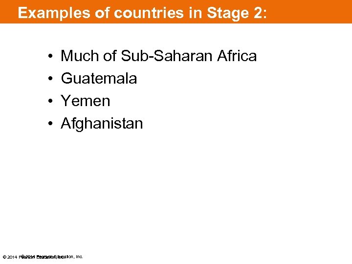
 Stage 2: High Growth • High CBR • Rapidly declining CDR • Very high NIR • Europe and North America entered stage 2, as a result of the Industrial Revolution, starting around 1750 - wealth led to better technology, sanitation, more food, etc. • Africa, Asia, and Latin America entered stage 2 around 1950, as a result of Medical Revolution - improved medical care diffused from Europe and North America © 2014 Pearson Education, Inc.
 Examples of countries in Stage 2: • • Much of Sub-Saharan Africa Guatemala Yemen Afghanistan © 2014 Pearson Education, Inc.
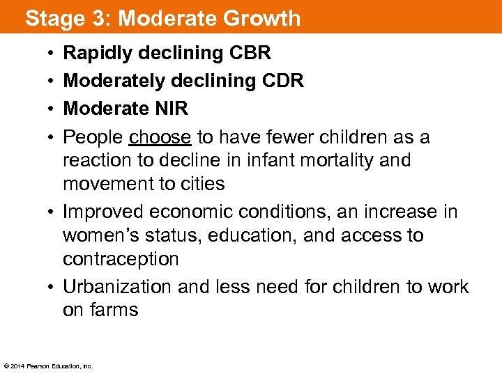 Stage 3: Moderate Growth • • Rapidly declining CBR Moderately declining CDR Moderate NIR People choose to have fewer children as a reaction to decline in infant mortality and movement to cities • Improved economic conditions, an increase in women’s status, education, and access to contraception • Urbanization and less need for children to work on farms © 2014 Pearson Education, Inc.
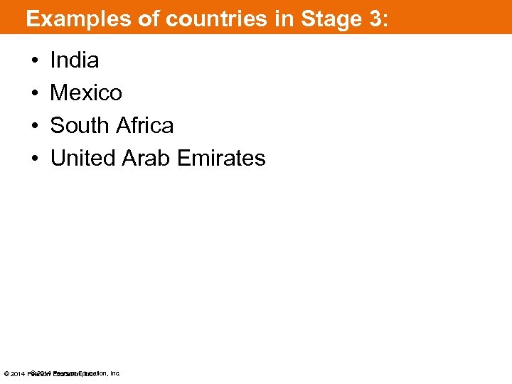 Examples of countries in Stage 3: • • India Mexico South Africa United Arab Emirates © 2014 Pearson Education, Inc.
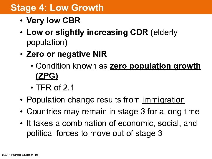 Stage 4: Low Growth • Very low CBR • Low or slightly increasing CDR (elderly population) • Zero or negative NIR • Condition known as zero population growth (ZPG) • TFR of 2. 1 • Population change results from immigration • Countries may remain in stage 3 for a long time • It takes a combination of economic, social, and political forces to move out of stage 3 © 2014 Pearson Education, Inc.
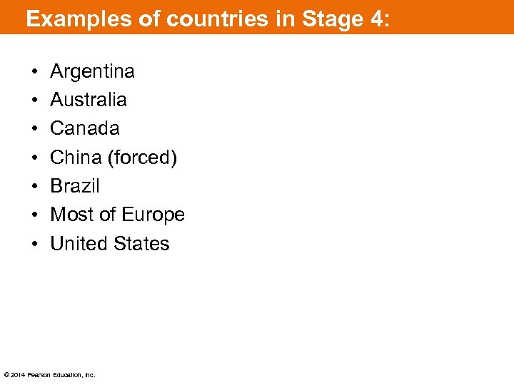 Examples of countries in Stage 4: • • Argentina Australia Canada China (forced) Brazil Most of Europe United States © 2014 Pearson Education, Inc.
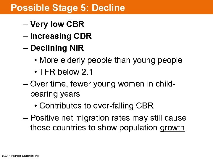 Possible Stage 5: Decline – Very low CBR – Increasing CDR – Declining NIR • More elderly people than young people • TFR below 2. 1 – Over time, fewer young women in childbearing years • Contributes to ever-falling CBR – Positive net migration rates may still cause these countries to show population growth © 2014 Pearson Education, Inc.
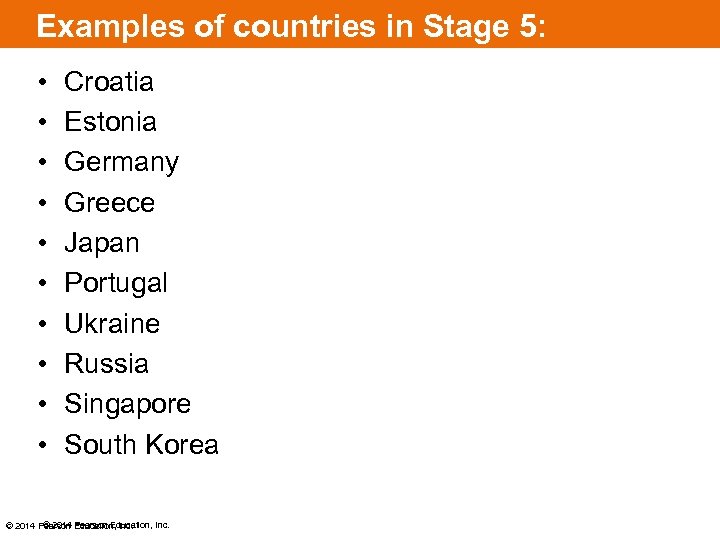 Examples of countries in Stage 5: • • • Croatia Estonia Germany Greece Japan Portugal Ukraine Russia Singapore South Korea © 2014 Pearson Education, Inc.
 © 2014 Pearson Education, Inc.
 Two Strategies for Lowering Birth Rates: 1. Improving Education and Health Care • Long-term goal • Emphasizes improving local economic conditions so that increased wealth is allocated to education and health programs seeking to lower birth rates. 2. Contraception • More immediate results • Met with greater resistance, because it goes against cultural or religious beliefs of some groups (Roman Catholics, fundamentalist Protestants, Muslims, and Hindus) © 2014 Pearson Education, Inc.
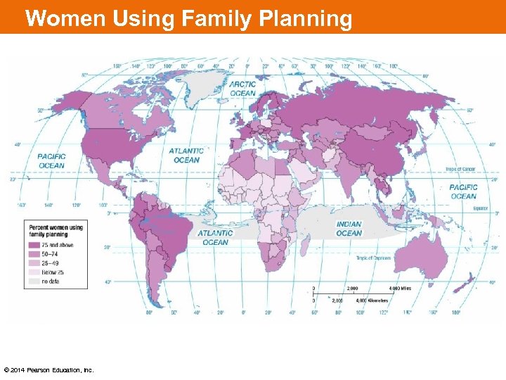 Women Using Family Planning © 2014 Pearson Education, Inc.
 Population Policies Two points of view: 1. Pronatalist – encouragement of the birth of children • Europe has a falling population and therefore has programs in place offering incentives for parents to have children 2. Antinatalist – opposition to the birth of children • China started a strict One Child Policy in 1979 to reduce population growth • India has used advertising, persuasion, and family planning clinics to reduce population growth © 2014 Pearson Education, Inc.
 Malthusian Theory Thomas Malthus (1766 – 1834) – English economist, reverent, and scholar – He claimed the population was growing faster than the increase in food supply. – Malthus’s theory was based on idea that the world’s supply of resources is fixed rather than expanding. – Sounds a lot like…. Environmental Determinism! – Neo-Malthusians still agree with him today © 2014 Pearson Education, Inc.
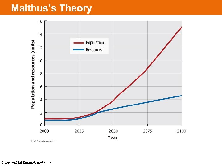 Malthus’s Theory © 2014 Pearson Education, Inc.
 Critics of Neo-Malthusianism • With technology we have been able to increase our resources – Sounds a lot like…Possibilism! • Larger populations could stimulate economic growth, and therefore, production of more food. • Some say poverty and hunger result from inequality, not population growth – World needs to allocate more resources to less developed countries – We have enough food for everyone © 2014 Pearson Education, Inc.
 Theory and Reality: • Food production has increased over last 50 years, faster than Malthus predicted. • His model predicted world population to quadruple over the course of 50 years. – Not even in India has population growth outpaced food production. © 2014 Pearson Education, Inc.
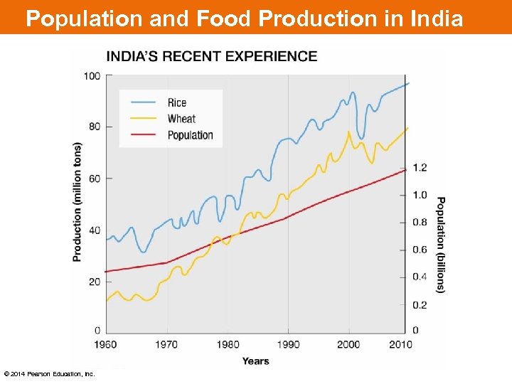 Population and Food Production in India © 2014 Pearson Education, Inc.
 KEY ISSUE 4: WHY DO SOME REGIONS FACE HEALTH THREATS? © 2014 Pearson Education, Inc.
 Epidemiologic Transition Model Focuses on distinct health threats in each stage of the demographic transition Stage 1: Pestilence and Famine (High CDR) • Principal cause of death: infectious and parasitic diseases – Unsanitary conditions – Lack of medical knowledge – Example: black plague (bubonic plague) © 2014 Pearson Education, Inc.
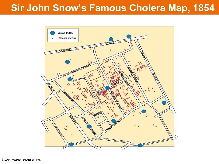
 Epidemiologic Transition Model Stage 2: Receding Pandemic (Rapidly Declining CDR) • Pandemic is a disease that occurs over a wide geographic area and affects a very high proportion of the population. • Factors that reduced spread of disease during the industrial revolution: – Improved sanitation – Improved nutrition – Improved medicine • Crowding in cities contributes to high death rates © 2014 Pearson Education, Inc.
 Sir John Snow’s Famous Cholera Map, 1854 © 2014 Pearson Education, Inc.
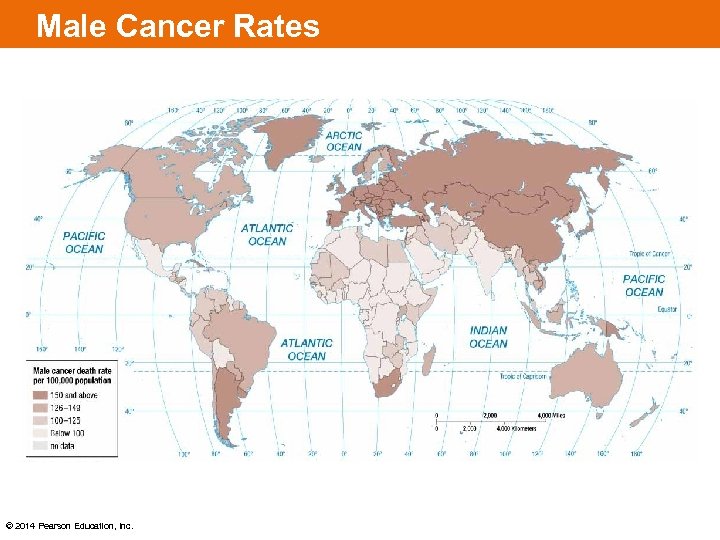
 Epidemiologic Transition Model Stage 3: Degenerative Diseases (Moderately Declining CDR) – Decrease in deaths from infectious diseases – Increase in chronic disorders associated with aging like cardiovascular diseases and cancer © 2014 Pearson Education, Inc.
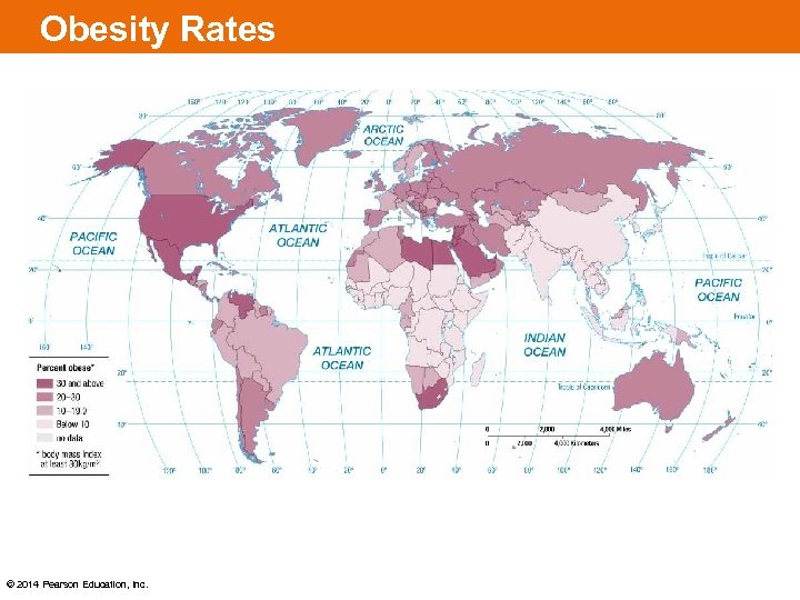
 Epidemiologic Transition Model Stage 4: Delayed Degenerative Diseases (Low but Increasing CDR) – Deaths caused by cardiovascular diseases and cancer are delayed because of modern medicine – Life expectancies extended – Increase in obesity © 2014 Pearson Education, Inc.
 Male Cancer Rates © 2014 Pearson Education, Inc.
 Obesity Rates © 2014 Pearson Education, Inc.
 Epidemiologic Transition Model Reasons for Possible Stage 5 (reemergence of infectious and parasitic diseases): 1. Evolution of microbes – Infectious disease microbes evolve and establish a resistance to drugs and insecticides. – Antibiotics and genetic engineering contributes to the emergence of new strains of viruses and bacteria. © 2014 Pearson Education, Inc.
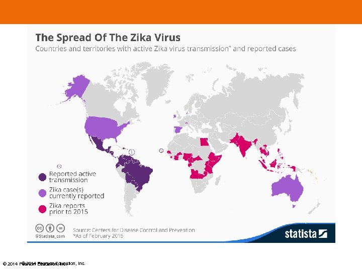
 Epidemiologic Transition Model 2. Poverty – Infectious diseases are more prevalent in poor areas because of presence of unsanitary conditions and inability to afford drugs needed for treatment. 3. Increased Connections – Advancements in modes of transportation, especially air travel, makes it easier for an individual infected in one country to be in another country before exhibiting symptoms. © 2014 Pearson Education, Inc.
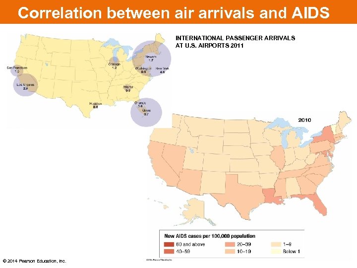 Correlation between air arrivals and AIDS INTERNATIONAL PASSENGER ARRIVALS AT U. S. AIRPORTS 2011 © 2014 Pearson Education, Inc.
 © 2014 Pearson Education, Inc.
 Indicators of Health 1. Infant Mortality Rate (IMR) – the annual number of deaths if infants under one year of age, per 1000 births – IMR reflects the quality of a country’s health care system 2. Life expectancy – the average number of years a newborn can expect to live at current mortality levels – Highest in Japan and much of Europe – Lowest in sub-Saharan Africa © 2014 Pearson Education, Inc.
 Life Expectancies • • 89: Monaco 84: Japan, Singapore, Macau 83: San Marino 82: Iceland, Andorra, Switzerland, Israel, Luxembourg, Australia, Italy • 79: United States • • 71: World 49: Chad 50: Guinea Bissau, Afghanistan 51: Swaziland, Namibia, CAR, Somalia 52: Gabon, Zambia, Lesotho, Mozambique © 2014 Pearson Education, Inc.


