327e88d24399ad69eda807ed73320757.ppt
- Количество слайдов: 17
 UI Examples Real world user interface examples 3461
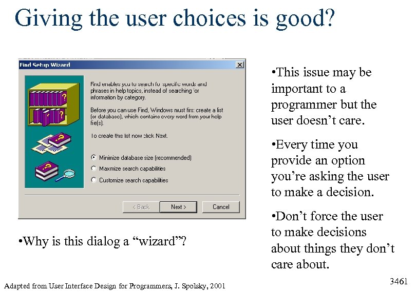 Giving the user choices is good? • This issue may be important to a programmer but the user doesn’t care. • Every time you provide an option you’re asking the user to make a decision. • Why is this dialog a “wizard”? Adapted from User Interface Design for Programmers, J. Spolsky, 2001 • Don’t force the user to make decisions about things they don’t care about. 3461
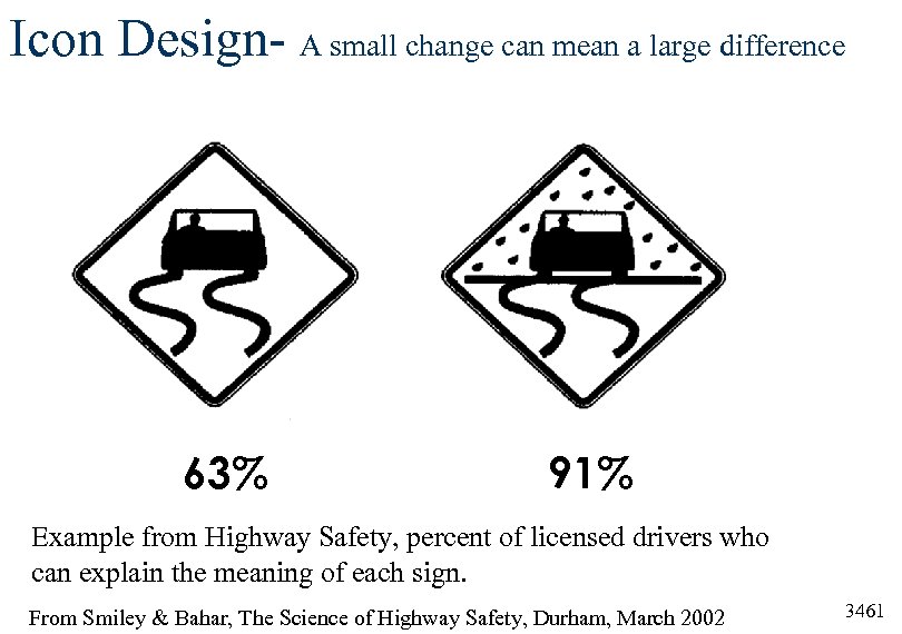 Icon Design- A small change can mean a large difference 63% 91% Example from Highway Safety, percent of licensed drivers who can explain the meaning of each sign. From Smiley & Bahar, The Science of Highway Safety, Durham, March 2002 3461
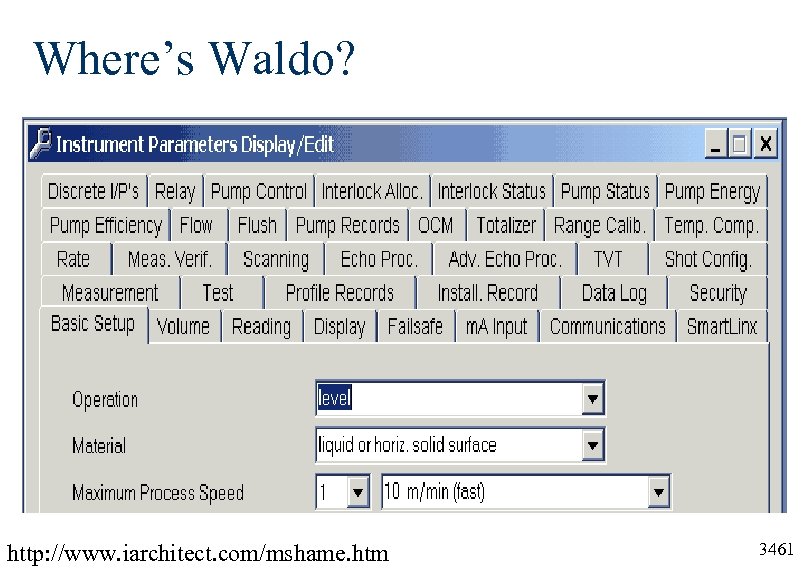 Where’s Waldo? http: //www. iarchitect. com/mshame. htm 3461
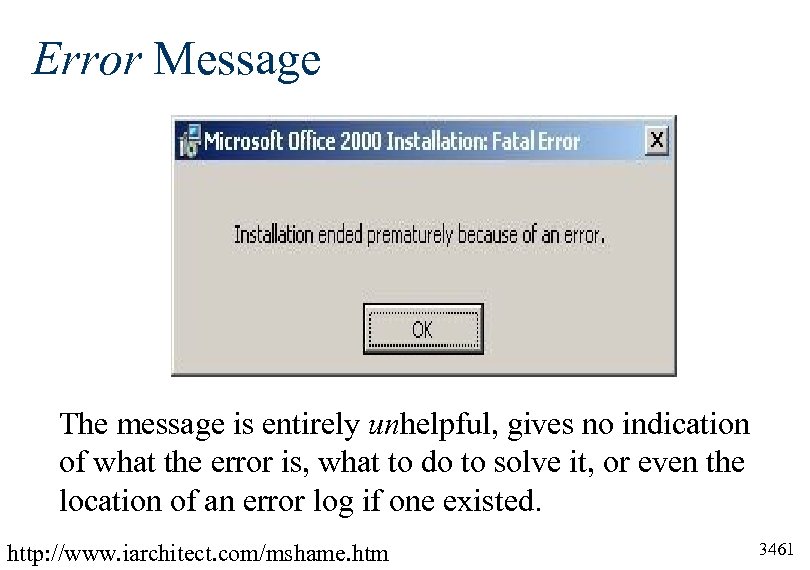 Error Message The message is entirely unhelpful, gives no indication of what the error is, what to do to solve it, or even the location of an error log if one existed. http: //www. iarchitect. com/mshame. htm 3461
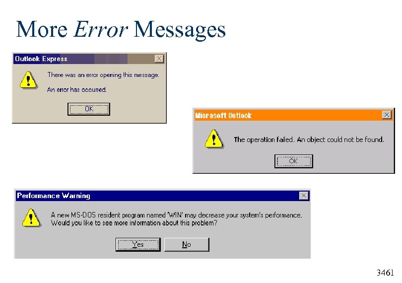 More Error Messages 3461
 Requests for Proposals User Interface Requirements 3461
 User Interface Requirements (1 of 3) Free Text to Use in Your Request for Proposals (RFPs) http: //www. usabilityinstitute. com/articles/RFPInterface. Requirements. htm 1. The software should be usable without reading a printed guide. If the complexity of the tasks being automated cannot feasibly be embedded into the software interface, reading a printed guide may be unavoidable. In this case, the most that any individual user should have to read for a particular role is 50 pages-short enough to read in one sitting. 2. Users should be able to accomplish every task and entry with the fewest possible keystrokes. For instance, dates should not necessitate typing four digits for the year unless the context of the given field leaves considerable doubt as to which millennium might be intended. In many cases, keying in any characters at all for the year may be an unnecessary expense of the users' time. 3461
 User Interface Requirements (2 of 3) Free Text to Use in Your Request for Proposals (RFPs) http: //www. usabilityinstitute. com/articles/RFPInterface. Requirements. htm 3. The interface should enable all interaction techniques and input to be discoverable and chosen from a browse-able, hierarchical structure, arranged in order of the functions the user needs to perform. Until recently this simply meant supplying an exhaustive menu or menu-like outline of choices, supported by dialogs with options and click-able choices. More recently, this requirement is being satisfied by multiple graphical choices, in the form of icons and segmented, click-able graphics known by various names, such as imagemaps. In either case, what this requirement specifically precludes is reliance solely on any of the following techniques: command line syntax; parameter (INI) file options not built into the interface; techniques supported only by combination keystrokes, mouse techniques, or combinations thereof; techniques requiring knowledge of special, manually entered values. 3461
 User Interface Requirements (3 of 3) Free Text to Use in Your Request for Proposals (RFPs) http: //www. usabilityinstitute. com/articles/RFPInterface. Requirements. htm § 4. The software should enable users to do things out of § § order without being penalized. 5. The software should enable users to make outright mistakes without being terminated, executed, canceled, re -booted, or erased. 6. The system should save all of what the users type, by default, meaning without extra steps. 7. Users should be forewarned when any work is overwritten, undone, or erased. 8. The interface and messages should make it clear why the program does what it does. 3461
 Gestalt Principles 3461
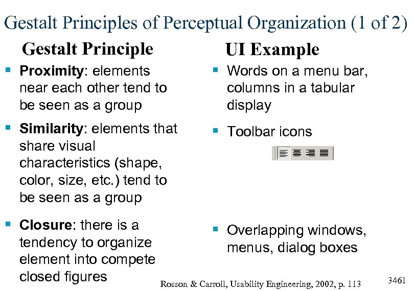 Gestalt Principles of Perceptual Organization (1 of 2) Gestalt Principle UI Example § Proximity: elements § Words on a menu bar, near each other tend to be seen as a group § Similarity: elements that share visual characteristics (shape, color, size, etc. ) tend to be seen as a group § Closure: there is a tendency to organize element into compete closed figures columns in a tabular display § Toolbar icons § Overlapping windows, menus, dialog boxes Rosson & Carroll, Usability Engineering, 2002, p. 113 3461
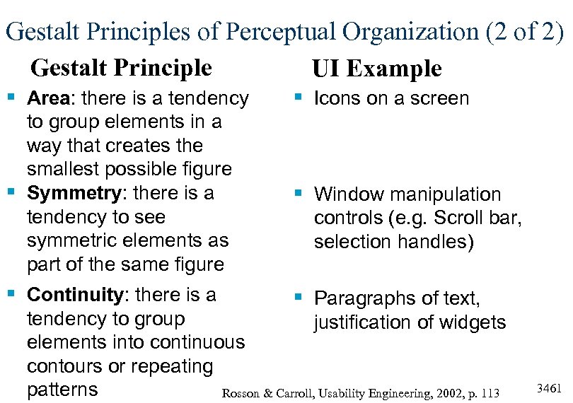 Gestalt Principles of Perceptual Organization (2 of 2) Gestalt Principle UI Example § Area: there is a tendency § Icons on a screen to group elements in a way that creates the smallest possible figure § Symmetry: there is a tendency to see symmetric elements as part of the same figure § Window manipulation § Continuity: there is a § Paragraphs of text, controls (e. g. Scroll bar, selection handles) tendency to group justification of widgets elements into continuous contours or repeating patterns Rosson & Carroll, Usability Engineering, 2002, p. 113 3461
 Documentation 3461
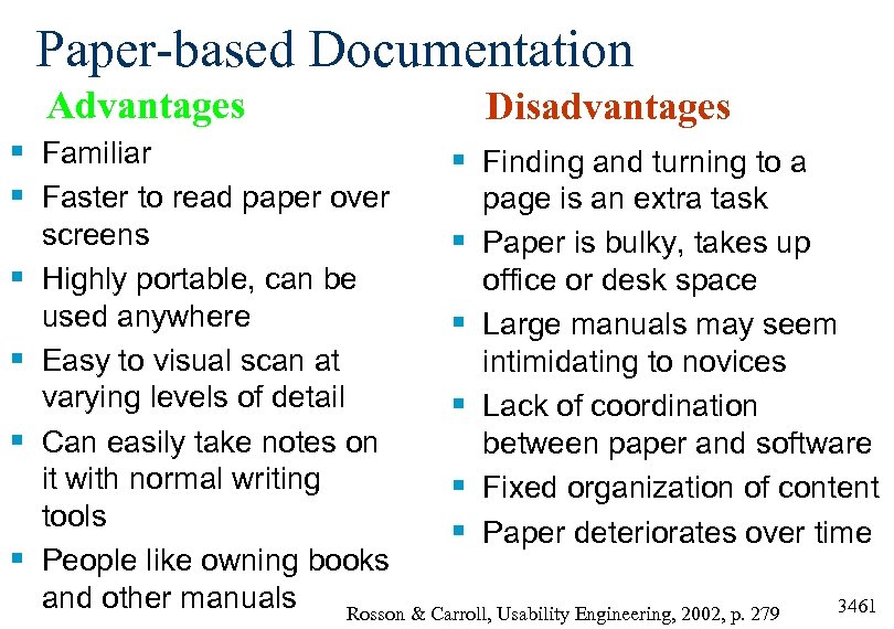 Paper-based Documentation Advantages § Familiar § Faster to read paper over § § Disadvantages § Finding and turning to a page is an extra task Paper is bulky, takes up office or desk space Large manuals may seem intimidating to novices Lack of coordination between paper and software Fixed organization of content Paper deteriorates over time screens § Highly portable, can be used anywhere § Easy to visual scan at varying levels of detail § Can easily take notes on it with normal writing § tools § People like owning books and other manuals Rosson & Carroll, Usability Engineering, 2002, p. 279 3461
 Documentation § § Manuals Demo versions Interactive tutorials Paper and online manuals These are all types of things users do not want to spend their time doing- manuals are a last resort for most users. Instead, users today demand software which is “walk-upand-use”. Users don’t read the manual. 3461
 Support walk-up-and-use by. . . § Training-Wheels Environment. Reduced functionality interface where the user can do less and is protected from serious mistakes. By limiting actions available, user is redirected toward core functionality. Hiding the documentation in the UI § Icon Tooltips. Name or brief description which appears in a pop-up label box when the user pauses the mouse pointer over the icon. § Balloon Help. User can explicitly turn on and off pop-up help which provides assistance at a level of detail greater than found in tooltips. 3461


