f1bac20920477f94ee5407cb52ebe76a.ppt
- Количество слайдов: 81
Typography for Automatic Markup Liam Quin Barefoot Computing, 1999
Firs `ings Firs v Your Insrucor: Liam Quin v Your Cofe: get i while i’s hot v Your Laptop: if you don’t have one, don’t worry. It is optional. So are socks. v Stop and ask Quesions v Tell me when you are confused v If you’re in the wrong room, why not say?
1: Introducing Graphic Design Overview 1. Page Layout 2. Text and Fonts 3. Text and Paragraphs 4. Discussion and Exercises 5. Break
1. 1: Page Layout Ratios & Proportions, Motion & Res v The Golden Secion, 3: 4, 1: 2 v Whie space adds res v Use space to draw attention v Use a paper size suied to the task v Consider printers, binders, consumers v Paper sizes used (usa letter, iso a 4 etc. ) v 1: 2: 3: 4 ratios for margns
1. 1 Page Layout: `e Grid Why use a grid? v Fewer Decisions: Simpli 0 es page design v Helps increase consisency v Pages treated diferently sand out v Precise control over ratios v Reduce paper backing problems v Protec and perpetuate the design
Page Layout: `e Grid (2) Designing a Grid v Leave room for margns, binding, gutters v Posiion illusrations vertically & horizontally v choose sizes for main design elements v Make sure text areas are exac numbers of lines v Consider paper show-through (back-up) v Use pleasing proportions (Tschichold)
Page Layout: `e Tile Page v Use clumps and not cluxer v If you don’t centre i, make your design obviously not centred v Check for legal wording requirements v The optical centre of the page is above the acual centre; this applies to all apecs of page design.
Page Layout: Table of Contents Avoid Clutter v Rows of dots like dripping blood liter the page v Leave things out to make i plainer: people won’t read a long contents page. v Use per-chapter tables if necessary v Put page numbers on the left or right-align the chapter tiles so they are next to the numbers v Don’t try to show too much information!
Page Layout: Generated Pages Some sysems generate a table of contents at the end of the output, and you have to move i; problem for pdf, but much faser. Make sure your designs allow for extra long tiles; “A Rose by Any Other Name Would Smell as Sweet; But What if You Called both a Rose and a Pansy by the Same Name? ” Wriers will gladly supply multiple versions of tiles or other text.
Page Layout: Looking Inside `e human eye detecs lumps: Put related things near to one another; Put unrelated things far apart. Robin Williams calls this the Rule of Proximiy.
Page Layout: Looking Inside Bewen the Lumps Are Spaces… v Whie pace is di 2 cult in xml and sgml. v Multiple blanks mus be coalesced; v Use space before/after elements (or low objecs) to control gaps v Remember to keep vertical pace a multiple of half the vertical line spacing (e. g. 3½ times) v If in doubt, use more whie pace.
Page Layout: Alignment `e eye detecs misalignment of 0· 002 inches; Something not quie aligned looks wrong. `e more things that line up, the sronger the design. Wesern eyes move rom let to right, top to boxom; use alignment to lead the reader in the desired order.
Page Layout: Summary Line things up (alignment) wih a Grid Keep unaligned things well apart Group related things (tiles and text) Treat whie pace wih care Always srive to axain pleasing proportions
Firs Brief Intermission More cofe Don’t pill the coffee on the examples Competiion: identid this ypeface Quesions What shall we talk about next?
Text and Type Outline: v A Brief Hisory of Type v Typographic Colour and Type Syles v L e t t e r s p a c i n g and legbiliy v Type Families v Special Characers v Puxing on the Right Face
A Brief Hisory of Type Gutenberg: Moveable ype that didn’t move Bis of metal wih srips of lead bewen the lines (leading) Poiny fet (serifs) made by pen srokes A ypeface is a design; a font is the implementation
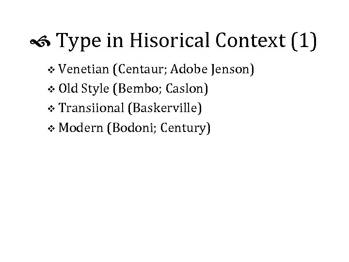
Type in Hisorical Context (1) v Venetian (Centaur; Adobe Jenson) v Old Style (Bembo; Caslon) v Transiional (Baskerville) v Modern (Bodoni; Century)
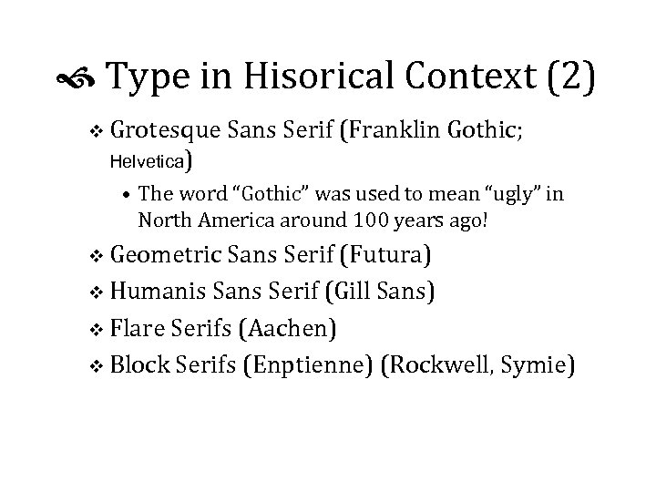
Type in Hisorical Context (2) v Grotesque Sans Serif (Franklin Gothic; Helvetica) • The word “Gothic” was used to mean “ugly” in North America around 100 years ago! v Geometric Sans Serif (Futura) v Humanis Sans Serif (Gill Sans) v Flare Serifs (Aachen) v Block Serifs (Enptienne) (Rockwell, Symie)
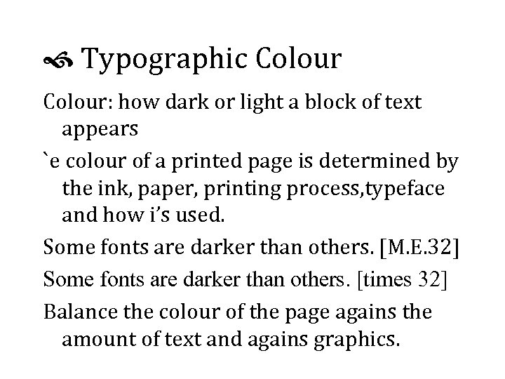
Typographic Colour: how dark or light a block of text appears `e colour of a printed page is determined by the ink, paper, printing process, typeface and how i’s used. Some fonts are darker than others. [M. E. 32] Some fonts are darker than others. [times 32] Balance the colour of the page agains the amount of text and agains graphics.
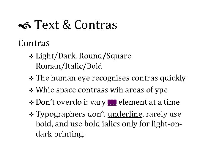
Text & Contras v Light/Dark, Round/Square, Roman/Italic/Bold v The human eye recognises contras quickly v Whie space contrass wih areas of ype v Don’t overdo i: vary one element at a time v Typographers don’t underline, rarely use bold, and use bold ialics only for light-ondark printing.
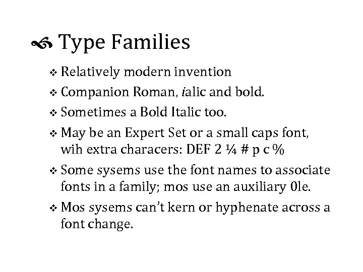
Type Families v Relatively modern invention v Companion Roman, ialic and bold. v Sometimes a Bold Italic too. v May be an Expert Set or a small caps font, wih extra characers: DEF 2 ¼ # p c % v Some sysems use the font names to associate fonts in a family; mos use an auxiliary 0 le. v Mos sysems can’t kern or hyphenate across a font change.
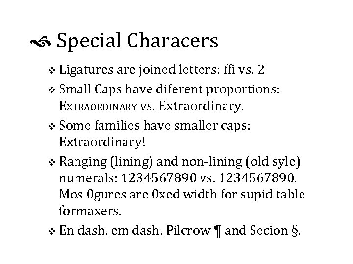
Special Characers v Ligatures are joined letters: ffi vs. 2 v Small Caps have diferent proportions: EXTRAORDINARY vs. Extraordinary. v Some families have smaller caps: Extraordinary! v Ranging (lining) and non-lining (old syle) numerals: 1234567890 vs. 1234567890. Mos 0 gures are 0 xed width for supid table formaxers. v En dash, em dash, Pilcrow ¶ and Secion §.
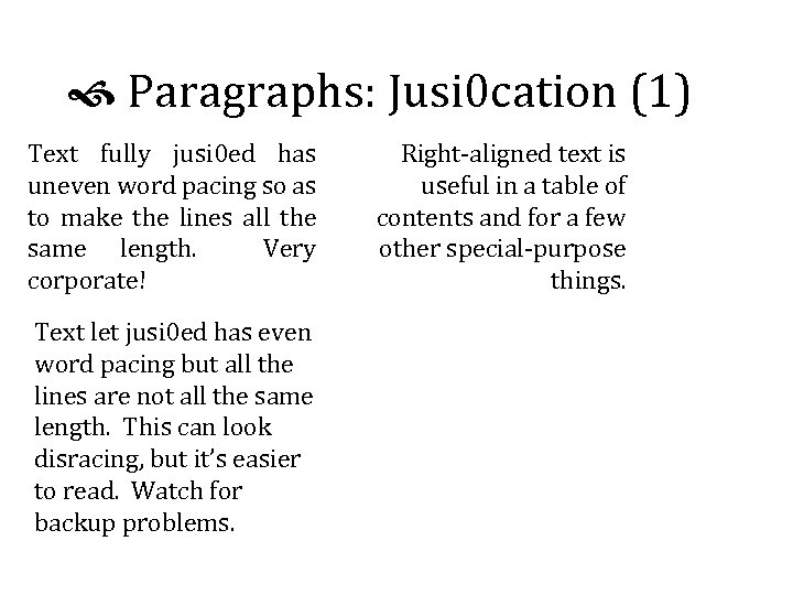
Paragraphs: Jusi 0 cation (1) Text fully jusi 0 ed has uneven word pacing so as to make the lines all the same length. Very corporate! Text let jusi 0 ed has even word pacing but all the lines are not all the same length. This can look disracing, but it’s easier to read. Watch for backup problems. Right-aligned text is useful in a table of contents and for a few other special-purpose things.
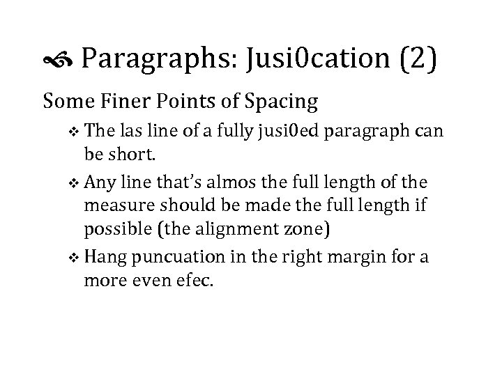
Paragraphs: Jusi 0 cation (2) Some Finer Points of Spacing v The las line of a fully jusi 0 ed paragraph can be short. v Any line that’s almos the full length of the measure should be made the full length if possible (the alignment zone) v Hang puncuation in the right margin for a more even efec.
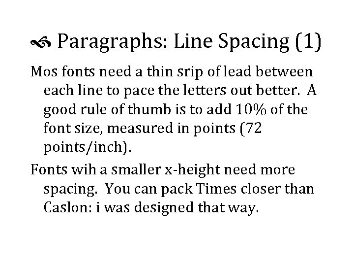
Paragraphs: Line Spacing (1) Mos fonts need a thin srip of lead between each line to pace the letters out better. A good rule of thumb is to add 10% of the font size, measured in points (72 points/inch). Fonts wih a smaller x-height need more spacing. You can pack Times closer than Caslon: i was designed that way.
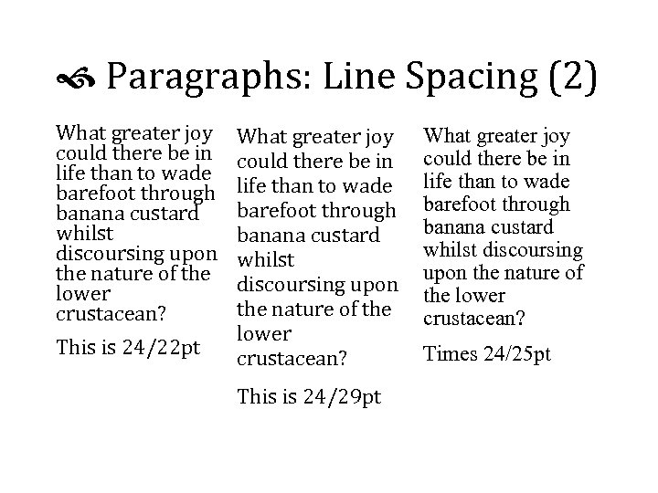
Paragraphs: Line Spacing (2) What greater joy could there be in life than to wade barefoot through banana custard whilst discoursing upon the nature of the lower crustacean? This is 24/22 pt What greater joy could there be in life than to wade barefoot through banana custard whilst discoursing upon the nature of the lower crustacean? This is 24/29 pt What greater joy could there be in life than to wade barefoot through banana custard whilst discoursing upon the nature of the lower crustacean? Times 24/25 pt
INQRVL & SECND Morning Break v Insalling a font family and using i v Exploring the characer set v How would you use ligatures in your software? Quesions, Ruminations and Answers
Part 2: Automatic Formatting Document formaxing and xml/sgml dtds Presentation imparts meaning, and meaning is guided by markup. Limiations in sotware may necessiate pecial markup. Mos sotware seems to need containers around groups of elements to be treated alike.
Changing Markup You can edi documents, use a Perl script jus once, or maybe xsl or Omnimark on the ly. If you edi the insances, you’ll need to change the dtd; i helps to keep the old one around! You can use a conversion dtd in which both old and new forms are valid, but then throw i away!
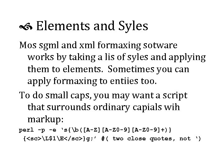
Elements and Syles Mos sgml and xml formaxing sotware works by taking a lis of syles and applying them to elements. Sometimes you can apply formaxing to entiies too. To do small caps, you may want a script that surrounds ordinary capials wih markup: perl -p -e ‘s{b([A-Z][A-Z 0 -9]+)} {<sc>L$1E</sc>}g; ’ #( two close quotes, not ‘)
Siblings, Groups and Boxes If you want every 0 th Panel. Number element to sart a new row in a table, you’ll probably need to put row elements in there. If a sequence of elements are grouped together, i’s probably because they share a common meaning or funcion, so give them a container (list, chapter, partlist, …).
Axributes vs. Content v Formaxers oten won’t display axribute values in any useful way. If you can display i at all, you might not to be able to put i in a diferent font. v Axributes can contain entiy references (& ) but not elements. v You can usually choose a diferent syle based on an axribute value. v Really posh sotware can use an axribute value in an expression, e. g. size = $att(height) * 0. 8
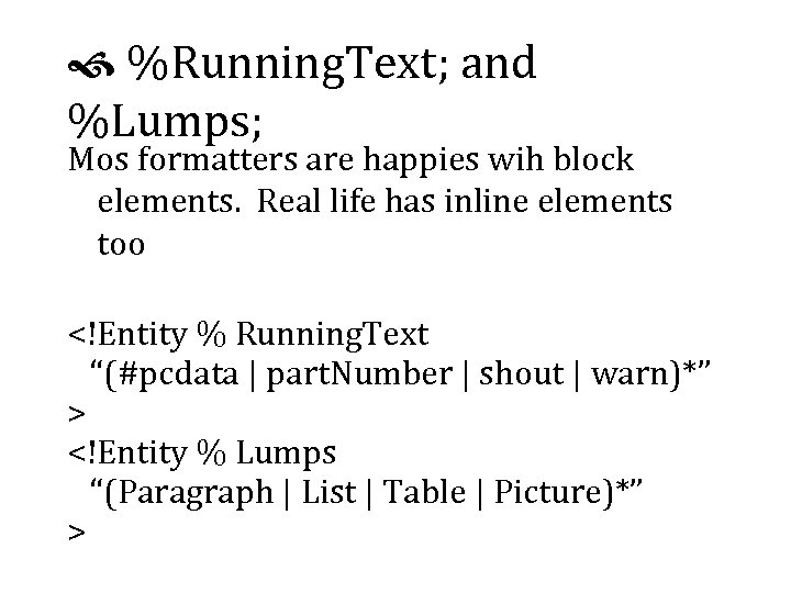
%Running. Text; and %Lumps; Mos formatters are happies wih block elements. Real life has inline elements too <!Entity % Running. Text “(#pcdata | part. Number | shout | warn)*” > <!Entity % Lumps “(Paragraph | List | Table | Picture)*” >
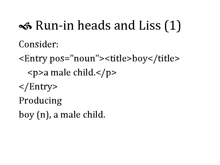
Run-in heads and Liss (1) Consider: <Entry pos="noun"><title>boy</title> <p>a male child. </p> </Entry> Producing boy (n), a male child.
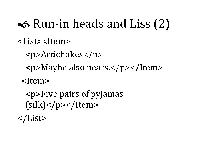
Run-in heads and Liss (2) <List><Item> <p>Artichokes</p> <p>Maybe also pears. </p></Item> <Item> <p>Five pairs of pyjamas (silk)</p></Item> </List>
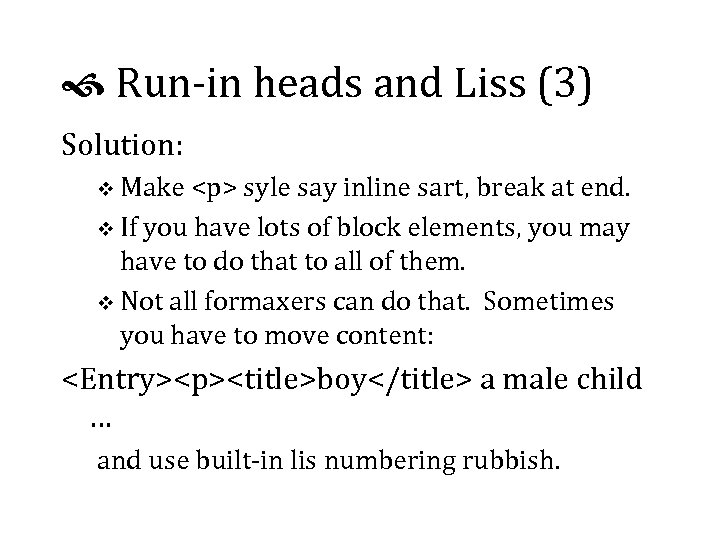
Run-in heads and Liss (3) Solution: v Make <p> syle say inline sart, break at end. v If you have lots of block elements, you may have to do that to all of them. v Not all formaxers can do that. Sometimes you have to move content: <Entry><p><title>boy</title> a male child … and use built-in lis numbering rubbish.
Style Axributes Style axributes are like <td align="left"> or <display face="bold"> or have syle content: <font size="7 pt" face="Helvetica"> Not all formaxers support both of these. `e second ype is much harder. Not all formaxers can do arihmetic eiher, such as Indent = point size * 3.
Tables A table is a way of presenting information. v Aside about how cool Ed Tute’s books are v Use markup that lets you tranpose tables v Use minimal cluxer: you probably don’t ned all the lines and boxes, and they take axention away from the information. v Don’t pread tables out more than you ned to. v Avoid lixle rows of dots in tables!
Table Markup (1) Four kinds of tables v cals tables, in particular the sgml open model; v Soft. Quad tables v html tables v Mrs Eaves’ Own Home-grown Organic Tables v Content tables v Mos formaxers can do at leas two of these.
Table Markup (2) Running Heads and Fet: v Running table headers repeat on every page. v You may need a “table continues” marker; e. g. set a variable to “continued…” at the sart of a table and clear i at the end. v `e cals and sq models put table heads and fet in separate tables; automatic calculation breaks. v Remember Proximity: put related things nearer together than unrelated things.
Prescriptive or Descriptive? Prescriptive Markup v controls what is allowed where, usually tightly v requires editorial authoriy Descriptive markup v describes an exising document or text v can’t disallow things that acually occur v oten much harder to format v same problems with buq dtds!
Before `e Rubber Chicken Examples v converting to trof with Perl v conversion to html with xsl v talking about expensive posh high-end suff Quesions, answers, cogtation and agtation Rubber Du 5, or, Dinner.
While `ey Are Gone `is room is in use for an all-day tutorial: Typography for Automatic Markup Liam Quin Barefoot Computing, 1999
Welcome Back We shall shortly be resuming: Typography for Automatic Markup Liam Quin Barefoot Computing, 1999
GOD AFQRNON Part Three: Print Technologies v Pos. Script, hpgl, True. Type and Quick. Draw Fonts, Encoding and Unicode v Fonts on the World Wide Web v Images v Part Four: Putting it all together Quick introducion to dsssl, xsl and css v Detailed look at Something v v Managing the Files
Part 3: Print Technologies Printer Hardware v all except cad ploxers are raser devices v they print a giant array of very tiny dots v some of the dots are bimer than others v some of the dots are black and some are pink v the thinnes line possible is one dot thick v can make offset lithography plates direcly v need to consider ink traps and blots
Sotware inside the Printer v Typesetters (1200 - 4500 dpi) usually receive a huge bitmap image from a Raster Image Processor (rip). v Most rips run on Unix, very high-end Macs or special hardware (e. g. an Alpha under os 9). v Most laser printers receive bitmaps, hpgl or Post. Script programs v You can download font programs to printers and rips. We will see how to do this later.
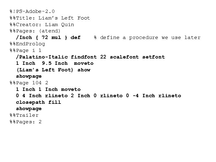
A Brief look at Post. Script v The output of a Post. Script program is usually a printed page. v Comments start with % followed by a space v Significant Comments start with %! or %% v Level One ps is in ascii v Level Two can contain binary compressed data v Embedded fonts can be binary in either case
%!PS-Adobe-2. 0 %%Title: Liam’s Left Foot %%Creator: Liam Quin %%Pages: (atend) /Inch { 72 mul } def % define a procedure we use later %%End. Prolog %%Page i 1 /Palatino-Italic findfont 22 scalefont setfont 1 Inch 9. 5 Inch moveto (Liam’s Left Foot) showpage %%Page 104 2 1 Inch moveto 0 4 Inch rlineto 2 Inch 0 rlineto 0 -4 Inch rlineto closepath fill showpage %%Trailer %%Pages: 2
Weaknesses of Post. Script v No access to font metrics v No automatic kerning (but programs that generate Post. Script can do the kerning themselves) v Verbose (but compresses well) v Multiple Levels and the three versions of Encapsulated Post. Script confusing v page is usually as frozen as an image v Awfully hard to debug
Strengths of Post. Script v Plain text: easy to generate from a program, and you can read it to see if it’s right v Device independent: always 72 dpi even on an 8 000 dpi Berthold Typesetter! v Portable: a Level 1 Post. Script 0 le can print just about anywhere, with no special driver needed v Amenable to sed and perl v Most high-quality commercial fonts are for Post. Script.
Other Formats The other print formats usually require special drivers, and the print files can’t be copied. The most common is hpgl, from hp. But it isn’t as general, so you keep running into things you can’t do. Xerox have their own language, Interpress; deficiencies in that led to Post. Script.
Font Formats 1: Bitmap Fonts (very rare today for printing) v hp cartridges and soft fonts v Post. Script Type 3 fonts can include bitmaps v Xerox use them too; so can TEX v Can have a different design for every size (compare Big Caslon, Mrs Eaves and Adobe Caslon) v You can’t scale them in any useful way.
Fonts: Outline Formats Post. Script Type 1 v Originally a secret format to protect royalties v But all the high end printers use PS Type | True. Type v Developed by Apple and Microsoft v First successful internationalised font format v Fonts often automatic conversions from Type | v Microsft Windows has strong support for tt.
Other Outline Formats Quick. Draw GX (Macintosh Only) v Very few commercial GX fonts exist. v Too complex, and only works on the Mac. Post. Script Type 3 v Unhinted (Unhinged, says the spell checker!) v You can make them yourself v mostly for logos, bitmaps, or unusual effects
Fonts: Encodings v Input character sequence must be turned to a sequence of shapes, called glyphs. v Formatter accesses a glyph implementation in a font using a number. v The number-to-glyph mapping is the font’s encoding vector. v You can change a Type 1 font’s encoding vector in Post. Script.
Text Encoding v Xml uses Unicode for the document character set. v Most input documents are encoded in iso 8859 -1 (Latin 1) or utf-8; this is not a font encoding. v Unicode doesn’t specify how characters are mapped to glyphs; that’s up to the formatter. v Text encoding, document character set, font encoding are all joysomely different.
Post. Script Font Encodings Some standard encodings: v Latin 1 (iso 8859 -1) v Adobe. Standard. Encoding (see the Red Book): ascii, accents, ligatures V, W, X, and some publishing symbols v Adobe Expert Set (contains small caps, ligatures Y, Z and some fractions) v Small Caps (Barefoot Barefoot)
Custom Font Encodings v Reverse small caps (Barefoot b. AREFOOT) v Font subsets, e. g. in pdf (abcde Wherb) v Logo fonts v Filling the gaps in Latin 1 with extra symbols from Adobe’s Standard Encoding
Adobe Font Metrics v The afm is ascii; Windows uses a binary. pfm file. v Bounding box of each glyph, plus its default encoding position v List of kern pairs v Tracking information for spacing characters out further at small sizes v Information about accents
Using font metrics v Font bounding box - no character draws outside this v Character bounding box - the glyph is entierly within the box v Character advance - x and y amounts to move by after drawing the character v Kerning - amount to adjust character advance by depending on the previous character v You can’t kern across fonts with this scheme; TEX can do that with Virtual Fonts.
Downloading Post. Script Fonts v Read %%Page. Font and %%Document. Font comments to work out which fonts are used v Look for %%Include. Font lines, or include all fonts just before %%End. Prolog, or just before the first %%Page if that’s not found. v Use t 1 tools or pfb 2 ps on Unix to convert binary pfb fonts to ascii. Note that pfb fonts are not compressed!
Fonts on the Web You can embed fonts in web pages: v Microsoft Weft (free) works only for IE 4 & IE 5 http: //www. microsoft. com/typography/ v Bitstream True. Doc works only for Netscape v It costs approx. $200 for the encoder, so no- one uses it; www. bitstream. com; decoder is included with Netscape. v Bitmap images have no royalty problems.
Designing Images v Avoid clutter v Use a line thickness that will show up on your printer, but that is not too much heavier than the underline in your text____font. v Consider the overall typographic colour of the page, whether it is dark or light. v Convert colour images to black and white before sending to a black & white printer.
Vector/Outline Image Formats v 1 inch 5 inch rlineto: commands, not pictures v can scale to any resolution v Encapsulated Post. Script (eps, epsi), cgm, wmf most common. v Can be problems with fonts used by images but not included in the image file v Best for engineering drawings, charts, or things you generated in a program
Bitmap (Raster) Images v From 1 bit to 32 or more bits per pixel v Compuserv gif: up to 8 bpp (256 colours); best for line drawings v jpeg: up to 24 -bit but lossy compression; best for photographs v Portable Network Graphics (png) new; lossless compression. v Many, many others!
Generating Images v Fairly easy to generate Post. Script from programs you write v Perl libraries make gif (gd) and Post. Script (Post. Script) images v Tcl/Tk can generate Post. Script too v Adobe’s ftp site had C code to read an afm file v netpbm, Image. Magick, giftrans, gimp, xv are all useful on Unix; see www. freshmeat. net.
Images on the Web v Reduce gif colours to speed download v New standard, pgml, may be supported soon v If you write scripts to generate images, make sure you get the mime Content-Type right! v Beware of copyright issues!
Brief walk for fresh air For those who remain… v Making a five-line drop cap v Other Questions
Part 4: Putting it all Together v Formatting Languages: dsssl, xsl, css v Other formatters v Option: • Generated Text • Managing Files With Revision Control Tools • Relating dtd and instance versions v Further Reading and Learning More v Questions, Free-for-All v Recovery Time
Formatting Languages Document Style and Semantics Specification Language (dsssl) v Sgml and xml based v Uses lisp syntax, so very hard to read v no good books on it v moderately powerful v too difficult for most people to use v few implementations
& XML Style Language (xsl) v Comes from the World Wide Web Consortium v Uses xml syntax so you can edit it easily v Easy things are fairly easy with templates v Declarative, so hard things require Particular and Careful Thinking v Not good enough for fine paper typography v Two parts: transformation and style; implementations can choose to do one or both, reducing interoperability.
Other sgml/xml formatters Commercial formatters v 3 b 2 v Miles 33 Genera v Datalogics Pager v Xyvision Parlance Publisher v Arbor. Text Adept/Epic (uses TEX) v Exosoft v See the trade show for others!
Other Formatters (2) Free Solutions v TEX is free and works on Unix and Macintosh; maybe Windows too? v There are free versions of troff for Unix, including James Clark’s groff. v James Tauber is working on fop, with the goal of doing reasonable quality layout; it’s in Java. v David Megginson’s nsgmls. pm can be used to write an sgml to troff (say) converter.
Batch Formatting Example v Convert sgml input to esis with nsgmls v Convert esis to troff with nsgmls. pm and a custom perl script (about 500 lines) v Run troff with macro package (1500+ lines) to produce ascii context file v Take troff output and add ligatures, hung punctuation and spacing corrections in awk v Generate 80 MByte Post. Script file with sqdps v Add fonts with addpsfonts (shell script)
Handling Cross References (1) v Referring to generated text elsewhere: see figure 12 v Referring to content elsewhere: see Figure 12, The Mating Habits of Mountains v Referring to page numbers: see Figure 12 on page 37 v Never say, See page 12, if you’re on page 12! See Figure 5 (opposite page, bottom); See Figure 12 (next page); See Table 3 (above)
Handling Cross References (2) Implementation v You generally need two passes to get the page number information. v Inserting the text may cause pagination to change; you have to detect this and format again v You can get an infinite loop!
Optional Section 1 Generated Text v Tables of contents v Prefixes, Postfixes and formats v Indexes v Effectivity v Revision Bars
Optional Section 2 Managing Automatic Formatting v Revision Control Explained v RCS and SCCS v A repository with CVS v Printing $Id$ in the margin: keeping track of everything used to print a document
Optional Section 3 Relating Files v dtds, instances, style sheet and script versions v tests and checks v managing manual changes v using fixed attributes
Further Reading Robin Williams, The Non-Designer’s Design Book, Peachpit Press, bright yellow cover Robert Bringhurst, The Elements of Typographic Style, second edition, tall thin black book Various Te. X books by Knuth Stop stealing sheep and start desiginig type, Adobe Press (small blue book)
f1bac20920477f94ee5407cb52ebe76a.ppt