2a5f85315f372a4cd41bdfadef3d61af.ppt
- Количество слайдов: 21
 The Importance of Walking can add minutes to your life. This enables you at 85 years old to spend an additional 5 months in a nursing home at $7000 per month. . My grandpa started walking five miles a day when he was 60. Now he's 97 years old and we don't know where he is. I like long walks, especially when they are taken by people who annoy me.
 I have to walk early in the morning, before my brain figures out what I'm doing. . I joined a health club last year, spent about 400 bucks. Haven't lost a pound. Apparently you have to go there. Every time I hear the dirty word 'exercise', I wash my mouth out with chocolate. The advantage of exercising every day is so when you die, they'll say, 'Well, she looks good doesn't she. '
 If you are going to try cross-country skiing, start with a small country. I know I got a lot of exercise the last few years, . . . just getting over the hill. We all get heavier as we get older, because there's a lot more information in our heads. That's my story and I'm sticking to it.
 Opinion: For stocks, the best time to sell and go away starts today Published: Apr 1, 2015 3: 28 a. m. ET Two top-ranked investors get a head start on summer weakness
 CHAPEL HILL, N. C. (Market. Watch) — Should you sell in April and go away? It’s an odd question, I admit. Widespread talk of selling usually doesn’t begin until late April, when investors each year are reminded of the famous seasonal pattern “sell in May and go away. ” But it’s precisely because it is so well-known that some followers of this seasonal tendency wonder if they should act sooner rather than later. Waiting until May Day runs the risk of selling at the same time that a large number of other investors are doing the same. Fortunately, we have real-world data on two attempts to get a jump start on the “sell in May and go away” pattern. The first is the “Almanac Investor Newsletter, ” edited by Jeffrey Hirsch, and the other is Sy Harding’s “Street Smart Report. ”
 Both pursue surprisingly similar modifications to this basic seasonal pattern. Each relies on a technical indicator known as MACD to pinpoint the precise day on which they enter and exit the market. (MACD is a short-term momentum indicator, standing for moving average convergence divergence. ) The Hulbert Financial Digest has track records for both market timers’ modifications of this seasonal pattern dating to mid-2002, nearly 13 years ago. The HFD calculates their returns on the assumption that, when they are invested in stocks, they earn the return of the Wilshire 5000 Index; otherwise they are assumed to be invested in 90 -day Treasury bills.
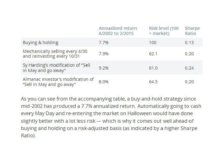
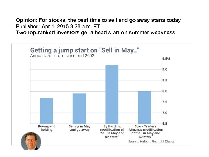
 Harding’s modification of the Halloween Indicator did even better still, producing a 9. 2% annualized return over the same period — 1. 5 percentage points per year more than a purely mechanical application of this seasonal pattern, and 1. 3 percentage points ahead of a buy-andhold. Even better, this market-beating return was produced with 39% less risk, which means it’s even further ahead of buy-and-hold on a riskadjusted basis. In fact, Harding’s modification of the Halloween Indicator is in fourth place for risk-adjusted performance since mid-2002 out of the 91 stockmarket-timing strategies the Hulbert Financial Digest has tracked over this period. To be sure, Hirsch’s modification of the Halloween Indicator performed less well than Harding’s, producing an 8% annualized return while incurring 35% less risk than the market itself. It still came out ahead of buy-and-hold, however, on both an unadjusted and a risk-adjusted basis.
 What about this April? To be informed when those two advisers actually trigger their “sell” signals, you would need to subscribe to their services. But one way in which their MACD-based systems could trigger an early “sell” signal (but not the only way) would be for the market to be strong for a few days and then quickly drop back. Given the stock market’s impressive rally on Monday, such a “sell” signal could come fairly soon. If that happens, followers of this seasonal pattern might consider going to cash — thereby taking off the rest of the spring and summer from stressing about the market. You still would want to read your favorite investment columnists, however
 BOTTOM LINE The bull market for stocks is not done yet, but the end is in sight, due to arrive between early July and early August 2015. There should be a memorable decline from that top into early 2016. We will firm up that forecast as it gets closer, but for now the mission is to continue riding the uptrend. Look for a brief uptrend interruption for a bottom due April 20 -22, but a resurgence upward into the April 28 -29 FOMC meeting. T -Bond yields should start rising (prices falling), now that the COT data show commercial traders going strongly to the net short side. Gold should continue to do well for a while, especially when priced in euros, thanks to the ECB’s QE. But gold still has a date with a major cycle low due in August 2015.
 Ron Chestna, 89 years of age, was stopped by police around 2 a. m. and was asked where he was going at that time of night. Ron replied, "I'm on my way to a lecture about alcohol abuse and the effects it has on the human body, as well as smoking and staying out late. " The officer asked, "Really? Who's giving that lecture at this time of night? " Ron replied, "That would be my wife
 TOM MCCLELLAN Eurodollar COT Shows Problems For Late 2015 For now, the bull market is still on, but there are problems on the horizon. The first chart shows the leading indication for stock prices given by the Commitment of Traders (COT) Report data for Euro dollar futures. For the uninitiated, the term euro dollar in this context is not a currency product, but rather it refers to dollar denominated time deposits in European banks. So it is an interest rate product, and related to LIBOR interest rates. We figured out a few years ago that the movements of the commercial traders’ net positions in euro dollar futures were echoed about a year later in the SP 500. It has been a wonderful forecasting tool, except for one notable period in 2013 when the relationship inverted. That was when QE 3 was in full force, with the Fed putting an $85 billion per month thumb on the scale. Now that the Fed’s QE program is over, the relationship appears to have been restored to normal.
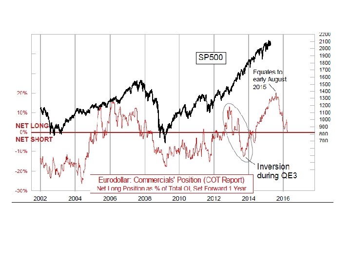
 Why this relationship works is a question for which we don’t have an answer. We also do not know why it is a one-year lag; but that’s what it takes to get the patterns to line up. We do know that it has been working for the most part since about 1997, which was when the eurodollar futures contract became a popular product. The top chart shows a major top looming for stock prices, equating for August 2015 for the SP 500, and then a sharp dropoff lasting into 2016. The lower chart zooms in closer on this relationship. Except for the Ebola Panic in October 2014, there has been good correlation with the SP 500 matching the dance steps of the euro dollar COT data. April’s strong seasonality (see page 5) should be validated this year, according to this leading indication. After April, the message is that the upward slope starts to flatten out, leading to that top due in early August.
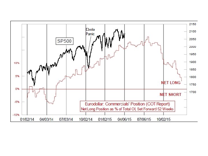
 This message is pretty similar to the message of the Presidential Cycle Pattern, shown in the chart on page 2. It agrees with thesis of a strong advance in April, and with a meaningful price top this summer. Where it disagrees slightly is that it shows the top to be in July rather than early August according to the Euro dollar COT leading indication. That is a rather small difference, and we will work on identifying when the actual top should arrive as that time frame gets closer. For confirmation of this thesis from a really unconventional source, see page 8. Bottom Line: We are still in the bullish 3 rd year of a presidential term, and the major averages are still in an uptrend. But a change is coming for the latter half of 2015, following an important top due in July to August.
 DJU Upturn: Good News For Rest of Market Utilities stocks are thought to be valuable due to their higher than average dividends. But perhaps their most important function is as a messenger about what lies ahead for the rest of the market. The top chart on page 5 comparesthe Dow Jones Utility Average (DJU) to the Industrial Average (DJIA). Most of the time they are doing pretty much the same thing. It is when they disagree that there is useful information. Divergences tend to be resolved in favor of the DJU’s message, and several examples are highlighted in the chart. This is relevant now because while the DJIA seems to still be just chopping sideways, the DJU has already pushed ahead with a pattern of higher highs and higher lows. So the message is that the DJIA and the other broad stock market indices should follow suit and head higher as well.
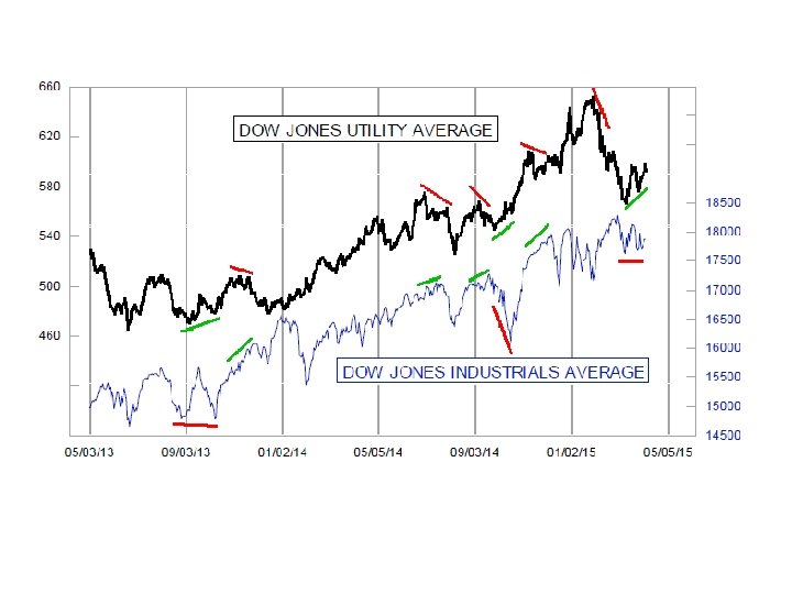
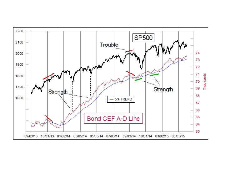
 The fact that the DJU is still below its January high is less important to the overall interpretation. The divergences which matter tend to be shorter term in nature, as illustrated above. In addition to the bullish message from the DJU, there is another bullish message for the stock market from another interest sensitive sector. There are currently 242 bond-related closed end funds (CEFs) listed on the NYSE, out of 3597 total listed issues. The bond CEFs are often blamed for “contaminating” the Advance-Decline data, since they are not real operating companies. Years ago, we set up a system to track all of the NYSE listed issues, using a closing data file available by subscription from the NYSE. This allowed us to get our own data on what each of the categories of issues are doing, including the bond CEFs. We found that the belief in the contamination hypothesis was not justified, and that instead the bond CEFs are a great pool of issues to evaluate the health of the liquidity pool.
 The chart below shows the A-D Line for these issues, and it is now making new all time highs. It is stronger than the pattern of the SP 500, and that condition is typically followed by more strength for the SP 500. We even saw instances in early 2014 when the SP 500 was dipping down to short term lows while this A-D Line was making higher highs. The bond CEFs turned out to be telling the truer story about the state of market liquidity. Bottom Line: The DJIA and SP 500 have not yet broken out to new highs, but reliable signs are saying that we should expect to see that very soon.
