7b443a5bddc4b955c5e724c88fab75b2.ppt
- Количество слайдов: 64
 The Consistent User Experience Tasmanian E-Government Forum
 Vision for Smart Service Queensland That the public can expect access to products and services anywhere, anytime through a variety of channels
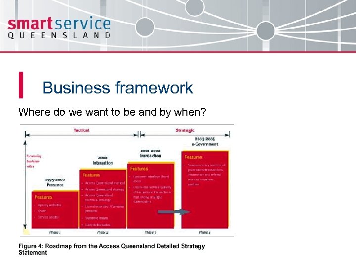 Business framework Where do we want to be and by when?
 3 tiered approach to achieve goals • Re-design and launch of a new ‘look and feel’ for the Queensland Government Gateway, and creation of the Consistent User Experience standard to assist Agencies as they align their individual sites • Development and introduction of ‘Service Clusters’ as a means of presenting information under meaningful, customer focussed headings • Acting as a change agent to support the alignment of all Queensland Government Departments
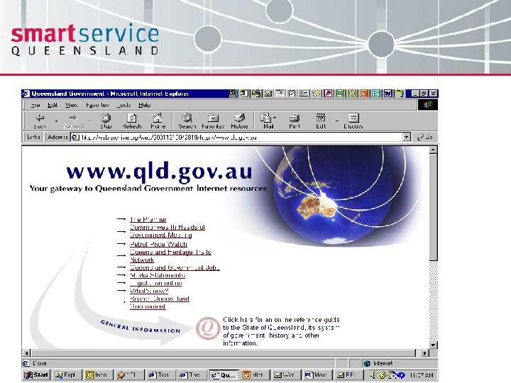
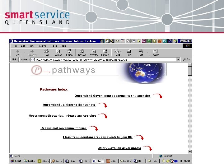
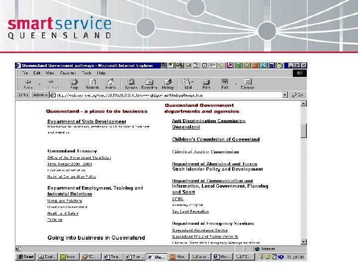
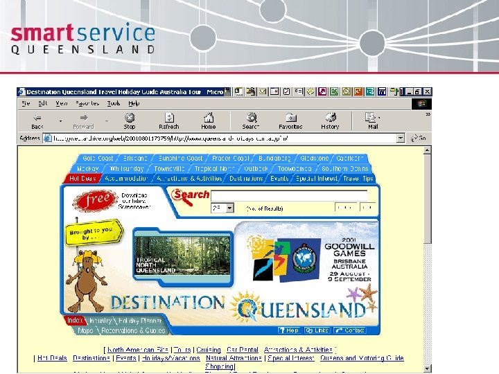
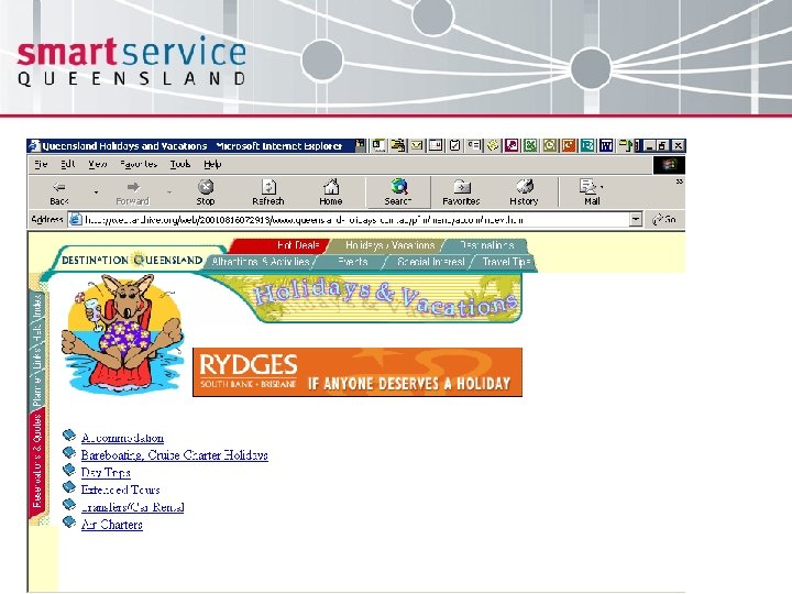
 Where we started from • Assumption that customers knew what agencies delivered services and information • Fragmented approach to service delivery • Presentation and navigation elements different between sites • Agency web development in silos with minimal cross agency collaboration • Accessibility being met at a minimal level
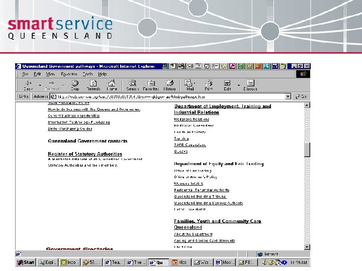
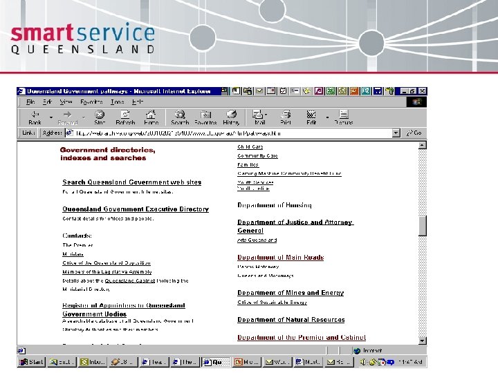
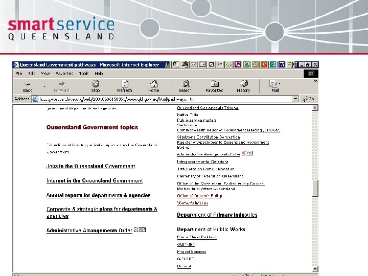
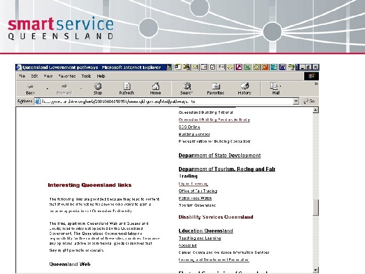
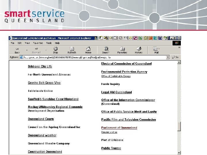
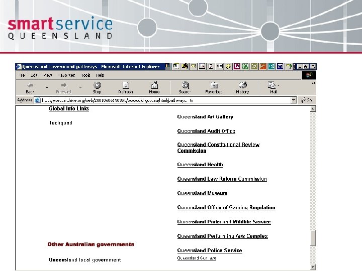
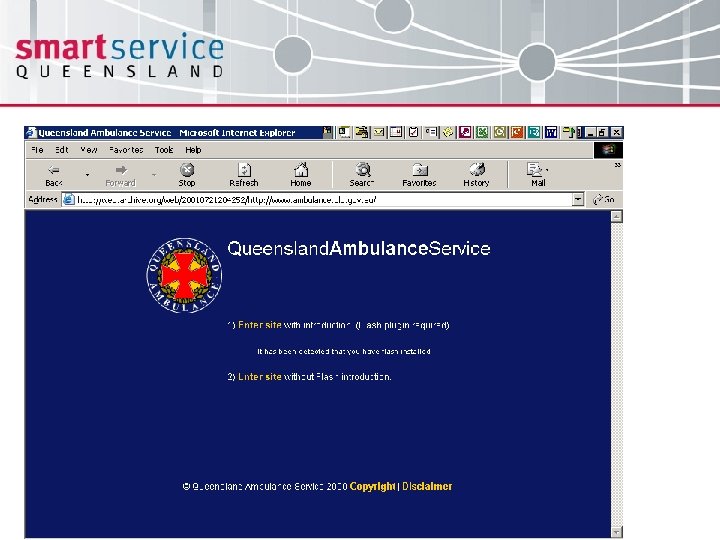
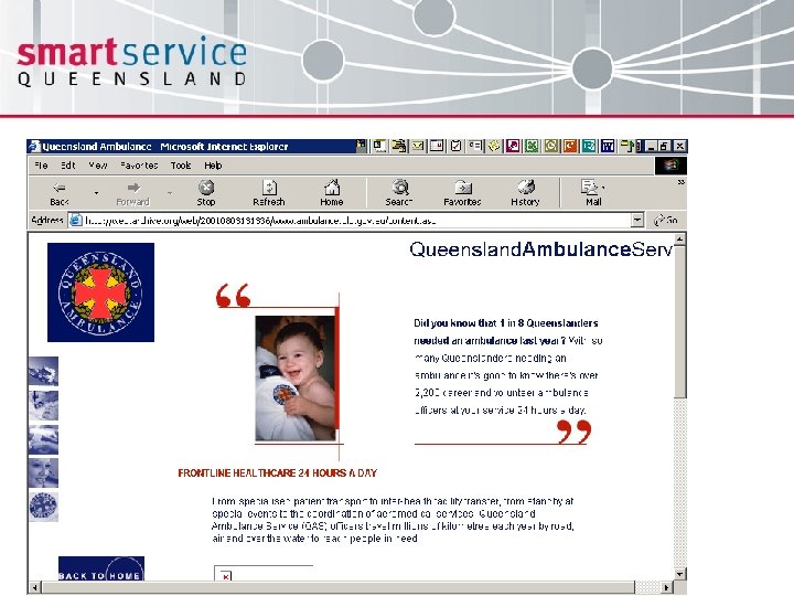
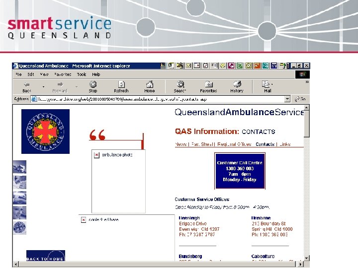
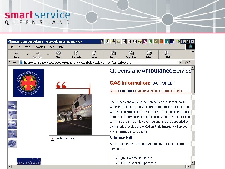
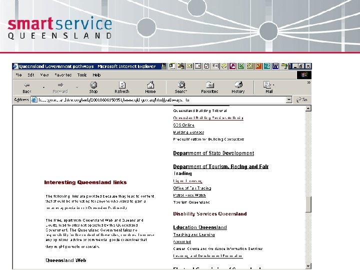
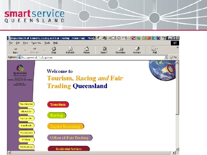
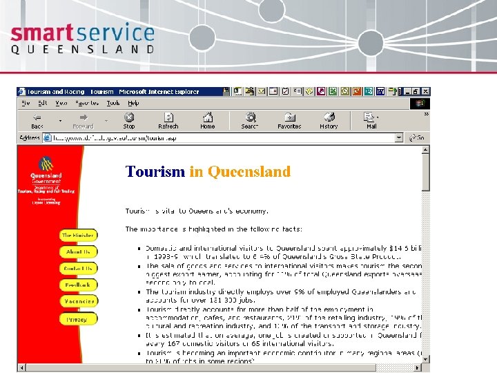
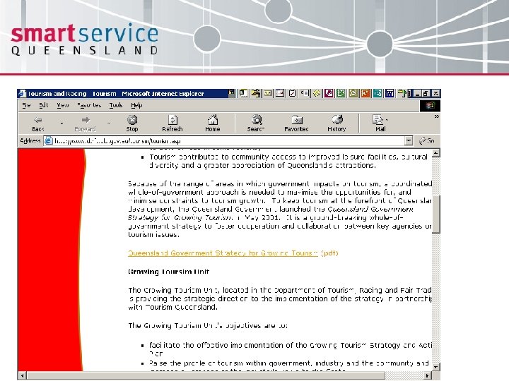
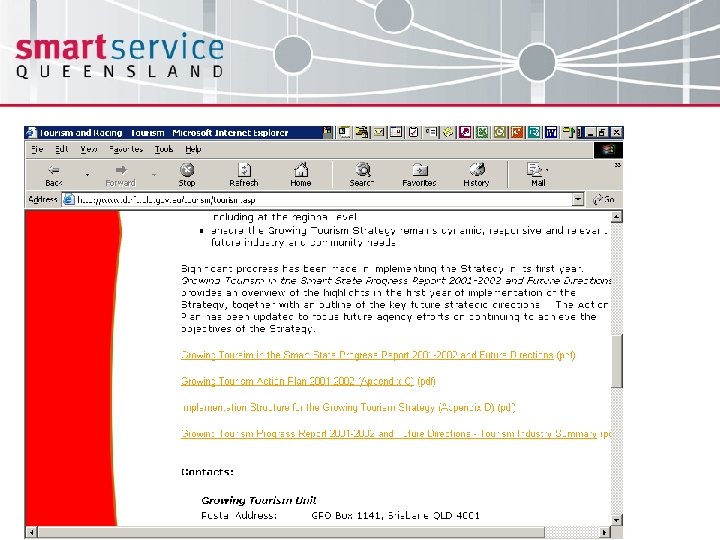
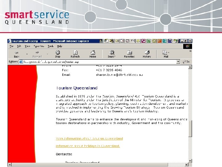
 Agency buy-in essential Over six months 50 officers from 15 agencies covered in working groups: • Presentation and navigation • Accessibility • Content management • Technical standards • Consistent user experience
 Consistent user experience • Cabinet endorsement of process in October 2001 • Change management plan developed to assist with agency buy-in and transition • Why the CUE is more than just a common look and feel
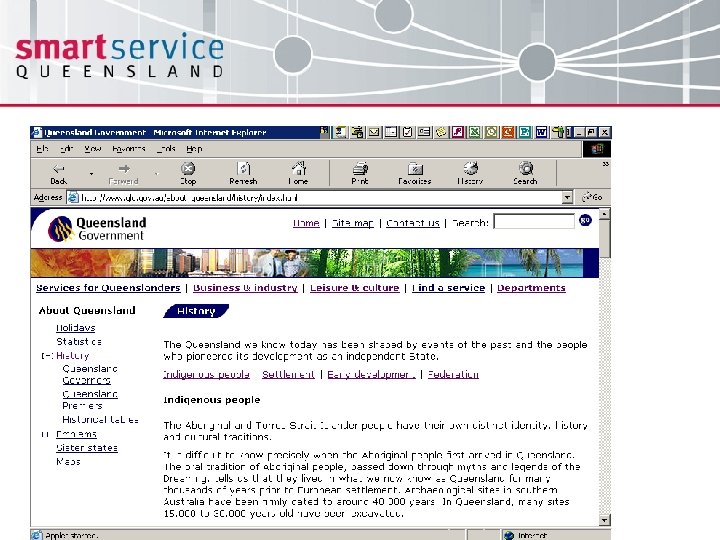
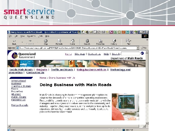
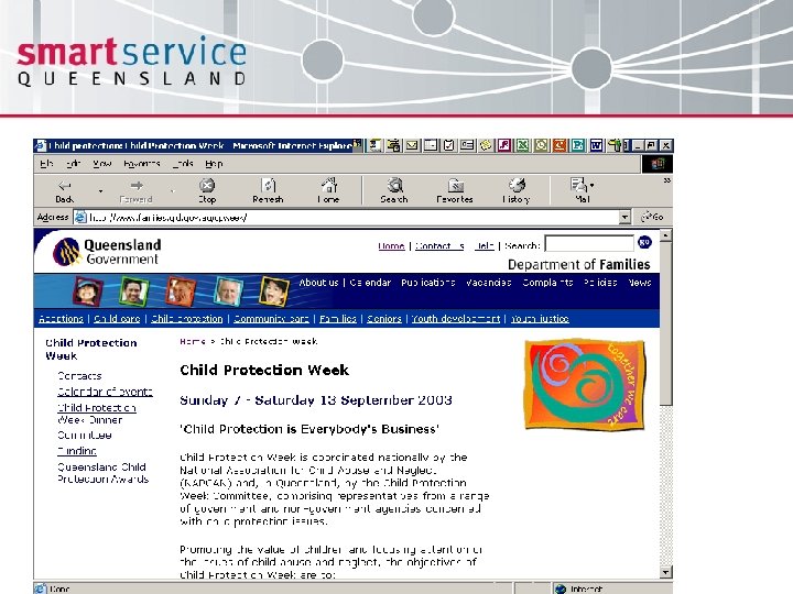
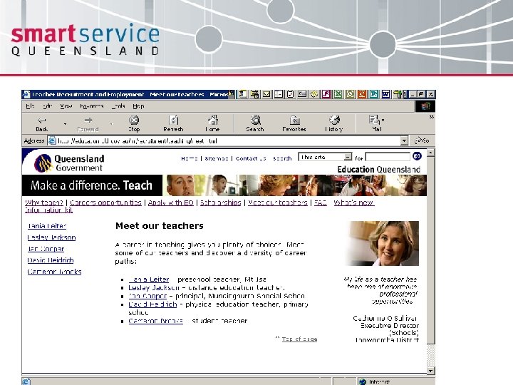
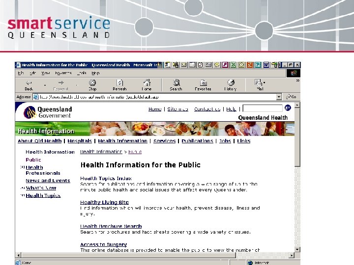
 Consistent presentation layer • Consistent branding elements • Consistent navigation – primary, secondary, utility & footer • Consistent framework for design – 41 pixels of freedom • Consistent fonts, background colours
 More then common look and feel Through the collaborative development of a Consistent user experience standard and template the Queensland Government is on track to achieving: • Consistent underlying code – major benefit if using assistive technologies (screen readers, no mouse, etc) • W 3 C Priority 1 and 2 compliance • Future proofing sites by building to international standards • Greater customer focus with Writing for the Web guide – plain English, inverted pyramids, chunking content, minimise scrolling
 CUE launched June 2002 October 2003 check point: • 20 core departments aligned (complete or advanced staged migration) • Remaining 6 core departments have projects in train to align CUE is now being rolled out progressively to other government sites – currently 17 other sites (eg tribunals, offices, commercial business units, statutory authorities, etc)
 Customer research supports direction Usability testing in December 2002 with 50 customers from a range of demographics, including business, found: • Widespread customer support for the CUE and an expectation that it should be rolled out across all government sites, including local government. Separation of powers issues not seen as preventing CUE implementation • Fine tuned areas of the standard and template based on theory • Further testing 4 October 2003
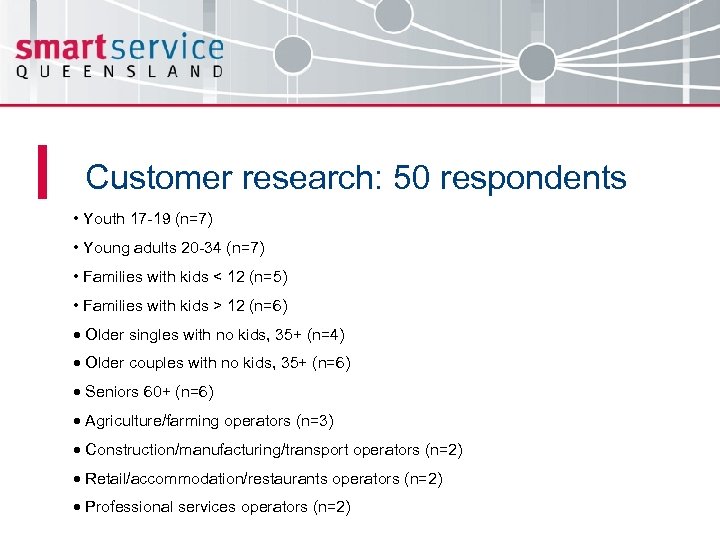 Customer research: 50 respondents • Youth 17 -19 (n=7) • Young adults 20 -34 (n=7) • Families with kids < 12 (n=5) • Families with kids > 12 (n=6) · Older singles with no kids, 35+ (n=4) · Older couples with no kids, 35+ (n=6) · Seniors 60+ (n=6) · Agriculture/farming operators (n=3) · Construction/manufacturing/transport operators (n=2) · Retail/accommodation/restaurants operators (n=2) · Professional services operators (n=2)
 CUE – benefits to customers • “If you make the sites consistent and user-friendly then this makes users come back and use the site again. All different types of designs just confuse people… They should be based on the same corporate image rather than all looking different. ” • That Government web sites not using the Consistent User Experience were “dodgy… like anyone could have put it up there…” • “Knowledge of brand also gives confidence - you expect. qld. gov. au to provide accurate and reliable information. ” • That the Consistent User Experience style template “…has a lot of information without overload… It has enough to get you started. ”
 CUE – benefits to customers • “…the way that each Department has its own ways of doing menus and websites at the moment… they should be consistent, with the same basic template of information available consistently throughout all pages. ” • That consistency in menus using the Consistent User Experience style template was “…good for navigation. ” • “The layout needs to be the same across different web sites…” Integrated Service Delivery Customer Feedback Project. Mc. Donnell-Phillips 2003.
 Business benefits from the CUE • Reduced development costs, reduced staff resources required for implementation and reduced time to market • Benefits further multiplied in subsequent implementations after staff and suppliers had “cut their teeth” on the code • Less focus on design and coding has meant more time for improved information architecture development and content • Improved skills development in public sector • Greater opportunities for career development as agencies now all publish similarly – don’t have to relearn as many processes
 Independent review supports direction A February 2003 review by KPMG discovered that the Queensland Government has: “…attained one of the highest levels of consistency in ‘look and feel’ in Online Government” And that this was achieved not just in visuals, but in informational content and presentation
 Recent research In December 2002 the Hiser Group conducted usability research into a range of government portals. One of its key findings was: “Users tend to look for information on government portal sites using topic categories rather than alternative navigation devices such as search, service assistants, A-Z lists or life events categories” The user experience of government online: recommendations for a citizen centric future 2 December 2002
 Customer focus makes the difference Twelve months prior to the Hiser Group’s results, Queensland already had this customer feedback Surveying customers (1780 community members and 500 business operators) identified how they wanted to deal with government: • Not just online, but multi-channel • Navigation by topics – don’t need to know the agency delivering the service • “One government” • A common look and feel
 What navigation model? • Whilst there were a number of models for information provision available within Australia and overseas on which the Gateway could have been based, Queensland chose to model the Gateway on the demonstrated needs of its customers • Queensland did not simply copy an existing model, but organised the presentation of information and services on extensive customer research and developed a more commonsense, user-friendly model of its own, tailored for its own audience
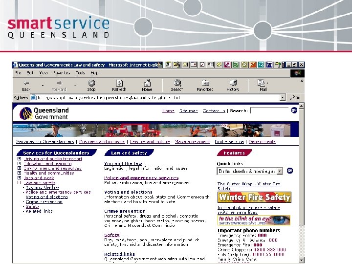
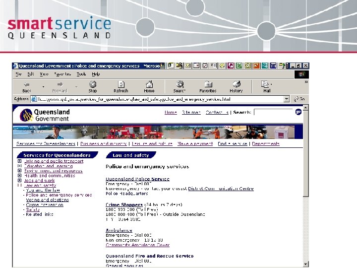
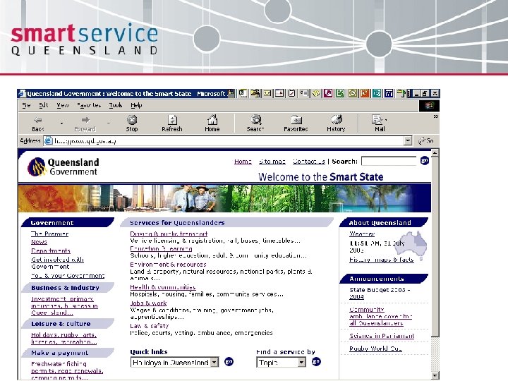
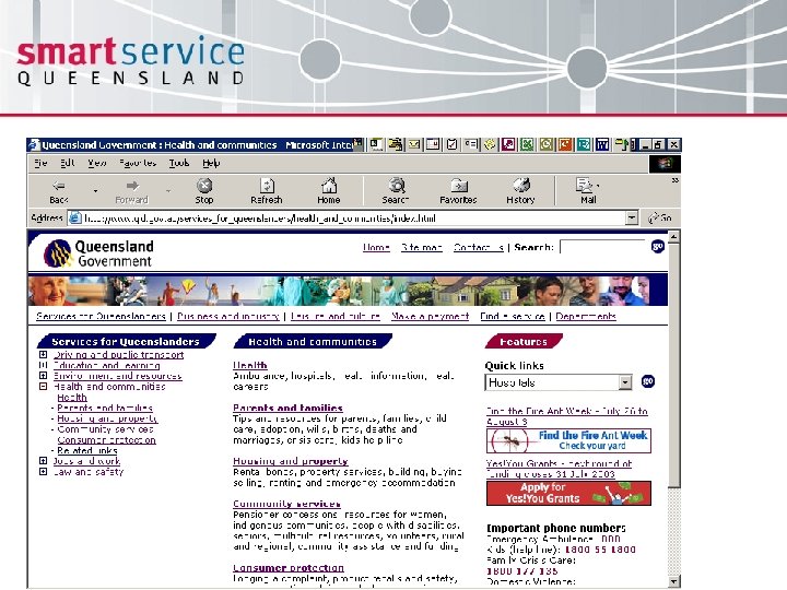
 Service cluster navigation model • Groups services into meaningful clusters from the customer perspective, making Government services and information more intuitive and easy to find and negating the need for the customer to understand Government structure • Cuts across traditional Agency lines to group together related services • Highly intuitive, enabling a customer to search for a service without needing to know the name of the Agency that provides it • Follows Pareto Principle – 80% of the queries will be about 20% of the content
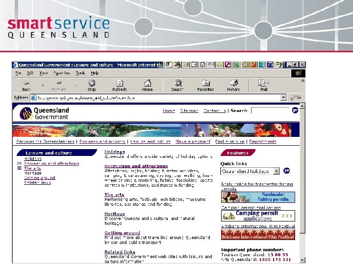
 Service clusters • Services for Queenslanders Driving and public transport Education and learning Environment and resources Health and communities Jobs and work Law and safety • Business and industry • Leisure and culture • Make a payment
 Customer research • ". . . headings are logical and easy to understand. " • ". . . clusters of categories seem comprehensive. " • ". . . the screen is well laid out so no scrolling is needed. " • “. . . the Queensland Government logo is an indication to let you know where you are. ” • “. . . it appears as if everything you would need is available within the site. ” • “. . . there are lots of options given and they are selfexplanatory. ”
 Customer research • provides a good overview of all government has to offer - “so you don’t have to go to individual sites. ” • “. . . uncluttered, all on one page with no scrolling, which is required, which is very good. I like having the weather and the time functions. ” • “. . . it seems to indicate the most popular links for example the ‘Driving’ heading, that's pretty self-explanatory. The headings certainly seem logical like ‘Driving and public transport’ timetables. ” • the site looks “. . . good with lots of information. ” Integrated Service Delivery Customer Feedback Project. Mc. Donnell-Phillips 2003.
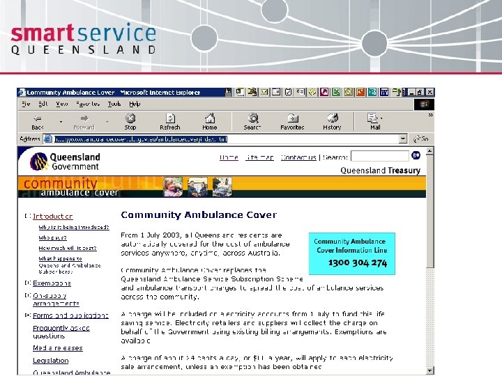
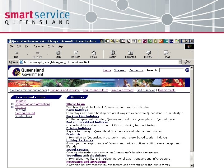
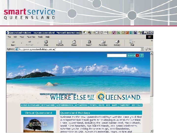
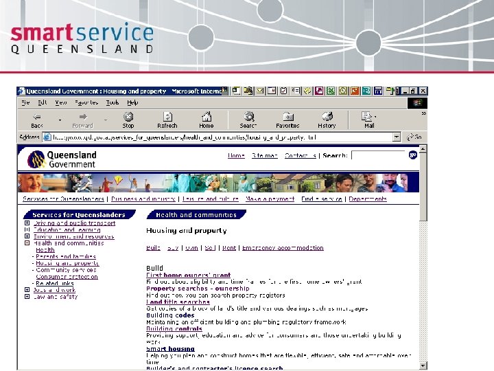
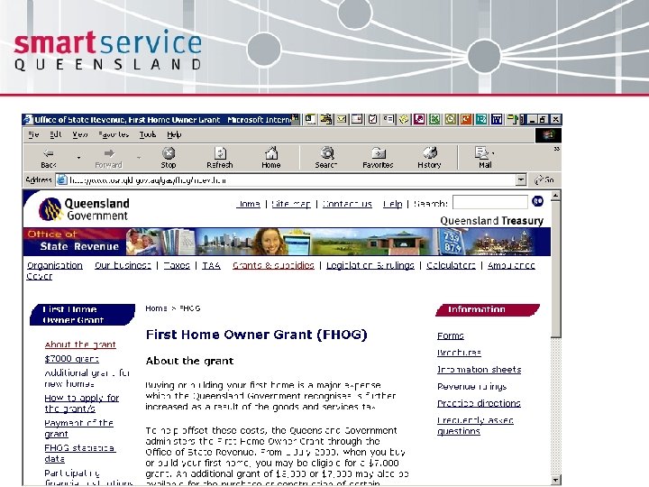
 Community ratings service usefulness • Ambulance cover (72% very useful, 15% some use) • Holidays in Queensland (56% very useful, 27% some use) • What to do when you buy a home (49% very useful, 22% some use)


 Conclusion • Credit for the development of a consistent user experience and delivery of customer focused content lies with each Government department for their commitment to whole-of-Government outcomes and enhanced customer service delivery • A collaborative cross agency Web Steering Committee comprising delegates from each CEO across Government was formed in July 2003 to guide the strategic and operational direction of generic service delivery and information provision on the Internet
 Contact details Gavin Atkinson Government Gateway Manager Smart Service Queensland Department of Innovation and Information Economy Phone (07) 3405 5813 Email Gavin. Atkinson@qld. gov. au Web http: //www. qld. gov. au


