
STUDYING PHENOMENA AND PROCESSES Grouping, descriptive statistics and

studying_phenomena_and_processes.ppt
- Размер: 3.5 Mегабайта
- Количество слайдов: 48
Описание презентации STUDYING PHENOMENA AND PROCESSES Grouping, descriptive statistics and по слайдам
STUDYING PHENOMENA AND PROCESSES Grouping, descriptive statistics and graphical visualization
DATA SETS CLASSIFICATION By number of variables there are for each elementary unit (=people, companies, countries, cities, etc. ) By the kind of measurement (numbers of categories in each case) Whethere is a time sequence Newly created or was previously created by someone else
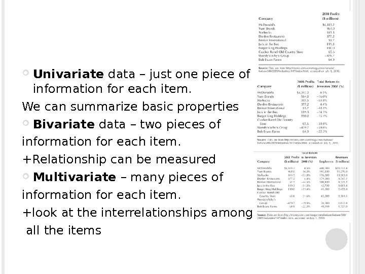
Univariate data – just one piece of information for each item. We can summarize basic properties Bivariate data – two pieces of information for each item. +Relationship can be measured Multivariate – many pieces of information for each item. +look at the interrelationships among all the items
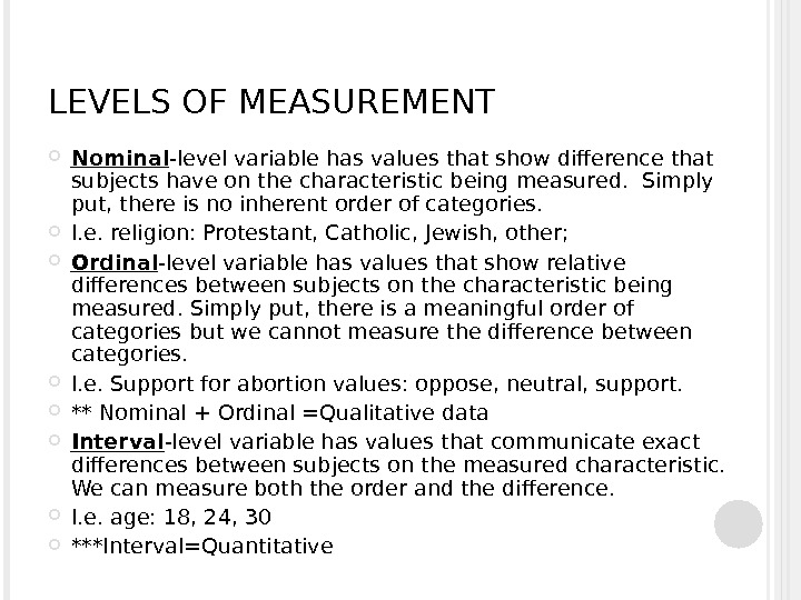
LEVELS OF MEASUREMENT Nominal -level variable has values that show difference that subjects have on the characteristic being measured. Simply put, there is no inherent order of categories. I. e. religion: Protestant, Catholic, Jewish, other; Ordinal -level variable has values that show relative differences between subjects on the characteristic being measured. Simply put, there is a meaningful order of categories but we cannot measure the difference between categories. I. e. Support for abortion values: oppose, neutral, support. ** Nominal + Ordinal =Qualitative data Interval -level variable has values that communicate exact differences between subjects on the measured characteristic. We can measure both the order and the difference. I. e. age: 18, 24, 30 ***Interval=Quantitative
QUANTITATIVE DATA (NUMBERS) Discrete quantitative data can assume values only from a list of specific numbers. I. e. gender of students, coded 0=male, 1=female; Number of kids in household: 1=1 kid, 2=2 kids, 3=3 kids, 4=4 or more kids; Equipment breakdowns on a factory in the past 24 hours, out of 20 working machines Continuous quantitative data – all positive numbers, all values between 0% and 100%.
Grouping statistical data A data class is group of data which is related by some user defined property. For example, if you were collecting the ages of the people you met as you walked down the street, you could group them into classes as those in their teens, twenties, thirties, forties and so on. Each of those groups is called a class. Each of those classes is of a certain width and this is referred to as the Class Interval or Class Size. This class interval is very important when it comes to drawing Histograms and Frequency diagrams. All the classes may have the same class size or they may have different classes sizes depending on how you group your data. The class interval is always a whole number. Number of intervals: n=1+3, 322*lg. N (N – number of set values) Interval size for equal intervals: (Highest Value-Lowest Value)/no of classes Size should be a whole number. I. e. , if you get 2, 7 – your class size is
Grouping in Excel I. e. you have a raw set of data in excel. You have numbers of different people’s ages. Eg. 28 years old -50 ppl, 60 years old – 10 ppl, 14 years old – 10 ppl, etc. . You can sort the data by people’s ages and then, using the formula, count the length of an interval. Put the intervals and using the sum function, organize the data into intervals. Or function =SUMMPRODUCT
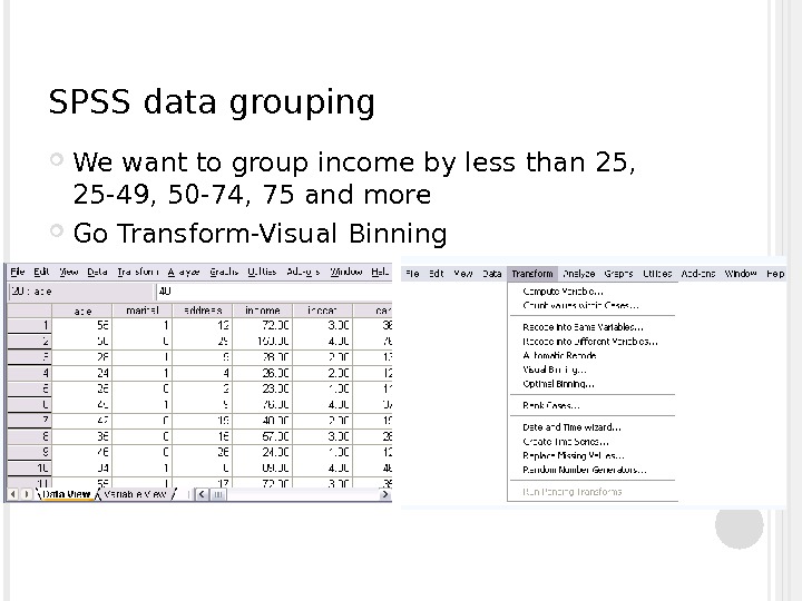
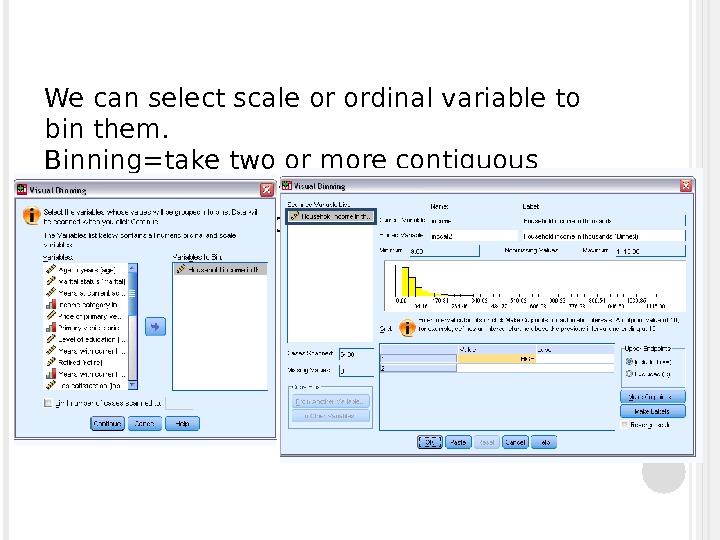
SPSS data grouping We want to group income by less than 25, 25 -49, 50 -74, 75 and more Go Transform-Visual Binning
We can select scale or ordinal variable to bin them. Binning=take two or more contiguous values and group them into a category Press “make cutpoints”
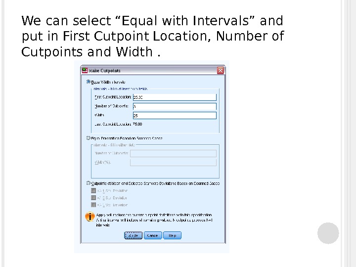
We can select “Equal with Intervals” and put in First Cutpoint Location, Number of Cutpoints and Width.
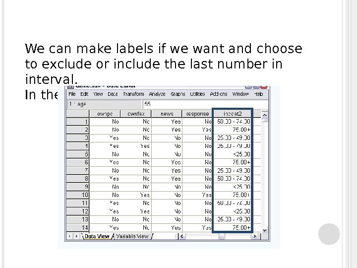
We can make labels if we want and choose to exclude or include the last number in interval. In the end, we get:
DESCRIPTIVE STATISTICS Measures of central tendency — identify the most typical value or best representative of a set of empirical data Measures of dispersion- amount of variation around the most representative value
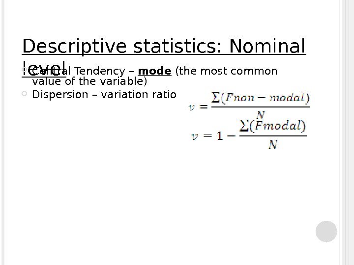
Descriptive statistics: Nominal level Central Tendency – mode (the most common value of the variable) Dispersion – variation ratio
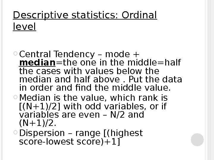
Descriptive statistics: Ordinal level Central Tendency – mode + median =the one in the middle=half the cases with values below the median and half above. Put the data in order and find the middle value. Median is the value, which rank is [(N+1)/2] with odd variables, or if variables are even – N/2 and (N+1)/2. Dispersion – range [(highest score-lowest score)+1]
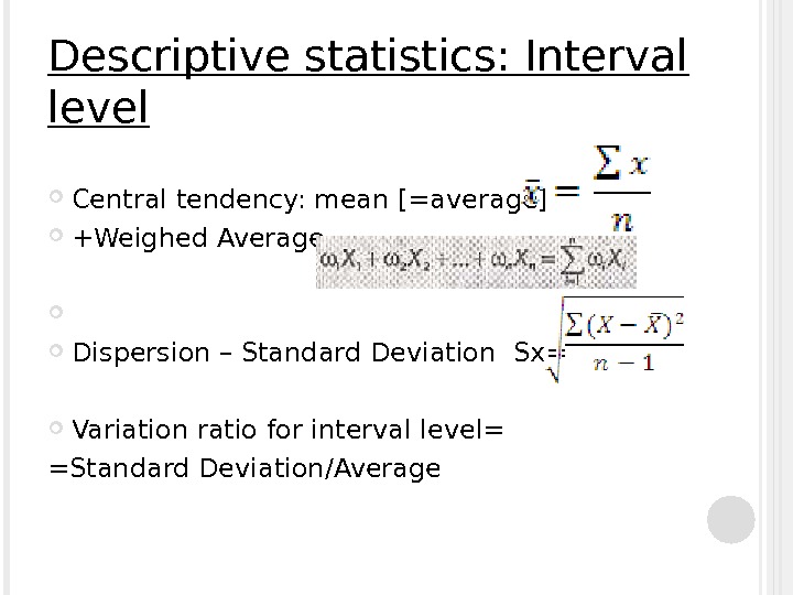
Descriptive statistics: Interval level Central tendency: mean [=average] +Weighed Average Dispersion – Standard Deviation Sx= Variation ratio for interval level= =Standard Deviation/Average
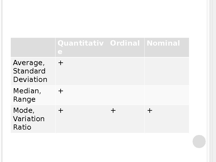
Quantitativ e Ordinal Nominal Average, Standard Deviation + Median, Range + Mode, Variation Ratio + + +
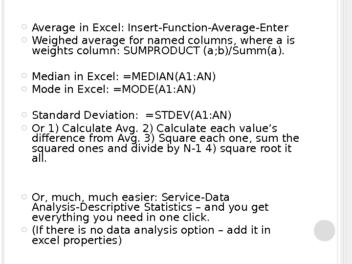
Average in Excel: Insert-Function-Average-Enter Weighed average for named columns, where a is weights column: SUMPRODUCT (a; b)/Summ(a). Median in Excel: =MEDIAN(A 1: AN) Mode in Excel: =MODE(A 1: AN) Standard Deviation: =STDEV(A 1: AN) Or 1) Calculate Avg. 2) Calculate each value’s difference from Avg. 3) Square each one, sum the squared ones and divide by N-1 4) square root it all. Or, much easier: Service-Data Analysis-Descriptive Statistics – and you get everything you need in one click. (If there is no data analysis option – add it in excel properties)
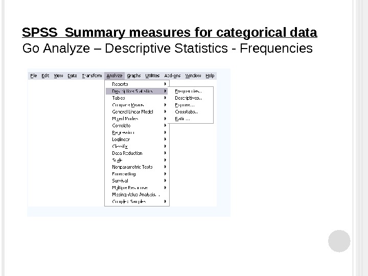
SPSS Summary measures for categorical data Go Analyze – Descriptive Statistics — Frequencies
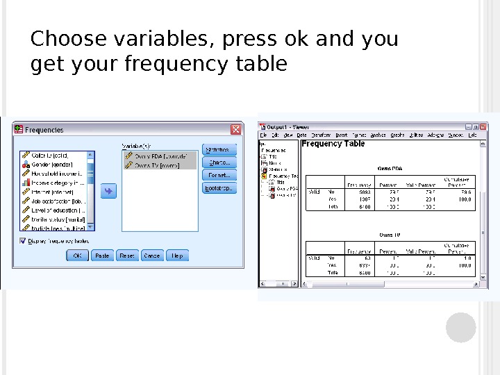
Choose variables, press ok and you get your frequency table
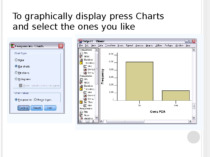
To graphically display press Charts and select the ones you like
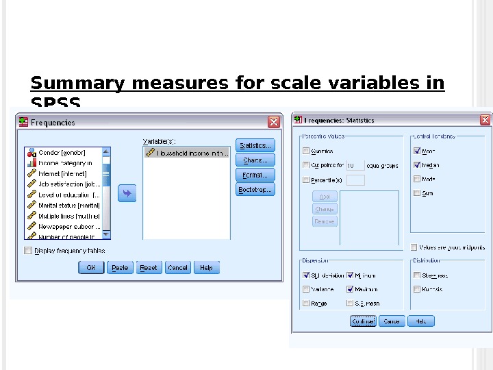
Summary measures for scale variables in SPSS * Go Analyze-Descriptive Statistics-Frequencies * Choose variables * Click “statistics”, select the ones you need.
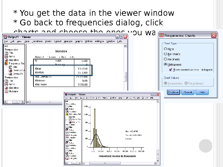
* You get the data in the viewer window * Go back to frequencies dialog, click charts and choose the ones you want
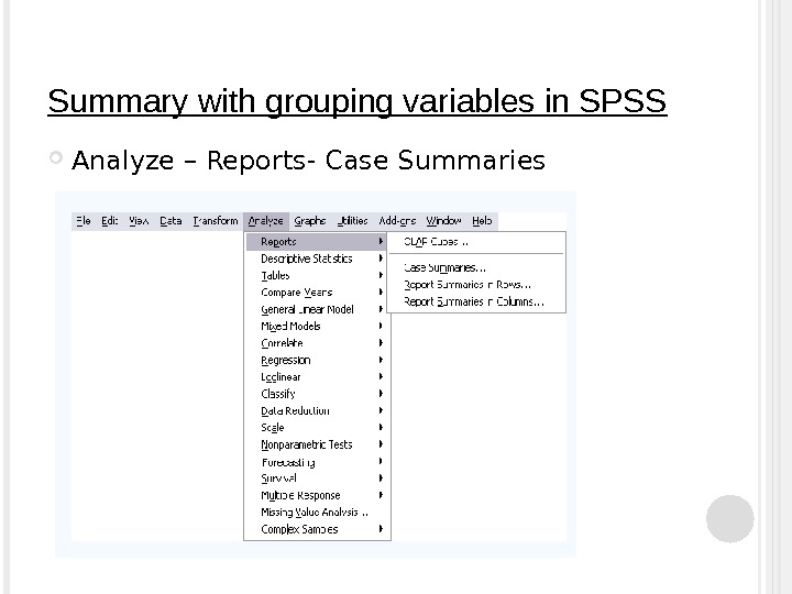
Summary with grouping variables in SPSS Analyze – Reports- Case Summaries
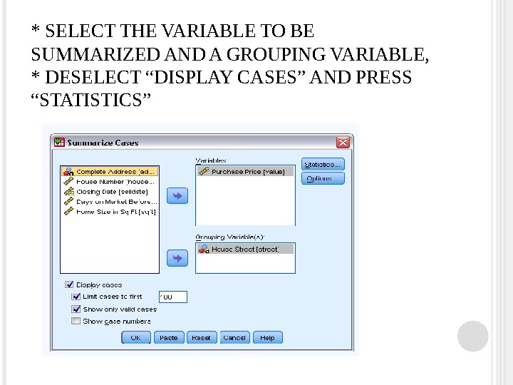
* SELECT THE VARIABLE TO BE SUMMARIZED AND A GROUPING VARIABLE, * DESELECT “DISPLAY CASES” AND PRESS “STATISTICS”
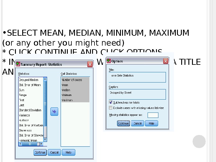
• SELECT MEAN, MEDIAN, MINIMUM, MAXIMUM (or any other you might need) * CLICK CONTINUE AND CLICK OPTIONS * IN AN OPTION WINDOW, YOU CAN GIVE A TITLE AND A CAPTION
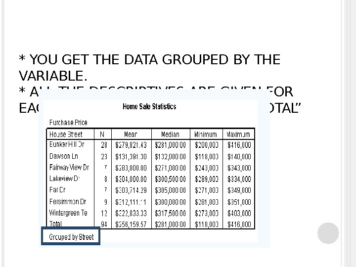
* YOU GET THE DATA GROUPED BY THE VARIABLE. * ALL THE DESCRIPTIVES ARE GIVEN FOR EACH VARIABLE, AS WELL AS FOR “TOTAL”
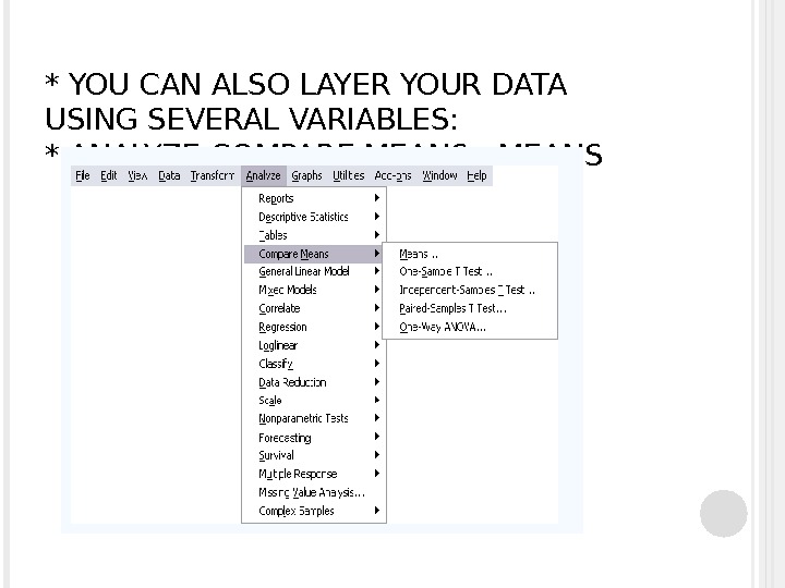
* YOU CAN ALSO LAYER YOUR DATA USING SEVERAL VARIABLES: * ANALYZE-COMPARE MEANS — MEANS
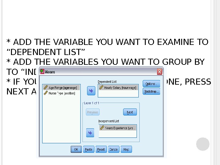
* ADD THE VARIABLE YOU WANT TO EXAMINE TO “DEPENDENT LIST” * ADD THE VARIABLES YOU WANT TO GROUP BY TO “INDEPENDENT LIST” * IF YOU WANT TO HAVE MORE THAN ONE, PRESS NEXT AND ADD THEM
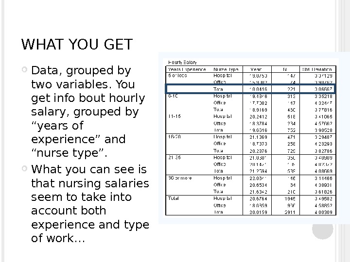
WHAT YOU GET Data, grouped by two variables. You get info bout hourly salary, grouped by “years of experience” and “nurse type”. What you can see is that nursing salaries seem to take into account both experience and type of work…
You can also select certain cases that follow the rule you choose (using if=, if> and any functions), as well as sort your data. (Data-Select Cases; Data-Sort)
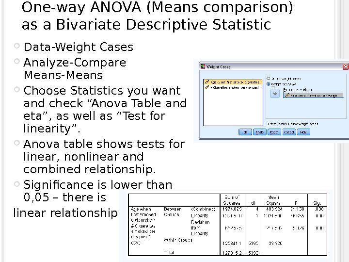
One-way ANOVA (Means comparison) as a Bivariate Descriptive Statistic Data-Weight Cases Analyze-Compare Means-Means Choose Statistics you want and check “Anova Table and eta”, as well as “Test for linearity”. Anova table shows tests for linear, nonlinear and combined relationship. Significance is lower than 0, 05 – there is linear relationship.
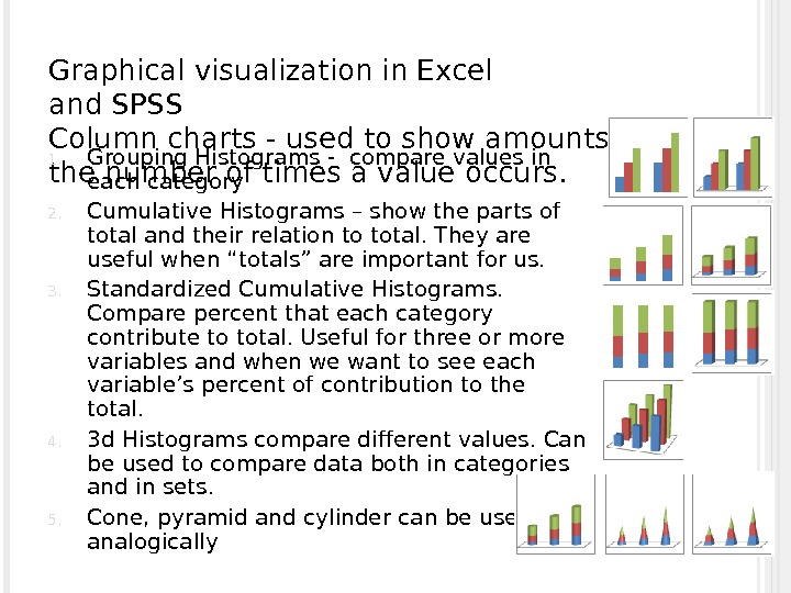
Graphical visualization in Excel and SPSS Column charts — used to show amounts or the number of times a value occurs. 1. Grouping Histograms — compare values in each category 2. Cumulative Histograms – show the parts of total and their relation to total. They are useful when “totals” are important for us. 3. Standardized Cumulative Histograms. Compare percent that each category contribute to total. Useful for three or more variables and when we want to see each variable’s percent of contribution to the total. 4. 3 d Histograms compare different values. Can be used to compare data both in categories and in sets. 5. Cone, pyramid and cylinder can be used analogically
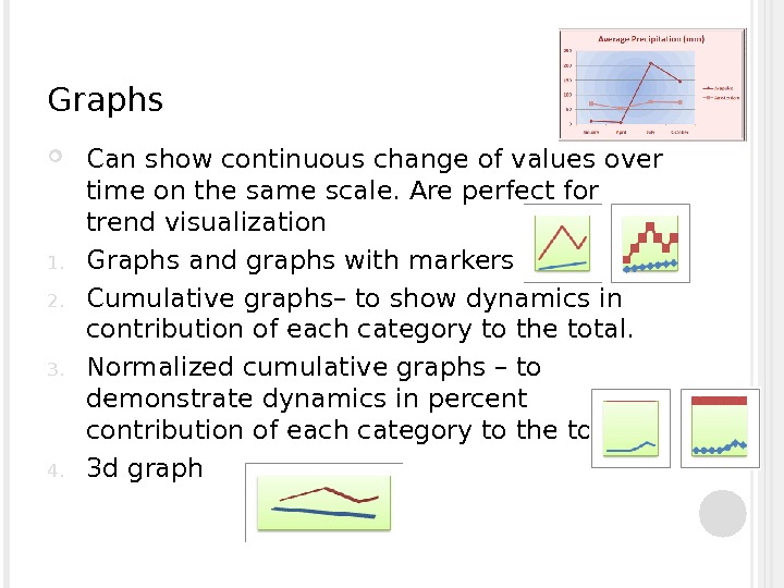
Graphs Can show continuous change of values over time on the same scale. Are perfect for trend visualization 1. Graphs and graphs with markers 2. Cumulative graphs– to show dynamics in contribution of each category to the total. 3. Normalized cumulative graphs – to demonstrate dynamics in percent contribution of each category to the total 4. 3 d graph
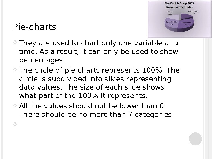
Pie-charts T hey are used to chart only one variable at a time. As a result, it can only be used to show percentages. The circle of pie charts represents 100%. The circle is subdivided into slices representing data values. The size of each slice shows what part of the 100% it represents. All the values should not be lower than 0. There should be no more than 7 categories.
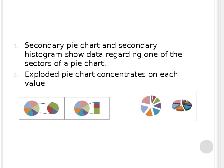
1. Secondary pie chart and secondary histogram show data regarding one of the sectors of a pie chart. 2. Exploded pie chart concentrates on each value
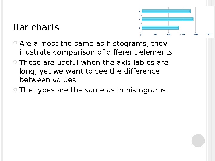
Bar charts Are almost the same as histograms, they illustrate comparison of different elements These are useful when the axis lables are long, yet we want to see the difference between values. The types are the same as in histograms.
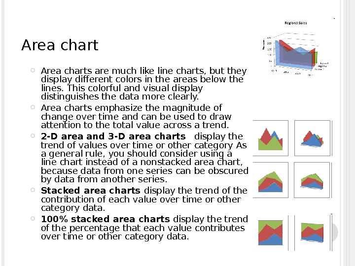
Area charts are much like line charts, but they display different colors in the areas below the lines. This colorful and visual display distinguishes the data more clearly. Area charts emphasize the magnitude of change over time and can be used to draw attention to the total value across a trend. 2 -D area and 3 -D area charts display the trend of values over time or other category As a general rule, you should consider using a line chart instead of a nonstacked area chart, because data from one series can be obscured by data from another series. Stacked area charts display the trend of the contribution of each value over time or other category data. 100% stacked area charts display the trend of the percentage that each value contributes over time or other category data.
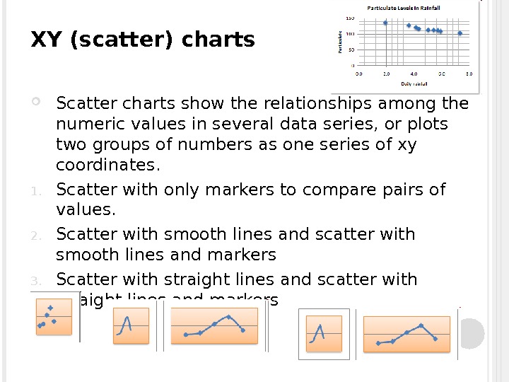
XY (scatter) charts Scatter charts show the relationships among the numeric values in several data series, or plots two groups of numbers as one series of xy coordinates. 1. Scatter with only markers to compare pairs of values. 2. Scatter with smooth lines and scatter with smooth lines and markers 3. Scatter with straight lines and scatter with straight lines and markers
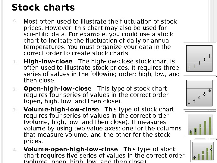
Stock charts M ost often used to illustrate the fluctuation of stock prices. However, this chart may also be used for scientific data. For example, you could use a stock chart to indicate the fluctuation of daily or annual temperatures. You must organize your data in the correct order to create stock charts. 1. High-low-close The high-low-close stock chart is often used to illustrate stock prices. It requires three series of values in the following order: high, low, and then close. 2. Open-high-low-close This type of stock chart requires four series of values in the correct order (open, high, low, and then close). 3. Volume-high-low-close This type of stock chart requires four series of values in the correct order (volume, high, low, and then close). It measures volume by using two value axes: one for the columns that measure volume, and the other for the stock prices. 4. Volume-open-high-low-close This type of stock chart requires five series of values in the correct order (volume, open, high, low, and then close).
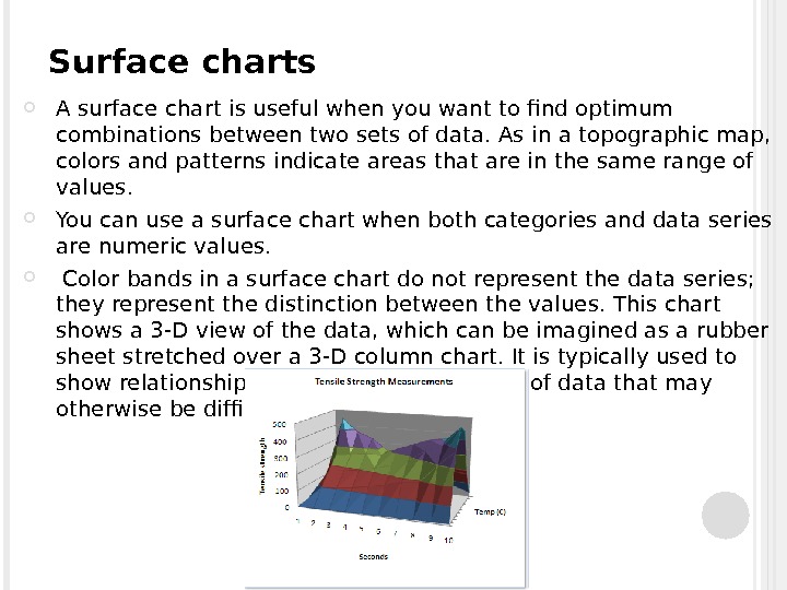
Surface charts A surface chart is useful when you want to find optimum combinations between two sets of data. As in a topographic map, colors and patterns indicate areas that are in the same range of values. You can use a surface chart when both categories and data series are numeric values. Color bands in a surface chart do not represent the data series; they represent the distinction between the values. This chart shows a 3 -D view of the data, which can be imagined as a rubber sheet stretched over a 3 -D column chart. It is typically used to show relationships between large amounts of data that may otherwise be difficult to see.
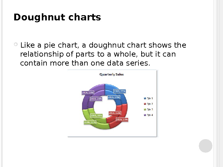
Doughnut charts Like a pie chart, a doughnut chart shows the relationship of parts to a whole, but it can contain more than one data series.
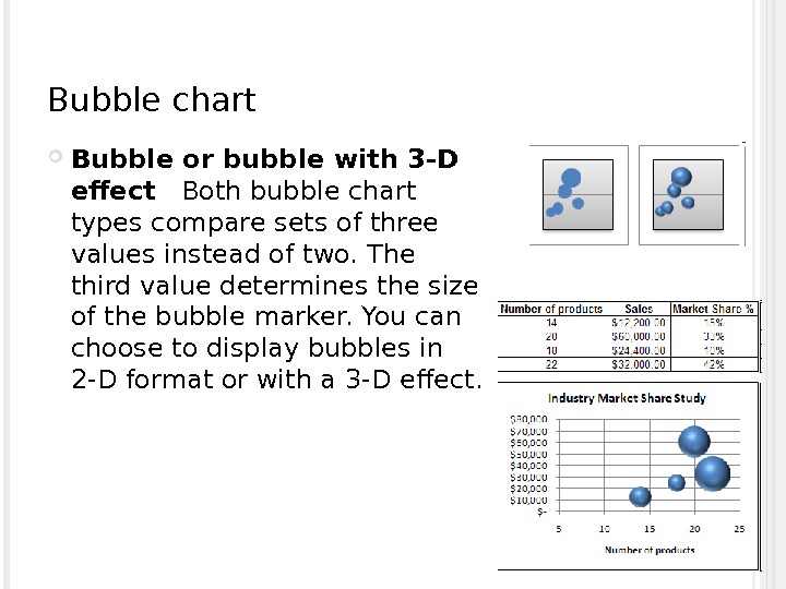
Bubble chart Bubble or bubble with 3 -D effect Both bubble chart types compare sets of three values instead of two. The third value determines the size of the bubble marker. You can choose to display bubbles in 2 -D format or with a 3 -D effect.
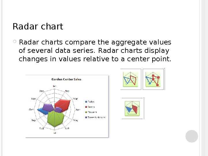
Radar charts compare the aggregate values of several data series. R adar charts display changes in values relative to a center point.
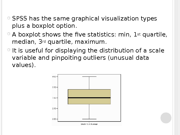
SPSS has the same graphical visualization types plus a boxplot option. A boxplot shows the five statistics: min, 1 st quartile, median, 3 rd quartile, maximum. It is useful for displaying the distribution of a scale variable and pinpoiting outliers (unusual data values).
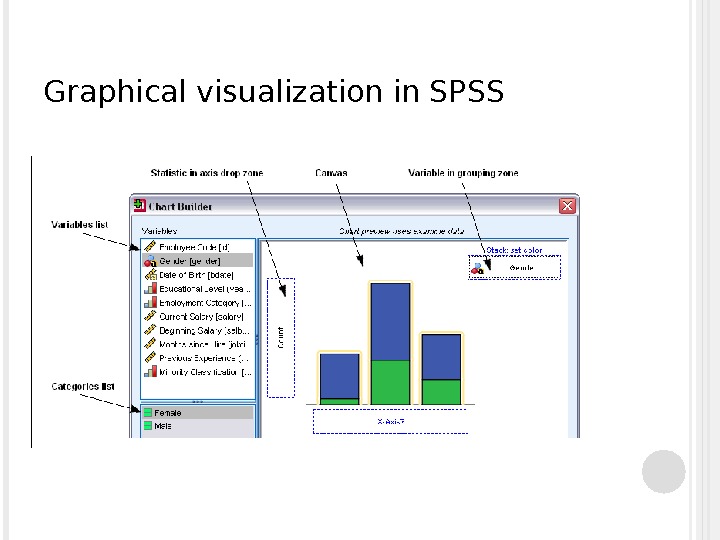
Graphical visualization in SPSS
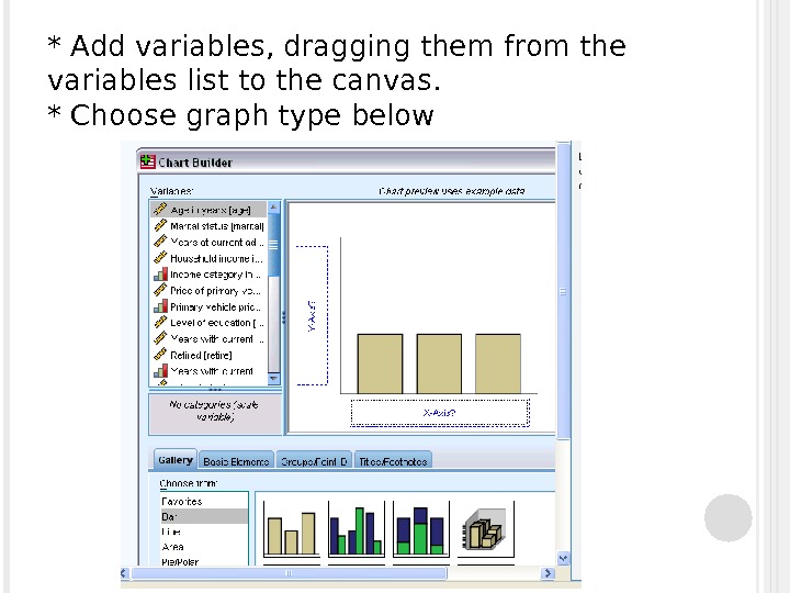
* Add variables, dragging them from the variables list to the canvas. * Choose graph type below
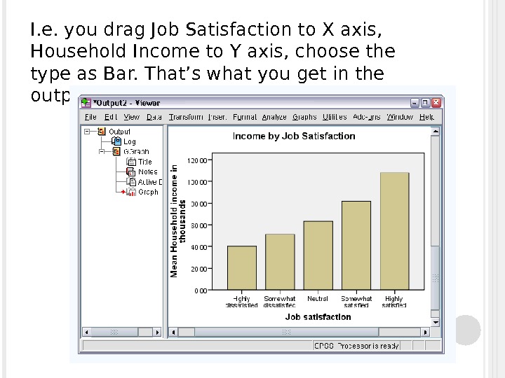
I. e. you drag Job Satisfaction to X axis, Household Income to Y axis, choose the type as Bar. That’s what you get in the output window:
Any questions?