 Step-3 Principles of Good Interface and Screen Design
 What Users Want n n n n An orderly, clean appearance An obvious indication of what is being shown & what should be done with it Expected information located where it should be A clear indication of what relates to what, including options, headings, captions, data, & so forth Plain, simple English (Kazakh, Russian) A simple way of finding out what is in a system & how to get it out A clear indication of when an action can make a permanent change in the data or system
 MAXIM n People will spend many, many hours staring at your screens.
 Interface Design Goals n - To make an interface easy & pleasant to use, then, the goal in design is to Reduce visual work Reduce intellectual work Reduce memory work Reduce motor work Minimize or eliminate any burdens or instructions imposed by technology
 The Test for a Good Design n n Can all screen or Web page elements be identified by cues other than by reading the words that make them up? The best interfaces make everything on the screen obvious.
 Screen & Web Page Meaning & Purpose n n n - Each element Every control All text The screen organization All emphasis Each color Every graphic All screen animation Each message All forms of feedback Must Have meaning to users Serve a purpose in performing tasks.
 Signals & Noise n n n Noise is useless information. Signals are useful information. Noise is distracting, reduces clarity, & contributes to info overload. Minimize noise & maximize signals. Ex: World’s Worst Website
 Consistency n n n Follow the same conventions & rules across all related interfaces Deviate only when there is a clear benefit for the user MYTH: Users can get used to anything
 Starting Point n n n - Upper-left corner Focus user attention on the most important parts of a screen Textual displays Top-to-bottom, left-to-right Reading text
 Starting Point (cont. ) n - - Graphical & Web Displays People tend to look at text first, not images Larger type dominates over smaller type Changing info is looked at before nonchanging info
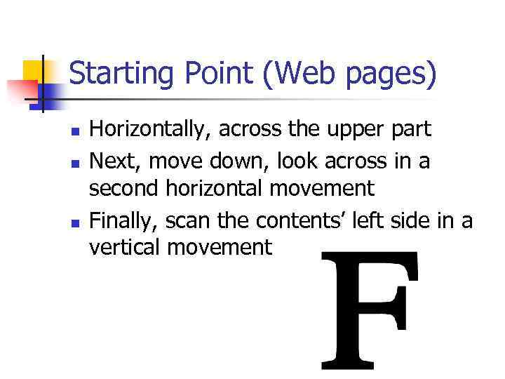 Starting Point (Web pages) n n n Horizontally, across the upper part Next, move down, look across in a second horizontal movement Finally, scan the contents’ left side in a vertical movement
 Ordering of Data & Content n n - Divide info into units that are logical, meaningful, & sensible Possible ordering schemes: Conventional Sequence of use Frequency of use Function Importance General to specific
 MAXIM n n Aesthetic designs are perceived as easier to use than less-aesthetic designs. Contrast, colors, grouping, & alignment
 Other principles n n n n Balance Symmetry Regularity Predictability Sequentiality Economy Proportion Etc. See p. 142
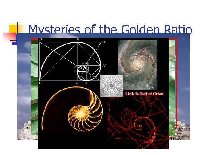
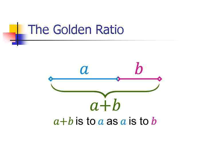 The Golden Ratio
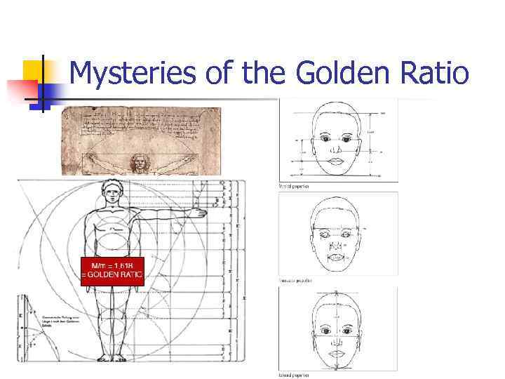 Mysteries of the Golden Ratio
 Mysteries of the Golden Ratio
 Homework-2