

246a9d082d2ec01280242f951bcc99e3.ppt
- Количество слайдов: 35
 Statistics 270 - Lecture 2
 • Introduced main types") • Last class began Chapter 1 (Section 1. 1) • Introduced main types of data: Quantitative and Qualitative (or Categorical) • Discussed ways to describe qualitative data with plots: Bar Chart & Pie Chart • Which is more flexible - Pie Chart or Bar Chart? Why? • Is there a difference in shape of a Bar Chart if show counts or percentages?
• Last class began Chapter 1 (Section 1. 1) • Introduced main types of data: Quantitative and Qualitative (or Categorical) • Discussed ways to describe qualitative data with plots: Bar Chart & Pie Chart • Which is more flexible - Pie Chart or Bar Chart? Why? • Is there a difference in shape of a Bar Chart if show counts or percentages?
 • What is") Important Stuff • Statistics and Actuarial Science Stats Lab (Statistics Workshop) • What is Stats Lab for? : One-on-one help is available during its operation hours. • Where is it? The Stats Lab is located in K 9516 (inside k 9510). How does the Stats Lab Work? • Statistics Lab Schedule • The Statistics Workshop opens for regular use from the second week of classes. The hours will depend on the amount of T. A. time available and will be posted at the end of the first week of classes. The Workshop will be open only when there is a T. A. on duty. • Typically, Mon-Fri: 9: 30 -16: 30
Important Stuff • Statistics and Actuarial Science Stats Lab (Statistics Workshop) • What is Stats Lab for? : One-on-one help is available during its operation hours. • Where is it? The Stats Lab is located in K 9516 (inside k 9510). How does the Stats Lab Work? • Statistics Lab Schedule • The Statistics Workshop opens for regular use from the second week of classes. The hours will depend on the amount of T. A. time available and will be posted at the end of the first week of classes. The Workshop will be open only when there is a T. A. on duty. • Typically, Mon-Fri: 9: 30 -16: 30
 Important Stuff • Course web page can be found: www. stat. sfu. ca/~dbingham • Download lecture notes day before class
 Important Stuff • Assignments: 5 -7 of them • Will be due Friday, before 4: 30 in boxes outside lab • The boxes are labelled by course and also by the first letter of your last name • Note: 1. Late assignments will not be accepted 2. Assignments placed in the wrong box (e. g. , stat 201) will not be accepted 3. Class email list…watch out
 Important Stuff • Office hours: M-W 3: 00 -4: 00…or appointment… • Mid-Term: Friday, February 17 …. Day before reading break.
 • Some suggested problems: • Chapter 1: 1, 5, 13 or 14, 19, 26, 29, 33 • Today: • Finish with Chapter 1. 2, 1. 3 and start 1. 4 • Will do all of Chapter 1…except stem-leaf & time plots • Please read Chapter 1…nice introduction
 Plots for Quantitative Variables • Can summarize quantitative data using plots • Most common plots - histogram and box-plots • Will introduce box-plots later • Must first distinguish between types of quantitative data
 Types of Quantitative Data • Discrete Variable: A variable is discrete if the set of possible values is finite or else is countably infinite • Continuous Variable: A variable is continuous if its possible values consist of interval(s) on the real line
 • In a study of productivity, a large nuber of authors") Example (discrete data) • In a study of productivity, a large nuber of authors were classified according to the number of articles they published during a particular period of time.
Example (discrete data) • In a study of productivity, a large nuber of authors were classified according to the number of articles they published during a particular period of time.
 • Experiment was conducted to investigate the muzzle velocity of a") Example (continuous data) • Experiment was conducted to investigate the muzzle velocity of a anti-personnel weapon (King, 1992) • Sample of size 16 was taken and the muzzle velocity (MPH) recorded
Example (continuous data) • Experiment was conducted to investigate the muzzle velocity of a anti-personnel weapon (King, 1992) • Sample of size 16 was taken and the muzzle velocity (MPH) recorded
 of values") Histogram – Discrete Data • Uses rectangles to show number (or percentage) of values in intervals • Y-axis usually displays counts or percentages • X-Axis usually shows intervals • Rectangles are all the same width
Histogram – Discrete Data • Uses rectangles to show number (or percentage) of values in intervals • Y-axis usually displays counts or percentages • X-Axis usually shows intervals • Rectangles are all the same width
 Constructing a Histogram – Discrete Data • Determine frequency of each value (e. g. , number of articles) • Mark the possible values for the distribution on an axis (usually the x-axis) • Draw a rectangle over each value with height is the frequency (or relative frequency)
") Example (discrete data)
Example (discrete data)
 of values") Histogram – continuous data • Uses rectangles to show number (or percentage) of values in intervals • Y-axis usually displays counts or percentages • X-Axis usually shows intervals • Rectangles are all the same width
Histogram – continuous data • Uses rectangles to show number (or percentage) of values in intervals • Y-axis usually displays counts or percentages • X-Axis usually shows intervals • Rectangles are all the same width
 Constructing a Histogram – continuous data • Find minimum and maximum values of the data • Divide range of data into non-overlapping intervals of equal length • Count number of observations in each interval • Height of rectangle is number (or percentage) of observations falling in the interval • How many categories?
 Example • Experiment was conducted to investigate the muzzle velocity of a anti-personnel weapon (King, 1992) • Sample of size 16 was taken and the muzzle velocity (MPH) recorded
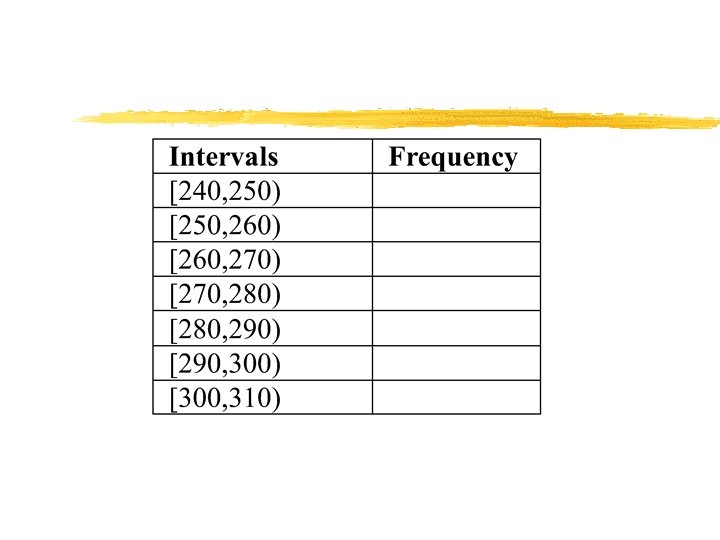
 • What are the minimum and maximum values? • How do we divide up the range of data? • What happens if have too many intervals? • Too Few intervals? • Suppose have intervals from 240 -250 and 250 -260. In which interval is the data point 250 included?
 Histogram of Muzzle Velocity
 What Does a Histogram Demonstrate?
 Numerical Summaries • Graphic procedures visually describe data • Numerical summaries can quickly capture main features • Will consider data coming from large populations
 Measures of Center • Have sample of size n from some population, • An important feature of a sample is its central value. • Most common measures of center - Mean & Median
 Sample Mean • The sample mean is the average of a set of measurements • The sample mean:
 Sample Median • Have a set of n measurements, • Median is point in the data that divides the data in half • Viewed as the mid-point of the data • To compute the median: • Sort the data from smallest to largest • If n is odd, the median is the ordered value • If n is even, the median is the average of the and the ordered value
 Muzzle Velocity Example
 Sample Mean vs. Sample Median • Sometimes sample median is better measure of center • Sample median less sensitive to unusually large or small values called • For symmetric distributions the relative location of the sample mean and median is • For skewed distributions the relative locations are
 Other Measures of interest • Maximum • Minimum
 • Percentile - The 100 pth percentile is point where at least 100 p% of data are at or above and 100(1 -p)% are at or below.
 • To compute 100 pth percentile of data , • Order data from largest to smallest • Compute np • If np is not an integer, round up to nearest integer, k. The kth ordered value is the desired percentile. • If np is an integer, k, the desired percentile is the average of the kth and (k+1)th ordered values.
 Important Percentiles • First Quartile • Second Quartile • Third Quartile
 Example
 Measures of Spread • Location of center does not tell whole story • Usually report measure of center and also spread • Spread may be different for two distributions, even if center is the same
. .") Example: • Lifetime of 2 types of car (100 cars of each brand). . . which would you buy?
Example: • Lifetime of 2 types of car (100 cars of each brand). . . which would you buy?
 = Q 3 -Q 1 • IQR") • Range=Max-Min • Interquartile Range (IQR) = Q 3 -Q 1 • IQR typically better than range because • IQR can be used to detect outliers:
• Range=Max-Min • Interquartile Range (IQR) = Q 3 -Q 1 • IQR typically better than range because • IQR can be used to detect outliers: