322313189b7175655b3db5f5d316fdd5.ppt
- Количество слайдов: 78
 Statistical Process Control (SPC) and Shewhart Charts QA Cohort 6 Residency 3.
 Shewhart Charts aka Control Charts
 Objectives By the end of this session, you will be able to: 1. Determine when to use a control chart in your work 2. Explain key features of a control chart 3. Choose the right chart for your type of data 4. Apply tests to analyze a control charts 5. Understand purpose of revising control limits on the chart
 Reference for all content:
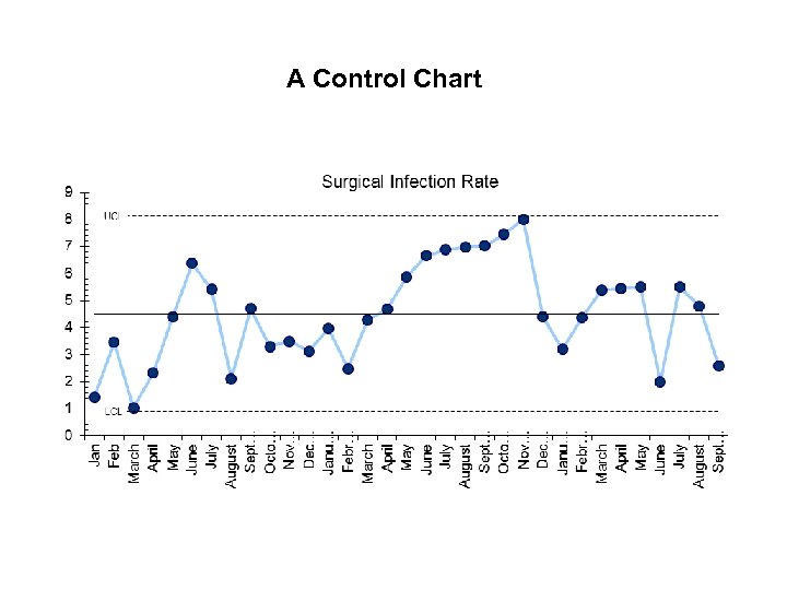 A Control Chart
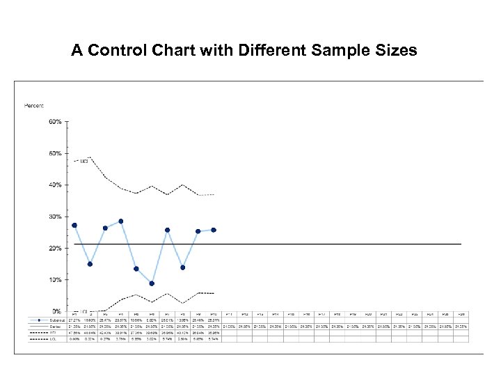 A Control Chart with Different Sample Sizes
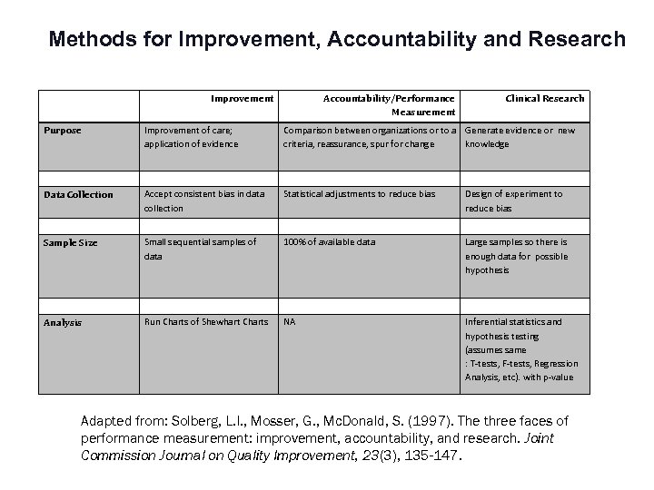 Methods for Improvement, Accountability and Research Improvement Accountability/Performance Measurement Clinical Research Purpose Improvement of care; application of evidence Comparison between organizations or to a Generate evidence or new criteria, reassurance, spur for change knowledge Data Collection Accept consistent bias in data collection Statistical adjustments to reduce bias Design of experiment to reduce bias Sample Size Small sequential samples of data 100% of available data Large samples so there is enough data for possible hypothesis Analysis Run Charts of Shewhart Charts NA Inferential statistics and hypothesis testing (assumes same : T-tests, F-tests, Regression Analysis, etc). with p-value Adapted from: Solberg, L. I. , Mosser, G. , Mc. Donald, S. (1997). The three faces of performance measurement: improvement, accountability, and research. Joint Commission Journal on Quality Improvement, 23(3), 135 -147.
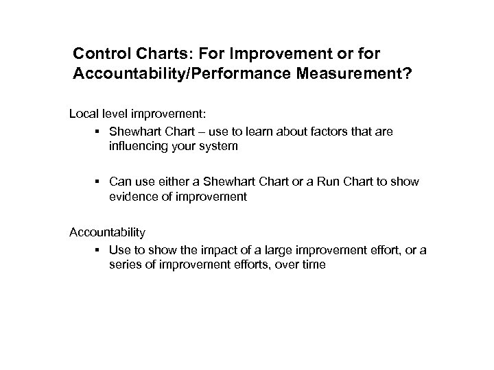 Control Charts: For Improvement or for Accountability/Performance Measurement? Local level improvement: § Shewhart Chart – use to learn about factors that are influencing your system § Can use either a Shewhart Chart or a Run Chart to show evidence of improvement Accountability § Use to show the impact of a large improvement effort, or a series of improvement efforts, over time
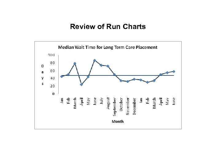 Review of Run Charts
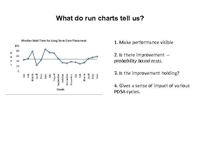 What do run charts tell us? 1. Make performance visible 2. Is there improvement – probability based tests. 3. Is the improvement holding? 4. Gives a sense of impact of various PDSA cycles.
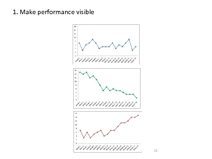 1. Make performance visible 11
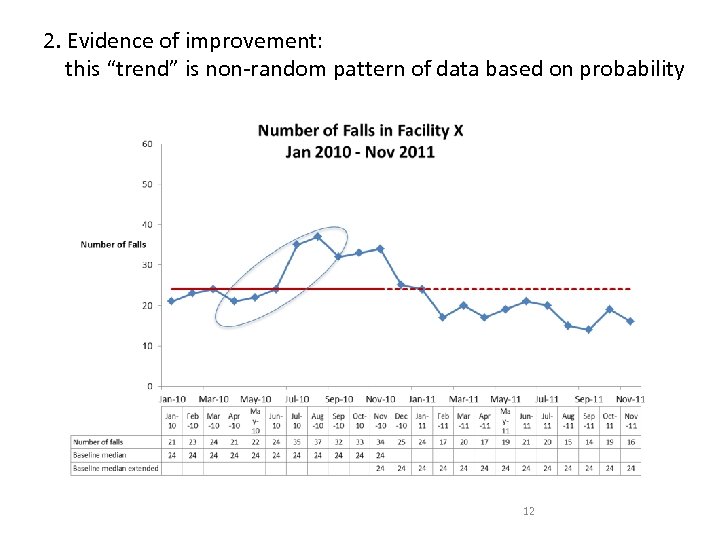 2. Evidence of improvement: this “trend” is non-random pattern of data based on probability 12
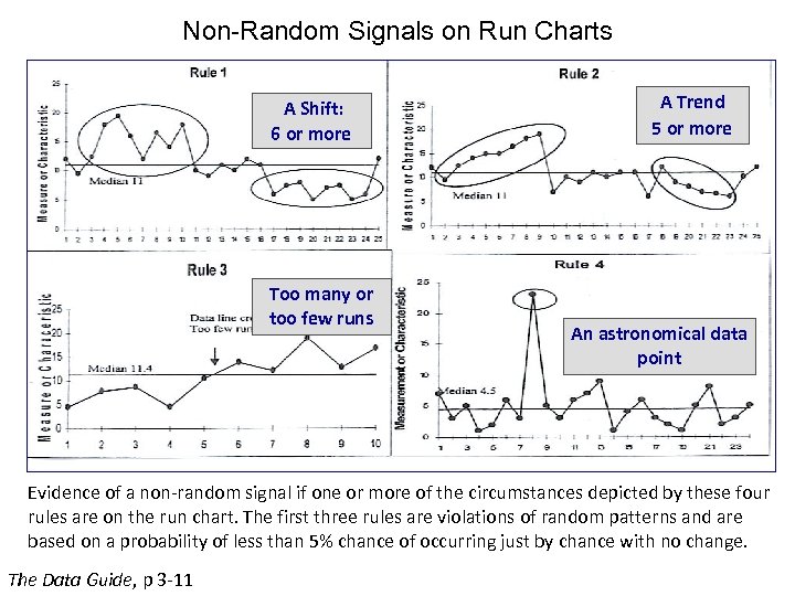 Non-Random Signals on Run Charts A Shift: 6 or more Too many or too few runs A Trend 5 or more An astronomical data point Evidence of a non-random signal if one or more of the circumstances depicted by these four rules are on the run chart. The first three rules are violations of random patterns and are based on a probability of less than 5% chance of occurring just by chance with no change. The Data Guide, p 3 -11
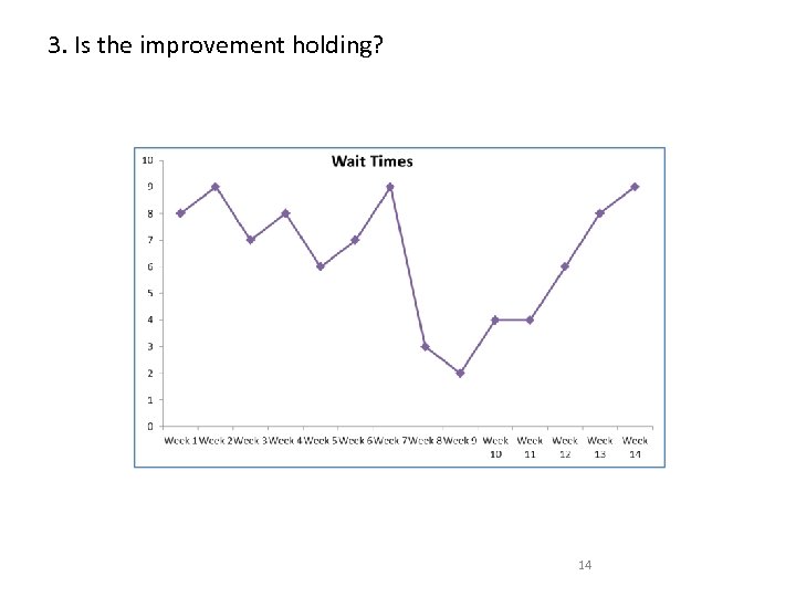 3. Is the improvement holding? 14
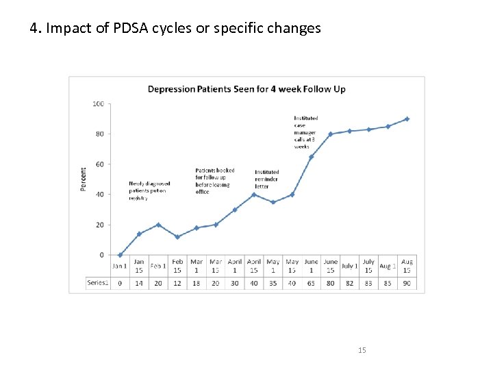 4. Impact of PDSA cycles or specific changes 15
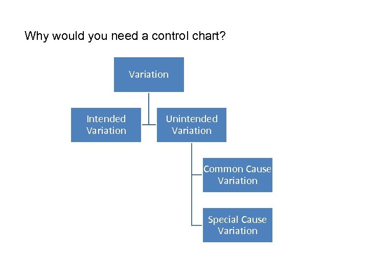 Why would you need a control chart? Variation Intended Variation Unintended Variation Common Cause Variation Special Cause Variation
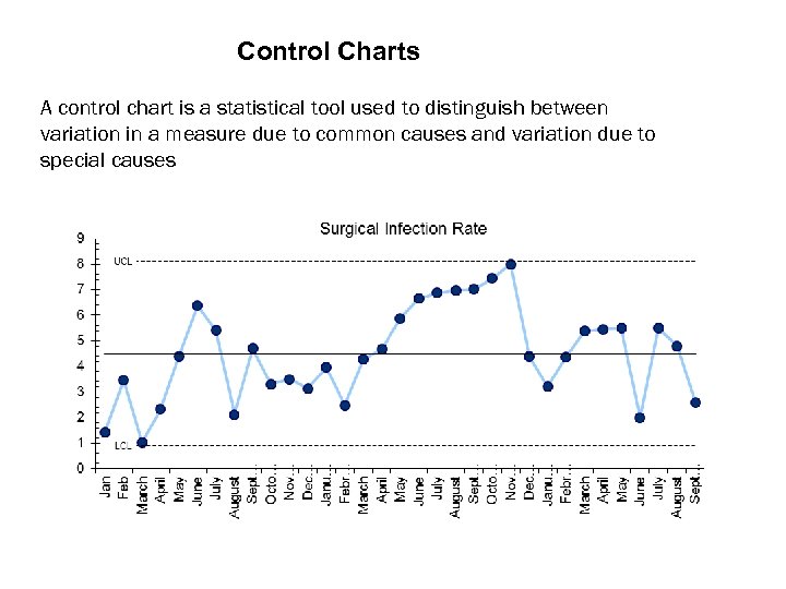 Control Charts A control chart is a statistical tool used to distinguish between variation in a measure due to common causes and variation due to special causes
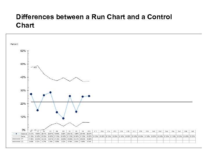 Differences between a Run Chart and a Control Chart
 Control Limits: use to identify Special Cause Variation 3 lines on a control chart: - centre line (mean) - upper control limit (mean+ 3 sigma) - lower control limit (mean – 3 sigma)
 Control Limits: use to identify Special Cause Variation Calculations for limits: - depend on the type of data - not the same as confidence intervals - recommend using SPC software
 Control Limits: use to identify Special Cause Variation Statistical properties: probability of misinterpretation is low (less than 11% overall; less than 5% for some data)
 When to use a control chart instead of a run chart? 1. To determine change quickly (improvement will be picked up more quickly than in a run chart) 2. Different samples sizes in each period 3. To see if results are stable and predictable? 4. Predict performance in coming weeks or months. 5. Reasons for variation
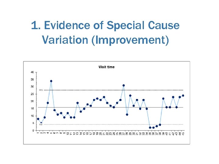 1. Evidence of Special Cause Variation (Improvement)
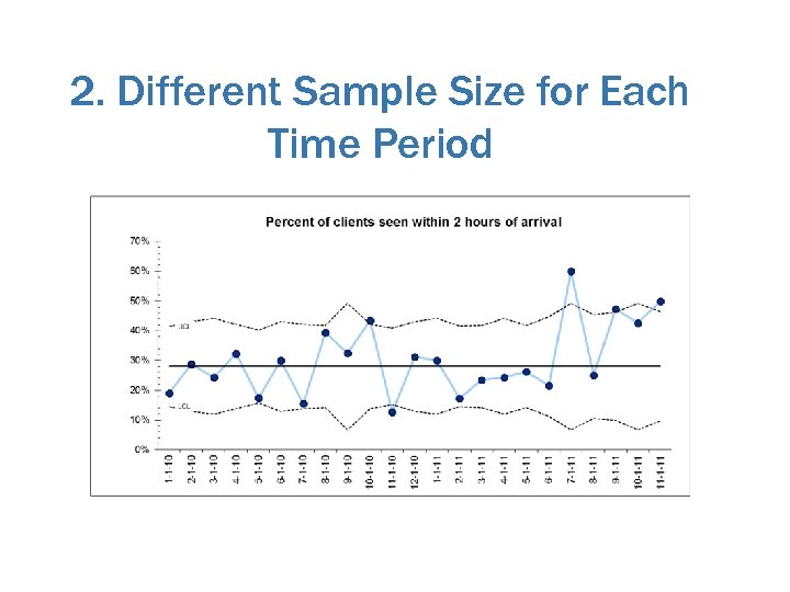 2. Different Sample Size for Each Time Period
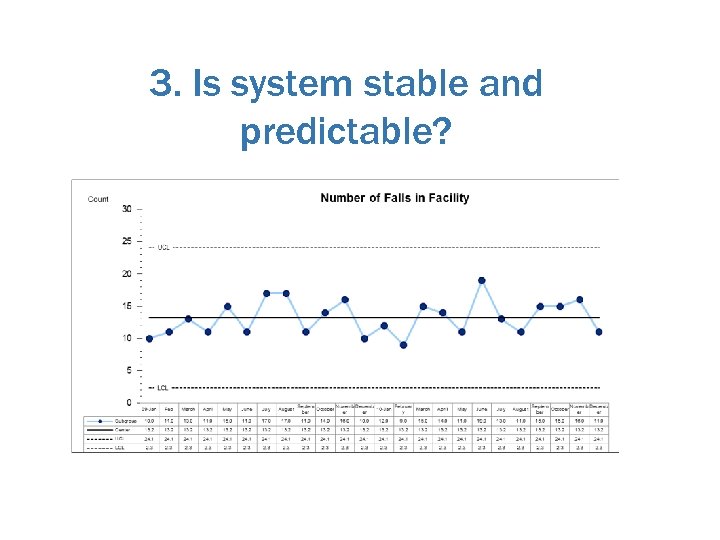 3. Is system stable and predictable?
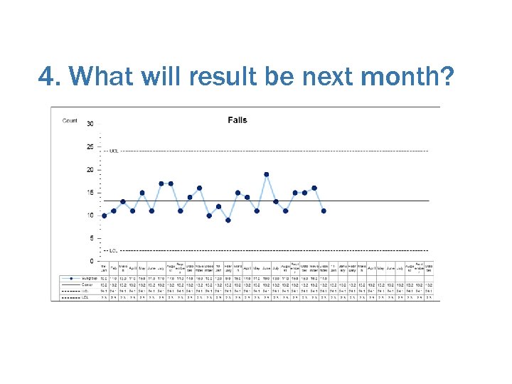 4. What will result be next month?
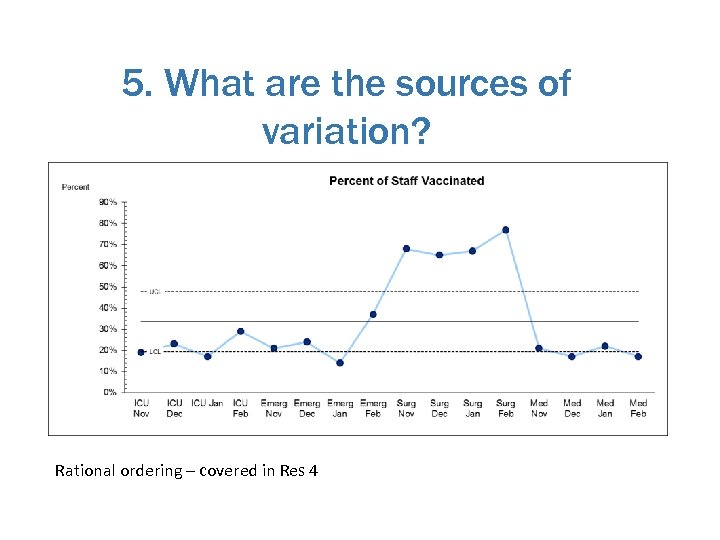 5. What are the sources of variation? Rational ordering – covered in Res 4
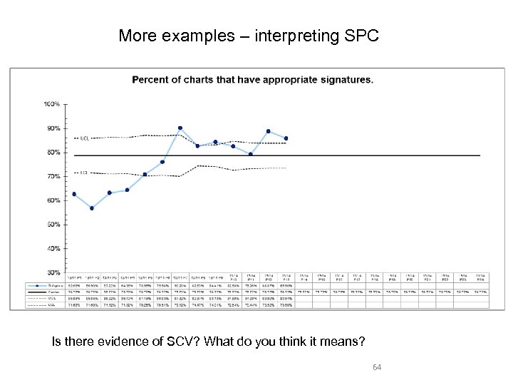
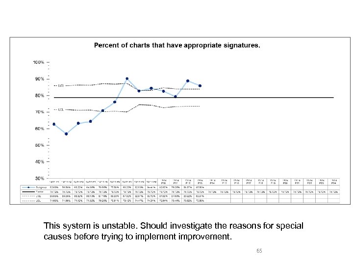
 Is Special Cause Variation Good or Bad? For improvement work: 1. Bad: evidence of SCV in our existing system (baseline) means system is not stable. 2. Good: if we start off with a stable system, then we introduce improvement, SCV is evidence of improvement.
 Special Cause Variation as Evidence of Improvement – Plain Language Interpretation We can be confident that the variation we are seeing is not merely due to chance, nor due to the effect of common causes – it is likely due to the improvement effort.
 Reflection 1. Opportunities for control charts in your improvement project – what will they tell you? 2. Opportunities for control charts in other parts of your work – what will they tell you?
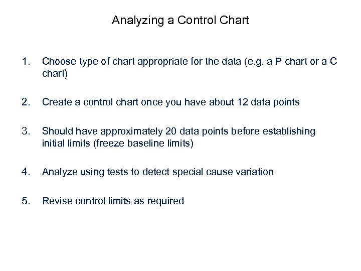 Analyzing a Control Chart 1. Choose type of chart appropriate for the data (e. g. a P chart or a C chart) 2. Create a control chart once you have about 12 data points 3. Should have approximately 20 data points before establishing initial limits (freeze baseline limits) 4. Analyze using tests to detect special cause variation 5. Revise control limits as required
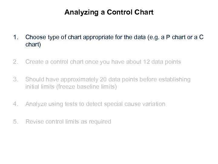 Analyzing a Control Chart 1. Choose type of chart appropriate for the data (e. g. a P chart or a C chart) 2. Create a control chart once you have about 12 data points 3. Should have approximately 20 data points before establishing initial limits (freeze baseline limits) 4. Analyze using tests to detect special cause variation 5. Revise control limits as required
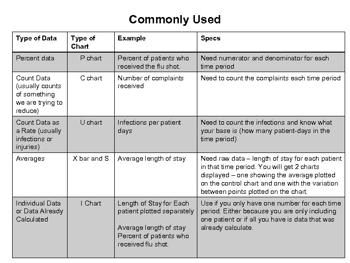 Commonly Used Type of Data Type of Chart Example Specs Percent data P chart Percent of patients who received the flu shot. Need numerator and denominator for each time period Count Data (usually counts of something we are trying to reduce) C chart Number of complaints received Need to count the complaints each time period Count Data as a Rate (usually infections or injuries) U chart Infections per patient days Need to count the infections and know what your base is (how many patient-days in the time period) Average length of stay Need raw data – length of stay for each patient in that time period. You will get 2 charts displayed – one showing the average plotted on the control chart and one with the variation between points plotted on the chart. Averages Individual Data or Data Already Calculated X bar and S I Chart Length of Stay for Each Use if you only have one number for each time patient plotted separately period. Either because you are only including one patient or if all you have is data that was Average length of stay already calculate. Percent of patients who received flu shot.
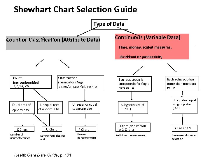 Shewhart Chart Selection Guide Type of Data Count or Classification (Attribute Data) Continuous (Variable Data) - Time, money, scaled measures, Workload or productivity Classification (nonconforming) either/or, pass/fail, yes/no Count (nonconformities) 1, 2, 3, 4, etc. Equal area of opportunity C Chart Number of nonconformities Unequal area of opportunity U Chart Nonconformities per unit Health Care Data Guide, p. 151 Unequal or equal subgroup size P Chart Percent nonconforming Each subgroup is composed of a single data value Subgroup size of 1 (n=1) I Chart (also known as X Chart) Individual measurement Each subgroup has more than one data value Unequal or equal subgroup size (n>1) X Bar and S Average and standard deviation
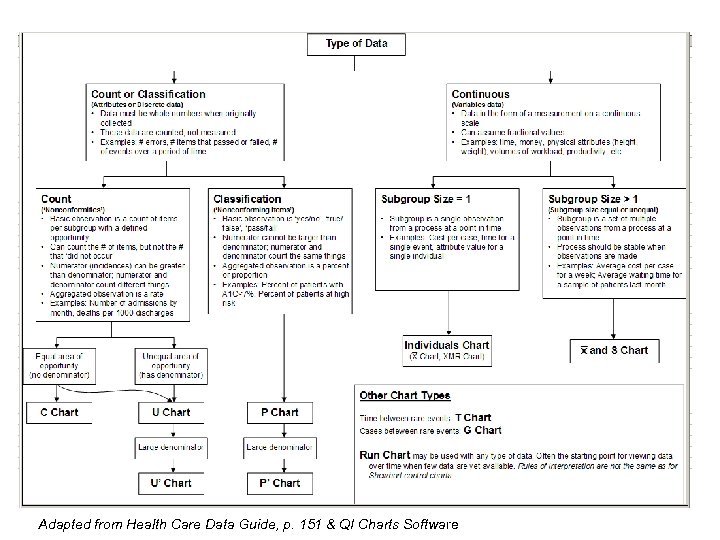 Adapted from Health Care Data Guide, p. 151 & QI Charts Software
 Practice Choosing a Chart Attribute or Continuous 1. You have length of stay for all patients on your unit. You want to display it by month. If Attribute, is it a count or classification (2 buckets) If count, is there an equal or unequal ‘opportunity’ If continuous– is subgroup size=1 or >1? Type of Chart
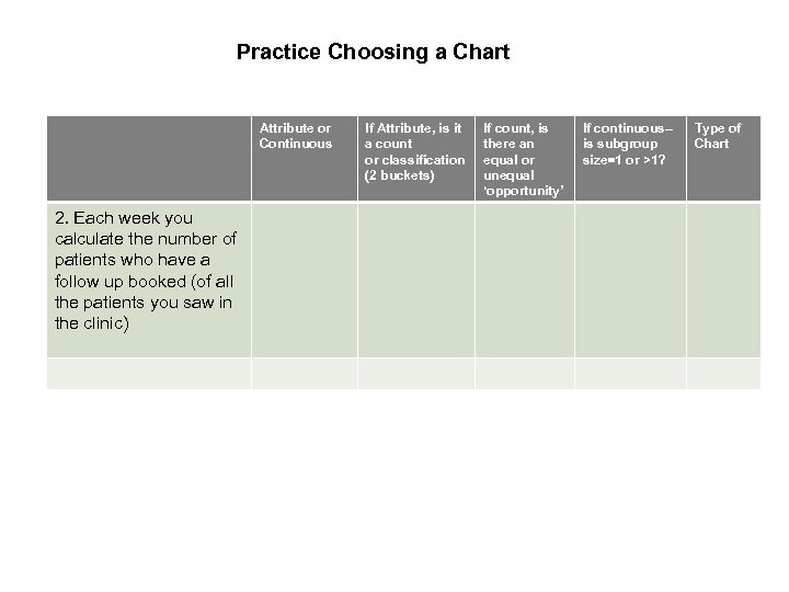 Practice Choosing a Chart Attribute or Continuous 2. Each week you calculate the number of patients who have a follow up booked (of all the patients you saw in the clinic) If Attribute, is it a count or classification (2 buckets) If count, is there an equal or unequal ‘opportunity’ If continuous– is subgroup size=1 or >1? Type of Chart
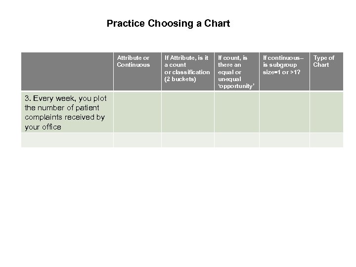 Practice Choosing a Chart Attribute or Continuous 3. Every week, you plot the number of patient complaints received by your office If Attribute, is it a count or classification (2 buckets) If count, is there an equal or unequal ‘opportunity’ If continuous– is subgroup size=1 or >1? Type of Chart
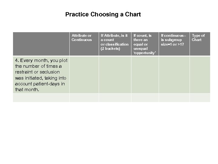 Practice Choosing a Chart Attribute or Continuous 4. Every month, you plot the number of times a restraint or seclusion was initiated, taking into account patient-days in that month. If Attribute, is it a count or classification (2 buckets) If count, is there an equal or unequal ‘opportunity’ If continuous– is subgroup size=1 or >1? Type of Chart
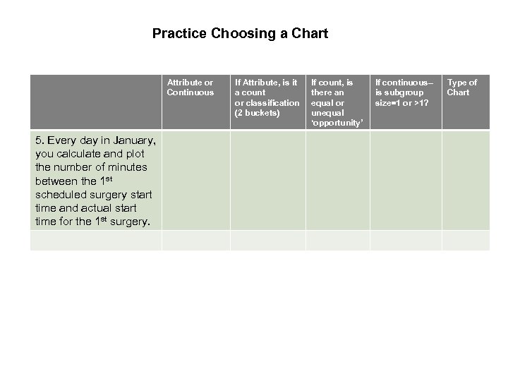 Practice Choosing a Chart Attribute or Continuous 5. Every day in January, you calculate and plot the number of minutes between the 1 st scheduled surgery start time and actual start time for the 1 st surgery. If Attribute, is it a count or classification (2 buckets) If count, is there an equal or unequal ‘opportunity’ If continuous– is subgroup size=1 or >1? Type of Chart
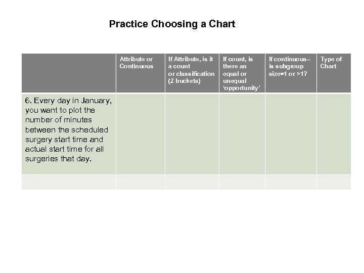 Practice Choosing a Chart Attribute or Continuous 6. Every day in January, you want to plot the number of minutes between the scheduled surgery start time and actual start time for all surgeries that day. If Attribute, is it a count or classification (2 buckets) If count, is there an equal or unequal ‘opportunity’ If continuous– is subgroup size=1 or >1? Type of Chart
 Homework: fill this table out for each key measure on your charter Attribute or Continuous If Attribute, is it a count or classification (2 buckets) If count, is there an equal or unequal ‘opportunity’ If continuous– is subgroup size=1 or >1? Type of Chart
 Analyzing a Control Chart 1. Choose type of chart appropriate for the data (e. g. a P chart or a C chart) 2. Create a control chart once you have about 12 data points 3. Should have approximately 20 data points before establishing initial limits (freeze baseline limits) 4. Analyze using tests to detect special cause variation 5. Revise control limits as required
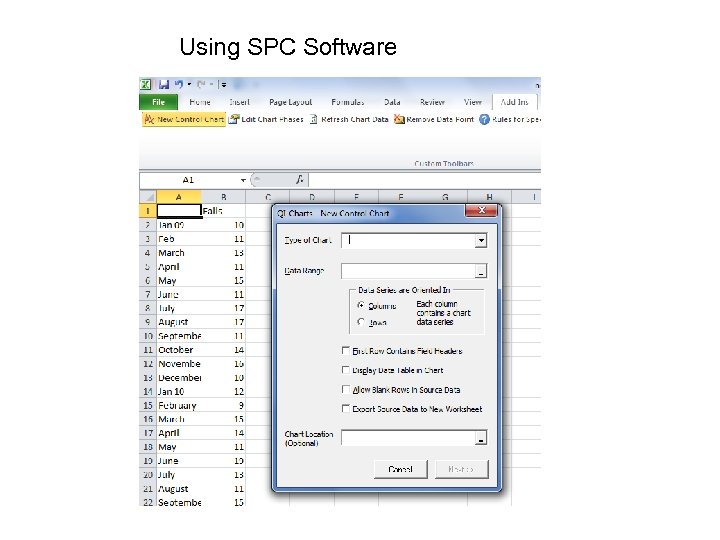 Using SPC Software
 Analyzing a Control Chart 1. Choose type of chart appropriate for the data (e. g. a P chart or a C chart) 2. Create a control chart once you have about 12 data points 3. Should have approximately 20 data points before establishing initial limits (freeze baseline limits) 4. Analyze using tests to detect special cause variation 5. Revise control limits as required
 Analyzing a Control Chart 1. Choose type of chart appropriate for the data (e. g. a P chart or a C chart) 2. Create a control chart once you have about 12 data points 3. Should have approximately 20 data points before establishing initial limits (freeze baseline limits) 4. Analyze using tests to detect special cause variation 5. Revise control limits as required
 Case Study #1 a
 Case Study #1 b Percent of cases with urinary tract infection
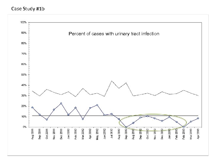 Case Study #1 b Percent of cases with urinary tract infection
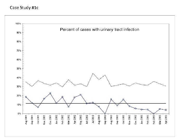 Case Study #1 c Percent of cases with urinary tract infection
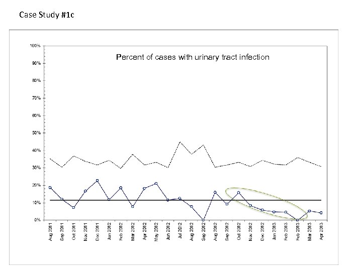 Case Study #1 c Percent of cases with urinary tract infection
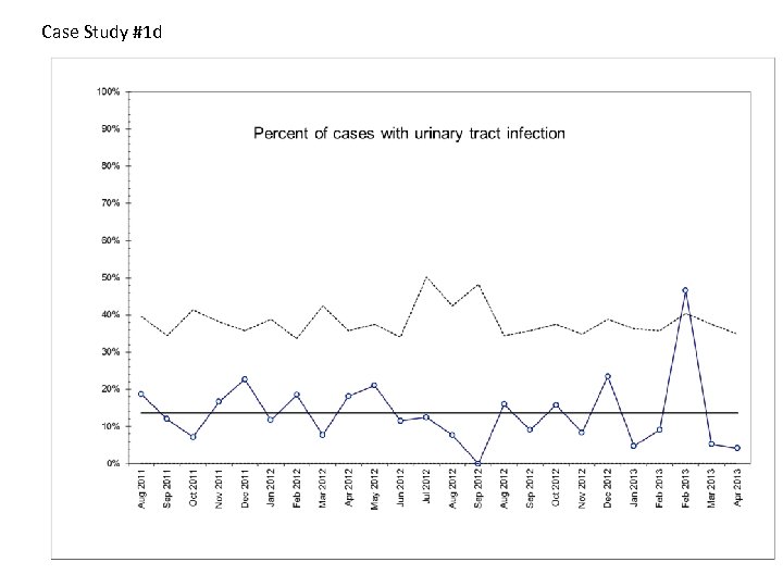 Case Study #1 d
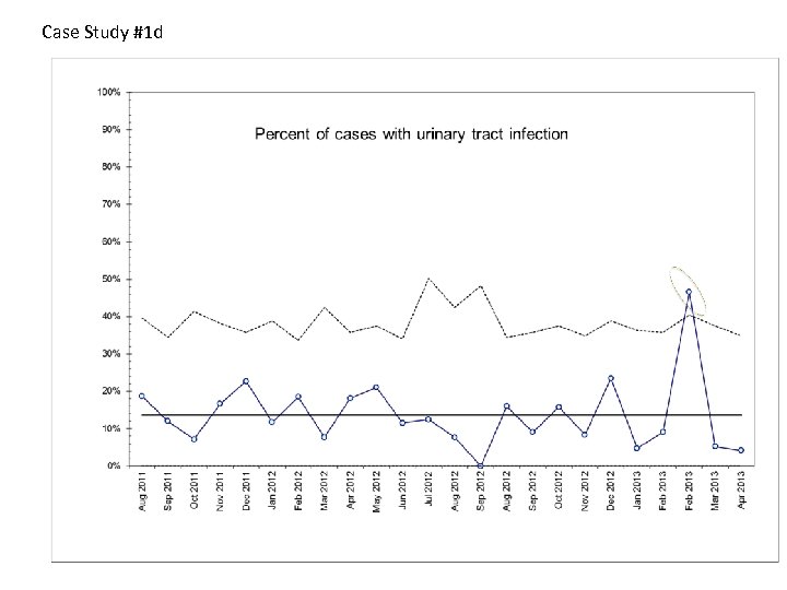 Case Study #1 d
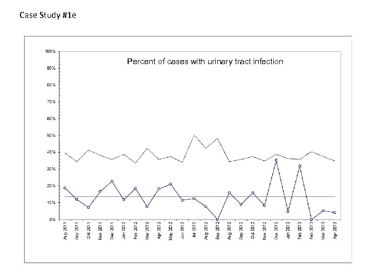 Case Study #1 e Percent of cases with urinary tract infection
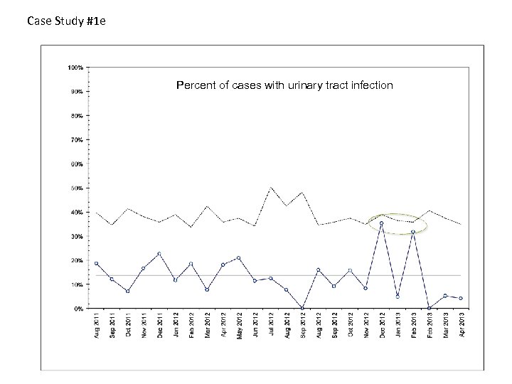 Case Study #1 e Percent of cases with urinary tract infection
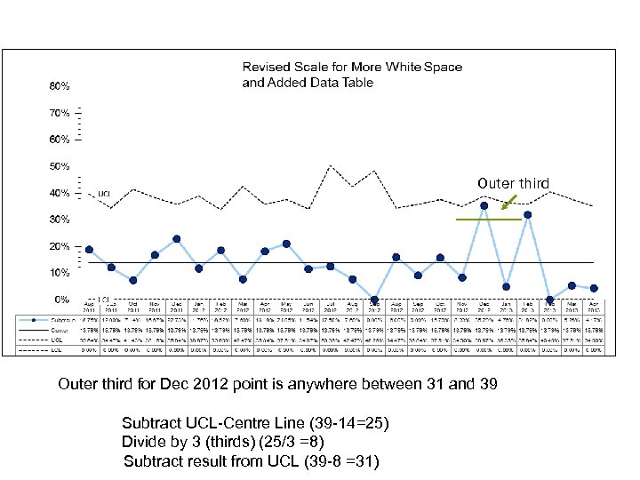 Outer third for Dec 2012 point is anywhere between 31 and 39 Subtract UCL-Centre Line (39 -14=25) Divide by 3 (thirds) (25/3 =8) Subtract result from UCL (39 -8 =31)
 Analyzing a Control Chart 1. Choose type of chart appropriate for the data (e. g. a P chart or a C chart) 2. Create a control chart once you have about 12 data points 3. Should have approximately 20 data points before establishing initial limits (freeze baseline limits) 4. Analyze using tests to detect special cause variation 5. Revise control limits as required
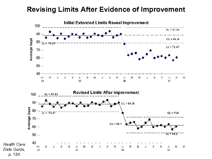 Revising Limits After Evidence of Improvement Health Care Data Guide, p. 124
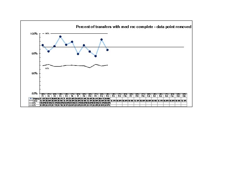
 Investigating Special Cause • Analyzing control charts is an iterative process • Based on analysis: 1. If SCV indicates a new system – revise limits 2. If SCV is a problem that you have dealt with – take out point and update limits
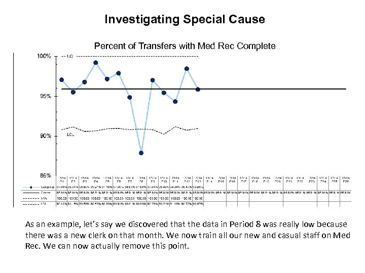 Investigating Special Cause Percent of Transfers with Med Rec Complete As an example, let’s say we discovered that the data in Period 8 was really low because there was a new clerk on that month. We now train all our new and casual staff on Med Rec. We can now actually remove this point.
 Percent of transfers with med rec complete - data point removed 100% UCL 95% LCL 90% 85% 13/14 13/14 13/14 13/14 13/14 13/14 13/14 P 1 P 2 P 3 P 4 P 5 P 6 P 7 P 9 P 10 P 11 P 12 P 13 P 14 P 15 P 16 P 17 P 18 P 19 P 20 P 21 P 22 P 23 P 24 P 25 P 26 Subgroup 97. 06% 95. 51% 96. 80% 99. 21% 97. 16% 97. 90% 94. 85% 97. 04% 95. 45% 94. 34% 98. 47% 95. 86% Center 96. 59% 96. 59% 96. 59% UCL 100. 00%100. 00% LCL 91. 93% 92. 24% 91. 73% 91. 76% 92. 01% 92. 04% 91. 93% 91. 91% 91. 41% 92. 28% 91. 84% 92. 07%
 More examples – interpreting SPC Is there evidence of SCV? What do you think it means? 64
 This system is unstable. Should investigate the reasons for special causes before trying to implement improvement. 65
 Percent of cases seen by appropriate care provider. Is there SCV in this baseline data? What is the interpretation?
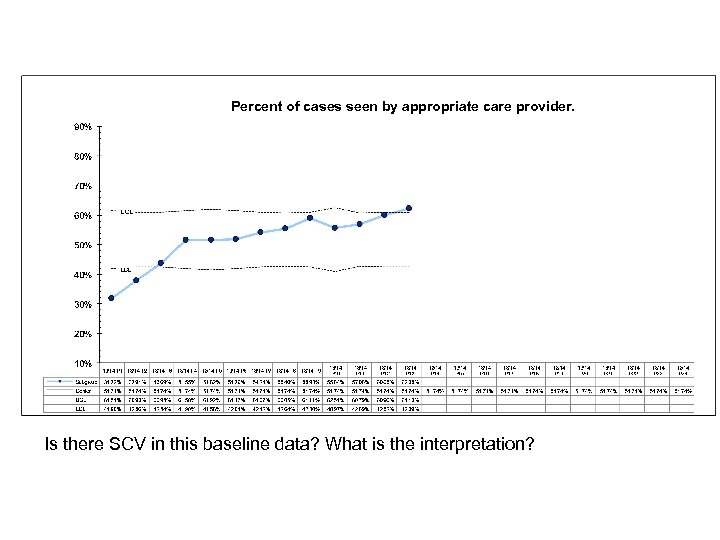
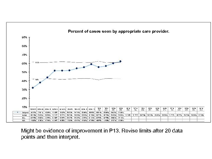 Percent of cases seen by appropriate care provider. Might be evidence of improvement in P 13. Revise limits after 20 data points and then interpret.
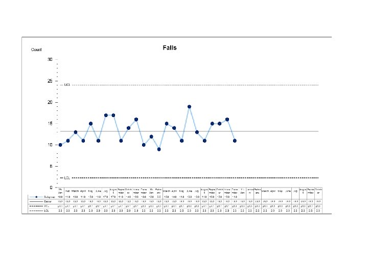
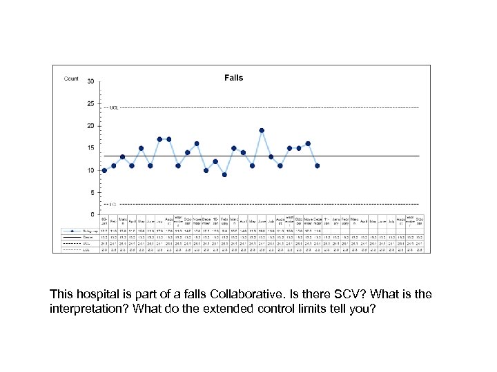 This hospital is part of a falls Collaborative. Is there SCV? What is the interpretation? What do the extended control limits tell you?
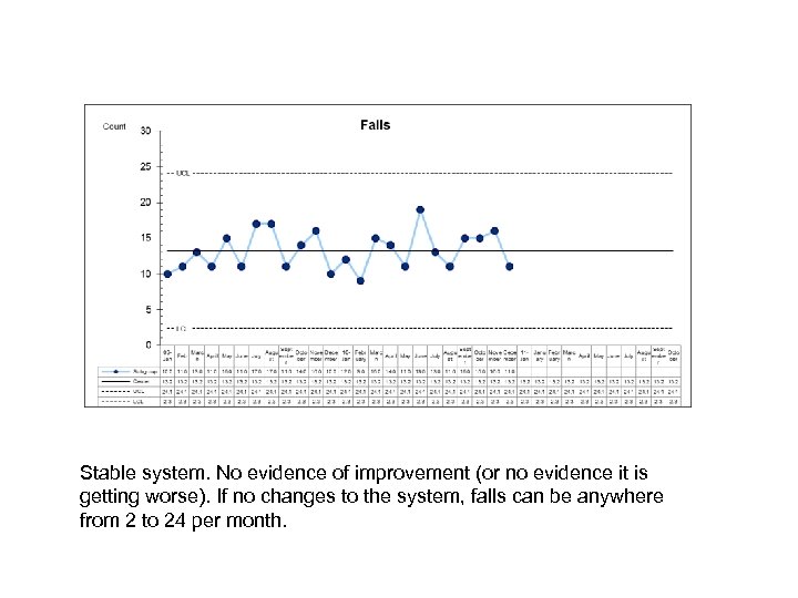 Stable system. No evidence of improvement (or no evidence it is getting worse). If no changes to the system, falls can be anywhere from 2 to 24 per month.
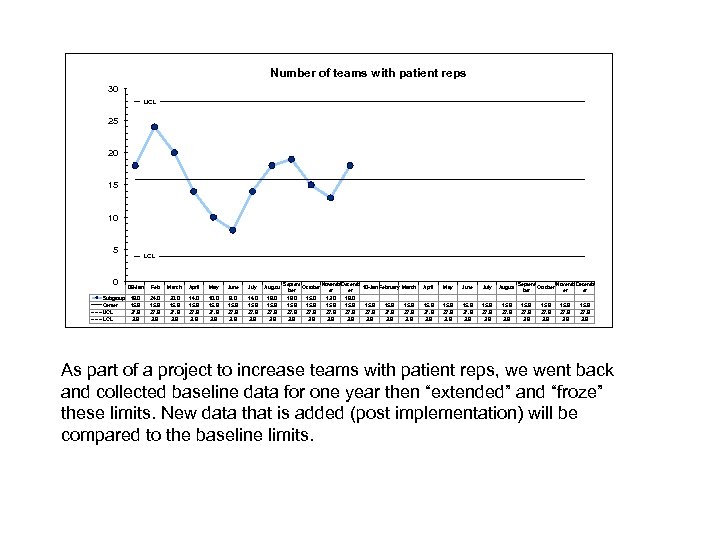 Number of teams with patient reps 30 UCL 25 20 15 10 5 0 Subgroup Center UCL LCL 09 -Jan Feb March April May June July August 18. 0 15. 9 27. 9 3. 9 24. 0 15. 9 27. 9 3. 9 20. 0 15. 9 27. 9 3. 9 14. 0 15. 9 27. 9 3. 9 10. 0 15. 9 27. 9 3. 9 8. 0 15. 9 27. 9 3. 9 14. 0 15. 9 27. 9 3. 9 18. 0 15. 9 27. 9 3. 9 Septem Novemb Decemb October 10 -Jan February March ber er er 19. 0 15. 0 13. 0 18. 0 15. 9 15. 9 27. 9 3. 9 April May June July August 15. 9 27. 9 3. 9 Septem Novemb Decemb October er er 15. 9 27. 9 3. 9 As part of a project to increase teams with patient reps, we went back and collected baseline data for one year then “extended” and “froze” these limits. New data that is added (post implementation) will be compared to the baseline limits.
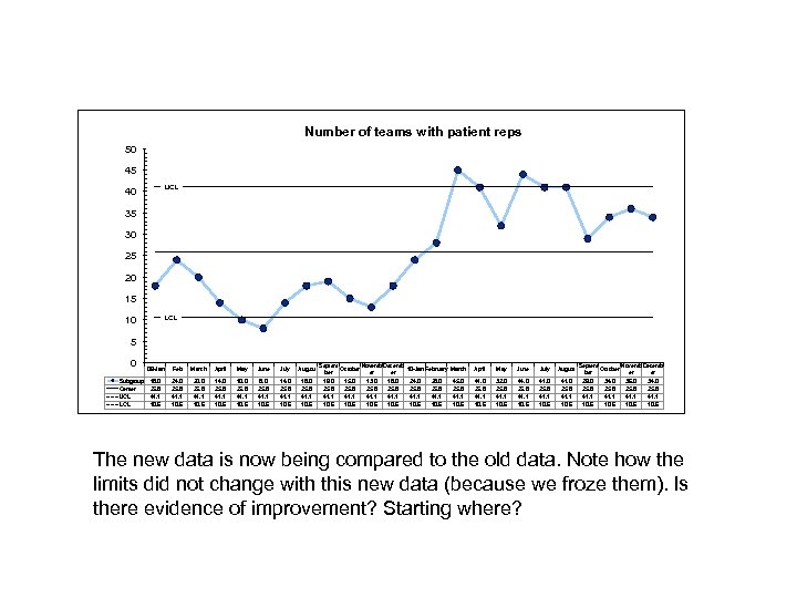 Number of teams with patient reps 50 45 UCL 40 35 30 25 20 15 LCL 10 5 0 Subgroup Center UCL LCL 09 -Jan Feb March April May June July August 18. 0 25. 8 41. 1 10. 6 24. 0 25. 8 41. 1 10. 6 20. 0 25. 8 41. 1 10. 6 14. 0 25. 8 41. 1 10. 6 10. 0 25. 8 41. 1 10. 6 8. 0 25. 8 41. 1 10. 6 14. 0 25. 8 41. 1 10. 6 18. 0 25. 8 41. 1 10. 6 Septem Novemb Decemb October 10 -Jan February March ber er er 19. 0 15. 0 13. 0 18. 0 24. 0 28. 0 45. 0 25. 8 25. 8 41. 1 41. 1 10. 6 10. 6 April May June July August 41. 0 25. 8 41. 1 10. 6 32. 0 25. 8 41. 1 10. 6 44. 0 25. 8 41. 1 10. 6 41. 0 25. 8 41. 1 10. 6 Septem Novemb Decemb October er er 29. 0 34. 0 36. 0 34. 0 25. 8 41. 1 10. 6 The new data is now being compared to the old data. Note how the limits did not change with this new data (because we froze them). Is there evidence of improvement? Starting where?
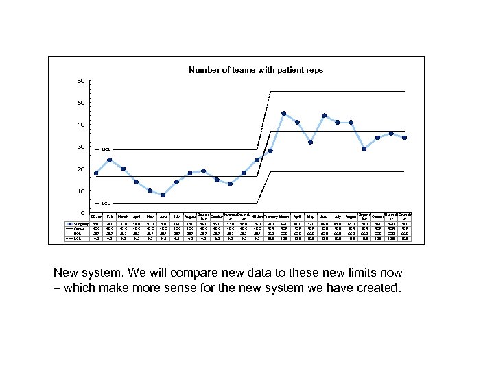 Number of teams with patient reps 60 50 40 30 UCL 20 10 LCL 0 Subgroup Center UCL LCL 09 -Jan Feb March April May June July August 18. 0 16. 5 28. 7 4. 3 24. 0 16. 5 28. 7 4. 3 20. 0 16. 5 28. 7 4. 3 14. 0 16. 5 28. 7 4. 3 10. 0 16. 5 28. 7 4. 3 8. 0 16. 5 28. 7 4. 3 14. 0 16. 5 28. 7 4. 3 18. 0 16. 5 28. 7 4. 3 Septem Novemb Decemb October 10 -Jan February March ber er er 19. 0 15. 0 13. 0 18. 0 24. 0 28. 0 45. 0 16. 5 36. 8 28. 7 55. 0 4. 3 4. 3 18. 6 April May June July August 41. 0 36. 8 55. 0 18. 6 32. 0 36. 8 55. 0 18. 6 44. 0 36. 8 55. 0 18. 6 41. 0 36. 8 55. 0 18. 6 Septem Novemb Decemb October er er 29. 0 34. 0 36. 8 55. 0 18. 6 New system. We will compare new data to these new limits now – which make more sense for the new system we have created.
 Your updated job description…. . as a QI expert Knowing what kind of Shewhart Chart to use for different data Knowing how to create the chart with control limits Applying tests for analyzing Shewhart Charts (evidence of SCV) Collaborating with others to understand the source of SCV Deciding when/if to revise the limits – using software to do revisions Explaining to others the benefit of SPC and why it is more appropriate than inferential statistics for healthcare improvement
 Practice Analysis and Interpretation – Case Studies
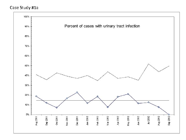
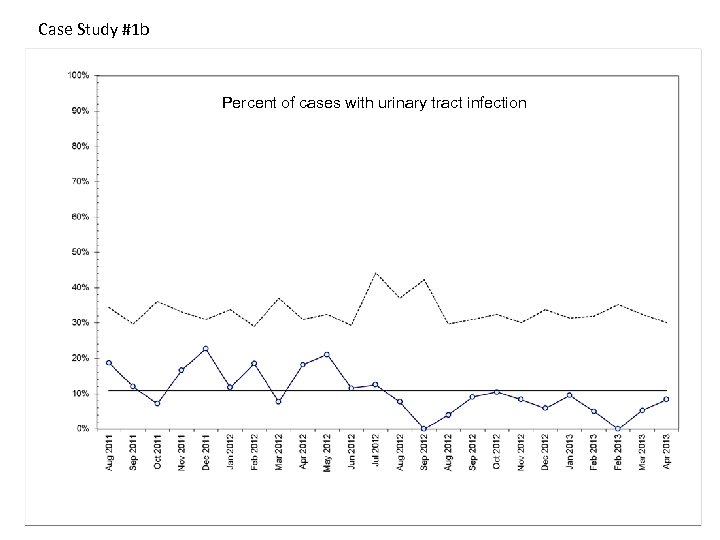
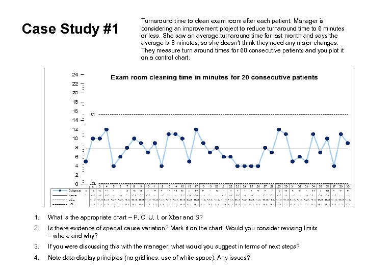 Case Study #1 Turnaround time to clean exam room after each patient. Manager is considering an improvement project to reduce turnaround time to 6 minutes or less. She saw an average turnaround time for last month and says the average is 8 minutes, so she doesn’t think they need any major changes. They measure turn around times for 60 consecutive patients and you plot it on a control chart. 1. What is the appropriate chart – P, C, U, I, or Xbar and S? 2. Is there evidence of special cause variation? Mark it on the chart. Would you consider revising limits – where and why? 3. If you were discussing this with the manager, what would you suggest in terms of next steps? 4. Note data display principles (no gridlines, use of white space). Any issues?
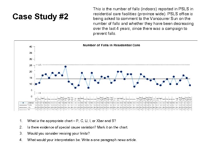 Case Study #2 This is the number of falls (indoors) reported in PSLS in residential care facilities (province wide). PSLS office is being asked to comment to the Vancouver Sun on the number of falls and whether they have been decreasing over the last 4 years, since there was a campaign to prevent falls. 1. What is the appropriate chart – P, C, U, I, or Xbar and S? 2. Is there evidence of special cause variation? Mark it on the chart. 3. Would you consider revising your limits? 4. What would your interpretation be. Write a one paragraph news article.
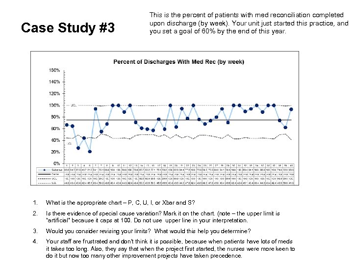 Case Study #3 This is the percent of patients with med reconciliation completed upon discharge (by week). Your unit just started this practice, and you set a goal of 60% by the end of this year. 1. What is the appropriate chart – P, C, U, I, or Xbar and S? 2. Is there evidence of special cause variation? Mark it on the chart. (note – the upper limit is “artificial” because it caps at 100. Do not use upper line in your interpretation. 3. Would you consider revising your limits? What would this help you determine? 4. Your staff are frustrated and don’t think it is possible, because when patients have lots of meds it takes too long. Also, they say that when the project first started, the nurses were more keen to do it but now too many other improvement projects have taken precedence.
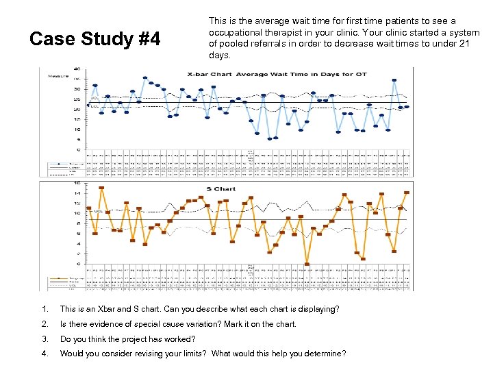 Case Study #4 This is the average wait time for first time patients to see a occupational therapist in your clinic. Your clinic started a system of pooled referrals in order to decrease wait times to under 21 days. 1. This is an Xbar and S chart. Can you describe what each chart is displaying? 2. Is there evidence of special cause variation? Mark it on the chart. 3. Do you think the project has worked? 4. Would you consider revising your limits? What would this help you determine?


