 Slides: Contents and Design
 Presentation Software • Power. Point • Keynote • Prezi • Haiku Deck • Slides…
 Design of Slides • Think about avoidinig the slide themes included in your software • Use one template for the whole slide deck • Use contrast colours of text and background
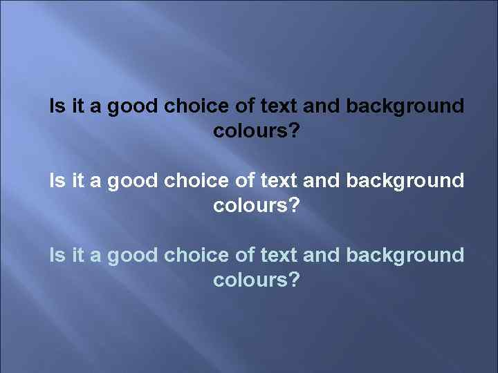 Is it a good choice of text and background colours?
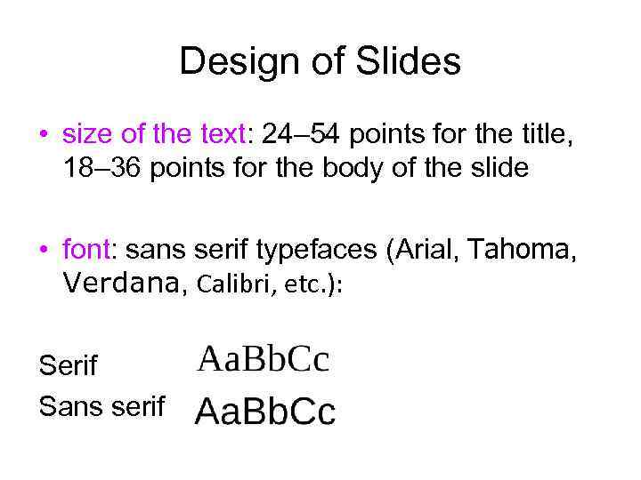 Design of Slides • size of the text: 24– 54 points for the title, 18– 36 points for the body of the slide • font: sans serif typefaces (Arial, Tahoma, Verdana, Calibri, etc. ): Serif Sans serif
 Design of Slides Don’t use more than 3 different • typefaces (including italics) • text colours on 1 slide • Use a colour (colours) to emphasise important points in you text
 Design of Slides • Try not to use more than 6 lines of the text • Make sure that all your points have the same structure • Don’t pack too much information onto one slide • Make two-unit space between different points • If you use tables, try to confine yourself to 4 columns and 4 lines
 Design of Slides • Don’t put a point after titles and subtitles • No punctuation marks are generally used after one point and before the next one
 Final Slide • contact details • core message • call to action • powerful image
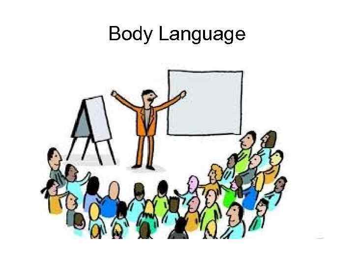 Body Language
 Body Language • stance and movement • eye contact • gestures and facial expression • articulation
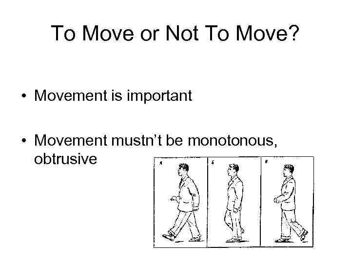 To Move or Not To Move? • Movement is important • Movement mustn’t be monotonous, obtrusive
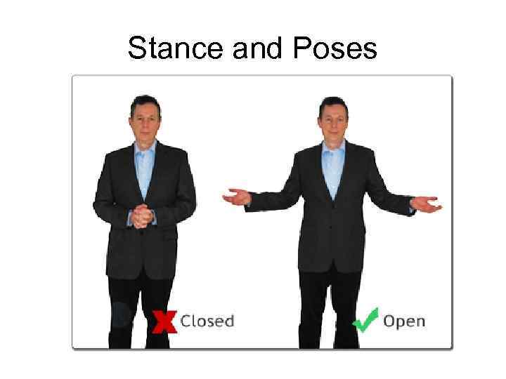 Stance and Poses
 Open or Closed?
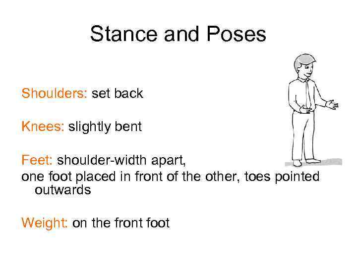 Stance and Poses Shoulders: set back Knees: slightly bent Feet: shoulder-width apart, one foot placed in front of the other, toes pointed outwards Weight: on the front foot
 Gestures NB: “air” under the arms • arise from shoulder or elbows • held at chest level • have good amplitude • correspond to the pronounced words
 Head Position and Eye Contact Chin: slightly raised Eye focus: on one person at a time, long enough to complete a natural phrase (sometimes you can look into the distance)