Duarte_Slidedocs_Download.pptx
- Количество слайдов: 165
Slidedocs Spread ideas with effective visual documents by nancy duarte
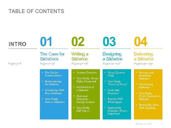
TABLE OF CONTENTS Pages 3– 8 01 02 03 04 The Case for Slidedocs INTRO Writing a Slidedoc Designing a Slidedoc Delivering a Slidedoc Pages 9– 36 Pages 37– 98 Pages 99– 136 Pages 137– 159 + The Call for Conversations + Reintroducing the Slidedoc + Connecting With Your Audience + Case Study: Docs to Slidedocs + Content Creation + Case Study: Dense Slides Converted + Architecture of a Slidedoc + Data and Diagrams Clarify Content + Case Study: SAP Top 10 + Visual Systems Unify + Case Study: “Power of Story” + Grids Add Structure + Breathe With White Space + Typesetting Amplifies What’s Important + Printing and Projecting Slidedocs + Distributing Slidedocs + Case Study: From Cinematic to Slidedoc + Spread Big Ideas With Slidedocs © Duarte, Inc. 2014 2
COMMUNICATION HAS CHANGED Business is moving faster than ever. Employees are constantly asked to do a little bit more, a little bit faster. This obsession with pace has caused us to weed out inefficiency on nearly every level, especially when it comes to communication. Internet and mobile communications have reconditioned people to prefer consuming information in small chunks. LINK: PICTORIAL LEARNING In the process, we’ve all but killed long-form business communications. Today, content not boiled down to its essence is a time-waster. Long, detailed, multipage documents of prose take too long to read between e-mails and meetings. So, we ignore them until our schedules allow a long block of time for consuming dense information—if that time ever comes. Short blog posts get the most traffic. You can barely fit a couple of sentences in a tweet. And text messages usually only take up a line or two. LINK: MULTIMEDIA LEARNING LINK: SCIENTIFIC STUDY © Duarte, Inc. 2014 3
SHORTER COMMUNICATION IS THE NEW NORM As a result, shorter, tighter, visual communication is the go-to method for getting everybody on the same page quickly. People learn concepts better when they see pictures combined with prose. Therefore, visual media like presentations are used more readily. The best way to spread visual ideas is through slides. The slide format makes it easy for people to capture great ideas and share them. Since first starting Duarte, Inc. in 1988, I’ve watched this trend toward communicating visually intensify. In our early years, we cleaned up slides from people who were desperate not so much to give a verbal presentation, but to express their ideas visually and spread them throughout their organization. At Duarte, we’d often see slides we had visualized reused in hundreds of different presentations within the organization. Great slides spread. These short, tight, atomic bites of content have become the default way of visually communicating ideas. © Duarte, Inc. 2014 4
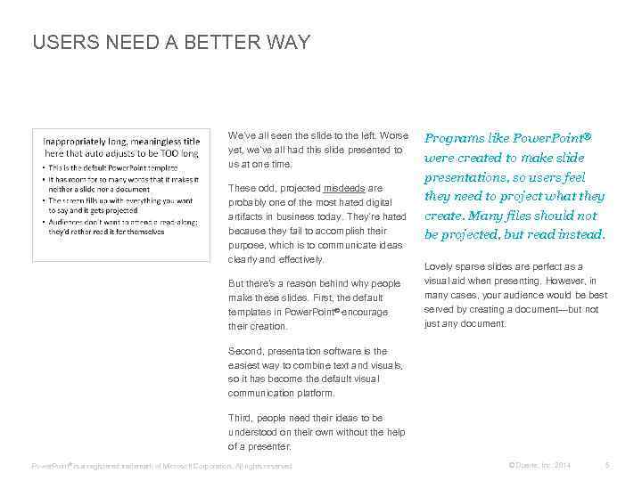
USERS NEED A BETTER WAY We’ve all seen the slide to the left. Worse yet, we’ve all had this slide presented to us at one time. These odd, projected misdeeds are probably one of the most hated digital artifacts in business today. They’re hated because they fail to accomplish their purpose, which is to communicate ideas clearly and effectively. But there’s a reason behind why people make these slides. First, the default templates in Power. Point® encourage their creation. Programs like Power. Point® were created to make slide presentations, so users feel they need to project what they create. Many files should not be projected, but read instead. Lovely sparse slides are perfect as a visual aid when presenting. However, in many cases, your audience would be best served by creating a document—but not just any document. Second, presentation software is the easiest way to combine text and visuals, so it has become the default visual communication platform. Third, people need their ideas to be understood on their own without the help of a presenter. Power. Point ® is a registered trademark of Microsoft Corporation. All rights reserved. © Duarte, Inc. 2014 5
SLIDEDOCS™: A NEW MEDIUM It’s time for a new medium— a medium that retains presentation software’s ability to seamlessly integrate graphics and words—and quickly travel throughout organizations. A slidedoc is a document created using presentation software, where visuals and words unite to illustrate one clear point per page. The result is a medium that can be read and digested more quickly than either a document or a presentation. Slidedocs are meant to be printed or distributed and read on screen without the accompaniment of a presenter. My books so far have advised people on how to create sparse, highly visual presentations. So, it might come as a surprise to hear me support another use for slide software. We’ve been creating slidedocs for the past 25 years because they help quickly spread our clients’ ideas around their organizations. Slidedocs™ is a trademark of Duarte Press LLC. All rights reserved. Slidedocs work because: Uniformat of a slide encourages clear, succinct articulation and visualization of concepts on one page. Editable nature allows it to be a living document that is collaborative and can evolve over time. Overarching view allows you to see the whole, instead of only the parts. By working in outline or slide sorter mode, you can see the entire message and structure in addition to individual pages. Spreadability allows the smartest pages to spread throughout an organization. Great slidedocs are reused again and again. © Duarte, Inc. 2014 6
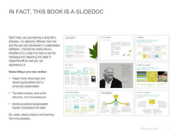
IN FACT, THIS BOOK IS A SLIDEDOC Right now, you are reading a long-form slidedoc. It’s probably different than the last file you saw developed in presentation software. I decided to model what a slidedoc is by using the medium as the message and releasing this book in Power. Point® so that you can deconstruct it. Some things you may notice: • Pages have more copy and visual explanations than a cinematic presentation • Template system uses grids, columns, and full sentences • Dense analytical explanations appear throughout the book So, enjoy poking around and learning from this slidedoc. © Duarte, Inc. 2014 7
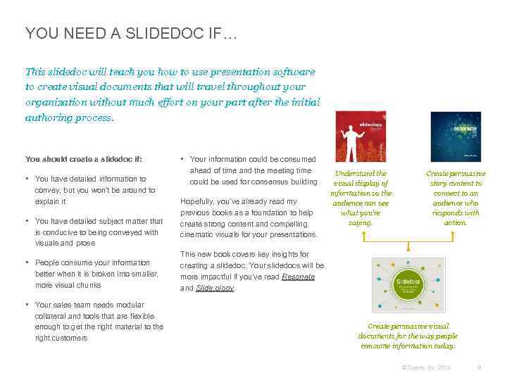
YOU NEED A SLIDEDOC IF… This slidedoc will teach you how to use presentation software to create visual documents that will travel throughout your organization without much effort on your part after the initial authoring process. You should create a slidedoc if: • You have detailed information to convey, but you won’t be around to explain it • You have detailed subject matter that is conducive to being conveyed with visuals and prose • People consume your information better when it is broken into smaller, more visual chunks • Your sales team needs modular collateral and tools that are flexible enough to get the right material to the right customers • Your information could be consumed ahead of time and the meeting time could be used for consensus building Hopefully, you’ve already read my previous books as a foundation to help create strong content and compelling cinematic visuals for your presentations. Understand the visual display of information so the audience can see what you’re saying. Create persuasive story content to connect to an audience who responds with action. This new book covers key insights for creating a slidedoc. Your slidedocs will be more impactful if you’ve read Resonate and Slide: ology. Create persuasive visual documents for the way people consume information today. © Duarte, Inc. 2014 8
The Case for Slidedocs + The Call for Conversations + Reintroducing the Slidedoc + Connecting With Your Audience + Case Study: Slides to Slidedocs 01 © Duarte, Inc. 2014 9

+ The Call for Conversations 01 © Duarte, Inc. 2014 10
PRESENTATIONS ARE FAMILIAR There’s no doubt about it; we are a presentation culture. By some estimates, Microsoft’s Power. Point® has been installed on roughly one billion computers. Plus, an average of 350 presentations are given every second of every day. We’ve adopted this behavior for a good reason: presentations are one of the best ways to communicate ideas, persuade an audience to adopt an idea, and pursue a course of action. Yet, many popular articles have grabbed headlines and won praise by calling for an end to presentations. While I wouldn’t go so far as to say “presentations are evil, ” I do believe that we could do a better job of creating and using them. However, even the best presentation won’t work if it’s not delivered in the right context. Just like you wouldn’t give a presentation to tell someone there’s a tiger behind him, there are certain business settings where a presentation isn’t the right approach. But most people do it anyway, because it’s what we know. And that’s where the trouble begins. In fact, I’ve built a thriving business and written three best-selling books on how to make presentations more effective and enjoyable. © Duarte, Inc. 2014 11
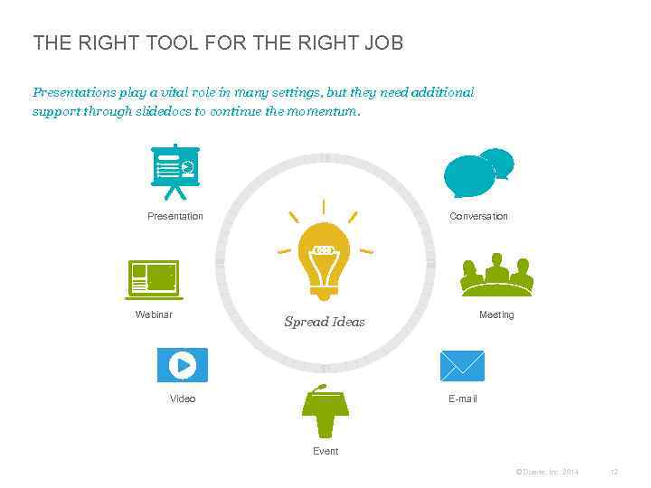
THE RIGHT TOOL FOR THE RIGHT JOB Presentations play a vital role in many settings, but they need additional support through slidedocs to continue the momentum. Presentation Webinar Conversation Meeting Spread Ideas Video E-mail Event © Duarte, Inc. 2014 12
CONVERSATIONS BUILD CONSENSUS A presentation can be an amazing tool, but only when it’s used correctly. Presentations are most effective when you need to persuade a group of people to change their behavior. Presentations are often a one-way street: information flows from the presenter to the audience. But what happens when you need to bring a group to consensus or make a decision based on some shared information? Formal presentations don’t allow for enough back-and-forth to accomplish these goals. Instead, consensus-building and decisionmaking events are perfect opportunities for informed conversations, meaning conversations in which all the participants have access to a common set of information. Conversations give participants the ability to build on your ideas instead of simply receiving them. The verbal back-and-forth of challenging and defending, resisting and accepting, and creating and destructing, refines the idea while helping you build credibility by showing your command of the content. SLIDE 14: SIR RICHARD BRANSON INTERVIEW SLIDE 22: SHERYL SANDBERG INTERVIEW SLIDE 27: JEFF WEINER INTERVIEW As a result, informed conversations can help you build consensus and erode resistance to an idea. These benefits are the reasons why several notable executives, including Sir Richard Branson, Sheryl Sandberg, and Jeff Weiner, have called for an increased emphasis on conversations. Instead of presenting, we’ve found that everyone can get up to speed quickly if you give them information beforehand, or allow 10 minutes at the beginning of the meeting for people to read a slidedoc. Then, each person is fully informed for the discussion. Plus, they can refer to the materials as they discuss the issues. © Duarte, Inc. 2014 13

“ Too many people are hiding in dark rooms flipping through too many words on big screens. There’s a reason why I avoid boardrooms. I’d rather spend time with people ‘in the field, ’ where eye contact, genuine conviction, and trustworthiness are in full evidence. Dyslexia shaped my—and Virgin’s —communication style. From the beginning, Virgin used clear, ordinary language. If I could quickly understand a campaign concept, it was good to go. If something can’t be explained off the back of an envelope, it’s rubbish. I believe in conversations and eye contact. – Sir Richard Branson ” Founder and Chairman, Virgin Group Photo: virgin. com © Duarte, Inc. 2014 14
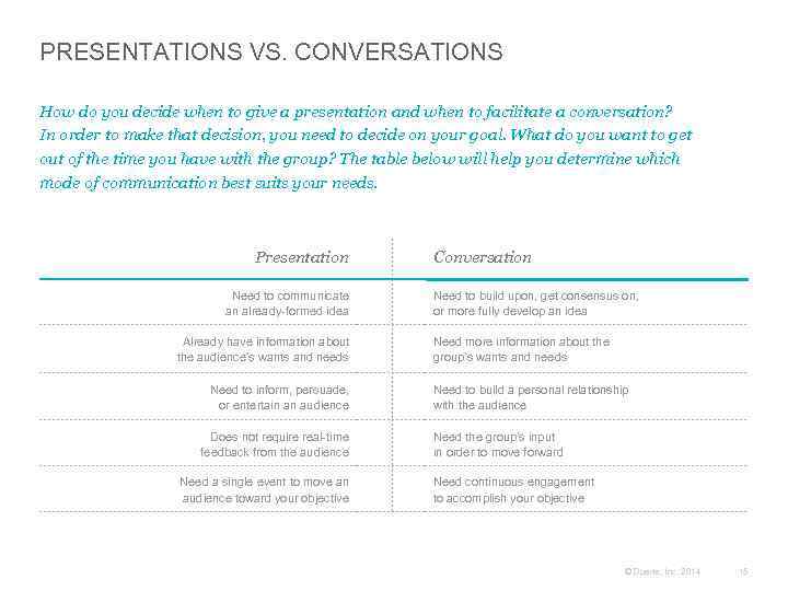
PRESENTATIONS VS. CONVERSATIONS How do you decide when to give a presentation and when to facilitate a conversation? In order to make that decision, you need to decide on your goal. What do you want to get out of the time you have with the group? The table below will help you determine which mode of communication best suits your needs. Presentation Need to communicate an already-formed idea Already have information about the audience’s wants and needs Need to inform, persuade, or entertain an audience Does not require real-time feedback from the audience Need a single event to move an audience toward your objective Conversation Need to build upon, get consensus on, or more fully develop an idea Need more information about the group’s wants and needs Need to build a personal relationship with the audience Need the group’s input in order to move forward Need continuous engagement to accomplish your objective © Duarte, Inc. 2014 15
+ Reintroducing the Slidedoc 01 © Duarte, Inc. 2014 16
DOCUMENTS ARE DENSE The best way to build consensus during a meeting is to distribute the information beforehand to give people time to review and absorb it. But what is the best way to distribute that information? If you use a document format, you can add more detail while still allowing people to consume information at their own pace. However, the dense nature of documents can raise some issues. Very few people look at a page full of business prose and think, “This looks like great reading. I can’t wait to dive in!” Also, documents can be difficult to reference during a discussion. Has anyone ever asked you to find the third sentence in the second to last paragraph in section four? If so, how long did it take to find it? When you refer to a document, you lose valuable time just trying to get everyone to the same place—never mind your actual point. Finally, many people process information faster and understand it better if it’s presented visually. By handing out pages full of paragraphs, you’re putting up barriers on the road to understanding— not the best way to start a meeting. © Duarte, Inc. 2014 17
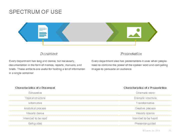
SPECTRUM OF USE Document Every department has long and dense, but necessary, documentation in the form of memos, reports, manuals, and briefs. These artifacts are useful for holding a lot of information in a single container. Presentation Every department also has presentations it uses when people need to combine the power of the spoken word and compelling images to persuade an audience. Characteristics of a Document Characteristics of a Presentation Exhaustive Cinematic story Topical structure Dramatic structure Informative Transformative Analytical process Creative process Visually dense Visually sparse Intended to be read Intended to be heard Self-guided Presenter-guided © Duarte, Inc. 2014 18
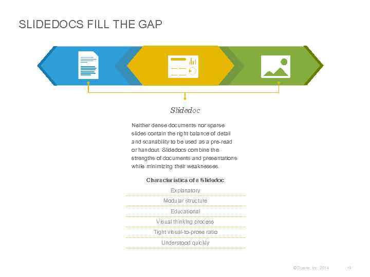
SLIDEDOCS FILL THE GAP Slidedoc Neither dense documents nor sparse slides contain the right balance of detail and scanability to be used as a pre-read or handout. Slidedocs combine the strengths of documents and presentations while minimizing their weaknesses. Characteristics of a Slidedoc Explanatory Modular structure Educational Visual thinking process Tight visual-to-prose ratio Understood quickly © Duarte, Inc. 2014 19
WHAT IS A SLIDEDOC? Slidedocs are visual documents, developed in presentation software, that are intended to be read and referenced instead of projected. I’d be willing to make three bets: 1. You already know what slidedocs are 2. You already have slidedocs floating around your organization 3. You yourself have already created a slidedoc How can I be so sure? Because it’s been in front of us the whole time—this awesome way of communicating information that’s both easily consumed and easily referenced. Many people haven’t realized the brilliance behind these artifacts, because they’ve been using them in the wrong way. While using presentation software is the easiest way to create a slidedoc today, the concept actually predates software. In fact, Hughes Aircraft published a report on the Sequential Thematic Organization of Publications (STOP) in 1965. Proponents of the STOP method believed that communicating information by putting a single idea on a page and supporting it with text and pictures was a more concise and collaborative way to build dense proposals and reports. Instead of allowing audiences to read these slidedocs, people have been “presenting” them in long, boring readalongs and putting audiences to sleep. By doing this, people have learned to overlook presentation software as a tool Similarly, slidedocs allow communicators for combining words and visuals in a way that allows people to quickly consume and to break complex ideas into small chunks of information and give readers the time to spread information in atomic bites. absorb the information at their own pace. © Duarte, Inc. 2014 20
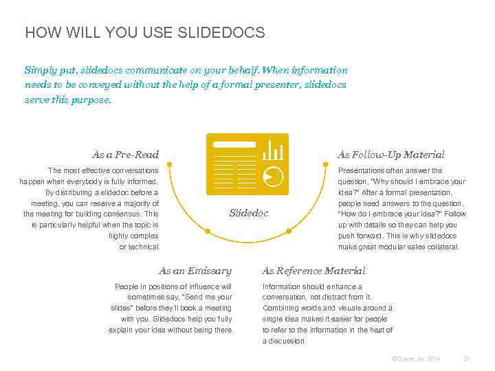
HOW WILL YOU USE SLIDEDOCS Simply put, slidedocs communicate on your behalf. When information needs to be conveyed without the help of a formal presenter, slidedocs serve this purpose. As a Pre-Read As Follow-Up Material The most effective conversations happen when everybody is fully informed. By distributing a slidedoc before a meeting, you can reserve a majority of the meeting for building consensus. This is particularly helpful when the topic is highly complex or technical. Slidedoc As an Emissary People in positions of influence will sometimes say, “Send me your slides” before they’ll book a meeting with you. Slidedocs help you fully explain your idea without being there. Presentations often answer the question, “Why should I embrace your idea? ” After a formal presentation, people need answers to the question, “How do I embrace your idea? ” Follow up with details so they can help you push forward. This is why slidedocs make great modular sales collateral. As Reference Material Information should enhance a conversation, not distract from it. Combining words and visuals around a single idea makes it easier for people to refer to the information in the heat of a discussion. © Duarte, Inc. 2014 21
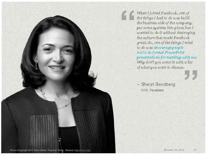
“ When I joined Facebook, one of the things I had to do was build the business side of the company, put some systems into place, but I wanted to do it without destroying the culture that made Facebook great. So, one of the things I tried to do was encourage people not to do formal Power. Point presentations for meetings with me. Why don’t you come in with a list of what you want to discuss. – Sheryl Sandberg COO, Facebook Photo: Copyright 2010 Drew Altizer, Financial Times Source: http: //drte. co/pz ” © Duarte, Inc. 2014 22
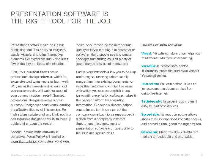
PRESENTATION SOFTWARE IS THE RIGHT TOOL FOR THE JOB Presentation software can be a great publishing tool. The ability to integrate words, visuals, and other interactive elements like hyperlinks and video are a few of the key attributes of a slidedoc. You’d be surprised by the number and quality of ideas that begin in presentation software. Many people use it to create concepts and strategies, and plenty of great ideas trickle out of these apps. First, it’s a practical alternative to professional design software, which is expensive and takes years to learn well. Why make that investment when a tool you use every day will work for most of your communication needs? Granted, professional designers serve a great purpose. Designers spend years learning the effective display of information. For high-stakes collateral of any kind, nothing can replace a designer’s ability to visually guide and engage the reader. Lastly, very few tools allow you to pick up entire pages, rearrange them, easily merge them into existing documents, or save them into their own file. The ease with which you can accomplish these tasks with presentation software makes it the perfect platform for spreading information. I’ve seen slides we helped create for a client in one part of the company come back to us repackaged in a deck from a completely different department. It’s a testament to presentation software’s unique ability to facilitate and spread ideas. Second, presentation software is pervasive. Power. Point® is installed on more than a billion computers worldwide. Slide. Share ™ is a trademark of Linked. In Corporation. All rights reserved. Benefits of slide software: Visualizing information helps your readers see what you’re explaining. Versatile: It incorporates photos, illustrations, sketches, and even video if it’s posted online. Interactive: You can embed links and jump around the document itself or out to the Internet. Tablet-ready: Its aspect ratio makes it easy to load onto devices. Spreadable: Its modular nature allows slides to be incorporated into other decks and spread it throughout the organization. Shareable: Platforms like Slide. Share™ make it embeddable and shareable. © Duarte, Inc. 2014 23
+ Connecting With Your Audience 01 © Duarte, Inc. 2014 24
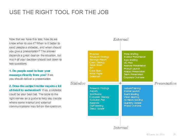
USE THE RIGHT TOOL FOR THE JOB External Now that we have this tool, how do we know when to use it? When is it better to send people a slidedoc, and when should you give a presentation? The answer depends a great deal on the situation, but much of your decision should boil down to two questions: Proposal Research Findings Earnings Report Client Strategy Sales Sheet RFI Case Study White Paper Datasheet 1. Do people need to hear your message directly from you? If so, you should deliver a presentation. 2. Does the subject matter require a lot of detail to understand? If so, a slidedoc could be your best bet. The table to the right serves as a guide to help you decide where some internal and external communications may fall on the spectrum. Press Briefing Investor Presentation Exec Briefing VC Pitch Keynote Presentation Product Launch Analyst Presentation Sales Presentation Corporate Overview Slidedoc Presentation Research Findings Reports Brief/Memo Corporate Strategy Execution Plan Appendix Staff Meeting Status Update Lecture/Training Internal Launch Board Meeting Vision Meeting All-Hands Meeting Quarterly Update Project Overview Internal © Duarte, Inc. 2014 25
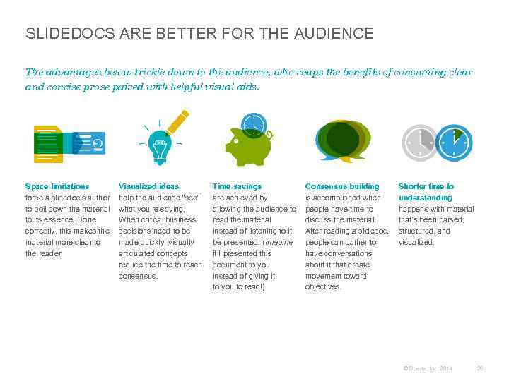
SLIDEDOCS ARE BETTER FOR THE AUDIENCE The advantages below trickle down to the audience, who reaps the benefits of consuming clear and concise prose paired with helpful visual aids. Space limitations force a slidedoc’s author to boil down the material to its essence. Done correctly, this makes the material more clear to the reader. Visualized ideas help the audience “see” what you’re saying. When critical business decisions need to be made quickly, visually articulated concepts reduce the time to reach consensus. Time savings are achieved by allowing the audience to read the material instead of listening to it be presented. (Imagine if I presented this document to you instead of giving it to you to read!) Consensus building is accomplished when people have time to discuss the material. After reading a slidedoc, people can gather to have conversations about it that create movement toward objectives. Shorter time to understanding happens with material that’s been parsed, structured, and visualized. © Duarte, Inc. 2014 26
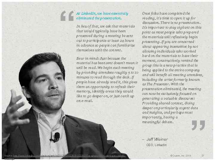
“ At Linked. In, we have essentially eliminated the presentation. Once folks have completed the reading, it's time to open it up for discussion. There is no presentation. In lieu of that, we ask that materials It's important to stay vigilant on this that would typically have been point as most people who prepared presented during a meeting be sent the materials will reflexively begin out to participants at least 24 hours presenting. If you are concerned in advance so people can familiarize about appearing insensitive by not themselves with the content. allowing individuals who worked hard on the materials to have their Bear in mind: Just because the moment, constructively remind the material has been sent doesn't mean it group this is a new practice that is will be read. We begin each meeting being applied to the entire company by providing attendees roughly 5 to 10 and will benefit all meeting attendees, minutes to read through the deck. If including the artist formerly known people have already read it, this gives as The Presenter. With them an opportunity to refresh their presentation eliminated, the meeting memory, identify areas they would can now be exclusively focused on like to go deeper on, or just catch up generating a valuable discourse: on e-mail. Providing shared context, diving deeper on particularly cogent data and insights, and perhaps most importantly, having a meaningful debate. – Jeff Weiner CEO, Linked. In Source: http: //www. linkedin. com/today/post/article/20130701022638 -22330283 -a-simple-rule-to-eliminate-useless. Photo: Copyright meetings ” © Duarte, Inc. 2014 27
SPREAD YOUR SMART THINKING Chunking Trapped Ideas Make It Spreadable The best way to digest information is to chunk it into a digestible form using slide software. There’s a time and a place for complex reports, proposals, and collateral. Businesses need dense documents for things like contracts, full research reports, and transcripts. Really great slidedocs—the ones where smart thinking meets informative visuals —spread like wildfire. They get picked up, reused, and re-expressed. Unlike a document, slidedocs create the flexibility to reuse small units of content. These units of insight spreadily, However, important information can get because all of the copy and images clearly lost if it’s locked in a sea of prose. The support one unique thought. slidedoc format puts this information into the hands of the people. If you want your brilliant work populated throughout an organization, slidedocs are one of the easiest ways for your ideas to take root in every department. © Duarte, Inc. 2014 28
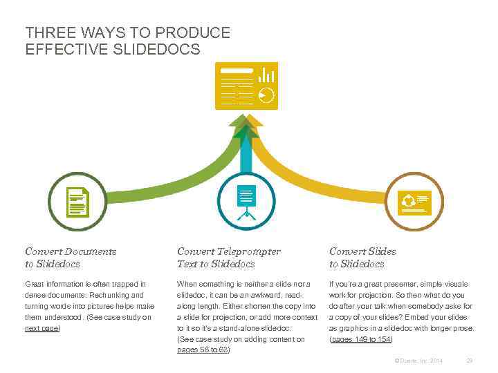
THREE WAYS TO PRODUCE EFFECTIVE SLIDEDOCS Convert Documents to Slidedocs Convert Teleprompter Text to Slidedocs Convert Slides to Slidedocs Great information is often trapped in dense documents. Rechunking and turning words into pictures helps make them understood. (See case study on next page) When something is neither a slide nor a slidedoc, it can be an awkward, readalong length. Either shorten the copy into a slide for projection, or add more context to it so it’s a stand-alone slidedoc. (See case study on adding content on pages 58 to 63) If you’re a great presenter, simple visuals work for projection. So then what do you do after your talk when somebody asks for a copy of your slides? Embed your slides as graphics in a slidedoc with longer prose. (pages 149 to 154) © Duarte, Inc. 2014 29
CASE STUDY Converting Documents Into Slidedocs This case study transforms lengthy, text-based prose from NOAA’s Solar Physics high school curriculum into a visually rich and easily consumable slidedoc that engages the reader and passes along knowledge quickly. © Duarte, Inc. 2014 30
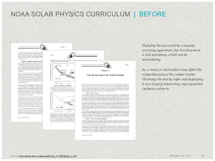
NOAA SOLAR PHYSICS CURRICULUM | BEFORE Studying the sun could be a visually arresting experience, but this document is dull and dense, which can be intimidating. As a result, its dull nature may affect the comprehension of the subject matter. Chunking the text by topic and displaying it in a visually interesting way can entice students to dive in. Source: http: //www. swpc. noaa. gov/Curric_7 -12/Chapter_1. pdf © Duarte, Inc. 2014 31
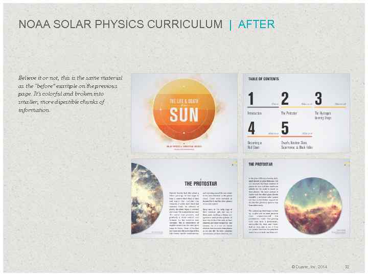
NOAA SOLAR PHYSICS CURRICULUM | AFTER Believe it or not, this is the same material as the “before” example on the previous page. It’s colorful and broken into smaller, more digestible chunks of information. © Duarte, Inc. 2014 32
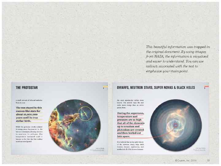
This beautiful information was trapped in the original document. By using images from NASA, the information is visualized and easier to understand. You can use callouts associated with the text to emphasize your main point. © Duarte, Inc. 2014 33
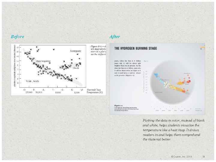
Before After Plotting the data in color, instead of black and white, helps students visualize the temperature like a heat map. It draws readers in and helps them comprehend the material better. © Duarte, Inc. 2014 34
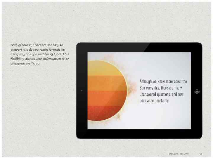
And, of course, slidedocs are easy to convert into device-ready formats by using any one of a number of tools. This flexibility allows your information to be consumed on the go. © Duarte, Inc. 2014 35
PUBLISHING IS CHANGING There has been an incredible sea of change in publishing over the past few years. Large publishers are scrambling to figure out the digital era and digital book sales are surpassing traditional print books. In 2008, when my first book was published, there were only a handful of other business books that used visuals as heavily as we did. Now, several business books per year are released with a visual focus. The uptick in visual books is closely related to organizations’ presentation culture and how we consume information on a day-to-day basis. The introduction of tablets and digital books has conditioned people to read on screens. Yet, I still haven’t found a publishing platform that makes it easy to publish a digital, visual book that works on all screens, across all platforms. Another benefit is the fact that slidedocs aren’t trapped in a propriety platform that is difficult to promote or share with others. You can convert slidedocs to other file formats such as PDF, HTML, video, and images relatively easily. Slidedocs, on the other hand, are multiplatform. You can distribute them via e-mail, tablets, servers, or social media like Slide. Share. All this can be done in an application that you use every day. © Duarte, Inc. 2014 36
Writing a Slidedoc + Content Creation + Case Study: Dense Slides Converted + Architecture of a Slidedoc + Data and Diagrams Clarify Content + Case Study: SAP Top 10 02 © Duarte, Inc. 2014 37
+ Content Creation 02 © Duarte, Inc. 2014 38
KNOW YOUR AUDIENCE Take a mental walk in their shoes. In all three of my books, I’ve spent a significant amount of time talking about the need to craft your message around the audience’s concerns. You could say some things never change. Take a mental walk in their shoes. Anticipate their concerns, their questions, and their circumstances, and keep those thoughts in mind as you construct your copy. You’ll be glad you did. The truth is that no matter your mode of communication, your audience should always be your number one priority. They must understand your message. Without their buy-in, your message doesn’t go anywhere. People aren’t motivated by what’s important. They’re motivated by “What’s in it for me? ” As you create your slidedoc, remember to make it evident to your readers what’s in it for them. © Duarte, Inc. 2014 39
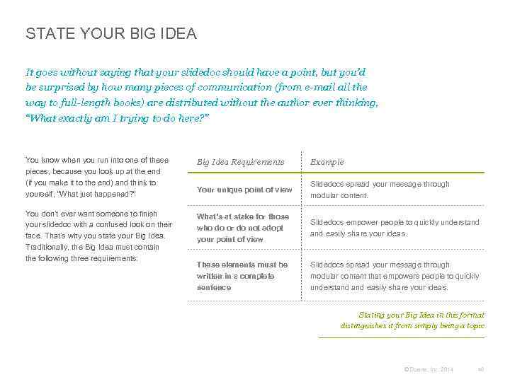
STATE YOUR BIG IDEA It goes without saying that your slidedoc should have a point, but you’d be surprised by how many pieces of communication (from e-mail all the way to full-length books) are distributed without the author ever thinking, “What exactly am I trying to do here? ” You know when you run into one of these pieces, because you look up at the end (if you make it to the end) and think to yourself, “What just happened? ” Big Idea Requirements Example Your unique point of view Slidedocs spread your message through modular content. You don’t ever want someone to finish your slidedoc with a confused look on their face. That’s why you state your Big Idea. Traditionally, the Big Idea must contain the following three requirements: What’s at stake for those who do or do not adopt your point of view Slidedocs empower people to quickly understand easily share your ideas. These elements must be written in a complete sentence Slidedocs spread your message through modular content that empowers people to quickly understand easily share your ideas. Stating your Big Idea in this format distinguishes it from simply being a topic. © Duarte, Inc. 2014 40
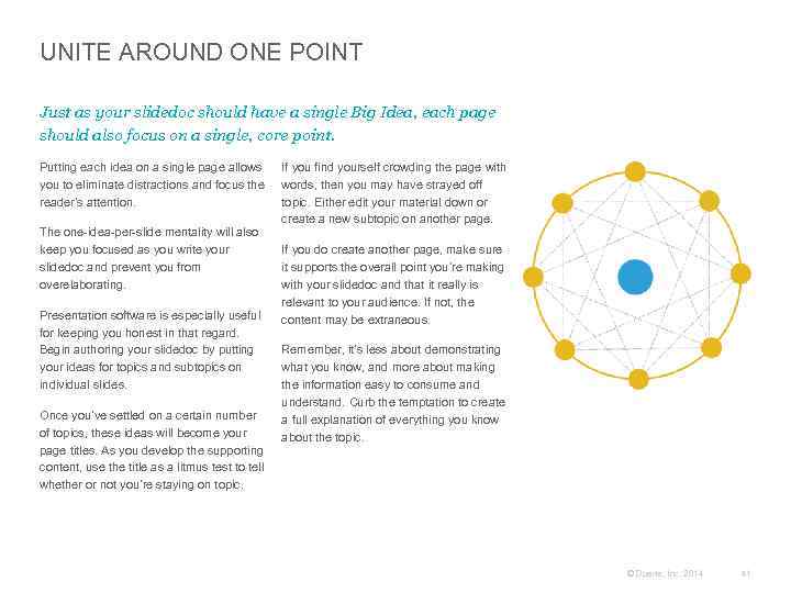
UNITE AROUND ONE POINT Just as your slidedoc should have a single Big Idea, each page should also focus on a single, core point. Putting each idea on a single page allows you to eliminate distractions and focus the reader’s attention. The one-idea-per-slide mentality will also keep you focused as you write your slidedoc and prevent you from overelaborating. Presentation software is especially useful for keeping you honest in that regard. Begin authoring your slidedoc by putting your ideas for topics and subtopics on individual slides. Once you’ve settled on a certain number of topics, these ideas will become your page titles. As you develop the supporting content, use the title as a litmus test to tell whether or not you’re staying on topic. If you find yourself crowding the page with words, then you may have strayed off topic. Either edit your material down or create a new subtopic on another page. If you do create another page, make sure it supports the overall point you’re making with your slidedoc and that it really is relevant to your audience. If not, the content may be extraneous. Remember, it’s less about demonstrating what you know, and more about making the information easy to consume and understand. Curb the temptation to create a full explanation of everything you know about the topic. © Duarte, Inc. 2014 41
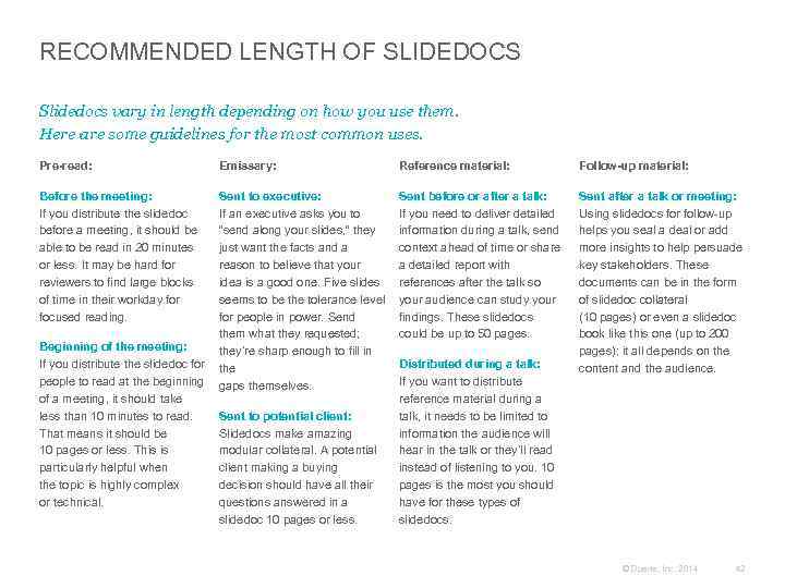
RECOMMENDED LENGTH OF SLIDEDOCS Slidedocs vary in length depending on how you use them. Here are some guidelines for the most common uses. Pre-read: Before the meeting: If you distribute the slidedoc before a meeting, it should be able to be read in 20 minutes or less. It may be hard for reviewers to find large blocks of time in their workday for focused reading. Emissary: Sent to executive: If an executive asks you to “send along your slides, ” they just want the facts and a reason to believe that your idea is a good one. Five slides seems to be the tolerance level for people in power. Send them what they requested; Beginning of the meeting: they’re sharp enough to fill in If you distribute the slidedoc for the people to read at the beginning gaps themselves. of a meeting, it should take less than 10 minutes to read. Sent to potential client: That means it should be Slidedocs make amazing 10 pages or less. This is modular collateral. A potential particularly helpful when client making a buying the topic is highly complex decision should have all their or technical. questions answered in a slidedoc 10 pages or less. Reference material: Follow-up material: Sent before or after a talk: If you need to deliver detailed information during a talk, send context ahead of time or share a detailed report with references after the talk so your audience can study your findings. These slidedocs could be up to 50 pages. Sent after a talk or meeting: Using slidedocs for follow-up helps you seal a deal or add more insights to help persuade key stakeholders. These documents can be in the form of slidedoc collateral (10 pages) or even a slidedoc book like this one (up to 200 pages); it all depends on the content and the audience. Distributed during a talk: If you want to distribute reference material during a talk, it needs to be limited to information the audience will hear in the talk or they’ll read instead of listening to you. 10 pages is the most you should have for these types of slidedocs. © Duarte, Inc. 2014 42
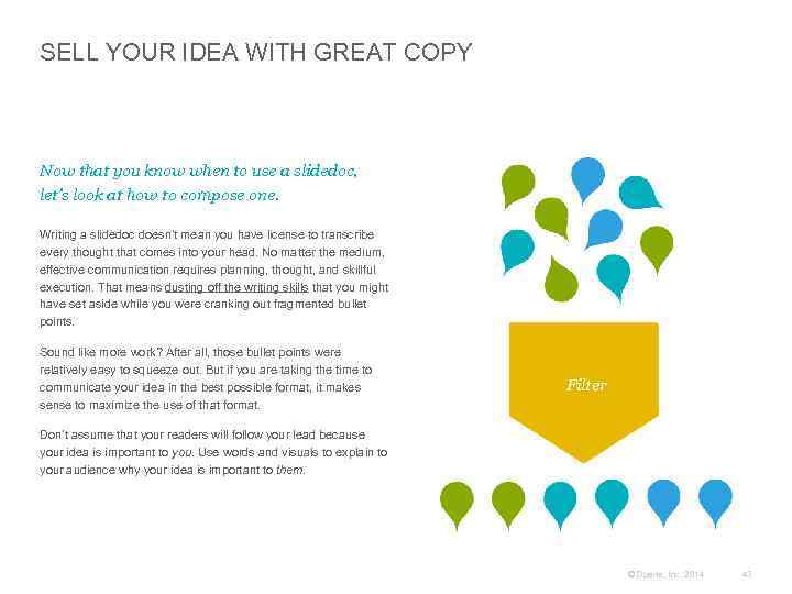
SELL YOUR IDEA WITH GREAT COPY Now that you know when to use a slidedoc, let’s look at how to compose one. Writing a slidedoc doesn’t mean you have license to transcribe every thought that comes into your head. No matter the medium, effective communication requires planning, thought, and skillful execution. That means dusting off the writing skills that you might have set aside while you were cranking out fragmented bullet points. Sound like more work? After all, those bullet points were relatively easy to squeeze out. But if you are taking the time to communicate your idea in the best possible format, it makes sense to maximize the use of that format. Filter Don’t assume that your readers will follow your lead because your idea is important to you. Use words and visuals to explain to your audience why your idea is important to them. © Duarte, Inc. 2014 43
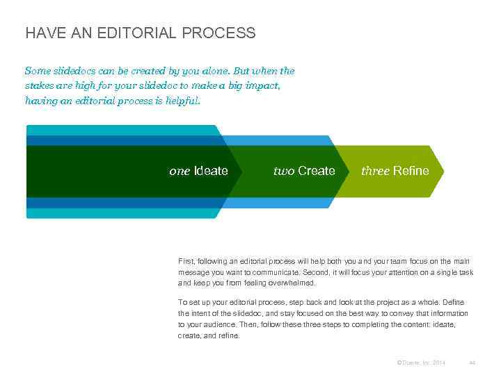
HAVE AN EDITORIAL PROCESS Some slidedocs can be created by you alone. But when the stakes are high for your slidedoc to make a big impact, having an editorial process is helpful. one Ideate two Create three Refine First, following an editorial process will help both you and your team focus on the main message you want to communicate. Second, it will focus your attention on a single task and keep you from feeling overwhelmed. To set up your editorial process, step back and look at the project as a whole. Define the intent of the slidedoc, and stay focused on the best way to convey that information to your audience. Then, follow these three steps to completing the content: ideate, create, and refine. © Duarte, Inc. 2014 44
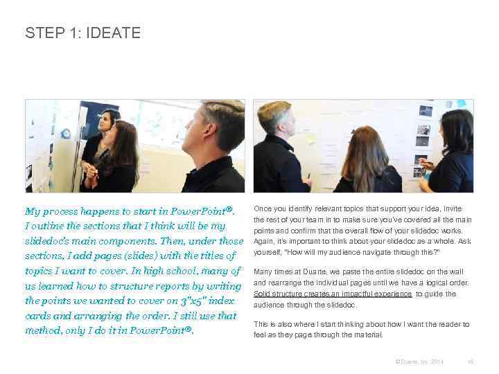
STEP 1: IDEATE My process happens to start in Power. Point®. I outline the sections that I think will be my slidedoc’s main components. Then, under those sections, I add pages (slides) with the titles of topics I want to cover. In high school, many of us learned how to structure reports by writing the points we wanted to cover on 3"x 5" index cards and arranging the order. I still use that method, only I do it in Power. Point®. Once you identify relevant topics that support your idea, invite the rest of your team in to make sure you’ve covered all the main points and confirm that the overall flow of your slidedoc works. Again, it’s important to think about your slidedoc as a whole. Ask yourself, “How will my audience navigate through this? ” Many times at Duarte, we paste the entire slidedoc on the wall and rearrange the individual pages until we have a logical order. Solid structure creates an impactful experience to guide the audience through the slidedoc. This is also where I start thinking about how I want the reader to feel as they page through the material. © Duarte, Inc. 2014 45
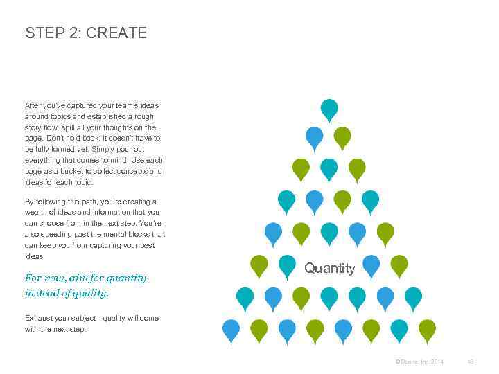
STEP 2: CREATE After you’ve captured your team’s ideas around topics and established a rough story flow, spill all your thoughts on the page. Don’t hold back; it doesn’t have to be fully formed yet. Simply pour out everything that comes to mind. Use each page as a bucket to collect concepts and ideas for each topic. By following this path, you’re creating a wealth of ideas and information that you can choose from in the next step. You’re also speeding past the mental blocks that can keep you from capturing your best ideas. For now, aim for quantity instead of quality. Quantity Exhaust your subject—quality will come with the next step. © Duarte, Inc. 2014 46
STEP 3: REFINE Once you have your ideas collected, refine them. This is the time to craft your copy and make sure every word and every sentence contributes to the main idea on the page and the slidedoc’s Big Idea. Once you’re here, it’s a good time to invite your team back in. Make sure they have context, but also encourage them to bring a critical eye and represent the needs of your audience. At Duarte, we repost everything on the board and take a second look at the flow. With a more fully fleshed out version, we refine the slidedoc until we feel we have the right flow and right information on each slide. Refine During this step, we also ensure that the information is chunked properly. This attention to the big picture pays off in reader comprehension. © Duarte, Inc. 2014 47
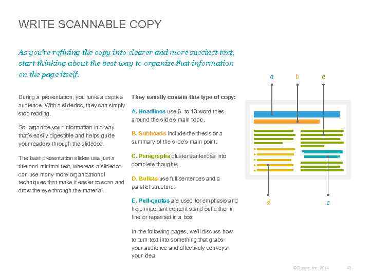
WRITE SCANNABLE COPY As you’re refining the copy into clearer and more succinct text, start thinking about the best way to organize that information on the page itself. a b c During a presentation, you have a captive They usually contain this type of copy: audience. With a slidedoc, they can simply A. Headlines use 6 - to 10 -word titles stop reading. around the slide’s main topic. So, organize your information in a way B. Subheads include thesis or a that’s easily digestible and helps guide summary of the slide’s main point. your readers through the slidedoc. The best presentation slides use just a title and minimal text, whereas a slidedoc can use many more organizational techniques that make it easier to scan and draw the eye through the material. C. Paragraphs cluster sentences into complete thoughts. D. Bullets use full sentences and a parallel structure. E. Pull-quotes are used for emphasis and help important content stand out either in line or repeated in a box. d e In the following pages, we’ll discuss how to turn text into something that grabs your audience and effectively conveys your idea. © Duarte, Inc. 2014 48
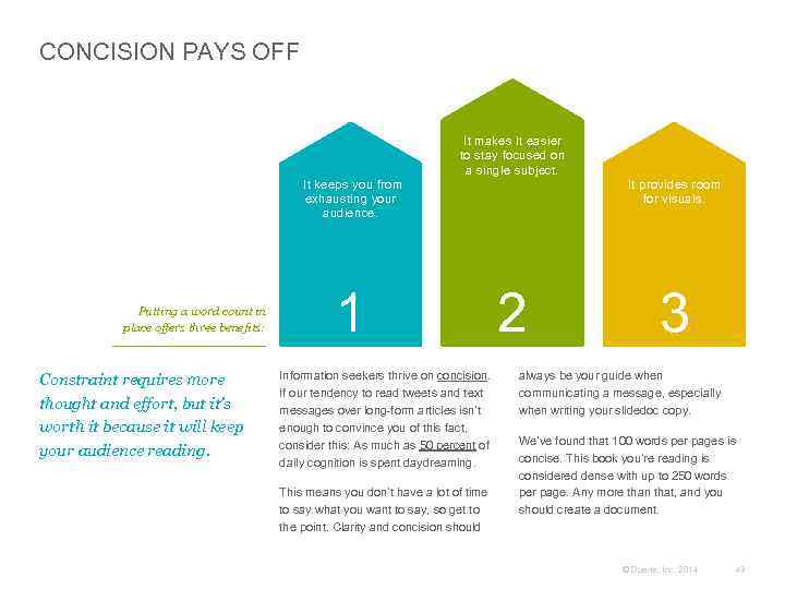
CONCISION PAYS OFF It makes it easier to stay focused on a single subject. It keeps you from exhausting your audience. Putting a word count in place offers three benefits: Constraint requires more thought and effort, but it’s worth it because it will keep your audience reading. 1 Information seekers thrive on concision. If our tendency to read tweets and text messages over long-form articles isn’t enough to convince you of this fact, consider this: As much as 50 percent of daily cognition is spent daydreaming. This means you don’t have a lot of time to say what you want to say, so get to the point. Clarity and concision should It provides room for visuals. 2 3 always be your guide when communicating a message, especially when writing your slidedoc copy. We’ve found that 100 words per pages is concise. This book you’re reading is considered dense with up to 250 words per page. Any more than that, and you should create a document. © Duarte, Inc. 2014 49
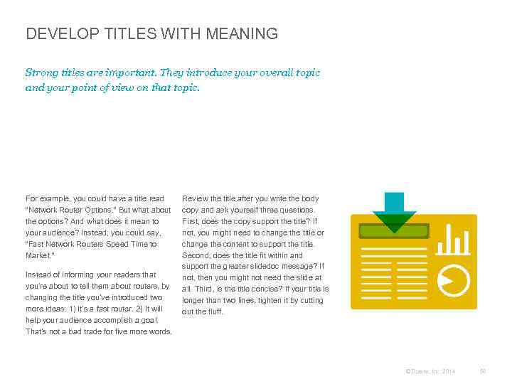
DEVELOP TITLES WITH MEANING Strong titles are important. They introduce your overall topic and your point of view on that topic. For example, you could have a title read “Network Router Options. ” But what about the options? And what does it mean to your audience? Instead, you could say, “Fast Network Routers Speed Time to Market. ” Instead of informing your readers that you’re about to tell them about routers, by changing the title you’ve introduced two more ideas: 1) It’s a fast router. 2) It will help your audience accomplish a goal. That’s not a bad trade for five more words. Review the title after you write the body copy and ask yourself three questions. First, does the copy support the title? If not, you might need to change the title or change the content to support the title. Second, does the title fit within and support the greater slidedoc message? If not, then you might not need the slide at all. Third, is the title concise? If your title is longer than two lines, tighten it by cutting out the fluff. © Duarte, Inc. 2014 50
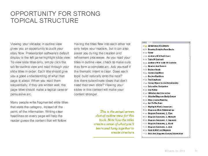
OPPORTUNITY FOR STRONG TOPICAL STRUCTURE Viewing your slidedoc in outline view gives you an opportunity to audit your story flow. Presentation software’s default display is the left panel highlight slide view. To view slide titles only, simply click the tab for outline view and read through your slide titles in order. Each title should give you a good understanding of what that page is about. When you read them sequentially, if they are written well, the page titles should make a logical case or persuasive arc. Many people write fragmented slide titles that state the category, instead of the point, of the information. Writing clear headlines on every page will help the reader guess the content that will follow. Having the titles flow into each other not only helps your readers, but it can also assist you during the creation and refinement processes. As you read your titles in outline view, check to make sure they form a complete arc. Ask yourself if thematic intent is clear. Does each topic build naturally onto the next? Are there subordinate ideas that don’t need their own slide? Viewing your slides in this context will make your content stronger. This is the actual screen shot of outline view for this book. Note how the titles create a sense of what you’ll learn and hang together to create structure. © Duarte, Inc. 2014 51
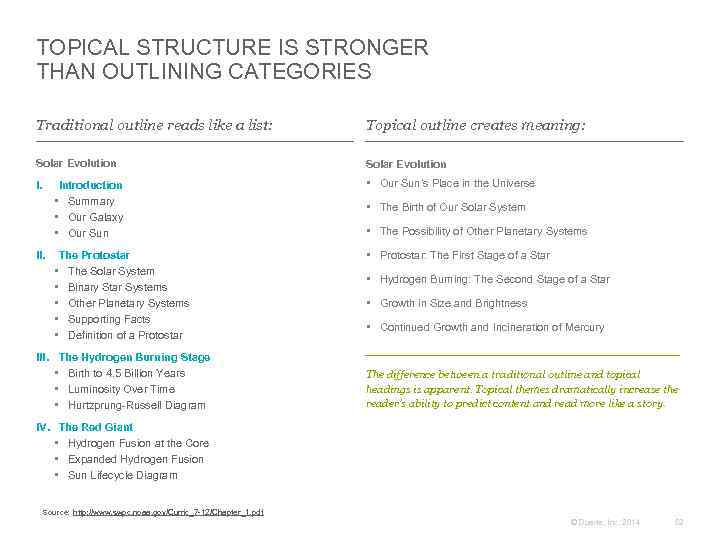
TOPICAL STRUCTURE IS STRONGER THAN OUTLINING CATEGORIES Traditional outline reads like a list: Topical outline creates meaning: Solar Evolution I. Introduction • Summary • Our Galaxy • Our Sun’s Place in the Universe The Protostar • The Solar System • Binary Star Systems • Other Planetary Systems • Supporting Facts • Definition of a Protostar • Protostar: The First Stage of a Star II. III. The Hydrogen Burning Stage • Birth to 4. 5 Billion Years • Luminosity Over Time • Hurtzprung-Russell Diagram • The Birth of Our Solar System • The Possibility of Other Planetary Systems • Hydrogen Burning: The Second Stage of a Star • Growth in Size and Brightness • Continued Growth and Incineration of Mercury The difference between a traditional outline and topical headings is apparent. Topical themes dramatically increase the reader’s ability to predict content and read more like a story. IV. The Red Giant • Hydrogen Fusion at the Core • Expanded Hydrogen Fusion • Sun Lifecycle Diagram Source: http: //www. swpc. noaa. gov/Curric_7 -12/Chapter_1. pdf © Duarte, Inc. 2014 52
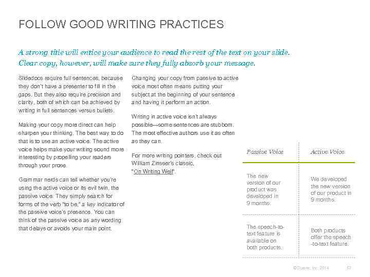
FOLLOW GOOD WRITING PRACTICES A strong title will entice your audience to read the rest of the text on your slide. Clear copy, however, will make sure they fully absorb your message. Slidedocs require full sentences, because they don’t have a presenter to fill in the gaps. But they also require precision and clarity, both of which can be achieved by writing in full sentences versus bullets. Making your copy more direct can help sharpen your thinking. The best way to do that is to use an active voice. The active voice helps make your writing sound more interesting by propelling your readers through your prose. Grammar nerds can tell whether you’re using the active voice or its evil twin, the passive voice. They simply search forms of the verb “to be, ” a key indicator of the passive voice’s presence. You can think of the passive voice as any wording that delays or avoids your main point. Changing your copy from passive to active voice most often means putting your subject at the beginning of your sentence and having it perform an action. Writing in active voice isn’t always possible—some sentences are stubborn. The most effective authors use it as often as they can. For more writing pointers, check out William Zinsser’s classic, “On Writing Well”. Passive Voice Active Voice The new version of our product was developed in 9 months. We developed the new version of our product in 9 months. The speech-totext feature is available on both products. Both products offer the speech -to-text feature. © Duarte, Inc. 2014 53
WRITE COMPELLING COPY The slidedoc format gives you a higher word count than a traditional slide, but less than a document. By writing full paragraphs, you have room to craft more compelling, persuasive copy. This is imperative since, without a presenter, your copy and visuals are the only thing guiding the audience through the slidedoc. That said, a slidedoc doesn’t have to be boring or ineffectual—here a few ways to avoid that: Use emotional appeal: Business copy tends to be cold and factual. But decisions are made from the gut before they are rationalized. Incorporate emotive visuals, shocking statistics, and stories that create an emotional response in the reader. Make benefits explicit: Before a reader will get on board with what you’re proposing, they need to see what’s in it for them. Make it clear what reward they will receive if they take the risk of aligning with you. Use analogies: People respond when they can identify things as either similar or different from their perspective. Using analogies to compare the similarities and differences aids understanding. This type of language helps people rationalize, remember your ideas, and make decisions easier. Cite examples: Show readers examples of times when others in a similar situation made a decision to align with your perspective and had a successful outcome. Case studies and proof help people through their decision process. © Duarte, Inc. 2014 54
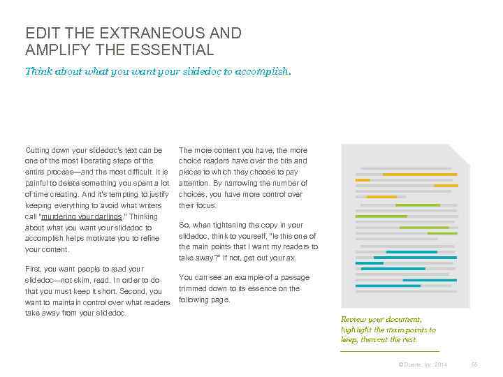
EDIT THE EXTRANEOUS AND AMPLIFY THE ESSENTIAL Think about what you want your slidedoc to accomplish. Cutting down your slidedoc's text can be one of the most liberating steps of the entire process—and the most difficult. It is painful to delete something you spent a lot of time creating. And it’s tempting to justify keeping everything to avoid what writers call “murdering your darlings. ” Thinking about what you want your slidedoc to accomplish helps motivate you to refine your content. The more content you have, the more choice readers have over the bits and pieces to which they choose to pay attention. By narrowing the number of choices, you have more control over their focus. So, when tightening the copy in your slidedoc, think to yourself, “Is this one of the main points that I want my readers to take away? ” If not, get out your ax. First, you want people to read your You can see an example of a passage slidedoc—not skim, read. In order to do trimmed down to its essence on the that you must keep it short. Second, you want to maintain control over what readers following page. take away from your slidedoc. Review your document, highlight the main points to keep, then cut the rest. © Duarte, Inc. 2014 55
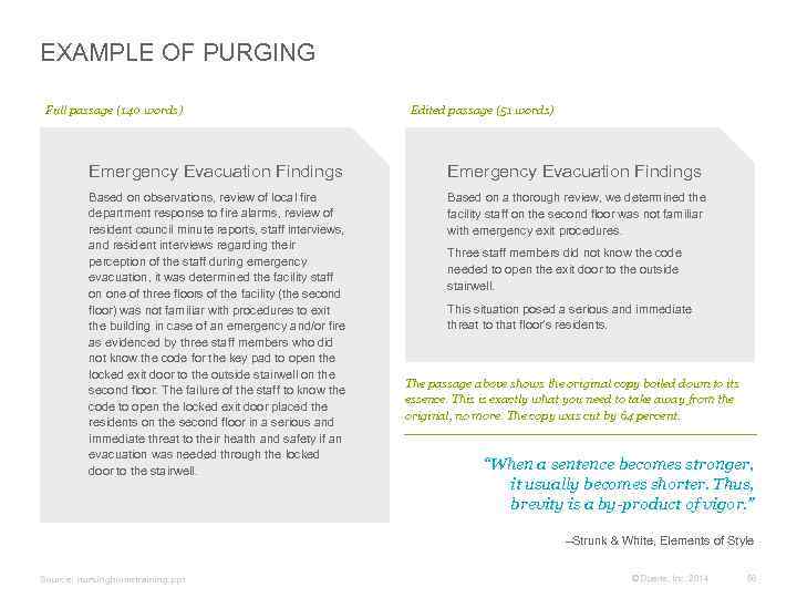
EXAMPLE OF PURGING Full passage (140 words) Edited passage (51 words) Emergency Evacuation Findings Based on observations, review of local fire department response to fire alarms, review of resident council minute reports, staff interviews, and resident interviews regarding their perception of the staff during emergency evacuation, it was determined the facility staff on one of three floors of the facility (the second floor) was not familiar with procedures to exit the building in case of an emergency and/or fire as evidenced by three staff members who did not know the code for the key pad to open the locked exit door to the outside stairwell on the second floor. The failure of the staff to know the code to open the locked exit door placed the residents on the second floor in a serious and immediate threat to their health and safety if an evacuation was needed through the locked door to the stairwell. Based on a thorough review, we determined the facility staff on the second floor was not familiar with emergency exit procedures. Three staff members did not know the code needed to open the exit door to the outside stairwell. This situation posed a serious and immediate threat to that floor’s residents. The passage above shows the original copy boiled down to its essence. This is exactly what you need to take away from the original, no more. The copy was cut by 64 percent. “When a sentence becomes stronger, it usually becomes shorter. Thus, brevity is a by-product of vigor. ” –Strunk & White, Elements of Style Source: nursinghometraining. ppt © Duarte, Inc. 2014 56
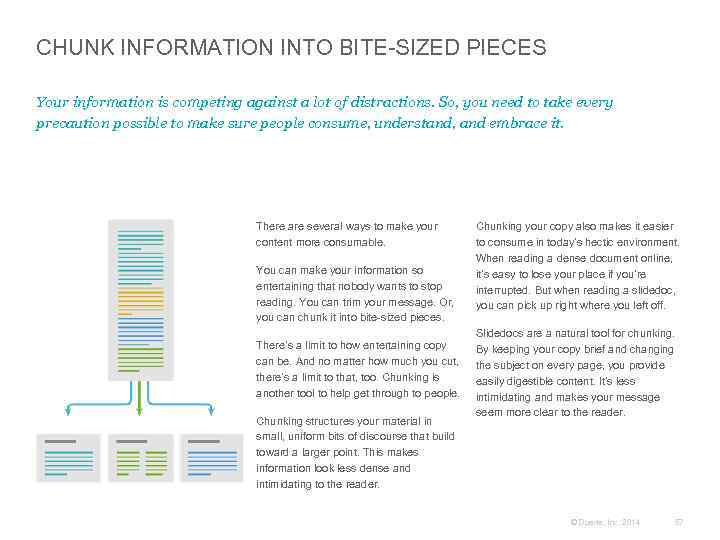
CHUNK INFORMATION INTO BITE-SIZED PIECES Your information is competing against a lot of distractions. So, you need to take every precaution possible to make sure people consume, understand, and embrace it. There are several ways to make your content more consumable. You can make your information so entertaining that nobody wants to stop reading. You can trim your message. Or, you can chunk it into bite-sized pieces. There’s a limit to how entertaining copy can be. And no matter how much you cut, there’s a limit to that, too. Chunking is another tool to help get through to people. Chunking structures your material in small, uniform bits of discourse that build toward a larger point. This makes information look less dense and intimidating to the reader. Chunking your copy also makes it easier to consume in today’s hectic environment. When reading a dense document online, it’s easy to lose your place if you’re interrupted. But when reading a slidedoc, you can pick up right where you left off. Slidedocs are a natural tool for chunking. By keeping your copy brief and changing the subject on every page, you provide easily digestible content. It’s less intimidating and makes your message seem more clear to the reader. © Duarte, Inc. 2014 57
CASE STUDY Converting Dense Slides Into Slidedocs The following slides for the Hawaii Tsunami Warning System were too dense to be slides, but not dense enough to be effective documents. So, we combined the content from the slides and speaker notes to make a beautiful slidedoc. © Duarte, Inc. 2014 58
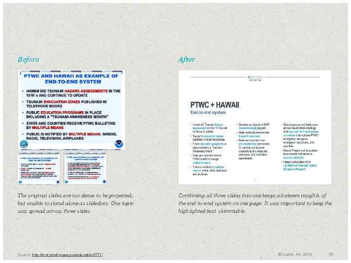
Before After The original slides are too dense to be projected, but unable to stand alone as slidedocs. One topic was spread across three slides. Combining all three slides into one keeps all eleven insights of the end-to-end system on one page. It was important to keep the highlighted text skimmable. Source: http: //nctr. pmel. noaa. gov/education/ITTI / © Duarte, Inc. 2014 59
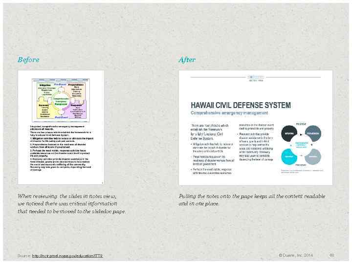
Before After When reviewing the slides in notes view, we noticed there was critical information that needed to be moved to the slidedoc page. Pulling the notes onto the page keeps all the content readable and in one place. Source: http: //nctr. pmel. noaa. gov/education/ITTI/ © Duarte, Inc. 2014 60
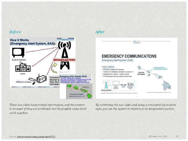
Before After These two slides have critical information, and the content is stronger if they are combined, but the graphic styles don’t work together. By combining the two slides and using a consistent illustration style, you see the system in relation to its designated location. Source: http: //nctr. pmel. noaa. gov/education/ITTI / © Duarte, Inc. 2014 61
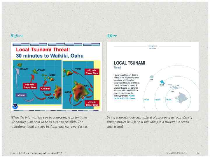
Before After When the information you’re conveying is potentially life-saving, you need to be as clear as possible. The multidirectional arrows in this graphic are confusing. Using concentric circles instead of swooping arrows clearly demonstrates how long it will take for a tsunami to reach island. Source: http: //nctr. pmel. noaa. gov/education/ITTI / © Duarte, Inc. 2014 62
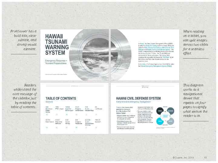
Front cover has a bold title, clear subtitle, and strong visual element. When reading on a tablet, you can split images across two slides for a seamless effect. Readers understand the core message of the slidedoc just by reading the table of contents. This diagram works as a navigational device that repeats on four pages to signify what section the reader is in. © Duarte, Inc. 2014 63
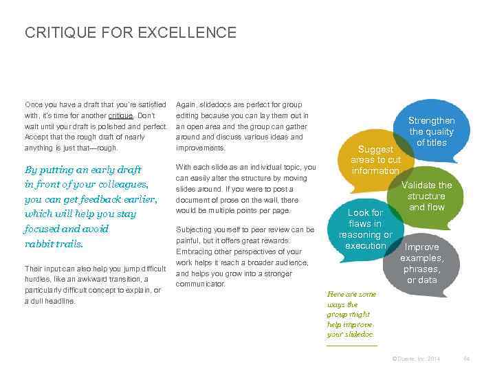
CRITIQUE FOR EXCELLENCE Once you have a draft that you’re satisfied with, it’s time for another critique. Don’t wait until your draft is polished and perfect. Accept that the rough draft of nearly anything is just that—rough. Again, slidedocs are perfect for group editing because you can lay them out in an open area and the group can gather around and discuss various ideas and improvements. By putting an early draft in front of your colleagues, you can get feedback earlier, which will help you stay focused and avoid rabbit trails. With each slide as an individual topic, you can easily alter the structure by moving slides around. If you were to post a document of prose on the wall, there would be multiple points per page. Their input can also help you jump difficult hurdles, like an awkward transition, a particularly difficult concept to explain, or a dull headline. Subjecting yourself to peer review can be painful, but it offers great rewards. Embracing other perspectives of your work helps it reach a broader audience, and helps you grow into a stronger communicator. Strengthen the quality of titles Suggest areas to cut information Validate the structure and flow Look for flaws in reasoning or execution Improve examples, phrases, or data Here are some ways the group might help improve your slidedoc. © Duarte, Inc. 2014 64
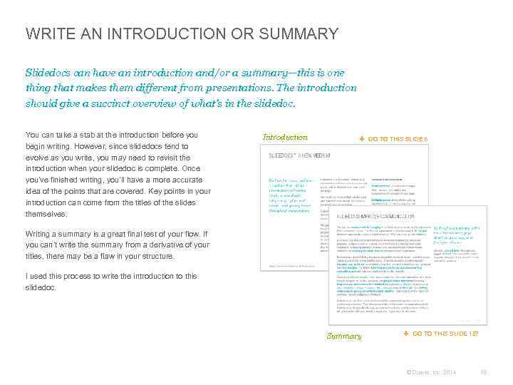
WRITE AN INTRODUCTION OR SUMMARY Slidedocs can have an introduction and/or a summary—this is one thing that makes them different from presentations. The introduction should give a succinct overview of what’s in the slidedoc. You can take a stab at the introduction before you begin writing. However, since slidedocs tend to evolve as you write, you may need to revisit the introduction when your slidedoc is complete. Once you’ve finished writing, you’ll have a more accurate idea of the points that are covered. Key points in your introduction can come from the titles of the slides themselves. Introduction GO TO THIS SLIDE 6 Writing a summary is a great final test of your flow. If you can’t write the summary from a derivative of your titles, there may be a flaw in your structure. I used this process to write the introduction to this slidedoc. Summary GO TO THIS SLIDE 157 © Duarte, Inc. 2014 65

“ The traditional kind of corporate meeting starts with a presentation. Somebody gets up in front of the room and presents with a Power. Point presentation, some type of slide show. In our view, you get very little information, you get bullet points. This is easy for the presenter, but difficult for the audience. And so instead, all of our meetings are structured around a 6 -page narrative memo. When you have to write your ideas out in complete sentences, it forces deeper clarity. – Jeff Bezos CEO, Amazon ” Photo: Copyright 2010 Steve Jurvetson Source: http: //drte. co/qa © Duarte, Inc. 2014 66

+ Architecture of a Slidedoc 02 © Duarte, Inc. 2014 67
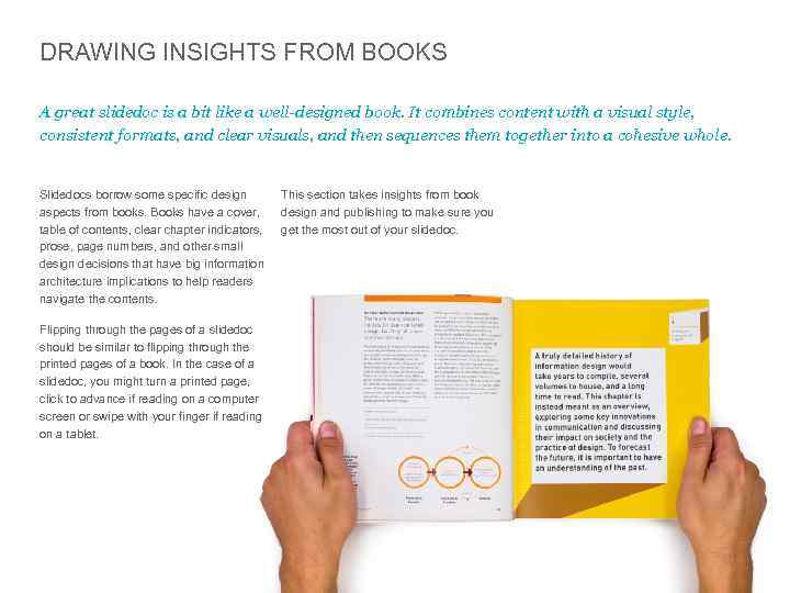
DRAWING INSIGHTS FROM BOOKS A great slidedoc is a bit like a well-designed book. It combines content with a visual style, consistent formats, and clear visuals, and then sequences them together into a cohesive whole. Slidedocs borrow some specific design aspects from books. Books have a cover, table of contents, clear chapter indicators, prose, page numbers, and other small design decisions that have big information architecture implications to help readers navigate the contents. This section takes insights from book design and publishing to make sure you get the most out of your slidedoc. Flipping through the pages of a slidedoc should be similar to flipping through the printed pages of a book. In the case of a slidedoc, you might turn a printed page, click to advance if reading on a computer screen or swipe with your finger if reading on a tablet. © Duarte, Inc. 2014 68
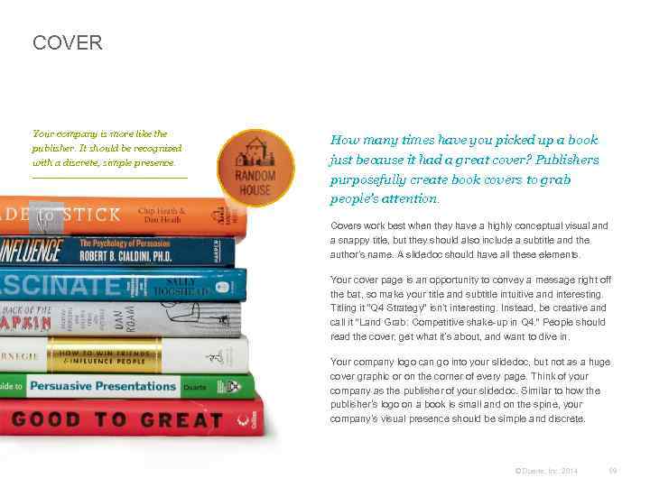
COVER Your company is more like the publisher. It should be recognized with a discrete, simple presence. How many times have you picked up a book just because it had a great cover? Publishers purposefully create book covers to grab people’s attention. Covers work best when they have a highly conceptual visual and a snappy title, but they should also include a subtitle and the author’s name. A slidedoc should have all these elements. Your cover page is an opportunity to convey a message right off the bat, so make your title and subtitle intuitive and interesting. Titling it “Q 4 Strategy” isn’t interesting. Instead, be creative and call it “Land Grab: Competitive shake-up in Q 4. ” People should read the cover, get what it’s about, and want to dive in. Your company logo can go into your slidedoc, but not as a huge cover graphic or on the corner of every page. Think of your company as the publisher of your slidedoc. Similar to how the publisher’s logo on a book is small and on the spine, your company’s visual presence should be simple and discrete. © Duarte, Inc. 2014 69
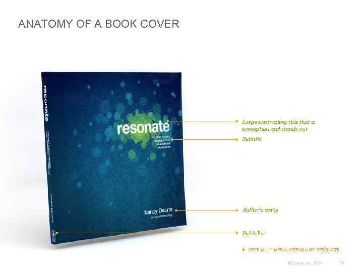
ANATOMY OF A BOOK COVER Large contrasting title that is conceptual and stands out Subtitle Author’s name Publisher FREE MULTIMEDIA VERSION OF RESONATE © Duarte, Inc. 2014 70
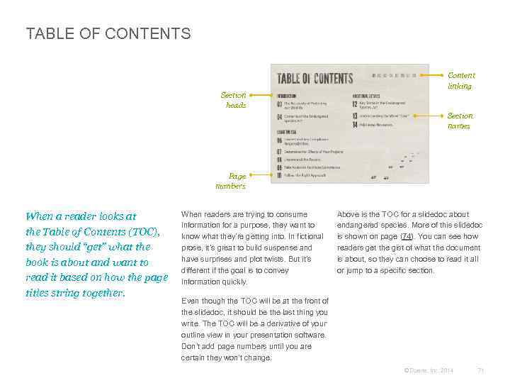
TABLE OF CONTENTS Content linking Section heads Section names Page numbers When a reader looks at the Table of Contents (TOC), they should “get” what the book is about and want to read it based on how the page titles string together. When readers are trying to consume information for a purpose, they want to know what they’re getting into. In fictional prose, it’s great to build suspense and have surprises and plot twists. But it’s different if the goal is to convey information quickly. Above is the TOC for a slidedoc about endangered species. More of this slidedoc is shown on page (74). You can see how readers get the gist of what the document is about, so they can choose to read it all or jump to a specific section. Even though the TOC will be at the front of the slidedoc, it should be the last thing you write. The TOC will be a derivative of your outline view in your presentation software. Don’t add page numbers until you are certain they won’t change. © Duarte, Inc. 2014 71
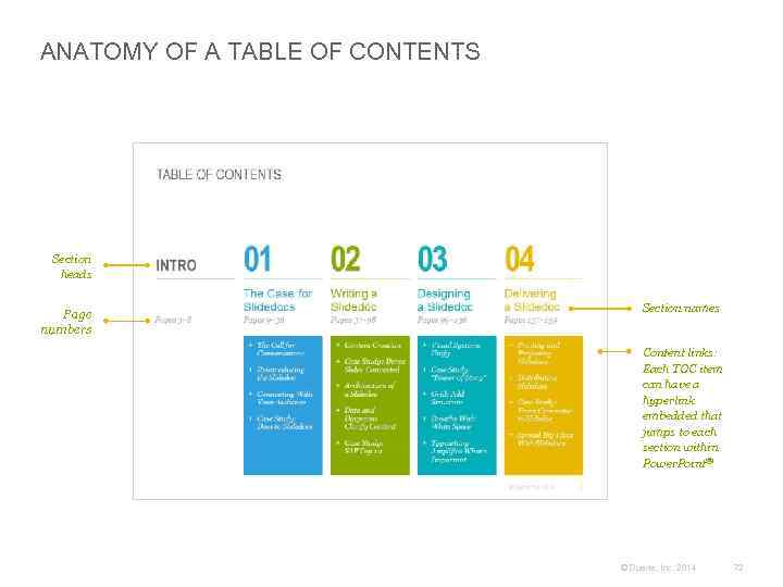
ANATOMY OF A TABLE OF CONTENTS Section heads Page numbers Section names Content links: Each TOC item can have a hyperlink embedded that jumps to each section within Power. Point® © Duarte, Inc. 2014 72
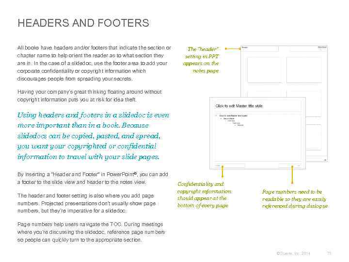
HEADERS AND FOOTERS All books have headers and/or footers that indicate the section or chapter name to help orient the reader as to what section they are in. In the case of a slidedoc, use the footer area to add your corporate confidentiality or copyright information which discourages people from spreading your secrets. The “header” setting in PPT appears on the notes page Having your company’s great thinking floating around without copyright information puts you at risk for idea theft. Using headers and footers in a slidedoc is even more important than in a book. Because slidedocs can be copied, pasted, and spread, you want your copyrighted or confidential information to travel with your slide pages. By inserting a “Header and Footer” in Power. Point®, you can add a footer to the slide view and header to the notes view. The header and footer setting is also where you add page numbers. Projected presentations don’t usually show page numbers, but they’re imperative for a slidedoc. Confidentiality and copyright information should appear at the bottom of every page Page numbers need to be readable so they are easily referenced during dialogue Page numbers help users navigate the TOC. During meetings where you’re discussing the slidedoc, reference page numbers so people can quickly turn to the appropriate section. © Duarte, Inc. 2014 73
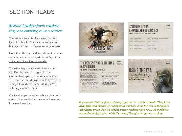
SECTION HEADS Section heads inform readers they are entering a new section. The section head is like a new chapter head in a book. You know when you’ve left one chapter and are entering the next. Each time the material transitions to a new section, use a distinctly different layout to distinguish the change visually. Transitioning to a new section can be signified by color, bold graphic, or memorable type. No matter what visual cue you use, the design should be distinct enough to make it obvious that you’re entering a new section. Contrast helps make transitions clear and sets up the reader to know what to expect from each section. You can see that the first and last pages serve as section heads. They have large type and images of endangered animals while the rest of the pages have dense prose. In the slidedoc you’re reading right now, we made the section heads full color, while the rest of the information is on white. © Duarte, Inc. 2014 74
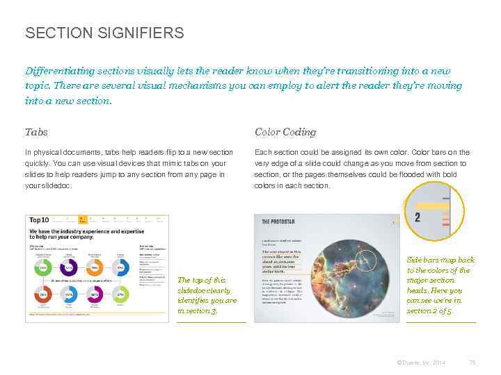
SECTION SIGNIFIERS Differentiating sections visually lets the reader know when they’re transitioning into a new topic. There are several visual mechanisms you can employ to alert the reader they’re moving into a new section. Tabs Color Coding In physical documents, tabs help readers flip to a new section quickly. You can use visual devices that mimic tabs on your slides to help readers jump to any section from any page in your slidedoc. Each section could be assigned its own color. Color bars on the very edge of a slide could change as you move from section to section, or the pages themselves could be flooded with bold colors in each section. The top of this slidedoc clearly identifies you are in section 3. Side bars map back to the colors of the major section heads. Here you can see we’re in section 2 of 5. © Duarte, Inc. 2014 75
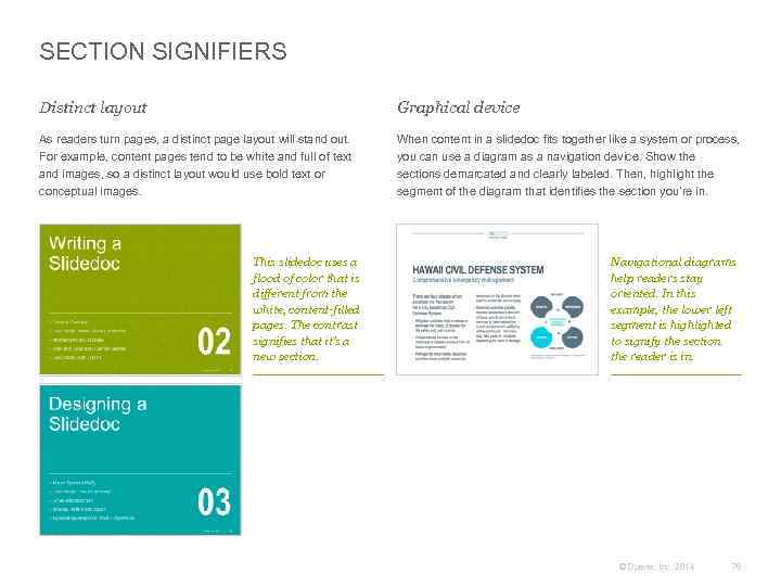
SECTION SIGNIFIERS Distinct layout Graphical device As readers turn pages, a distinct page layout will stand out. For example, content pages tend to be white and full of text and images, so a distinct layout would use bold text or conceptual images. When content in a slidedoc fits together like a system or process, you can use a diagram as a navigation device. Show the sections demarcated and clearly labeled. Then, highlight the segment of the diagram that identifies the section you’re in. This slidedoc uses a flood of color that is different from the white, content-filled pages. The contrast signifies that it’s a new section. Navigational diagrams help readers stay oriented. In this example, the lower left segment is highlighted to signify the section the reader is in. © Duarte, Inc. 2014 76
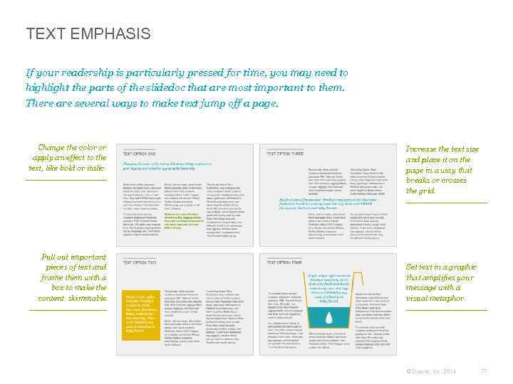
TEXT EMPHASIS If your readership is particularly pressed for time, you may need to highlight the parts of the slidedoc that are most important to them. There are several ways to make text jump off a page. Change the color or apply an effect to the text, like bold or italic. Pull out important pieces of text and frame them with a box to make the content skimmable. Increase the text size and place it on the page in a way that breaks or crosses the grid. Set text in a graphic that amplifies your message with a visual metaphor. © Duarte, Inc. 2014 77
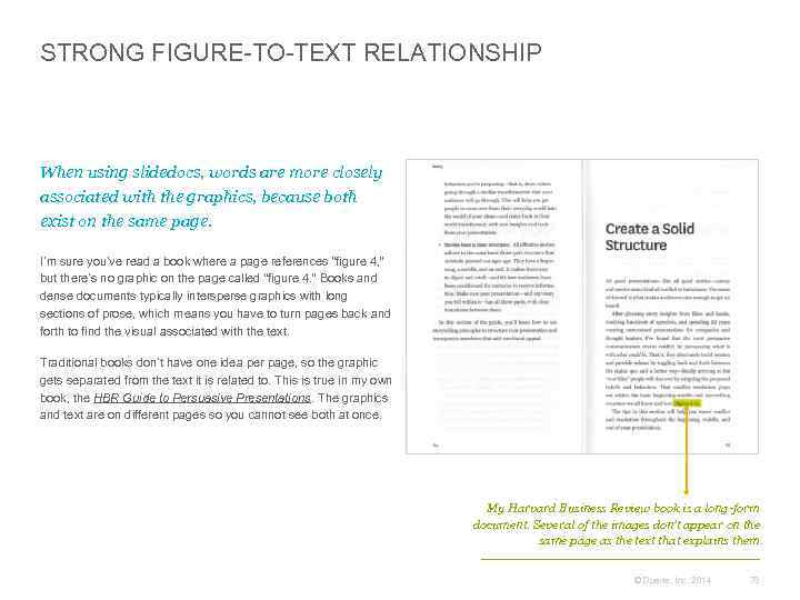
STRONG FIGURE-TO-TEXT RELATIONSHIP When using slidedocs, words are more closely associated with the graphics, because both exist on the same page. I’m sure you’ve read a book where a page references “figure 4, ” but there’s no graphic on the page called “figure 4. ” Books and dense documents typically intersperse graphics with long sections of prose, which means you have to turn pages back and forth to find the visual associated with the text. Traditional books don’t have one idea per page, so the graphic gets separated from the text it is related to. This is true in my own book, the HBR Guide to Persuasive Presentations. The graphics and text are on different pages so you cannot see both at once. My Harvard Business Review book is a long-form document. Several of the images don’t appear on the same page as the text that explains them. © Duarte, Inc. 2014 78
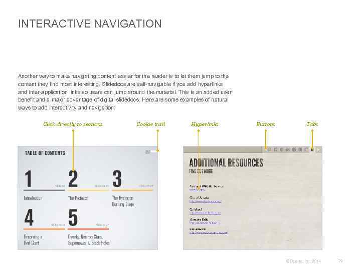
INTERACTIVE NAVIGATION Another way to make navigating content easier for the reader is to let them jump to the content they find most interesting. Slidedocs are self-navigable if you add hyperlinks and inter-application links so users can jump around the material. This is an added user benefit and a major advantage of digital slidedocs. Here are some examples of natural ways to add interactivity and navigation: Click directly to sections Cookie trail Hyperlinks Buttons Tabs © Duarte, Inc. 2014 79
END MATTER It should be clear when the reader is at the end of a section or at the end of the entire document. Below is a list of elements often found at the end of sections or documents: Summary Activities Topics of discussion Glossary Encapsulate the main points in a summary to remind the audience of the most important ideas. Test if the reader learned what you needed them to know by adding a quiz or worksheets. Frame up provocative questions for discussion at the end of your slidedoc to help readers think. Help readers understand your distinct vocabulary or acronyms by clarifying what they mean in a glossary. Appendix Additional info Reference pages Index Add supporting statistical and research information as an appendix for readers who want a deep dive. Link to in-depth materials (forums, discussion boards, white papers) for readers who want to research further. Cite resources and give credit to your sourced authors so readers can gain more insights. Key words are pulled out, displayed alphabetically, and associated with a page number by using an index. © Duarte, Inc. 2014 80
SLIDEDOCS ARE INTERACTIVE Slidedocs are a great opportunity for interaction. Clicking a button or swiping a screen kinesthetically stimulates the brain in short bursts. Many people understand consume information better if they interact with it. Chunking content into bite-sized pieces and loading it onto a tablet or touchscreen keeps readers engaged. The action of clicking to advance or swiping to turn pages often keeps readers involved with the information. You can add links that jump around the slidedoc itself or link out to the Internet, which gives the reader a more interactive experience. © Duarte, Inc. 2014 81
+ Data and Diagrams Clarify Content 02 © Duarte, Inc. 2014 82
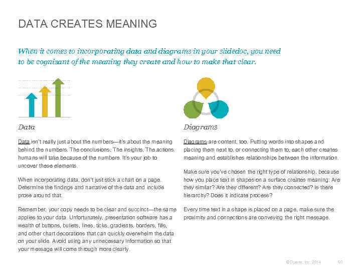
DATA CREATES MEANING When it comes to incorporating data and diagrams in your slidedoc, you need to be cognizant of the meaning they create and how to make that clear. Data Diagrams Data isn’t really just about the numbers—it’s about the meaning behind the numbers. The conclusions. The insights. The actions humans will take because of the numbers. It’s your job to uncover these elements. Diagrams are content, too. Putting words into shapes and placing them next to, or connecting them to, each other creates meaning and establishes relationships between the information. When incorporating data, don’t just stick a chart on a page. Determine the findings and narrative of the data and include prose around that. Make sure you’ve chosen the right type of relationship, because how you place text in shapes on a surface creates meaning: Are they similar? Are they different? Are they connected? Is there hierarchy? Does it indicate process? Remember, your copy needs to be clear and succinct—the same Every time text in a shape is placed on a page, make sure the applies to your data. Unfortunately, presentation software has a proximity and connections are conveying the right message. wealth of buttons, bullets, lines, ticks, gradients, borders, fills, and other chart decorations that can quickly overwhelm the data on your slide. Avoid using any unnecessary information so that your message will come through more clearly. © Duarte, Inc. 2014 83
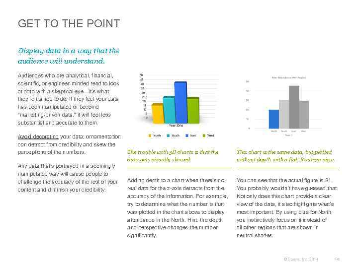
GET TO THE POINT Display data in a way that the audience will understand. Audiences who are analytical, financial, scientific, or engineer-minded tend to look at data with a skeptical eye—it’s what they’re trained to do. If they feel your data has been manipulated or become “marketing-driven data, ” it will feel less substantial and accurate to them. Avoid decorating your data; ornamentation can detract from credibility and skew the The trouble with 3 D charts is that the perceptions of the numbers. data gets visually skewed. Any data that’s portrayed in a seemingly manipulated way will cause people to challenge the accuracy of the rest of your Adding depth to a chart when there’s no real data for the z-axis detracts from the content and diminish your credibility. accuracy of the information. For example, try to determine what the number is that was plotted in the chart above to display attendance in the North. Hint: the depth and perspective changes the number significantly. This chart is the same data, but plotted without depth with a flat, front-on view. You can see that the actual figure is 21. You probably wouldn’t have guessed that. Not only does this chart provide a clear view of the data, it also highlights what’s most important. By using blue for North, you instinctively focus on it instead of all other regions that are shown in neutral shades. © Duarte, Inc. 2014 84
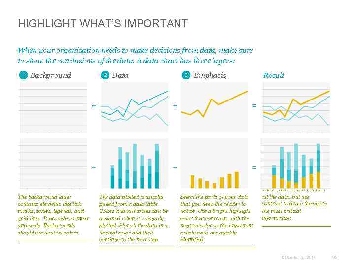
HIGHLIGHT WHAT’S IMPORTANT When your organization needs to make decisions from data, make sure to show the conclusions of the data. A data chart has three layers: 1 Background 2 Data 3 Emphasis Result + = + The background layer contains elements like tick marks, scales, legends, and grid lines. It provides context and scale. Backgrounds should use neutral colors. + + = The data plotted is usually pulled from a data table. Colors and attributes can be assigned when it’s visually plotted. Plot all the data in a neutral color and then continue to the next step. Select the parts of your data that you need the reader to notice. Use a bright highlight color that contrasts with the neutral color so the important conclusions are quickly identified. These final results contain all the data, but use contrast to draw the eye to the most critical information. © Duarte, Inc. 2014 85
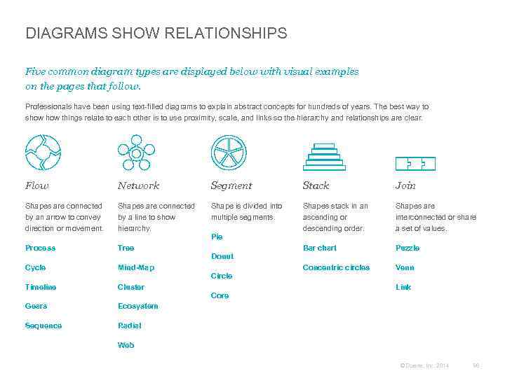
DIAGRAMS SHOW RELATIONSHIPS Five common diagram types are displayed below with visual examples on the pages that follow. Professionals have been using text-filled diagrams to explain abstract concepts for hundreds of years. The best way to show things relate to each other is to use proximity, scale, and links so the hierarchy and relationships are clear. Flow Network Segment Stack Join Shapes are connected by an arrow to convey direction or movement. Shapes are connected by a line to show hierarchy. Shape is divided into multiple segments. Shapes stack in an ascending or descending order. Shapes are interconnected or share a set of values. Process Tree Bar chart Puzzle Cycle Mind-Map Concentric circles Venn Timeline Cluster Gears Ecosystem Sequence Radial Pie Donut Circle Core Link Web © Duarte, Inc. 2014 86
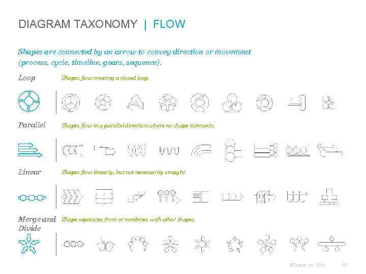
DIAGRAM TAXONOMY | FLOW Shapes are connected by an arrow to convey direction or movement (process, cycle, timeline, gears, sequence). Loop Shapes flow creating a closed loop. Parallel Shapes flow in a parallel direction where no shape intersects. Linear Shapes flow linearly, but not necessarily straight. Merge and Divide Shape separates from or combines with other shapes. © Duarte, Inc. 2014 87
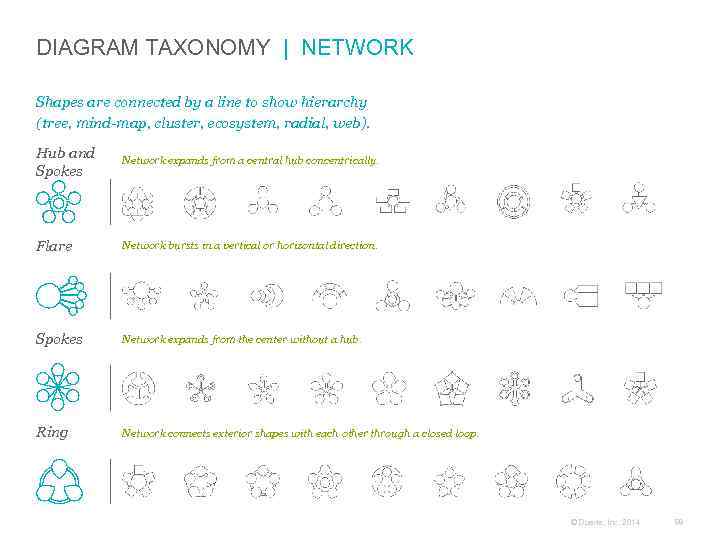
DIAGRAM TAXONOMY | NETWORK Shapes are connected by a line to show hierarchy (tree, mind-map, cluster, ecosystem, radial, web). Hub and Spokes Network expands from a central hub concentrically. Flare Network bursts in a vertical or horizontal direction. Spokes Network expands from the center without a hub. Ring Network connects exterior shapes with each other through a closed loop. © Duarte, Inc. 2014 88
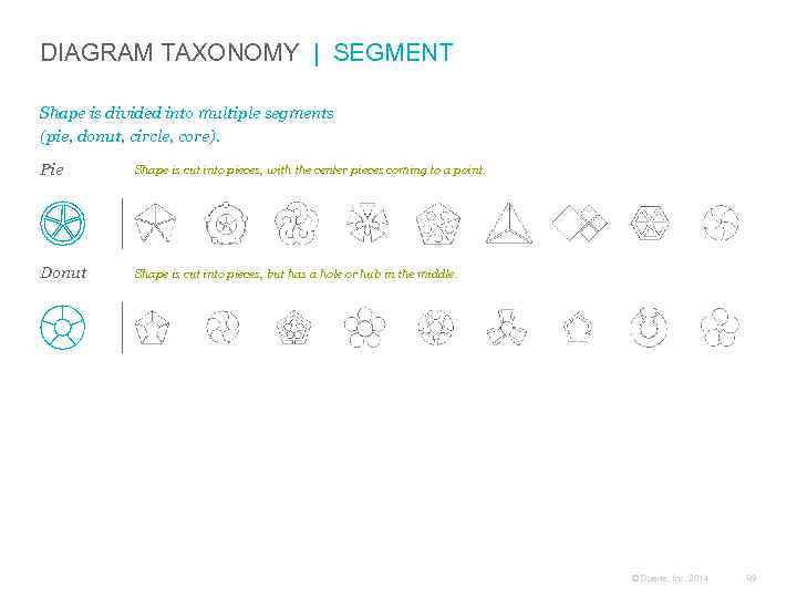
DIAGRAM TAXONOMY | SEGMENT Shape is divided into multiple segments (pie, donut, circle, core). Pie Shape is cut into pieces, with the center pieces coming to a point. Donut Shape is cut into pieces, but has a hole or hub in the middle. © Duarte, Inc. 2014 89
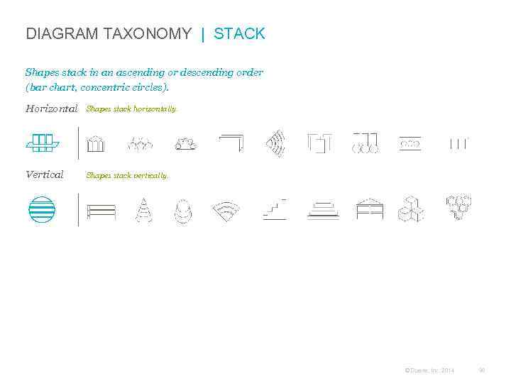
DIAGRAM TAXONOMY | STACK Shapes stack in an ascending or descending order (bar chart, concentric circles). Horizontal Shapes stack horizontally. Vertical Shapes stack vertically. © Duarte, Inc. 2014 90
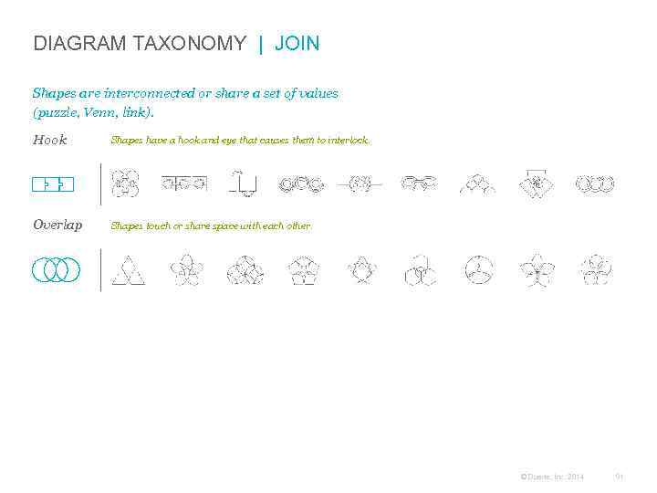
DIAGRAM TAXONOMY | JOIN Shapes are interconnected or share a set of values (puzzle, Venn, link). Hook Shapes have a hook and eye that causes them to interlock. Overlap Shapes touch or share space with each other. © Duarte, Inc. 2014 91
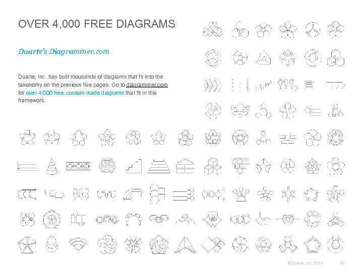
OVER 4, 000 FREE DIAGRAMS Duarte’s Diagrammer. com Duarte, Inc. has built thousands of diagrams that fit into the taxonomy on the previous five pages. Go to diagrammer. com for over 4, 000 free, custom-made diagrams that fit in this framework. © Duarte, Inc. 2014 92
CASE STUDY Data and Diagrams Convey Information SAP creates a series of skimmable “SAP Top 10” white papers. These informative documents shows the top 10 reason customers choose SAP. These unique documents address many of their clients’ industries, such as business transformation, life sciences, and others. © Duarte, Inc. 2014 93

Front page has a bold title, clear subtitle, and logo element. Source: http: //global. sap. com/netherlands/about/pdfs/2011 -02_Ten. Reasons. Customers. Choose. SAP. pdf © 2014. SAP AG or an SAP affiliate company. All rights reserved. © Duarte, Inc. 2014 94
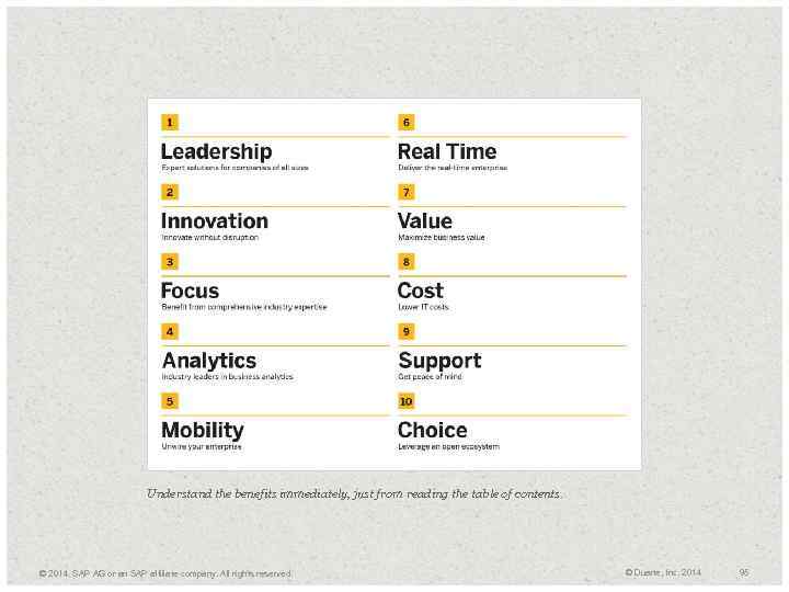
Understand the benefits immediately, just from reading the table of contents. © 2014. SAP AG or an SAP affiliate company. All rights reserved. © Duarte, Inc. 2014 95
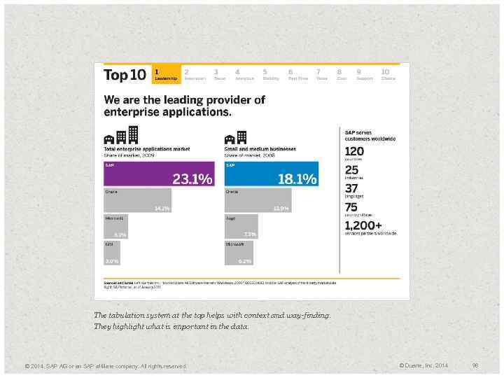
The tabulation system at the top helps with context and way-finding. They highlight what is important in the data. © 2014. SAP AG or an SAP affiliate company. All rights reserved. © Duarte, Inc. 2014 96
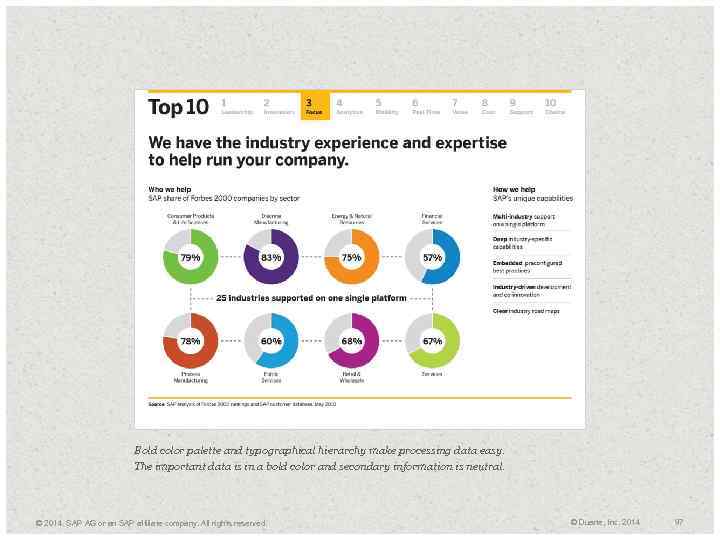
Bold color palette and typographical hierarchy make processing data easy. The important data is in a bold color and secondary information is neutral. © 2014. SAP AG or an SAP affiliate company. All rights reserved. © Duarte, Inc. 2014 97
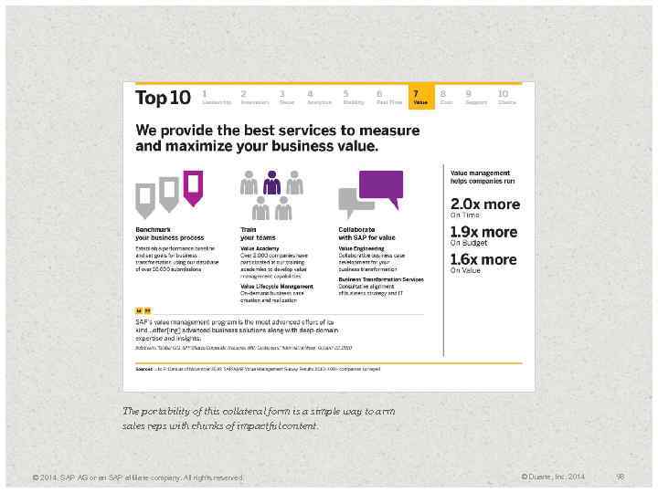
The portability of this collateral form is a simple way to arm sales reps with chunks of impactful content. © 2014. SAP AG or an SAP affiliate company. All rights reserved. © Duarte, Inc. 2014 98
Designing a Slidedoc + Visual Systems Unify + Case Study: “Power of Story” + Grids Add Structure + Breathe With White Space + Typesetting Amplifies What’s Important 03 © Duarte, Inc. 2014 99
+ Visual Systems Unify 03 © Duarte, Inc. 2014 100
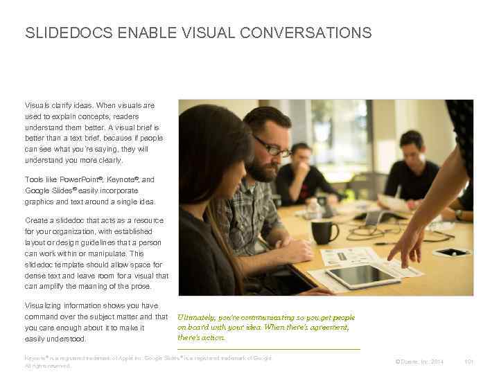
SLIDEDOCS ENABLE VISUAL CONVERSATIONS Visuals clarify ideas. When visuals are used to explain concepts, readers understand them better. A visual brief is better than a text brief, because if people can see what you’re saying, they will understand you more clearly. Tools like Power. Point®, Keynote®, and Google Slides® easily incorporate graphics and text around a single idea. Create a slidedoc that acts as a resource for your organization, with established layout or design guidelines that a person can work within or manipulate. This slidedoc template should allow space for dense text and leave room for a visual that can amplify the meaning of the prose. Visualizing information shows you have command over the subject matter and that you care enough about it to make it easily understood. Ultimately, you’re communicating so you get people on board with your idea. When there’s agreement, there’s action. Keynote ® is a registered trademark of Apple Inc. Google Slides ® is a registered trademark of Google. All rights reserved. © Duarte, Inc. 2014 101
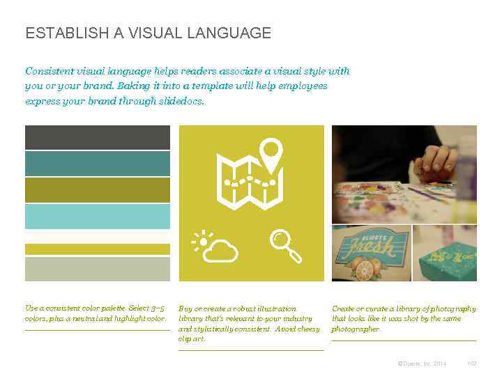
ESTABLISH A VISUAL LANGUAGE Consistent visual language helps readers associate a visual style with you or your brand. Baking it into a template will help employees express your brand through slidedocs. Use a consistent color palette. Select 3– 5 colors, plus a neutral and highlight color. Buy or create a robust illustration library that’s relevant to your industry and stylistically consistent. Avoid cheesy clip art. Create or curate a library of photography that looks like it was shot by the same photographer. © Duarte, Inc. 2014 102
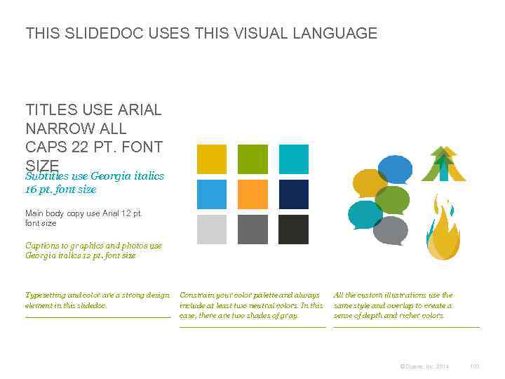
THIS SLIDEDOC USES THIS VISUAL LANGUAGE TITLES USE ARIAL NARROW ALL CAPS 22 PT. FONT SIZE Subtitles use Georgia italics 16 pt. font size Main body copy use Arial 12 pt. font size Captions to graphics and photos use Georgia italics 12 pt. font size Typesetting and color are a strong design element in this slidedoc. Constrain your color palette and always include at least two neutral colors. In this case, there are two shades of gray. All the custom illustrations use the same style and overlap to create a sense of depth and richer colors. © Duarte, Inc. 2014 103
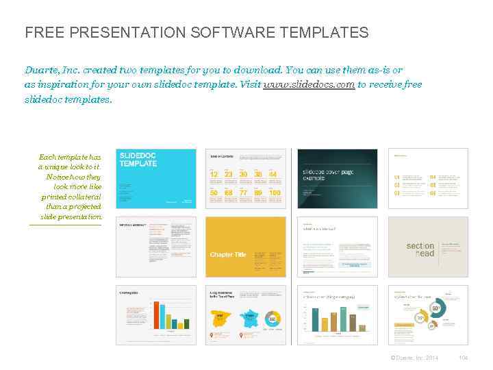
FREE PRESENTATION SOFTWARE TEMPLATES Duarte, Inc. created two templates for you to download. You can use them as-is or as inspiration for your own slidedoc template. Visit www. slidedocs. com to receive free slidedoc templates. Each template has a unique look to it. Notice how they look more like printed collateral than a projected slide presentation. © Duarte, Inc. 2014 104
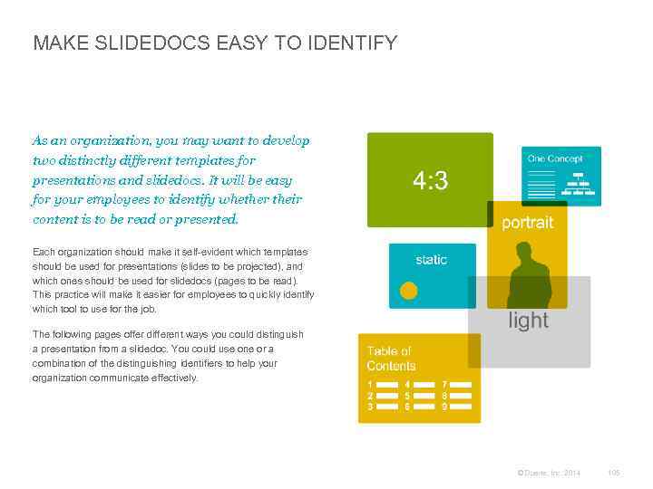
MAKE SLIDEDOCS EASY TO IDENTIFY As an organization, you may want to develop two distinctly different templates for presentations and slidedocs. It will be easy for your employees to identify whether their content is to be read or presented. Each organization should make it self-evident which templates should be used for presentations (slides to be projected), and which ones should be used for slidedocs (pages to be read). This practice will make it easier for employees to quickly identify which tool to use for the job. The following pages offer different ways you could distinguish a presentation from a slidedoc. You could use one or a combination of the distinguishing identifiers to help your organization communicate effectively. © Duarte, Inc. 2014 105
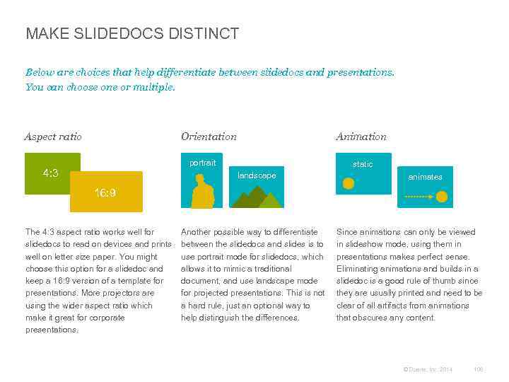
MAKE SLIDEDOCS DISTINCT Below are choices that help differentiate between slidedocs and presentations. You can choose one or multiple. Aspect ratio Orientation Animation portrait 4: 3 static landscape animates 16: 9 The 4: 3 aspect ratio works well for slidedocs to read on devices and prints well on letter size paper. You might choose this option for a slidedoc and keep a 16: 9 version of a template for presentations. More projectors are using the wider aspect ratio which make it great for corporate presentations. Another possible way to differentiate between the slidedocs and slides is to use portrait mode for slidedocs, which allows it to mimic a traditional document, and use landscape mode for projected presentations. This is not a hard rule, just an optional way to help distinguish the differences. Since animations can only be viewed in slideshow mode, using them in presentations makes perfect sense. Eliminating animations and builds in a slidedoc is a good rule of thumb since they are usually printed and need to be clear of all artifacts from animations that obscures any content. © Duarte, Inc. 2014 106
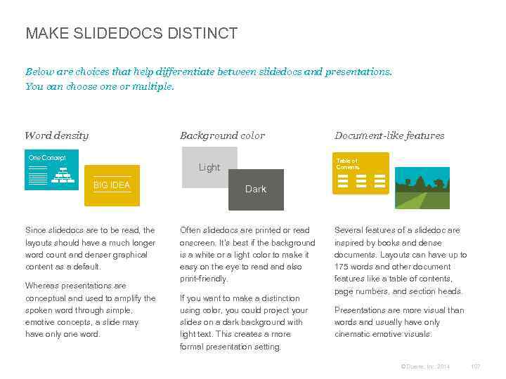
MAKE SLIDEDOCS DISTINCT Below are choices that help differentiate between slidedocs and presentations. You can choose one or multiple. Word density Background color One Concept Table of Contents Light BIG IDEA Since slidedocs are to be read, the layouts should have a much longer word count and denser graphical content as a default. Whereas presentations are conceptual and used to amplify the spoken word through simple, emotive concepts, a slide may have only one word. Document-like features Dark Often slidedocs are printed or read onscreen. It’s best if the background is a white or a light color to make it easy on the eye to read and also print-friendly. If you want to make a distinction using color, you could project your slides on a dark background with light text. This creates a more formal presentation setting. Several features of a slidedoc are inspired by books and dense documents. Layouts can have up to 175 words and other document features like a table of contents, page numbers, and section heads. Presentations are more visual than words and usually have only cinematic emotive visuals. © Duarte, Inc. 2014 107
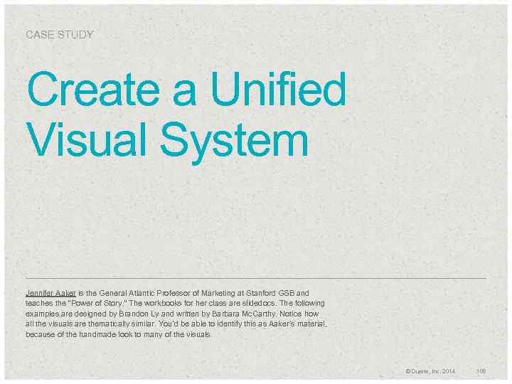
CASE STUDY Create a Unified Visual System Jennifer Aaker is the General Atlantic Professor of Marketing at Stanford GSB and teaches the “Power of Story. ” The workbooks for her class are slidedocs. The following examples are designed by Brandon Ly and written by Barbara Mc. Carthy. Notice how all the visuals are thematically similar. You’d be able to identify this as Aaker’s material, because of the handmade look to many of the visuals. © Duarte, Inc. 2014 108
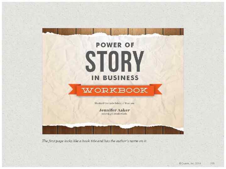
The first page looks like a book title and has the author’s name on it. © Duarte, Inc. 2014 109
Every chapter segue is consistently simple with a flood of bold gray color. © Duarte, Inc. 2014 110
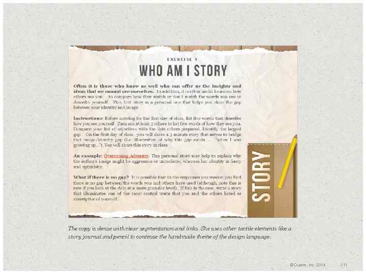
The copy is dense with clear segmentation and links. She uses other tactile elements like a story journal and pencil to continue the handmade theme of the design language. © Duarte, Inc. 2014 111
Repeating the wood grain background, wood texture, and pencil element visually signifies that these pages go together. © Duarte, Inc. 2014 112
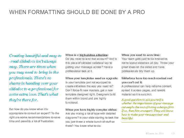
WHEN FORMATTING SHOULD BE DONE BY A PRO Creating beautiful and easy-to -read slidedocs isn’t always easy. There are times when you may need to bring in the professionals. There’s no shame in handing over your slidedoc to a professional for some extra love. That’s what they’re there for. But how do you know when it’s appropriate to consult an expert? To the right are some recommendations to save time and possibly a lot of frustration: When in a high-stakes situation: Do you need to land that account? And is this piece of slidedoc collateral key to getting your message across? Have a professional look at it. When you need to save time: Your team gets paid to be innovative, not to layout slidedocs all day. Throw your great ideas on the slides and have professionals tidy them up. When your templates need an upgrade: Is your template just not equipped to create slidedocs the way you need to? Don’t force-fit new masters, get a new template designed right. Designers build them within brand are highly functional. Slidedocs have too much content and you can’t cut it: A professional can help reframe content, spread it across pages, and rework material so it is succinct. A good question to ask yourself is whether the importance of your message outweighs the cost of hiring a design firm. When you have highly complex slides: If so, then hire an expert. They will know Are you mixing a lot of type with detailed how to make your message clear and diagrams? Is your slide starting to look like beautiful. you just threw a whole bunch of stuff on there? You know what to do. © Duarte, Inc. 2014 113
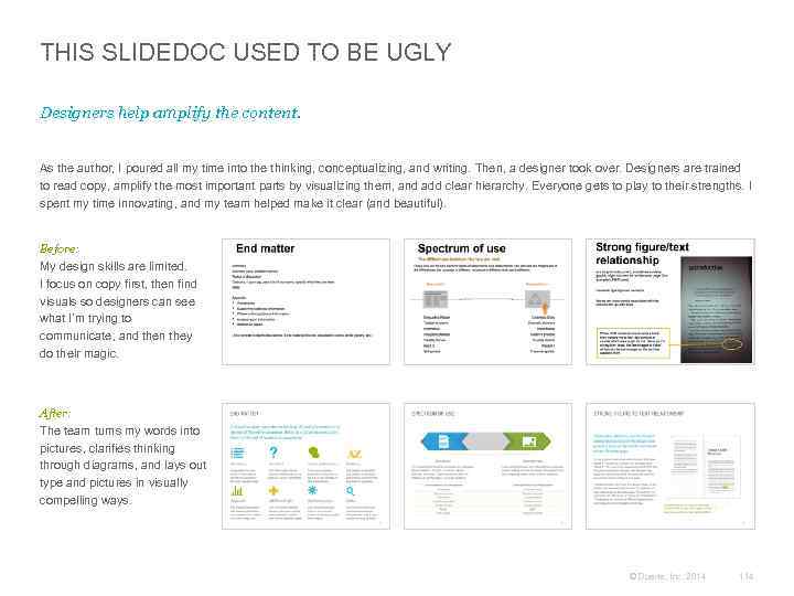
THIS SLIDEDOC USED TO BE UGLY Designers help amplify the content. As the author, I poured all my time into the thinking, conceptualizing, and writing. Then, a designer took over. Designers are trained to read copy, amplify the most important parts by visualizing them, and add clear hierarchy. Everyone gets to play to their strengths. I spent my time innovating, and my team helped make it clear (and beautiful). Before: My design skills are limited. I focus on copy first, then find visuals so designers can see what I’m trying to communicate, and then they do their magic. After: The team turns my words into pictures, clarifies thinking through diagrams, and lays out type and pictures in visually compelling ways. © Duarte, Inc. 2014 114
+ Grids Add Structure 03 © Duarte, Inc. 2014 115
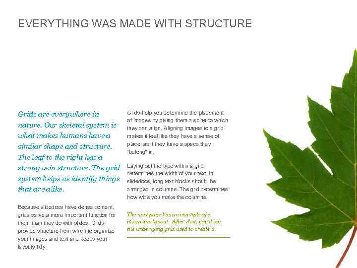
EVERYTHING WAS MADE WITH STRUCTURE Grids are everywhere in nature. Our skeletal system is what makes humans have a similar shape and structure. The leaf to the right has a strong vein structure. The grid system helps us identify things that are alike. Because slidedocs have dense content, grids serve a more important function for them than they do with slides. Grids provide structure from which to organize your images and text and keeps your layouts tidy. Grids help you determine the placement of images by giving them a spine to which they can align. Aligning images to a grid makes it feel like they have a sense of place, as if they have a space they “belong” in. Laying out the type within a grid determines the width of your text. In slidedocs, long text blocks should be arranged in columns. The grid determines how wide you make the columns. The next page has an example of a magazine layout. After that, you’ll see the underlying grid used to create it. © Duarte, Inc. 2014 116
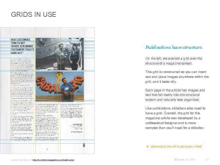
GRIDS IN USE Publications have structure. On the left, we overlaid a grid over the structure of a magazine spread. This grid is constructed so you can insert text and place images anywhere within the grid, and it looks tidy. Each page in the article has images and text that fall neatly into this structural system and naturally look organized. Like publications, slidedocs also need to have a grid. Granted, the grid for this magazine article was developed by a professional designer and is more complex than you’ll need for a slidedoc. DOWNLOAD 10% OF SLIDE: OLOGY FREE Layout courtesy of: http: //content-magazine. com/welcome / © Duarte, Inc. 2014 117
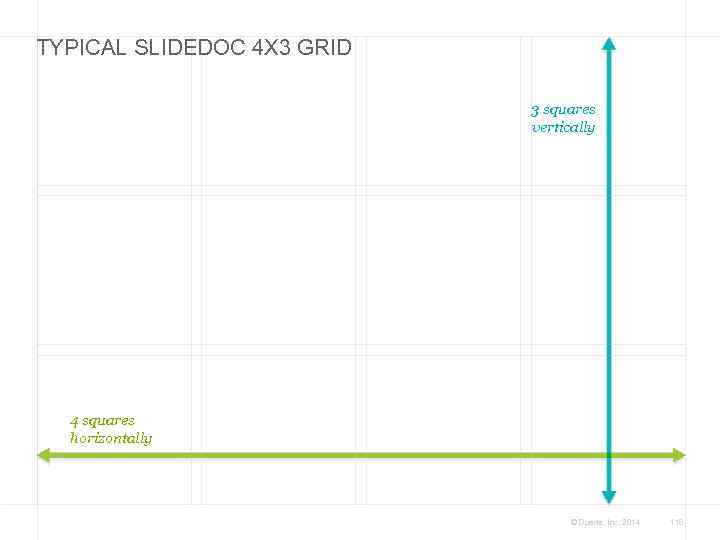
TYPICAL SLIDEDOC 4 X 3 GRID 3 squares vertically 4 squares horizontally © Duarte, Inc. 2014 118
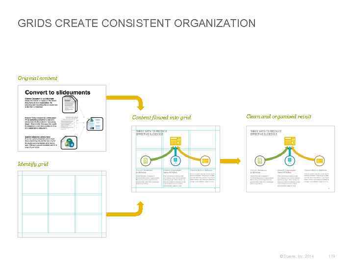
GRIDS CREATE CONSISTENT ORGANIZATION Original content Content flowed into grid Clean and organized result Identify grid © Duarte, Inc. 2014 119
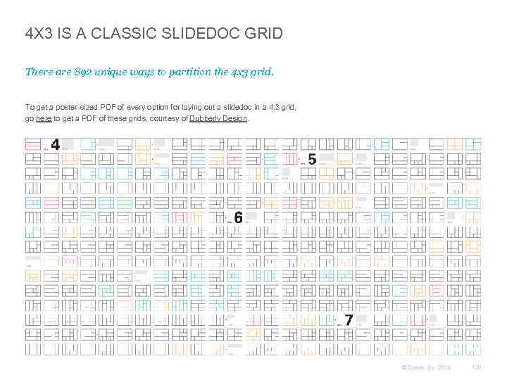
4 X 3 IS A CLASSIC SLIDEDOC GRID There are 892 unique ways to partition the 4 x 3 grid. To get a poster-sized PDF of every option for laying out a slidedoc in a 4: 3 grid, go here to get a PDF of these grids, courtesy of Dubberly Design. © Duarte, Inc. 2014 120
+ Breathe With White Space 03 © Duarte, Inc. 2014 121
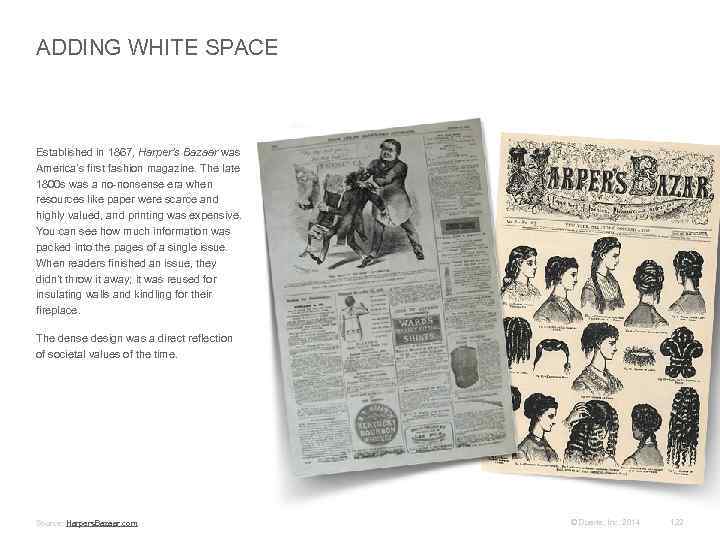
ADDING WHITE SPACE Established in 1867, Harper’s Bazaar was America’s first fashion magazine. The late 1800 s was a no-nonsense era when resources like paper were scarce and highly valued, and printing was expensive. You can see how much information was packed into the pages of a single issue. When readers finished an issue, they didn’t throw it away; it was reused for insulating walls and kindling for their fireplace. The dense design was a direct reflection of societal values of the time. Source: Harpers. Bazaar. com © Duarte, Inc. 2014 122

YOUR CONTENT NEEDS ROOM TO BREATHE In 1934, the magazine discovered young Russian designer Alexey Brodovitch and brought him on as Art Director. Brodovitch’s work has been described as “bold and arresting, ” featuring “cropped photographs, typography, and design” on “pages that bled beautifully. ” Brodovitch's signature use of white space and the cinematic quality created through image cropping brought gracefulness to the layouts. His design compelled Truman Capote to write, “What Dom Pérignon was to champagne. . . so [Brodovitch] has been to. . . photographic design and editorial layout. ”* His work revolutionized both fashion and magazine design. Adding white space and dramatic cropped images helped Harper’s Bazaar surpass Vogue as the top fashion magazine. The following two pages provide examples of how Brodovitch created designs that breathe with white space. “A good picture must be a completely individual expression which intrigues the viewer and forces him to think. ” – Alexey Brodovitch, Art Director *Source: http: //en. wikipedia. org/wiki/Harper's_Bazaar and http: //en. wikipedia. org/wiki/Alexey_Brodovitch © Duarte, Inc. 2014 123
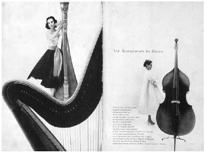
© Duarte, Inc. 2014 124
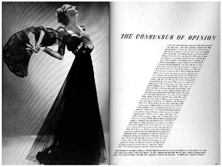
© Duarte, Inc. 2014 125

LUXURY BRANDS USE WHITE SPACE The more breathing room you give to a design or product, the more luxurious it’s perceived to be. Many brands have embraced the concept of white space. When creating a slidedoc, surround key points with white space (also called “open space” or “clear space”) to draw the eye toward the most important elements on the page. Examples of advertisements using white space © Duarte, Inc. 2014 126
+ Typesetting Amplifies What’s Important 03 © Duarte, Inc. 2014 127
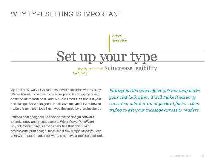
WHY TYPESETTING IS IMPORTANT Select your type Set up your type Create hierarchy Up until now, we’ve learned how to write slidedoc-worthy copy. We’ve learned how to introduce people to that copy by taking some pointers from print. And we’ve learned a bit about layout and design. So far, so good. In this section, you’ll learn how to make the text itself look like it was designed by a professional. to increase legibility Putting in this extra effort will not only make your text look nicer, it will make it easier to consume; which is an important factor when trying to get your message across to readers. Professional designers use sophisticated design software to make copy easily consumable. While Power. Point® and Keynote® don’t have all the capabilities that come with professional print design, there a few simple steps you can take within presentation software to achieve a professional look. © Duarte, Inc. 2014 128
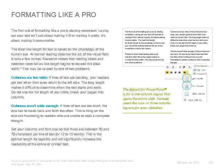
FORMATTING LIKE A PRO The first rule of formatting like a pro is staying consistent. Laying out your text isn’t just about making it fit or making it pretty; it’s about making it consumable. The first rule of formatting like a pro is staying consistent. Laying out your text isn’t just about making it fit or making it pretty; it’s about making Columns are too wide: If lines of text are too long, your readers get lost when their eyes return to the left side. The long length makes it difficult to determine when the text starts and ends. Do not use the full length of your slide; break your pages into columns. The ideal line length for text is based on the physiology of the human eye. At normal reading distance the arc of the visual field is only a few inches. Research shows that reading slows and retention rates fall as line length begins to exceed the ideal width. * This may be caused by one of two problems: it consumable. The ideal line length for text is based on the physiology of the human eye. At normal reading distance the arc of the visual field is only a few inches. Research shows that reading slows and retention rates fall as line length begins to exceed the ideal width. This may be caused by one of two problems: Columns are too wide: If lines of text are too long, your readers get lost when their eyes return to the left side. The long length makes it difficult to determine when the text starts and ends. Do not use the full length of your slide; break your pages into columns. Columns aren’t wide enough: If lines of text are too short, the eye has to travel back and forth too often. This is tiring on the eye and frustrating to readers who are unable to read a complete thought. Columns aren’t wide enough: If lines of text are too short, the eye has to travel back and forth too often which is tiring on the eye and frustrating to readers unable to read a complete thought. The default for Power. Point® is for a one-column layout that spans the entire slide. Instead, select the two- or three-column layouts for your slidedocs. Set your columns and font size so that there are between 50 and 70 characters per line of text (or 12 to 15 words). This is the optimal length for legibility and will significantly increase the readability of the online or printed text. *Source: Lynch, Patrick J. and Sarah Horton. Web Style Guide: Basic Design Principles for Creating Web Sites. New Haven: Yale UP, 2009. © Duarte, Inc. 2014 129
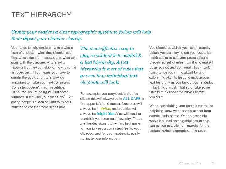
TEXT HIERARCHY Giving your readers a clear typographic system to follow will help them digest your slidedoc clearly. Your layouts help readers make a whole host of choices—what they should read first, where the main message is, what text goes with the diagram, what’s extra reading that they can skip for now, and the list goes on. . . That means you have to curate the copy, and that’s why it’s important to make your text consistent. Consistent doesn’t mean repetitive. Of course, you’re going to want some variation in the way your slides look. But giving people an idea of what to expect makes the content more accessible. The most effective way to stay consistent is to establish a text hierarchy. A text hierarchy is a set of rules that govern how individual text elements will look. For example, you may decide that the slide’s title will always be in ALL CAPS in the upper left hand corner, footnotes will always be in italics, and subtitles will always be bright blue. You will need to establish your own text hierarchy. These are the decisions that will make it easier for you to keep a consistent feel to your slidedoc, and for your readers to easily navigate your information. You should establish your text hierarchy before you start laying out your copy. It’s much easier to edit your prose using a predefined set of rules than it is to make it up as you go and continually back track if you change your mind about fonts or colors. It’s okay to test and update your text hierarchy as you lay out your slidedoc. In fact, it’s a must. That said, take some time to think about the basics before you start. When establishing your text hierarchy, it’s helpful to know what people expect from certain kinds of text. On the next slide we’ve included some guidelines to help you as you establish a hierarchy for the various textual elements on the page. © Duarte, Inc. 2014 130
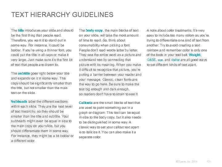
TEXT HIERARCHY GUIDELINES The title introduces your slide and should be the first thing that people read. Therefore, you want it to stand out in some way. For instance, it could be bolder. If you’re using a thinner font, you could put the title in all caps or make it very large. Just make sure it’s the first bit of text that people are drawn to. The subtitle goes right below your title and expands on it in some way. This copy should be significantly smaller than the title, but not smaller than the main text on the slide. Subheads label the different sections within each slide. They are the next level of text hierarchy, so they should be smaller than the title and subtitle. Your subheads might even be equal in size to the main copy on your slide, but you should differentiate them in some way. For instance, they might be a bit bolder or a different color. The body copy, the main blocks of text on your slide, will take the most amount of time to read. So, think about consumability when picking a font. People don’t read words letter by letter. They see the entire word as a picture and understand text by connecting that picture with its meaning. When you make it difficult to recognize that picture, you’re putting a barrier between your reader and your message. Classic, clean fonts are the way to go here. Be sure to make the text big enough and dark enough, so readers don’t have to strain to see it. A note about color treatments: It’s very easy to include too many colors as you’re trying to differentiate one kind of text from another. Try to avoid creating a text rainbow and remember color is only one of the tools in your tool belt. Weight, CASE, size, and italics are all good ways to set different kinds of text apart. Callouts are the small blocks of text that are used to point something out in a graph or diagram. This text can be equal in size to the body copy, but it also needs to be distinguished in some way. A classic way to set your callout text apart is to italicize it. You can also make it a separate color. © Duarte, Inc. 2014 131
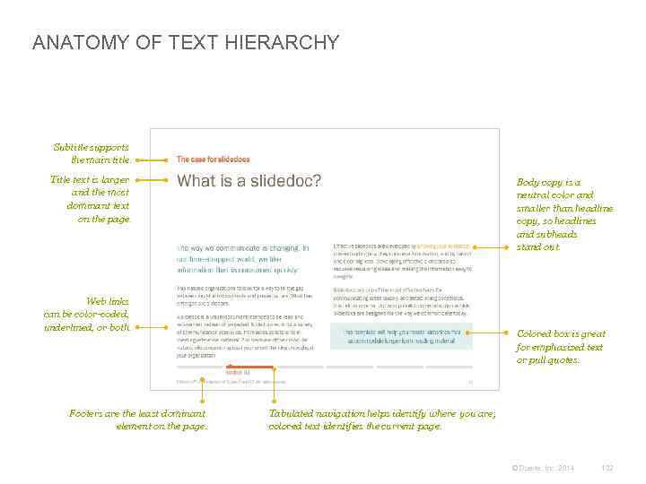
ANATOMY OF TEXT HIERARCHY Subtitle supports the main title. Title text is larger and the most dominant text on the page. Body copy is a neutral color and smaller than headline copy, so headlines and subheads stand out. Web links can be color-coded, underlined, or both. Footers are the least dominant element on the page. Colored box is great for emphasized text or pull quotes. Tabulated navigation helps identify where you are; colored text identifies the current page. © Duarte, Inc. 2014 132
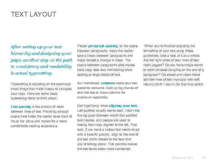
TEXT LAYOUT After setting up your text hierarchy and designing your page, another step on the path to consistency and readability is actual typesetting. Proper paragraph spacing, or the space between paragraphs, helps the reader take a break between paragraphs and helps denote a change in ideas. The space between paragraphs also makes body copy look less intimidating when looking at large blocks of text. Typesetting is adjusting all the seemingly small things that make it easy to navigate your copy. Here are some basic typesetting items to think about: As I mentioned, columns make your text easier to consume. Split up big chunks of text into two or more columns for maximum readability. Line spacing is the amount of room between lines of text. Providing enough space here helps the reader keep track of his or her place and makes for a more comfortable reading experience. When you’re finished adjusting the formatting of your text using these guidelines, take a look at it as a whole. Are the right sides of your lines of text really jagged? Do you have single words or short phrases dangling on the end of a paragraph? Go ahead and clean those last few lines of text manually with soft returns (shift + return) for that final polish. Don’t get fancy when aligning your text. Left justified usually works best. I don’t like the big gaps between words that justified text creates, and people are used to seeing their copy aligned to the left. That said, if you have a callout that needs to go with a specific graphic, align to the side of the text that’s closest to the item that you’re talking about. This practice makes the two items seem more connected. © Duarte, Inc. 2014 133
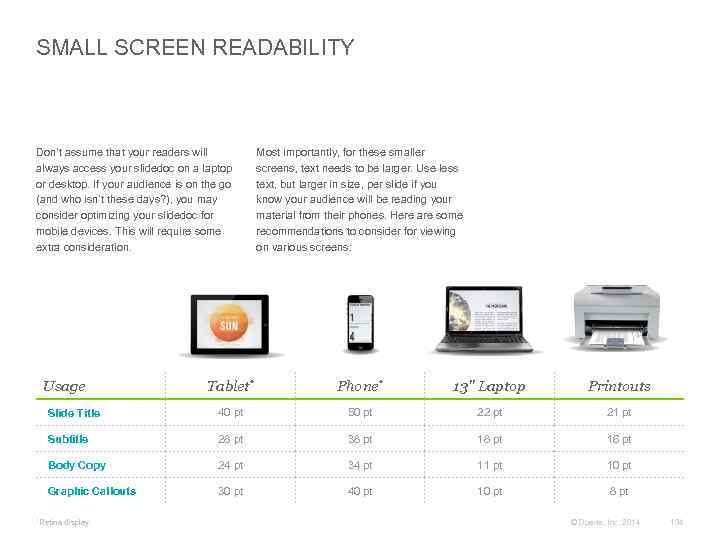
SMALL SCREEN READABILITY Don’t assume that your readers will always access your slidedoc on a laptop or desktop. If your audience is on the go (and who isn’t these days? ), you may consider optimizing your slidedoc for mobile devices. This will require some extra consideration. Usage Most importantly, for these smaller screens, text needs to be larger. Use less text, but larger in size, per slide if you know your audience will be reading your material from their phones. Here are some recommendations to consider for viewing on various screens: Tablet* Phone* 13" Laptop Printouts Slide Title 40 pt 50 pt 22 pt 21 pt Subtitle 28 pt 38 pt 16 pt Body Copy 24 pt 34 pt 11 pt 10 pt Graphic Callouts 30 pt 40 pt 10 pt 8 pt *Retina display © Duarte, Inc. 2014 134
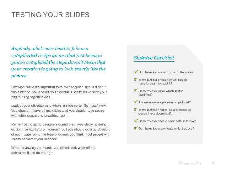
TESTING YOUR SLIDES Anybody who’s ever tried to follow a complicated recipe knows that just because you’ve completed the steps doesn’t mean that your creation is going to look exactly like the picture. Likewise, while it’s important to follow the guidelines laid out in this slidedoc, you should do an overall audit to make sure your pages hang together well. Look at your slidedoc as a whole in slide sorter (lightbox) view. You shouldn’t have all text slides and you should have pages with white space and breathing room. Remember, graphic designers spend their lives studying design, so don’t be too hard on yourself. But you should do a quick audit of each page using the type of screen you think most people will use to consume your slidedoc. Slidedoc Checklist Do I have too many words on the slide? Is my text big enough or will people have to strain to read it? Does my eye know which text to read first? Are main messages easy to pick out? Is my text scannable like a slidedoc or dense like a document? Does my eye have a clear path to follow? Do I have too many fonts or font colors? When reviewing your work, you should ask yourself the questions listed on the right. © Duarte, Inc. 2014 135
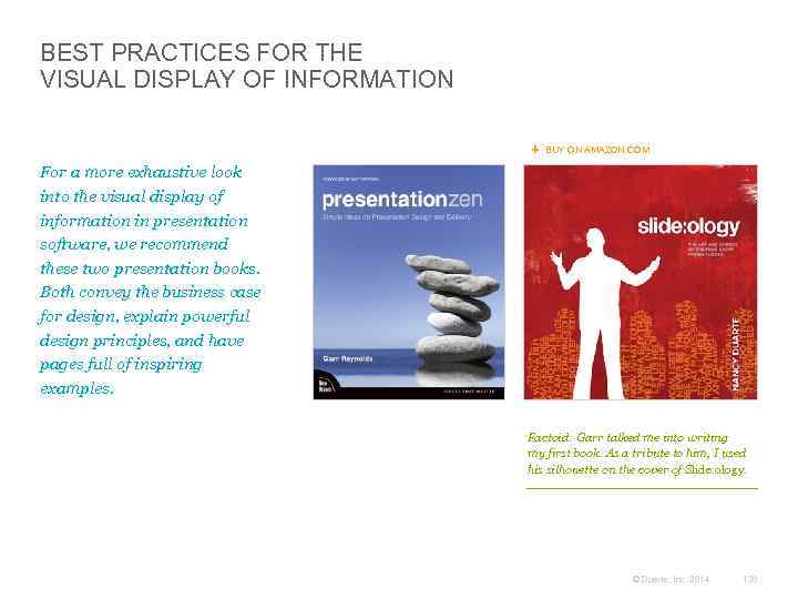
BEST PRACTICES FOR THE VISUAL DISPLAY OF INFORMATION BUY ON AMAZON. COM For a more exhaustive look into the visual display of information in presentation software, we recommend these two presentation books. Both convey the business case for design, explain powerful design principles, and have pages full of inspiring examples. Factoid: Garr talked me into writing my first book. As a tribute to him, I used his silhouette on the cover of Slide: ology. © Duarte, Inc. 2014 136
Delivering a Slidedoc + Printing and Projecting Slidedocs + Distributing Slidedocs + Case Study: Notes View How-To + Spread Big Ideas With Slidedocs 04 © Duarte, Inc. 2014 137
+ Printing and Projecting Slidedocs 04 © Duarte, Inc. 2014 138
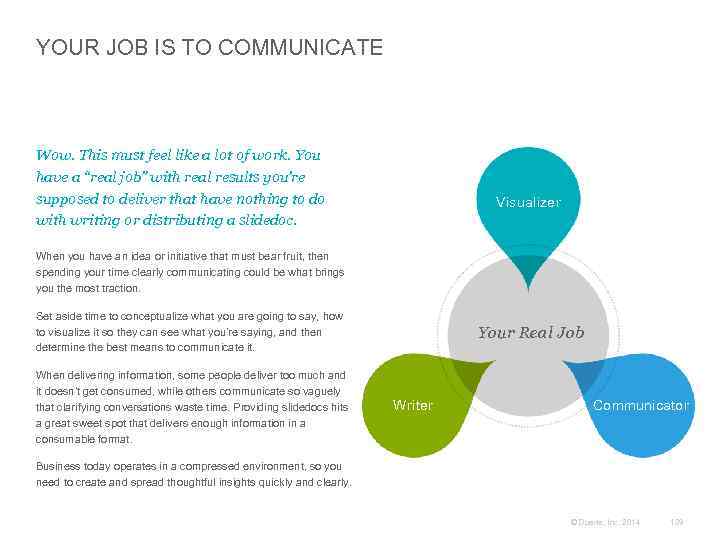
YOUR JOB IS TO COMMUNICATE Wow. This must feel like a lot of work. You have a “real job” with real results you’re supposed to deliver that have nothing to do with writing or distributing a slidedoc. Visualizer When you have an idea or initiative that must bear fruit, then spending your time clearly communicating could be what brings you the most traction. Set aside time to conceptualize what you are going to say, how to visualize it so they can see what you’re saying, and then determine the best means to communicate it. When delivering information, some people deliver too much and it doesn’t get consumed, while others communicate so vaguely that clarifying conversations waste time. Providing slidedocs hits a great sweet spot that delivers enough information in a consumable format. Your Real Job Writer Communicator Business today operates in a compressed environment, so you need to create and spread thoughtful insights quickly and clearly. © Duarte, Inc. 2014 139
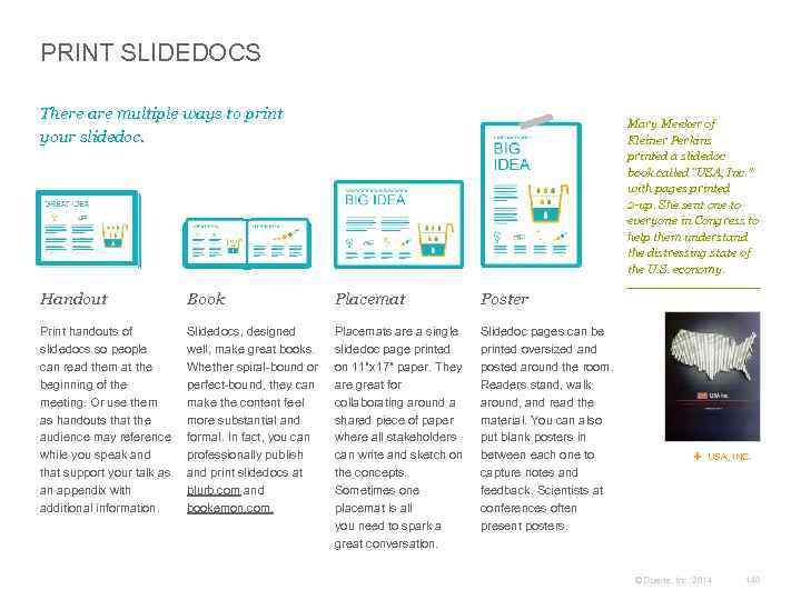
PRINT SLIDEDOCS There are multiple ways to print your slidedoc. Mary Meeker of Kleiner Perkins printed a slidedoc book called “USA, Inc. ” with pages printed 2 -up. She sent one to everyone in Congress to help them understand the distressing state of the U. S. economy. Handout Book Placemat Poster Print handouts of slidedocs so people can read them at the beginning of the meeting. Or use them as handouts that the audience may reference while you speak and that support your talk as an appendix with additional information. Slidedocs, designed well, make great books. Whether spiral-bound or perfect-bound, they can make the content feel more substantial and formal. In fact, you can professionally publish and print slidedocs at blurb. com and bookemon. com. Placemats are a single slidedoc page printed on 11"x 17" paper. They are great for collaborating around a shared piece of paper where all stakeholders can write and sketch on the concepts. Sometimes one placemat is all you need to spark a great conversation. Slidedoc pages can be printed oversized and posted around the room. Readers stand, walk around, and read the material. You can also put blank posters in between each one to capture notes and feedback. Scientists at conferences often present posters. USA, INC. © Duarte, Inc. 2014 140
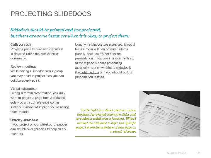
PROJECTING SLIDEDOCS Slidedocs should be printed and not projected, but there are some instances when it is okay to project them: Collaboration: Project a page to read and discuss it in detail to refine the idea or build consensus. Review meeting: While editing a slidedoc with a group, you may need to project it so you can collaboratively edit it. Visual reference: During a formal presentation, you may want to project a page from a slidedoc solely as a visual reference so the audience knows what page you’re asking them to read. Overlay sketches: If you project onto a whiteboard, people can sketch over graphics to help clarify meaning. Usually if slidedocs are projected, it would be in a room with ten or fewer internal people, because it’s not a formal presentation. If you are in a room with six or more people or are presenting externally, rethink whether a slidedoc is the right medium or if you should build a presentation instead. To the right is a slide I used in a vision meeting. I projected cinematic slides and provided a slidedoc as a handout. When I wanted the audience to refer to a specific page, I projected a picture of that page as a visual reference. © Duarte, Inc. 2014 141
BAD HABITS ARE HARD TO BREAK, BUT BREAK THEM Do not verbally present slidedocs. Bad Habit #1: Bad Habit #2: Bad Habit #3: Bad Habit #4: Use slides as a teleprompter Leave no time to prepare a real presentation Think dense slides look smart Desire accreditation The biggest reason people present slides-as-documents is that they want to make sure they cover everything comprehensively. Presenters put every word on a slide so they don’t forget what they’re supposed to say. They build what is essentially a visual teleprompter. Audiences become frustrated when they have to sit through a presenter read-along, just like it would frustrate you to read the President’s teleprompter instead of listening to the State of the Union. Authors pour ideas, words, and pictures onto slides as part of the creative process. The problem is that people stop there—with all their thoughts in writing on the slide. If you plan to present the material, there’s an additional step you need to take to distill the document into a true visual aid. If you don’t have time to perform this step, it’s best to distribute it as a document. People in analytical roles sometimes think the merit of an idea is directly proportional to the amount of information on the slide. They feel that if you don’t have dense charts and graphs, you haven’t done your research or been thorough enough. However, projecting several layers of charts on a slide is a very different experience than distributing several charts throughout a slidedoc for people to read and interpret for themselves. When you’ve worked hard on your ideas, it’s tempting to present the material instead of handing it out. Presenting material makes it clear that you’re the author and subject matter expert. But is that necessary? This behavior is based on pride of authorship, not communication efficiency. Regardless of why people present their dense slides, the practice should stop. © Duarte, Inc. 2014 142
+ Distributing Slidedocs 04 © Duarte, Inc. 2014 143
DISTRIBUTE SLIDEDOCS ONLINE Link to your slidedoc on Slide. Share to get the word out. Embed E-mail Slide. Share presentations can be embedded into HTML pages. Anywhere a You. Tube video can go, a Slide. Share slidedoc file can go. Slide. Share can track who has seen the file, connect them to your website, and collect contact information which generates leads. Share Instead of e-mailing a large file that clogs inboxes, send a link to the Slide. Share file online. Analytics Slide. Share is a great tool for distributing slidedocs. Upload your presentation, and it translates into a format that can be broadly and publicly distributed online. © Duarte, Inc. 2014 144
USE SLIDEDOCS FOR WEBINARS A few years ago, I conducted a survey to see how many people attended presentations remotely versus in person. The results showed that 85% of presentations were remote. It’s harder to make a sincere connection with an audience when you’re not in the same room. Managers spend most of their workday in meetings. Many managers consider almost half of those meetings a waste of time. So when meetings are already feeling like a waste, make yours more productive by using a slidedoc. In a remote meeting situation, you’re competing with many attendee distractions, the primary one being their e-mail. If your material isn’t more interesting than their inbox, they won’t be 100% present. Have meeting attendees read one page and discuss that topic. When attendees read the slidedoc and then discuss it, it engages them more often. Each time you advance to a new slide, if attendees are multitasking, they’ll have to minimize email (or whatever they’re doing) to read the slide so they can continue to be a participant. But again, don’t read or present the slide to them; it’s faster if they read it and then discuss it. You can also use slidedocs as a guide and context for all the topics you want to talk over. Putting the topics you’ll be discussing in a slidedoc moves the meeting along. It also helps attendees gauge how much you’ve covered as the meeting progresses. If you’re using telepresence or other emerging video systems, sending slidedocs ahead of time will ensure that your communication is failsafe (you never know what might go wrong with technology). © Duarte, Inc. 2014 145
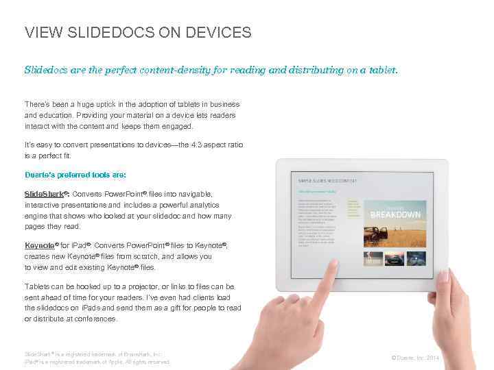
VIEW SLIDEDOCS ON DEVICES Slidedocs are the perfect content-density for reading and distributing on a tablet. There’s been a huge uptick in the adoption of tablets in business and education. Providing your material on a device lets readers interact with the content and keeps them engaged. It’s easy to convert presentations to devices—the 4: 3 aspect ratio is a perfect fit. Duarte’s preferred tools are: Slide. Shark®: Converts Power. Point® files into navigable, interactive presentations and includes a powerful analytics engine that shows who looked at your slidedoc and how many pages they read. Keynote® for i. Pad®: Converts Power. Point® files to Keynote®, creates new Keynote® files from scratch, and allows you to view and edit existing Keynote® files. Tablets can be hooked up to a projector, or links to files can be sent ahead of time for your readers. I’ve even had clients load the slidedocs on i. Pads and send them as a gift for people to read or distribute at conferences. Slide. Shark® is a registered trademark of Brainshark, Inc. i. Pad® is a registered trademark of Apple. All rights reserved. © Duarte, Inc. 2014 146
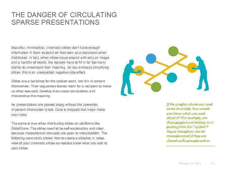
THE DANGER OF CIRCULATING SPARSE PRESENTATIONS Beautiful, minimalistic, cinematic slides don’t have enough information in them to stand on their own as a document when distributed. In fact, when slides travel around with only an image and a handful of words, the readers have to fill in far too many blanks to understand their meaning. As you embrace simplifying slides, this is an unexpected negative side effect. Slides are a backdrop for the spoken word, not rich in content themselves. Their vagueness leaves room for a recipient to make up what was said, develop inaccurate conclusions, and misconstrue the meaning. As presentations are passed along without the presenter, important information is lost. Data is dropped that helps make your case. The same is true when distributing slides on platforms like Slide. Share. The slides need to be self-explanatory and clear, because metaphorical concepts are open to interpretation. The following case study shows how to create a slidedoc in notes view of your cinematic slides so readers know what you said to your slides. If the graphic above was used alone on a slide, how would you know what was said about it? For example, are these people contributing to or pulling from this “system”? Vague metaphors can be misunderstood if they are shared without explanation. © Duarte, Inc. 2014 147
CASE STUDY Convert Cinematic Slides Into Slidedocs David Allen, of The David Allen Company, is a great presenter who uses cinematic slides effectively. When he needs to leave information behind after his talks, he delivers beautiful layouts of his slides in notes view. © Duarte, Inc. 2014 148
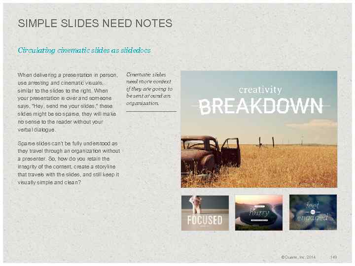
SIMPLE SLIDES NEED NOTES Circulating cinematic slides as slidedocs When delivering a presentation in person, use arresting and cinematic visuals, similar to the slides to the right. When your presentation is over and someone says, “Hey, send me your slides, ” these slides might be so sparse, they will make no sense to the reader without your verbal dialogue. Cinematic slides need more context if they are going to be sent around an organization. Sparse slides can’t be fully understood as they travel through an organization without a presenter. So, how do you retain the integrity of the content, create a storyline that travels with the slides, and still keep it visually simple and clean? © Duarte, Inc. 2014 149
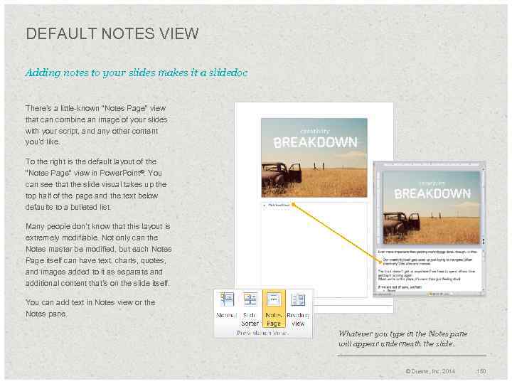
DEFAULT NOTES VIEW Adding notes to your slides makes it a slidedoc There’s a little-known “Notes Page” view that can combine an image of your slides with your script, and any other content you’d like. To the right is the default layout of the “Notes Page” view in Power. Point®. You can see that the slide visual takes up the top half of the page and the text below defaults to a bulleted list. Many people don’t know that this layout is extremely modifiable. Not only can the Notes master be modified, but each Notes Page itself can have text, charts, quotes, and images added to it as separate and additional content that’s on the slide itself. You can add text in Notes view or the Notes pane. Whatever you type in the Notes pane will appear underneath the slide. © Duarte, Inc. 2014 150
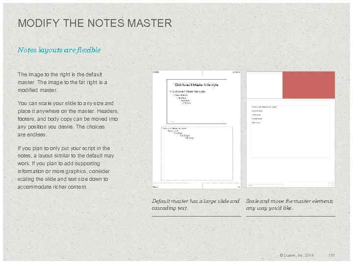
MODIFY THE NOTES MASTER Notes layouts are flexible The image to the right is the default master. The image to the far right is a modified master. You can scale your slide to any size and place it anywhere on the master. Headers, footers, and body copy can be moved into any position you desire. The choices are endless. If you plan to only put your script in the notes, a layout similar to the default may work. If you plan to add supporting information or more graphics, consider scaling the slide and text size down to accommodate richer content. Default master has a large slide and Scale and move the master elements cascading text. any way you’d like. © Duarte, Inc. 2014 151
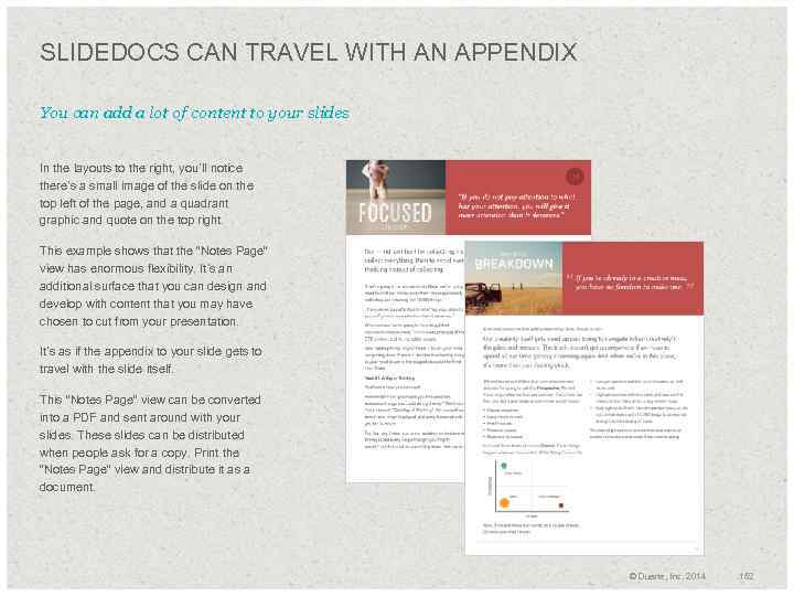
SLIDEDOCS CAN TRAVEL WITH AN APPENDIX You can add a lot of content to your slides In the layouts to the right, you’ll notice there’s a small image of the slide on the top left of the page, and a quadrant graphic and quote on the top right. This example shows that the “Notes Page” view has enormous flexibility. It’s an additional surface that you can design and develop with content that you may have chosen to cut from your presentation. It’s as if the appendix to your slide gets to travel with the slide itself. This ”Notes Page” view can be converted into a PDF and sent around with your slides. These slides can be distributed when people ask for a copy. Print the “Notes Page” view and distribute it as a document. © Duarte, Inc. 2014 152
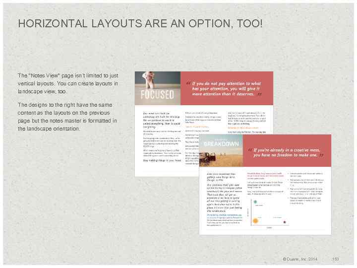
HORIZONTAL LAYOUTS ARE AN OPTION, TOO! The “Notes View” page isn’t limited to just vertical layouts. You can create layouts in landscape view, too. The designs to the right have the same content as the layouts on the previous page but the notes master is formatted in the landscape orientation. © Duarte, Inc. 2014 153
+ Spread Big Ideas With Slidedocs 04 © Duarte, Inc. 2014 154
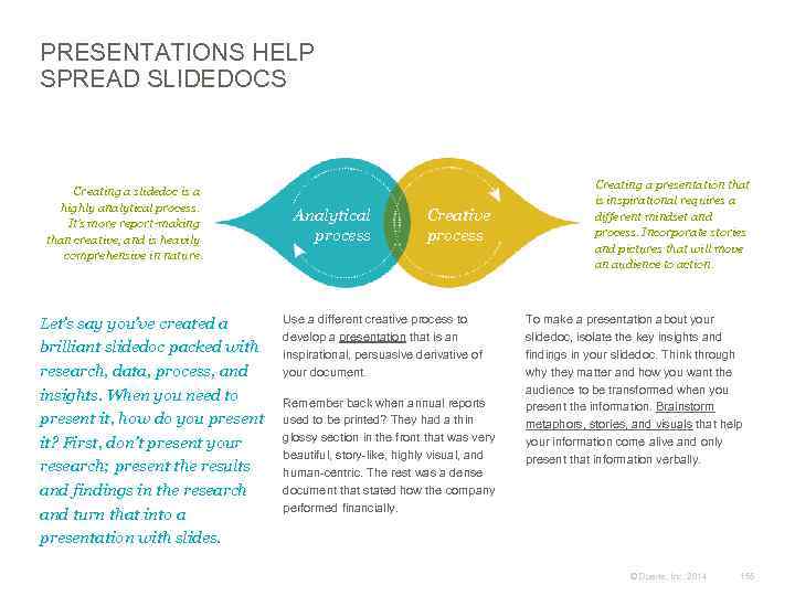
PRESENTATIONS HELP SPREAD SLIDEDOCS Creating a slidedoc is a highly analytical process. It’s more report-making than creative, and is heavily comprehensive in nature. Let’s say you’ve created a brilliant slidedoc packed with research, data, process, and insights. When you need to present it, how do you present it? First, don’t present your research; present the results and findings in the research and turn that into a presentation with slides. Analytical process Creative process Use a different creative process to develop a presentation that is an inspirational, persuasive derivative of your document. Remember back when annual reports used to be printed? They had a thin glossy section in the front that was very beautiful, story-like, highly visual, and human-centric. The rest was a dense document that stated how the company performed financially. Creating a presentation that is inspirational requires a different mindset and process. Incorporate stories and pictures that will move an audience to action. To make a presentation about your slidedoc, isolate the key insights and findings in your slidedoc. Think through why they matter and how you want the audience to be transformed when you present the information. Brainstorm metaphors, stories, and visuals that help your information come alive and only present that information verbally. © Duarte, Inc. 2014 155
BENEFITS OF SPREADING SLIDEDOCS One of the most powerful attributes of a slidedoc is its modular nature. The ability to have small, organized chunks of content to arrange makes creating slidedocs very efficient. Organizing content by focusing on one idea per page, you can mix and match ideas to meet different reader needs. The atomic nature of the units makes it easy to structure your thoughts into a clear case. If slides aren’t rich with content and don’t visually look like they hang together in a unified visual language, recipients will feel like you’ve simply piecemealed it together, or “Frankensteined” slides from different decks. They’ll assume you created the slidedoc without caring about how they need to process the information. Organizations need to create different slidedocs to appeal to different audiences. The flexibility of this rich content source allows employees to be agile communicators. Plus, to rearrange the content, you don’t need to learn new, complicated software. Great slidedocs spread quickly. If you’re the author of great slidedocs, your strategy, thinking, and solutions will be latched onto by the organization and become core to the company’s success. Slidedoc content helps spread your ideas, making it easy for people to repurpose your thinking. Marketing departments use well-written and well-designed slidedocs to create key messages that employees should include in every key piece of communication. © Duarte, Inc. 2014 156
SLIDEDOCS IMPROVE COMMUNICATION Below is a summary of this book. The summary page should reinforce key points from your slidedoc. We used colored text in this summary page to illustrate how some of the exact page titles throughout the slidedoc can be used in the summary. The way we communicate is changing. In our time-strapped world, we like information that is consumed quickly. This has led organizations to look for a way to fill the gap between long-form documents and presentations. What has emerged are slidedocs. A slidedoc is a visual document intended to be read and referenced instead of projected. Slidedocs work for a variety of communication scenarios, from sales collateral to in-meeting reference material. And because of their modular nature, slidedocs can spread your smart thinking throughout your organization. But creating a great slidedoc also means taking the time to do it right—and that means investing in both the writing and the design. Effective slidedocs are developed by knowing your audience, understanding how they consume information, and by having one clear big idea. From there, following good writing practices and writing compelling copy well help you create a slidedoc that spreads. Using basic design principles—like creating structure with a grid and adding white space to give your content room to breathe—helps amplify what’s important and helps readers digest your information. Slidedocs are one of the most effective tools for communicating ideas quickly and establishing consensus. Your ideas deserve the best possible communication vehicle. Slidedocs are designed for the Developing effective slidedocs also means way we communicate today, and these visualizing ideas and making the best practices will give you the skills you information easy to navigate. To do that, need to change your organization for the you need to highlight what’s important better. while using diagrams and data to show the relationships between the different elements of an idea. © Duarte, Inc. 2014 157
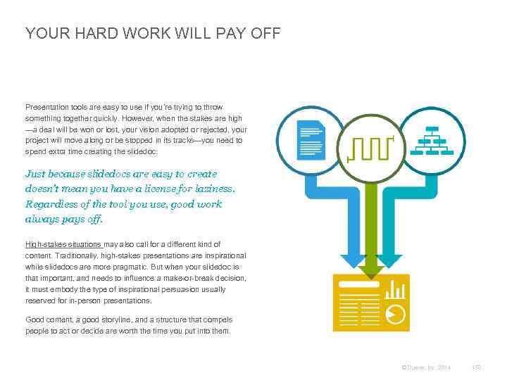
YOUR HARD WORK WILL PAY OFF Presentation tools are easy to use if you’re trying to throw something together quickly. However, when the stakes are high —a deal will be won or lost, your vision adopted or rejected, your project will move along or be stopped in its tracks—you need to spend extra time creating the slidedoc. Just because slidedocs are easy to create doesn’t mean you have a license for laziness. Regardless of the tool you use, good work always pays off. High-stakes situations may also call for a different kind of content. Traditionally, high-stakes presentations are inspirational while slidedocs are more pragmatic. But when your slidedoc is that important, and needs to influence a make-or-break decision, it must embody the type of inspirational persuasion usually reserved for in-person presentations. Good content, a good storyline, and a structure that compels people to act or decide are worth the time you put into them. © Duarte, Inc. 2014 158
Thank You © Duarte, Inc. 2014 159
CONTACT US If you want to contact Duarte: www. duarte. com 650 -625 -8200 info@duarte. com Twitter: @duarte If you want to contact Nancy: Facebook: Duarte, Inc. Linked. In: Duarte, Inc. Twitter: @nancyduarte Linked. In: Nancy Duarte Blog RSS: Duarte Blog Feed Slide. Share: Duarte, Inc. You. Tube: Duarte, Inc. © Duarte, Inc. 2014 160

© Duarte, Inc. 2014 161

© Duarte, Inc. 2014 162
ENGAGING WITH DUARTE We’d love to help! Consulting Design Publishing Events Multimedia Duarte’s writers are skilled in persuasive storytelling practices. Whether your content needs a complete rework or you’re starting with a blank page, our writers can create your entire story from start to finish. We design cinematic presentations that awe and inspire, robust template systems that help foster better companywide communication, and pre -existing content that just needs that extra something. Duarte can transform your content (presentation, book, sales tools, slidedoc, technical pub, and collateral) into a platform-agnostic, visually rich, easily navigable, dynamic document to use on tablets or mobile devices. We craft compelling, memorable keynote and breakout session presentations that motivate audiences. We can also provide overall event theme and design support. Duarte creates interactive presentations, visual essays, videos, and animated demos that further engage audiences. We can also extend the life of a presentation by making it web- and/or You. Tube-ready. © Duarte, Inc. 2014 163
Amanda Working with you was a blast! Thank for wrangling and writing chunks of this puppy. This book is real because of a herd of Duartians Diandra Ashley, Chris, Dave, Doug, Emily, Janice, Kelly, Michelle, Patti, & Paula This book is beautiful because you make everything beautiful. Special Thanks Ric Your support over the years and on this slidedoc has astounded me. Aisling, Denise, Tyler & Ivan The book wouldn’t have happened without your rocking design skills and tenacity. http: //www. ricbret. com Dan Thank you for generously donating the slidedoc. com domain to this cause. Your template wizardry has made this slidedoc and the free templates magical to use. Denise, Janet, Kyle & Stephanie Your case studies and template designs are beautiful and central to this book. And it wouldn’t be a valuable book without a cute pic of my granddogs Bear and Necessity. © Duarte, Inc. 2014 164
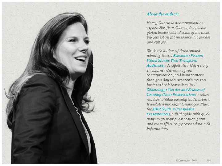
About the author: Nancy Duarte is a communication expert. Her firm, Duarte, Inc. , is the global leader behind some of the most influential visual messages in business and culture. She is the author of three awardwinning books. Resonate: Present Visual Stories That Transform Audiences, identifies the hidden story structures inherent in great communication, and it spent more than 300 days on Amazon’s top 100 business book bestsellers list. Slide: ology: The Art and Science of Creating Great Presentations teaches readers to think visually and has been translated into eight languages. Plus, the HBR Guide to Persuasive Presentations, a field guide with quick ways to up your presentation game and more effectively present data-rich information. © Duarte, Inc. 2014 165
Duarte_Slidedocs_Download.pptx