Duarte_SBTemplate_Download.pptx
- Количество слайдов: 25
 slidedoc cover page example Author Name Position title Other contact information
 table of contents 01 02 03 this is a section title text placeholder and text is lowercased Franklin Gothic Book keep titles short but with enough info for readers to skim and understand the structure these text fields plus the ones on the right are on a master so you can have up to six sections 04 05 06 this is a section title text placeholder where text is lowercased Franklin Gothic Book
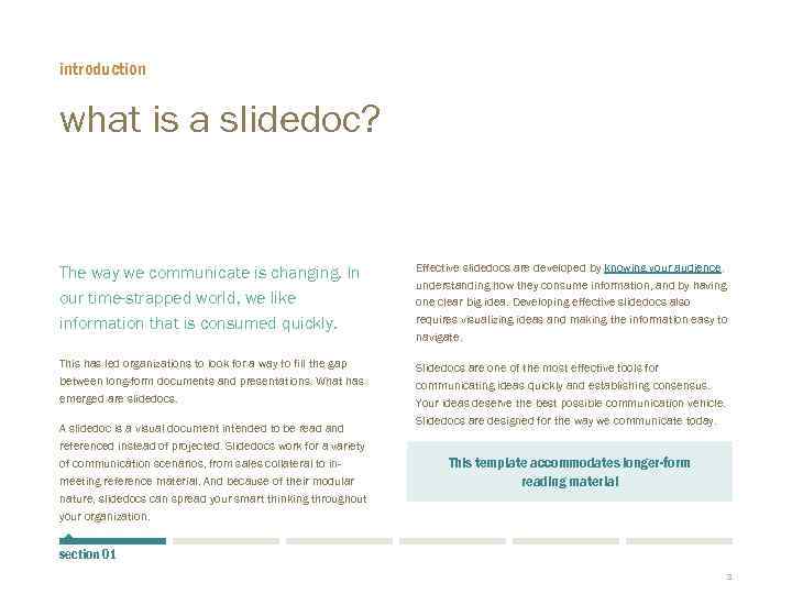 introduction what is a slidedoc? The way we communicate is changing. In our time-strapped world, we like information that is consumed quickly. Effective slidedocs are developed by knowing your audience, understanding how they consume information, and by having one clear big idea. Developing effective slidedocs also requires visualizing ideas and making the information easy to navigate. This has led organizations to look for a way to fill the gap between long-form documents and presentations. What has emerged are slidedocs. Slidedocs are one of the most effective tools for communicating ideas quickly and establishing consensus. Your ideas deserve the best possible communication vehicle. Slidedocs are designed for the way we communicate today. A slidedoc is a visual document intended to be read and referenced instead of projected. Slidedocs work for a variety of communication scenarios, from sales collateral to inmeeting reference material. And because of their modular nature, slidedocs can spread your smart thinking throughout your organization. This template accommodates longer-form reading material section 01 3
 introduction Slidedocs are like books Slidedocs borrow some specific design aspects from books. Books have a cover, table of contents, clear chapter indicators, prose, page numbers, and other small design decisions that have big information architecture implications to help readers navigate the contents. The masters are set up for prose and have plenty of white space. Each page holds just the right amount of information to process quickly. Flipping through the pages of a slidedoc should feel similar to flipping through the printed pages of a book or swiping the screen of a tablet device. See page 67 to 81 at www. slidedocs. com 4
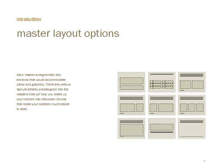 introduction master layout options Each master is segmented into sections that would accommodate prose and graphics. There are various layouts already predesigned into the masters that will help you break up your content into bite-sized chunks that make your slidedoc much easier to read. 5
 typographic hierarchy creating contrast with type If you type in the field to the right titled “Click to add text”, you get this light blue text style. This is used for highlighting pieces of text for a subtitle, subhead, or main callouts. Hit return and tab and the text changes to charcoal and you now have a paragraph header style applied. Hit return and tab again and it changes to a size that works great for body copy. This efficient way of setting up the master template to create typographic hierarchy is unique to slidedocs. § A fourth tab sequence is a bullet § Try it now for yourself to the right 6
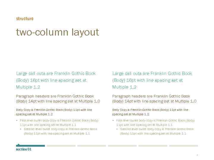 structure two-column layout Large call outs are Franklin Gothic Book (Body) 16 pt with line spacing set at Multiple 1. 2 Paragraph headers are Franklin Gothic Book (Body) 14 pt with line spacing set at Multiple 1. 0 Body Copy is Franklin Gothic Book (Body) 11 pt with line spacing set at Multiple 1. 2 § First level bullet body copy is Franklin Gothic Book (Body) 11 pt with line spacing set at Multiple 1. 1 § Second level bullet body copy is Franklin Gothic Book (Body) 11 pt with line spacing set at Multiple 1. 1 section 01 7
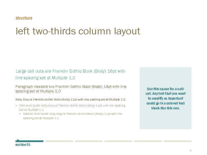 structure left two-thirds column layout Large call outs are Franklin Gothic Book (Body) 16 pt with line spacing set at Multiple 1. 2 Paragraph headers are Franklin Gothic Book (Body) 14 pt with line spacing set at Multiple 1. 0 Body Copy is Franklin Gothic Book (Body) 11 pt with line spacing set at Multiple 1. 2 § First level bullet body copy is Franklin Gothic Book (Body) 11 pt with line spacing set at Multiple 1. 1 § Second level bullet body copy is Franklin Gothic Book (Body) 11 pt with line spacing set at Multiple 1. 1 Use this space for a callout. Any text that you want to amplify as important could go in a colored text block like this one. section 01 8
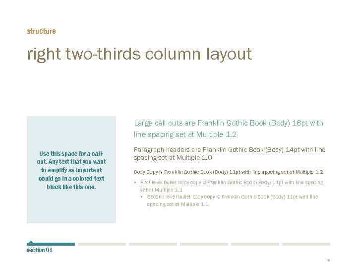 structure right two-thirds column layout Large call outs are Franklin Gothic Book (Body) 16 pt with line spacing set at Multiple 1. 2 Use this space for a callout. Any text that you want to amplify as important could go in a colored text block like this one. Paragraph headers are Franklin Gothic Book (Body) 14 pt with line spacing set at Multiple 1. 0 Body Copy is Franklin Gothic Book (Body) 11 pt with line spacing set at Multiple 1. 2 § First level bullet body copy is Franklin Gothic Book (Body) 11 pt with line spacing set at Multiple 1. 1 § Second level bullet body copy is Franklin Gothic Book (Body) 11 pt with line spacing set at Multiple 1. 1 section 01 9
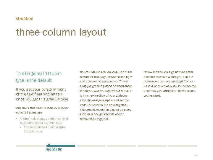 structure three-column layout This large teal 16 point type is the default If you set your cursor in front of the text field and hit tab once you get this gray 14 type One more tab and the body copy pops up as 11 point type § Another tab brings up the first level bullet at a lighter 11 point type § The second-level bullet is also 11 point type Notice that the section identifier at the bottom of this page moved to the right and changed to section two. This is simply a graphic placed on each slide. When you want to signify that a reader is in a new section of your slidedoc, slide the orange graphic and section head text over to the next segment. This graphic could be placed on every slide as a navigational device or removed all together. Below the section signifier is a small discreet text field where you can put reference or source material. You can have it be a live web link to the source or simply give attribution to the source you’ve cited. section 02 10
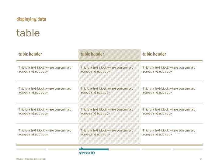 displaying data table header This is a text block where you can tab across and add copy This is a text block where you can tab across and add copy This is a text block where you can tab across and add copy section 03 Source: Placeholder example 11
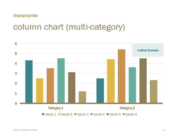 displaying data column chart (multi-category) 6 Callout Example 5 4 3 2 1 0 Category 1 Series 1 Source: Placeholder example Series 2 Category 2 Series 3 Series 4 Series 5 Series 6 12
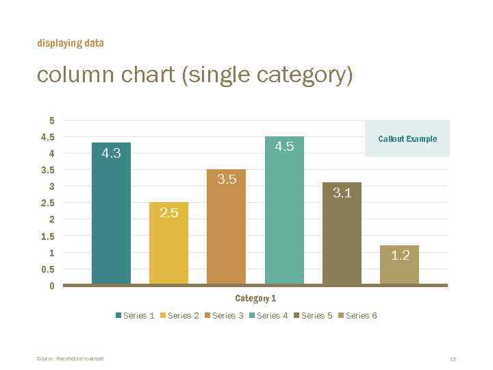 displaying data column chart (single category) 5 4 Callout Example 4. 5 4. 3 3. 5 3 2. 5 3. 1 2. 5 2 1. 5 1 1. 2 0. 5 0 Category 1 Series 1 Source: Placeholder example Series 2 Series 3 Series 4 Series 5 Series 6 13
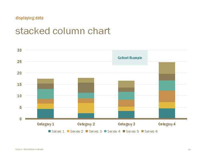 displaying data stacked column chart 30 Callout Example 25 20 15 10 5 0 Category 1 Series 1 Source: Placeholder example Category 2 Series 3 Category 3 Series 4 Series 5 Category 4 Series 6 14
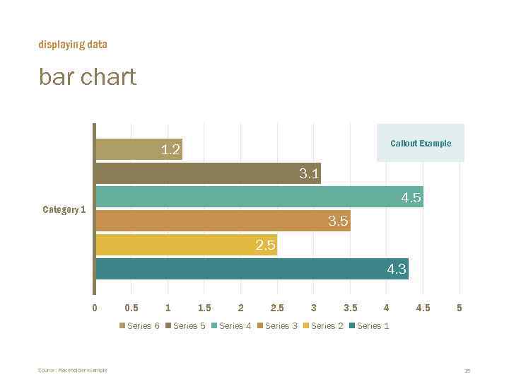 displaying data bar chart Callout Example 1. 2 3. 1 4. 5 Category 1 3. 5 2. 5 4. 3 0 0. 5 Series 6 Source: Placeholder example 1 1. 5 Series 5 2 Series 4 2. 5 Series 3 3 Series 2 3. 5 4 4. 5 5 Series 1 15
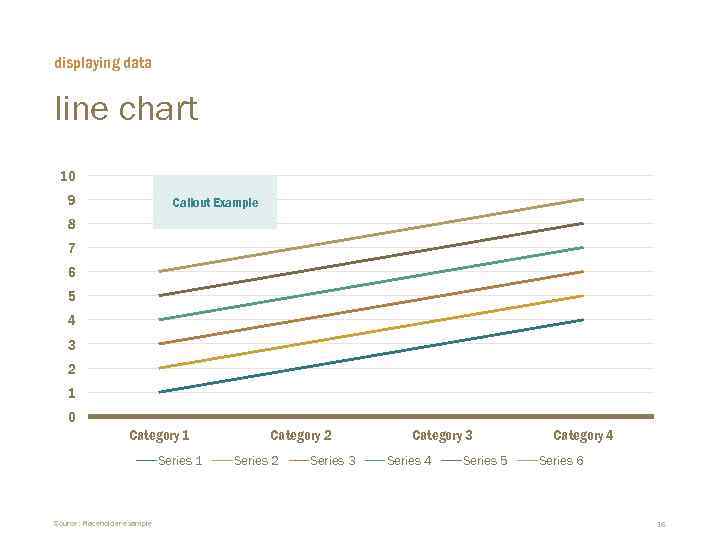 displaying data line chart 10 9 Callout Example 8 7 6 5 4 3 2 1 0 Category 1 Series 1 Source: Placeholder example Category 2 Series 3 Category 3 Series 4 Series 5 Category 4 Series 6 16
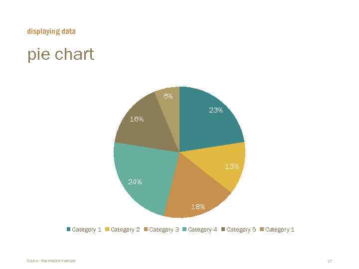 displaying data pie chart 6% 23% 16% 13% 24% 18% Category 1 Source: Placeholder example Category 2 Category 3 Category 4 Category 5 Category 1 17
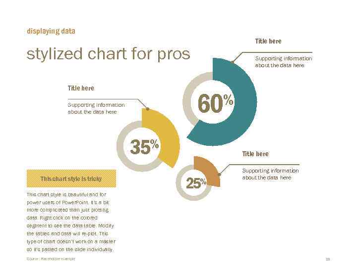 displaying data Title here stylized chart for pros Title here Supporting information about the data here 60% Supporting information about the data here 35% This chart style is tricky This chart style is beautiful and for power users of Power. Point. It’s a bit more complicated than just plotting data. Right click on the colored segment to see the data table. Modify the tables and data will re-plot. This type of chart doesn’t work on a master so it’s pasted on the slide individually. Source: Placeholder example Title here 25% Supporting information about the data here 18
 Quote slide style example layout. Text should be sentence case. First, Last Name Company name Title comes here
 Quote slide style example layout. Text should be sentence case. First, Last Name Company name Title comes here
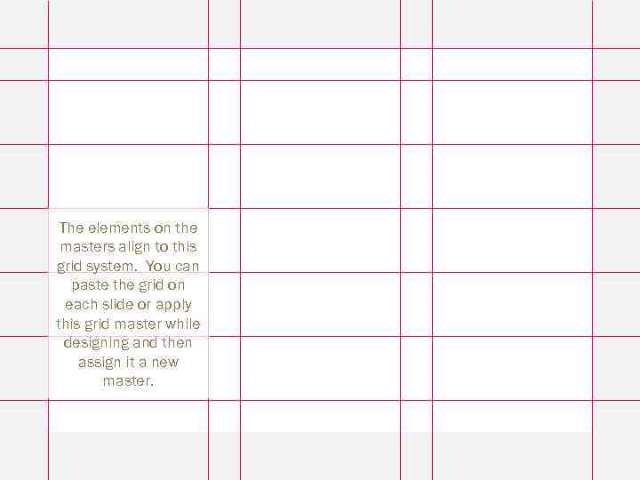 The elements on the masters align to this grid system. You can paste the grid on each slide or apply this grid master while designing and then assign it a new master. 21
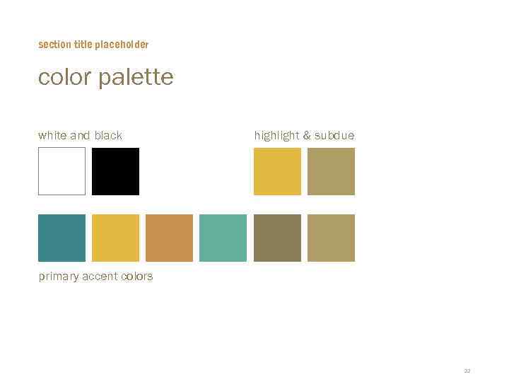 section title placeholder color palette white and black highlight & subdue primary accent colors 22
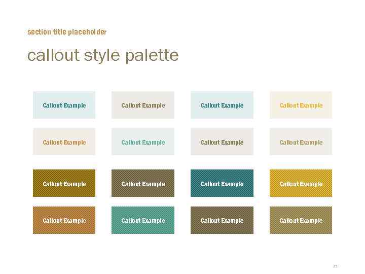 section title placeholder callout style palette Callout Example Callout Example Callout Example Callout Example 23
 section head overview of the section You may use this master to segue within a major section, or use it as a Q&A slide.
 thank you contact information For more info, please contact us at info@duarte. com 650 -625 -8200


