e9050d18af7fd21a3633e81c7fabb62f.ppt
- Количество слайдов: 47
Show me the Answer: Dashboarding and KPIs Tangible Data 15 th October 2008
Some questions for you Do you know what a dashboard is? n Do you currently have a dashboard in operation? n Is your dashboard working well? n Are you looking to implement a dashboard in the next 12 Slidemonths? 2 n
Who this session is aimed at n Fundraising analysts with little or no experience of creating dashboards & KPIs n People who have developed a dashboard and would like to pick up some industry best practice n Aimed at the people who are tasked with building or improving the dashboard n n Rather than the audience who use them What this session is not Not a review of what’s new in cutting edge software n Not a review of interactive reporting and analytics, OLAP Data Mining, reporting suites, Web-based analysis, etc. n Slide 3
Show Me the Answer: Agenda n Context n n What exactly is a dashboard? What’s the Answer. . . Knowing your audience n Getting the information right n n . . . And how do you Show it? How not to show it: common mistakes n Examples of successful dashboards n n n Slide 4 Best practice guide to building a dashboard Appendix: some further useful slides for you
Context What exactly is a dashboard? Some recent history – where does dashboarding come from What are the main issues?
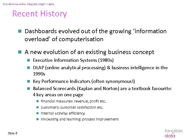
Recent History n Dashboards evolved out of the growing ‘information overload’ of computerisation n A new evolution of an existing business concept Executive Information Systems (1980 s) n OLAP (online analytical processing) & business intelligence in the 1990 s n Key Performance Indicators (often synonymous!) n Balanced Scorecards (Kaplan and Norton) are a textbook favourite: 4 key areas on one page n financial measures: revenue, profit etc. n customers: customer satisfaction etc. n internal activity: efficiency n innovating and learning: process improvement n Slide 6
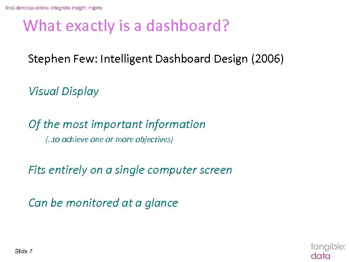
What exactly is a dashboard? Stephen Few: Intelligent Dashboard Design (2006) Visual Display Of the most important information (. . to achieve one or more objectives) Fits entirely on a single computer screen Can be monitored at a glance Slide 7
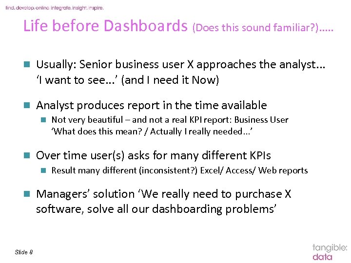
Life before Dashboards (Does this sound familiar? ). . . n Usually: Senior business user X approaches the analyst. . . ‘I want to see. . . ’ (and I need it Now) n Analyst produces report in the time available n n Over time user(s) asks for many different KPIs n n Slide 8 Not very beautiful – and not a real KPI report: Business User ‘What does this mean? / Actually I really needed. . . ’ Result many different (inconsistent? ) Excel/ Access/ Web reports Managers’ solution ‘We really need to purchase X software, solve all our dashboarding problems’
. . . What are the issues here? n Two separate issues around dashboarding: n What to dashboard Which metrics / Key Performance Indicators, at what level, for what reason: reviewing the KPIs as a whole Ø What’s the Answer? n n How to display it How to make the KPIs immediately comprehensible Ø How to Show it n Slide 9
What’s the Answer. . Getting the information right: bringing in the stakeholders
What’s the Answer: defining the KPIs n This section just covers how to define the KPIs: specific examples of KPIs will be mentioned later n Who is your (internal) customer? n n Individual department managers, executive board, managing director only, etc. Defining the KPIs is an analysis project. . . Analyst time & resource put aside n Business user time & resource put aside n n . . which never really ends e. g. Marketers keep finding new & innovative solutions to fundraise n Marketing KPIs need to evolve with the marketers n Slide 11
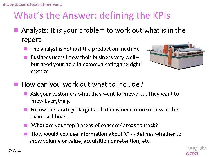
What’s the Answer: defining the KPIs n Analysts: It is your problem to work out what is in the report The analyst is not just the production machine n Business users know their business very well – but need your help in communicating the right metrics n n How can you work out what to include? Ask your customers what they want to know? . . . They want to know Everything n Follow the strategic targets – but may need more or less in the main dashboard n “What are your top 3 areas of concern/ areas to track? ” n “How would you use information about X” -> defines whether to show volume or value, acquisition or retention, etc. n Slide 12
What’s the Answer: defining the KPIs n Getting the numbers right Interpreting and querying the database correctly: can you reach all the data sources? n Getting the numbers to match what the business thought it had n Matching other (lower-level) reports n n Computer says no? n You’re not reporting what’s in the database, you’re reporting what’s in the business. . n n Direct . . . Although sometimes KPIs flag up practices that are divorced from reality n Slide 13 “Actually we include all recruits who responded to source code xxxx as Recruits” so the Direct Recruits metric needs to incorporate that. “Oh we always estimate these supporters as current unless we have a ‘stop flag’”. . maybe a separate analysis to get a more realistic picture?
. . . And how do you Show it? How not to show it: Common mistakes Good Practice examples
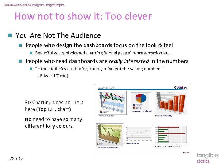
How not to show it: Too clever n You Are Not The Audience n People who design the dashboards focus on the look & feel n n Beautiful & sophisticated charting & ‘fuel gauge’ representation etc. People who read dashboards are really interested in the numbers n “If the statistics are boring, then you’ve got the wrong numbers” (Edward Tufte) 3 D Charting does not help here (Top L. H. chart) No need to have so many different jolly colours Slide 15
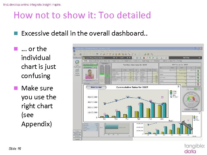
How not to show it: Too detailed n Excessive detail in the overall dashboard. . n . . . or the individual chart is just confusing n Make sure you use the right chart (see Appendix) Slide 16
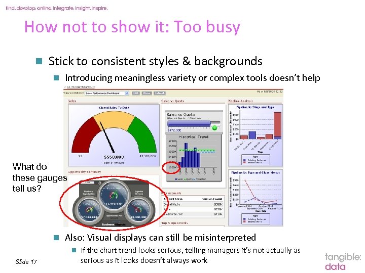
How not to show it: Too busy n Stick to consistent styles & backgrounds n Introducing meaningless variety or complex tools doesn’t help What do these gauges tell us? n Also: Visual displays can still be misinterpreted n Slide 17 If the chart trend looks serious, telling managers it’s not actually as serious as it looks doesn’t always work
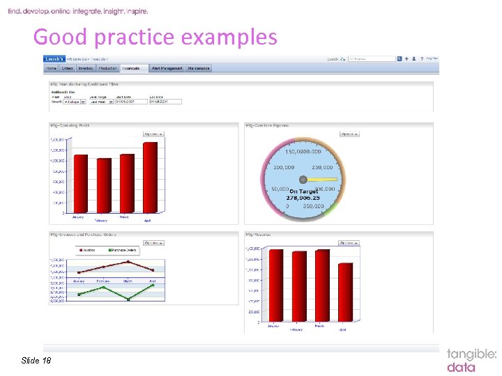
Good practice examples Slide 18
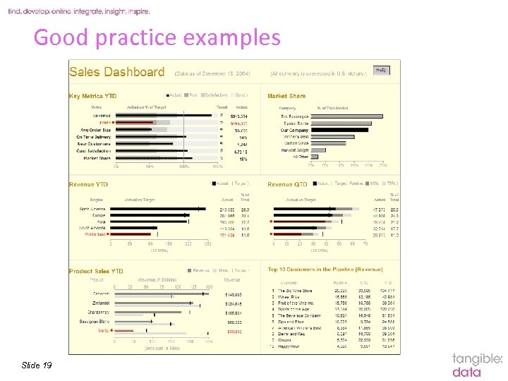
Good practice examples Slide 19
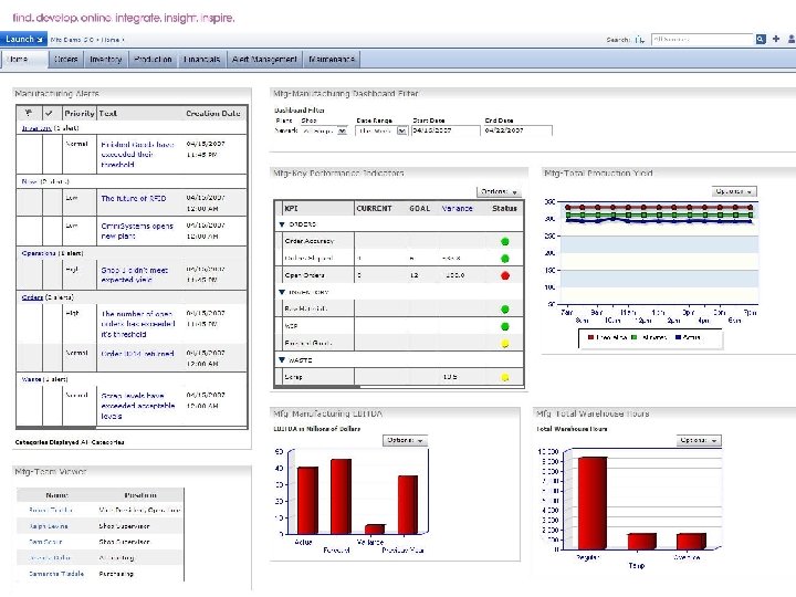
Good practice: Context & commentary n Some context is essential Explains (excuses? ) anomalies & provides sound bites n But minimal: do not overuse (Put detail in the cover note) n Slide 20
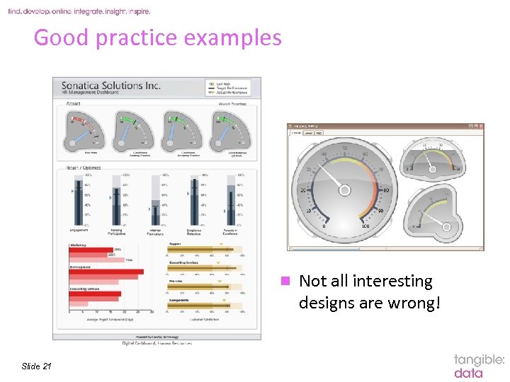
Good practice examples n Slide 21 Not all interesting designs are wrong!
Best practice guide to developing a dashboard
Dashboarding approaches n There is a plethora of dashboarding tools and software in the market n Excel is a great place to start if you own no other dashboarding software n n n Slide 23 Best to try out an existing Excel dashboard on your own data Many different free or cheap downloads Powerful capabilities and flexible data manipulation: very good display capabilities But keep best practices in mind, avoid the defaults, avoid things like 3 D charts, bright colours, and pie charts And consider data security and access control
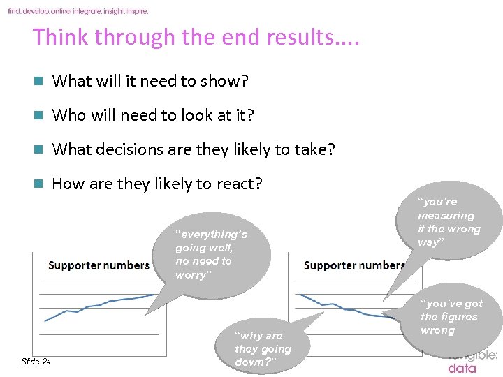
Think through the end results. . n What will it need to show? n Who will need to look at it? n What decisions are they likely to take? n How are they likely to react? “everything’s going well, no need to worry” Slide 24 “why are they going down? ” “you’re measuring it the wrong way” “you’ve got the figures wrong
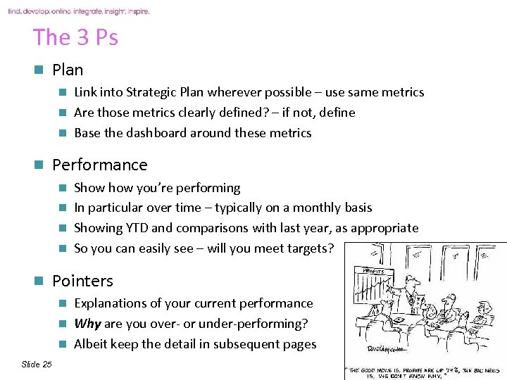
The 3 Ps n Plan Link into Strategic Plan wherever possible – use same metrics n Are those metrics clearly defined? – if not, define n Base the dashboard around these metrics n n Performance Show you’re performing n In particular over time – typically on a monthly basis n Showing YTD and comparisons with last year, as appropriate n So you can easily see – will you meet targets? n n Pointers Explanations of your current performance n Why are you over- or under-performing? n Albeit keep the detail in subsequent pages n Slide 25
Visualising information n Charts Great for showing key performance measures over time n Trends n Keep simple! – if getting too complex, use. . . n n . . . tables and numbers Great for showing greater detail n Or the numbers on which the charts are based n n Words At the top of the page! n Demands to be read! n The most important messages n Great for including the Pointers i. e. explaining the trends in the charts n Slide 26
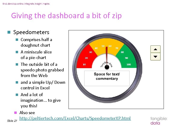
Giving the dashboard a bit of zip n Speedometers Comprises half a doughnut chart n A miniscule slice of a pie-chart n The outside bit of a speedo photo grabbed Space for text/ from the Web commentary n and a simple Up/ Down control in Excel n And a lot of imagination. . . to give you this! n Also see http: //peltiertech. com/Excel/Charts/Speedometer. XP. html Slide 27 n
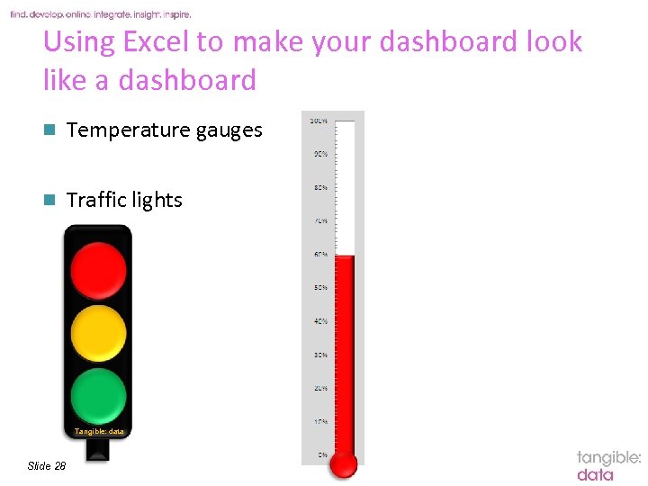
Using Excel to make your dashboard look like a dashboard n Temperature gauges n Traffic lights Tangible: data Slide 28
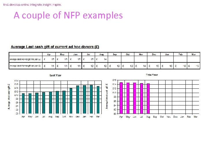
A couple of NFP examples n What are the 10 areas of my business that are most important to me? e. g. n n n n What sorts of things do I want to know about them? n n n Slide 29 Regular givers Ad hoc donors Legacy marketing Events Fundraising Membership Raffle supporters n n Recruitment rates Net growth Tracking volume, value % Attrition Cross-/up-selling Total Annual value Gift aiding Mail order purchase
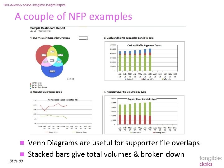
A couple of NFP examples Venn Diagrams are useful for supporter file overlaps n Stacked bars give total volumes & broken down n Slide 30
Any Questions? Julian Foxon 01285 883 783 Georgina Spary 01285 883 779
“a huge resource - able to help us with any data issue whether how to write SPSS syntax, where to source additional data, how to approach an analysis task. All that and a light-hearted yet professional, relaxed yet efficient, proactive yet no-pressure approach to our relationship. ” “experienced, high-calibre staff with all round knowledge of statistical techniques, presented in an accessible, jargon-free, client-friendly manner” Tangible Data Part of the Cello Group The Old Museum Tetbury Road Cirencester GL 7 1 UP 01285 644220 www. tangibledata. co. uk Slide 32 “down to earth, approachable yet knowledgeable data experts”
Appendix: additional useful slides More on how to Show it Business Intelligence Tools available Step-by-Step guide to dashboarding Other sources to research
More on how to Show it Stephen Few again: “The greatest display technology in the world won't solve [the information overload problem] if you fail to use effective visual design. And if a dashboard fails to tell you precisely what you need to know in an instant, you'll never use it, even if it's filled with cute gauges, meters, and traffic lights. ” Slide 34
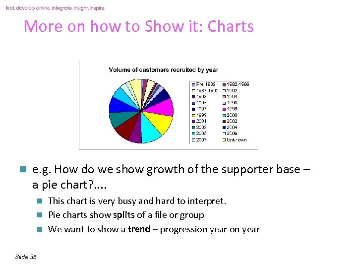
More on how to Show it: Charts n e. g. How do we show growth of the supporter base – a pie chart? . . This chart is very busy and hard to interpret. n Pie charts show splits of a file or group n We want to show a trend – progression year n Slide 35
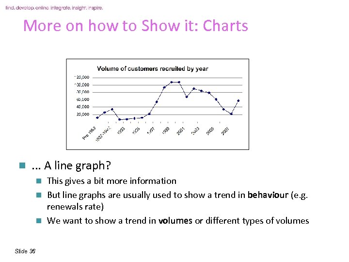
More on how to Show it: Charts n . . . A line graph? This gives a bit more information n But line graphs are usually used to show a trend in behaviour (e. g. renewals rate) n We want to show a trend in volumes or different types of volumes n Slide 36
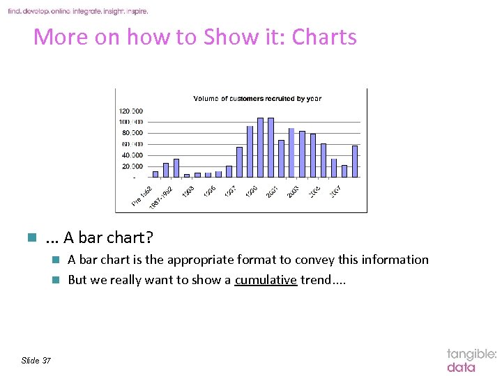
More on how to Show it: Charts n . . . A bar chart? A bar chart is the appropriate format to convey this information n But we really want to show a cumulative trend. . n Slide 37
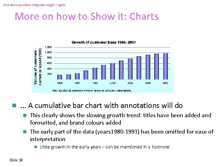
More on how to Show it: Charts n . . . A cumulative bar chart with annotations will do This clearly shows the slowing growth trend: titles have been added and formatted, and brand colours added n The early part of the data (years 1980 -1993) has been omitted for ease of interpretation n n Slide 38 Little growth in the early years – can be mentioned in a footnote
More on how to Show it: Interactivity n Interactivity is most useful when it allows the user to perform ad hoc queries n n -> this makes the report a data mining tool not a dashboard Some dashboards have interactive filters (to squeeze several different reports onto ‘one’ screen) -> not really an at-a-glance one page comparison n In practice the business will select out the top 3 -4 preferred views and cobble together their dashboard n n Slide 40 “Let’s go straight to Page 17”. . . how useful are pages 1 -16?
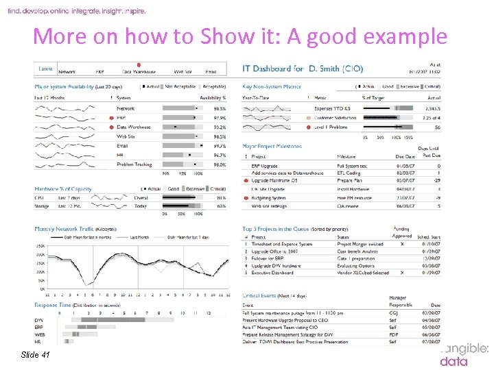
More on how to Show it: A good example Slide 41
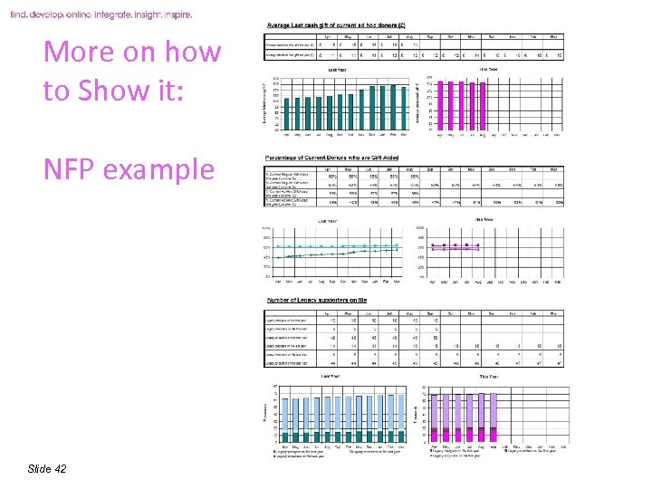
More on how to Show it: NFP example Slide 42
Business Intelligence Software available n 5 Top Business Intelligence Tool Vendors 1. 2. SAS: second-largest BI tools vendor, mostly from its advanced analytics tools, but its effort market its QRA tools since 2004 has paid off 3. Cognos: BI tools and financial performance management applications, &workforce analytics. 4. Microsoft: highest growth rate among the top 10 vendors. Pro. Clarity Software and also embedded BI tools that are bundled with Microsoft SQL Server. (Analysis Services and Reporting Services). NB specific Excel 2007 features for BI 5. Slide 43 Business Objects: Leading BI tools vendor Hyperion: acquired by Oracle
Summary: a Step-by-Step Guide A) Defining the Dashboard tangible: data 1. Work out who and what the dashboard is for 2. Plan the dashboarding project and resource it n 3. Get involved in understanding /interpreting the KPIs n 4. What is their impact? What are the action points? Work to get a minimal, meaningful, and appropriate list of KPIs n n Slide 44 Including time from senior business users And make sure the numbers are accurate and true in a business sense You may need to work with database operations to clean the source data
Summary: a Step-by-Step Guide B) Choosing the dashboard 5. Choose your developing tool n 6. Try agreeing them and drafting a one-sheet Excel report (dummy numbers) before you buy If you are working with a supplier or other team, write a full and detailed brief n Slide 45 Many good external software suppliers and analytics partners out there to support you BUT – you still need to own and understand the KPIs n 7. tangible: data If possible ask for example reports based around your KPIs
Summary: a Step-by-Step Guide C) Designing the dashboard tangible: data 8. Choose the design and layout around the metrics n n 9. Don’t be seduced by the pretty pictures n 10. The design must clarify not obscure the content Don’t cram too much in n n Slide 46 Most important KPI in the top left Most appropriate for each metric Not too busy & not too long! If there is too much information for 1 page this may be more than one report
Summary: a Step-by-Step Guide D) Implementing the dashboard 11. Keep the dashboard updated and refreshed n 12. Slide 47 This means planning in more resource: who, specifically, is responsible for this? If the dashboard is to be handed over to a production team, write a handover briefing n 13. tangible: data A full definition & derivation of each KPI Monitor changes in strategy and have a change control plan as requirements evolve
Other Sources to try n The Dashboard Spy (http: //dashboardspy. com/ ) Contains vast number of examples of best practice, free templates, free tools, comparisons of major software providers n e. g. ‘Best Excel Dashboard 2008’ n n Intelligent Dashboard Design n n “An alternative to crappy dashboards” n n Book by Stephen Few (2006) recent blog by Avinash Kaushik (see handout) Logi Report and others http: //www. freereporting. com free Excel based dashboarding too with a great deal of functionality n www. javaplanetinc. com n http: //www. exceluser. com/catalog/landdash 2. htm around £ 25 n Slide 48
e9050d18af7fd21a3633e81c7fabb62f.ppt