
Principles of “Effective” Slide Presentation By Volodymyr Vakhitov,


case_presentation.ppt
- Размер: 180.5 Кб
- Количество слайдов: 29
Описание презентации Principles of “Effective” Slide Presentation By Volodymyr Vakhitov, по слайдам
Principles of “Effective” Slide Presentation By Volodymyr Vakhitov, KSE/KEI November 20,
Principles of “Effective” Slide Presentation By Volodymyr Vakhitov, KSE/KEI November 22,
3 Three Key Questions (Economics) • What? ( To produce ) • For Whom? ( to produce ) • How? ( to produce )
4 Three Key Questions (Presentation) • What … ( What is my core message ? ) • For Whom? ( Who is my audience ? ) • How? ( The art of delivering the message )
5 Structure of the presentation: • Content • Visual appearance • Oral presentation
6 Roadmap: • Content • Visual appearance • Oral presentation
7 Content • Definitely correlates with your paper! • Opening : attention-catchers Smilingly unrelated story or set of “stylized facts” • Idea : “ punch-line” , everything else should support it; link with your opening
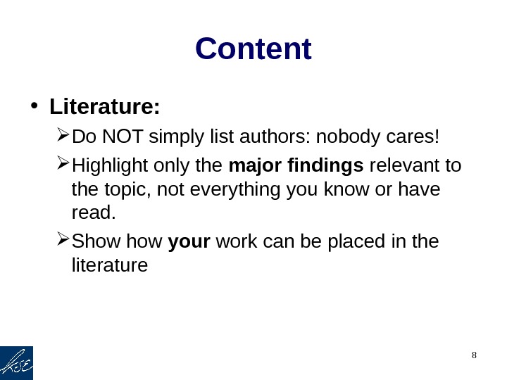
8 Content • Literature: Do NOT simply list authors: nobody cares! Highlight only the major findings relevant to the topic, not everything you know or have read. Show your work can be placed in the literature
9 Content • Example: Used Car Price • Price = f ( Age, Car Specs, Type, Mileage ) Age Mileage : liters per 100 km (Target Variable) Car Specs: Head Room, Trunk Space, Weight, Length, Gear Ratio Car Type: set of dummies
10 Content • Tables should be visible and concise! No Stata outputs! (Use outreg or estout ) • Conclusion : very concise, only major points • Balance content evenly across sections • Effective ending (tied up with starting attention catch-point ) good and whole impression in general.
11 Roadmap: • Content • Visual appearance • Oral presentation
12 Visual appearance and effects • Mind the audience (readers vs. listeners) • Layout: Structure, structure! Unity of style (font, size, slide transitions, slide numbers, effects) Amount of information (nobody will ever read the entire paragraph on slides: use 3 -4 bullets)
13 Visual appearance and effects Fonts This text is typed in Times New Roman, 32 pts • My very important point 1 • My very important point 2 • My very important point 3 Some explanation of point 3 (Times New Roman, Bold, 28)
14 Visual appearance and effects Fonts This text is typed in Arial, 32 pts • My very important point 1 • My very important point 2 • My very important point 3 Some explanation of point 3 (Arial, Bold, 28)
15 Visual appearance and effects Fonts This text is typed in Comic Sans, 32 pts • My very important point 1 • My very important point 2 • My very important point 3 Some explanation of point 3 (Comic Sans, Bold, 28)
16 Differencebetween San Serif (Arial) and Serif (Book Antigua) , size 20 This very important text has been typed manually to additionally stress its utter importance. No other text in the entire presentation was ever even closely as important as this one. The sole goal of this presentation is to demonstrate you how important and significant this text is. All statistical tests and empirical hypothesizing support the greatness of minds of anyone whose attention was fixed on this text for more than fifteen seconds straight. This very important text has been typed manually to additionally stress its utter importance. No other text in the entire presentation was ever even closely as important as this one. The sole goal of this presentation is to show you how important and significant this text is. All statistical tests and empirical hypothesizing support the greatness of minds of anyone whose attention was fixed on this text for more than fifteen seconds straight.
17 Differencebetween size 16 and 18( Arial) This text is no less important than the previous one, though it is typeset in lower size letters. I have chosen this size not to undermine is equal importance, but underline how unimportant a text may look if it is small and difficult to read from the first row of seats. I deliberately used polysyllable words and substantially heavier grammatical constructions than necessary so that you could feel with all its upcoming inevitability that a text written in so long expressions and without any slightest hint of punctuation, to say nothing about colloquial construction interjected into the main text is quite difficult to perceive even for the original author of the text with no regard to (im)possible case of rampant plagiarizing. This text is no less important than the previous one, though it is typeset in lower size letters. I have chosen this size not to undermine is equal importance, but underline how unimportant a text may look if it is small and difficult to read from the first row of seats. I deliberately used polysyllable words and substantially heavier grammatical constructions than necessary so that you could feel with all its upcoming inevitability that a text written in so long expressions and without any slightest hint of punctuation, to say nothing about colloquial construction interjected into the main text is quite difficult to perceive even for the original author of the text with no regard to (im)possible case of rampant plagiarizing.
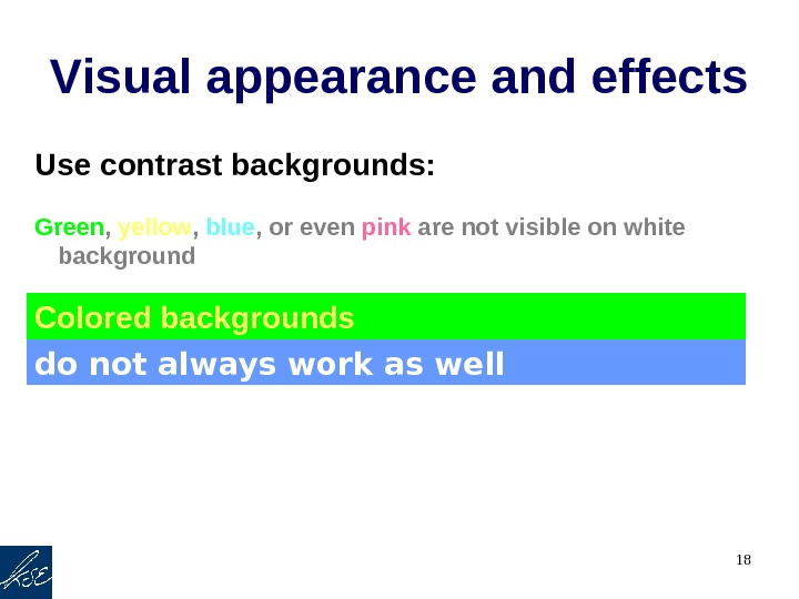
18 Visual appearance and effects Use contrast backgrounds: Green , yellow , blue , or even pink are not visible on white background Colored backgrounds do not always work as well
19 Visual appearance “ Zen slides” are wrong!
20 • I beleive you still can raed this text and even udnrestand its cotnent. However there is sevral speling and gramar erorrs. • How many have you already find? • 10 (correct version below) • I bel ie ve you still can r ea d this text and even under stand its co nt ent. However there are sev e ral spe ll ing and gra mm ar e rr ors. (2 more? )Visual appearance and effects: spelling
21 Roadmap: • Content • Visual appearance • Oral presentation
22 Oral presentation • Rehearse your presentation in advance • Eye contact: Look at your audience , not in your slides • Gestures: open, supporting your words
23 Oral presentation • Vocal variety: Speak CLEARLY and LOUDLY Don’t mumblebumble monotonically Make pauses
24 Oral presentation • Emotions are important! • Audience should feel that you have mastered the topic • Prepare notes in advance, • Long tables, formulae: handouts • Time control (1 slide ~ 1 min. ) !!!
25 What I Did Wrong: • Slides: Too long title Too much text in the intro Plain text: no bullets Different styles and fonts Long numbers have no dividers Equations too long Typos and grammar errors
26 • Presentation: No structure No idea what the point is No data description No conclusion and discussion of the results Monotonic voice No eye contact Reading rather than speaking Language and pronunciation What I Did Wrong:
27 Conclusion • Effective presentation is one you want to see again, one you like, love and admire. • Idea – structure – layout – rehearsal –performance
28 Conclusion • If you don’t like your presentation, it is probably not worth to be shown to others as well. • It is you who sells your project, not your text / pictures / tables…
Thank you!