Презентация Лекція 30-UI Design

- Размер: 192.5 Кб
- Количество слайдов: 17
Описание презентации Презентация Лекція 30-UI Design по слайдам
 User Interface Design and Development
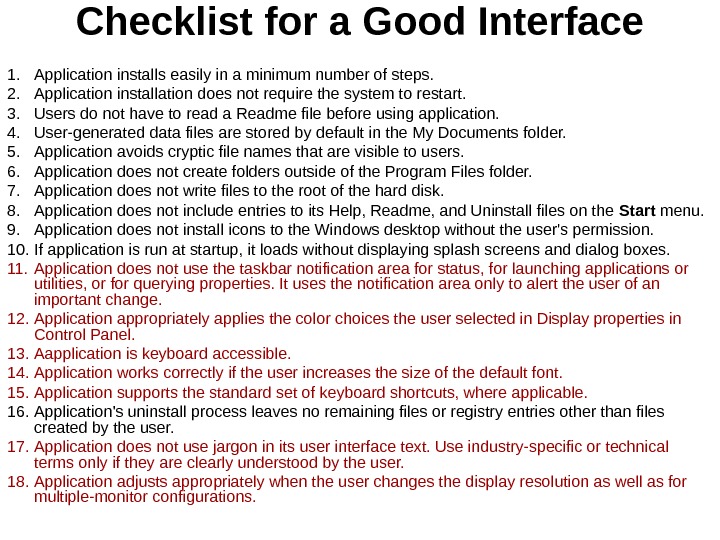
 Checklist for a Good Interface 1. Application installs easily in a minimum number of steps. 2. Application installation does not require the system to restart. 3. Users do not have to read a Readme file before using application. 4. User-generated data files are stored by default in the My Documents folder. 5. Application avoids cryptic file names that are visible to users. 6. Application does not create folders outside of the Program Files folder. 7. Application does not write files to the root of the hard disk. 8. Application does not include entries to its Help, Readme, and Uninstall files on the Start menu. 9. Application does not install icons to the Windows desktop without the user’s permission. 10. If application is run at startup, it loads without displaying splash screens and dialog boxes. 11. Application does not use the taskbar notification area for status, for launching applications or utilities, or for querying properties. It uses the notification area only to alert the user of an important change. 12. Application appropriately applies the color choices the user selected in Display properties in Control Panel. 13. Aapplication is keyboard accessible. 14. Application works correctly if the user increases the size of the default font. 15. Application supports the standard set of keyboard shortcuts, where applicable. 16. Application’s uninstall process leaves no remaining files or registry entries other than files created by the user. 17. Application does not use jargon in its user interface text. Use industry-specific or technical terms only if they are clearly understood by the user. 18. Application adjusts appropriately when the user changes the display resolution as well as for multiple-monitor configurations.
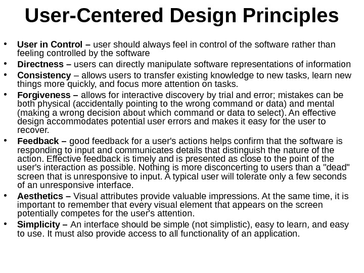
 User-Centered Design Principles • User in Control – user should always feel in control of the software rather than feeling controlled by the software • Directness – users can directly manipulate software representations of information • Consistency – allows users to transfer existing knowledge to new tasks, learn new things more quickly, and focus more attention on tasks. • Forgiveness – allows for interactive discovery by trial and error; mistakes can be both physical (accidentally pointing to the wrong command or data) and mental (making a wrong decision about which command or data to select). An effective design accommodates potential user errors and makes it easy for the user to recover. • Feedback – good feedback for a user’s actions helps confirm that the software is responding to input and communicates details that distinguish the nature of the action. Effective feedback is timely and is presented as close to the point of the user’s interaction as possible. Nothing is more disconcerting to users than a «dead» screen that is unresponsive to input. A typical user will tolerate only a few seconds of an unresponsive interface. • Aesthetics – Visual attributes provide valuable impressions. At the same time, it is important to remember that every visual element that appears on the screen potentially competes for the user’s attention. • Simplicity – An interface should be simple (not simplistic), easy to learn, and easy to use. It must also provide access to all functionality of an application.
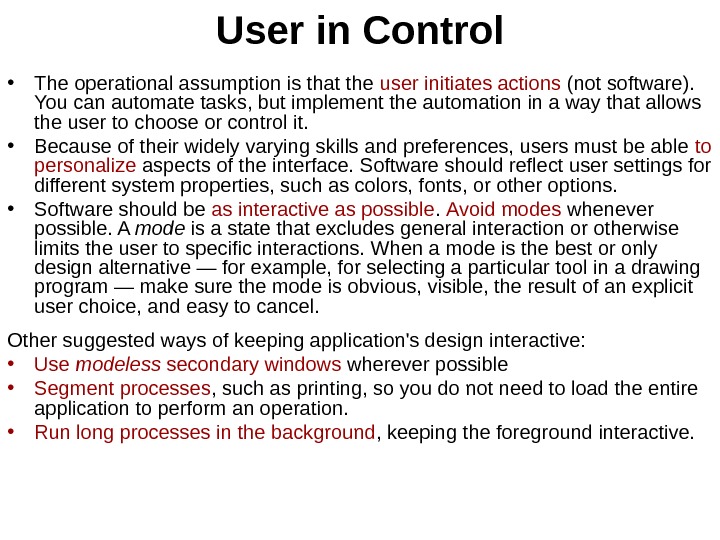
 User in Control • The operational assumption is that the user initiates actions (not software). You can automate tasks, but implement the automation in a way that allows the user to choose or control it. • Because of their widely varying skills and preferences, users must be able to personalize aspects of the interface. Software should reflect user settings for different system properties, such as colors, fonts, or other options. • Software should be as interactive as possible. Avoid modes whenever possible. A mode is a state that excludes general interaction or otherwise limits the user to specific interactions. When a mode is the best or only design alternative — for example, for selecting a particular tool in a drawing program — make sure the mode is obvious, visible, the result of an explicit user choice, and easy to cancel. Other suggested ways of keeping application’s design interactive: • Use modeless secondary windows wherever possible • Segment processes , such as printing, so you do not need to load the entire application to perform an operation. • Run long processes in the background , keeping the foreground interactive.
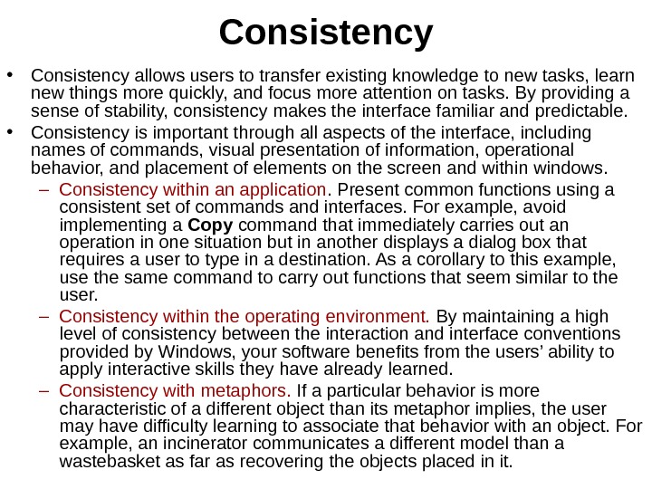
 Consistency • Consistency allows users to transfer existing knowledge to new tasks, learn new things more quickly, and focus more attention on tasks. By providing a sense of stability, consistency makes the interface familiar and predictable. • Consistency is important through all aspects of the interface, including names of commands, visual presentation of information, operational behavior, and placement of elements on the screen and within windows. – Consistency within an application. Present common functions using a consistent set of commands and interfaces. For example, avoid implementing a Copy command that immediately carries out an operation in one situation but in another displays a dialog box that requires a user to type in a destination. As a corollary to this example, use the same command to carry out functions that seem similar to the user. – Consistency within the operating environment. By maintaining a high level of consistency between the interaction and interface conventions provided by Windows, your software benefits from the users’ ability to apply interactive skills they have already learned. – Consistency with metaphors. If a particular behavior is more characteristic of a different object than its metaphor implies, the user may have difficulty learning to associate that behavior with an object. For example, an incinerator communicates a different model than a wastebasket as far as recovering the objects placed in it.
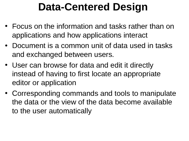
 Data-Centered Design • Focus on the information and tasks rather than on applications and how applications interact • Document is a common unit of data used in tasks and exchanged between users. • User can browse for data and edit it directly instead of having to first locate an appropriate editor or application • Corresponding commands and tools to manipulate the data or the view of the data become available to the user automatically
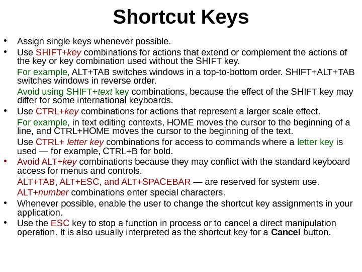
 Shortcut Keys • Assign single keys whenever possible. • Use SHIFT+ key combinations for actions that extend or complement the actions of the key or key combination used without the SHIFT key. For example, ALT+TAB switches windows in a top-to-bottom order. SHIFT+ALT+TAB switches windows in reverse order. Avoid using SHIFT+ text key combinations, because the effect of the SHIFT key may differ for some international keyboards. • Use CTRL+ key combinations for actions that represent a larger scale effect. For example, in text editing contexts, HOME moves the cursor to the beginning of a line, and CTRL+HOME moves the cursor to the beginning of the text. Use CTRL+ letter key combinations for access to commands where a letter key is used — for example, CTRL+B for bold. • Avoid ALT+ key combinations because they may conflict with the standard keyboard access for menus and controls. ALT+TAB, ALT+ESC, and ALT+SPACEBAR — are reserved for system use. ALT+ number combinations enter special characters. • Whenever possible, enable the user to change the shortcut key assignments in your application. • Use the ESC key to stop a function in process or to cancel a direct manipulation operation. It is also usually interpreted as the shortcut key for a Cancel button.
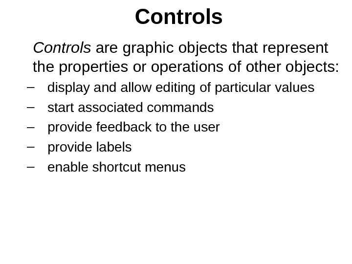
 Controls are graphic objects that represent the properties or operations of other objects: – display and allow editing of particular values – start associated commands – provide feedback to the user – provide labels – enable shortcut menus
 Buttons • Command buttons • Option buttons • Check boxes
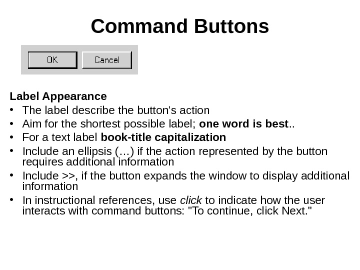
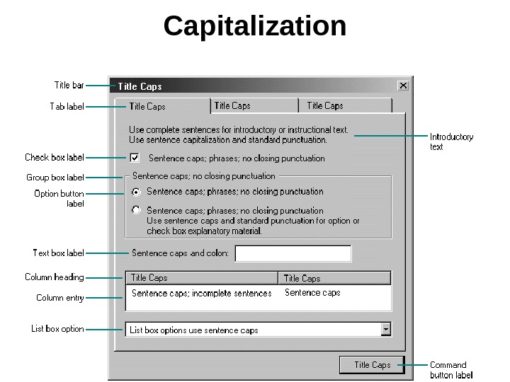
 Command Buttons Label Appearance • The label describe the button’s action • Aim for the shortest possible label; one word is best. . • For a text label book-title capitalization • Include an ellipsis (…) if the action represented by the button requires additional information • Include >>, if the button expands the window to display additional information • In instructional references, use click to indicate how the user interacts with command buttons: «To continue, click Next. «
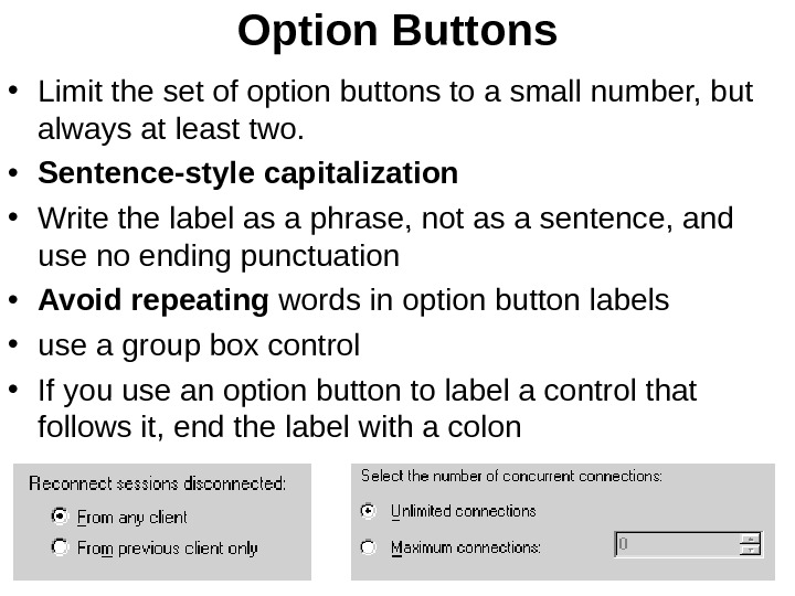
 Option Buttons • Limit the set of option buttons to a small number, but always at least two. • Sentence-style capitalization • Write the label as a phrase, not as a sentence, and use no ending punctuation • Avoid repeating words in option button labels • use a group box control • If you use an option button to label a control that follows it, end the label with a colon
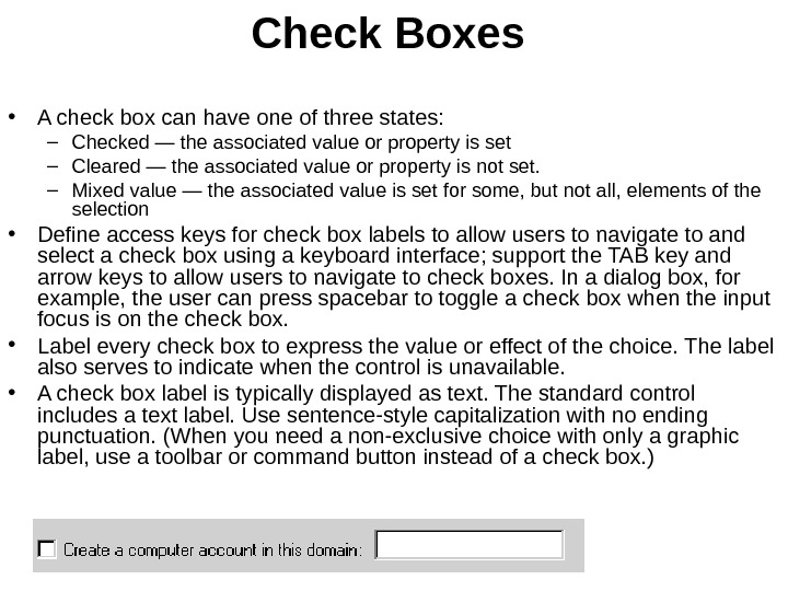
 Check Boxes • A check box can have one of three states: – Checked — the associated value or property is set – Cleared — the associated value or property is not set. – Mixed value — the associated value is set for some, but not all, elements of the selection • Define access keys for check box labels to allow users to navigate to and select a check box using a keyboard interface; support the TAB key and arrow keys to allow users to navigate to check boxes. In a dialog box, for example, the user can press spacebar to toggle a check box when the input focus is on the check box. • Label every check box to express the value or effect of the choice. The label also serves to indicate when the control is unavailable. • A check box label is typically displayed as text. The standard control includes a text label. Use sentence-style capitalization with no ending punctuation. (When you need a non-exclusive choice with only a graphic label, use a toolbar or command button instead of a check box. )
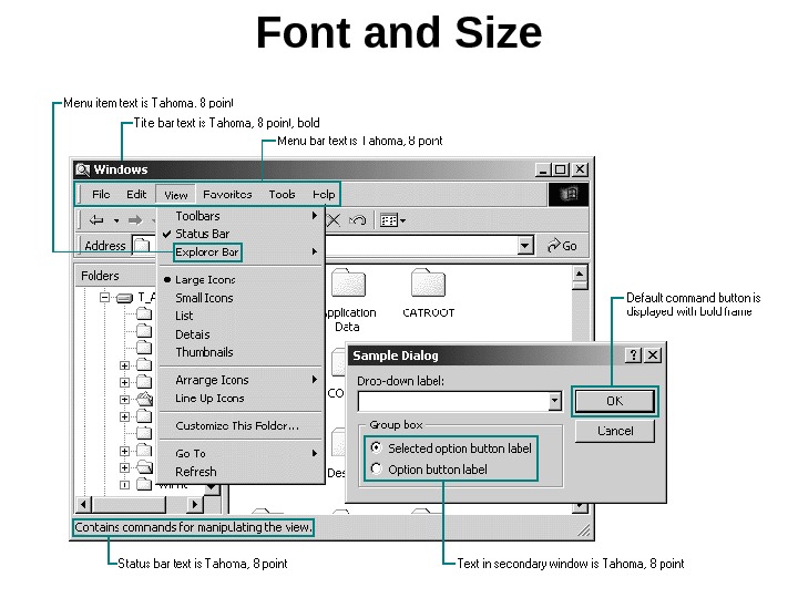
 Font and Size
 Capitalization
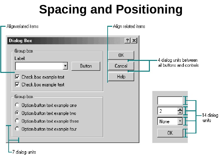
 Spacing and Positioning
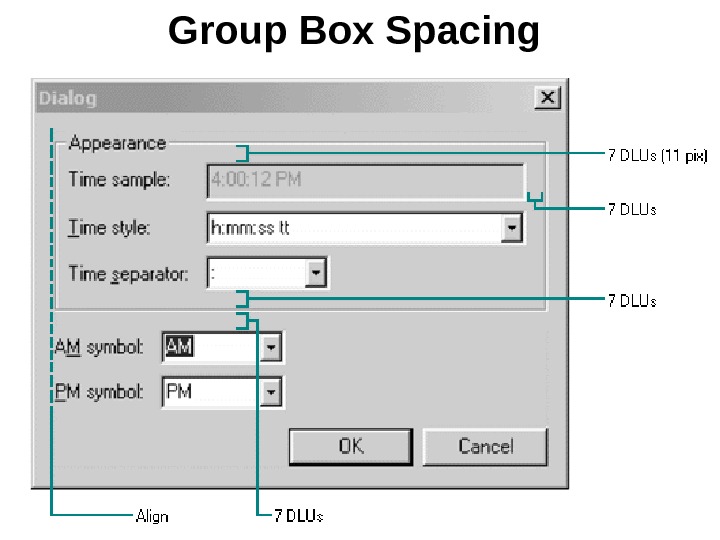
 Group Box Spacing
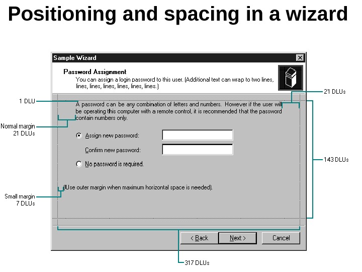
 Positioning and spacing in a wizard

