
Презентация how-to-create-5-fabulous-infographics

- Размер: 1.7 Mегабайта
- Количество слайдов: 6
Описание презентации Презентация how-to-create-5-fabulous-infographics по слайдам
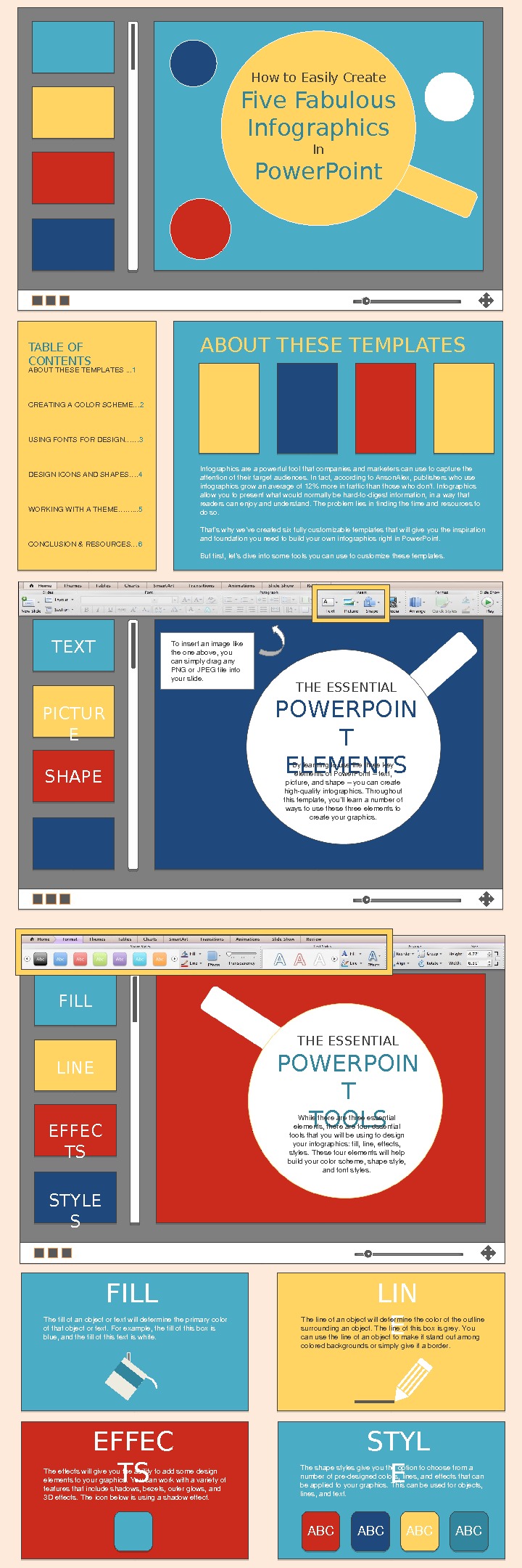
How to Easily Create Five Fabulous Infographics In Power. Point TABLE OF CONTENTS ABOUTTHESETEMPLATES. . . 1 CREATINGACOLORSCHEME… 2 USINGFONTSFORDESIGN…… 3 DESIGNICONSANDSHAPES…. 4 WORKINGWITHATHEME……. . . 5 CONCLUSION&RESOURCES… 6 ABOUT THESE TEMPLATES Infographicsareapowerfultoolthatcompaniesandmarketerscanusetocapturethe attentionoftheirtargetaudiences. Infact, accordingto. Anson. Alex, publisherswhouse infographicsgrowanaverageof 12%moreintrafficthanthosewhodon’t. Infographics allowyoutopresentwhatwouldnormallybehardtodigestinformation, inawaythat readerscanenjoyandunderstand. Theproblemliesinfindingthetimeandresourcesto doso. That’swhywe’vecreatedsixfullycustomizabletemplatesthatwillgiveyoutheinspiration andfoundationyouneedtobuildyourowninfographicsrightin. Power. Point. Butfirst, let’sdiveintosometoolsyoucanusetocustomizethesetemplates. THE ESSENTIAL POWERPOIN T TOOLSFILL LINE EFFEC TS STYLE S Whiletherearethreeessential elements, therearefouressential toolsthatyouwillbeusingtodesign yourinfographics: fill, line, effects, styles. Thesefourelementswillhelp buildyourcolorscheme, shapestyle, andfontstyles. FILL Thefillofanobjectortextwilldeterminetheprimarycolor ofthatobjectortext. Forexample, thefillofthisboxis blue, andthefillofthistextiswhite. LIN EThelineofanobjectwilldeterminethecoloroftheoutline surroundinganobject. Thelineofthisboxisgrey. You canusethelineofanobjecttomakeitstandoutamong coloredbackgroundsorsimplygiveitaborder. EFFEC TSTheeffectswillgiveyoutheabilitytoaddsomedesign elementstoyourgraphics. Youcanworkwithavarietyof featuresthatincludeshadows, bezels, outerglows, and 3 Deffects. Theiconbelowisusingashadoweffect. STYL ETheshapestylesgiveyoutheoptiontochoosefroma numberofpredesignedcolors, lines, andeffectsthatcan beappliedtoyourgraphics. Thiscanbeusedforobjects, lines, andtext. ABC ABCTHE ESSENTIAL POWERPOIN T ELEMENTSTEXT PICTUR E SHAPE Bylearningtousethethreekey elementsof. Power. Point–text, picture, andshape–youcancreate highqualityinfographics. Throughout thistemplate, you’lllearnanumberof waystousethesethreeelementsto createyourgraphics. Toinsertanimagelike theoneabove, you cansimplydragany PNGor. JPEGfileinto yourslide.
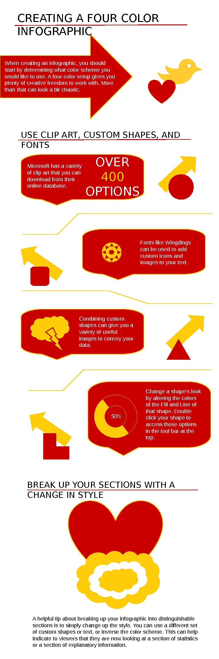
CREATING A FOUR COLOR INFOGRAPHIC When creating an infographic, you should start by determining what color scheme you would like to use. A four color setup gives you plenty of creative freedom to work with. More than that can look a bit chaotic. USE CLIP ART, CUSTOM SHAPES, AND FONTS Microsoft has a variety of clip art that you can download from their online database. OVER 400 OPTIONS Fonts like Wingdings can be used to add custom icons and images to your text. Combining custom shapes can give you a variety of useful images to convey your data. Change a shape’s look by altering the colors of the Fill and Line of that shape. Double click your shape to access those options in the tool bar at the top. 50% BREAK UP YOUR SECTIONS WITH A CHANGE IN STYLE A helpful tip about breaking up your infographic into distinguishable sections is to simply change up the style. You can use a different set of custom shapes or text, or inverse the color scheme. This can help indicate to viewers that they are now looking at a section of statistics or a section of explanatory information.
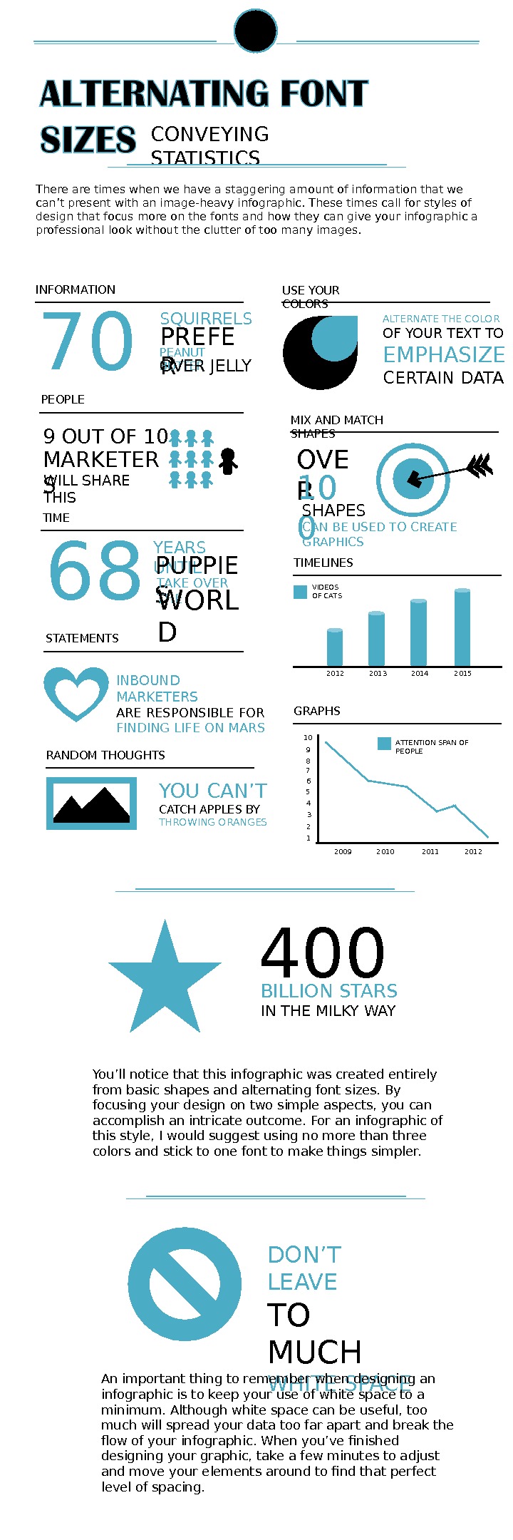
CONVEYING STATISTICS There are times when we have a staggering amount of information that we can’t present with an image-heavy infographic. These times call for styles of design that focus more on the fonts and how they can give your infographic a professional look without the clutter of too many images. INFORMATION 70 SQUIRRELS PREFE R PEANUT BUTTER OVER JELLY TIME 68 YEARS UNTIL PUPPIE S TAKE OVER THE WORL DPEOPLE 9 OUT OF 10 MARKETER S WILL SHARE THIS STATEMENTS INBOUND MARKETERS ARE RESPONSIBLE FOR FINDING LIFE ON MARS USE YOUR COLORS ALTERNATE THE COLOR OF YOUR TEXT TO EMPHASIZE CERTAIN DATA MIX AND MATCH SHAPES OVE R 10 0 SHAPES CAN BE USED TO CREATE GRAPHICS TIMELINES 2012 2013 2014 2015 VIDEOS OF CATS GRAPHS 10 9 8 7 6 5 4 3 2 1 2009 2010 2011 2012 ATTENTION SPAN OF PEOPLE RANDOM THOUGHTS YOU CAN’T CATCH APPLES BY THROWING ORANGES 400 BILLION STARS IN THE MILKY WAY You’ll notice that this infographic was created entirely from basic shapes and alternating font sizes. By focusing your design on two simple aspects, you can accomplish an intricate outcome. For an infographic of this style, I would suggest using no more than three colors and stick to one font to make things simpler. DON’T LEAVE TO MUCH WHITE SPACEAn important thing to remember when designing an infographic is to keep your use of white space to a minimum. Although white space can be useful, too much will spread your data too far apart and break the flow of your infographic. When you’ve finished designing your graphic, take a few minutes to adjust and move your elements around to find that perfect level of spacing.
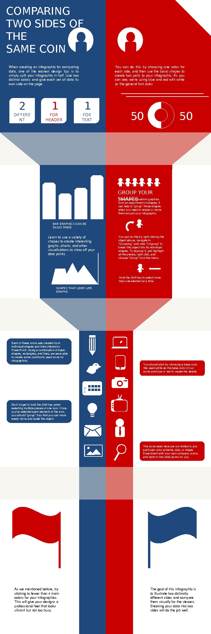
COMPARING TWO SIDES OF THE SAME COIN When creating an infographic for comparing data, one of the easiest design tips is to simply split your infographic in half. Use two distinct colors and give each set of data its ownsideonthepage. You can do this by choosing one color for eachside, andthenusethebasicshapesto create two parts to your infographic. As you cansee, we’reusingblueandredwithwhite asthegeneralfontcolor. 2 DIFFERE NT FONTS 1 1 FOR HEADER S FOR TEXT 50 50 GROUP YOUR SHAPES Whencreatingcustomgraphics fromanassortmentofshapes, it canhelpto“group”thoseshapes whenyouneedtoresizeormove themaroundyourinfographic. Youcandothisbyrightclickingthe objectabove, navigateto “Grouping, ”andclick“Ungroup”to breakthisobjectintoitsindividual shapes. Toregroupit, justhighlight allthepieces, rightclick, and choose“Group”fromthemenu. Holdthe. Shiftkeytoselectmore thanoneelementatatime. SHAPES THAT LOOK LIKE GRAPHSBAR GRAPHICS CAN BE EASILY MADE Learntouseavarietyof shapestocreateinteresting graphs, charts, andother visualizationstoshowoffyour datapoints. 3 1 Eachoftheseiconswascreatedfrom individualshapesandlinesofferedby Power. Point. Usingacombinationofbasic shapes, rectangles, andlines, wewereable tocreatesomecommonlyusediconsfor infographics. Youshouldstartbychoosingabasecolor. Weusedwhiteasthebasecolorofour iconsandblueorredtocreatethedetails. Don’tforgettoholdthe. Shiftkeywhen selectingmultiplepiecesofoneicon. Once you’veselectedeachelementoftheicon, youshould“group”itsothatyoucanmore easilymoveandscaletheobject. Theiconsseenherearenotlimitedtoany particularcolorscheme, size, orshape. Experimentwithyourowncompanycolors andstyletofindwhatworksforyou. Aswementionedbefore, try stickingtofewerthan 4 main colorsforyourinfographics. Thiswillgiveyourdesignsa professionalfeelthatlooks vibrantbutnottoobusy. Thegoalofthisinfographicis toillustratetwodistinctly differentsidesandcompare themvisuallyfortheviewers. Breakingyourdataintotwo sideswilldothejobwell.
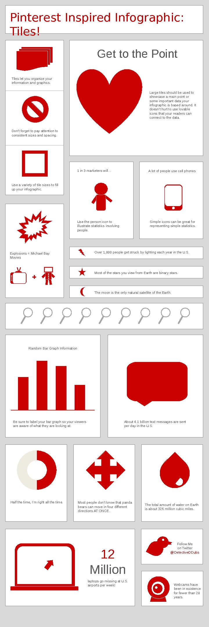
Pinterest Inspired Infographic: Tiles! Tiles let you organize your information and graphics. Don’t forget to pay attention to consistent sizes and spacing. Use a variety of tile sizes to fill up your infographic. Large tiles should be used to showcase a main point or some important data your infographic is based around. It doesn’t hurt to use lovable icons that your readers can connect to the data. Get to the Point Use the person icon to illustrate statistics involving people. 1 in 3 marketers will… A lot of people use cell phones Simple icons can be great for representing simple statistics. Over 1, 000 people get struck by lighting each year in the U. S. Most of the stars you view from Earth are binary stars. The moon is the only natural satellite of the Earth. Explosions = Michael Bay Movies Random Bar Graph Information Be sure to label your bar graph so your viewers are aware of what they are looking at. About 4. 1 billion text messages are sent per day in the U. S. Half the time, I’m right all the time. Most people don ’ t know that panda bears can move in four different directions AT ONCE. The total amount of water on Earth is about 326 million cubic miles. laptops go missing at U. S. airports per week! 12 Million Follow Me on Twitter @Detective. DDubs Webcams have been in existence for fewer than 20 years.
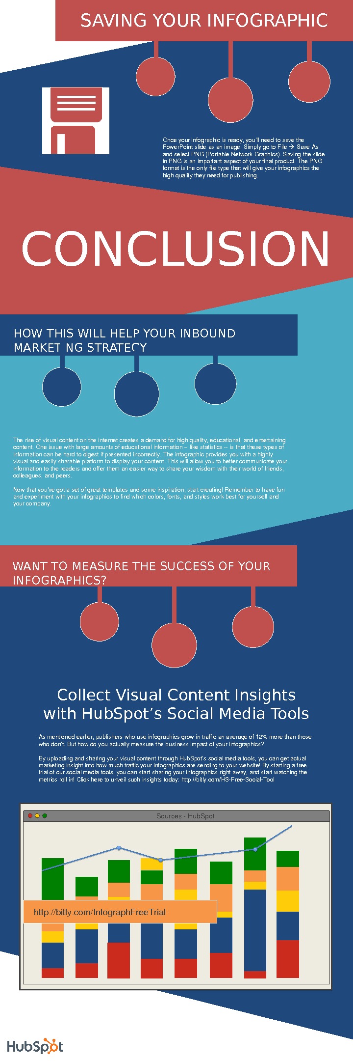
CONCLUSION Onceyourinfographicisready, you’llneedtosavethe Power. Pointslideasanimage. Simplygoto. File Save. As andselect. PNG(Portable. Network. Graphics). Savingtheslide in. PNGisanimportantaspectofyourfinalproduct. The. PNG formatistheonlyfiletypethatwillgiveyourinfographicsthe highqualitytheyneedforpublishing. SAVING YOUR INFOGRAPHIC Collect Visual Content Insights with Hub. Spot’s Social Media Tools Sources. Hub. Spot http: //bitly. com/Infograph. Free. Trial. HOW THIS WILL HELP YOUR INBOUND MARKETING STRATEGY Theriseofvisualcontentontheinternetcreatesademandforhighquality, educational, andentertaining content. Oneissuewithlargeamountsofeducationalinformationlikestatisticsisthatthesetypesof informationcanbehardtodigestifpresentedincorrectly. Theinfographicprovidesyouwithahighly visualandeasilysharableplatformtodisplayyourcontent. Thiswillallowyoutobettercommunicateyour informationtothereadersandofferthemaneasierwaytoshareyourwisdomwiththeirworldoffriends, colleagues, andpeers. Nowthatyou’vegotasetofgreattemplatesandsomeinspiration, startcreating!Remembertohavefun andexperimentwithyourinfographicstofindwhichcolors, fonts, andstylesworkbestforyourselfand yourcompany. WANT TO MEASURE THE SUCCESS OF YOUR INFOGRAPHICS? Asmentionedearlier, publisherswhouseinfographicsgrowintrafficanaverageof 12%morethanthose whodon’t. Buthowdoyouactuallymeasurethebusinessimpactofyourinfographics? Byuploadingandsharingyourvisualcontentthrough. Hub. Spot’ssocialmediatools, youcangetactual marketinginsightintohowmuchtrafficyourinfographicsaresendingtoyourwebsite!Bystartingafree trialofoursocialmediatools, youcanstartsharingyourinfographicsrightaway, andstartwatchingthe metricsrollin!Clickheretounveilsuchinsightstoday: http: //bitly. com/HSFree. Social. Tool