1907e2714c407e06e6cffc74c93c89bf.ppt
- Количество слайдов: 40
 Output from Analysis GEOG 370 Instructor: Christine Erlien
 Overview n Maps as communication tools – Objective/purpose – Audience – Knowledge transfer n Choices & conventions n Map Design & Constraints n Types of Cartographic Output n Types of Non-cartographic Output
 Output n Final product of any analysis n Should communicate effectively – What did you do? – What do your results mean? n Types of output – Permanent or Ephemeral • Permanent: Hardcopy (e. g. , paper, Mylar) • Ephemeral: Stored, viewable files
 Maps as Communication Tools n Possibilities are many: – GIS software readily available – Many GIS analysts; varied levels of experience with cartographic production & design n So, must have mapping standards that these many cartographers aim for
 Cartographic Output n Objective: That viewers understand the map’s meaning n In making a map, then, be aware of: – The map’s purpose/intended use – The audience n Cartographer’s aim: Create a product that allows knowledge transfer to the map user
 Cartographic Output n Is there one correct map? – Monmonier (Mapping It Out) No n So what do you do? – Look carefully at your data – Experiment with different representations/classifications – Weigh requirements of analysis & readers’ likely perceptions – Consider presenting multiple views of data
 Thematic Map Design n Involves a lot of decision-making: – Scale – Projection – Symbology – Color – Organization • Selection • Generalization • Placement n So, plan ahead! & n Allow your plan to be guided by tradition
 Cartographic Conventions Fonts n Usually one is enough – But if you use more than 1 • Serif typically used for physical features (e. g. , rivers, lakes) • Sans-serif used for cultural features (names of countries, cities, towns, streets, buildings). Why? n n Street names Sans-serif Oceans, rivers, lakes, streams, other hydrographic features italicized serif – Idea of flow n n n Oceans & lakes all capitals Rivers capitals with lower case Legibility limit: 3 - 5 font http: //www. swgc. mun. ca/~cburden/2000/Cartographic%20 Conventions. pdf
 Cartographic Conventions Point Features n Label up & to the right (unless If crowds other labels or features) n Should be parallel to the graticule n Avoid overlapping Linear features n Label on top (to the north) of the line n Rivers or streets curve the label if necessary but place the label where the feature bends the least n Roads are usually solid or dashed lines, railways are hatched, and trails are often dotted lines. n For rivers, thoughtful placement of the labels for the main flow and tributary can make it clear which is the tributary – Example: Red Deer River flows into the Saskatchewan River Red Deer River is all together but Saskatchewan is placed on the river before the Red Deer River meets it, and the word River comes after, making it clear that the Red Deer River is the tributary http: //www. swgc. mun. ca/~cburden/2000/Cartographic%20 Conventions. pdf
 Cartographic Conventions Polygons n Lettering for extensive land areas (e. g. , Canada) should be extended or stretched. n As a rule, dot patterns are preferable to line patterns – Why? Strong directional character makes line patterns disturbing – Cross-hatched lines are OK • Easily distinguished from dot patterns • Available in a range of densities • Do not have the disturbing directional character of simple parallel lines n If you're going to use many attributes in the legend, group symbology Example: 3 sub-types of one type of soil get different shades of grey, while 3 sub-types of another type of soil get different intensities of crosshatching and the remaining types get dots http: //www. swgc. mun. ca/~cburden/2000/Cartographic%20 Conventions. pdf
 Cartographic Conventions Color n Colour (or hue) is typically used to differentiate categories (e. g. , commercial versus residential land uses) while color intensity is assigned to numerical value (e. g. , darker colours indicate higher numbers or densities) n Elevation dark green, light green, yellow, orange, red and brown for increasing elevations n Bathymetry (water depth) progressively darker blue indicates increasing depth n Levels of intensity are best perceived in red and least easily in yellow. Blue also works well. n Colors for particular features – Highways are red; less important roads are black; contour lines are brown; – forests and vegetative cover are green; barren/snowcapped areas are white; hydrological features like rivers, lakes and oceans are blue; the ground (i. e. , figure background) is usually white, gray or blue (if an ocean is involved);
 Cartographic Conventions North is typically at the top of the map n Map elements (e. g. , scale, north arrow) recessive locations on the map n – Minimize dead areas fill them up with map elements – Nonvital areas of the map figure itself can have map elements placed on top of them n Map symbology should mimic the real world – Examples: Skull & crossbones to indicate site toxicity or danger; small triangle for a mountain summit n Overall, avoid homogeneity (e. g. , the same lettering size for all labels, the same color for everything) – Logical use of contrasts is the essential tool for map compositions that are attractive and easily understood n Strive for a balanced composition of elements http: //www. swgc. mun. ca/~cburden/2000/Cartographic%20 Conventions. pdf
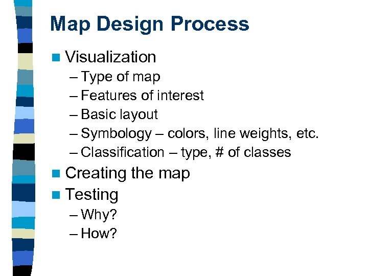 Map Design Process n Visualization – Type of map – Features of interest – Basic layout – Symbology – colors, line weights, etc. – Classification – type, # of classes n Creating n Testing – Why? – How? the map
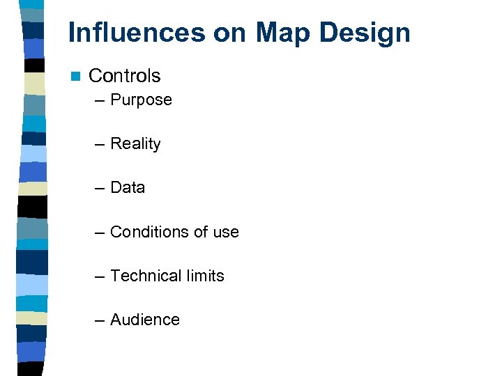 Influences on Map Design n Controls – Purpose – Reality – Data – Conditions of use – Technical limits – Audience
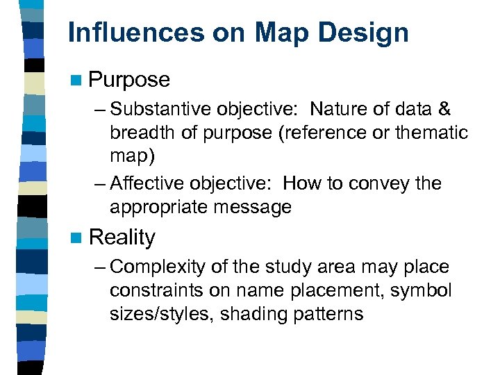 Influences on Map Design n Purpose – Substantive objective: Nature of data & breadth of purpose (reference or thematic map) – Affective objective: How to convey the appropriate message n Reality – Complexity of the study area may place constraints on name placement, symbol sizes/styles, shading patterns
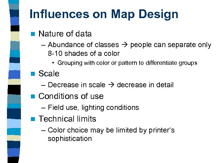 Influences on Map Design n Nature of data – Abundance of classes people can separate only 8 -10 shades of a color • Grouping with color or pattern to differentiate groups n Scale – Decrease in scale decrease in detail n Conditions of use – Field use, lighting conditions n Technical limits – Color choice may be limited by printer’s sophistication
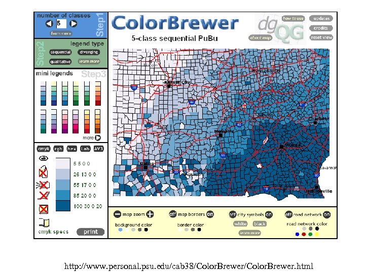
 Influences on Map Design n Audience – Experienced vs. inexperienced – Older vs. younger • Text size • Color schemes – Color blindness • Issues distinguishing red from green – Avoid confusion by altering lightness & darkness of colors – Skip over one of the offending colors use a scheme that goes red to blue and leaves out the greens – Other successful color combinations: blues & yellows, magenta-violets & yellow-reds and blue, green, yellow sequences
 http: //www. personal. psu. edu/cab 38/Color. Brewer. html
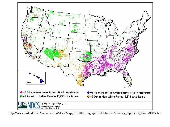
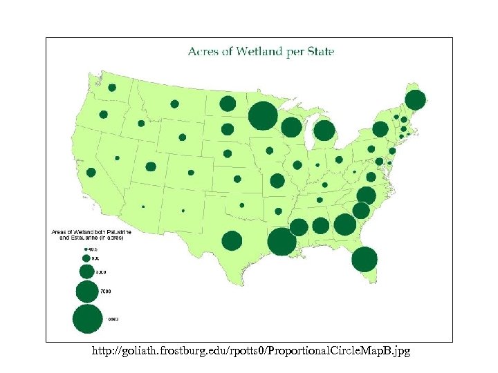
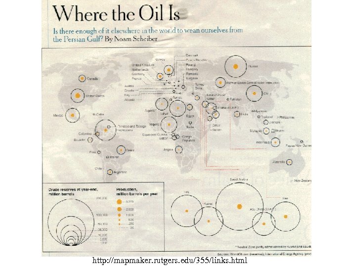
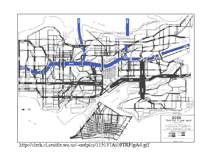
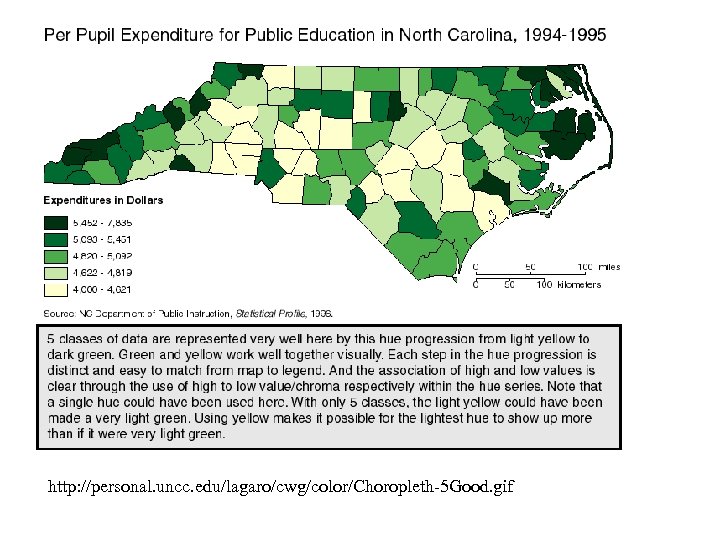
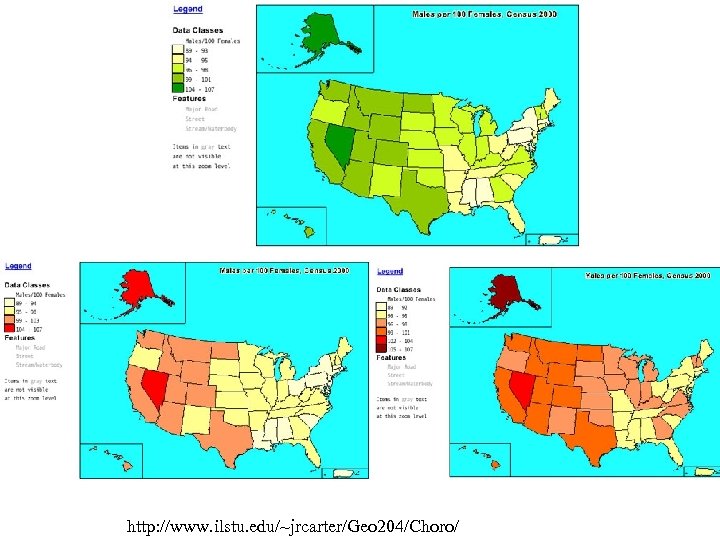
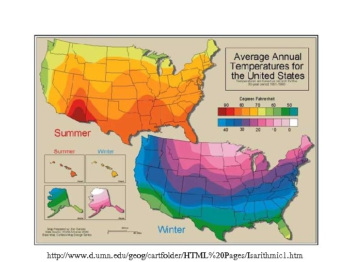
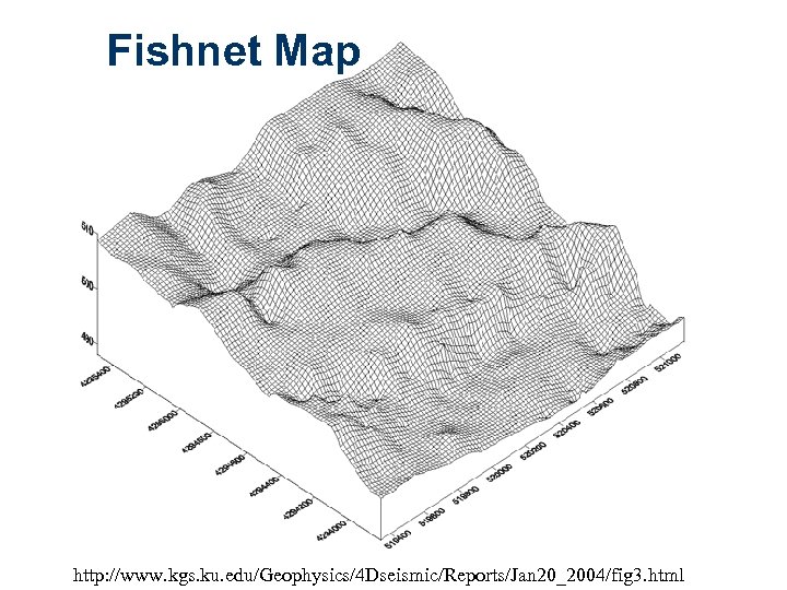
 Types of Cartographic Output n n Reference maps Thematic maps – – – n n n Dot maps Graduated symbol maps Choropleth map Isarithmic maps Stepped statistical surfaces Fishnet maps/wire-frame diagrams Cartograms Network maps Flow maps Flyovers
 http: //www. unl. edu/nac/conservation/atlas/Map_Html/Demographics/National/Minority_Operated_Farms/1997. htm
 http: //goliath. frostburg. edu/rpotts 0/Proportional. Circle. Map. B. jpg
 http: //mapmaker. rutgers. edu/355/links. html
 http: //clerk. ci. seattle. wa. us/~ordpics/115137 At 10 TRFig. A 4. gif
 http: //personal. uncc. edu/lagaro/cwg/color/Choropleth-5 Good. gif
 http: //www. ilstu. edu/~jrcarter/Geo 204/Choro/
 http: //www. d. umn. edu/geog/cartfolder/HTML%20 Pages/Isarithmic 1. htm
 Fishnet Map http: //www. kgs. ku. edu/Geophysics/4 Dseismic/Reports/Jan 20_2004/fig 3. html
 Cartograms n Non-traditional – Have the appearance of maps – Spatial arrangement modified by value of variable being measured • Called “value by area” maps – Can be contiguous or non-contiguous • Contiguous: Areas are touching • Non-contiguous: Areas are not touching
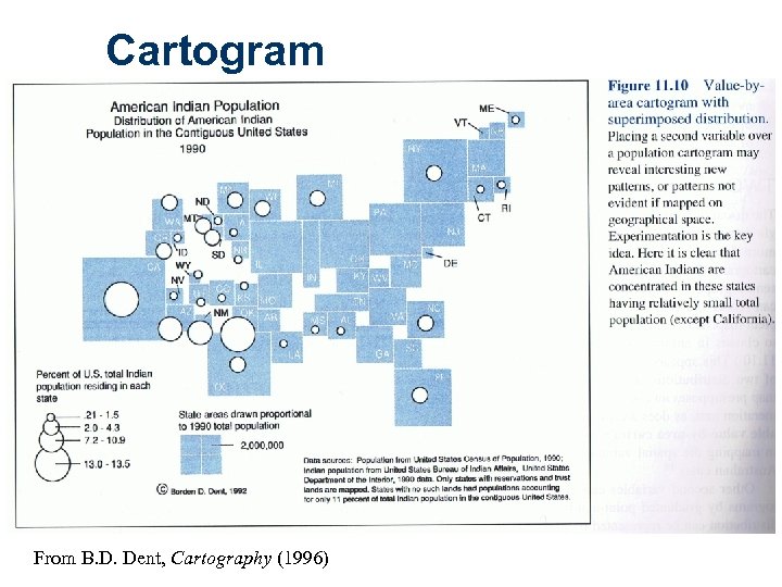 Cartogram From B. D. Dent, Cartography (1996)
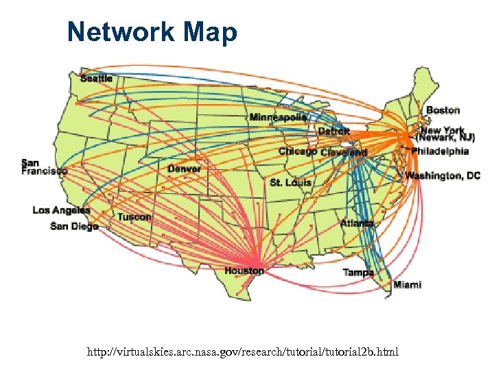 Network Map http: //virtualskies. arc. nasa. gov/research/tutorial 2 b. html
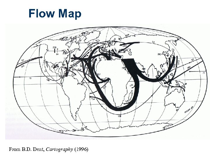 Flow Map From B. D. Dent, Cartography (1996)
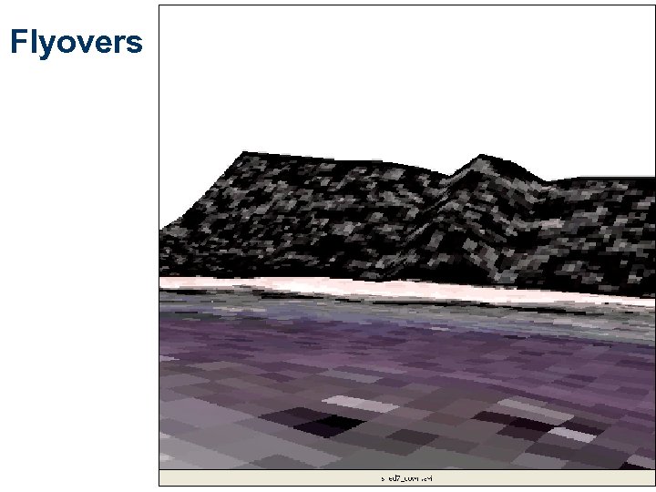 Flyovers
 Mapping on the Internet n Distributed GIS – – n Client: Map user Server: Map/spatial data provider Viewing, browsing, sharing Query & analysis Examples Durham Interactive Maps Durham Crime Mapper The Rome Map National Atlas (http: //nationalatlas. gov/) allows you to download data
 Noncartographic Output n Interactive output – 911 electronic response – Routing deliveries • Map & text-based output – Mapquest • Map & text-based output – Automobile onboard navigation
 Non-cartographic Output n Tables & charts – Importance of readability – Include if enhance mapped info n Digital photographs
 Wrapping Up n Why is map design in GIS important? n What kinds of decisions needs to be made in designing and organizing maps? n What are some types of cartographic output? Non-cartographic output? – Give examples of situations in which or datasets for which the various cartographic/non-cartographic types of output could be used
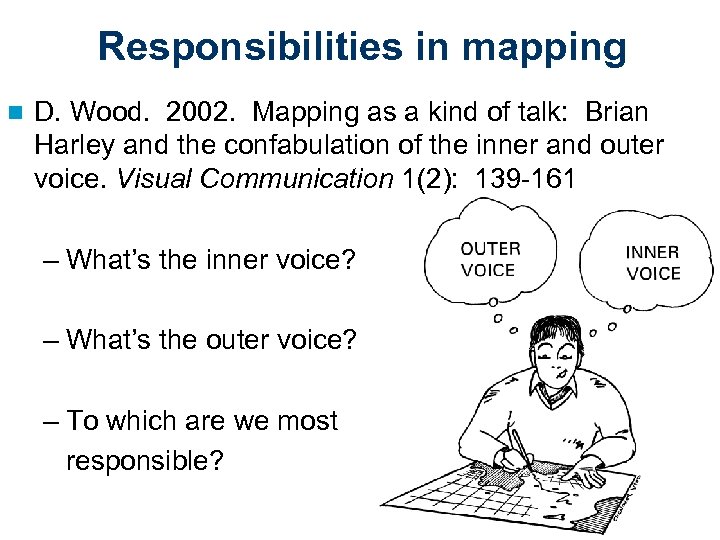 Responsibilities in mapping n D. Wood. 2002. Mapping as a kind of talk: Brian Harley and the confabulation of the inner and outer voice. Visual Communication 1(2): 139 -161 – What’s the inner voice? – What’s the outer voice? – To which are we most responsible?
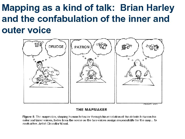 Mapping as a kind of talk: Brian Harley and the confabulation of the inner and outer voice
 So…ethics n Ethics: Study of morals, and the moral choices to be made by individuals. – Describes the rules/standards governing the conduct of members of a society or a profession. n Ethics: Maps & Mapmakers – Maps are representations of the world. Mapmakers simply present the relationships of the world. There is no ethical onus to representing what is. . To presenting truth. OR – Maps are arguments presented in a two-dimensional plane, conclusions based on data selected to advance a proposition. Mapmakers are as responsible as anyone in any media for the arguments they present. Dr. Tom Koch, UBC, http: //kochworks. com
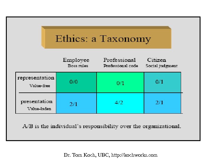 Dr. Tom Koch, UBC, http: //kochworks. com


