4a1591572d923b72238f24e6cebfa659.ppt
- Количество слайдов: 39

NC STATE UNIVERSITY Program for North American Mobility in Higher Education Introducing Process Integration for Environmental Control in Engineering Curricula MODULE 17: “Introduction to Multivariate Analysis” Created at: Ecole Polytechnique de Montreal & North Carolina State University, 2003. NAMP Module 17: “Introduction to Multivariate Analysis” Tier 2, Rev. : 5

TIER 2: Worked Examples NAMP Module 17: “Introduction to Multivariate Analysis” Tier 2, Rev. : 5

Tier 2: Statement of Intent Tier 2: Statement of intent: The goal of Tier 2 is to demonstrate the various MVA concepts using real examples. At the end of Tier 2, the student should be able to grasp the following: • How to read the basic MVA outputs • How to deal with raw, messy data • How to deal with a large number of variables • How to deal with shorter timespans The purpose is to teach the concepts behind MVA, and not merely how to run the software itself, which could be gleaned from any user’s manual. The biggest danger of this technique is using the software blindly, without understanding what’s inside the ‘black box’. NAMP Module 17: “Introduction to Multivariate Analysis” Tier 2, Rev. : 5
Tier 2: Contents Tier 2 is broken down into four sections: 2. 1 Where are the data coming from? 2. 2 Example 1: PCA on Raw, Messy Data 2. 3 Example 2: Using Fewer Variables 2. 4 Example 3: Using Shorter Timescales At the end of Tier 2 there is a short multiple-answer quiz. NAMP Module 17: “Introduction to Multivariate Analysis” Tier 2, Rev. : 5

2. 1: Where are the data coming from? NAMP Module 17: “Introduction to Multivariate Analysis” Tier 2, Rev. : 5

Where are data coming from? A standard joke is that teenagers think milk comes from a refrigerator. Similarly, we could wrongly say that process data come from the plant’s data historian. They are, of course, generated somewhere else. We must fully understand each data “tag” if we are to make sense of the final MVA results. NAMP Module 17: “Introduction to Multivariate Analysis” Tier 2, Rev. : 5
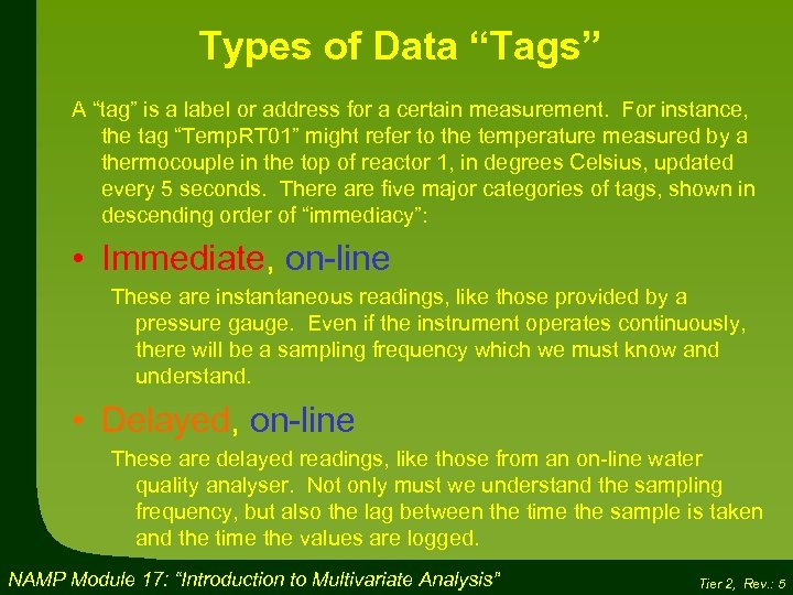
Types of Data “Tags” A “tag” is a label or address for a certain measurement. For instance, the tag “Temp. RT 01” might refer to the temperature measured by a thermocouple in the top of reactor 1, in degrees Celsius, updated every 5 seconds. There are five major categories of tags, shown in descending order of “immediacy”: • Immediate, on-line These are instantaneous readings, like those provided by a pressure gauge. Even if the instrument operates continuously, there will be a sampling frequency which we must know and understand. • Delayed, on-line These are delayed readings, like those from an on-line water quality analyser. Not only must we understand the sampling frequency, but also the lag between the time the sample is taken and the time the values are logged. NAMP Module 17: “Introduction to Multivariate Analysis” Tier 2, Rev. : 5
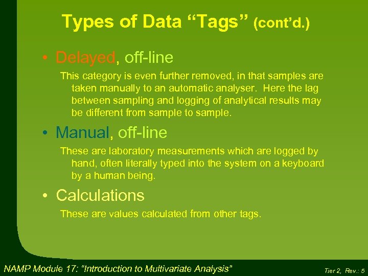
Types of Data “Tags” (cont’d. ) • Delayed, off-line This category is even further removed, in that samples are taken manually to an automatic analyser. Here the lag between sampling and logging of analytical results may be different from sample to sample. • Manual, off-line These are laboratory measurements which are logged by hand, often literally typed into the system on a keyboard by a human being. • Calculations These are values calculated from other tags. NAMP Module 17: “Introduction to Multivariate Analysis” Tier 2, Rev. : 5
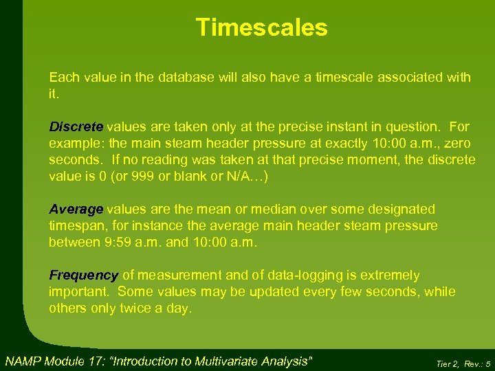
Timescales Each value in the database will also have a timescale associated with it. Discrete values are taken only at the precise instant in question. For example: the main steam header pressure at exactly 10: 00 a. m. , zero seconds. If no reading was taken at that precise moment, the discrete value is 0 (or 999 or blank or N/A…) Average values are the mean or median over some designated timespan, for instance the average main header steam pressure between 9: 59 a. m. and 10: 00 a. m. Frequency of measurement and of data-logging is extremely important. Some values may be updated every few seconds, while others only twice a day. NAMP Module 17: “Introduction to Multivariate Analysis” Tier 2, Rev. : 5

Process Lags If you are using daily averages for your MVA, then a ten-minute residence time in a reactor or vessel will not impact your results. However, if you are comparing one-minute averages, then obviously such a process lag must be taken into account. Estimating these lags is not obvious, since they can change with time (e. g. , fluctuating tank levels). NAMP Module 17: “Introduction to Multivariate Analysis” Tier 2, Rev. : 5
Preparing the Spreadsheet Generally, the data are downloaded into a standard spreadsheet, which then serves as the input to the MVA software. This offers several advantages: 1) Rows and columns can be set up appropriately, with tag numbers, long variable names, short variable names (to show on plots), observation numbers, time stamps and so forth. This greatly facilitates the use of the MVA software. 2) Additional calculations can be done, if required, for instance taking the log of certain variables for use in the MVA analysis. 3) Time lags can be incorporated right from the start, by shifting data from certain tags forward or backward in time. For instance, input variables for a process with a 30 -minute residence time can be shifted to the same row as product quality variables measured 30 minutes later. NAMP Module 17: “Introduction to Multivariate Analysis” Tier 2, Rev. : 5
2. 2: Example (1) PCA of Raw, Messy Data NAMP Module 17: “Introduction to Multivariate Analysis” Tier 2, Rev. : 5

Process Example: TMP Refining line All the examples in Tier 2 are based on thermo-mechanical pulping (TMP) process, used to convert wood chips into pulp. This is a straightforward process, with well known underlying physical characteristics. TMP is used to make newsprint A generic flowsheet for the TMP process is shown on the next page. The wood chips are about 3 cm x 4 cm x 0, 5 cm. They are pre-heated and pass through two refiners where huge spinning disks cut them down into individual cellulose fibre strands. The resulting pulp, a cellulose-water slurry, resembles the stuffing in a disposable diaper. This pulp is held for 45 minutes in the latency chest, to allow the cellulose strands to disentangle themselves, before being sent to the papermaking section of the plant. NAMP Module 17: “Introduction to Multivariate Analysis” Example 1 Tier 2, Rev. : 5
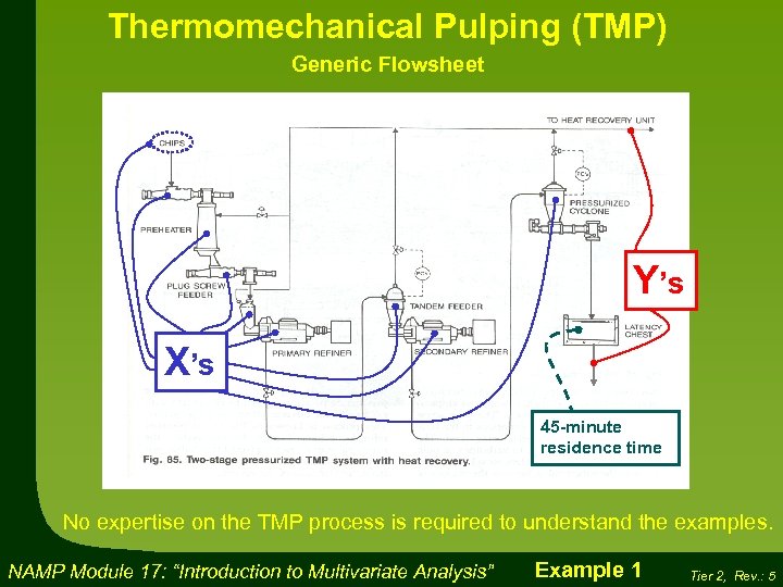
Thermomechanical Pulping (TMP) Generic Flowsheet Y’s X’s 45 -minute residence time No expertise on the TMP process is required to understand the examples. NAMP Module 17: “Introduction to Multivariate Analysis” Example 1 Tier 2, Rev. : 5
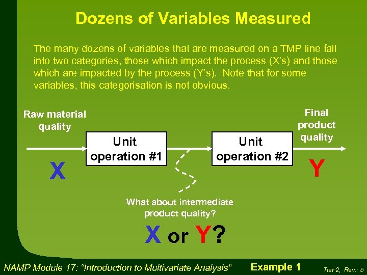
Dozens of Variables Measured The many dozens of variables that are measured on a TMP line fall into two categories, those which impact the process (X’s) and those which are impacted by the process (Y’s). Note that for some variables, this categorisation is not obvious. Raw material quality X Unit operation #1 Unit operation #2 Final product quality Y What about intermediate product quality? X or Y? NAMP Module 17: “Introduction to Multivariate Analysis” Example 1 Tier 2, Rev. : 5
The Actual Data Used The data used in this example came from a real TMP mill in North America. The data have been modified to ensure that no confidential information is revealed. About 130 tags were selected, corresponding to the X and Y list on the next page. It is not necessary for the student to understand all these, just to be aware that it is complicated and involves many different measurements. Remember the terminology: • “Variables”: These are the types of measurements or tags (e. g. , refiner body temperature). Variables are shown on the Loadings plot. • “Observations”: These are the individual measurements, separated in time (March 19, 2000). Observations are shown on the Score plot. NAMP Module 17: “Introduction to Multivariate Analysis” Example 1 Tier 2, Rev. : 5
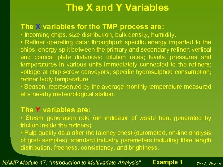
The X and Y Variables The X variables for the TMP process are: • Incoming chips: size distribution, bulk density, humidity. • Refiner operating data: throughput; specific energy imparted to the chips; energy split between the primary and secondary refiner; vertical and conical plate distances; dilution rates; levels, pressures and temperatures in various units immediately connected to the refiners; voltage at chip screw conveyors; specific hydrosulphite consumption; refiner body temperature. • Season, represented by the average monthly temperature measured at a nearby meteorological station. The Y variables are: • Steam generation rate (an indicator of waste heat generated by friction inside the refiners) • Pulp quality data after the latency chest (automated, on-line analysis of grab samples): standard industry parameters including fibre length distribution, freeness, consistency, and brightness. NAMP Module 17: “Introduction to Multivariate Analysis” Example 1 Tier 2, Rev. : 5
Pretreatment of data For this first example, daily averages were obtained for all 130 tags over a 34 -month period, corresponding to 1044 observations. Note that the data historian can provide averages over many different time periods, from seconds to months. Daily averages The purpose of this exercise was simply to determine which variables trended together over this multi-year period. The spreadsheet contained over 100, 000 values (130 variables x 1044 observations), obviously far too much for manual analysis. Because these are daily averages, the 45 -minute residence time in the latency was ignored. NAMP Module 17: “Introduction to Multivariate Analysis” Example 1 Tier 2, Rev. : 5
PCA of All the Data As a first step, all the data were put into the MVA program to look for outliers. No distinction was made between X’s and Y’s (everything lumped together). The software immediately rejected four variables for having “zero or close to zero variance”. This means that they did not vary enough to be of use to the MVA exercise (remember, this is not a planned experiment). The rest of the variables were accepted. Some variables did not change enough to be accepted by the MVA software tool The score plot for this initial PCA exercise is shown on the next page. NAMP Module 17: “Introduction to Multivariate Analysis” Example 1 Tier 2, Rev. : 5
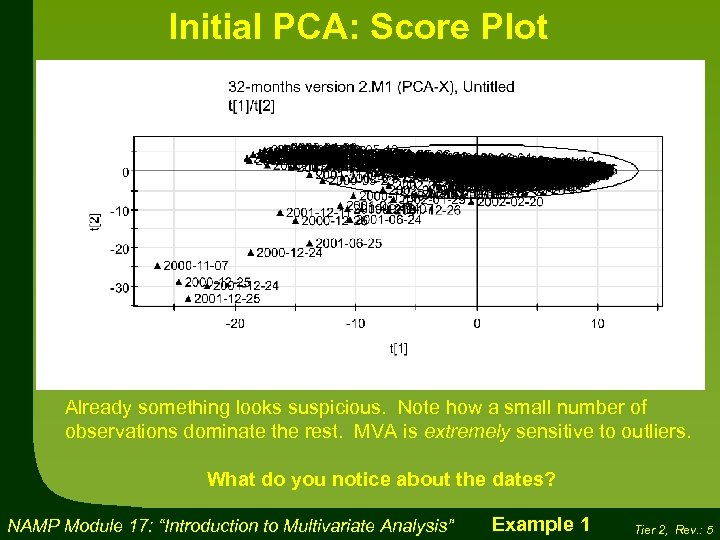
Initial PCA: Score Plot Already something looks suspicious. Note how a small number of observations dominate the rest. MVA is extremely sensitive to outliers. What do you notice about the dates? NAMP Module 17: “Introduction to Multivariate Analysis” Example 1 Tier 2, Rev. : 5
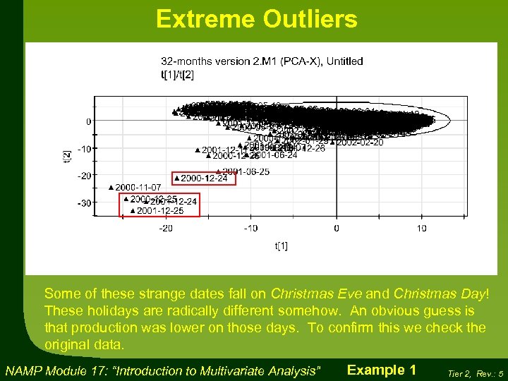
Extreme Outliers Some of these strange dates fall on Christmas Eve and Christmas Day! These holidays are radically different somehow. An obvious guess is that production was lower on those days. To confirm this we check the original data. NAMP Module 17: “Introduction to Multivariate Analysis” Example 1 Tier 2, Rev. : 5
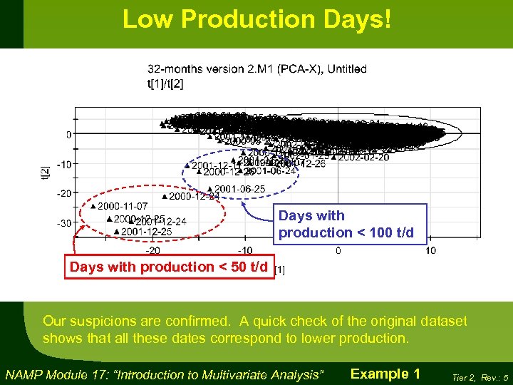
Low Production Days! Days with production < 100 t/d Days with production < 50 t/d Our suspicions are confirmed. A quick check of the original dataset shows that all these dates correspond to lower production. NAMP Module 17: “Introduction to Multivariate Analysis” Example 1 Tier 2, Rev. : 5

Decision to remove outliers Now that we know why these dates are outliers, we can remove them with confidence. Chopping the outliers It is generally a bad idea to remove outliers without determining why they are different. It may be that these are not outliers at all, but actually interesting and important shifts in the process – the very thing we would like to know about. Determining the cause of outliers is usually more difficult than this “Christmas holiday” example. We will see other techniques in the examples that follow. NAMP Module 17: “Introduction to Multivariate Analysis” Example 1 Tier 2, Rev. : 5
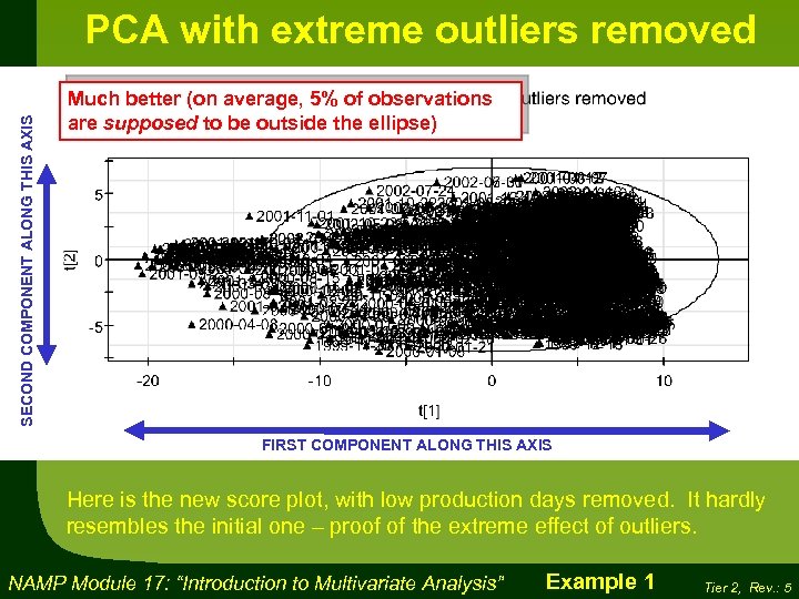
SECOND COMPONENT ALONG THIS AXIS PCA with extreme outliers removed Much better (on average, 5% of observations are supposed to be outside the ellipse) FIRST COMPONENT ALONG THIS AXIS Here is the new score plot, with low production days removed. It hardly resembles the initial one – proof of the extreme effect of outliers. NAMP Module 17: “Introduction to Multivariate Analysis” Example 1 Tier 2, Rev. : 5
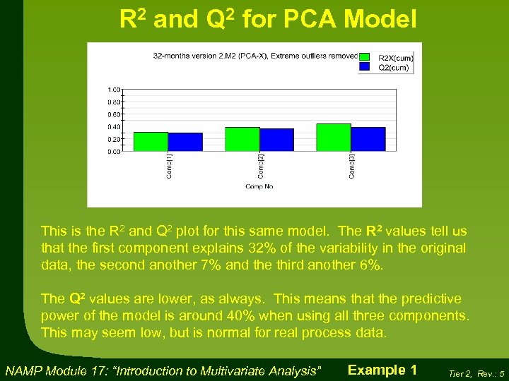
R 2 and Q 2 for PCA Model This is the R 2 and Q 2 plot for this same model. The R 2 values tell us that the first component explains 32% of the variability in the original data, the second another 7% and the third another 6%. The Q 2 values are lower, as always. This means that the predictive power of the model is around 40% when using all three components. This may seem low, but is normal for real process data. NAMP Module 17: “Introduction to Multivariate Analysis” Example 1 Tier 2, Rev. : 5
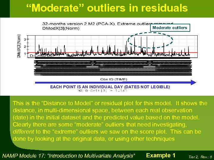
“Moderate” outliers in residuals Moderate outliers EACH POINT IS AN INDIVIDUAL DAY (DATES NOT LEGIBLE) This is the “Distance to Model” or residual plot for this model. It shows the distance, in multi-dimensional space, between each real observation (date) in the initial dataset and the predicted value based on the model. Clearly there are some “moderate” outliers that need investigating, different to the “extreme” outliers we saw on the score plot. This can be done by looking at the original data, or using other techniques NAMP Module 17: “Introduction to Multivariate Analysis” Example 1 Tier 2, Rev. : 5
Looking at the Results So what do these results mean? Obviously the score plot showing the dates is totally illegible. We will therefore remove the date label. However, in order not to lost the seasonal information, we will colour-code each day to show which time of year it occurred in. It is very easy to modify the graphical outputs in this way. Let’s have a look at the result. NAMP Module 17: “Introduction to Multivariate Analysis” Example 1 Tier 2, Rev. : 5
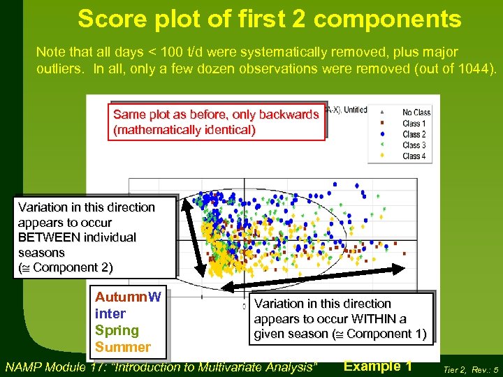
Score plot of first 2 components Note that all days < 100 t/d were systematically removed, plus major outliers. In all, only a few dozen observations were removed (out of 1044). Same plot as before, only backwards (mathematically identical) Variation in this direction appears to occur BETWEEN individual seasons ( Component 2) Autumn. W inter Spring Summer Variation in this direction appears to occur WITHIN a given season ( Component 1) NAMP Module 17: “Introduction to Multivariate Analysis” Example 1 Tier 2, Rev. : 5
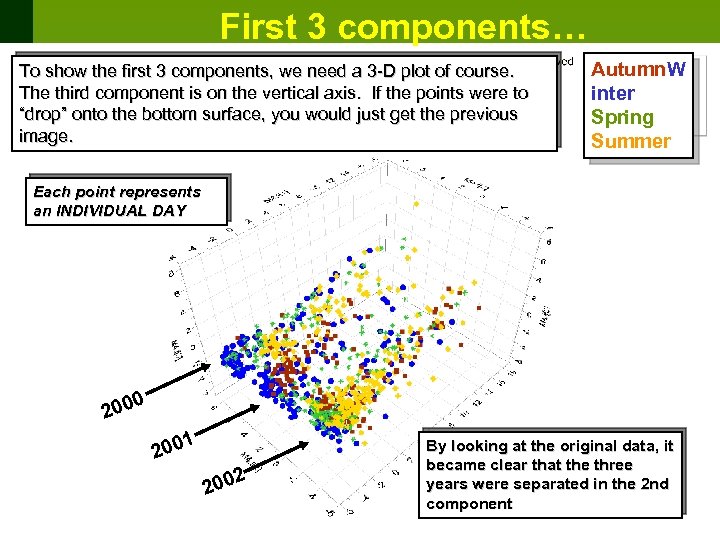
First 3 components… To show the first 3 components, we need a 3 -D plot of course. The third component is on the vertical axis. If the points were to “drop” onto the bottom surface, you would just get the previous image. Autumn. W inter Spring Summer Each point represents an INDIVIDUAL DAY 0 200 1 200 2 200 By looking at the original data, it became clear that the three years were separated in the 2 nd component NAMP Module 17: “Introduction to Multivariate Analysis” Tier 2, Rev. : 5
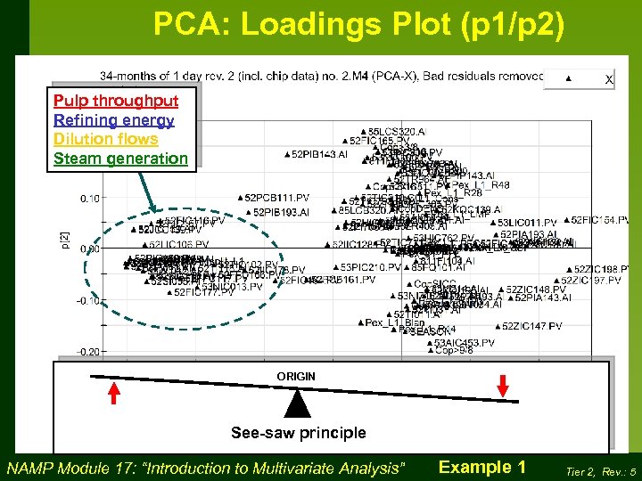
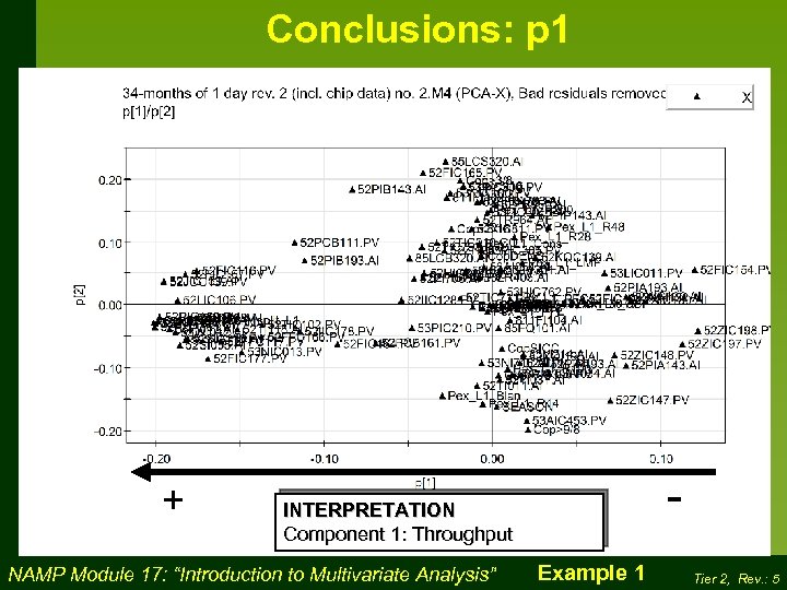
Loadings Plot The MVA software generates a set of new axes called “components” that are statistically significant. However, the software does not tell us what these new components actually mean. To figure out how the original variables relate to the newly created MVA components, we must look at the Loadings Plot. For this example, the 1 st / 2 nd component loadings plot is shown on the next slide. It looks somewhat daunting, because the tag numbers are shown. It is not necessary for the purposes of this exercise to understand what all the tag numbers mean. The important point is that similar tags trend together, as indicated by the text box. In this case, many variables related to the throughput tend to increase and decrease together, as shown by their clustering. Also, they are clearly related to the first component, on the negative side (positive and negative are totally arbitrary in MVA component space). NAMP Module 17: “Introduction to Multivariate Analysis” Example 1 Tier 2, Rev. : 5
PCA: Loadings Plot (p 1/p 2) Pulp throughput Refining energy Dilution flows Steam generation ORIGIN See-saw principle NAMP Module 17: “Introduction to Multivariate Analysis” Example 1 Tier 2, Rev. : 5
Conclusions: p 1 + - INTERPRETATION Component 1: Throughput NAMP Module 17: “Introduction to Multivariate Analysis” Example 1 Tier 2, Rev. : 5

Interpretation of 1 st component Our conclusion is that the first component corresponds to throughput. This is logical, for two reasons: 1) many process variables are related either directly or indirectly to throughput; 2) The extreme outliers we removed at the beginning, which dominated the model, were also related to throughput (low production days) Now we are ready to look at the score plot again. Remember we said that the 1 st component was something that varied within an individual season? Now we know what it is: throughput. So what have we accomplished? We’ve reduced the dimensionality by going from dozens of variables to a single latent variable. NAMP Module 17: “Introduction to Multivariate Analysis” Example 1 Tier 2, Rev. : 5
2 nd component Same plot as before Bleach consumption Pulp brightness Season NAMP Module 17: “Introduction to Multivariate Analysis” Tier 2, Rev. : 5

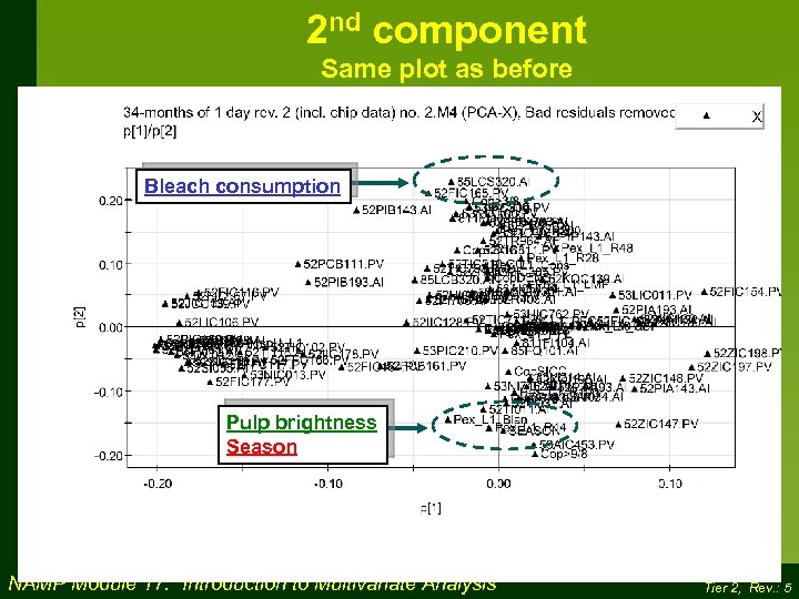
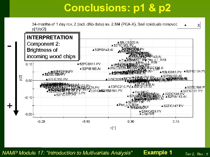
Interpretation of 2 nd component If you recall, we said that the 2 nd component explains only 7% of the total variability. It is therefore “messier” than the first component, and will be less easy to interpret. We also noted that the three years were separated with respect to this second component. A major clue occurs in the prominence of two important and related tags: bleach consumption and pulp brightness. This would suggest that perhaps the brightness of the incoming wood chips was different from year to year, requiring more bleaching to get a less white pulp. Note also that “Season” is prominent. We already knew this, by the obvious separation of the seasons on the score plot. This suggests that winter chips are less bright than summer chips. NAMP Module 17: “Introduction to Multivariate Analysis” Example 1 Tier 2, Rev. : 5
Conclusions: p 1 & p 2 - INTERPRETATION Component 2: Brightness of incoming wood chips + NAMP Module 17: “Introduction to Multivariate Analysis” Example 1 Tier 2, Rev. : 5

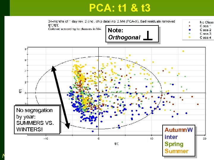
Looking at 3 rd component To look at the 3 rd component, we must generate a new plot showing the 1 st component vs. the 3 rd. In other words, we ignore the 2 nd component. This 3 rd component is orthogonal, and thus statistically independent, to the first two components. We said that the 3 rd component explains only 6% of the total variability. It is therefore even “messier” than the 2 nd component. st vs. 1 rd 3 Let’s have a look at this new score plot. Note that this is exactly the image you would get if all the points on the 3 -D score plot were projected onto the back wall. NAMP Module 17: “Introduction to Multivariate Analysis” Example 1 Tier 2, Rev. : 5
PCA: t 1 & t 3 Note: Orthogonal No segregation by year: SUMMERS VS. WINTERS! NAMP Module 17: “Introduction to Multivariate Analysis” Autumn. W inter Spring Summer Tier 2, Rev. : 5

Looking at 3 rd component One very interesting results is that the three years are not separated on this plot. All the winters line up, and all the summers line up. This suggests that the 3 rd component is related to the time of year, pure and simple. This is confirmed by the corresponding loadings plot, which shows “SEASON” to be the single most prominent variable. A reasonable interpretation would be that summer chips differ from winter chips in some way other than brightness, which was already covered by the second component. This could be, for instance, the ease with which the wood fibres can be separated from each other. NAMP Module 17: “Introduction to Multivariate Analysis” Example 1 Tier 2, Rev. : 5
4a1591572d923b72238f24e6cebfa659.ppt