

d1d45fc4aaba27cb071c7c83b2dd348b.ppt
- Количество слайдов: 43
 Multidimensional Data Analysis IS 247 Information Visualization and Presentation 22 February 2002 James Reffell Moryma Aydelott Jean-Anne Fitzpatrick
 Problem Statement • How to effectively present more than 3 dimensions of information in a visual display with 2 (to 3) dimensions? • How to effectively visualize “inherently abstract” data? • How to effectively visualize very large, often complex data sets? • How to effectively display results – when you don’t know what those results will be?
 Key Goals • More than 3 dimensions of data simultaneously • Support “fuzzyness” (similarity queries, vector space, tolerance ranges) • Support exploratory, opportunistic, “what-if” queries • Allow identification of “interesting data properties” through pattern recognition • Explore various dimensions without losing overview
 Another Statement of Goals Visualization of multidimensional data • Without loss of information • With: – – Minimal complexity Any number of dimensions Variables treated uniformly Objects remain recognizable across transformations – Easy / intuitive conveyance of information – Mathematically / algorithmically rigorous (Adapted from Inselberg)
 Purposes / Uses • Find clusters of similar data • Find “hot spots” (exceptional items in otherwise homogeneous regions) • Show relationships between multiple variables • Similarity retrieval rather than boolean matching, show near misses “Searching for patterns in the big picture and fluidly investigating interesting details without losing framing context” (Rao & Card)
 – Often combine color") Characteristics • “Data-dense displays” (large number of dimensions and/or values) – Often combine color with position / proximity representing relevance “distance” – Often provide multiple views • Build on concepts from previous weeks: – – – Retinal properties of marks Gestalt concepts, e. g. , grouping Direct manipulation / interactive queries Incremental construction of queries Dynamic feedback • Some require specialized input devices or unique gesture vocabulary
Characteristics • “Data-dense displays” (large number of dimensions and/or values) – Often combine color with position / proximity representing relevance “distance” – Often provide multiple views • Build on concepts from previous weeks: – – – Retinal properties of marks Gestalt concepts, e. g. , grouping Direct manipulation / interactive queries Incremental construction of queries Dynamic feedback • Some require specialized input devices or unique gesture vocabulary
 Examples Warning: These visualizations are not easy to grasp at “first glance”! DON’T PANIC
 • We saw the video") Influence Explorer / Prosection Matrix (Tweedie et. al. ) • We saw the video • Abstract one-way mathematical models: multiple parameters, multiple variables • Data through sampling • Colour coding, esp. near misses • Task: Make the red bit as big as possible!
Influence Explorer / Prosection Matrix (Tweedie et. al. ) • We saw the video • Abstract one-way mathematical models: multiple parameters, multiple variables • Data through sampling • Colour coding, esp. near misses • Task: Make the red bit as big as possible!
 • Selecting performance limits") Influence Explorer / Prosection Matrix (Tweedie et. al. ) • Selecting performance limits
Influence Explorer / Prosection Matrix (Tweedie et. al. ) • Selecting performance limits
 • The colours go in") Influence Explorer / Prosection Matrix (Tweedie et. al. ) • The colours go in two directions!
Influence Explorer / Prosection Matrix (Tweedie et. al. ) • The colours go in two directions!
 • Fitting tolerance region (yellow") Influence Explorer / Prosection Matrix (Tweedie et. al. ) • Fitting tolerance region (yellow box) to acceptability (red region) gives high yield for minimum cost
Influence Explorer / Prosection Matrix (Tweedie et. al. ) • Fitting tolerance region (yellow box) to acceptability (red region) gives high yield for minimum cost
 • - Tools: zoom, adjust, slide • -") The Table Lens (Rao and Card) • - Tools: zoom, adjust, slide • - Cell contents coded by color (nominal) or bar length (interval) • - Special mouse gesture vocabulary • Search / browse (spotlighting)
The Table Lens (Rao and Card) • - Tools: zoom, adjust, slide • - Cell contents coded by color (nominal) or bar length (interval) • - Special mouse gesture vocabulary • Search / browse (spotlighting)
") The Table Lens (Rao and Card)
The Table Lens (Rao and Card)
 http: //www. tablelens. com") The Table Lens (Rao and Card) http: //www. tablelens. com
The Table Lens (Rao and Card) http: //www. tablelens. com
 • Transformation of multiple graphs by using parallel axes in a") Parallel Coordinates (Inselberg) • Transformation of multiple graphs by using parallel axes in a 2 D representation. • Users attempt to recognize patterns between the axes - adding or removing parts of the data to see general patterns or more closely examine particular interactions. • Article offers suggestions on how to most effectively use this system.
Parallel Coordinates (Inselberg) • Transformation of multiple graphs by using parallel axes in a 2 D representation. • Users attempt to recognize patterns between the axes - adding or removing parts of the data to see general patterns or more closely examine particular interactions. • Article offers suggestions on how to most effectively use this system.
 Dataset in a Cartesian graph Same dataset in parallel coordinates Parallel") Parallel Coordinates (Inselberg) Dataset in a Cartesian graph Same dataset in parallel coordinates Parallel Coordinates applet - http: //csgrad. cs. vt. edu/~agoel/parallel_coordinates/
Parallel Coordinates (Inselberg) Dataset in a Cartesian graph Same dataset in parallel coordinates Parallel Coordinates applet - http: //csgrad. cs. vt. edu/~agoel/parallel_coordinates/
 Strengths – • • • Works for any N Clearly displays") Parallel Coordinates (Inselberg) Strengths – • • • Works for any N Clearly displays data characteristics of the data (without needing beaucoup explanations) Easy to adjust or focus displays/ queries Testing showed that it showed problems missed using other forms of process control Can be used in decision support when used as a visual modeling tool (to see how adjusting one parameter effects others). Weaknesses – • Formation of complex queries can be tricky (if you want to get results that are useful and easy to interpret).
Parallel Coordinates (Inselberg) Strengths – • • • Works for any N Clearly displays data characteristics of the data (without needing beaucoup explanations) Easy to adjust or focus displays/ queries Testing showed that it showed problems missed using other forms of process control Can be used in decision support when used as a visual modeling tool (to see how adjusting one parameter effects others). Weaknesses – • Formation of complex queries can be tricky (if you want to get results that are useful and easy to interpret).
 • Extends pivot tables to generate graphic displays • Multiple") Polaris (Stolte and Hanharan) • Extends pivot tables to generate graphic displays • Multiple graphs on one screen • Designed to “combine statistical analysis and visualization” (a pivot table) (polaris)
Polaris (Stolte and Hanharan) • Extends pivot tables to generate graphic displays • Multiple graphs on one screen • Designed to “combine statistical analysis and visualization” (a pivot table) (polaris)
 • Table algebra automatically generated via drag and drop. •") Polaris (Stolte and Hanharan) • Table algebra automatically generated via drag and drop. • Suitable graphic types are system selected based on query/result criteria. Include tables, bar charts, dot plot, gantt charts, matrices of scatterplots, maps. • Users can select marks (marks differ by shape, size, orientation and color).
Polaris (Stolte and Hanharan) • Table algebra automatically generated via drag and drop. • Suitable graphic types are system selected based on query/result criteria. Include tables, bar charts, dot plot, gantt charts, matrices of scatterplots, maps. • Users can select marks (marks differ by shape, size, orientation and color).
 Strengths – • • Can be used with existing DB") Polaris (Stolte and Hanharan) Strengths – • • Can be used with existing DB systems Direct manipulation - drag and drop Users can play with appearance of display Linking and Brushing supported Weaknesses – • User only sees aggregated (not original) data • System performs a number of functions automatically (conversion of variables, aggregation) - user may not know or not be able to control how their data is changed.
Polaris (Stolte and Hanharan) Strengths – • • Can be used with existing DB systems Direct manipulation - drag and drop Users can play with appearance of display Linking and Brushing supported Weaknesses – • User only sees aggregated (not original) data • System performs a number of functions automatically (conversion of variables, aggregation) - user may not know or not be able to control how their data is changed.
 • Basic approach: graph 3 dimensions, while holding") Worlds Within Worlds (Fiener and Beshers) • Basic approach: graph 3 dimensions, while holding “extra” dimensions constant • Visually represent “extra” dimensions as space within which graph(s) are placed – Position of “inner world” graph axis zero point equals set of constant values in “outer world” • Tools: – Dipstick – Waterline – Magnifying box The following images from: http: //www-courses. cs. uiuc. edu/~cs 419/multidim. ppt
Worlds Within Worlds (Fiener and Beshers) • Basic approach: graph 3 dimensions, while holding “extra” dimensions constant • Visually represent “extra” dimensions as space within which graph(s) are placed – Position of “inner world” graph axis zero point equals set of constant values in “outer world” • Tools: – Dipstick – Waterline – Magnifying box The following images from: http: //www-courses. cs. uiuc. edu/~cs 419/multidim. ppt
 and output") Worlds Within Worlds • Constraints: – Uses special input device (“Data Glove”) and output device (liquid crystal stereo glasses); use without these special devices less than optimal • Technical details: – Suspend calculation of “child” details during movement – Algorithm for prioritizing overlapping objects – Need to “turn off” gesture recognition to allow normal use of hand
Worlds Within Worlds • Constraints: – Uses special input device (“Data Glove”) and output device (liquid crystal stereo glasses); use without these special devices less than optimal • Technical details: – Suspend calculation of “child” details during movement – Algorithm for prioritizing overlapping objects – Need to “turn off” gesture recognition to allow normal use of hand
 Worlds Within Worlds I/O Devices
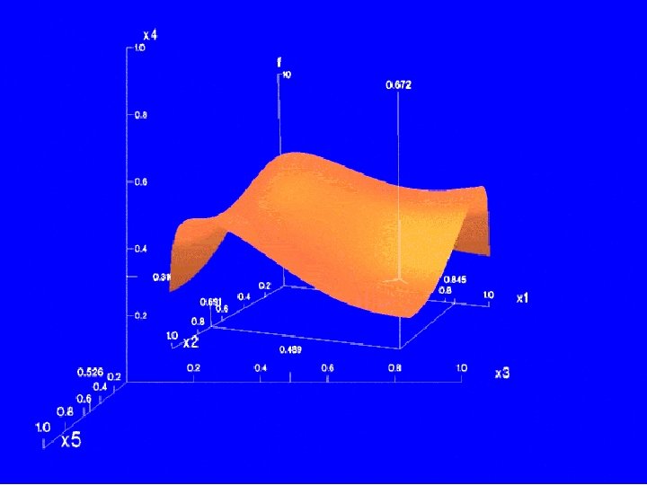
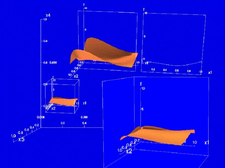
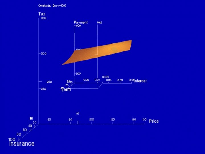
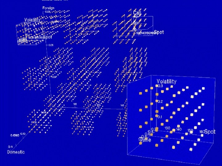
 • Multiples showing component dimensions, color") Techniques for plotting multivariate functions (Mihalisin et al) • Multiples showing component dimensions, color codes for dimensions applied across multiples • Or, for categorical data, select mth category from nth dimension • Or, plot nested boxes, step values of independent variables and color-coding dependent variable
Techniques for plotting multivariate functions (Mihalisin et al) • Multiples showing component dimensions, color codes for dimensions applied across multiples • Or, for categorical data, select mth category from nth dimension • Or, plot nested boxes, step values of independent variables and color-coding dependent variable
 • Tools: – General zoom: look") Techniques for plotting multivariate functions (Mihalisin et al) • Tools: – General zoom: look at smaller range of data in same amount of space – Subspace zoom: select view of particular dimension’s input to function – Decimate tool: sample fewer values within range
Techniques for plotting multivariate functions (Mihalisin et al) • Tools: – General zoom: look at smaller range of data in same amount of space – Subspace zoom: select view of particular dimension’s input to function – Decimate tool: sample fewer values within range
 from http: //www. cs. umd. edu/class/spring 2001/cmsc 838 b/presentations/Zhijian_Pan/mdmv. ppt
 from http: //www. cs. umd. edu/class/spring 2001/cmsc 838 b/presentations/Zhijian_Pan/mdmv. ppt
 • Mapping entries from relational database to pixels on") Vis. DB (Keim & Kriegel) • Mapping entries from relational database to pixels on the screen • Include “approximate” answers, with placement and color-coding based on relevance • Data points laid out in: – Rectangular spiral – Or, with axes representing positive/negative values for two selected dimensions – Or, group dimensions together (easier to interpret than very large number of dimensions)
Vis. DB (Keim & Kriegel) • Mapping entries from relational database to pixels on the screen • Include “approximate” answers, with placement and color-coding based on relevance • Data points laid out in: – Rectangular spiral – Or, with axes representing positive/negative values for two selected dimensions – Or, group dimensions together (easier to interpret than very large number of dimensions)
 from http: //infovis. cs. vt. edu/cs 5984/students/Vis. DB. ppt
 Vis. DB - Relevance • Relevance calculation based on “distance” of each variable from query specification • Distance calculation depends on data type – Numeric: mathematical – String: character/substring matching, lexical, phonetic? , syntactic? – Nominal: predefined distance matrix – Possibly other “domain-specific” distance metrics
 Vis. DB – Screen Resolution • Stated screen resolution seems reasonable by today’s standards: 19 inch display, 1024 x 1280 pixels = 1. 3 million data points • However, controls take up a lot of space!
 from http: //www 1. ics. uci. edu/~kobsa/courses/ICS 280/notes/presentations/Keim-Vis. DB. ppt
 Vis. DB – Implementation • Requires features not available in commercial databases: – Partial query results – Incremental changes to queries – Speed? (1994 vs today)
") Limitations and Issues • (intro to following slides and/or Tweedie’s words of wisdom? )
Limitations and Issues • (intro to following slides and/or Tweedie’s words of wisdom? )
 Complexity • Simplest approach to representing N dimensions is N controls, N onedimensional outputs – but this fails to represent complex relationships • Middle ground achieved by some?
 Abstract data • These visualizations are oriented toward abstract data • For “naturally” two or three-dimensional data (things that vary over time or space, e. g. , geographic data) visualizations which exploit those properties may exist and be more effective
 User Testing? • Many of these systems seem only appropriate for expert use
 Future Work • Save query parameters for reference / sharing results • Automated query generation or filtering – Intelligent agents?
 Words of wisdom from Tweedie et al • Trade-off between amount of information, simplicity, and accuracy • “It is often hard to judge what users will find intuitive and how [a visualization] will support a particular task”