4edee5b97143bff31bec3e02931a2bc3.ppt
- Количество слайдов: 32


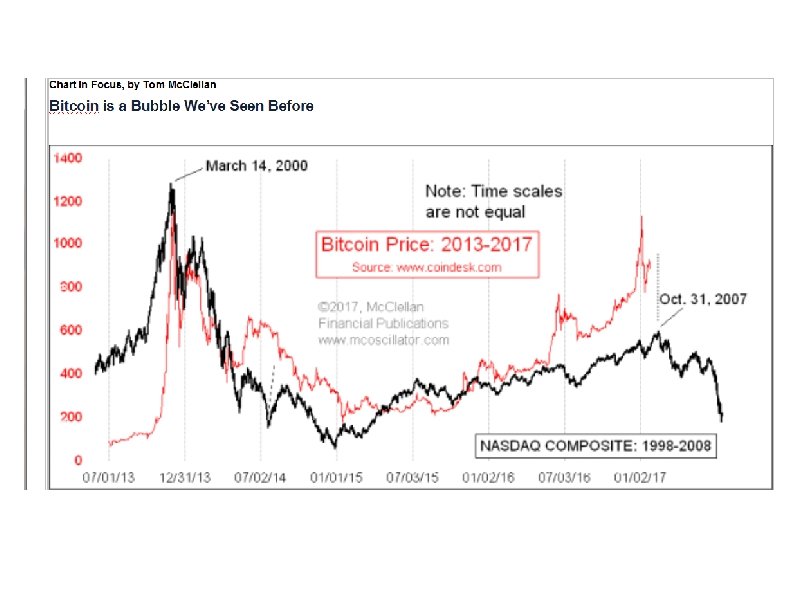

Most investors remember the 2000 Internet Bubble, which was an example of bubbles for the history books. What is harder is to recognize a replica bubble when it appears again later, especially if it disguises itself. This week’s chart reveals that the price of Bitcoins is replicating the 2000 Nasdaq bubble and its aftermath. But the curious point is that Bitcoin prices are tracing out the dance steps much more quickly. This is a great example of the new and improved “Efficient Market Hypothesis” or EMH. No, it’s not the one you think. The new EMH states that the market now can get a lot more work done in a short time, work that used to take a long time.

An example of the new EMH is the Brexit minicrash, which was a surprise to investors and which two and a half days to play out. It saw a rapid price drop for stock prices, and then a robust rebound. The Nov. 8 election victory of Donald Trump caused a similar upset to the financial markets, but rather than taking two and a half days to play out, the minicrash and rebound unfolded in a single overnight session. The market is getting more efficient. The price of bitcoins had a bubble top and crash back in late 2013 to early 2014. As a brief review, a bitcoin is a “cryptocurrency”, or a digital asset designed to take the place of money. Bitcoins have only been used as a medium of exchange since 2010. Adherents are attracted to them because of their (supposed) anonymity, and portability without border restriction, or so it has been believed. China’s intrusions into that market have brought that assumption into question.

Bitcoin prices had an initial bubble top in late 2013. This week’s chart compares the history of bitcoin prices since mid-2013 to the pattern made by the Nasdaq Composite from 1998 -2008. As noted in the chart, the time scales here are not equal. It appears that bitcoin prices are tracing out the double-bubble dance steps seen in the Nasdaq, but the Bitcoin prices are doing so much more quickly. The time scales are not equal in this comparison. So I had to do a little bit of chart trickery to create this image. Most charting programs that allow two data series to be displayed together in one chart want equal numbers of data points for each data series. To get around that, and allow the resemblance to be visible, I actually created two charts with transparent backgrounds, and then overlaid one upon the other, like two pieces of acetate used for overhead transparencies (remember those? ). Then a little bit of accordion style stretching and repositioning allowed the pattern correlation to be revealed.

Assuming that this correlation continues into the future, bitcoins are going to arrive in a few days at the equivalent of the Oct. 31, 2007 top in the Nasdaq. And shortly thereafter, they should see an echo of the 2008 bear market (again, assuming that the correlation continues). So if you are “holding” any Bitcoins (not that anyone can actually hold something so ethereal), your moment to exit and flee is rapidly approaching.

BOTTOM LINE A meaningful top is due right now, and appears to be arriving on schedule. Predictive models from climate data and the Presidential Cycle Pattern say we should see an 8 -week decline to a bottom due in early April. Then the uptrend begins again. Curiously, gold and bond prices also show tops due just ahead, ideally around Friday, Feb. 10. Look for rising housing demand in 2017, thanks to Millenials starting to buy their own homes, and as predicted by lumber prices over the past year. Housing should be a leading sector. Gold should lead the way for

What To Expect Stocks are topping right now, and should correct for the rest of February plus March. The March 8 -10 bottom should just be a preliminary one, with the more meaningful one due in April. Bonds are also topping right now, but that topping process may carry on for a few more days after the stock market’s top, as the T-Bond top signals last until Feb. 15. They all likely describe thesame event. Gold shows a short term top signal due Feb. 9, one day off from the full moon due Feb. 10. Full moons tend to mark important turning points or acceleration points for gold prices, as discussed on page 4. Such a top should not mark the end of the new up trend,

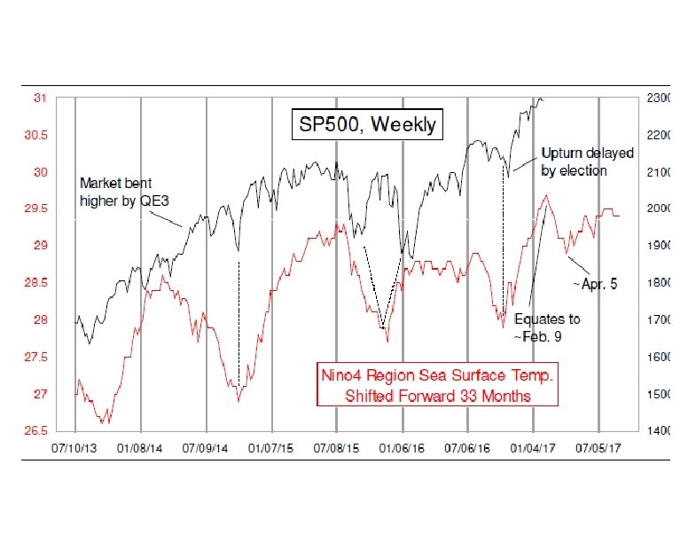
Arriving at Our Top Target We have been focused for a while on an important stock market top ideally due around this week, and here we are. We are seeing a lot of confirming signs that such a top very well could be at hand. So let’s go through the evidence. The expectation for a meaningful top right now came from the Presidential Cycle Pattern, that we discussed in our last Report, and our recently discovered Nino 4 model shown in the first chart. We came across this relationship while doing an independent inquiry into global climate data, and noticed that the plot of Pacific Ocean surface temperatures in the Nino 4 region looked a whole lot like the movements of the SP 500.

We investigated further, and found itwas not a coincident relationship. Rather, the Nino 4 region surface temperature data seem to lead the movements of the SP 500 by about 33 months. It does not always work perfectly, especially when the FOMC puts a thumb on the scale as with QE 3. And most recently the election seemed to hold back the rally that was scheduled to start from an October low, but then prices worked extra hard afterward to make up for lost time. Looking ahead, the Nino 4 data show an 8 -week decline to a bottom due around April 5. These are weekly data, so don’t take that date literally (but do take it seriously). After that bottom, prices should be able to rise again. But before we get to the “rise again” part, we have to deal with the correction of the post-election rally.

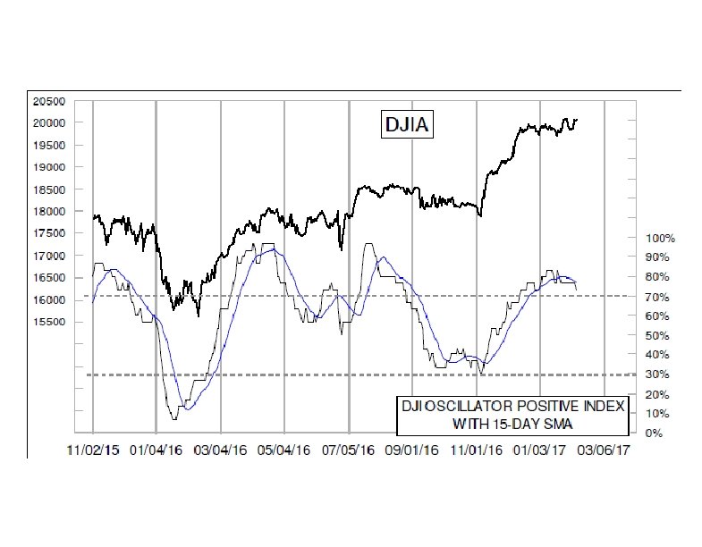
The lower chart shows evidence that we may already be in that corrective mode. Our DJI Oscillator Positive Index looks at the Price Oscillator for each of the 30 DJIA component stocks, to see if each is above or below zero. It pays no attention to the direction of travel of those Price Oscillators, just their value. Then we average them all together to make this indicator. It is a really nice indicator in that it matches the dominant trend direction of the DJIA, but with less noise. And when it goes above or below its own 15 day moving average, it can give meaningful signals about a change in that trend direction.

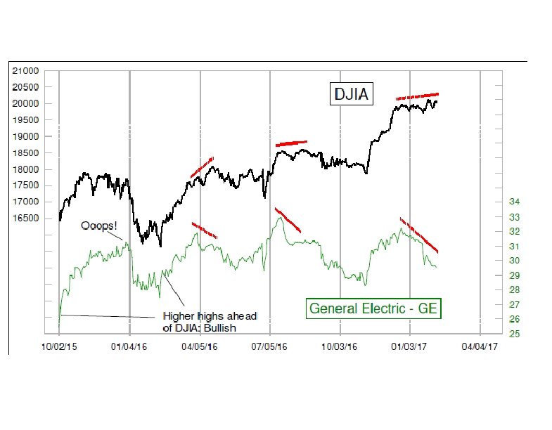
Further confirmation of trouble for the market comes in the chart on page 2. We learned years ago from the late Larry Katz that when the DJIA and GE’s share price disagree, GE is usually right about where both are headed. Usually. GE topped all the way back on Dec. 20, and has been trending downward ever since. That’s a problem for all of the Dow 20 K cheerleaders. Bottom Line: The expectation was for an early. February top, and it appears to be arriving on schedule, complete with momentum divergences. Look for an 8 -week decline, with more of the damage in late February.

Common Only, or Composite A-D Data? We get asked a lot about which set of Advance-Decline data is better, the “common only” or the composite (all issues) data. Many analysts assert that one should only look at the data on “operating companies”, since they are the real representation of what the real stock market is about. But this is a prejudiced view. It assumes what is better before actually looking at the data. We have gone that extra step, and have a controversial finding: the common-only A-D are NOT better.

The top chart makes the case for us, but first a bit of explanation is needed. In judging “better” or “worse”, one should analyze the data based on what the task is. The whole point of looking at A-D data is to get a different answer from what the price data are saying. And ideally one would want that different answer to be a better one. Take a look at the top chart on page 5, which compares the common-only A-D Line to the NYSE Composite Index ($NYA). There are several instances when they have “disagreed”, by virtue of the $NYA making a lower high while this common-only A-D Line made a higher high. Under conventional A-D Line analysis, these instances should have meant that prices were wrong, and that the market should go higher. But in each of the highlighted cases, the common-only A-D Line turned out to be the one that was wrong.
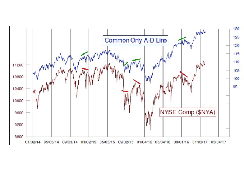

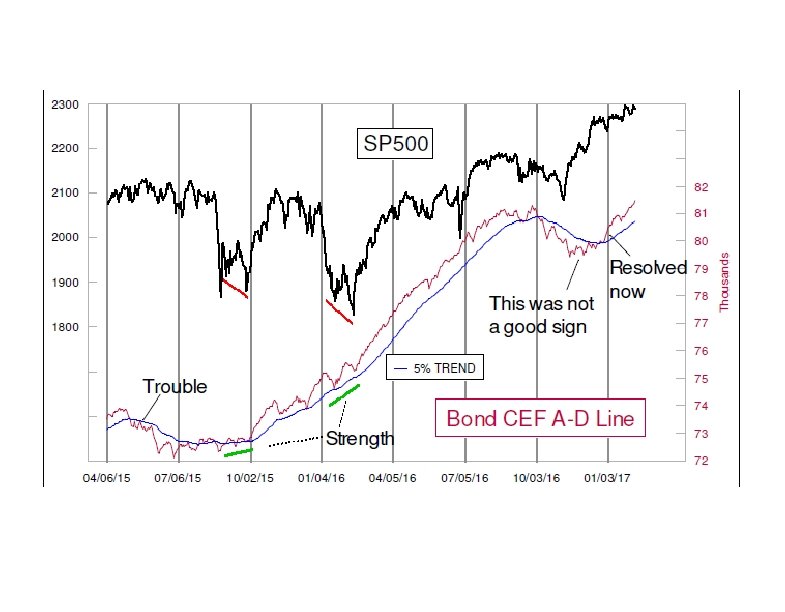
One of the common criticisms of the composite A-D data is that the NYSE list of issues is “contaminated” by things that are not real stocks, issues such as preferred stocks, rights, warrants, “when-issued” issues, structured products, and the most hated of them all, the bond related closed end funds (CEFs). They are reviled for being “interest rate sensitive” and not real companies. Interestingly, this was one of the original criticisms of A-D Line data generally, back when Joe Granville and Richard Russell introduced it to a larger audience back in 1962. Back then, utilities and insurance companies were reviled as the “interest rate sensitive” issues. It is amazing how some arguments get recycled.

When examining the real data, it turns out that the Bond CEFs’ A-D data is actually better than the common. These are the real canaries in the coal mine, more sensitive to liquidity than other issues. They seem to know when one should be more worried than prices indicate, or when one should not be as worried. Just recently, the Bond CEF A-D Line has moved to a new all-time high, which says that liquidity is plentiful. The market can still undergo ordinary corrective periods, and indeed we expect such a correction over the next 8 weeks. This is not the end of the world, and that is a useful point to know. Bottom Line: Don’t believe everything you hear about AD data (unless it is from us).

Oil Headed Lower We like getting the answers ahead of time. We find that when we can have a good model of what should happen, and then use other tools to confirm that, we can invest and trade with greater confidence, and greater success. The top chart shows an interesting insight about what lies ahead for crude oil prices. It reveals how the path of crude oil prices has mostly matched the path of gold prices from about 21 months earlier. That is important, because it says that oil prices are headed lower from here. The correlation between the two plots has not always been perfect. Sometimes there is a little bit of lead-lag error, something we like to call “accordioning” after the way that the baffles in an accordion do not always show equal distances between the folds. If it gets off a bit, then the timing gets back on track a few weeks later.
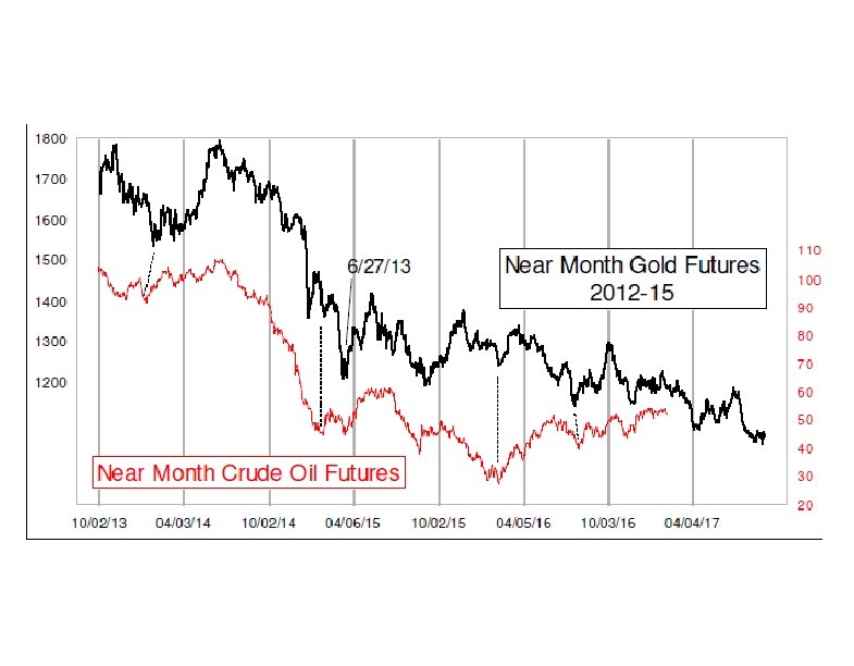

Just ahead, it shows a dip into early April. That just happens to match the expectation for the stock market from the Nino 4 model discussed on page 1. The implication is that falling oil prices should once again create some weakness for the stock market, and then an oil price rebound from that April low can help to support a stock market rebound. Providing confirmation of this notion of a downturn for oil prices are the indicators in the next two charts. The middle chart shows data from the weekly Commitment of Traders (COT) Report, published by the CFTC. It reveals that the big-money “commercial” category of traders is now net short as a group by a larger number of contracts than we saw at the price top in June 2014. That top led to oil prices being cut in half in just 7 months.
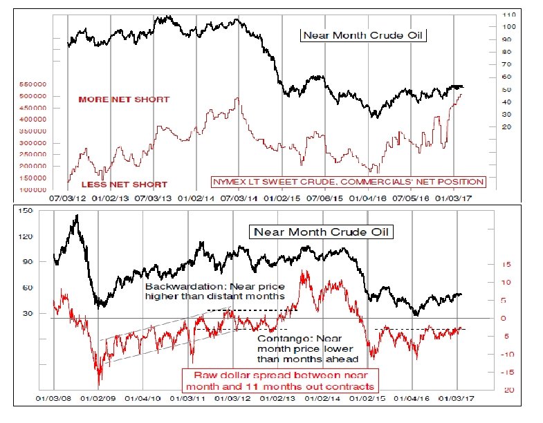

We are not necessarily expecting that large of a price drop this time. But the point is that the commercial traders (including a lot of oil producers) believe strongly that this price level is a great place to lock in prices for future oil production. This implies that prices are headed lower from here. The bottom chart looks at the contango in crude oil futures. Contango is a wonky financial markets term that refers to the differences in pricing between different contract expiration months. If contango is very large (deeply negative in the chart), then the farther out contracts are at a much higher price than the near month and spot prices. In such a condition, one could buy oil in the spot market and sell a contract out into the future, pocketing the difference minus storage costs

But the condition we see right now is one where the near month pricing is very close to that of the contracts out several months into the future. This condition tends to result in lower near month prices for crude oil in the weeks and months that follow. One problem is that establishing a standard of “high” and “low” for this indicator tends to be a bit of a moving target. From 2009 to 2012, it was an upward trending channel. 2013 and 2014 saw really extreme back wardation. Since early 2015, a reading of around -3 points has been good enough to mark really important crude oil price tops, and that’s what we are seeing now. Bottom Line: Look for a 2 -month oil price drop to pave the way for a 2 -month stock market drop.

Gold Resumes Uptrend Gold prices bottomed in Dec. 2016, one month late according to the 13 -1/2 month cycle, but then started up nicely. It took a brief pause in late January, and has now resumed the uptrend. The need for that brief pause in late January was foretold in a way by the indicator in the top chart on page 4. The Choppiness Index was developed by Australian commodities trader E. W. Driess, who wanted a way to quantify how linear (or not) price action had been. It is not widely available on the popular charting packages or web sites, but it is fairly easy to set up the formulas in a spreadsheet. The math can be found on the Internet. The low reading in mid-January said that recent price action had been fairly linear, and thus that a pause or a nonlinear period was in order. That message was correct, and the pause led to a very high reading just a few days ago.
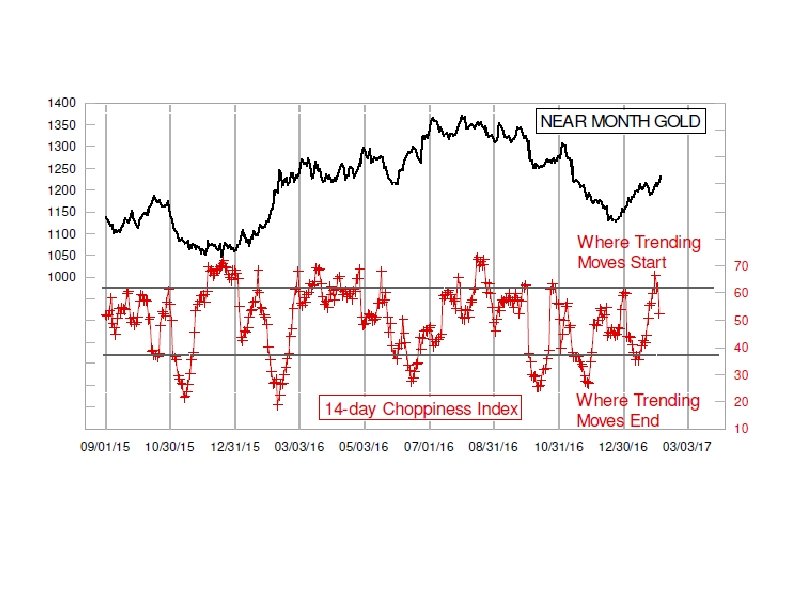

That high reading said that recent price action had been very choppy, and thus that a new trending move was likely to begin. The problem with that message is that it does not tell us in which direction that trending move will go. That’s pretty important information. We had expected that the resolution would be upward. The middle chart shows that we are still very early in the 13 -1/2 month cycle, which is when the biggest gains are usually seen. So the path of least resistance should still be upward. Sometime around May 2017, plus or minus, we should see a mid-cycle low. But that is still a long ways off. And the fact that the last cycle saw “right translation” says that we should expect a higher high in this cycle.
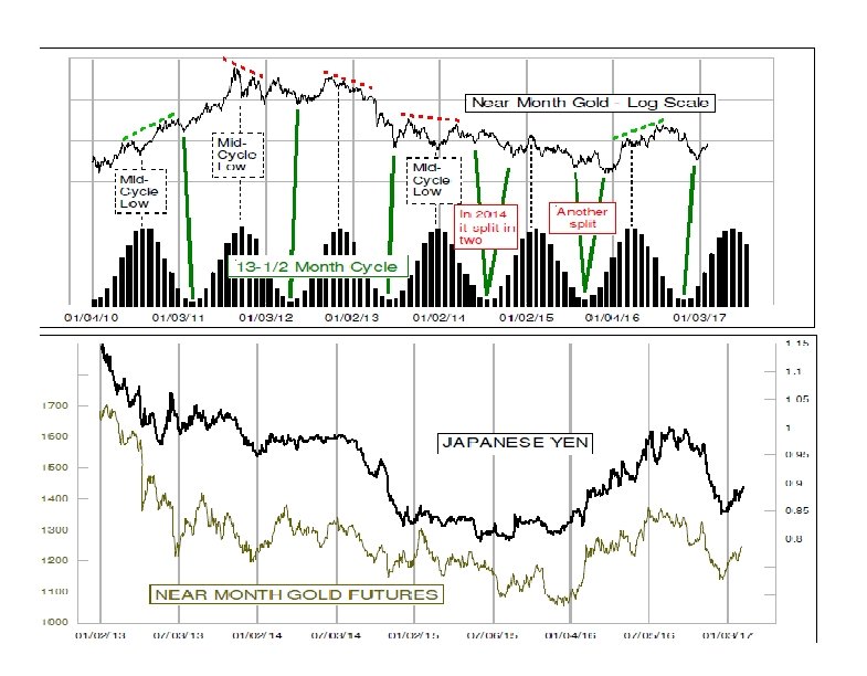

Right translation means that the high which arrived after the mid-cycle low was above the one before that midcycle point. When that happens, it conveys a bullish message about the next cycle. Left translation (red dashed lines) has the opposite meaning. So we had been promised a bullish cycle this time, and gold appears to be working hard to deliver on that promise. And 13 -1/2 months from the Nov. 2016 ideal cycle low, we should see another major price bottom. But that is a long way away from now. One big problem with trying to do discrete analysis of gold prices all by themselves is that gold is not an independent entity. The bottom chart compares the path of gold prices to that of the Japanese yen, and it is pretty clear that the two dance together for the most part. So if you own gold, you really own yen. But a word of advice:

If you are going to accept our bullish premise on gold, then you have to also accept that it means the yen should rise. Either that, or else you think that this relationship is going to suddenly break correlation after many years. Maybe it will break someday, but we don’t have a good way to model how and when that should happen. Bottom Line: Gold is rising again as it should, and there is more to go. The risk to gold’s bullish case is from geopolitical attention suddenly shifting to Japan in an adverse way.
4edee5b97143bff31bec3e02931a2bc3.ppt