

d0f3ca823194a76c53b5624ad1014491.ppt
- Количество слайдов: 104
 Looking at Data
 n n The researchers analyzed") Clinical Data Example n 1. Kline et al. (2002) n n The researchers analyzed data from 934 emergency room patients with suspected pulmonary embolism (PE). Only about 1 in 5 actually had PE. The researchers wanted to know what clinical factors predicted PE. I will use four variables from their dataset today: n n Pulmonary embolism (yes/no) Age (years) Shock index = heart rate/systolic BP Shock index categories = take shock index and divide it into 10 groups (lowest to highest shock index)
Clinical Data Example n 1. Kline et al. (2002) n n The researchers analyzed data from 934 emergency room patients with suspected pulmonary embolism (PE). Only about 1 in 5 actually had PE. The researchers wanted to know what clinical factors predicted PE. I will use four variables from their dataset today: n n Pulmonary embolism (yes/no) Age (years) Shock index = heart rate/systolic BP Shock index categories = take shock index and divide it into 10 groups (lowest to highest shock index)
 Descriptive Statistics
 Types of Variables: Overview Categorical binary nominal Quantitative ordinal discrete continuous 2 categories + more categories + order matters + numerical + uninterrupted
 Categorical Variables n Also known as “qualitative. ” n Categories. n n n treatment groups exposure groups disease status
 – two levels n n n n Dead/alive Treatment/placebo") Categorical Variables n Dichotomous (binary) – two levels n n n n Dead/alive Treatment/placebo Disease/no disease Exposed/Unexposed Heads/Tails Pulmonary Embolism (yes/no) Male/female
Categorical Variables n Dichotomous (binary) – two levels n n n n Dead/alive Treatment/placebo Disease/no disease Exposed/Unexposed Heads/Tails Pulmonary Embolism (yes/no) Male/female
 Categorical Variables n Nominal variables – Named categories Order doesn’t matter! n n n The blood type of a patient (O, A, B, AB) Marital status Occupation
 Categorical Variables n Ordinal variable – Ordered categories. Order matters! n n n n Staging in breast cancer as I, III, or IV Birth order— 1 st, 2 nd, 3 rd, etc. Letter grades (A, B, C, D, F) Ratings on a scale from 1 -5 Ratings on: always; usually; many times; once in a while; almost never; never Age in categories (10 -20, 20 -30, etc. ) Shock index categories (Kline et al. )
 Quantitative Variables n Numerical variables; may be arithmetically manipulated. n n Counts Time Age Height
 Quantitative Variables n Discrete Numbers – a limited set of distinct values, such as whole numbers. n n n Number of new AIDS cases in CA in a year (counts) Years of school completed The number of children in the family (cannot have a half a child!) The number of deaths in a defined time period (cannot have a partial death!) Roll of a die
 Quantitative Variables n Continuous Variables - Can take on any number within a defined range. n n n n Time-to-event (survival time) Age Blood pressure Serum insulin Speed of a car Income Shock index (Kline et al. )
 Looking at Data n ü How are the data distributed? n n n Where is the center? What is the range? What’s the shape of the distribution (e. g. , Gaussian, binomial, exponential, skewed)? ü Are there “outliers”? ü Are there data points that don’t make sense?
 The first rule of statistics: USE COMMON SENSE! 90% of the information is contained in the graph.
 Categorical variables n Bar Chart Continuous variables n Box Plot n") Frequency Plots (univariate) Categorical variables n Bar Chart Continuous variables n Box Plot n Histogram
Frequency Plots (univariate) Categorical variables n Bar Chart Continuous variables n Box Plot n Histogram
 Bar Chart n n Used for categorical variables to show frequency or proportion in each category. Translate the data from frequency tables into a pictorial representation…
 Bar Chart: categorical variables no yes
 Bar Chart for SI categories 200. 0 Much easier to extract information from a bar chart than from a table! 183. 3 Number of Patients 166. 7 150. 0 133. 3 116. 7 100. 0 83. 3 66. 7 50. 0 33. 3 16. 7 0. 0 1 2 3 4 5 6 7 Shock Index Category 8 9 10
 Box plot and histograms: for continuous variables n To show the distribution (shape, center, range, variation) of continuous variables.
 Outliers 1. 3 Q") Box Plot: Shock Index Units 2. 0 maximum (1. 7) Outliers 1. 3 Q 3 + 1. 5 IQR =. 8+1. 5(. 25)=1. 175 “whisker” 0. 7 75 th percentile (0. 8) median (. 66) 25 th percentile (0. 55) interquartile range (IQR) =. 8 -. 55 =. 25 minimum (or Q 11. 5 IQR) 0. 0 SI
Box Plot: Shock Index Units 2. 0 maximum (1. 7) Outliers 1. 3 Q 3 + 1. 5 IQR =. 8+1. 5(. 25)=1. 175 “whisker” 0. 7 75 th percentile (0. 8) median (. 66) 25 th percentile (0. 55) interquartile range (IQR) =. 8 -. 55 =. 25 minimum (or Q 11. 5 IQR) 0. 0 SI
 Histogram of SI 25. 0 Bins of size 0. 1 Note the “right skew” Percent 16. 7 8. 3 0. 0 0. 7 1. 3 SI 2. 0
") 100 bins (too much detail)
100 bins (too much detail)
") 2 bins (too little detail)
2 bins (too little detail)
 Box Plot: Shock Index Units 2. 0 Also shows the “right skew” 1. 3 0. 7 0. 0 SI
 Box Plot: Age 100. 0 maximum More symmetric Years 66. 7 75 th percentile interquartile range median 25 th percentile 33. 3 minimum 0. 0 AGE Variables
 Histogram: Age 14. 0 Not skewed, but not bell -shaped either… Percent 9. 3 4. 7 0. 0 33. 3 66. 7 AGE (Years) 100. 0
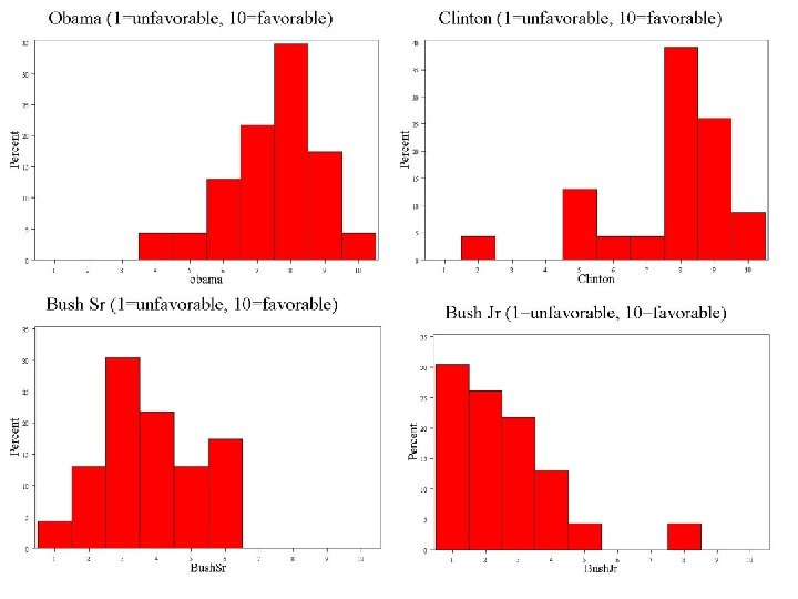
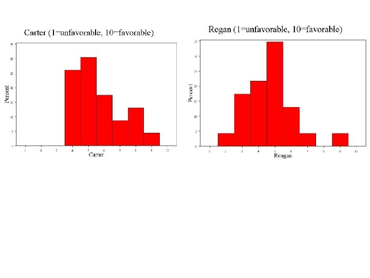
 Starting with politics…") Some histograms from your class (n=24) Starting with politics…
Some histograms from your class (n=24) Starting with politics…
 Feelings about math and writing…
 Optimism…
 Diet…
Diet…
 Habits…
 Measures of central tendency n n n Mean Median Mode
 Central Tendency n Mean – the average; the balancing point calculation: the sum of values divided by the sample size In math shorthand:
 Mean: example Some data: Age of participants: 17 19 21 22 23 23 23 38
 Mean of age in Kline’s data Means Section of AGE Mean 50. 19334 Mode 49 556. 9546 14. 0 Percent Parameter Value Geometric. Harmonic Median Mean Sum 49 46. 66865 43. 00606 46730 9. 3 4. 7 0. 0 33. 3 66. 7 100. 0
 Mean of age in Kline’s data Percent 14. 0 9. 3 4. 7 0. 0 33. 3 66. 7 The balancing point 100. 0
 80. 56% (750) 19. 44% (181)") Mean of Pulmonary Embolism? (Binary variable? ) 80. 56% (750) 19. 44% (181)
Mean of Pulmonary Embolism? (Binary variable? ) 80. 56% (750) 19. 44% (181)
 0 1 2 3") Mean n The mean is affected by extreme values (outliers) 0 1 2 3 4 5 6 7 8 9 10 Mean = 3 0 1 2 3 4 5 6 7 8 9 10 Mean = 4 n. Slide from: Statistics for Managers Using Microsoft® Excel 4 th Edition, 2004 Prentice-Hall
Mean n The mean is affected by extreme values (outliers) 0 1 2 3 4 5 6 7 8 9 10 Mean = 3 0 1 2 3 4 5 6 7 8 9 10 Mean = 4 n. Slide from: Statistics for Managers Using Microsoft® Excel 4 th Edition, 2004 Prentice-Hall
 Central Tendency n Median – the exact middle value Calculation: n n If there an odd number of observations, find the middle value If there an even number of observations, find the middle two values and average them.
 Median: example Some data: Age of participants: 17 19 21 22 23 23 23 38 Median = (22+23)/2 = 22. 5
 Median of age in Kline’s data Means Section of AGE Mean 50. 19334 Mode 49 14. 0 Percent Parameter Value Geometric. Harmonic Median Mean Sum 49 46. 66865 43. 00606 46730 9. 3 4. 7 0. 0 33. 3 66. 7 100. 0 AGE (Years)
 Median of age in Kline’s data 14. 0 50% of mass Percent 50% of mass 9. 3 4. 7 0. 0 33. 3 66. 7 100. 0
 Does PE have a median? n Yes, if you line up the 0’s and 1’s, the middle number is 0.
. 0 1 2") Median n The median is not affected by extreme values (outliers). 0 1 2 3 4 5 6 7 8 9 10 Median = 3 n. SSlide from: Statistics for Managers Using Microsoft® Excel 4 th Edition, 2004 Prentice-Hall
Median n The median is not affected by extreme values (outliers). 0 1 2 3 4 5 6 7 8 9 10 Median = 3 n. SSlide from: Statistics for Managers Using Microsoft® Excel 4 th Edition, 2004 Prentice-Hall
 Central Tendency n Mode – the value that occurs most frequently
 Mode: example Some data: Age of participants: 17 19 21 22 23 23 23 38 Mode = 23 (occurs 3 times)
 Mode of age in Kline’s data Means Section of AGE Parameter Value Mean 50. 19334 Geometric. Harmonic Median Mean Sum 49 46. 66865 43. 00606 46730 Mode 49
 Mode of PE? n 0 appears more than 1, so 0 is the mode.
 Measures of Variation/Dispersion n n Range Percentiles/quartiles Interquartile range Standard deviation/Variance
 Range n Difference between the largest and the smallest observations.
 Range of age: 94 years-15 years = 79 years 14. 0 Percent 9. 3 4. 7 0. 0 33. 3 66. 7 AGE (Years) 100. 0
 Range of PE? n 1 -0 = 1
 Quartiles 25% Q 1 n n n 25% Q 2 25% Q 3 The first quartile, Q 1, is the value for which 25% of the observations are smaller and 75% are larger Q 2 is the same as the median (50% are smaller, 50% are larger) Only 25% of the observations are greater than the third quartile
 Interquartile Range n Interquartile range = 3 rd quartile – 1 st quartile = Q 3 – Q 1
 Q 3 maximum 25% 25%") Interquartile Range: age minimum Q 1 Median (Q 2) Q 3 maximum 25% 25% 15 35 49 65 Interquartile range = 65 – 35 = 30 94
Interquartile Range: age minimum Q 1 Median (Q 2) Q 3 maximum 25% 25% 15 35 49 65 Interquartile range = 65 – 35 = 30 94
 of squared deviations of values from the mean") Variance n Average (roughly) of squared deviations of values from the mean
Variance n Average (roughly) of squared deviations of values from the mean
 Why squared deviations? n Adding deviations will yield a sum of 0. Absolute values are tricky! Squares eliminate the negatives. n Result: n n n Increasing contribution to the variance as you go farther from the mean.
 Standard Deviation n Most commonly used measure of variation Shows variation about the mean Has the same units as the original data
 : 17 19 21 22 23") Calculation Example: Sample Standard Deviation Age data (n=8) : 17 19 21 22 23 23 23 38 n = 8 Mean = X = 23. 25
Calculation Example: Sample Standard Deviation Age data (n=8) : 17 19 21 22 23 23 23 38 n = 8 Mean = X = 23. 25
 Std. dev is a measure of the “average” scatter around the mean. 14. 0 Percent 9. 3 Estimation method: if the distribution is bell shaped, the range is around 6 SD, so here rough guess for SD is 79/6 = 13 4. 7 0. 0 33. 3 66. 7 AGE (Years) 100. 0
 Std. Deviation age Variation Section of AGE Parameter Value Variance 333. 1884 Standard Deviation 18. 25345
 Std Dev of Shock Index 250. 0 Std. dev is a measure of the “average” scatter around the mean. Count 187. 5 Estimation method: if the distribution is bell shaped, the range is around 6 SD, so here rough guess for SD is 1. 4/6 =. 23 125. 0 62. 5 0. 0 0. 5 1. 0 SI 1. 5 2. 0
 Std. Deviation SI Variation Section of SI Parameter Variance Value 4. 155749 E-02 Standard Deviation 0. 2038566 Std Error of Mean 6. 681129 E-03 Interquartile Range 0. 2460432 1. 430856
 Std. Dev of binary variable, PE Std. dev is a measure of the “average” scatter around the mean. 80. 56% 19. 44%
 Std. Deviation PE Variation Section of PE Parameter Variance Standard Deviation Value 0. 156786 0. 3959621
 Comparing Standard Deviations Data A 11 12 13 14 15 16 17 18 19 20 21 Mean = 15. 5 S = 3. 338 20 21 Mean = 15. 5 S = 0. 926 20 21 Mean = 15. 5 S = 4. 570 Data B 11 12 13 14 15 16 17 18 19 Data C 11 12 13 14 15 16 17 18 19 n. SSlide from: Statistics for Managers Using Microsoft® Excel 4 th Edition, 2004 Prentice-Hall
 Bienaymé-Chebyshev Rule n Regardless of how the data are distributed, a certain percentage of values must fall within K standard deviations from the mean: Note use of (mu) to represent “mean”. At least Note use of (sigma) to represent “standard deviation. ” within (1 - 1/12) = 0% ……. …. . k=1 (μ ± 1σ) (1 - 1/22) = 75% …. . . . k=2 (μ ± 2σ) (1 - 1/32) = 89% ………. . k=3 (μ ± 3σ)
") Symbol Clarification n n S = Sample standard deviation (example of a “sample statistic”) = Standard deviation of the entire population (example of a “population parameter”) or from a theoretical probability distribution X = Sample mean µ = Population or theoretical mean
Symbol Clarification n n S = Sample standard deviation (example of a “sample statistic”) = Standard deviation of the entire population (example of a “population parameter”) or from a theoretical probability distribution X = Sample mean µ = Population or theoretical mean
 **The beauty of the normal curve: No matter what and are, the area between - and + is about 68%; the area between -2 and +2 is about 95%; and the area between -3 and +3 is about 99. 7%. Almost all values fall within 3 standard deviations.
 68 -95 -99. 7 Rule 68% of the data 95% of the data 99. 7% of the data
 Summary of Symbols n n n n S 2= Sample variance S = Sample standard dev 2 = Population (true or theoretical) variance = Population standard dev. X = Sample mean µ = Population mean IQR = interquartile range (middle 50%)
 Examples of bad graphics
 What’s wrong with this graph? from: ER Tufte. The Visual Display of Quantitative Information. Graphics Press, Cheshire, Connecticut, 1983, p. 69
 Notice the Xaxis From: Visual Revelations: Graphical Tales of Fate and Deception from Napoleon Bonaparte to Ross Perot Wainer, H. 1997, p. 29.
 Correctly scaled X-axis…
 Report of the Presidential Commission on the Space Shuttle Challenger Accident, 1986 (vol 1, p. 145) The graph excludes the observations where no O-rings failed.
 Smooth curve at least shows the trend toward failure at high and low temperatures… n http: //www. math. yorku. ca/SCS/Gallery/
 using a logistic regression model Tappin,") Even better: graph all the data (including non-failures) using a logistic regression model Tappin, L. (1994). "Analyzing data relating to the Challenger disaster". Mathematics Teacher, 87, 423 -426
Even better: graph all the data (including non-failures) using a logistic regression model Tappin, L. (1994). "Analyzing data relating to the Challenger disaster". Mathematics Teacher, 87, 423 -426
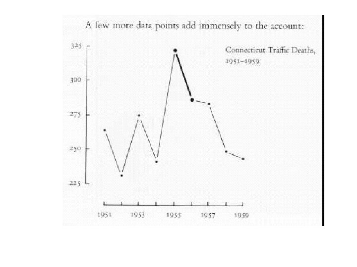
 What’s wrong with this graph? from: ER Tufte. The Visual Display of Quantitative Information. Graphics Press, Cheshire, Connecticut, 1983, p. 74
 What’s the message here? Diagraphics II, 1994
 Diagraphics II, 1994
 From: Johnson R. Just the Essentials of Statistics. Duxbury Press, 1995.
 From: Johnson R. Just the Essentials of Statistics. Duxbury Press, 1995.
 From: Johnson R. Just the Essentials of Statistics. Duxbury Press, 1995.
 From: Johnson R. Just the Essentials of Statistics. Duxbury Press, 1995.
 For more examples… n http: //www. math. yorku. ca/SCS/Gallery/
 “Lying” with statistics n More accurately, misleading with statistics…
 Example 1: projected statistics Lifetime risk of melanoma: 1935: 1/1500 1960: 1/600 1985: 1/150 2000: 1/74 2006: 1/60 http: //www. melanoma. org/mrf_facts. pdf
 Example 1: projected statistics How do you think these statistics are calculated? How do we know what the lifetime risk of a person born in 2006 will be?
 Example 1: projected statistics Interestingly, a clever clinical researcher recently went back and calculated (using SEER data) the actual lifetime risk (or risk up to 70 years) of melanoma for a person born in 1935. The answer? Closer to 1/150 (one order of magnitude off) (Martin Weinstock of Brown University, AAD conference 2006)
 Example 2: propagation of statistics n n In many papers and reviews of eating disorders in women athletes, authors cite the statistic that 15 to 62% of female athletes have disordered eating. I’ve found that this statistic is attributed to about 50 different sources in the literature and cited all over the place with or without citations. . .
 For example… n n n In a recent review (Hobart and Smucker, The Female Athlete Triad, American Family Physician, 2000): “Although the exact prevalence of the female athlete triad is unknown, studies have reported disordered eating behavior in 15 to 62 percent of female college athletes. ” No citations given.
 And… n n Fact Sheet on eating disorders: “Among female athletes, the prevalence of eating disorders is reported to be between 15% and 62%. ” Citation given: Costin, Carolyn. (1999) The Eating Disorder Source Book: A comprehensive guide to the causes, treatment, and prevention of eating disorders. 2 nd edition. Lowell House: Los Angeles.
 And… n n n From a Fact Sheet on disordered eating from a college website: “Eating disorders are significantly higher (15 to 62 percent) in the athletic population than the general population. ” No citation given.
 And… n n “Studies report between 15% and 62% of college women engage in problematic weight control behaviors (Berry & Howe, 2000). ” (in The Sport Journal, 2004) Citation: Berry, T. R. & Howe, B. L. (2000, Sept). Risk factors for disordered eating in female university athletes. Journal of Sport Behavior, 23(3), 207 -219.
 And… n n 1999 NY Times article “But informal surveys suggest that 15 percent to 62 percent of female athletes are affected by disordered behavior that ranges from a preoccupation with losing weight to anorexia or bulimia. ”
 And n “It has been estimated that the prevalence of disordered eating in female athletes ranges from 15% to 62%. ” ( in Journal of General Internal Medicine 15 (8), 577 -590. ) Citations: Steen SN. The competitive athlete. In: Rickert VI, ed. Adolescent Nutrition: Assessment and Management. New York, NY: Chapman and Hall; 1996: 223 47. Tofler IR, Stryer BK, Micheli LJ. Physical and emotional problems of elite female gymnasts. N Engl J Med. 1996; 335: 281 3.
 Where did the statistics come from? The 15%: Dummer GM, Rosen LW, Heusner WW, Roberts PJ, and Counsilman JE. Pathogenic weight-control behaviors of young competitive swimmers. Physician Sportsmed 1987; 15: 75 -84. The “to”: Rosen LW, Mc. Keag DB, O’Hough D, Curley VC. Pathogenic weight-control behaviors in female athletes. Physician Sportsmed. 1986; 14: 79 -86. The 62%: Rosen LW, Hough DO. Pathogenic weight-control behaviors of female college gymnasts. Physician Sportsmed 1988; 16: 140 -146.
 Where did the statistics come from? n Study design? Control group? n n n Cross-sectional survey (all) No non-athlete control groups Population/sample size? n n Convenience samples Rosen et al. 1986: 182 varsity athletes from two midwestern universities (basketball, field hockey, golf, running, swimming, gymnastics, volleyball, etc. ) Dummer et al. 1987: 486 9 -18 year old swimmers at a swim camp Rosen et al. 1988: 42 college gymnasts from 5 teams at an athletic conference
 Where did the statistics come from? n Measurement? n n Instrument: Michigan State University Weight Control Survey Disordered eating = at least one pathogenic weight control behavior: n n n n Self-induced vomiting fasting Laxatives Diet pills Diuretics In the 1986 survey, they required use 1/month; in the 1988 survey, they required use twice-weekly In the 1988 survey, they added fluid restriction
 Where did the statistics come from? n Findings? n n n Rosen et al. 1986: 32% used at least one “pathogenic weight-control behavior” (ranges: 8% of 13 basketball players to 73. 7% of 19 gymnasts) Dummer et al. 1987: 15. 4% of swimmers used at least one of these behaviors Rosen et al. 1988: 62% of gymnasts used at least one of these behaviors
 References n n n http: //www. math. yorku. ca/SCS/Gallery/ Kline et al. Annals of Emergency Medicine 2002; 39: 144 -152. Statistics for Managers Using Microsoft® Excel 4 th Edition, 2004 Prentice-Hall Tappin, L. (1994). "Analyzing data relating to the Challenger disaster". Mathematics Teacher, 87, 423426 Tufte. The Visual Display of Quantitative Information. Graphics Press, Cheshire, Connecticut, 1983. Visual Revelations: Graphical Tales of Fate and Deception from Napoleon Bonaparte to Ross Perot Wainer, H. 1997.