
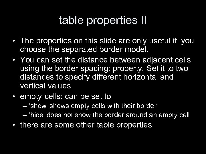
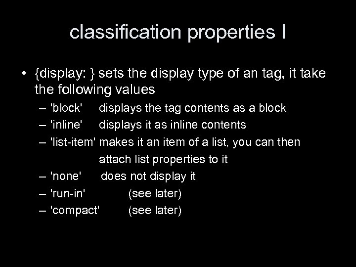
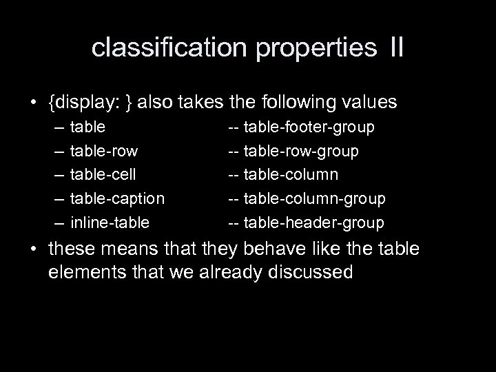
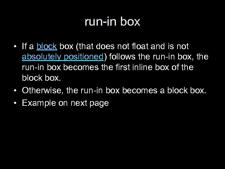
and a paragraph of text that follows it and it continues on the line of the h 3
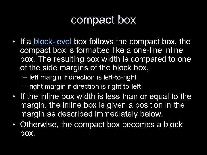 compact box • If a block-level box follows the compact box, the compact box is formatted like a one-line inline box. The resulting box width is compared to one of the side margins of the block box, – left margin if direction is left-to-right – right margin if direction is right-to-left • If the inline box width is less than or equal to the margin, the inline box is given a position in the margin as described immediately below. • Otherwise, the compact box becomes a block box.
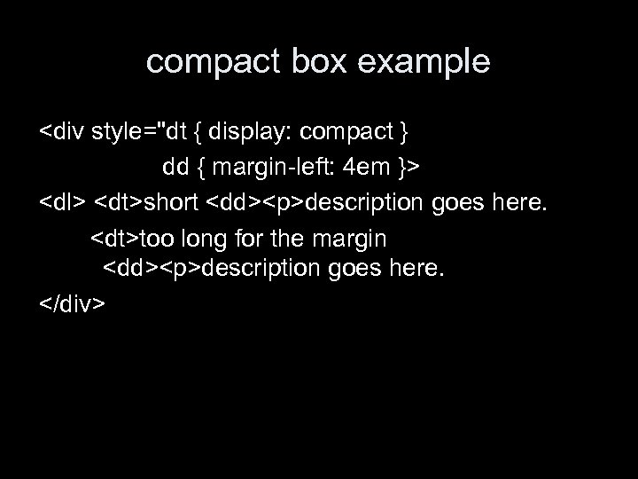 compact box example
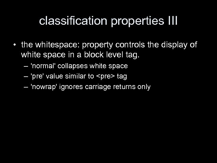 classification properties III • the whitespace: property controls the display of white space in a block level tag. – 'normal' collapses white space – 'pre' value similar to
tag – 'nowrap' ignores carriage returns only
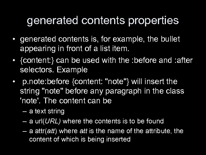 generated contents properties • generated contents is, for example, the bullet appearing in front of a list item. • {content: } can be used with the : before and : after selectors. Example • p. note: before {content: "note"} will insert the string "note" before any paragraph in the class 'note'. The content can be – a text string – a url(URL) where the contents is to be found – a attr(att) where att is the name of the attribute, the content of which is being inserted
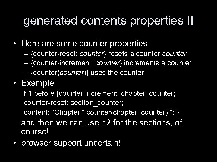 generated contents properties II • Here are some counter properties – {counter-reset: counter} resets a counter – {counter-increment: counter} increments a counter – {counter(counter)} uses the counter • Example h 1: before {counter-increment: chapter_counter; counter-reset: section_counter; content: "Chapter " counter(chapter_counter) ": "} and then we can use h 2 for the sections, of course! • browser support uncertain!
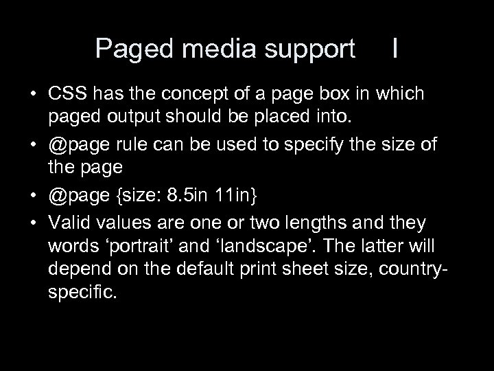 Paged media support I • CSS has the concept of a page box in which paged output should be placed into. • @page rule can be used to specify the size of the page • @page {size: 8. 5 in 11 in} • Valid values are one or two lengths and they words ‘portrait’ and ‘landscape’. The latter will depend on the default print sheet size, countryspecific.
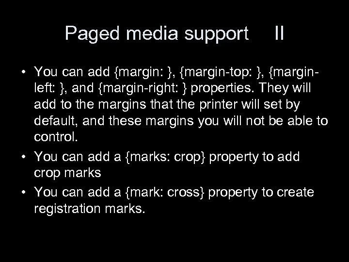 Paged media support II • You can add {margin: }, {margin-top: }, {marginleft: }, and {margin-right: } properties. They will add to the margins that the printer will set by default, and these margins you will not be able to control. • You can add a {marks: crop} property to add crop marks • You can add a {mark: cross} property to create registration marks.
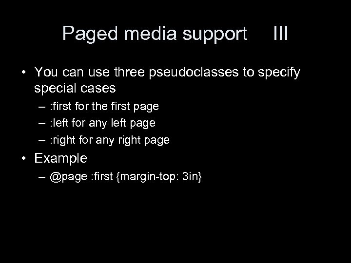 Paged media support III • You can use three pseudoclasses to specify special cases – : first for the first page – : left for any left page – : right for any right page • Example – @page : first {margin-top: 3 in}
 Named pages • You can give a page rule an optional name. Example @page rotated { size: landscape} • Then you can use this with the ‘page’ property to specify specific ways to print things. Example table {page: rotated} will print the table on a landscape sheet. This comes in handy for bulky tables.
 Actual page breaking • Pages will break if – the current page box flows over or if – a new page format is being used with a {page: } property • You can take some control with the {page-breakbefore: } and {page-break-after: } properties. They take the values – auto – always – avoid – left – right The latter two make sure that the element is on a left or right page. Sometimes this will require two page breaks.
 conclusions • These are not all the properties. • Audio properties are still missing • But I am not sure if I should go into more.
 Nielsen on site design • This is the longest of the chapters in his book. • It is about the organization of sites. • But the chapter itself is badly organized. It looks like a Jackson Pollock painting and reads like a bad student essay – no structure – things repeated from before
 Nielsen on site design • Usually there is more attention on pages design than on site design. Presumably because the page design is visual. • But site design is more important. • Study found that only 42% of users could find simple answers to questions on a web site.
 the home page • has to be designed differently than other pages. • must answer the questions – where am I? – what does this site do? • need a directory of main area • needs a summary of the site purpose • a principal search feature may be included, otherwise a link to a search page will do • you may want to put news, but not prominently
 the home page • make the home pages a splash screen is not a good idea • the name of the site should be very prominent, more so than on interior pages, where it should also be named • There should be a link to the homepage from all interior pages, maybe in the logo. • The less famous a site, the more it has to have information about the site on interior pages. • Users should not be "forced" to go through the home page.
 metaphor • (why does he talk about this here? ) • it is usually not a good idea to have metaphor on the home page. • a notable exception: the shopping cart – has become a standard feature – but still illustrates some limits of metaphors • when you want to buy multiple items of the same kind • when you want to move something out of the cart
 why navigation? • Navigation should address three questions – where am I? • relative to the whole web • relative to the site • the former dominates, as users only click through 4 to 5 pages on a site – where have I been? • but this is mainly the job of the browser esp. if links colors are not tempered with – where can I go? • this is a matter for site structure
 site structure • to visualize it, you have to have it first. Poor information architecture will lead to bad usability. • Some sites have a linear structure, • but most sites are hierarchically organized. • What ever the structure, it has to reflect the users' tasks, not the company structure.
 Nielsen's example company • A corporate site may be divided into – product information • product families – individual products – employment information --investor information • Now consider a page with configuration and pricing for Super. Widgets. It may belong to – company's web site -- Widgets products – products category -- Super. Widgets – pricing and configuration Nielsen says: show all five levels of navigation. Have links to Widgets. Classic and Mini. Widgets on the Super. Widgets page.
 breath vs depth in navigation • some sites list all the top categories on the left or top – users are reminded of all that the site has to offer – stripe can brand a site through a distinctive look • an alternative is to list the hierarchical path to the position that the user is in, through the use of breadcrumbs – can be done as a one liner • combining both – takes up a lot of space -- can be done as an L shape – recommended for large (10 k+ pages) with heterogeneous contents
 large volumes of information • most user interfaces on the web are clones of the design of the Mac in 1984. They are not designed to handle vast amounts of information. Nielsen does not say why. • Historically, early web pages had long lists of links • Nowadays, there is more selective linking • Users want site maps but they don't seem to be much help.
 reducing navigational clutter • aggregation shows that a single piece of data is part of a whole • summarization represents large amounts of data by a smaller amount • filtering is throwing out information that we don't need • truncation is having a "more" link on a page • example-based presentation is just having a few examples
 subsites • most sites are too large for the page belonging to them adding much information. • therefore subsites can add structure • a subsite is a bunch of pages with common appearance and navigational structure, with one page as the home page. – each page in the subsite should point to the subsite home page as well as to global homepage – should combine global and local navigation
 search and link behavior • Nielson says that his studies show that slightly more than 50% of users are search-dominant, they go straight to the search. • One in five users is link-dominant. They will only use the search after extensive looking around the site through links • The rest have mixed behavior. They will make up their mind depending on the task and the look of the site.
 search • site search should be on all pages • in general it is not a good idea to scope the search to the subsite that you are on – users don't understand the site structure – users don't understand the scope of the search • if you have a scoped search – state the scope in query and results page – include link to the search of the whole site, in query and results page "not found? … try to search entire site"
 Boolean searches • they should be avoided because noone understands them. • Example task. – "you have the following pets: • cats • dogs – find information about your pet" – users search "cats and dogs" and find nothing. – geeks or librarians among users will then say "oh, I should have used OR".
 help the user search • Nielsen says that computers are good at remembering synonyms, checking spelling etc, so they should evaluate the query and make suggestions on how to improve it. • but I am not aware of systems that do this "out of the box". • use a wide box. Information retrieval research has shown that users tend to enter more words in a wider box.
 the results page • computed relevance scores are useless for the user • URLs pointing to the same page should be consolidated • search should use quality evaluation. say, if the query matches the FAQ, the FAQ should give higher ranking. • [he has other suggestions that are either unrealistic or would be part of serious information retrieval research]
 metadata • Nielsen thinks that metadata should be used because humans are better at saying what the page is about than machines. • He recommends writing into the "name" attribute of with the value 'description' • He also says you should add keywords, with your own keywords and those of your competitors. • He mentions no engine that uses these…
 search destination design • when the user follows a link from search to a page, the page should be presented in context of the user's search • the most common way is to highlight all the occurrences of the search terms. – This helps scanning the destination page. – Helps understanding why the user reached this result. – [but will be no good if the term is in the metadata]
 URL design • URLs should not be part of design, but in practice, they are. • Leave out the "http: //" when referring to your web page. • You need a good domain name that is easy to remember.
 understandable URLs • Users rely on reading URLs when getting an idea about where they are on the web site. – all directory names must be human-readable – they must be words or compound words • site must support URL butchering where users remove the trailing part after a slash • make URLs as short as possible • use lowercase letters throughout • avoid special chars i. e. anything but letters or digits • stick to one visual word separator, i. e. either hyphen or underscore
 archival URL • After search engines and email recommendations, links are third most common way for people to come across a web site. • Incoming links must not be discouraged by changing site structures
 dealing with yesterday current contents • Sometimes it is necessary to have two URLs for the same contents: – "todays_news" … – "feature_2003 -12 -06" some may wish to link to the former, others to the latter • In this case you should advertise the URL at which the contents is archived (immediately) an hope that link providers will link to it there. • You can put a note on the bottom of the page, or possibly use a simple convention if it is very easy to guess.
 supporting old URLs • Old URLs should be kept alive for as long as possible. • Best way to deal with them is to set up a http redirect 301 – good browsers will update bookmarks – search engines will delete old URLs • There is also a 302 temporary redirect.
• This method has a bad" src="https://present5.com/presentation/5f837581fa447c4f76549cdb1b5c82c0/image-54.jpg" alt="refresh header •
 . htaccess • If you use Apache, you can create a file. htaccess (note the dot!) with a line redirect 301 old_url new_url • old_url must be a relative path from the top of your site • new_url can be any URL, even outside your site • This works on wotan by virtue of configuration set for apache for your home directory. Examples – redirect 301 /~krichel http: //openlib. org/home/krichel – redirect 301 Cantcook. jpg http: //www. foodtv. com
 http: //openlib. org/home/krichel Thank you for your attention!