185bb6de70f4c7c369dc129230daf241.ppt
- Количество слайдов: 80
LIS 650 lecture 3 Web site design Thomas Krichel 2004 -12 -04
Web site design • This is supposed to be a big topic in the LIS community. • There a lot of articles about using individual web sites, but there is little scientific material out there related to actual design. • But it really comes down to common sense. • There is no absolute right/wrong.

Learn from some experts – Experts discussed here • Krug – not technical • Nielsen – has tons of technical advice – weak on overall site design • Morville and Rosenfeld – site architecture focus, but mainly common-sensical blah – Much of their advice discusses active web sites, not passive ones as the ones that we will build here.
Krug's book • Short • Deals mainly with the issue of how to build commercial web sites. • Here user confusion is the cause of lost money. • He mainly deals with sites that have – extensive scale – searching and browsing – user interaction • Our sites for this course do not have these features.
Krug's advice • Krug's rule #1: Don’t make me think. – a site should be obvious – if it can not be obvious, it must be self-explanatory • Things that make think – non-standard terms • jobs • employment opportunities • job-o-rama – links and buttons that are not obvious to find
search example • Contrast – http: //www. sl. nsw. gov. au/webcat/srchhelp_w. cfm – http: //www. amazon. com for search. • Note, however, that search forms are not part of this course.
How people use the web • Received wisdom would suggest – people read the page – then make the best decision. • That is wrong. Instead, people – scan pages – look for something that seems vaguely related to the current aim – click on it if clickable • User satisfice (term by Herbert Simon, a cross between satisfying and sufficing)
why do they do that? • Why do users satisfice? – – Users are in a hurry. The penalty for a wrong guess is low. Weighing option does not seem much help. Guessing is more fun. • Users don't figure out how things work. They muddle through – It does not matter how things work – When they have found something that is useful to them, users stick with it.
Krug's advice • Create clear visual hierarchy. – the more important something is, the more prominent it should be – things that relate logically should relate visually – things that are part of something else should be nested visually within it. • Use conventions – they have proven useful – users have seen them before • Break pages into separate parts • Make obvious what is clickable
Krug's advice • Krug's second law: it does not matter how many times I have to click as long as each click is a mindless, unambiguous choice. • Krug's third law: Get rid of half the words on each page, and then get rid of half of what is left. – no happy talk – no instructions
Building navigation • For commercial web sites, people are usually trying to find something. • It is more difficult than in a shop – no sense of scale – no sense of direction – no sense of location • Navigation can – – give users something to hold on to tell users what is here explain users how to use the site give confidence in the site builder
Navigation elements • Site ID • Sections of items • utilities – link to home page – link to search page – separate instructions sheet • Current location needs to be highlighted.
ways to do navigation • Breadcrumbs like "store > fruit & veg > tomato" • Tabs, like the ones seen in Amazon. com – Krug's favorite. • A table on the left or right hand side that stays the same – will do just fine for us • Pull-down menus • Rollovers
navigational elements on the page • All pages except should have navigation except perhaps – home page – search page – instructions pages • Page names are also important – – every page needs one in the frame of contents that is unique to the page the name needs to be prominent the name needs to match what users click to get there.
Home page design • For large site, it is a mission impossible • But above all it has to convey the big picture – tagline • • • clear and informative just long enough differentiating clear benefit showing lively, personable and sometimes clever – welcome blurb – but no mission statement
bad home pages • • put a banner add even though they don't need it let deals drive the home page promote everything are greedy for user data
That's about all from Krug, folks • The rest of the book is about how to do usability testing. • But before he gets to that he has an interesting cartoon / story. • The morale of the story, as far as I am concerned is that you need to have enough technical expertise.

Jakob Nielsen • • The self-styled “King of Usability”. He has a web site at http: //www. useit. com This is recommended reading. His book, which we discuss here, is expensive and long-winded. For your purposes, stay with the web site. Use the web site, and these class notes to prepare the web page assessment. • Use your brain too. • Nielsen is very conservative. So am I.
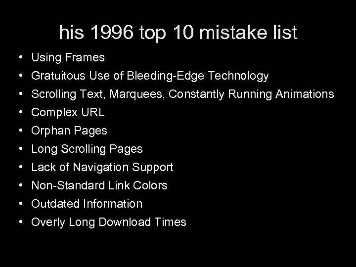
his 1996 top 10 mistake list • Using Frames • Gratuitous Use of Bleeding-Edge Technology • Scrolling Text, Marquees, Constantly Running Animations • Complex URL • Orphan Pages • Long Scrolling Pages • Lack of Navigation Support • Non-Standard Link Colors • Outdated Information • Overly Long Download Times
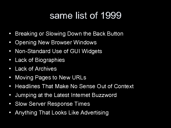
same list of 1999 • Breaking or Slowing Down the Back Button • Opening New Browser Windows • Non-Standard Use of GUI Widgets • Lack of Biographies • Lack of Archives • Moving Pages to New URLs • Headlines That Make No Sense Out of Context • Jumping at the Latest Internet Buzzword • Slow Server Response Times • Anything That Looks Like Advertising
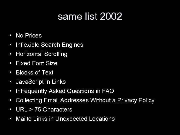
same list 2002 • No Prices • Inflexible Search Engines • Horizontal Scrolling • Fixed Font Size • Blocks of Text • Java. Script in Links • Infrequently Asked Questions in FAQ • Collecting Email Addresses Without a Privacy Policy • URL > 75 Characters • Mailto Links in Unexpected Locations
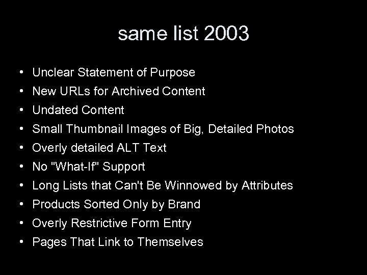
same list 2003 • Unclear Statement of Purpose • New URLs for Archived Content • Undated Content • Small Thumbnail Images of Big, Detailed Photos • Overly detailed ALT Text • No "What-If" Support • Long Lists that Can't Be Winnowed by Attributes • Products Sorted Only by Brand • Overly Restrictive Form Entry • Pages That Link to Themselves
top ten guidelines for the homepage • Include a One-Sentence Tagline • Write a Window Title with Good Visibility in Search Engines and Bookmark Lists • Group all Corporate Information in One Distinct Area • Emphasize the Site's Top High-Priority Tasks • Include a Search Input Box • Show Examples of Real Site Content • Begin Link Names with the Most Important Keyword • Offer Easy Access to Recent Homepage Features • Don't Over-Format Critical Content, Such as Navigation Areas • Use Meaningful Graphics
Nielson's book • • page design 16— 97 content design 98— 160 site design 162— 259 intranet design 260— 293 accessibility 296— 311 i 18 n 312— 344 future predictions 346— 376 conclusions 378— 396
screen real estate • on a screen that displays a web page, as much as possible should be the contents of the page. • Ideally the contents should occupy more than 50% of the screen. Most often it does not. • Some white space is almost inevitable • Cut navigation to below 20% of screen • When examining a page for usability, remove features by trial and error. If the page is still usable without the feature, remove it. Simplicity wins over complexity.
cross-platform design • Unlike traditional GUI systems, the web offers very little to control the designer – Users could come right into the middle of the site from a search engine. – Users could use a variety of devices, e. g. web browser for car drivers • Most pages only look good on an 17 in monitor with at least 1024× 768 pixels. It should not be that way. • WYSIWYG is dead! • Separate contents from presentation, use style sheets.
resolution independent design • Never use fixed width in pixels except perhaps for thin stripes and lines • Make sure that design looks good with small and large fonts in the browser. • Graphics must work at 100 dpi and better. • Text in graphics to be avoided. • Provide a print version for long documents.
be conservative • Avoid non-standard HTML code. • Take account of installation inertia. Figures for 1998/1999 show 1% of browsers updated a week. • Only use technology that is at least 1 year old, if not at 2 years old. Let other make the errors that come with trial.
semantics versus presentation • The original HTML tags were all based on semantics. For example <h 2> is a second level heading. • Semantic encoding was lost with the "extensions" invented by the browser vendors. • There will be a wide variety of browser in the future. It is already impossible to test pages on all user agents. • Style sheets already make it possible to style the page according to the "media" used by the user agent.
watch response times • Users loath waiting for downloads. • Classic research by Mille in 1968 found: – delay below 0. 1 second means instantaneous reaction to the user – 1 second is the limit for the user's train of thought not to be disrupted – 10 seconds is the limit to keep the user interested, otherwise they will start a parallel task • low variability of responses is also important but the web is notoriously poor for this.
factors affecting speed • The user's perceived speed depends on the weakest of the following – – – the throughput of the server's connection to the Internet the speed of the Internet the user's connection to the Internet the rendering speed of the computer
making speedy pages • keep page sizes small • reduce use of graphics • use multimedia only when it adds to the user's understanding • use the same image several times on the site • make sure that the / appear at the end of the URL for directories. http: //openlib. org/home/krichel/ downloads faster than http: //openlib. org/home/krichel
know your limits • 1 second implies maximum pages size of 2 KB on a modem, 8 KB on ISDN, and 100 KB on a T 1. 10 seconds implies maximum size of 34 KB on a modem, 150 KB on an ISDN and 2 MB on T 1, Nielsen writes. • I doubt these numbers. • It would be good to find an update on these numbers.
Web site usability • This is supposed to be a big topic in the LIS community. • There a lot of articles about using individual web sites, but there is little scientific material out there related to actual design. • But it really comes down to common sense. • There is no absolute right/wrong.
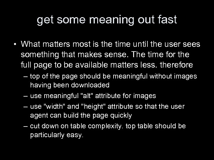
get some meaning out fast • What matters most is the time until the user sees something that makes sense. The time for the full page to be available matters less. therefore – top of the page should be meaningful without images having been downloaded – use meaningful "alt" attribute for images – use "width" and "height" attribute so that the user agent can build the page quickly – cut down on table complexity. top table should be particularly easy.

Nielsen on style sheets • "one of the greatest hopes for recapturing the Web's ideal of separation of presentation and contents". • That why this course studies them extensively! • Use a single style sheet for your site. • Always use external style sheets. – organizational benefits maximized – faster loading • Make sure your site still looks reasonable in your browser when you turn CSS off and reload the page
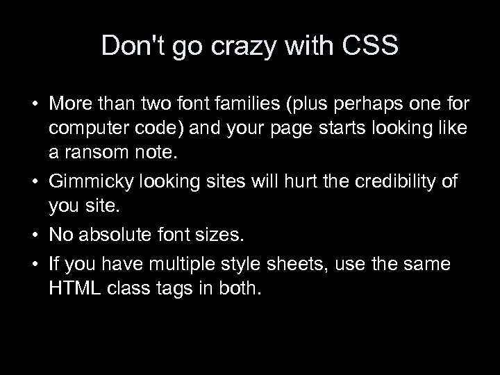
Don't go crazy with CSS • More than two font families (plus perhaps one for computer code) and your page starts looking like a ransom note. • Gimmicky looking sites will hurt the credibility of you site. • No absolute font sizes. • If you have multiple style sheets, use the same HTML class tags in both.
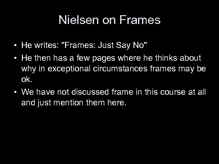
Nielsen on Frames • He writes: "Frames: Just Say No" • He then has a few pages where he thinks about why in exceptional circumstances frames may be ok. • We have not discussed frame in this course at all and just mention them here.
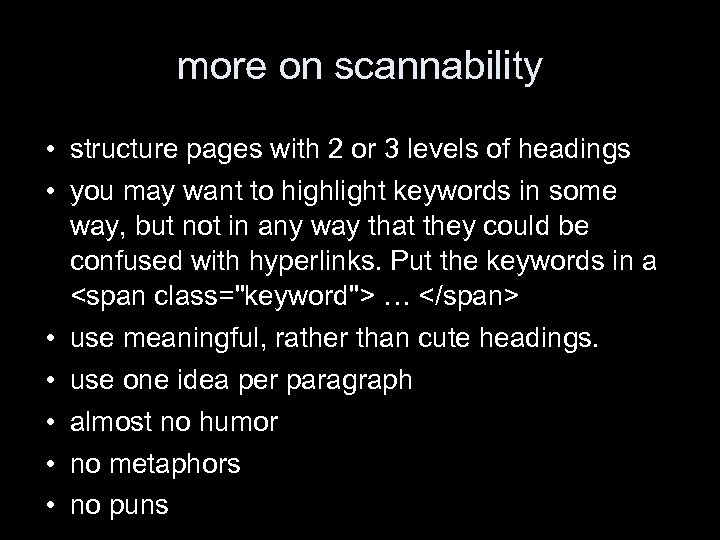
more on scannability • structure pages with 2 or 3 levels of headings • you may want to highlight keywords in some way, but not in any way that they could be confused with hyperlinks. Put the keywords in a <span class="keyword"> … </span> • use meaningful, rather than cute headings. • use one idea per paragraph • almost no humor • no metaphors • no puns
page chunking • Just simply splitting a long article by into different parts for linear reading is not good. • Devise a strategy of front pages with the important information and back pages linked from the front pages with the detail. • Base the distinction of important and not important stuff on audience analysis.
users rarely scroll • early studies showed 10% of users would scroll. • on navigational pages, users will tend to click something they see in the top portion. • scrolling navigational pages are bad because users can not see all the options at the same time. • the length of "destination" pages for users interested in details is less of a problem.
page <title> • needs to be cleverly chosen to summarize the page in a contents of a web search engine, esp. • between 40 to 60 chars long • different pages in a site should each have their own title. • No – welcome – "a" "the" etc. .

headline design • Explain clearly what the page is about • Use plain language • Skip leading articles ("A", "the". . ) in email subjects and page titles • Make the first word the most important one • Do not start all pages with the same word.
legibility • Use high color contrast. • Use plain or very subtle background images. • Make the text stand still – no zooming – no blinking – no moving • Left-align almost always • No all uppercase, it reads 10% slower.
rules for online documentation (if you must have some) • • It is essential to make it searchable Have an abundance of examples Instructions should be task-oriented Nevertheless, you may have to provide a conceptual introduction to the system • Hyperlink to a glossary
multimedia • Since such files are long, they should have an indication of their size • Write a summary of what happens in the multimedia document • For a video, provide a couple of still images. This will give people – quick visual scan of the contents of the multimedia – an impression of the quality of the image
pictures • Have a picture on a bio page • No gratuitous images • More pictures on background pages, that are reached by users with in-depth interest. • Never have a picture look like an advertising banner. • Maybe not have as many pictures of yourself on your site as Jakob Nielsen has.
animation • Animal instinct draws human attention to moving things • A spinning logo is a killer for reading, if you have it, have it spin only a few times • No scrolling marquees!
animation may be good for • • Showing continuity in transition Indication dimensionality in transaction Illustrating change over time Multiplexing the display Enriching graphical representation Visualizing three dimensional structures Attracting attention but we will not discuss this as it is out of scope for the course
streaming video • limited by available bandwidth • could be used for – promoting television shows, films etc – give user impression of a speaker's personality (if any) – demonstrate things that move • good for demo of physical products • less good for demos of software • watch out for narration quality
downloadable video • • probably better than streaming breaks the interactive mode of use on the web should be limited in length, say < 1 minute big topics should be broken down on a web page into smaller ones, each having its own video.
audio • probably a better way to convey a speaker's personality • can teach the pronunciation of words • can enhance the user experience, a classic study had users claiming that the graphics were better on a video game that had better sound but the same graphics than another.
3 D graphics • has a range of problems – man is not made for 3 D watching – screen is not made for rendering 3 D – interaction tools such as mouse have not been made for 3 D – poor screen resolution – requires plug-ins • therefore it should not be used unless absolutely necessary.
Nielsen on site design • This is the longest of the chapters in his book. • It is about the organization of sites. • But the chapter itself is badly organized. It looks like a Jackson Pollock painting and reads like a bad student essay – no structure – things repeated from before
Nielsen on site design • Usually there is more attention on pages design than on site design. Presumably because the page design is visual. • But site design is more important. • Study found that only 42% of users could find simple answers to questions on a web site.
the home page • has to be designed differently than other pages. • must answer the questions – where am I? – what does this site do? • need a directory of main area • needs a summary of the site purpose • a principal search feature may be included, otherwise a link to a search page will do • you may want to put news, but not prominently
the home page • make the home pages a splash screen is not a good idea • the name of the site should be very prominent, more so than on interior pages, where it should also be named • There should be a link to the homepage from all interior pages, maybe in the logo. • The less famous a site, the more it has to have information about the site on interior pages. • Users should not be "forced" to go through the home page.
metaphor • (why does he talk about this here? ) • it is usually not a good idea to have metaphor on the home page. • a notable exception: the shopping cart – has become a standard feature – but still illustrates some limits of metaphors • when you want to buy multiple items of the same kind • when you want to move something out of the cart
why navigation? • Navigation should address three questions – where am I? • relative to the whole web • relative to the site • the former dominates, as users only click through 4 to 5 pages on a site – where have I been? • but this is mainly the job of the browser esp. if links colors are not tempered with – where can I go? • this is a matter for site structure
site structure • to visualize it, you have to have it first. Poor information architecture will lead to bad usability. • Some sites have a linear structure, • but most sites are hierarchically organized. • What ever the structure, it has to reflect the users' tasks, not the company structure.
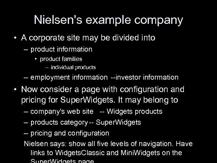
Nielsen's example company • A corporate site may be divided into – product information • product families – individual products – employment information --investor information • Now consider a page with configuration and pricing for Super. Widgets. It may belong to – company's web site -- Widgets products – products category -- Super. Widgets – pricing and configuration Nielsen says: show all five levels of navigation. Have links to Widgets. Classic and Mini. Widgets on the
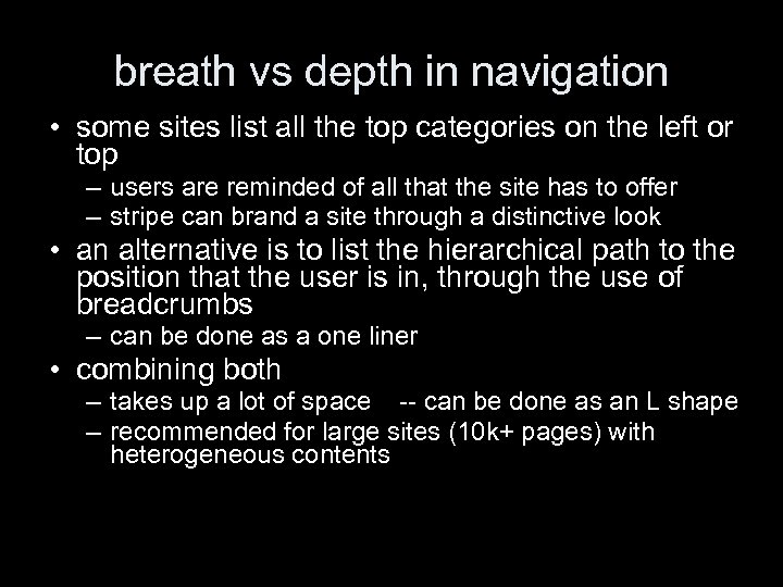
breath vs depth in navigation • some sites list all the top categories on the left or top – users are reminded of all that the site has to offer – stripe can brand a site through a distinctive look • an alternative is to list the hierarchical path to the position that the user is in, through the use of breadcrumbs – can be done as a one liner • combining both – takes up a lot of space -- can be done as an L shape – recommended for large sites (10 k+ pages) with heterogeneous contents
large volumes of information • most user interfaces on the web are clones of the design of the Mac in 1984. They are not designed to handle vast amounts of information. Nielsen does not say why. • Historically, early web pages had long lists of links • Nowadays, there is more selective linking • Users want site maps but they don't seem to be much help.
reducing navigational clutter • aggregation shows that a single piece of data is part of a whole • summarization represents large amounts of data by a smaller amount • filtering is throwing out information that we don't need • truncation is having a "more" link on a page • example-based presentation is just having a few examples
subsites • most sites are too large for the page belonging to them adding much information. • therefore subsites can add structure • a subsite is a bunch of pages with common appearance and navigational structure, with one page as the home page. – each page in the subsite should point to the subsite home page as well as to global homepage – should combine global and local navigation
search and link behavior • Nielson says that his studies show that slightly more than 50% of users are search-dominant, they go straight to the search. • One in five users is link-dominant. They will only use the search after extensive looking around the site through links • The rest have mixed behavior. They will make up their mind depending on the task and the look of the site.
search • site search should be on all pages • in general it is not a good idea to scope the search to the subsite that you are on – users don't understand the site structure – users don't understand the scope of the search • if you have a scoped search – state the scope in query and results page – include link to the search of the whole site, in query and results page "not found? … try to <a>search entire site</a>"
Boolean searches • they should be avoided because nobody understands them. • Example task. – "you have the following pets: • cats • dogs – find information about your pet" – users search "cats and dogs" and find nothing. – geeks or librarians among users will then say "oh, I should have used OR".

help the user search • Nielsen says that computers are good at remembering synonyms, checking spelling etc, so they should evaluate the query and make suggestions on how to improve it. • but I am not aware of systems that do this "out of the box". • use a wide box. Information retrieval research has shown that users tend to enter more words in a wider box.
the results page • computed relevance scores are useless for the user • URLs pointing to the same page should be consolidated • search should use quality evaluation. say, if the query matches the FAQ, the FAQ should give higher ranking. • [he has other suggestions that are either unrealistic or would be part of serious information retrieval research]

metadata • Nielsen thinks that metadata should be used because humans are better at saying what the page is about than machines. • He recommends writing into the "name" attribute of <meta> with the value 'description' • He also says you should add keywords, with your own keywords and those of your competitors. • He mentions no engine that uses these…
search destination design • when the user follows a link from search to a page, the page should be presented in context of the user's search • the most common way is to highlight all the occurrences of the search terms. – This helps scanning the destination page. – Helps understanding why the user reached this result. – [but will be no good if the term is in the metadata]
URL design • URLs should not be part of design, but in practice, they are. • Leave out the "http: //" when referring to your web page. • You need a good domain name that is easy to remember.
understandable URLs • Users rely on reading URLs when getting an idea about where they are on the web site. – all directory names must be human-readable – they must be words or compound words • site must support URL butchering where users remove the trailing part after a slash • make URLs as short as possible • use lowercase letters throughout • avoid special chars i. e. anything but letters or digits • stick to one visual word separator, i. e. either hyphen or underscore
archival URL • After search engines and email recommendations, links are third most common way for people to come across a web site. • Incoming links must not be discouraged by changing site structures
dealing with yesterday current contents • Sometimes it is necessary to have two URLs for the same contents: – "todays_news" … – "feature_2004 -09 -12" some may wish to link to the former, others to the latter • In this case you should advertise the URL at which the contents is archived (immediately) an hope that link providers will link to it there. • You can put a note on the bottom of the page, or possibly use a simple convention if it is very easy
supporting old URLs • Old URLs should be kept alive for as long as possible. • Best way to deal with them is to set up a http redirect 301 – good browsers will update bookmarks – search engines will delete old URLs • There is also a 302 temporary redirect.

refresh header • <head><meta http-equiv="refresh" content="0; url=new_url"> </head> • This method has a bad reputation because it is used by search engine spammers. They create pages with useful keywords, and then the user is redirect to a page with spam contents.

. htaccess • If you use Apache, you can create a file. htaccess (note the dot!) with a line redirect 301 old_url new_url • old_url must be a relative path from the top of your site • new_url can be any URL, even outside your site • This works on wotan by virtue of configuration set for apache for your home directory. Examples – redirect 301 /~krichel http: //openlib. org/home/krichel – redirect 301 Cantcook. jpg http: //www. foodtv. com

http: //openlib. org/home/krichel Please shutdown the computers when you are done. Thank you for your attention!
185bb6de70f4c7c369dc129230daf241.ppt