eb187ee3b0dcf4d5dbc00a7a9fe7ded2.ppt
- Количество слайдов: 37
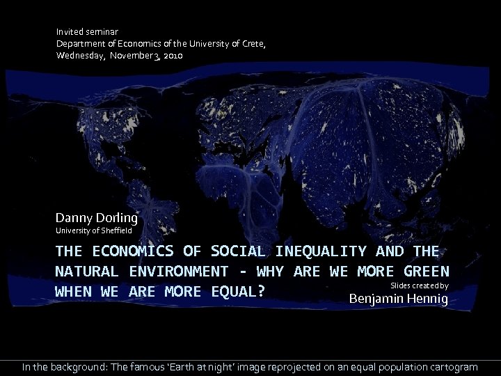 Invited seminar Department of Economics of the University of Crete, Wednesday, November 3, 2010 Danny Dorling University of Sheffield THE ECONOMICS OF SOCIAL INEQUALITY AND THE NATURAL ENVIRONMENT - WHY ARE WE MORE GREEN Slides created by WHEN WE ARE MORE EQUAL? Benjamin Hennig In the background: The famous ‘Earth at night’ image reprojected on an equal population cartogram
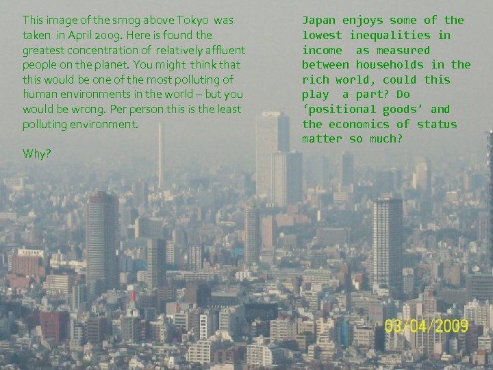 This image of the smog above Tokyo was taken in April 2009. Here is found the greatest concentration of relatively affluent people on the planet. You might think that this would be one of the most polluting of human environments in the world – but you would be wrong. Per person this is the least polluting environment. Why? Japan enjoys some of the lowest inequalities in income as measured between households in the rich world, could this play a part? Do ‘positional goods’ and the economics of status matter so much?
 From the ground Tokyo looks far ………more green This photograph is taken near a very affluent part
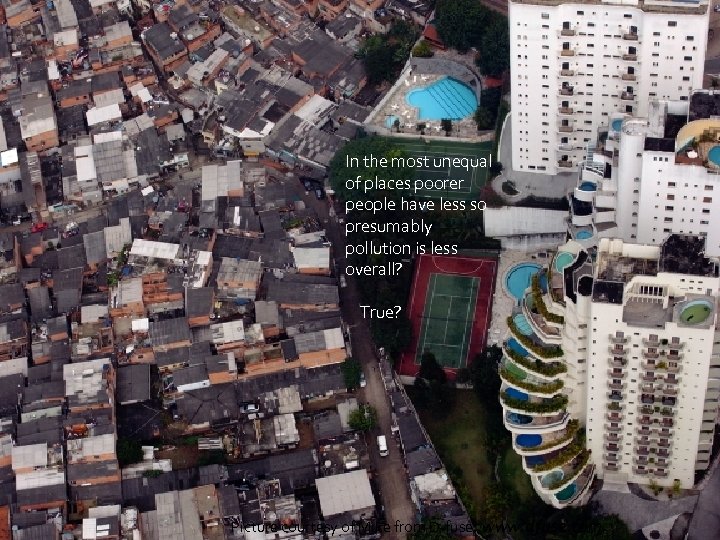 In the most unequal of places poorer people have less so presumably pollution is less overall? True? Picture courtesy of Mike from D-fuse: www. dfuse. com
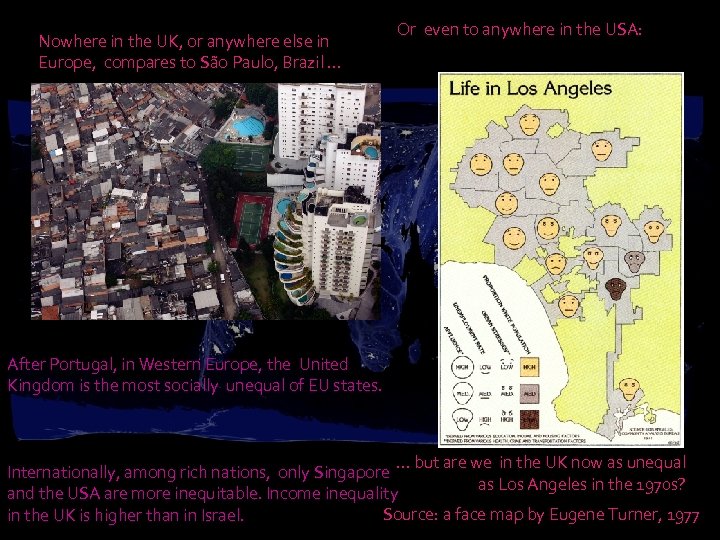 Nowhere in the UK, or anywhere else in Europe, compares to São Paulo, Brazil … Or even to anywhere in the USA: After Portugal, in Western Europe, the United Kingdom is the most socially unequal of EU states. … but are we in the UK now as unequal Internationally, among rich nations, only Singapore as Los Angeles in the 1970 s? and the USA are more inequitable. Income inequality Source: a face map by Eugene Turner, 1977 in the UK is higher than in Israel.
 The effects of inequality are found in many aspects of life, from child poverty to parks In Britain today “…people living in deprived areas have five times less parks and general public space than the most affluent 20 per cent of areas. If you live in an area where more than 40 per cent of the population are people from black and minority ethnic groups, you will have 11 times less public green space than areas where fewer than 2 percent of their population are people from minority ethnic groups. ” (CABE, report launched June 6 th 2010: Urban green nation: Building the evidence base ) How unusual is this? The best-off fifth of people in Britain now earn and receive 7. 2 times the income of the worse-off fifth (6. 9 in 1997). Is it any surprise that the best-off have access to 5 times more parks and other green space? Source: Injustice, why social inequality persists (Bristol: Policy press, 2010)
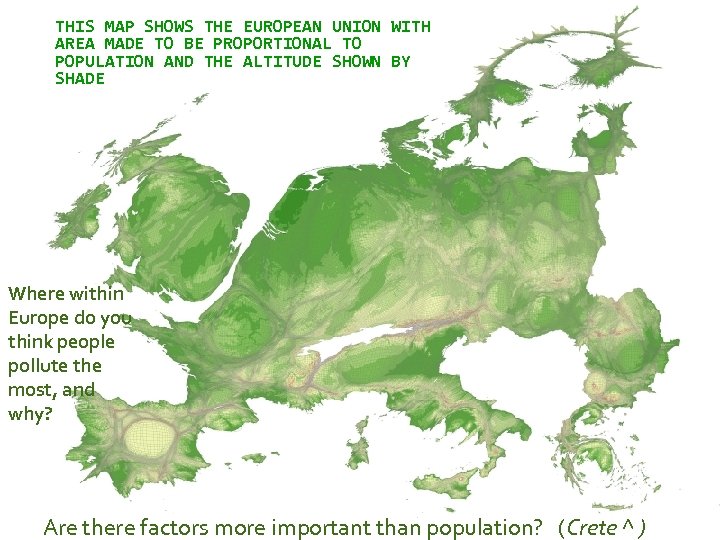 THIS MAP SHOWS THE EUROPEAN UNION WITH AREA MADE TO BE PROPORTIONAL TO POPULATION AND THE ALTITUDE SHOWN BY SHADE Where within Europe do you think people pollute the most, and why? Are there factors more important than population? (Crete ^ )
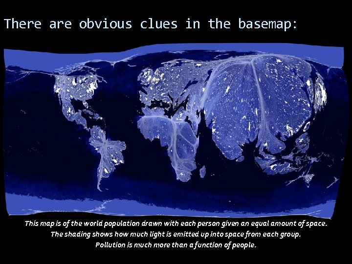 There are obvious clues in the basemap: This map is of the world population drawn with each person given an equal amount of space. The shading shows how much light is emitted up into space from each group. Pollution is much more than a function of people.
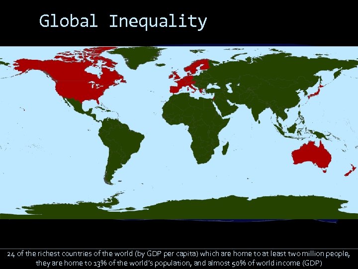 Global Inequality 24 of the richest countries of the world (by GDP per capita) which are home to at least two million people, they are home to 13% of the world’s population, and almost 50% of world income (GDP)
 Global Population Germany UK USA France Spain This is a reprojection of the population distribution, showing where most people are living A few countries are highlighted to make it easier to read. Japan
 Global Wealth UK USA Germany France Spain The world resized according to each country’s gross domestic product Source: modified and updated map from www. worldmapper. org Japan
 Inequality in Britain 2010: By wealth Britain has become more unequal that at any time since 1918. This is not least because of continuously rising income inequalities. Rising income inequalities, even after tax move the country a quarter of the way towards the position of the USA (1997 -2008). Health inequalities between areas surpass the last maxima recorded in the 1930 s. Sources: see http: //www. sheffield. ac. uk/geography/staff/dorling_danny/papers. html
 Understanding Inequality can be explained by looking at the ratio of the share of income from the richest 10% to the poorest 10% of the population. In the United Kingdom this ratio is 13∙ 8. . . but what does it mean? This ratio was revealed by the UNDP in their world report 2009 (table M)
 Inequality in the rich world 17. 7 Singapore 15. 9 United States 15. 0 Portugal 13∙ 8 United Kingdom 13. 4 Israel 12. 5 Australia 12. 5 New Zealand 11. 6 Italy 10. 3 Spain 10. 2 Greece 9. 4 Canada 9. 4 Belgium 8. 1 Denmark 7. 3 Slovenia 6. 9 Austria 6. 9 Germany 6. 2 Sweden 6. 1 Norway 5. 6 Finland 4. 5 Japan France Switzerland 8. 2 USA 15∙ 9 France 9. 0 6∙ 9 Netherlands 9. 1 13∙ 8 Germany Ireland 9. 2 UK Japan 9∙ 1 Spain 10∙ 3 In most other affluent countries the lives and income of Zacs and Alfies are more similar 4∙ 5
 Super-rich Wealth inequalities are far greater than income inequalities: The richest 10% in London have wealth which is 273 times greater than that of the poorest 10%. The wealth of the 1000 richest in the UK is even greater: 359 times higher than that of the richest 10%. These super -rich own £ 335. 5 billion, adding £ 77 billion to their wealth in 2009 alone. Calculated from figures provided by the Hills enquiry and Sunday Times, 2010
 Effects of inequality Nobody can spend as much money as the super rich have! You might then think that there is less waste if wealth is distributed like this. Is that true? You might think this isn’t real wealth, and people aren’t really that poor. So how do inequality and a consumption correlate? Isn’t it better to have the rich as custodians of most of the national wealth?
 The effects of the effects. . . of inequality We are going to look at Meat consumption Water consumption Waste production Number of Flights Ecological impact in each of the most affluent countries. You might think: "Surely, if a few people hold most of the wealth we all consume less? "
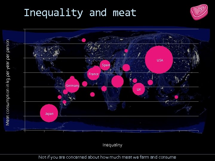 Inequality and meat Meat consumption in kg per year person 160 140 120 USA Spain 100 France Germany 80 UK 60 Japan 40 20 2 4 6 8 10 12 14 16 Inequality Not if you are concerned about how much meat we farm and consume 18 20
 Inequality and water in m 3 per year person 8. 0 7. 0 USA Spain 6. 0 France 5. 0 Germany 4. 0 3. 0 2. 0 UK Japan 2 4 6 8 10 12 14 16 18 Inequality Not if you are concerned about how much water we use (apart from the UK!) 20
 Inequality and waste Municipal waste collected (kg per capita per year) 1100 900 Singapore 800 USA 700 600 France Germany Spain UK 500 Japan 400 300 2 4 6 8 10 12 14 16 Inequality Not if you are concerned about how much waste we each produce 18 20
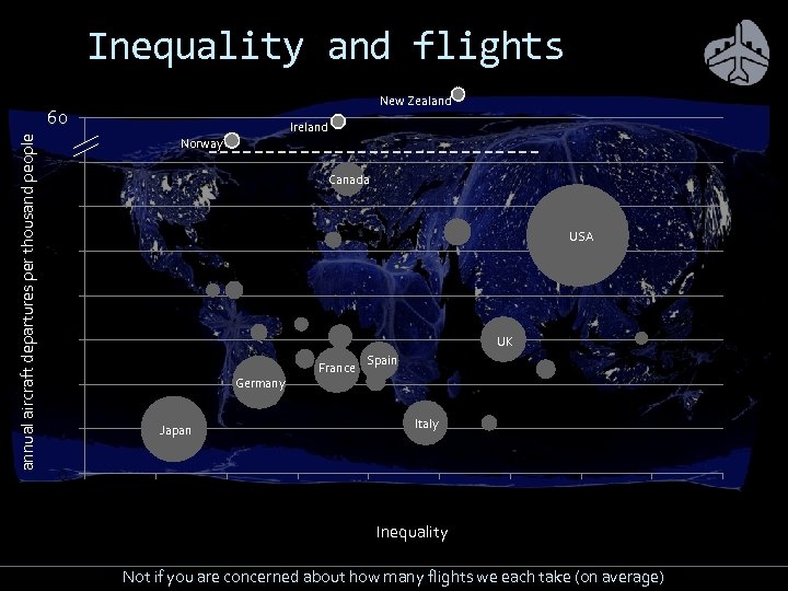 Inequality and flights New Zealand annual aircraft departures per thousand people 60 40 Ireland Norway 35 Canada 30 USA 25 20 15 UK 10 Germany 5 0 France Spain Italy Japan 2 4 6 8 10 12 14 16 18 Inequality Not if you are concerned about how many flights we each take (on average) 20
 Inequality and ecology Ecological footprint in global hectares per capita 11 10 USA 9 8 7 6 Spain Japan 5 France Singapore Germany 4 3 UK 2 4 6 8 10 12 14 16 18 Inequality Not if you are concerned about how many planets we might need to exist: An Ecological Footprint of 2. 1 global hectares per capita equals one-planet living 20
 Data sources UNDP/FAO http: //www. worldmapper. org/display. php? selected=126 UNDP/LPR http: //www. worldmapper. org/display. php? selected=104 UNSD http: //unstats. un. org/unsd/ENVIRONMENT/qindicators. htm World Bank World Development Indicators 2005 (IS. AIR. DPRT) WWF Living Planet Index 2008 More and more geographical data is becoming available, often for the first time.
 Ecological impact of the rich How does this relate to the ecological impact of those 24 countries on the globe as a whole, and how do the poorer nations compare – to what extent does global inequality have an impact on a sustainable future of the planet as well as inequalities within the rich world? The poor in unequal rich countries consume more than in more equal countries
 Ecological Footprint The map shows the ecological footprint (EF), a measure of the resources used per head in each country. A EF of 2. 1 global hectares per capita equals one-planet living on the basis that everyone is entitled to the same amount of the planet’s natural resources. - Source: New Economics Foundation, Happy Planet Index
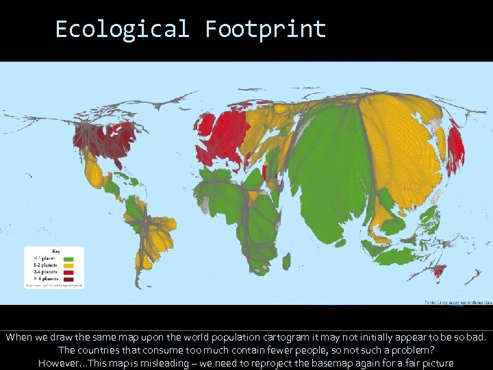 Ecological Footprint When we draw the same map upon the world population cartogram it may not initially appear to be so bad. The countries that consume too much contain fewer people, so not such a problem? However. . . This map is misleading – we need to reproject the basemap again for a fair picture
 Ecological Footprint UK USA Germany Japan France Spain If we reproject the globe again so that the area of each grid cell is drawn in proportion to the ecological impact of the people who live in that area, then we see that most of the damage is being caused by the rich world and more of that (per capita) by the most unequal countries of the rich world (which China services).
 Two views from across the UK political spectrum “We should … dethrone the idea that maximising the growth in measured prosperity, GDP per capita, should be an explicit objective of economic and social policy. ” Adair Turner, Chair of the UK Financial Services Authority, 2007 “They want the politics of hope and not the politics of fear and that’s what we are about. ” Caroline Lucas, Green Party, 2010 http: //www. guardian. co. uk/environment/georgemonbiot/2010/may/07/caroline-lucas-uk-first-green-mp
 Tokyo – looking very green. For a very long time we have ignored this: the United State’s experiment in equality that re-shaped Japan – how do people behave when equality is thrust upon them?
 We ignore the achievements of all Europe bar the UK and Portugal if we celebrate inequality, aristocracy and the free reign of market forces
 It is possible to be highly developed and sustainable
 We just don’t know how to pull each other along in a better way. To not follow the lead of the most unequal nations
 Most people wish for a sustainable future
 This wish can be found to now extend as far as those economists who write textbooks with men who run the US Federal Reserve
 You might say: is greater inequality only part of the story. Read: Frank (2007). Robert H. Frank is the H. J. Louis Professor of Management and Professor of Economics at the Johnson School of Management, Cornell University. He explains that what had been happening in countries like the UK and USA, right through the last three decades, is that as inequalities in incomes rose, so it became ever more important where you lived, for all kinds of outcomes: for school results, for crime levels, even for future house price rises. Even if everyone’s take home pay went up. People began to spend more and more on housing rents and mortgages to get away from living near those who were becoming relatively poorer than them. They had to spend more and more just to be able to afford an average home in an increasingly unequal society. See: Frank, R. H. and Bernanke, B. , 2003, 2010, Principles of Economics, New York: Mc. Graw-Hill. Frank, R. H. and Bernanke, B. , 2006, Principles of Macroeconomics, New York: Mc. Graw-Hill. But most of all please see: Frank, R. H. , 2007, Falling Behind: How rising inequality harms the middle class, Berkeley: University of California Press
 Conclusion To consume less, you need to feel you have more in common with other people. If success is about having a lot of money, success is about consuming more and wasting more. Consumption by everybody is less in countries where everyone is more equal. All affluent countries need to reduce their levels of consumption by reducing social inequalities. Through their dominance of global media and marketing the rest of the world usually looks up towards richer countries. What example are we providing?
