 ICT Classes Poster Presentations
 Why a poster? • A poster is a large wall display, summarising a piece of work or research. • They are often used at Academic conferences and courses. • There is no set format but we want A 2 landscape.
 What will I get from the experience? • Gives you an opportunity to develop your presentation skills • Allows you to express your points in graphical terms • Forces you to focus on key points in your research
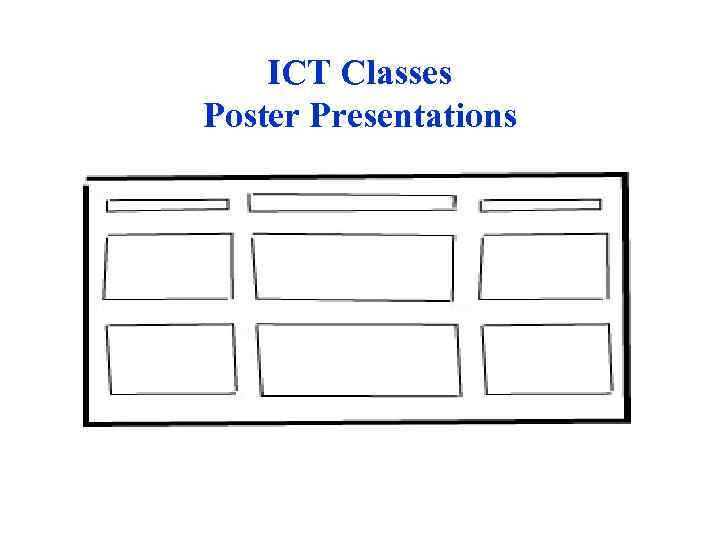
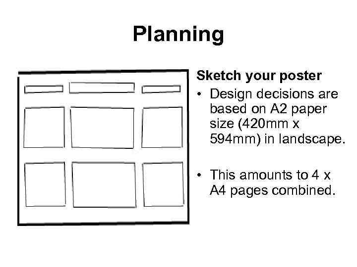 Planning Sketch your poster • Design decisions are based on A 2 paper size (420 mm x 594 mm) in landscape. • This amounts to 4 x A 4 pages combined.
 Planning (cont. ) • What’s the target audience in this task? • A limited area in which to work so there’s a need to focus on key points • A need to edit your source material, i. e. be selective with content • Important to create a visual emphasis
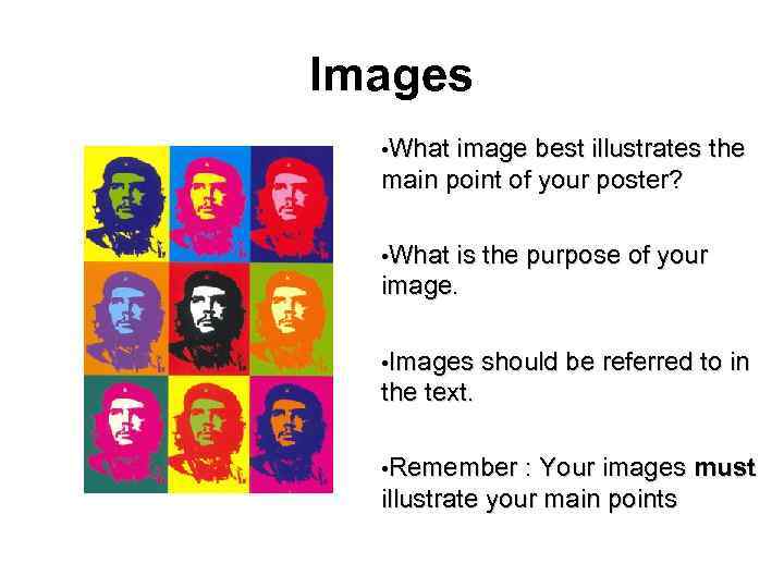 Images • What image best illustrates the main point of your poster? • What is the purpose of your image. • Images should be referred to in the text. • Remember : Your images must illustrate your main points
 Text Blocks • How many sections of text? Think in terms of inches-per-section. • Try different layouts – use bullet points. • How many lines of text per section? • Use phrases or words rather than full sentences. • Distinguish between main points and subsidiary points • Focus on the order of the material.
 Your Aims & Objectives • Audience - who is your audience? • Purpose - what is your aim? • What have you been asked to do? • How much do you need to explain? – Avoid jargon
 Design Principles Poster presentations are about communication; • Presenting a message as clearly as possible in a limited area. • It is easy to “over design” in Power. Point. • Simplicity is the best approach. • Posters are often viewed at a distance. Therefore diagrams and text have to be simplified.
 Design Features • A poster needs to be: • FOCUSED • VISUAL • ORGANISED • Focal Point - try to achieve a focal point to attract attention, e. g. a dramatic photo that relates to the subject. • Colour - Use colour to create an overall impression. • Type • Posters must be readable from 1 -2 metres distance. • Use a typeface that’s easy to read, e. g. Helvetica or Palatino. • 18 point minimum, possibly bold. • Flow – the order and sequence of your information should be clear.