

1b4b99e958bc7aafc38265ed3645a640.ppt
- Количество слайдов: 62
 How to make a poster David Sargan drs 20@cam. ac. uk
 What is a poster session? • Most scientific meetings have more presenters than platform time • Posters provide the means to present additional short communications • There’s plenty in it for you! – The poster communication often provides the means to get to the conference – Posters provide a launch point for networking – Some poster submitters may be given platform talks. – Many meetings run poster competitions - some have worthwhile prizes, all winners have a boost to their cv’s.
 Problems of the Poster Session • Posters are presented in large groups • The environment is usually crowded • The time allotted to poster sessions is limited – Most people are in a hurry – You have about 3 seconds to persuade the average passer-by to read your poster.
 Posters should have immediate impact Two messages with three words. . . Saatchi and Saatchi, 1979
 Getting to that Conference -the Abstract • Watch the date – Abstract deadlines are typically four to six months before conferences. • Quality control – Most conferences peer review abstracts before inviting posters or platform talks – Your abstract will be published in the conference programme. For many it may decide if they visit your poster – Your abstract is an important personal ad!
 The submitted abstract - content • The title is important – In theory the title of submitted abstract and poster should match – BUT… your abstract title needs to be detailed enough for web searching – … whilst your poster title needs to catch attention in 3 seconds
 The submitted abstract - content • The abstract should be very concise and clear • Describe the purpose of the experiment, the methods (brief) and the results. • A conclusion should take a maximum of one sentence. • Use short sentences, and don’t use references.
 The submitted abstract - content • There is a temptation to hint in the abstract about the results you hope to get in two months time. • DO NOT BE TEMPTED – you can put new results into the poster, even if they are not in your abstract – Retractions are less easy! • Check the word limit and formatting conform to conference requirements.
 The poster - planning 1 • Allow time to write, layout and print your poster. • Writing will be quick if you have your data ready and plan what you want to say properly. • Layout and then editing can take more time. • Although printing can be done quickly if you are desperate, it is more expensive. • The first time you make a poster you should start about ten days before your departure date, with at least three days of these ten set aside for poster work.
 The poster - planning 2 • Your audience at a meeting has three groups – Your scientific competitors • They will come by anyway, however badly you present! – Scientists in closely related areas • These people will be interested in a good presentation and can be helpful to you in your current project. – Scientists in more distant areas • These people are a bonus, but may have useful perspectives drawn from disparate fields. • So write for group two, but ensure group three can follow!
 The poster - planning 3 • No amount of good presentation makes up for bad science!! • Pick related data to make a short group of points • Usually about 4 - 6 figures (or groups of figures) is plenty • Plan the text around each figure
 The poster - planning the text • You have 3 seconds to capture the audience – Title! • You have about 30 seconds to persuade them to stay – The poster abstract (and/or “main points”) • In poster competitions, judges are asked to review posters at an average of 1 -2 minutes per poster • No-one will stay to read for more than five minutes – So make sure they can read all of it in that time!
 Aargh!!
 Consider the Audience • Sometimes you will be trying to appeal to a wider group – More general meetings, “Public face” of science (Science week) etc. • Some members of any audience may be colorblind, have reduced vision or suffer dyslexia – Fonts and figures
 Figure design and colour blindness • Red-Green colour blindness in males is more common than the AB blood group! • Colour blind people have particular problems with fluorescent images. • Substituting red with magenta gives an image that can be read by all. • To do this make a copy of the red image in the blue channel and add to the original. • Use direct labelling of lines or dashed as well as solid lines on charts.
 Titles BAD!! Sub-retinal administration of AAV-PDE 6 B in the rcd 1 Beagle X Irish setter cross: photopic responses Better Gene transfer restores cone function in an animal model of retinitis pigmentosa
 Think about your title • Write it down • Swap with a neighbour • Do they understand it? • Can you simplify?
 The poster - planning the text 2 • Don’t forget to include all authors and contact addresses (including email) under the title. • You do not have to stick to standard scientific journal layout • You do need to introduce the topic, describe any unusual methods, describe your results and set them in context – Methods should be brief – Results and their discussion should be close to the relevant figures
 OOPS!
OOPS!
 A take home message as a set of bulleted points is very helpful . use a box to make it more visible
 Phew!!
 • Do not use") Textual style • Use short sentences (average 8 -10 words) • Do not use jargon or unexplained abbreviation – Some of your audience will not be specialists in your area • Keep references to a minimum • Avoid excessive detail – Edit ruthlessly: ask yourself - is this absolutely necessary? If not, omit it. • But maintain a formal passive style – This conveys information efficiently.
Textual style • Use short sentences (average 8 -10 words) • Do not use jargon or unexplained abbreviation – Some of your audience will not be specialists in your area • Keep references to a minimum • Avoid excessive detail – Edit ruthlessly: ask yourself - is this absolutely necessary? If not, omit it. • But maintain a formal passive style – This conveys information efficiently.
 An attraction point • If you have a large bright figure/picture easily visible near the title this will help draw the non-competitor scientist group. • Don’t sacrifice your science to this.
 Example Gene transfer restores cone function in an animal model of retinitis pigmentosa Bainbridge, Mistry, Balaggan, Squire, Ali & Sargan Centre for Veterinary Science University of Cambridge Email: drs 20@cam. ac. uk
 Layout and all that • I am going to present a set of rules for laying out your poster. • They are useful, but remember you need your poster to look distinctive and attractive. • You must catch the eye.
 Specialist packages for laying out your poster abound. . • Adobe Creative Suite (Illustrator, In Design etc) – Illustrator is a good drawing package, but you have to define edges. Limitations with text editing. – In Design is complex to use though powerful. Sledgehammers and nuts… • Pagemaker Pro. This used to be quite good, but I haven’t tried it for several years. Max page size A 0. • Quark. XPress. Flexible but expensive package. Max page size 900 x 1200 mm. • Corel Draw. Useable especially on PC, but can create enormous file sizes. • Microsoft Word and Publisher are not good for final poster preparation.
 Programmes for layout cont. . • Power. Point is a useful programme for general poster layouts. – Strengths • simplicity and familiarity • Part of MS Office - compatibility – Weaknesses • limited drawing package • a bit clumsy with ruler based layout • problems with Mac/PC conversion • Nevertheless, this is the most commonly used package amongst our students
 Layout -basics • Make sure that your data files are compatible with your layout programme. – Power. Point accepts jpeg, tiff, psd and some but not all forms of pict, as well as excel and word files. – You can make limited alteration to imported files (shape, contrast, scale, but not moving or recolouring components of the imported file, text etc. ) • In Page Setup use the “Custom” setting to set size, then set Portrait or Landscape – A 0 = 118. 9 x 84. 1 cm • Keep text in boxes - Keep Snap-to-Grid on whilst you align, then turn off for fine movements
 Powerpoint tips for posters · Create text by cutting and pasting or typing directly into Power. Point - Do not use “insert”. · Tables can be typed directly into Powerpoint - use the tab functions rather than the space bar. · Graphics should be “Inserted” as a picture. Do NOT import graphics by cutting and pasting. · Leave a one-inch margin all the way around the outside edge of the poster to avoid having your content “cut off. ” · Ideally graphics and photos should be scanned at the size you want to use them on your poster (not necessarily actual size). Scanning resolution should be 150 dpi. · If you are enlarging a file for the poster, import at up to 300 dpi maximum.
 Layout -2 • Keep fonts simple – This is Times New Roman, a serif font: these are easy to read quickly and are compact, but can look fussy. Good for main text but less good for headings. – This is Ariel, a sans-serif font with a very clean look, but harder to read in big blocks. (Look also at Helvetica and Verdana). – And this is Comic Sans MS, with a less formal feel. • Do not be tempted to use anything more elaborate – complex fonts are hard to read
 Layout - 3 • Do not use more than two fonts across the whole poster. • Text should be readable from at least 1. 5 meters without strain. – For most fonts this means at least 24 point; some of the denser ones, e. g. Times New Roman may need 28 point. • Titles should be at least twice as big. – Author names, addresses etc. intermediate. • Choose background and text colours to maximise reading ease.
 Layout - 4 In a light room, and in the absence of projection, dark text on a light background is easier to read than light text on a dark background. (The converse is often true in a dark room with projected images, or when viewing the phosphorescent image on your computer screen. )
 • Graded and patterned backgrounds look pleasant • But avoid strongly graded backgrounds • There is no font colour that will let you read the whole poster! • Avoid strongly patterned backgrounds for the same reason
 Problems with colour scheme & with font sizes
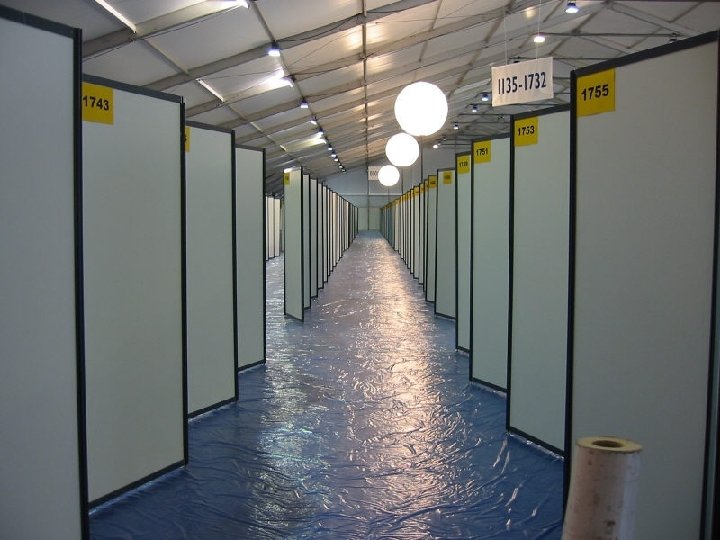
 Layout - 5 • Before you start, check the dimensions of your meeting’s poster boards! – (See the meeting programme or instructions for authors) – A 0 is 1189 x 841 mm – Most poster boards are 1. 5 m x 1 m, but some are not! – Check whether your board is “Landscape” or “Portrait” – Some poster boards are huge (4’ x 8’) - but it is still better to stick with A 0. This can be read without moving / craning.
 Layout - 6 • Plan your poster in vertical columns, not horizontal rows √ X - This prevents gridlock amongst those trying to read your poster
 Elizabeth Bernath
 Layout - 7 • Indicate the sequence in your poster – You can use numbers or arrows • Panels placed in regular columns are easier to follow than panels placed asymmetrically
 Layout - 8 • Show, don’t tell! – Very good for methods – But don’t let the audience miss important results • Use a simple visual grammar that reflects the importance of the elements – Large titles • Medium text – Small legends
 Layout - 9 • Large figures are easier to read • Where text linked to a figure has to be in a different section or column, you can use an arrow • Try to leave some blank spaces – They rest the reader’s eye
 Layout - 10 • The main results should be summarised • State conclusions from these results separately. – These sections should be easy to find BOX! • QR codes can link in extra information, web sites etc. • Don’t forget acknowledgements
 Editing • Now re-read and edit the poster. Make it shorter. • Done that? …DO IT AGAIN.
 and Printing • Print an A 4 copy before you get anything larger printed. – If you can’t read the A 4, print on your poster will be too small. – Use it to check appearance, and colour balance • Nowadays most posters are printed on glossy A 0 paper or laminated A 0 paper. • Your work has cost hundreds of hours and probably thousands of pounds. Poor presentation is a false economy. • Lots of A 4 sheets on a board look tatty. Get an A 0 print and a poster tube to carry it! • If money is tight don’t laminate unless you are going to leave it up for a long period • Photographic and Illustration service (pandis), New Museum site; Dept Biochemistry; Medical illustration, Addenbrookes;
 At the conference • You could print 30 or so A 4 colour copies to take with you and give out at the conference. • Make sure your poster goes up and comes down at the time recommended. – There may be multiple poster sessions re-using the same poster boards – The conference organisers usually provide velcro tape for felted poster boards, or pins etc, but it is useful to take some of each with you. – Check your poster from time to make sure it hasn’t fallen down.
 Your poster session • You can leave a notepad and/or your A 4 poster copies attached to the poster board when you are not there • Collect email addresses of anyone interested
 Your Poster Session • Wear your conference badge. – People will know who you are • The best way (the only good way) to get across the message of your poster is to talk people through it. – It ensures that your work is understood – It makes more impression – It gets you known • You or your appointed deputy must stand by your poster throughout your poster session for maximum impact. – As all other posters you care about are probably in the same session this calls for planning and division of labour
 Your Poster Session • Engage people who glance over the poster – Offer an explanation – DON’T WAIT TO BE ASKED! • Think about a short way to take people through the poster – Use the figures – Keep to the main points • Try to make a note of any good suggestions
 What about public communication of science? • Bringing your science to a wider audience – The audience may still be highly educated in biosciences • e. g. Graduate School Poster and Image Competition • Part of the Cambridge Science Festival
 Dates to remember • Dec 16 th – Departmental poster and lightening talk competition • March 7 -20 th – Cambridge Science Festival – Poster and image competition (Dates TBA) – Big prizes!! • March 19 th - Science Festival Vet School Open day
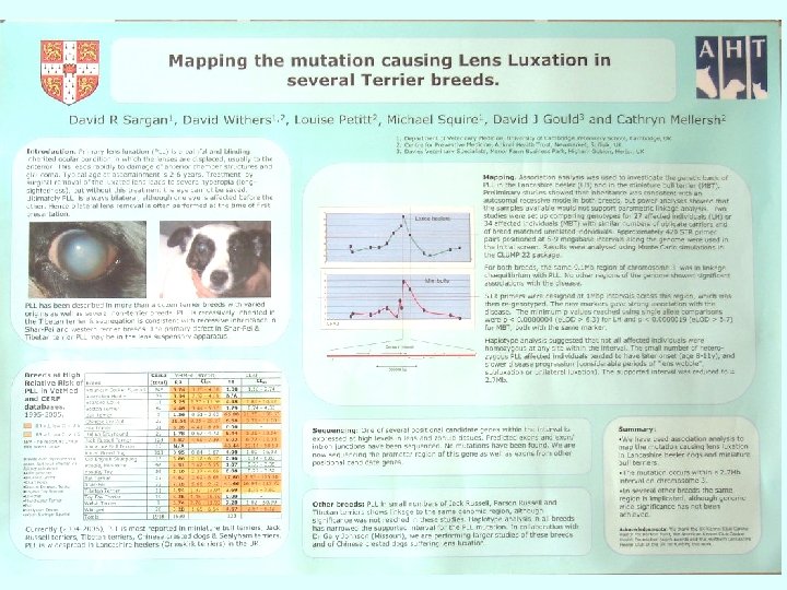
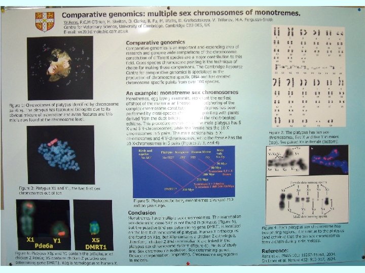
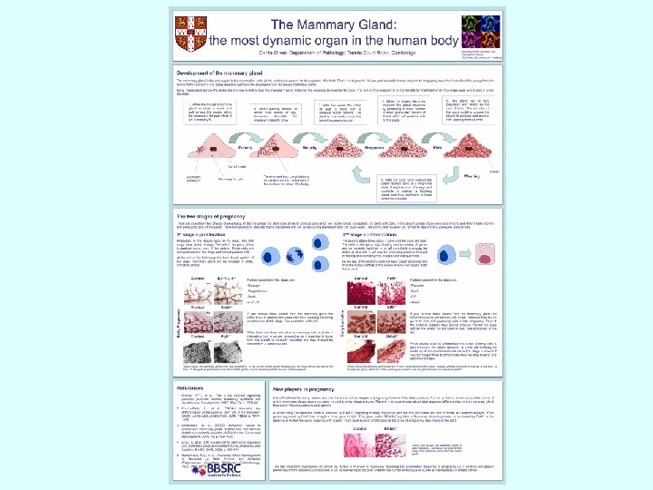
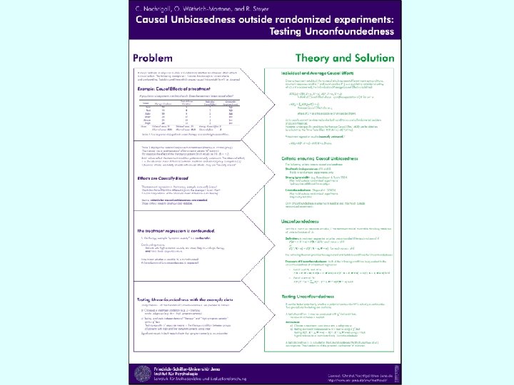
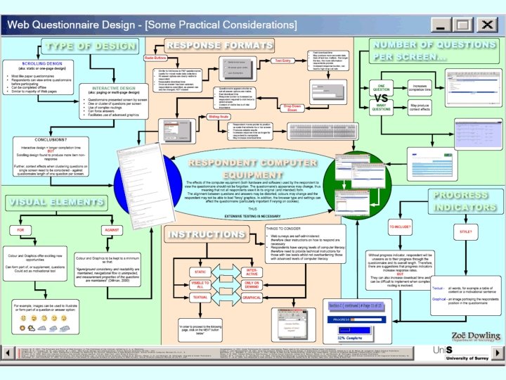
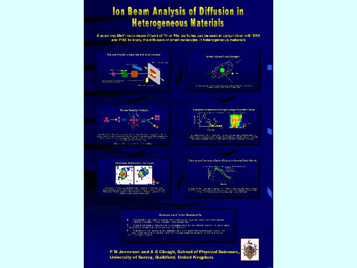
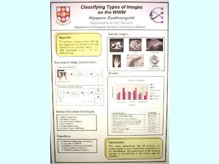
 Examples for your comments
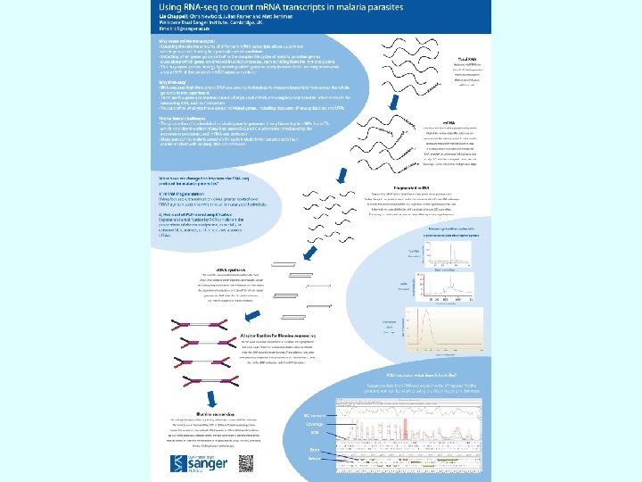
 • Fewer words, more pictures • The poster must give the message by itself
 Enjoy your conference! My thanks to all poster makers, especially Dr’s Rens and Tiley for letting me use their “bad examples”