 Guidelines for Making Power. Point Slides
 Golden Rule No More Than One Topic Per Slide
 Keep Unity of Design n n Use a master slide. n Same font or set of fonts n Same background, same colors n Consistent bullet style n All titles: same color, font, size, and position Use contrasting background and type. n n A dark background with light type (ideal) A light background with dark type
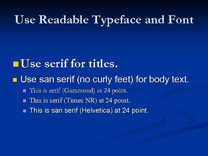 Use Readable Typeface and Font n Use serif for titles. n Use san serif (no curly feet) for body text. n n n This is serif (Garamond) at 24 point. This is serif (Times NR) at 24 point. This is san serif (Helvetica) at 24 point.
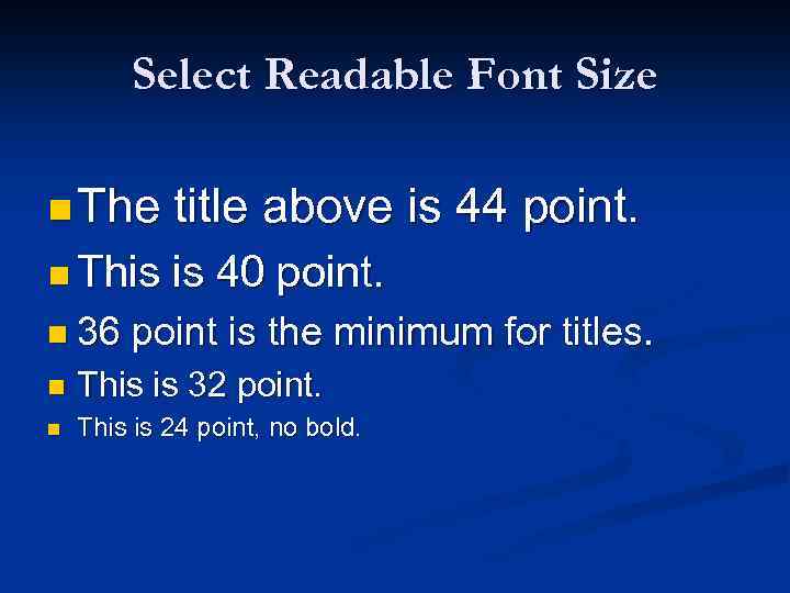 Select Readable Font Size n The title above is 44 point. n This is 40 point. n 36 point is the minimum for titles. n This is 32 point. n This is 24 point, no bold.
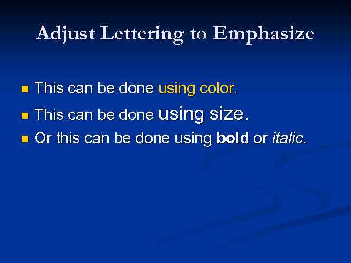 Adjust Lettering to Emphasize n This can be done using color. This can be done using size. n Or this can be done using bold or italic. n
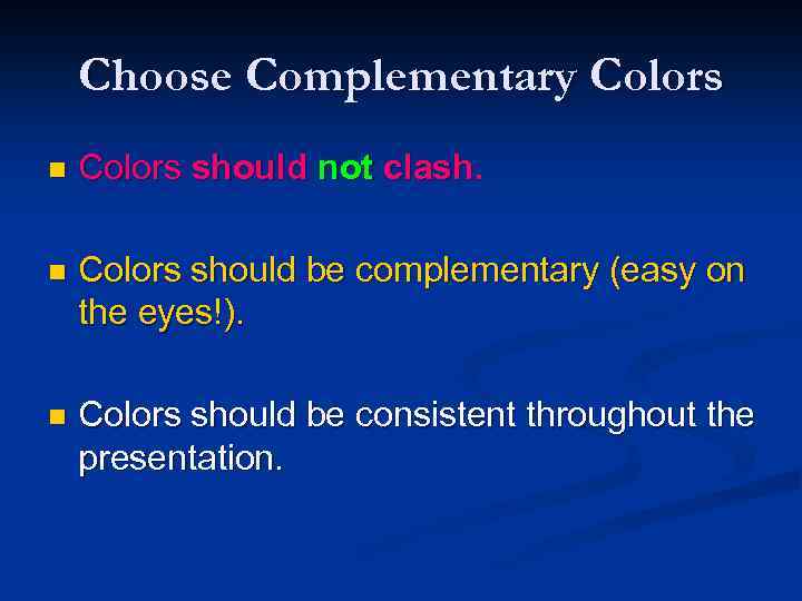 Choose Complementary Colors n Colors should not clash. n Colors should be complementary (easy on the eyes!). n Colors should be consistent throughout the presentation.
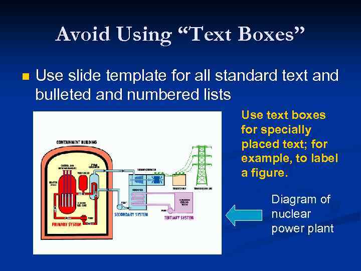 Avoid Using “Text Boxes” n Use slide template for all standard text and bulleted and numbered lists Use text boxes for specially placed text; for example, to label a figure. Diagram of nuclear power plant
 Avoid Fancy Animation Effects
 Consider the 6 x 6 Rule n Slides should have no more than 6 lines of text. n Slides should have no more than 6 -10 words per line. n This is a guideline, not really a rule.
 Use Bullets, Not Numbers n Bullets do not imply a specific order. n Use numbers only to show rank or sequence.
 Use Parallel Structure n All parallel bullets on a slide should have the same grammatical structure. All noun phrases or all verb phrases, e. g. n All complete sentences or all phrases or all clauses n
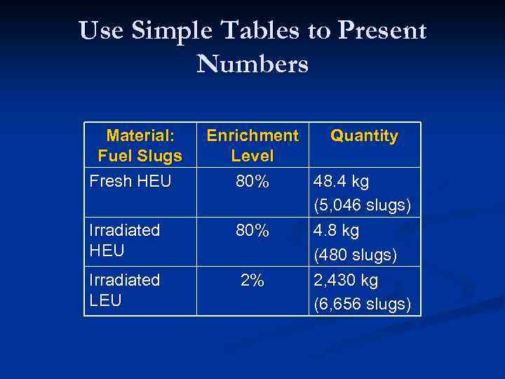 Use Simple Tables to Present Numbers Material: Fuel Slugs Fresh HEU Irradiated LEU Enrichment Quantity Level 80% 48. 4 kg (5, 046 slugs) 80% 4. 8 kg (480 slugs) 2% 2, 430 kg (6, 656 slugs)
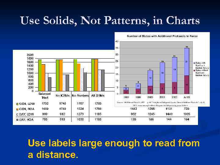 Use Solids, Not Patterns, in Charts Use labels large enough to read from a distance.
 Avoid Overwhelming Detail in Charts and Graphs n Break up organizational charts into large, easy-to-read chunks. n n For a large, complicated chart, think about providing a handout. Ensure that all text in a chart is readable from the back of the room.
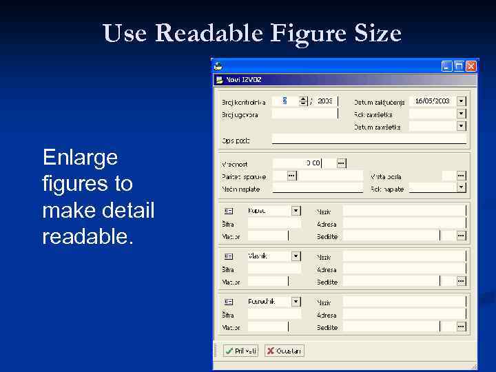 Use Readable Figure Size Enlarge figures to make detail readable.
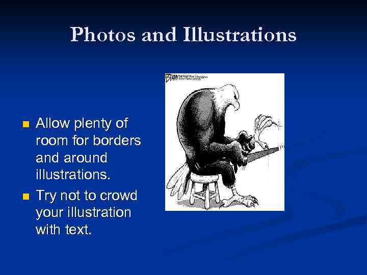 Photos and Illustrations n n Allow plenty of room for borders and around illustrations. Try not to crowd your illustration with text.
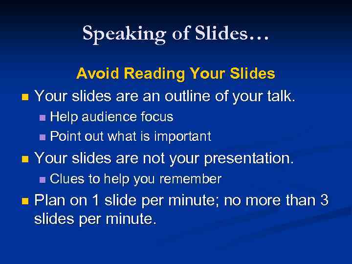 Speaking of Slides… Avoid Reading Your Slides n Your slides are an outline of your talk. Help audience focus n Point out what is important n n Your slides are not your presentation. n n Clues to help you remember Plan on 1 slide per minute; no more than 3 slides per minute.
 Thank you for attention