65c57017d131c3a2b67877ccbb839c1c.ppt
- Количество слайдов: 46

Guidelines for GOOD Web Design a presentation by Patrick Douglas Crispen
Our Goals • See why Web design guidelines are necessary • Discover how to find the defacto standard for every aspect of your site's design • Discuss Jakob Nielsen’s "Top Ten Guidelines for Homepage Usability" • Learn how to design good Web pages and Web sites from the start • See how your choice of page font impacts your pages' readability (and why you should stay away from serif fonts like Times New Roman) • And much, much more …
Good News / Bad News • The good news is that anyone can create a Web page or Web site. • The bad news is that anyone can create a Web page or Web site.
Regardless of whether you use Macromedia Dreamweaver, Microsoft Front. Page, or simply code by hand, there are some guiding principles you need to remember whenever you design anything for the web.
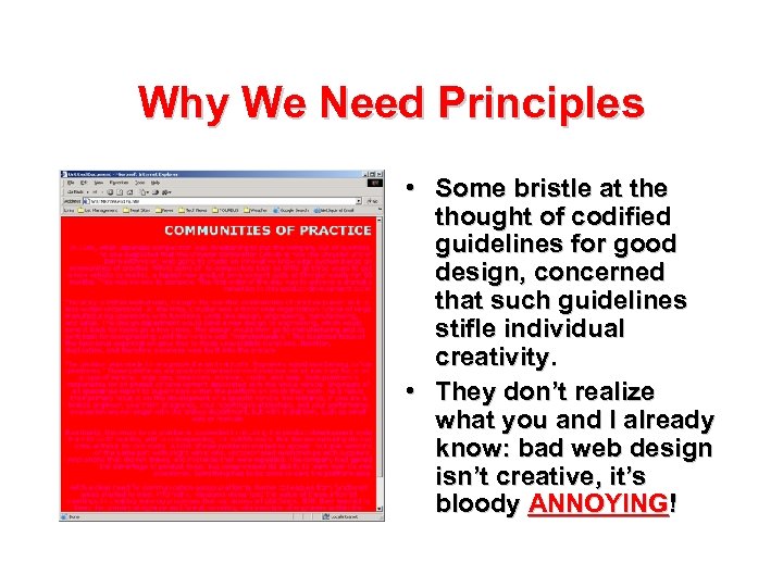
Why We Need Principles • Some bristle at the thought of codified guidelines for good design, concerned that such guidelines stifle individual creativity. • They don’t realize what you and I already know: bad web design isn’t creative, it’s bloody ANNOYING!
Some Truths • Yours is not the first web page or site your students will have visited. • When your students visit your page or site, they come with preconceived expectations about how it should look and work. – These expectations come from your students’ cumulative experiences with other web pages and sites. • Violate these expectations and you will, at best, anger your students or, at worst, lose them altogether.

The Tyranny of the Fortune 500 • As Jakob Nielsen wrote back in November 1999, “If you are thinking about how to design a certain page element, all you have to do is to look at the twenty most-visited sites on the Internet and see how they do it. ” • “If 90% or more of the big sites do things in a single way, then this is the de-facto standard and you have to comply. Only deviate from a design standard if your alternative design has at least 100% higher measured usability. ” Source: http: //www. useit. com/alertbox/991114. html
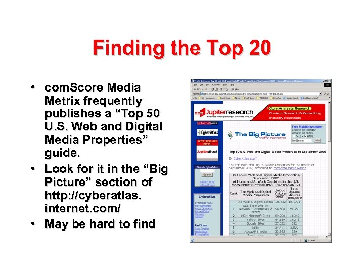
Finding the Top 20 • com. Score Media Metrix frequently publishes a “Top 50 U. S. Web and Digital Media Properties” guide. • Look for it in the “Big Picture” section of http: //cyberatlas. internet. com/ • May be hard to find
Part One: Top Ten Guidelines for Homepage Usability From Jakob Nielsen’s “Alertbox, ” May 12, 2002 http: //www. useit. com/alertbox/ 20020512. html
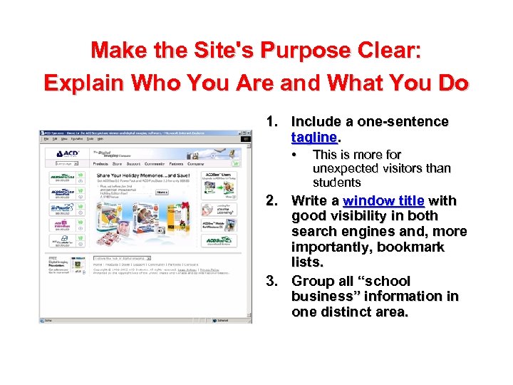
Make the Site's Purpose Clear: Explain Who You Are and What You Do 1. Include a one-sentence tagline. • This is more for unexpected visitors than students 2. Write a window title with good visibility in both search engines and, more importantly, bookmark lists. 3. Group all “school business” information in one distinct area.
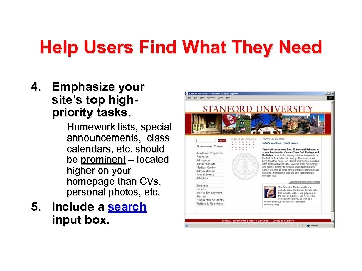
Help Users Find What They Need 4. Emphasize your site’s top highpriority tasks. Homework lists, special announcements, class calendars, etc. should be prominent – located higher on your homepage than CVs, personal photos, etc. 5. Include a search input box.
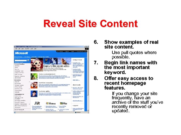
Reveal Site Content 6. Show examples of real site content. Use pull quotes where possible. 7. 8. Begin link names with the most important keyword. Offer easy access to recent homepage features. If you change your site frequently, have an archive of the stuff you’ve recently removed or updated.
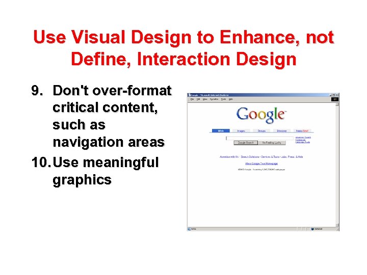
Use Visual Design to Enhance, not Define, Interaction Design 9. Don't over-format critical content, such as navigation areas 10. Use meaningful graphics

Part Two: Designing GOOD Web Sites from the Start It is easy, as long as you follow a few basic steps.
The “Paper” Rule • The first step to good web design is to turn off your computer and pull out a couple of pieces of paper. • Most poorly designed sites are poorly designed from the start.
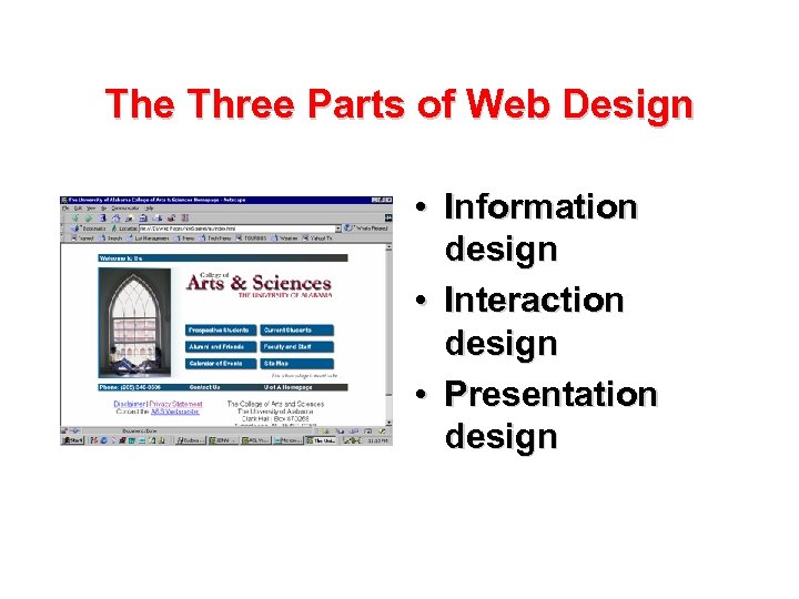
The Three Parts of Web Design • Information design • Interaction design • Presentation design
Information Design • • • Message Audience Purpose Background Structure ?
The Audience Is Key • Once you identify your audience, designing the web page or web site is a snap! • Example: the Bertrand Russell Intermediate High School Concert Choir
Part Three: Basic Design Rules Stuff that no one ever tells you

Homepage Usability • Most of the tips you are about to see come straight from Homepage Usability by Jakob Nielsen & Marie Tahir. • ISBN: 073571102 X • US$39. 99 ($27. 99 at Amazon. com)
Oh sure, it LOOKS good. . . • Reading from a computer screen is about 25% slower than reading from paper. • Write 50% less text than you would normally write for a brochure or paper.
Serif versus sans-serif • On paper, we are all used to reading serif fonts – fonts with a “tail” (like Times New Roman. ) • On screens, however, sans-serif fonts are easier to read. • The most readable screen font is Verdana (which ships with Internet Explorer. )
The basic scheme • For the main content area of your pages, ALWAYS use black text on a white background. – We have to defer to both David Ogilvy AND the Fortune 500 on this one. – The rest of your page can be colored, but leave the main content area alone! • If you have to change fonts, use a sans-serif font like Verdana, Helvetica, or Arial. – Or, if you code by hand, use a font family like <font face="Verdana, Arial, Helvetica, sans-serif“> – Better still, use CSS [which we’ll talk about in a bit. ] • Don’t change the link colors!
How wide? • While bigger monitors continue to pop-up, most people are still using 800 by 600. • You have to account for the scroll bars. • Stay under 760 pixels wide, especially with your graphics (600 wide if you are making something for Blackboard or Web. CT. )
How big? • Try to follow the “ 30/30 rule”: keep your main homepage – graphics and everything – to under 30 kilobytes in size. That way it will load in under 30 seconds over a very slow dial-up. • Your secondary pages can be larger. • I break this rule ALL the time.
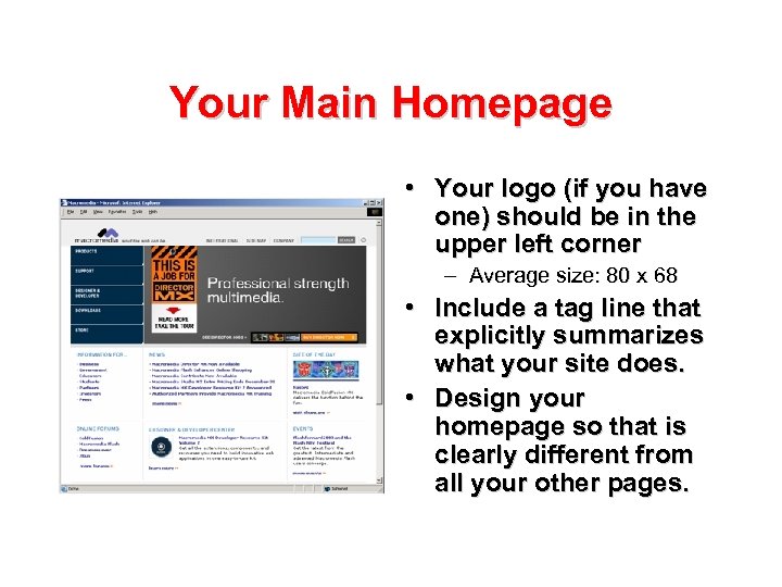
Your Main Homepage • Your logo (if you have one) should be in the upper left corner – Average size: 80 x 68 • Include a tag line that explicitly summarizes what your site does. • Design your homepage so that is clearly different from all your other pages.
Communicating Information about Your School or Department • If you’re making a site for your school or department, include a homepage link to an “About <name of organization>” section. • Include a “Contact Me” or “Contact Us” link on the homepage that goes to a page with all contact information for your organization.
Links • Differentiate links and make them easy to scan. – By default, links are differentiated by being blue and underlined. DON’T CHANGE THIS! • Don’t use generic instructions, such as “Click Here” as a link name. • Don’t use generic links, such as “More …” at the end of list items. • If a link does something other than go to another Web page … make sure the link explicitly indicates what will happen.
Stay away from frames. . . • Many browsers cannot print framed pages appropriately. • Frames are so hard to learn that many authors write buggy code when they try to use them. • Search engines have trouble with frames because they don’t know what composites of frames to include in their index.
Stay away from frames. . . • Some browsers make it difficult to bookmark frames. • Many Websites that offer users a choice between regular and framed versions have found that most users prefer frames-free designs.
Use CSS • CSS separates the style from the content • CSS makes your pages download faster – Browsers multitask downloads • CSS makes your site more accessible • CSS guarantees a consistent look-and-feel across your entire site • CSS is a sneaky way to make printer-friendly pages • The new Macromedia Dreamweaver MX 2004 automatically supports CSS out of the box!
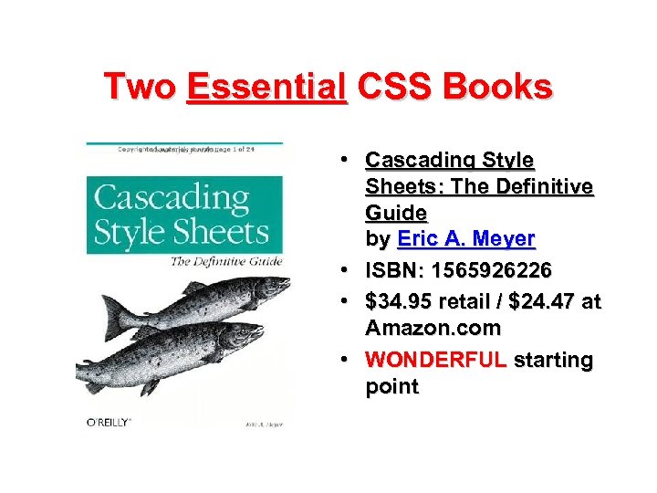
Two Essential CSS Books • Cascading Style Sheets: The Definitive Guide by Eric A. Meyer • ISBN: 1565926226 • $34. 95 retail / $24. 47 at Amazon. com • WONDERFUL starting point
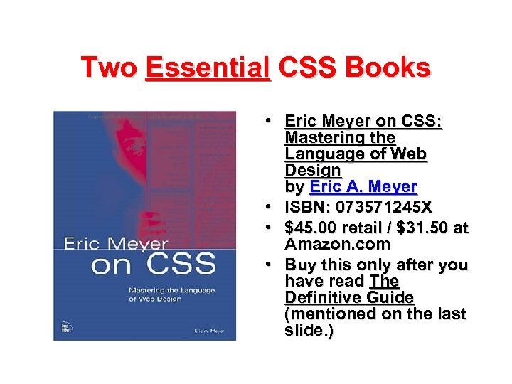
Two Essential CSS Books • Eric Meyer on CSS: Mastering the Language of Web Design by Eric A. Meyer • ISBN: 073571245 X • $45. 00 retail / $31. 50 at Amazon. com • Buy this only after you have read The Definitive Guide (mentioned on the last slide. )
Part Four: Accessibility Welcome to the wonderful world of Section 508
What is Section 508? • Section 508 of the Rehabilitation Act requires all federal agencies (with the exception national security systems) to ensure that electronic and information technology is accessible to employees and members of the public with disabilities. • This only applies to electronic and information technology that is procured by a FEDERAL department or agency. • BUT, most companies and educational institutions around the world voluntarily comply with section 508, especially when it comes to those companies' or institutions' Web sites.
Why Comply Voluntarily? • Why? One word: traffic. • If you can make your Web pages more accessible, especially to people with disabilities (like, say, Auburn University alumni), more people are going to be able to visit your Web pages.
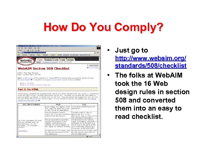
How Do You Comply? • Just go to http: //www. webaim. org/ standards/508/checklist • The folks at Web. AIM took the 16 Web design rules in section 508 and converted them into an easy to read checklist.
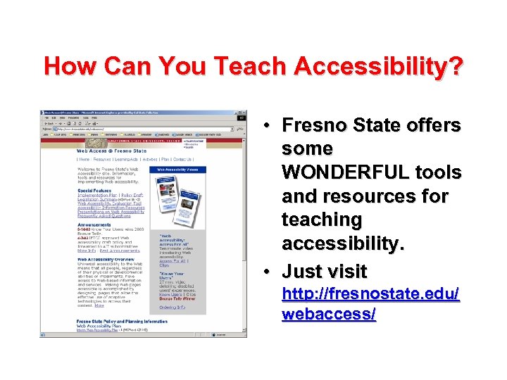
How Can You Teach Accessibility? • Fresno State offers some WONDERFUL tools and resources for teaching accessibility. • Just visit http: //fresnostate. edu/ webaccess/

Part Five: Sites that Ignore These Guidelines Including a few sites shamelessly stolen from Web. Pages. That. Suck. com
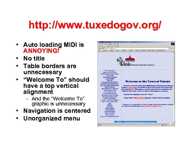
http: //www. tuxedogov. org/ • Auto loading MIDI is ANNOYING! • No title • Table borders are unnecessary • “Welcome To” should have a top vertical alignment – And the “Welcome To” graphic is unnecessary • Navigation is centered • Unorganized menu

http: //www. jcsheriff. com/ • The title doesn’t include the state. • The gun is wholly inappropriate. • The Flash is … um … • Click on “webmaster” and you get a “not found” note.
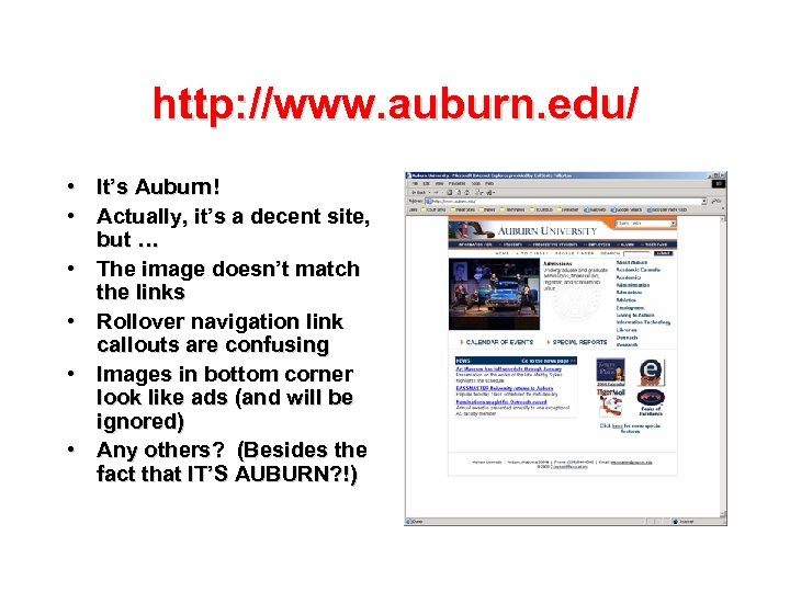
http: //www. auburn. edu/ • It’s Auburn! • Actually, it’s a decent site, but … • The image doesn’t match the links • Rollover navigation link callouts are confusing • Images in bottom corner look like ads (and will be ignored) • Any others? (Besides the fact that IT’S AUBURN? !)
Are There Any Other Sites You Want to Look at? And, no, we’re not going to look at http: //www. ua. edu/ [ROLL TIDE!]

Regardless of whether you use Macromedia Dreamweaver, Microsoft Front. Page, or simply code by hand, there are some guiding principles you need to remember whenever you design anything for the web.

Our Goals • See why Web design guidelines are necessary • Discover how to find the defacto standard for every aspect of your site's design • Discuss Jakob Nielsen’s "Top Ten Guidelines for Homepage Usability" • Learn how to design good Web pages and Web sites from the start • See how your choice of page font impacts your pages' readability (and why you should stay away from serif fonts like Times New Roman) • And much, much more …
Guidelines for GOOD Web Design a presentation by Patrick Douglas Crispen
65c57017d131c3a2b67877ccbb839c1c.ppt