de4c70919c19772c03938a551c164954.ppt
- Количество слайдов: 17
GRAPHIC DESIGN for NON-GRAPHIC DESIGNERS PRESENTED BY Mary Nell Shaw and Charles Creel ~ Graphic Arts Specialists Alabama Department of Education
Before You Begin to Design 1 • TARGET AUDIENCE – Decide Who Your Audience is. The more you know about your audience, the better equipped you are to attract their attention and communicate your message. Knowing who the audience is will help you determine the best format in which to communicate with them.
Before You Begin to Design 2 • CONTENT – What do you want to convey? It helps to know exactly what words you want to use (or have to use) on the page to convey your message, because the amount of words and the message will affect how you design your layout. Be ready to edit or cut text.
Before You Begin to Design 3 • IMAGE AREA – Consider the size, shape, and function of your layout. – Draw a mock-up showing where artwork, photos, etc should be placed relative to copy.
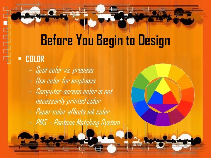
Before You Begin to Design 4 • COLOR – Spot color vs. process – Use color for emphasis – Computer-screen color is not necessarily printed color – Paper color affects ink color – PMS - Pantone Matching System
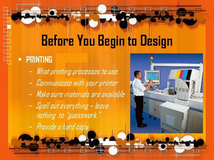
Before You Begin to Design 5 • PRINTING – What printing processes to use. – Communicate with your printer – Make sure materials are available – Spell out everything – leave nothing to “guesswork. ” – Provide a hard copy.
Before You Begin to Design • Consider these five things before you begin to design: – TARGET AUDIENCE – CONTENT – IMAGE AREA – COLOR – PRINTING
Say What? bleed pica widow orphan PDF typeface font leading kerning PMS serif san serif rag justified bi-fold tri-fold saddle stitch RGB CMYK
Good Graphic Design Utilizes: Simplicity Emphasis White Space
Simplicity • KISS – Have a good reason for everything you add, and take away anything that you don’t need – Keep headlines and lead paragraphs short • Have a purpose for everything - when in doubt, leave it out • Stick to three or fewer fonts in a layout • Contrast - Balance - Alignment - Repetition - Flow
Emphasis • The most important element on the page should be the most prominent • Emphasis Techniques: • Make it the biggest • Make it the boldest • Placing the element in a shape that is different from others on the page • Making it full intensity when everything else is faded • Adding a border around the element • Changing its color so it is different • Surrounding the element with lots of white space • Tilting it at an angle when other elements are horizontal
White Space • Allows the eye to “rest” • Makes type easier and faster to read • Resist the urge to fill entire space with words, pictures, charts and graphics • Avoid “gray” pages • White space creates emphasis
Photographs • Resolution - low vs. high – ppi (display) and dpi (printer) • • • Size - too big or too small Cropping – when and how Photo-editing programs (Paint) Formats – jpg, gif, tiff Vector images – what are they?
Logos • Less is more – Convey the idea as simply as possible. Few words and colors. – Create logos in a vector program – not Paint, Power. Point or Publisher. – Here are some examples:
Top 12 Graphic Design Don’ts 1. 2. 3. 4. 5. 6. Use low resolution photos for print Use too many different fonts in one design Use every color in the rainbow just because you can Put a box around everything LO-RES (web) = 72 dpi HIRES (print) = 300 dpi Center everything on the page Forget to check for widows and orphans
Top 12 Graphic Design Don’ts 7. Forget white space is your friend – avoid “gray pages” 8. Use fonts that are too small – 5, 6, 7 point 9. Use double spaces after punctuation 10. Underline or use all caps instead of italicizing 11. Justify type – creates too many hyphens and “rivers” 12. Rely on the computer for everything – it is only a tool
Right and wrong do not exist in graphic design. There is only effective and non-effective communication.
de4c70919c19772c03938a551c164954.ppt