48564c9adb961abcf99f615236b309a9.ppt
- Количество слайдов: 128


Fundamentals of Information Architecture and Usability Engineering Introductory Lecture david. rashty@gmail. com

Issues covered • Introduction to Information Architecture and Usability • Metrics for Usability evaluation and ROI • Defining users and tasks • Information Clustering, Labeling and Taxonomies • Usability testing methods • Heuristic Evaluation & Usability Labs • Information Architecture lifecycle • Research in the area of CHI and IA • Bibliography for further study

Introduction and Short History
 – (new term) Information Architecture (IA)")
Computer Human Interface Domain User Centered Design (UCD) – (new term) Information Architecture (IA) Design and Implementation Usability Computer Human Interface (UI/CHI) Testing and Evaluation
 • GUI (Graphical User")
Computer Human Interface - Terms • MMI (Man Machine Interface) • GUI (Graphical User Interface) • CHI (Computer Human Interaction) • UCD (User Centered Design) • IA – Information Architecture • PUI – Perceptual User Interface

Harvard Mark I, 1945 • Harvard Mark I – Picture from http: //www. maxmon. com/1939 ad. htm • 18 meters, 5 tons

1961 • Stretch – http: //www. brouhaha. com/~eric/retrocomputing/ibm/stretch/

1968

1970 -1980

First GUI 1984, Apple

Windows 1987 2. 0

Windows 3. 0/1 1990 -1992

Microsoft Bob 1995

Web Mosaic and Netscape 1994 -5

Today (1(

Today (2(
 •")
Perceptual User Interface • Multimedia- Use of audio, video, sound (one way only) • Multimodal- Communication is done in all senses • Perceptive- Computer Interface recognize Human emotions and language

Evolution of CHI • 50 s - Interface at the hardware level for engineers - switch panels • 60 -70 s - Interface at the programming level - COBOL, FORTRAN • 70 -90 s - Interface at the terminal level - command languages • 80 s - Interface at the interaction dialogue level - GUIs, multimedia • 90 s - Interface at the work setting - networked systems, groupware • 00 s - Interface becomes pervasive – RF tags, Bluetooth technology, mobile devices, consumer electronics, interactive screens, embedded technology

Trends in CHI • • B & W / Monochrome -> Color Two Dimensions -> 3 D Textual Interface -> Visual Interface Single Input -> Multi Perceptual Interface Machine Language -> Natural Language Single Screen -> Multi Screen Big -> Small

Examples

Basic Example

Basic Solution

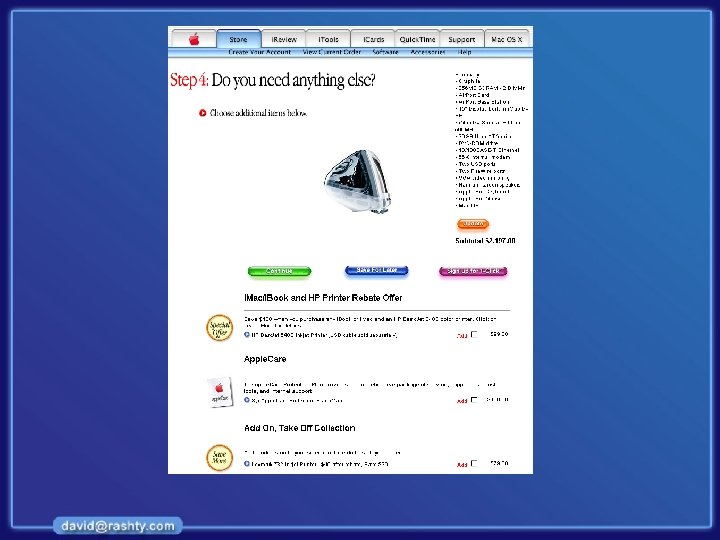
Information overload

Information overload

Disinformation overload

Information overload

Information overload

Culture Diff 1 News N

Culture Diff 2 Shopping

Culture Diff China 3 Siemens

Culture Diff 4 Siemens Germany

Culture Diff. Canada 5 Siemens

Culture. Siemens Saudia 6 Diff Arabia

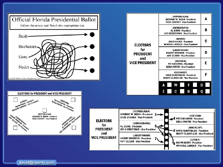
Terrible designs!

Confusing designs!

Missing Information!

This is hard to read. In fact, many people have gone stone blind from reading horrible pages on Web sites. You could be next! Well, that's a bit of an exaggeration. Please, please, never do this. This is easier to read. The colors may not be very pretty, but they sure are easier to read than the example above. Also avoid colors that look ugly together. Color Problems !

Cognitive Problems !

Eye Tracking Problem !

Focus !

Where the eye goes ?

Inconsistency

Memory…

How bad can it be?

Definitions

AI Definition • Information Architecture is the process of organizing and presenting information in an intuitive and clear manner. • Richard Saul Wurman – “The building of information structures that allow others to understand” • When architects design a house they need to: – Learn about the client’s wishes; – Organize those wishes into a coherent pattern; – Design a house that will meet the occupants’ needs.
 is: “concerned with the design, evaluation and")
CHI Definitions • Computer Human interaction (CHI) is: “concerned with the design, evaluation and implementation of interactive computing systems for human use and with the study of major phenomena surrounding them” (ACM SIGCHI, 1992, p. 6) • Usability is “That quality of a system that makes it easy to learn, easy to use and encourages the user to regard the system as a positive help in getting the job done. User A person who uses a system to perform a business function” “The ease with which a user can learn to operate, prepare inputs for, and interpret outputs of a system or component.

Metrics
. • Cost of not")
Usability metrics • Cost of finding (time, clicks, frustration, precision). • Cost of not finding (success, recall, frustration, alternatives). • Cost of development (time, budget, staff, frustration). • Value of learning (related products, services, projects, people).

User experience goals – Satisfying - rewarding – Fun - support creativity – Enjoyable - emotionally fulfilling – Entertaining …and more – Helpful – Motivating – Aesthetically pleasing – Motivating

Log file analysis (Tools(

Visual approach to metrics of IA

Defining Users and Tasks

Why do we need to understand users? • Interacting with technology is cognitive • We need to take into account cognitive processes involved and cognitive limitations of users • We can provide knowledge about what users can and cannot be expected to do • Identify and explain the nature and causes of problems users encounter • Supply theories, modelling tools, guidance and methods that can lead to the design of better interactive products

Core cognitive aspects • Attention • Perception and recognition • Memory • Reading, speaking and listening • Problem-solving, planning, reasoning and decisionmaking, learning • Here we focus on attention, perception & recognition, & memory

Different kinds of requirements • Users: Who are they? —Characteristics: ability, background, attitude to computers —System use: novice, expert, casual, frequent —Novice: step-by-step (prompted), constrained, clear information —Expert: flexibility, access/power —Frequent: short cuts —Casual/infrequent: clear instructions, e. g. menu paths

Who are the users? • Not as obvious as you think: —those who interact directly with the product —those who manage direct users —those who receive output from the product —those who make the purchasing decision —those who use competitor’s products ? ? ? • Three categories of user: —primary: frequent hands-on —secondary: occasional or via someone else; —tertiary: affected by its introduction, or will influence its purchase.
 • What are their capabilities? Humans vary in many")
Who are the users? (contd) • What are their capabilities? Humans vary in many dimensions! • Some examples are: —size of hands may affect the size and positioning of input buttons; —motor abilities may affect the suitability of certain input and output devices; —height if designing a physical kiosk; —strength - a child’s toy requires little strength to operate, but greater strength to change batteries

What are ‘needs’? • Users rarely know what is possible • Users can’t tell you what they ‘need’ to help them achieve their goals • Instead, look at existing tasks: —their context —what information do they require? —who collaborates to achieve the task? —why is the task achieved the way it is? • Envisioned tasks: — can be rooted in existing behaviour — can be described as future scenarios

Information Organization & Clustering

Information organization • • The most important step in planning your interface is organizing your information. Steps to build a usable information structure: – – – Divide the content into logical units; Chunk the information into sections and subsections (clusters); Think about which sections are more important; Think about how the sections relate to one another; Build links between related sections.

Building an Information Architecture Information Organization & Clustering Labeling Systems & Metaphors Searching Systems Navigation Systems

7 Step Process Research Whiteboard Clustering Highlighting Focusing Interaction Design Labeling User Experience Functional structure

Download About Help Test Licensing Authorware attain F. A. Q. Flash Developers centers Director Freehand Ordering Technologies Online store Dreamweaver options Generator Tech support Fireworks Pathware Software Support Advertising Magic program Shockwave. Beta programs Sites Training Home Page French Shockwave German Japanese Search Help Webmaster feedback Advertising Jukebox About the company Contact us Flash leading edge Director leading edge Press room Press releases Investors Canada Shocked site of the day DHTML Zone Gallery guide Jobs About us Arcade Events Shockzone Education

Labeling • Labels are concepts that represent chunks of information. • The About us page of a website, for instance, may include: – background information; – Relevant addresses; – Other contact information. • Labels must be clear and intuitive to be effective.

Labels are not definite The menus in this slide are all from consulting companies. Pay attention to the differences…

Metaphors • When choosing a label we often make use of metaphors – a word denoting one kind of idea is used in place of another to suggest an analogy between them. • For example: – someone that is drowning on money is not really drowning… – food for thought is not food… – time is not really money.

Metaphors – example

Metaphors – example • The VCR metaphor to control the printer doesn’t make sense: what does the rewind button means?

Building an Information Architecture > Navigation • Navigation refers to the way users find their way through information spaces: – When driving in a new neighborhood drivers expect to meet the traditional traffic signs. – When visiting a new house people do not expect to go through the kitchen in their way to the toilette. Meeting room Kitchen Bedroom Toilette

Building an Information Architecture > Navigation Example: Amazon

A menu with too many options Building an Information Architecture > Navigation

Usability Testing Methods

Testing methods Method Short description Usability laboratory A room with computer equipment, a place for an observer to sit and a special observation area. Web-based Online evaluation with live feedback from users. Thinking aloud A test subject thinks aloud while navigating the site. Observation Visiting the users and observing them work. Questionnaires Site or email questionnaires are an effective way of measuring user satisfaction.

Testing methods Method Short description Interviews Well suited to exploratory studies where one does not know yet what one is looking for. Focus groups Users are brought together to discuss new concepts and identify important issues. Heuristic evaluation Looking at an interface and trying to come up with an opinion about pros and cons about it. Log file analysis The computer automatically collect statistics about the detailed use of the system. User feedback Shows the immediate and pressing concerns, is an ongoing process and is adapts quickly.

Iterative Design Prototype Evaluate
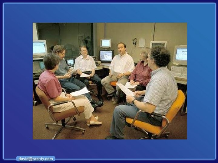
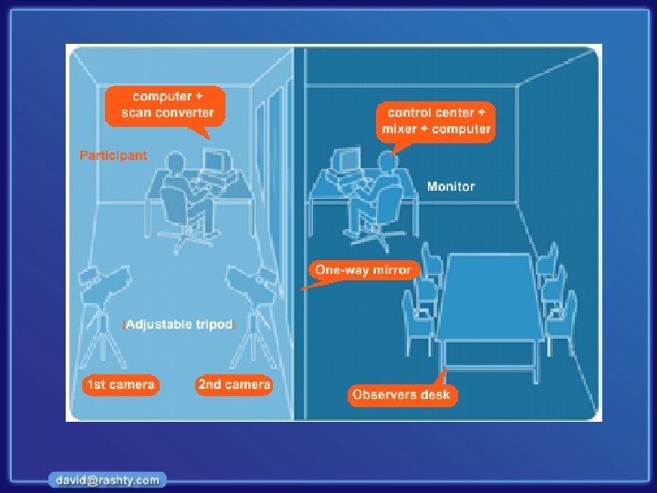

Observation room

3% 7% 11% 33% 6% 5% 19%

Heuristic Evaluation

Discount Usability Engineering • Cheap – no special labs or equipment needed – the more careful you are, the better it gets • Fast – on order of 1 day to apply – standard usability testing may take a week • Easy to use – can be taught in 2 -4 hours

Heuristic Evaluation • Developed by Jakob Nielsen • Helps find usability problems in a UI design • Small set (3 -5) of evaluators examine UI – independently check for compliance with usability principles (“heuristics”) – different evaluators will find different problems – evaluators only communicate afterwards • findings are then aggregated • Can perform on working UI or on sketches – I’ve found in this class it works better on working UI

Why Multiple Evaluators? • Every evaluator doesn’t find every problem • Good evaluators find both easy & hard ones

Heuristic Evaluation Process • Evaluators go through UI several times – inspect various dialogue elements – compare with list of usability principles – consider other principles/results that come to mind • Usability principles – Nielsen’s “heuristics” – supplementary list of category-specific heuristics • competitive analysis & user testing of existing products • Use violations to redesign/fix problems

Nilsen’s 10 Heuristics (original( • H 1 -1: Simple & natural dialog • H 1 -2: Speak the users’ language • H 1 -3: Minimize users’ memory load • H 1 -4: Consistency • H 1 -5: Feedback • H 1 -6: Clearly marked exits • H 1 -7: Shortcuts • H 1 -8: Precise & constructive error messages • H 1 -9: Prevent errors • H 1 -10: Help and documentation

Heuristics (revised set( searching database for matches • H 2 -1: Visibility of system status – keep users informed about what is going on – example: pay attention to response time • • 0. 1 sec: no special indicators needed, why? 1. 0 sec: user tends to lose track of data 10 sec: max. duration if user to stay focused on action for longer delays, use percent-done progress bars

Heuristics (cont (. • Bad example: Mac desktop – Dragging disk to trash • should delete it, not eject it • H 2 -2: Match between system & real world – speak the users’ language – follow real world conventions

Heuristic Evaluation vs. Usability Lab • HE is much faster – 1 -2 hours each evaluator vs. days-weeks • HE doesn’t require interpreting user’s actions • Usability lab is far more accurate (by def. ) – takes into account actual users and tasks – HE may miss problems & find “false positives” • Good to alternate between HE & Usability lab – find different problems – don’t waste participants

Information Architecture Lifecycle

Information Architecture work process • Plan • Research • Analyze Why ? • Design (Functional Design) • Evaluate (Usability) How ? • Implement (Visual Design and Templates) • Document (Design Guide) • Train Maintain

Information Architecture Lifecycle Plan Prototype Evaluate

IA Products Research report Taxonomy Functional Design Prototype

Taxonomy using Correlate

Taxonomy using MS Visio

Functional Design Span

IA Evolution in Macromedia. com 1996 1998 2002 2001

Macromedia. com 2004

Macromedia. com 2005

Examples of good IA

Examples of bad IA

Research in the Area of IA and CHI

Who is Doing Research • • • Universities Microsoft / IBM / Sun… Auto / Aviation industries Army Specialized research institutes

Examples of Research Areas • • • Wearable interfaces Visualization Information scent Automatic usability testing Input devices

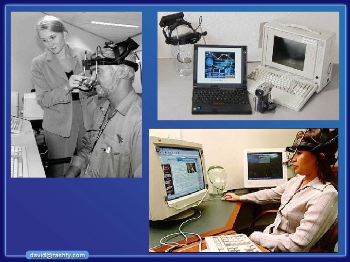
Wearable Interface

Wearable Interface “Good bye keyboard, so long mouse. Hello smart rooms and clothes that recognize acquaintances, understand speech, and communicate by gesture. And that’s just the beginning… ” Alex Pentland http: //www. media. mit. edu/wearables/

Visualization http: //www. cs. umd. edu/hcil/research/visualization. shtml

Visualization http: //www. visualthesaurus. com/? vt

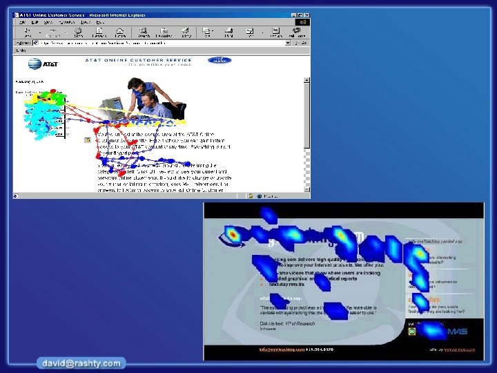
Information Scent http: //www 2. parc. com/istl/projects/uir/publications/project/index. html

Automatic Usability Testing

Input Devices and Sensors

Understanding Human Language

Bibliography

References – Research • http: //www. cs. umd. edu/hcil/ - University of Maryland man -Computer Interaction Lab • http: //www 2. parc. com/istl/projects/uir/ - User Interface Research @ PARC • http: //guir. berkeley. edu/ - Group of User Interface Research at Barkley • http: //research. microsoft. com/ui/ - Microsoft research group • http: //www. acm. org/sigchi/ - ACM CHI

References – Websites • www. argus-acia. com - Peter Morville and Louis Rosenfeld company’s website • www. jjg. net/ia - Information Architecture resources • www. useit. com - Jakob Nielsen website • www. usableweb. com - Mainly about usability but contains lots of info on IA

References – Books Information Architecture for the World Wide Web: Designing Large. Scale Web Sites by Louis Rosenfeld, Peter Morville Information Architecture: Blueprints for the Web by Christina Wodtke

References – Books (cont( The Usability Engineering Lifecycle: A Practitioner's Handbook for User Interface Design by Deborah J. Mayhew Usability Engineer by Jakob Nielsen

References – Books (cont( Designing the User Interface: Strategies for Effective Human-Computer Interaction Ben Shneiderman, University of Maryland Catherine Plaisant, University of Maryland

References – Also Recommended • • Designing Web Usability / Jacob Nielsen Don’t make me think / Steve Krug About Face / Alan Cooper The design of everyday things / Don Norman

Thank you!
48564c9adb961abcf99f615236b309a9.ppt