227291b082281b5514a3da769d54162f.ppt
- Количество слайдов: 48

FOUR DESKTOP PUBLISHING DESIGN ELEMENTS THAT EVERYONE NEEDS TO KNOW Presented by Jerry Smith
Where We’re Going Focus on four basic design elements Contrast Alignment Repetition Proximity Examples of Each Simple changes make a HUGE difference
The Big Four Contrast Alignment Repetition Proximity There is no clever acronymn: You’ll have to figure that one out on your own…
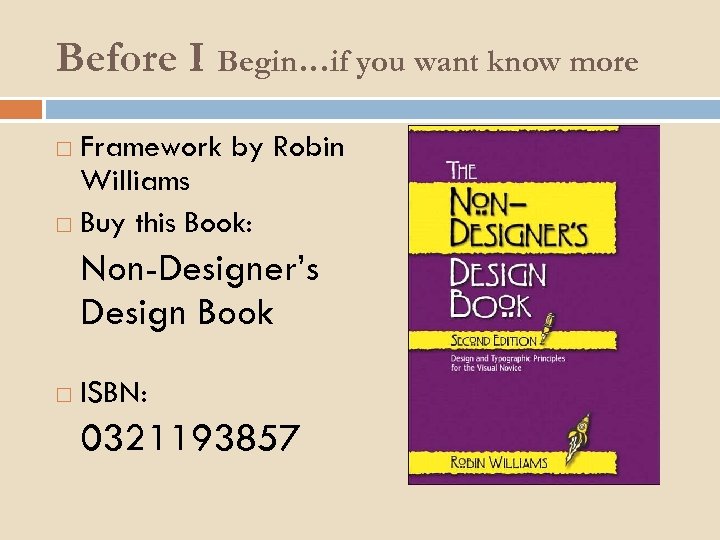
Before I Begin…if you want know more Framework by Robin Williams Buy this Book: Non-Designer’s Design Book ISBN: 0321193857

Subjectivity Yep, most of this is quite subjective These elements provide structured options Even if you don’t get it right the first shot, you’ll know some things you can change to create an entirely different look Eliminates poke-and-hope mentality of design

Framework is to English… True or False: The English language is always consistent? These rules can (and should be) broken sometimes It’s a framework, not a set of laws
Something is wrong… but you can’t put your finger on it. In many cases, the thing that’s wrong is one of these elements By having a name for the broken elements, you’ll find that it is much easier to fix The four elements overlap quite a bit This is a very good thing. It leads to near infinite possibilities.

Contrast (the king element) By definition, refers to the degree of noticeable differences in something There are lots of ways to provide contrast Color Alignment Typography Size Shape (fonts)
Color Contrast A simple logo with no contrast
Color Contrast Same simple logo with color contrast
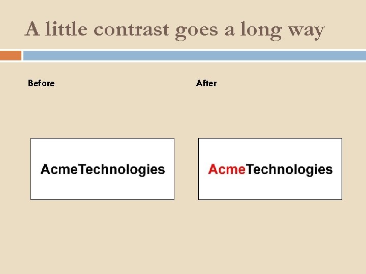
A little contrast goes a long way Before After

Alignment Contrast For years, most of us have been conditioned to believe that centering everything is the way to go:

Alignment Contrast But centering everything is overly formal and boring! With a little alignment contrast:
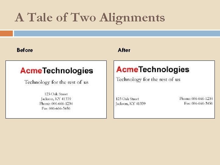
A Tale of Two Alignments Before After
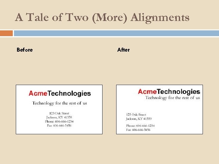
A Tale of Two (More) Alignments Before After
Typography Contrast Choose fonts that differ greatly! Times New Roman and Garamond Good: Times New Roman and Comic Sans MS Bad: Most common typography contrast involves serif vs. sans-serif

How NOT to do type contrast
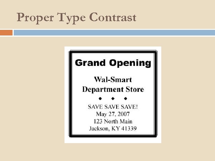
Proper Type Contrast

One Small Change of Font Before After

Put It All Together
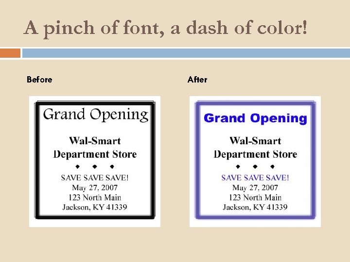
A pinch of font, a dash of color! Before After
Size Contrast Just as with fonts, if you’re going to do size contrasts, make it count!!! Two basic reasons to use size contrast: Emphasis Shock Value (Stress)

Yawn!
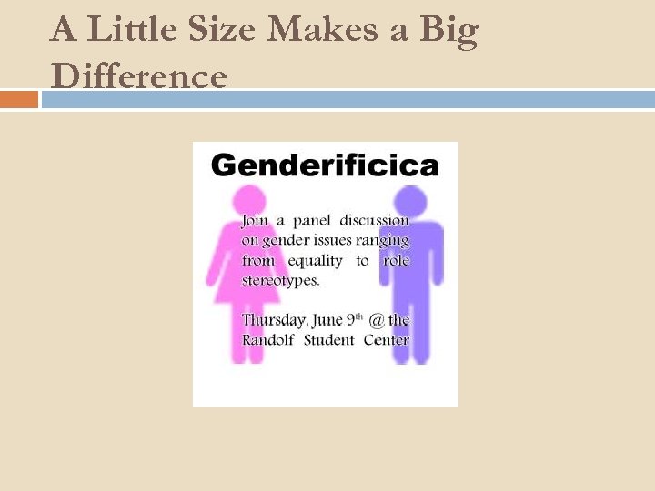
A Little Size Makes a Big Difference

Yawn to Yay! Before After
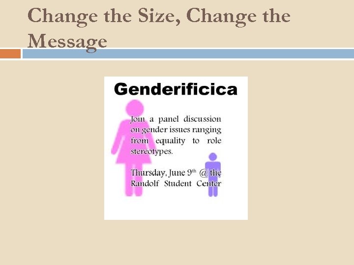
Change the Size, Change the Message
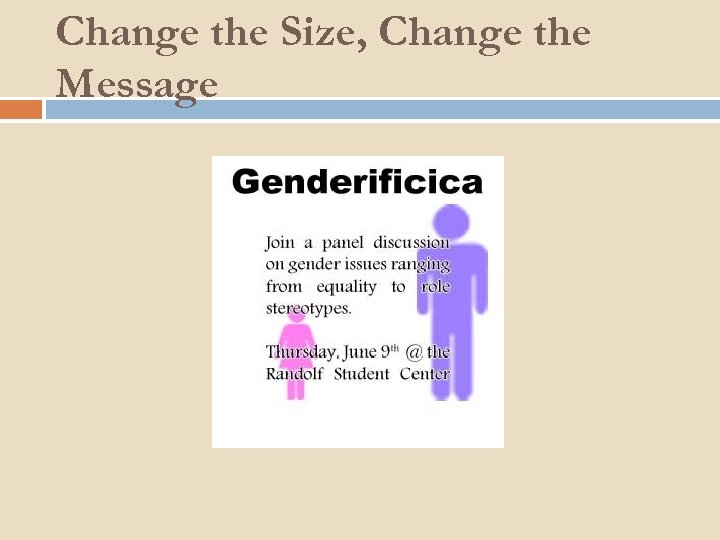
Change the Size, Change the Message
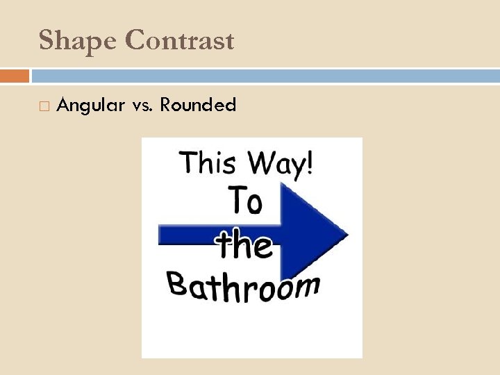
Shape Contrast Angular vs. Rounded
Contrast Review Differences stand out Emphasis Stress Color is easy Be really different with Fonts Sizes

Repetition By definition, to repeat The antithesis of Contrast Humans like patterns Makes things very comfortable The thing you see the most without realizing it The silent design element!
Things to Repeat Colors Fonts Shapes Sizes Humans are very good at intrinsically associating a repeated element with its function

Page 4 of a very long book
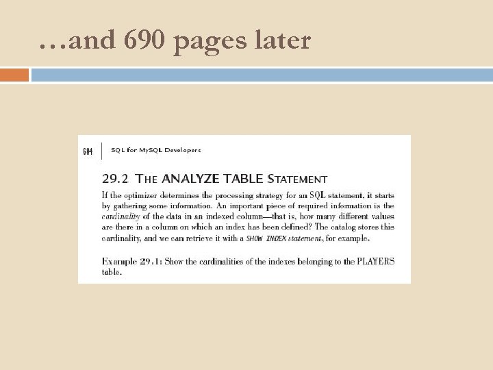
…and 690 pages later
What’s repeated? The page number formatting The heading font, size, and weight The body text font and size The weight of emphasized text
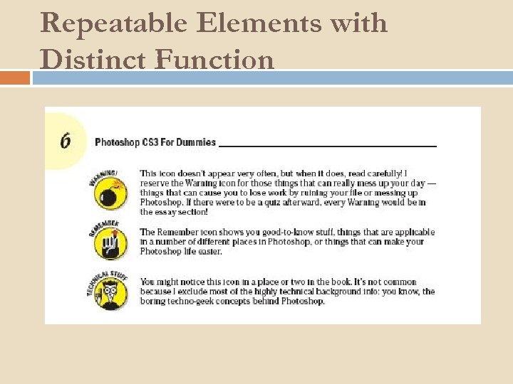
Repeatable Elements with Distinct Function
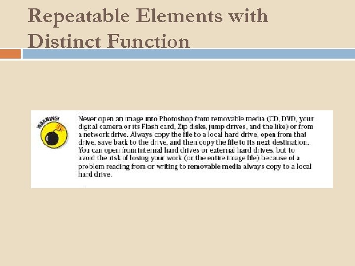
Repeatable Elements with Distinct Function
Repetition Review Create patterns where patterns are important Headings Body Other stuff Main Menu and Navigational Elements should be repeated Be careful not to overdo!
Proximity By definition, the spatial relationship between items Human beings naturally make associations between proximate objects The closer things are to one another, the more they must be related Good designs exploit this intrinsic trait
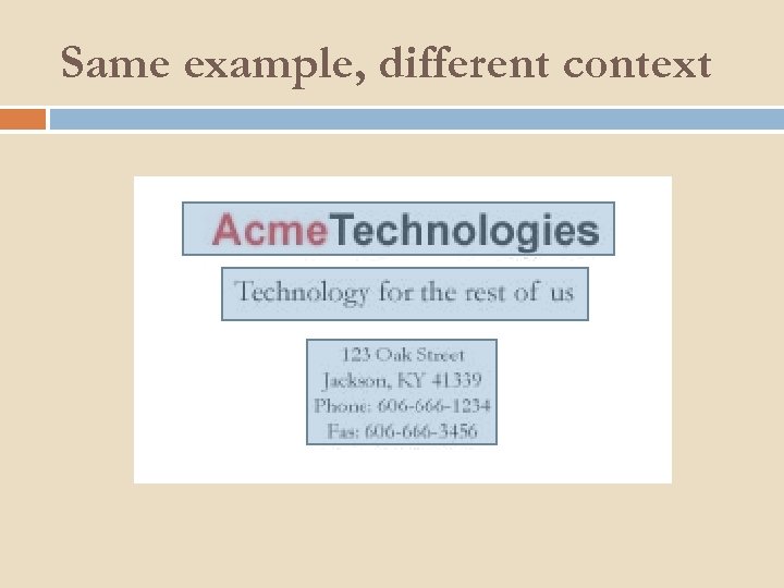
Same example, different context
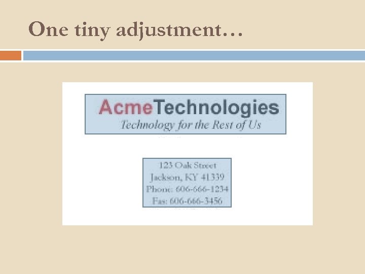
One tiny adjustment…
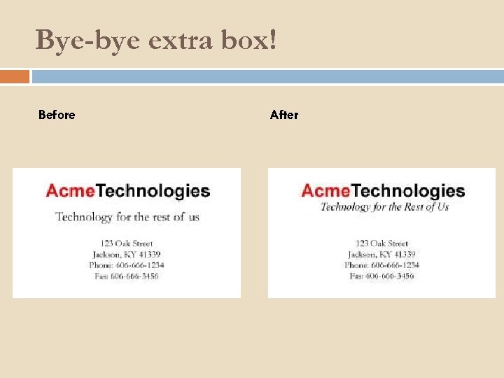
Bye-bye extra box! Before After
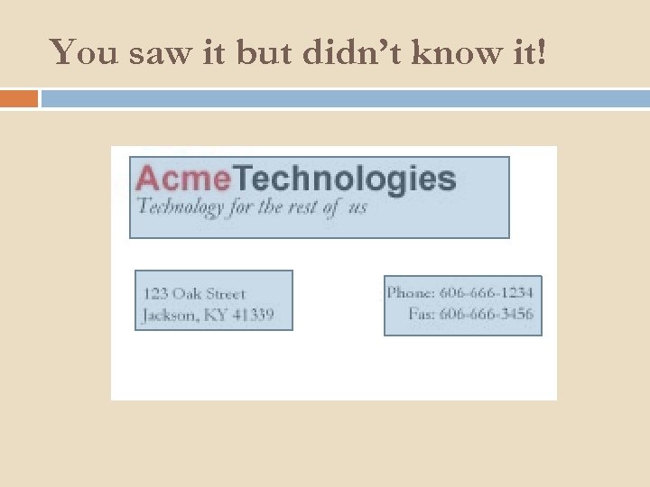
You saw it but didn’t know it!
What about Alignment? What about it! Think about the other three elements we’ve discussed… Alignment can be Contrasted Repeated Used to create proximation

How Do We Teach This Stuff As with everything else: Patiently Tackle individually at first Don’t go over all in one day Possibly a week long unit? ? One element per day with examples and practice Tie them together on Friday
Pavlov’s Children Give specific praise for using the elements “I really like your use of contrast there, Sally” “Nice proximity with your grouping of information, George!” The framework is great for constructive criticism “Think about what kind of contrast you could use here. ” “Is there something you could do to make this information seem more related? ”
In Review… Focus on four basic design elements Contrast Repetition Alignment Proximity It’s all subjective Simple changes make a HUGE difference
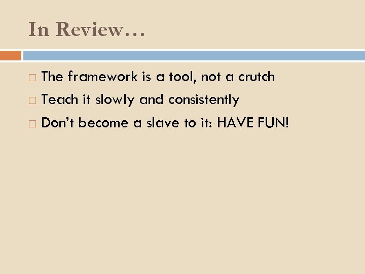
In Review… The framework is a tool, not a crutch Teach it slowly and consistently Don’t become a slave to it: HAVE FUN!

Thanks for playing along! Any questions or comments?
227291b082281b5514a3da769d54162f.ppt