

979c88b6ca3892dfb540e29013c0350f.ppt
- Количество слайдов: 41


 Experimental Comparison on 37 datasets
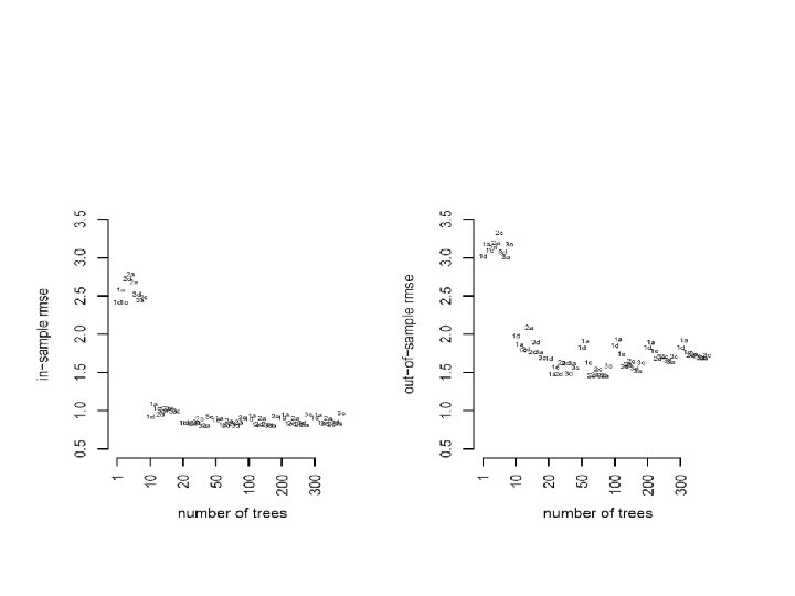
 Results: Root Mean Squared Errors
 One of the 37 Datasets is the well-known Boston Housing Data Each observation corresponds to a geographic district y = log(median house value) 13 x variables, stuff about the district eg. crime rate, % poor, riverfront, size, air quality, etc. n = 507 observations
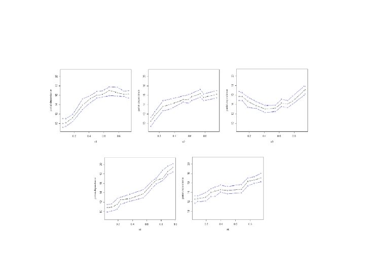
 BART Offers Estimates of Predictor Effects

 Applying BART to the Friedman Example
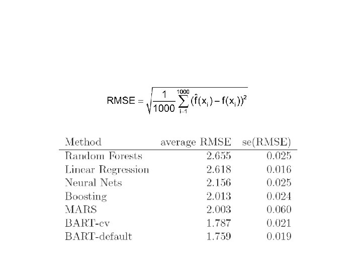
 Comparison of BART with Other Methods
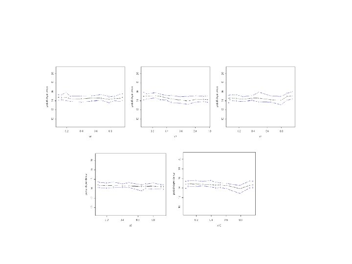
 Detecting Low Dimensional Structure in High Dimensional Data Added many useless x's to Friedman’s example
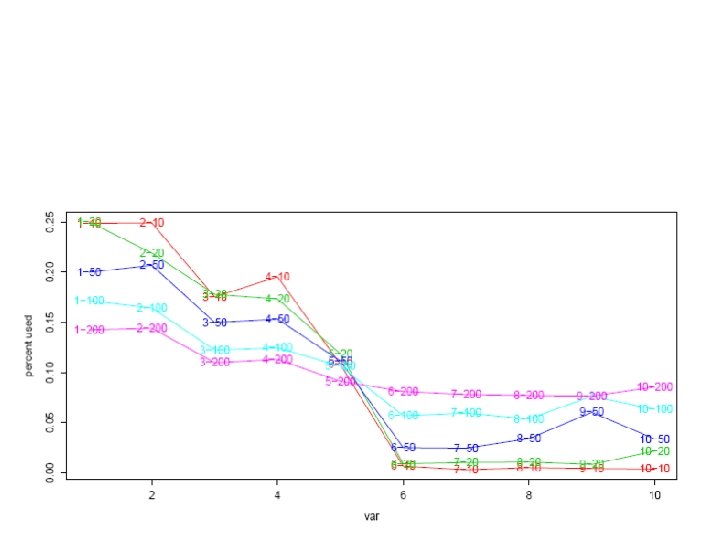

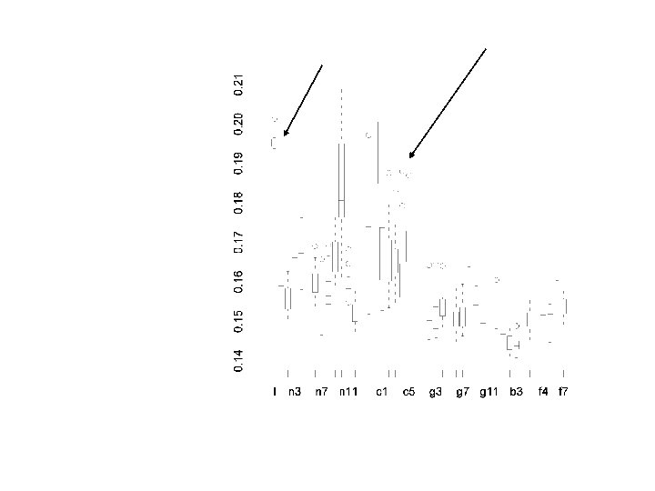
 For each draw, for each variable calculate the percentage of time that variable is used in a tree. Then average over trees. Subtle point: Can’t have too many trees. Variables come in without really doing anything.
 Just used variables 2, 7, 10, and 14. Here are the four univariate partialdependence plots.

 The BART Fit for the HIV Data BART suggests there is not a strong signal in x for this y.
 Partial Dependence Plots May Suggest Genotype Effects For example, the average predictive effect of ABI_383
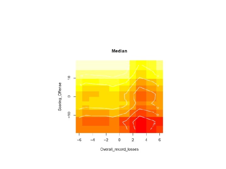
 Predictive Inference about Interaction of NNRTI 2 Treatment and ABI_383 Genotype There appears to be no interaction effect
 First, introduce prior independence as follows

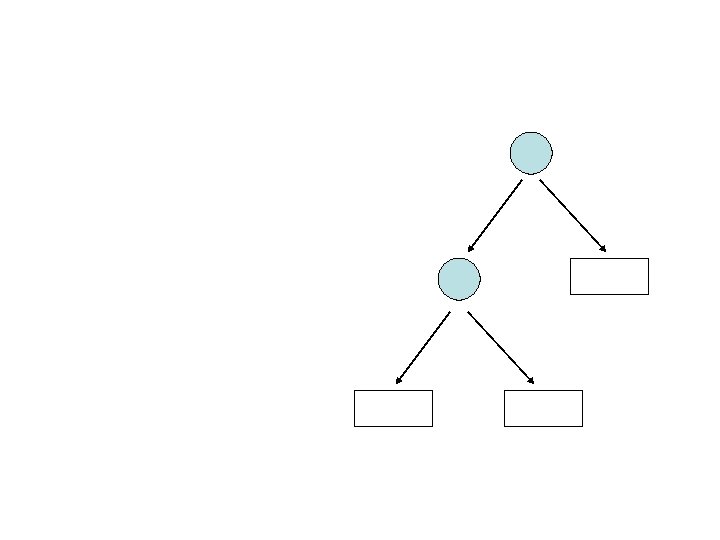
 = p(T | data) p(M | T, data)") p(T, M | data) = p(T | data) p(M | T, data)
p(T, M | data) = p(T | data) p(M | T, data)
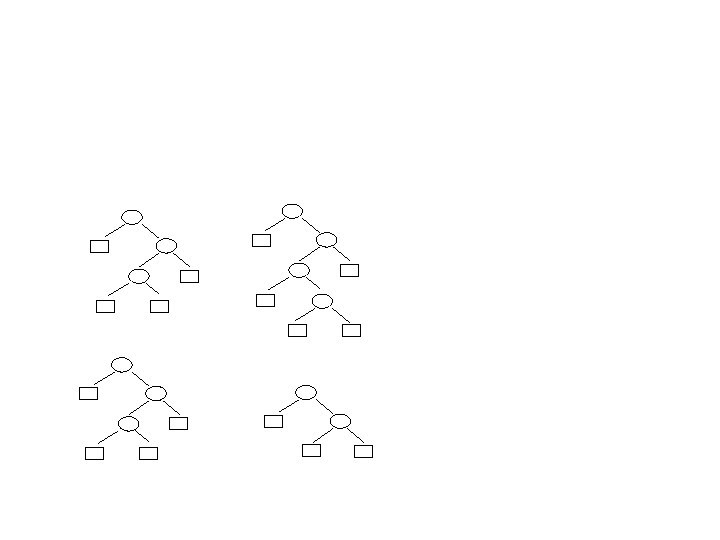
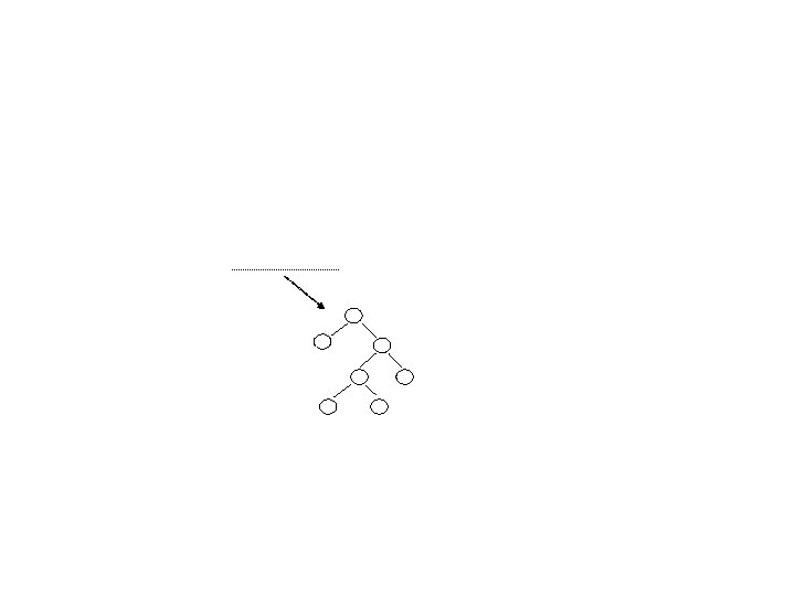
 The Dynamic Random Basis in Action: As we run the chain, we often observe that an individual tree grows quite large and then collapses back to a single node. This illustrates how each tree is dimensionally adaptive.
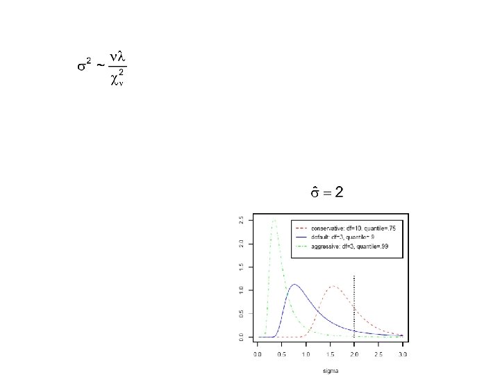
 Using the MCMC Output to Draw Inference At iteration i we have a draw from the posterior of the function To get in-sample fits we average the Posterior uncertainty is captured by variation of the

