c2c4e561d34e51ce411dec78a82952e4.ppt
- Количество слайдов: 32
Example 2. 2 Estimating the Relationship between Price and Demand
Background Information n The Links Company sells its golf clubs at golf outlet stores throughout the United States. n The company knows that demand for its clubs varies considerably with price. n In fact, the price has varied over the past 12 months, and the demand for each price level has been observed.
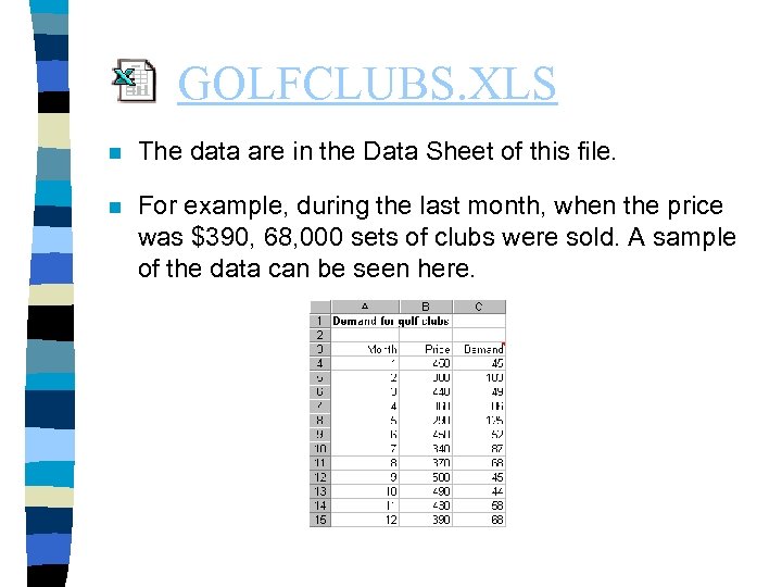
GOLFCLUBS. XLS n The data are in the Data Sheet of this file. n For example, during the last month, when the price was $390, 68, 000 sets of clubs were sold. A sample of the data can be seen here.
The Questions n The company would like to estimate the relationship between demand price. Then it would like to use this estimated relationship to answer the following questions. – Assuming the unit cost of producing a set of clubs is $250 and the price must be a multiple of $10, what price should Links charge to optimize its profit? – How does the optimal price depend on the unit cost of producing a set of clubs? – Is the model an accurate representation of reality?
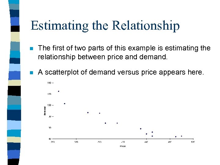
Estimating the Relationship n The first of two parts of this example is estimating the relationship between price and demand. n A scatterplot of demand versus price appears here.
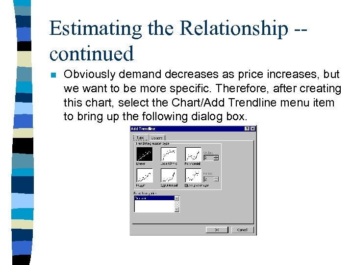
Estimating the Relationship -continued n Obviously demand decreases as price increases, but we want to be more specific. Therefore, after creating this chart, select the Chart/Add Trendline menu item to bring up the following dialog box.
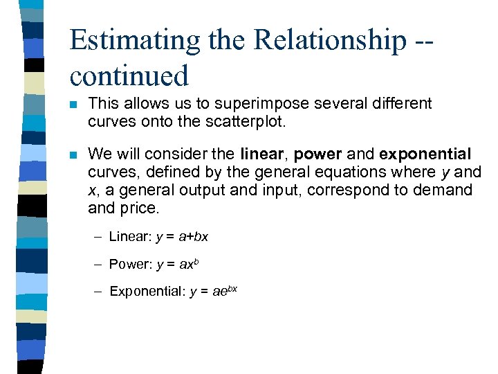
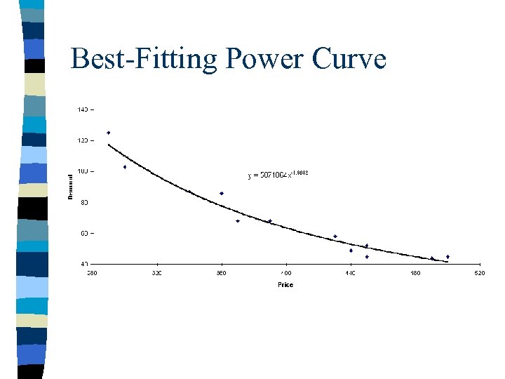
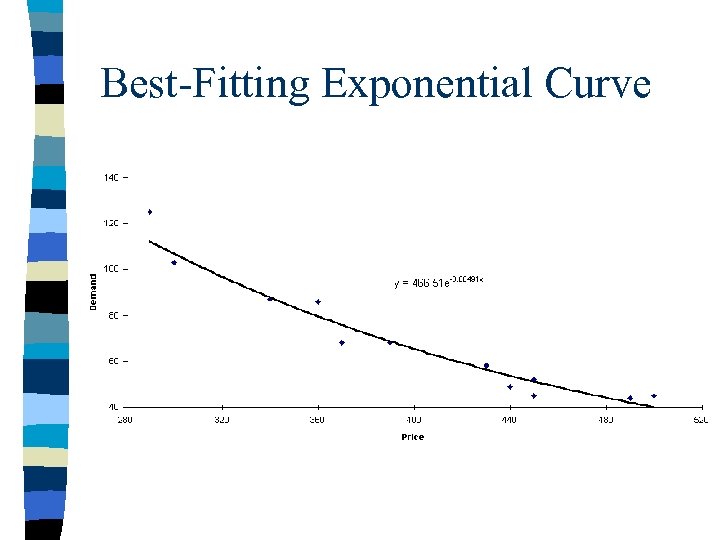
Estimating the Relationship -continued n This allows us to superimpose several different curves onto the scatterplot. n We will consider the linear, power and exponential curves, defined by the general equations where y and x, a general output and input, correspond to demand price. – Linear: y = a+bx – Power: y = axb – Exponential: y = aebx
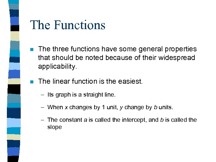
The Functions n The three functions have some general properties that should be noted because of their widespread applicability. n The linear function is the easiest. – Its graph is a straight line. – When x changes by 1 unit, y change by b units. – The constant a is called the intercept, and b is called the slope
The Functions -- continued n The power function is a curve except in the special case where the exponent b is 1. Then it is a straight line. The shape of the curve depends primarily on the exponent b. – If b >1, y increases at an increasing rate as x increases. – If 0 < b < 1, y increases, but at a decreasing rate, as x increases. – If b < 0, y decreases as x increases. n An important property of the power curve is that when x changes by 1%, y changes by a constant percentage, and this percentage is approximately equal to b%.
The Functions -- continued n The exponential function also represents a curve whose shape depends primarily on the constant b in the exponent. – If b > 0, y increases as x increases. – If b < 0, y decreases as x increases. n An important property of the exponential function is that if x changes by 1 unit, y changes by a constant percentage, and this percentage is approximately equal to 100 x b%. n Another important note about the equation is that is contains e, the special number 2. 7182…. In Excel, e to any power can be calculated by the EXP function.
Estimating the Relationship -continued n If we superimpose any one of these curves on the scatterplot for demand versus price, Excel will choose the best fitting curve of that type. n Better yet if we click the options tab of the dialog box and check Display equation on Chart option, we see the equation of this best-fitting curve. n Doing this for each type of curve we obtain the results in the following figures.
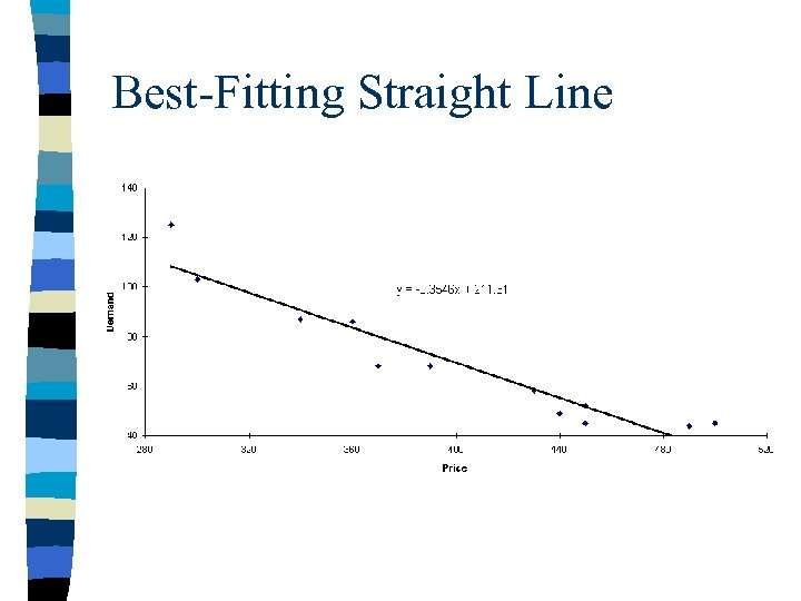
Best-Fitting Straight Line
Best-Fitting Power Curve
Best-Fitting Exponential Curve
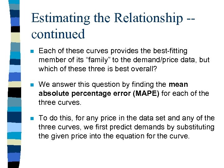
Estimating the Relationship -continued n Each of these curves provides the best-fitting member of its “family” to the demand/price data, but which of these three is best overall? n We answer this question by finding the mean absolute percentage error (MAPE) for each of the three curves. n To do this, for any price in the data set and any of the three curves, we first predict demands by substituting the given price into the equation for the curve.
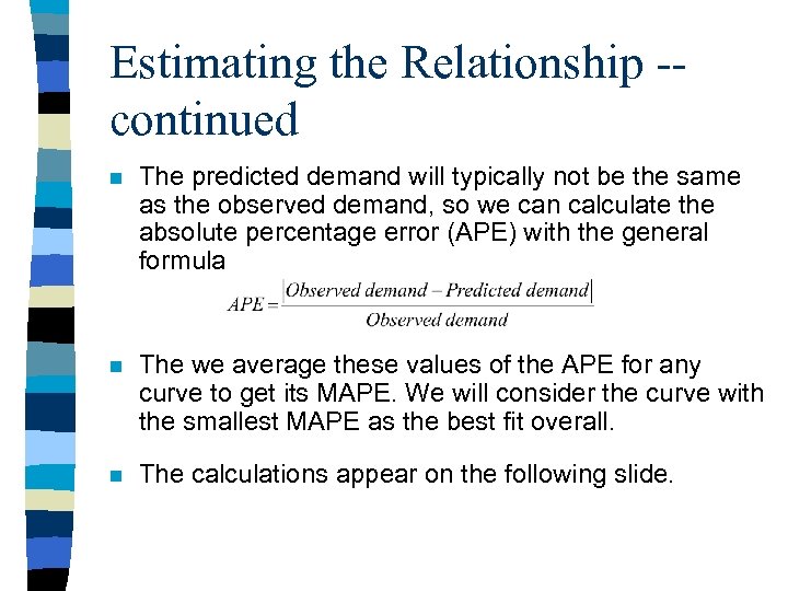
Estimating the Relationship -continued n The predicted demand will typically not be the same as the observed demand, so we can calculate the absolute percentage error (APE) with the general formula n The we average these values of the APE for any curve to get its MAPE. We will consider the curve with the smallest MAPE as the best fit overall. n The calculations appear on the following slide.

Estimating the Relationship -continued n After manually entering the parameters of the equations from the scatterplots into column B and giving them range names as shown, proceed as follows. – Predicted demands. Substitute observed prices into the linear, power, and exponential functions to obtain the predicted demands in columns E, F, and G. Specifically, enter the formulas =Intercept+Slope*B 4, =Pow. Const*B 4^Pow. Expon, and =Exp. Const*EXP(Exp. Expon*B 4) in cells E 19, F 19, and G 19, and copy them down their respective columns.
Estimating the Relationship -continued – Average percentage errors. Apply equation 2. 1 to calculate APEs in column H, I and J. Specifically, enter the general formula =ABS($C 4 -E 19)/$C 4 in cell H 19 and copy it to the range H 119: J 30. – MAPE. Average the APEs in each column with the AVERAGE function to get the MAPEs in row 31. n Evidently the power curve provides the best fit, with MAPE of 5. 88%. In words, its predictions are off, on average of 5. 88%. n This power curve predicts that each 1% increase in price leads to an approximate 1. 9% decrease in demand.
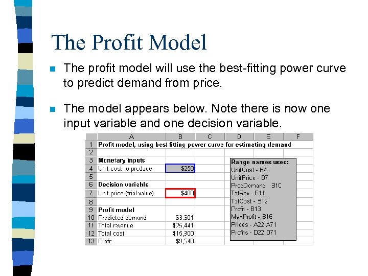
The Profit Model n The profit model will use the best-fitting power curve to predict demand from price. n The model appears below. Note there is now one input variable and one decision variable.
The Profit Model -- continued n The profit model is straightforward. We first calculated the predicted demand from the power function with the formula =Pow. Const*Unit. Price^Pow. Expon n This leads directly to the formulas for total revenue, total cost, and profit =Unit. Price*Pred. Demand, =Unit. Cost*Pred. Demand, and =Tot. Rev-Tot. Cost.
Answering the Questions n We can answer the company’s questions. n To see which price maximizes profit, we build the data table shown on the next slide. n The column input cell is Unit. Price and the “linking” formula in cell B 21 is =Profit. n The corresponding chart shows that profit first increases, then decreases. n We can find the maximum profit and corresponding price in at least three ways.
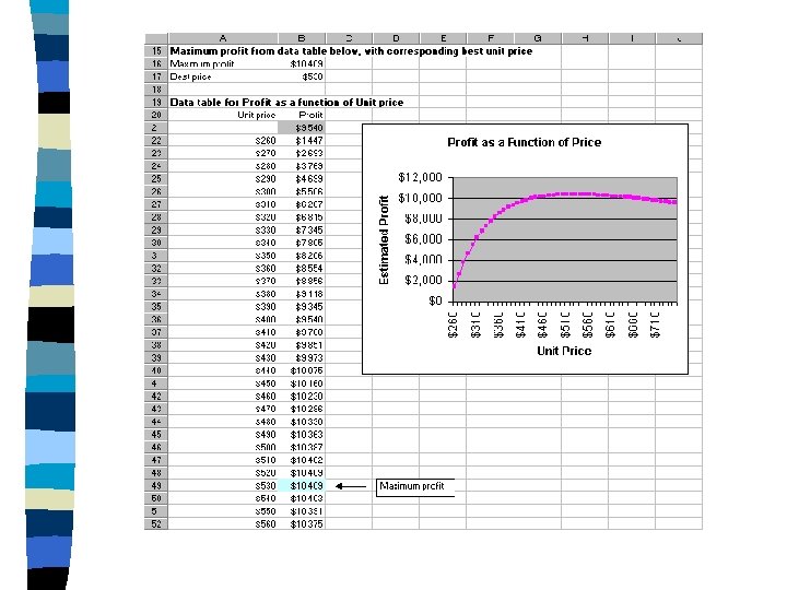
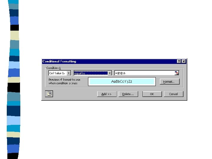
Answering the Questions -continued n First, we can attempt to read them off the chart. n Second, we can scan down the data table for the maximum profit, which we indicate in the figure. n The third method uses some of Excel’s most exotic features. One of these tools is conditional formatting. Excel will scan the selected range and apply a certain formatting to cells that meet certain conditions which you specify. The conditional formatting dialog box is shown on the next slide.
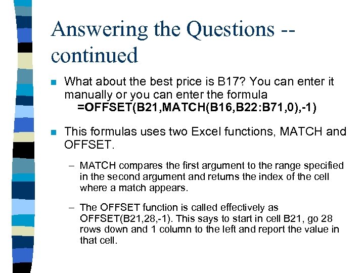
Answering the Questions -continued n What about the best price is B 17? You can enter it manually or you can enter the formula =OFFSET(B 21, MATCH(B 16, B 22: B 71, 0), -1) n This formulas uses two Excel functions, MATCH and OFFSET. – MATCH compares the first argument to the range specified in the second argument and returns the index of the cell where a match appears. – The OFFSET function is called effectively as OFFSET(B 21, 28, -1). This says to start in cell B 21, go 28 rows down and 1 column to the left and report the value in that cell.
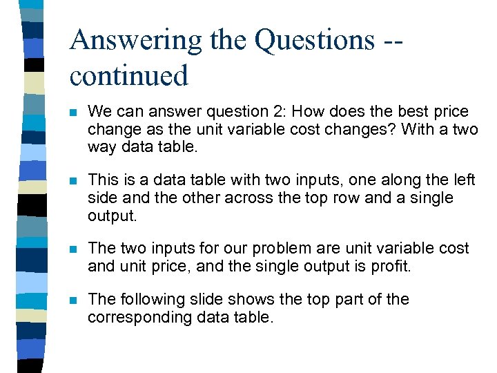
Answering the Questions -continued n We can answer question 2: How does the best price change as the unit variable cost changes? With a two way data table. n This is a data table with two inputs, one along the left side and the other across the top row and a single output. n The two inputs for our problem are unit variable cost and unit price, and the single output is profit. n The following slide shows the top part of the corresponding data table.
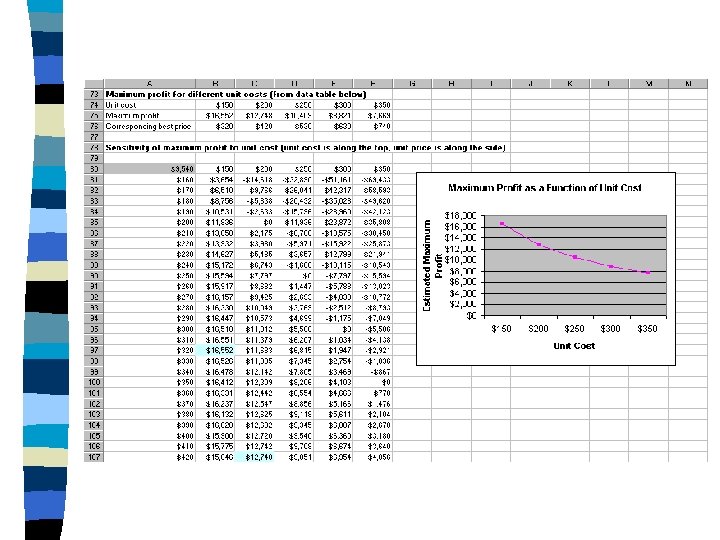
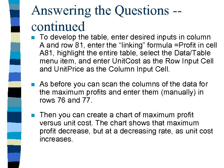
Answering the Questions -continued n To develop the table, enter desired inputs in column A and row 81, enter the “linking” formula =Profit in cell A 81, highlight the entire table, select the Data/Table menu item, and enter Unit. Cost as the Row Input Cell and Unit. Price as the Column Input Cell. n As before you can scan the columns of the data for the maximum profits and enter them (manually) in rows 76 and 77. n Then you can create a chart of maximum profit versus unit cost. The chart shows that maximum profit decrease, but at a decreasing rate, as unit cost increases.
Answering the Questions -continued n Finally, question 3 asks us to step back from all of these details and evaluate whether the model is realistic. n First, there is no real reason why golf club prices should be restricted to be multiples of $10. We required this only so we could use a data table to find the profit-maximizing price. n Ideally, we would like to have a way to search over all possible prices to find the profit-maximizing price.
Answering the Questions -continued n Fortunately, Excel’s Solver tool enables us to accomplish this task fairly easily. n The problem of finding a profit-maximizing price is an example of an optimization model. n A second possible flaw in our model is that implicit assumption that price is the only factor that influences demand. n In reality, other factors such as advertising, the state of the economy, competitors prices, strength of competition and promotional expenses also influence demand.
Answering the Questions -continued n A final flaw in our model is that demand might not equal sales. n For example, if the actual demand for golf clubs during a year is 70, 000 but the company’s annual capacity is only 50, 000, the company would observe sales of only 50, 000. n This would cause us to underestimate actual demand, and our curve fitting method would produce biased predictions. n As these comments indicate, . Most models are not perfect, but we have to start somewhere!
c2c4e561d34e51ce411dec78a82952e4.ppt