a3ea1e9dfe7046a04f0d15c6d2745971.ppt
- Количество слайдов: 62

Desktop Publishing Syed Agil Alsagoff
DESKTOP PUBLISHING SYLLABUS COURSE DESCRIPTION: l Desktop Publishing introduces publishing and presentation concepts through the development of sophisticated documents such as brochures, manuscripts, reports, conference programs, catalogue articles, pamphlets, business presentations, business graphics, transparencies, slides, advertisements, etc. l The Desktop Publishing course builds on word processing skills and uses industry software and hardware permitting the manipulation of text and graphics.
l This course is designed to provide “hands on” experience using a desktop computerized workstation with access to laser print capability. l This course emphasizes editing, formatting, page layout and design, and paste up technique for clarity and impact.
COURSE OBJECTIVES l l l Upon successful completion of this course, the student will be able to understand, apply, or assess 1. computer technology as it relates to careers. 2. basic computer terminology 3. the production of newsletters with appropriate publication software 4. manipulate text, graphics, and other drawing tools to produce sophisticated publications 5. Understand the importance of Desktop Publishing in the business world
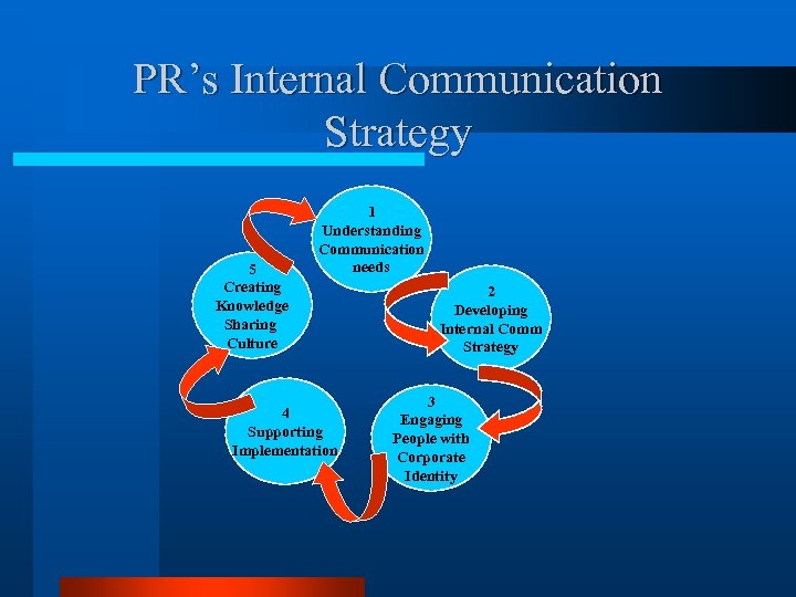
PR’s Internal Communication Strategy 5 Creating Knowledge Sharing Culture 1 Understanding Communication needs 4 Supporting Implementation 2 Developing Internal Comm Strategy 3 Engaging People with Corporate Identity
Types of PR Publications l Newsletter l Corporate Web Page l Brochure l Annual Reports l Megazine
DTP Definitions: l Publication system applications combines texts, graphics, animations, illustrations into a standard formatting to create and produces publications material
When was desktop publishing invented? l l l Several events of the mid-1980 s including the development of Aldus Page. Maker (now Adobe Page. Maker) ushered in the era of desktop publishing. A. It was primarily the introduction of both the Apple Laser. Writer, a Post. Script desktop printer, and Page. Maker for the Mac that kicked off the desktop publishing revolution. Aldus Corporation founder Paul Brainerd, is generally credited for coining the phrase, "desktop publishing. " 1984 - The Apple Macintosh debuts. 1984 - Hewlett-Packard introduces the Laser. Jet, the first desktop laser printer. 1985 - Adobe introduces Post. Script, the industry standard Page Description Language (PDL) for professional typesetting.
1985 - Aldus develops Page. Maker for the Mac, the first "desktop publishing" application. l 1985 - Apple produces the Laser. Writer, the first desktop laser printer to contain Post. Script. l 1987 - Page. Maker for the Windows platform is introduced. l 1990 - Microsoft ships Windows 3. 0. l
l In the intervening years since Page. Maker's introduction and purchase by Adobe, Quark, Inc. 's Quark. XPress took over as the sweetheart of desktop publishing applications. But today Adobe's In. Design is making inroads in the professional sector and wooing over many converts on both the PC and Mac platforms. l While Macintosh is still considered by some to be the platform of choice for professional desktop publishing, dozens of "consumer and small business desktop publishing" packages hit the shelves in the 1990 s, catering to the growing legions of PC/Windows users. Most notable among these low-cost Windows desktop publishing options, Microsoft Publisher and Serif Page. Plus continue to add features that make them more and more viable as contenders to the traditional "professional apps. "
Why is Desktop Publishing Important? Desktop publishing and graphic design can make documents look better, prettier. l Desktop publishing, used properly, enhances visual communication and streamlines the process of disseminating information of all kinds. l A. Desktop publishing is a tool that can enhance communication by making it possible to quickly and efficiently produce printed and electronic documents. l
Desktop Publishing Software allows the user to rearrange text and graphics on screen, change typefaces as easily as changing shoes, and resize graphics on the fly, before finally committing a design to paper. l There are drawbacks to desktop publishing in that it also makes it easier and less expensive to produce really bad designs. So, while desktop publishing is important, education in basic principles of graphic design and desktop publishing techniques is equally important. l
What is the difference between graphic design and desktop publishing? A. Graphic design jobs involve the creative process of coming up with the concepts and ideas and arrangements for visually communicating a specific message. B. Desktop publishing is the mechanical process that the designer and the non-designer use to turn their ideas for newsletters, brochures, ads, posters, greeting cards, and other projects into digital files for desktop or commercial printing. While desktop publishing does require a certain amount of creativity, it is more production-oriented than design-oriented.
l Graphic design is the process and art of combining text and graphics and communicating an effective message in the design of logos, graphics, brochures, newsletters, posters, signs, and any other type of visual communication. l Desktop publishing is the process of using the computer and specific types of software to combine text and graphics to produce documents such as newsletters, brochures, books, etc.
DTP’s Software l l l Adobe makes many software packages used by designers. You've probably heard of Photoshop, for example. But these other programs are not page layout software applications for print publishing. They are graphics software, Web design software, programs for creating and working with the PDF format, such as Adobe Acrobat, and other related software tools. The DTP software or page layout software applications are: Adobe Frame. Maker Adobe In. Design Adobe Page. Maker Adobe Photoshop Adobe Illustrator
Corel is best known for its graphics suite that includes Corel DRAW and Corel Photo-Paint. In the past it has produced creative printing or home publishing programs used for desktop publishing too but the primary page layout software from Corel is: l Corel Ventura l Microsoft produces Microsoft Word, Excel, Power. Point, and various consumer graphics and creative printing programs but they are not DTP software. Their entry into page layout for print is: l Microsoft Office Publisher l
l l l l Quark has other software but the one most closely associated with DTP is Quark. XPress and its many XTensions (produced by many third party vendors) that enhance and expand the basic capabilities of Quark. XPress Serif produces a suite of applications for graphics and Web design but the core desktop publishing software application is: Serif Page. Plus Also, a few of the other desktop publishing software packages that qualify as page layout applications or software suites that have a page layout component are: Deneba Canvas Rag. Time

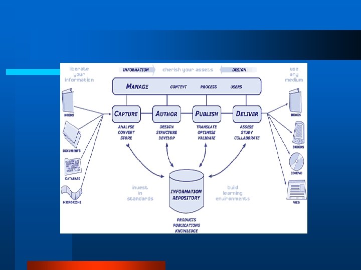
CAPDM Model l l Capture Author Publish Deliver Manage • • Pengurusan Perolehan Pengurusan Penciptaan/perekaan data Pengurusan Penerbitan Pengurusan Penghantaran Produk
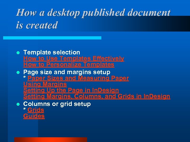
How a desktop published document is created Template selection How to Use Templates Effectively How to Personalize Templates l Page size and margins setup * Paper Sizes and Measuring Paper Using Margins Setting Up the Page in In. Design Setting Margins, Columns, and Grids in In. Design l Columns or grid setup * Grids Guides l
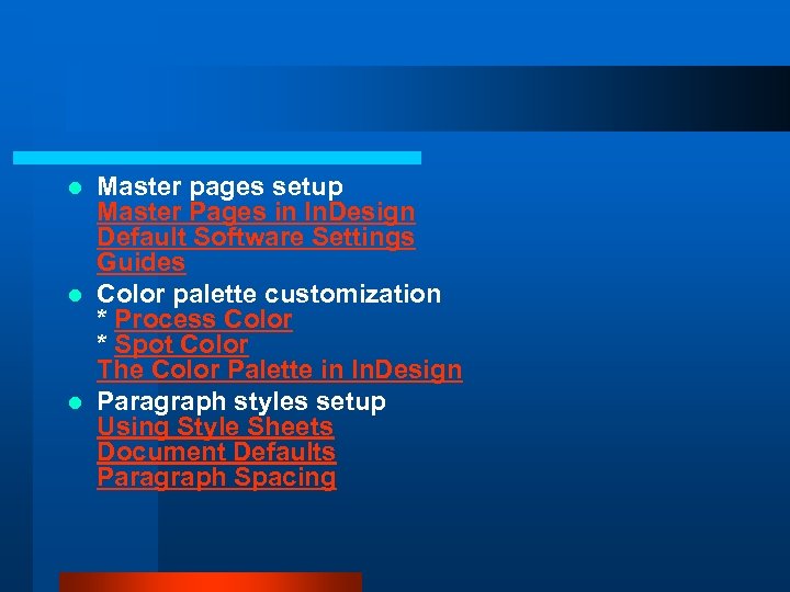
Master pages setup Master Pages in In. Design Default Software Settings Guides l Color palette customization * Process Color * Spot Color The Color Palette in In. Design l Paragraph styles setup Using Style Sheets Document Defaults Paragraph Spacing l
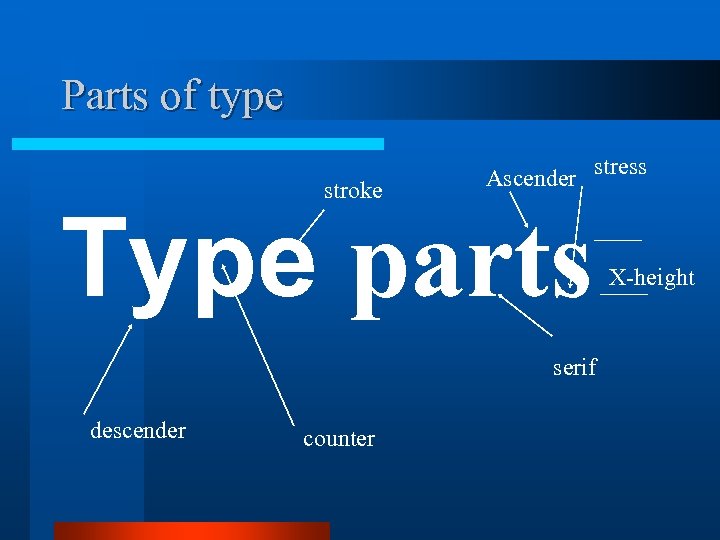
Parts of type stroke Ascender stress Type parts serif descender counter X-height
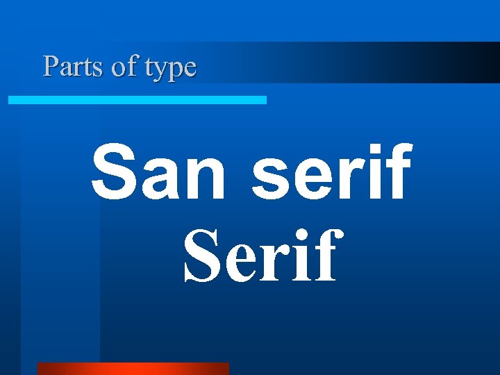
Parts of type San serif Serif
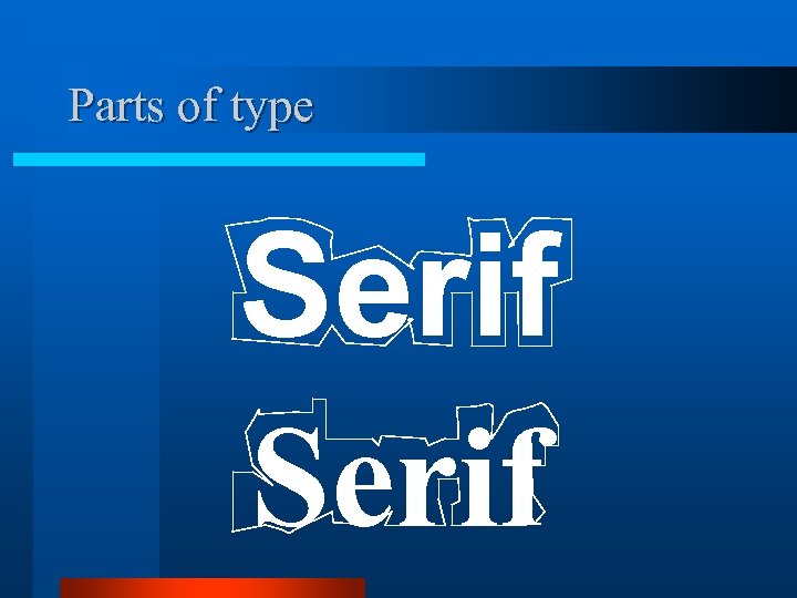
Parts of type Serif
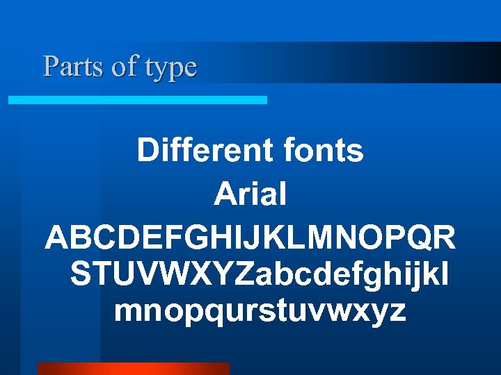
Parts of type Different fonts Arial ABCDEFGHIJKLMNOPQR STUVWXYZabcdefghijkl mnopqurstuvwxyz
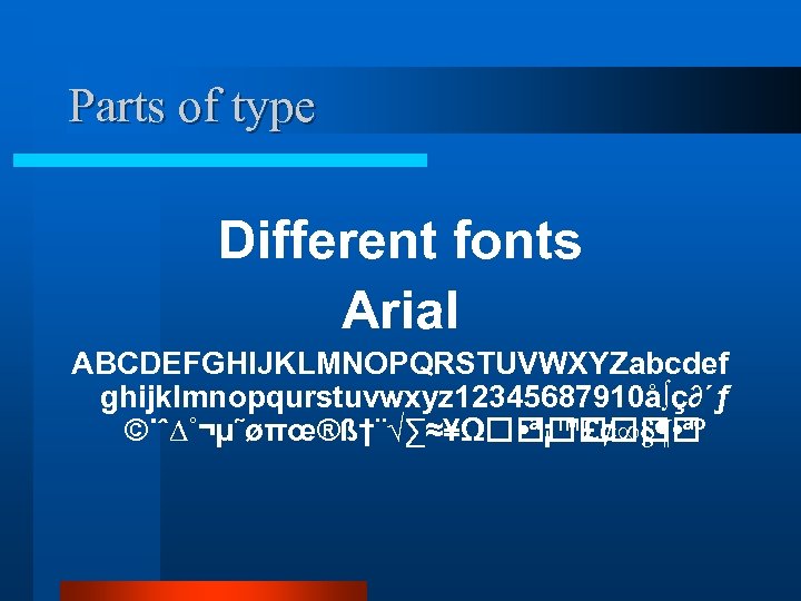
Parts of type Different fonts Arial ABCDEFGHIJKLMNOPQRSTUVWXYZabcdef ghijklmnopqurstuvwxyz 12345687910å∫ç∂´ƒ ©˙ˆ∆˚¬µ˜øπœ®ß†¨√∑≈¥Ω • ª¡™£¢∞§¶ • ªº
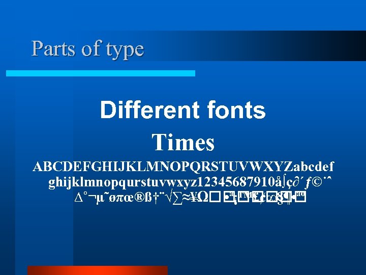
Parts of type Different fonts Times ABCDEFGHIJKLMNOPQRSTUVWXYZabcdef ghijklmnopqurstuvwxyz 12345687910å∫ç∂´ƒ©˙ˆ ∆˚¬µ˜øπœ®ß†¨√∑≈¥Ω • ª¡™£¢∞§¶ • ªº
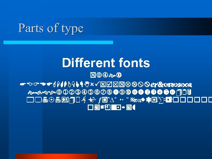
Parts of type Different fonts Times ABCDEFGHIJKLMNOPQRSTUVWXYZabcd efghijklmnopqurstuvwxyz 123 45687910å ç ƒ© ∫ ∂´ ˙ˆ∆˚ ¬µ ˜ ø ®ß √∑≈ Ω πœ †¨ ¥ • ¡ £¢ • ªº ª™ ∞ §¶
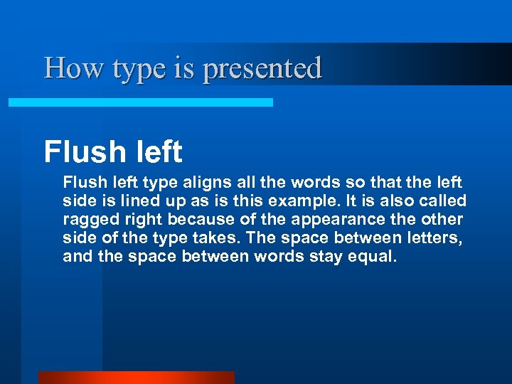
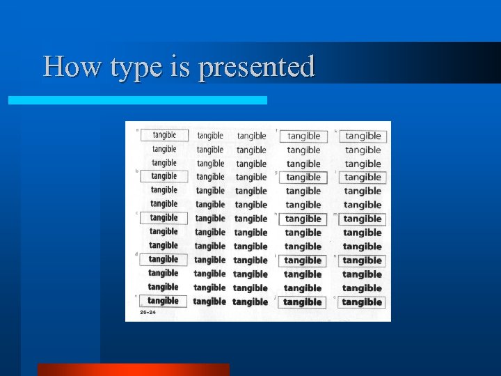
How type is presented Flush left type aligns all the words so that the left side is lined up as is this example. It is also called ragged right because of the appearance the other side of the type takes. The space between letters, and the space between words stay equal.
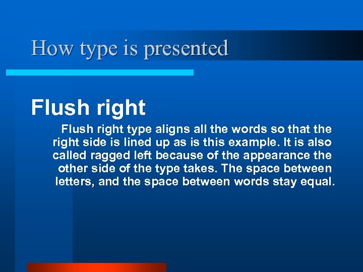
How type is presented Flush right type aligns all the words so that the right side is lined up as is this example. It is also called ragged left because of the appearance the other side of the type takes. The space between letters, and the space between words stay equal.
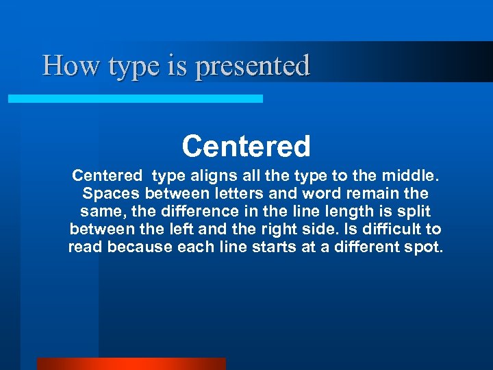
How type is presented Centered type aligns all the type to the middle. Spaces between letters and word remain the same, the difference in the line length is split between the left and the right side. Is difficult to read because each line starts at a different spot.
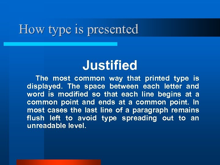
How type is presented Justified The most common way that printed type is displayed. The space between each letter and word is modified so that each line begins at a common point and ends at a common point. In most cases the last line of a paragraph remains flush left to avoid type spreading out to an unreadable level.
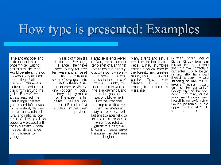
How type is presented: Examples
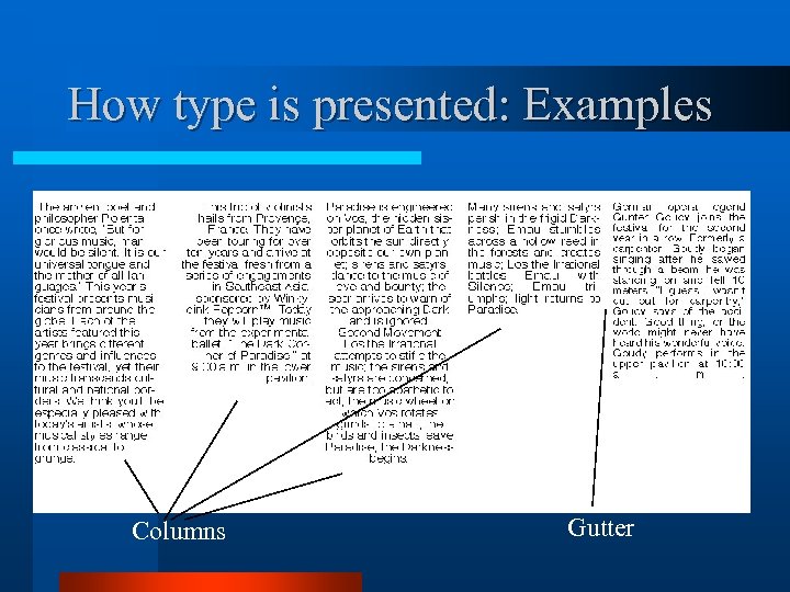
How type is presented: Examples Columns Gutter
How type is presented Units of measure points and picas 1 inch = 6 picas 12 points = 1 picas 72 points = 1 inch
How type is presented Units of measure Points are used to measure type Measure from the top of the ascender to the bottom of the descender
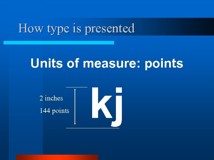
How type is presented Units of measure: points 2 inches 144 points kj
How type is presented Leading Space between the lines can be altered so that a given amount of type will take up less, or more space. Standard leading is 5 -10 percent over the size of the font
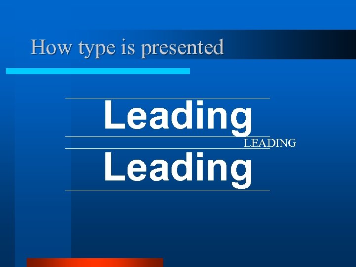
How type is presented Leading LEADING
How type is presented Kerning Space between letters and words. Can be altered to spread out type for effect or to take up, or remove space.
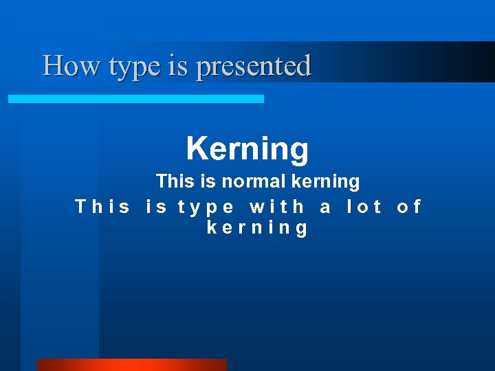
How type is presented Kerning This is normal kerning T h i s t y p e w i t h a l o t o f k e r n i n g
How type is presented
Basic design principle C. Contrast R. Repetition A. Alignment P. Proximity
C. R. A. P. and type Contrast. • Variations in sizes, weights and fonts can all give contrast to a design. • Contrast can help guide the reader around a design.

C. R. A. P. and type Repetition. • Repetition within a document can help connect things that go together.
C. R. A. P. and type Alignment. Lining up objects can help provide order to a design

C. R. A. P. and type Proximity. Object placed near one another provides the logical connection that the items are of the same group.
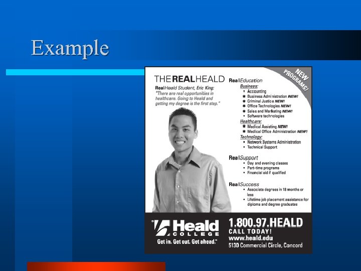
Example

Example
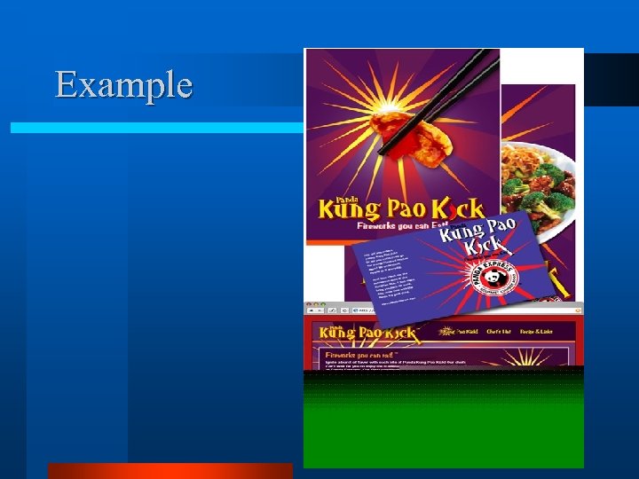
Example
Assignment for next class 1. 2. Read “Non-Designer’s” information on C. R. A. P Bring to next class the following. -- Two examples of designs that conform to the principle and that you feel are good designs.
Design is not new Fifth Century BC, Greece
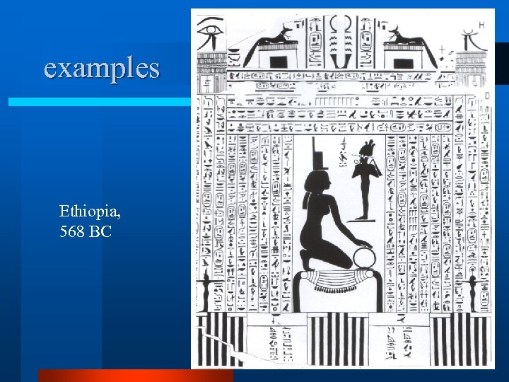
examples Ethiopia, 568 BC
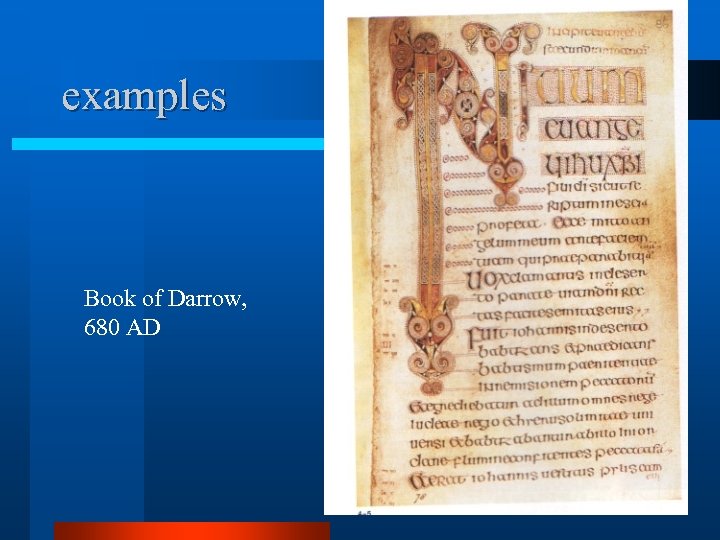
examples Book of Darrow, 680 AD
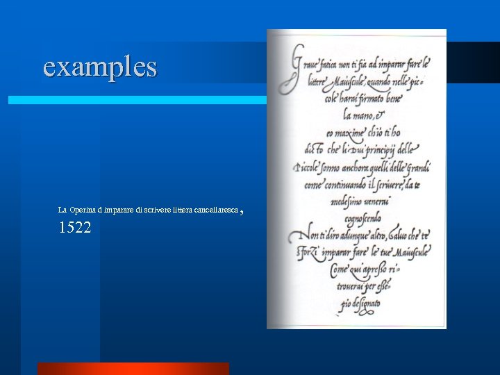
examples La Operina d imparare di scrivere littera cancellaresca 1522 ,
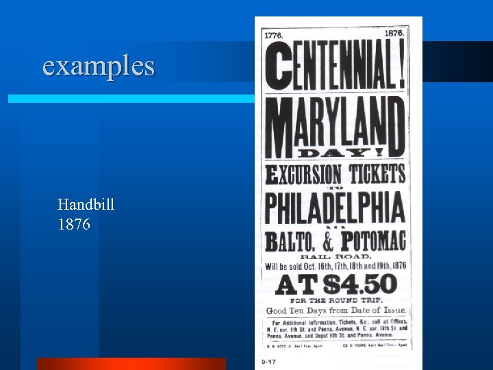
examples Handbill 1876
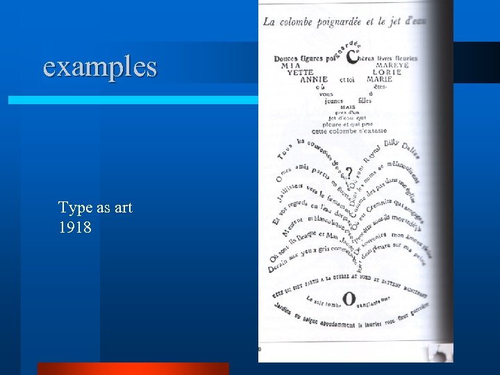
examples Type as art 1918
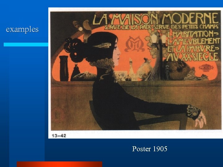
examples Poster 1905
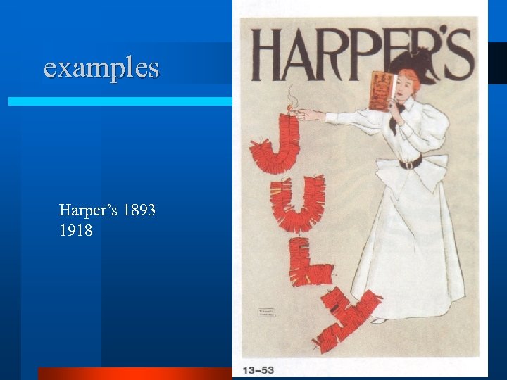
examples Harper’s 1893 1918
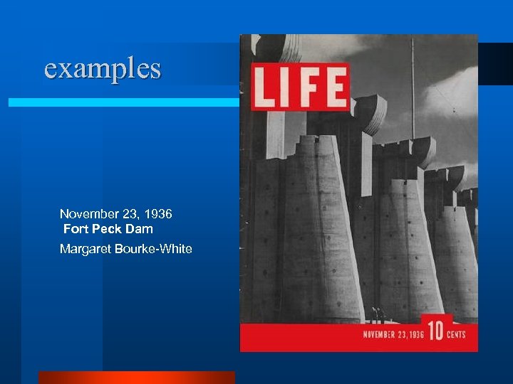
examples November 23, 1936 Fort Peck Dam Margaret Bourke-White
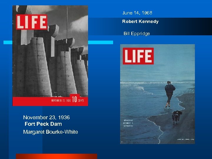
June 14, 1968 Robert Kennedy Bill Eppridge November 23, 1936 Fort Peck Dam Margaret Bourke-White
a3ea1e9dfe7046a04f0d15c6d2745971.ppt