81bc78fd86c3d4cc396fdc9a2cbba0a8.ppt
- Количество слайдов: 40
Demand IB Economics
Demand for chocolate bars experiment
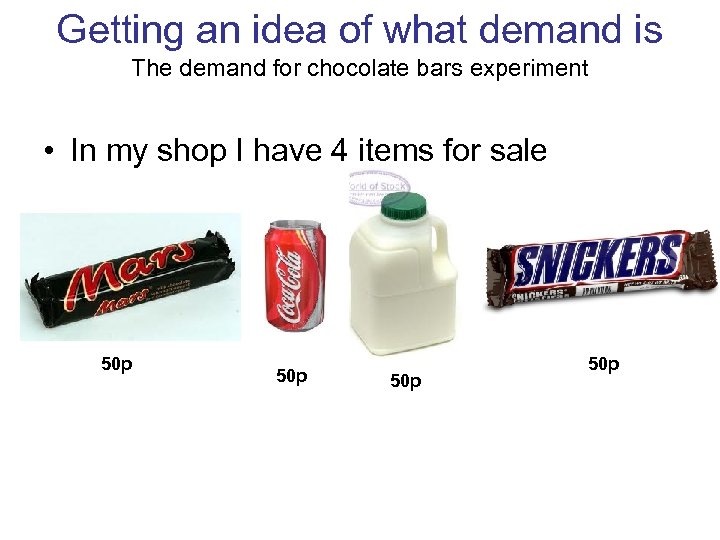
Getting an idea of what demand is The demand for chocolate bars experiment • In my shop I have 4 items for sale 50 p 50 p
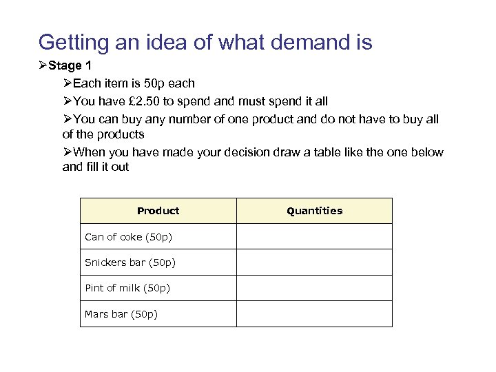
Getting an idea of what demand is ØStage 1 ØEach item is 50 p each ØYou have £ 2. 50 to spend and must spend it all ØYou can buy any number of one product and do not have to buy all of the products ØWhen you have made your decision draw a table like the one below and fill it out Product Quantities Can of coke (50 p) Snickers bar (50 p) Pint of milk (50 p) Mars bar (50 p)
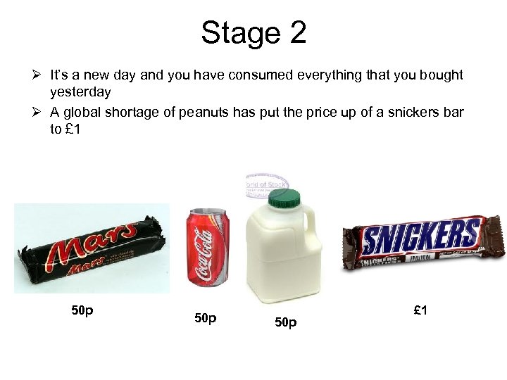
Stage 2 Ø It’s a new day and you have consumed everything that you bought yesterday Ø A global shortage of peanuts has put the price up of a snickers bar to £ 1 50 p 50 p £ 1
Demand for chocolate bars experiment continued ØStage 2 ØIt’s a new day and you have consumed everything that you bought yesterday ØA global shortage of peanuts has put the price up of a snickers bar to £ 1 ØYou still have £ 2. 50 income to spend and must spend it all ØYou can buy any number of one product and do not have to buy all of the products ØWhen you have made your decision draw a table like the one below again and fill it out with your new preferences Product Quantities Can of coke (50 p) Snickers bar (£ 1) Pint of milk (50 p) Mars bar (50 p)
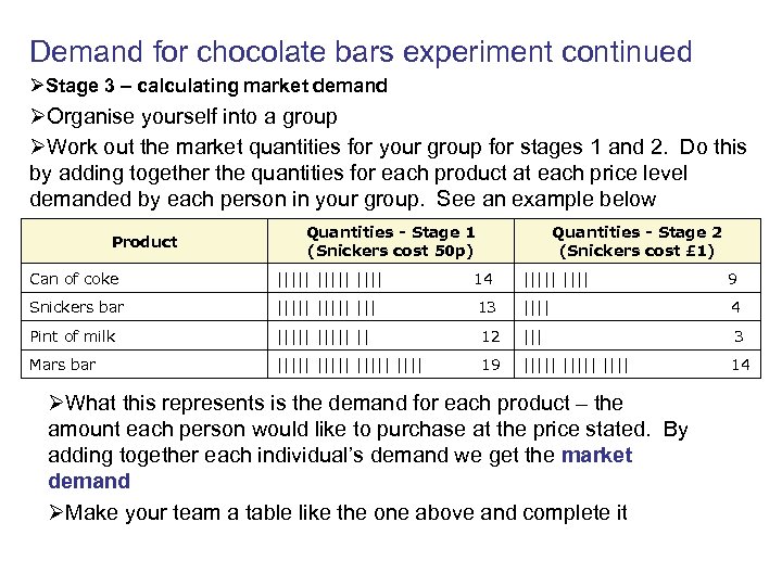
Demand for chocolate bars experiment continued ØStage 3 – calculating market demand ØOrganise yourself into a group ØWork out the market quantities for your group for stages 1 and 2. Do this by adding together the quantities for each product at each price level demanded by each person in your group. See an example below Product Quantities - Stage 1 (Snickers cost 50 p) Quantities - Stage 2 (Snickers cost £ 1) Can of coke ||||| 14 ||||| 9 Snickers bar ||||| ||| 13 |||| 4 Pint of milk ||||| || 12 ||| 3 Mars bar ||||| 19 ||||| 14 ØWhat this represents is the demand for each product – the amount each person would like to purchase at the price stated. By adding together each individual’s demand we get the market demand ØMake your team a table like the one above and complete it
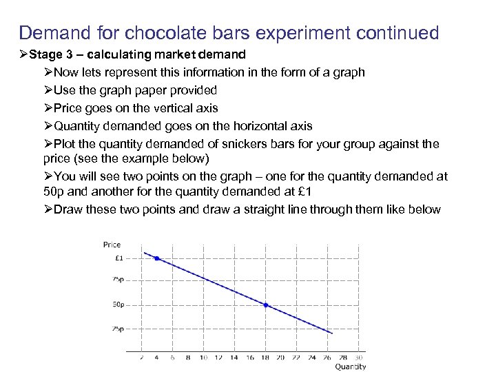
Demand for chocolate bars experiment continued ØStage 3 – calculating market demand ØNow lets represent this information in the form of a graph ØUse the graph paper provided ØPrice goes on the vertical axis ØQuantity demanded goes on the horizontal axis ØPlot the quantity demanded of snickers bars for your group against the price (see the example below) ØYou will see two points on the graph – one for the quantity demanded at 50 p and another for the quantity demanded at £ 1 ØDraw these two points and draw a straight line through them like below
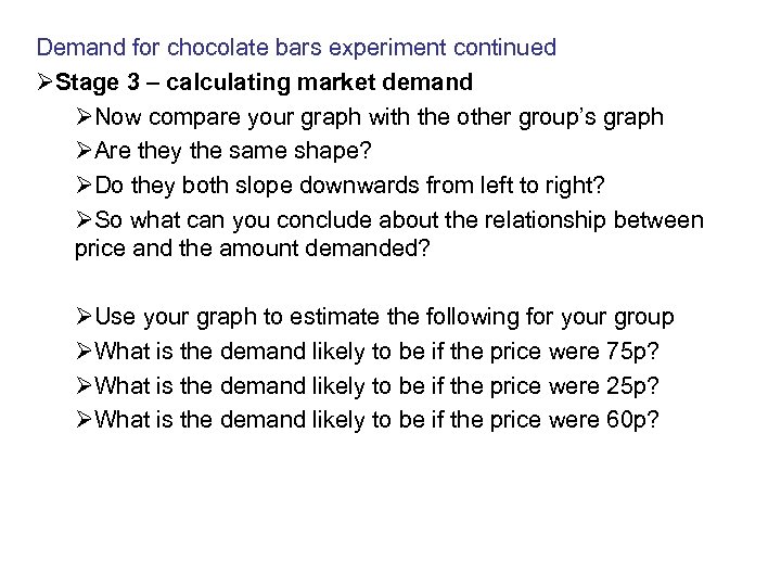
Demand for chocolate bars experiment continued ØStage 3 – calculating market demand ØNow compare your graph with the other group’s graph ØAre they the same shape? ØDo they both slope downwards from left to right? ØSo what can you conclude about the relationship between price and the amount demanded? ØUse your graph to estimate the following for your group ØWhat is the demand likely to be if the price were 75 p? ØWhat is the demand likely to be if the price were 25 p? ØWhat is the demand likely to be if the price were 60 p?
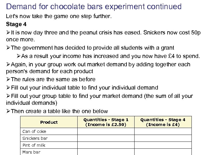
Demand for chocolate bars experiment continued Let's now take the game one step further. Stage 4 ØIt is now day three and the peanut crisis has eased. Snickers now cost 50 p once more. ØThe government has decided to provide all students with a grant ØAs a result your income has increased and you now have £ 4 to spend. ØAgain, in your group work out market demand by adding together each person's demand for each product ØThe rules are the same as before ØFill out your individual table to find your individual demand ØFill out your group table to find your market demand (the sum of all your individual demands) ØThen create a table like the one below Quantities - Stage 1 (Income is £ 2. 50) Product Quantities - Stage 4 (Income is £ 4) Can of coke Snickers bar Pint of milk Mars bar
Demand for chocolate bars experiment continued Stage 4 continued ØComparing stage 1 and stage 4 what can we see? ØWas the demand for all of the goods greater than before? ØThis is because demand is not static – it changes as a result of changes in factors that affect demand (other than price) ØSo we know that one of these factors is income; we saw that when we had an increase in income our demand levels increased. ØWhat other factors might increase demand? ØWhat factors might decrease demand? ØOn your original graph plot the new snickers demand. ØAssume that you would get the same increase in demand at £ 1 and plot your second point. ØNow draw your new demand line ØWhat do we see? ØNow lets have a look at theory of demand
The Theory of Demand
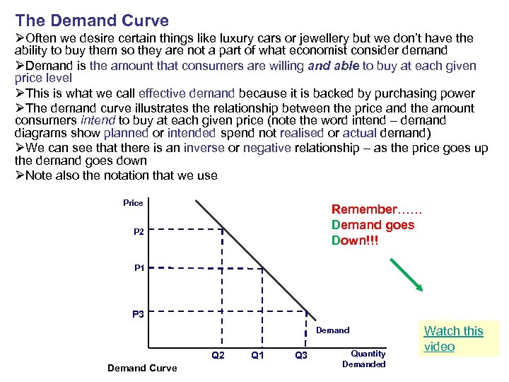
The Demand Curve ØOften we desire certain things like luxury cars or jewellery but we don’t have the ability to buy them so they are not a part of what economist consider demand ØDemand is the amount that consumers are willing and able to buy at each given price level ØThis is what we call effective demand because it is backed by purchasing power ØThe demand curve illustrates the relationship between the price and the amount consumers intend to buy at each given price (note the word intend – demand diagrams show planned or intended spend not realised or actual demand) ØWe can see that there is an inverse or negative relationship – as the price goes up the demand goes down ØNote also the notation that we use Price Remember…… Demand goes Down!!! P 2 P 1 P 3 Demand Q 2 Demand Curve Q 1 Q 3 Quantity Demanded Watch this video
Drawing diagrams It is really important that you learn to draw the diagrams well because there a lot of marks to gain if you do it correctly ØUse a ruler and a sharp pencil ØLabel the axes properly (quantity always goes on the x axis and price on the y when we draw demand diagrams) ØIf you were illustrating a certain market e. g. cars you would write Quantity of cars or price of cars ØWe draw demand curves as a straight line ØWe can draw several curves on one diagram but we have to label them each differently ØThe first demand curve we drew would be labelled D 1 ØThe first demand curve we drew would be labelled D 2 ØWe label the prices and the quantities on the axis in the same way ØWe always draw the curve first and then draw the dotted lines to show the new prices and quantities ØLater you will shade parts of diagrams and it is good to have different colours (pencil only) to hand although in the exam you will only have black ØDiagrams must be large enough so that labels can be seen clearly ØYou MUST always explain/analyse what is happening in a diagram. This is why it is good to use different colours because you can use the colour to describe the area or line you are discussing. I WILL GIVE YOU A HARD TIME IF YOU DRAW SMALL AND MESSY DIAGRAMS!!!!!!!
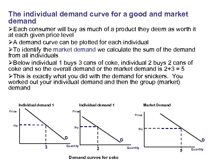
The individual demand curve for a good and market demand ØEach consumer will buy as much of a product they deem as worth it at each given price level ØA demand curve can be plotted for each individual ØTo identify the market demand we calculate the sum of the demand from all individuals ØBelow individual 1 buys 3 cans of coke, individual 2 buys 2 cans of coke and so the overall demand or the market demand is 2+3 = 5 ØThis is exactly what you did with the demand for snickers. You worked out your individual demand then the group (market) demand Individual demand 1 Price Market Demand Price 50 p 50 p D 3 D Quantity 2 Demand curves for coke D Quantity 5 Quantity
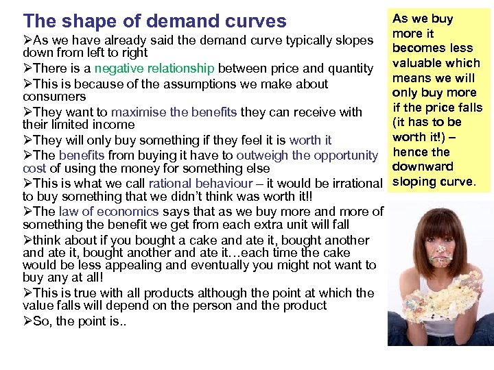
The shape of demand curves As we buy more it ØAs we have already said the demand curve typically slopes becomes less down from left to right ØThere is a negative relationship between price and quantity valuable which means we will ØThis is because of the assumptions we make about only buy more consumers if the price falls ØThey want to maximise the benefits they can receive with (it has to be their limited income worth it!) – ØThey will only buy something if they feel it is worth it ØThe benefits from buying it have to outweigh the opportunity hence the downward cost of using the money for something else ØThis is what we call rational behaviour – it would be irrational sloping curve. to buy something that we didn’t think was worth it!! ØThe law of economics says that as we buy more and more of something the benefit we get from each extra unit will fall Øthink about if you bought a cake and ate it, bought another and ate it…each time the cake would be less appealing and eventually you might not want to buy any at all! ØThis is true with all products although the point at which the value falls will depend on the person and the product ØSo, the point is. .
Movements along the demand curves ØWhen there is a change in price there is a movement along the demand curve ØWhen there is a fall in price there is an extension in demand (demand grows because the price is less and it is worth buying more) ØThere is a movement down the curve (there is an increase in the quantity demanded) Important wording! ØWhen there is an increase in price there is a contraction in demand (because the price is more it becomes less valuable and we buy less) ØThere is a movement up the curve (there is a decrease in the quantity demanded) ØRemember – movements along the curve are always caused by a change in price – nothing else!!!!
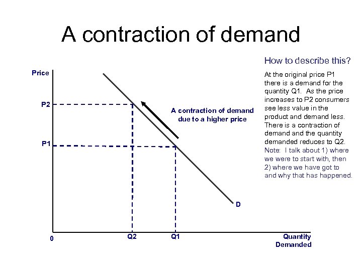
A contraction of demand How to describe this? Price P 2 A contraction of demand due to a higher price P 1 At the original price P 1 there is a demand for the quantity Q 1. As the price increases to P 2 consumers see less value in the product and demand less. There is a contraction of demand the quantity demanded reduces to Q 2. Note: I talk about 1) where we were to start with, then 2) where we have got to and why that has happened. D 0 Q 2 Q 1 Quantity Demanded
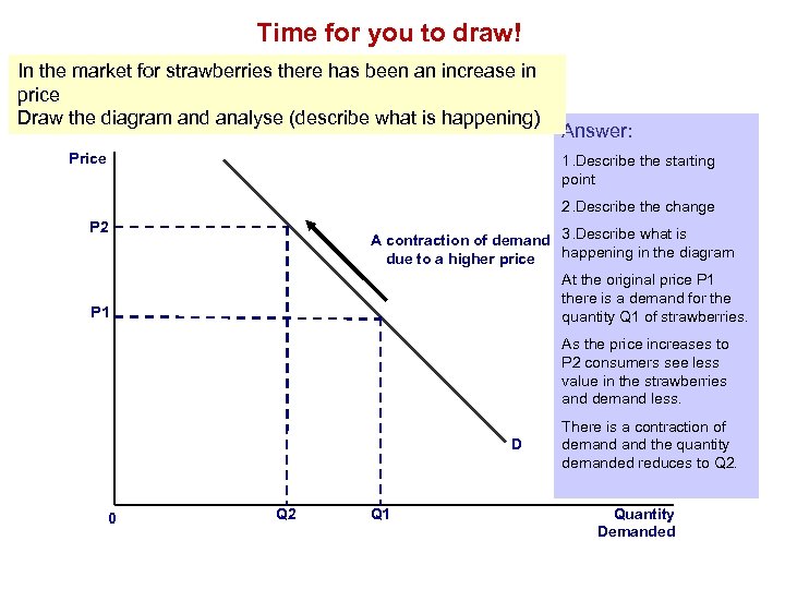
Time for you to draw! In the market for strawberries there has been an increase in price Draw the diagram and analyse (describe what is happening) Price Answer: 1. Describe the starting point 2. Describe the change P 2 A contraction of demand 3. Describe what is happening in the diagram due to a higher price At the original price P 1 there is a demand for the quantity Q 1 of strawberries. P 1 As the price increases to P 2 consumers see less value in the strawberries and demand less. D 0 Q 2 Q 1 There is a contraction of demand the quantity demanded reduces to Q 2. Quantity Demanded
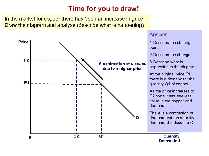
Time for you to draw! In the market for copper there has been an increase in price Draw the diagram and analyse (describe what is happening) Answer: Price 1. Describe the starting point 2. Describe the change P 2 A contraction of demand 3. Describe what is happening in the diagram due to a higher price At the original price P 1 there is a demand for the quantity Q 1 of copper. P 1 As the price increases to P 2 consumers see less value in the copper and demand less. D 0 Q 2 Q 1 There is a contraction of demand the quantity demanded reduces to Q 2. Quantity Demanded
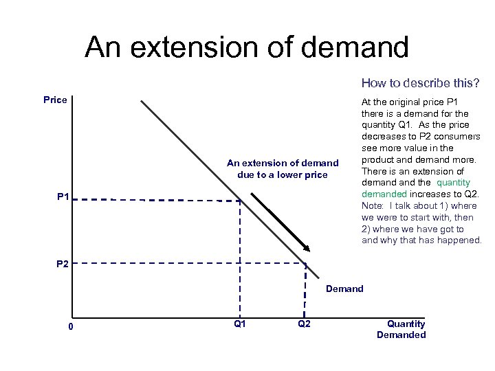
An extension of demand How to describe this? Price An extension of demand due to a lower price P 1 At the original price P 1 there is a demand for the quantity Q 1. As the price decreases to P 2 consumers see more value in the product and demand more. There is an extension of demand the quantity demanded increases to Q 2. Note: I talk about 1) where we were to start with, then 2) where we have got to and why that has happened. P 2 Demand 0 Q 1 Q 2 Quantity Demanded
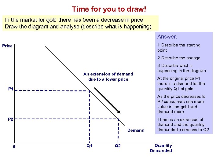
Time for you to draw! In the market for gold there has been a decrease in price Draw the diagram and analyse (describe what is happening) Answer: 1. Describe the starting point Price 2. Describe the change An extension of demand due to a lower price P 1 3. Describe what is happening in the diagram At the original price P 1 there is a demand for the quantity Q 1 of gold. As the price decreases to P 2 consumers see more value in the gold and demand more. P 2 Demand 0 Q 1 Q 2 There is an extension of demand the quantity demanded increases to Q 2. Quantity Demanded
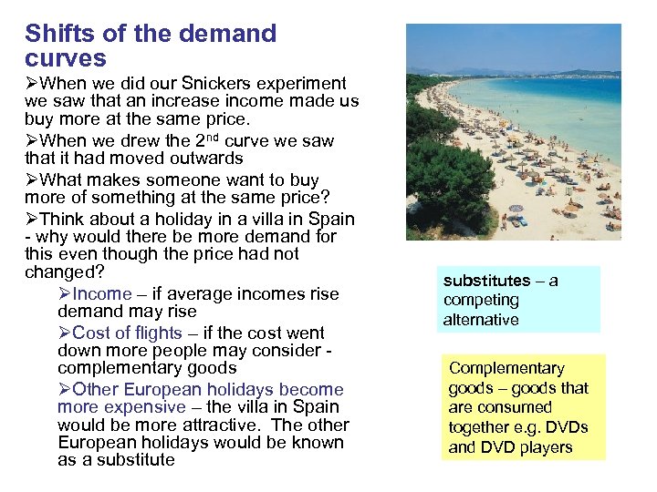
Shifts of the demand curves ØWhen we did our Snickers experiment we saw that an increase income made us buy more at the same price. ØWhen we drew the 2 nd curve we saw that it had moved outwards ØWhat makes someone want to buy more of something at the same price? ØThink about a holiday in a villa in Spain - why would there be more demand for this even though the price had not changed? ØIncome – if average incomes rise demand may rise ØCost of flights – if the cost went down more people may consider complementary goods ØOther European holidays become more expensive – the villa in Spain would be more attractive. The other European holidays would be known as a substitutes – a competing alternative Complementary goods – goods that are consumed together e. g. DVDs and DVD players
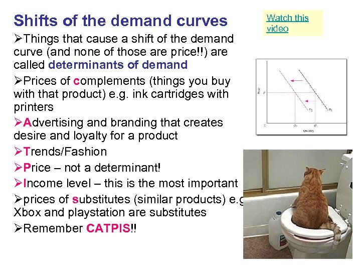
Shifts of the demand curves ØThings that cause a shift of the demand curve (and none of those are price!!) are called determinants of demand ØPrices of complements (things you buy with that product) e. g. ink cartridges with printers ØAdvertising and branding that creates desire and loyalty for a product ØTrends/Fashion ØPrice – not a determinant! ØIncome level – this is the most important Øprices of substitutes (similar products) e. g. Xbox and playstation are substitutes ØRemember CATPIS!! Watch this video
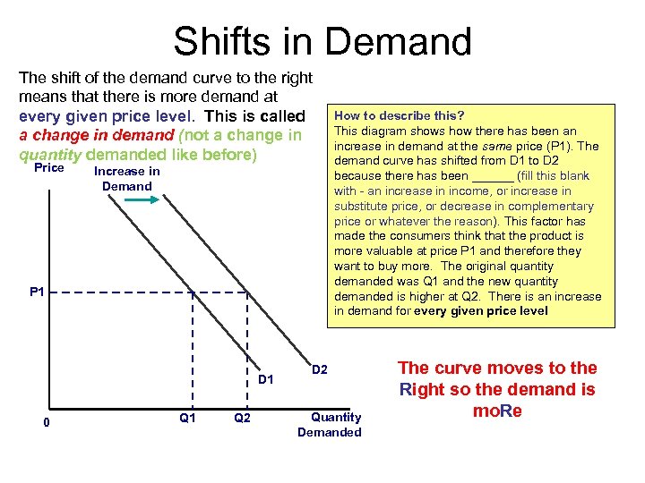
Shifts in Demand The shift of the demand curve to the right means that there is more demand at every given price level. This is called a change in demand (not a change in quantity demanded like before) Price Increase in Demand P 1 D 1 0 Q 1 Q 2 How to describe this? This diagram shows how there has been an increase in demand at the same price (P 1). The demand curve has shifted from D 1 to D 2 because there has been ______ (fill this blank with - an increase in income, or increase in substitute price, or decrease in complementary price or whatever the reason). This factor has made the consumers think that the product is more valuable at price P 1 and therefore they want to buy more. The original quantity demanded was Q 1 and the new quantity demanded is higher at Q 2. There is an increase in demand for every given price level D 2 Quantity Demanded The curve moves to the Right so the demand is mo. Re
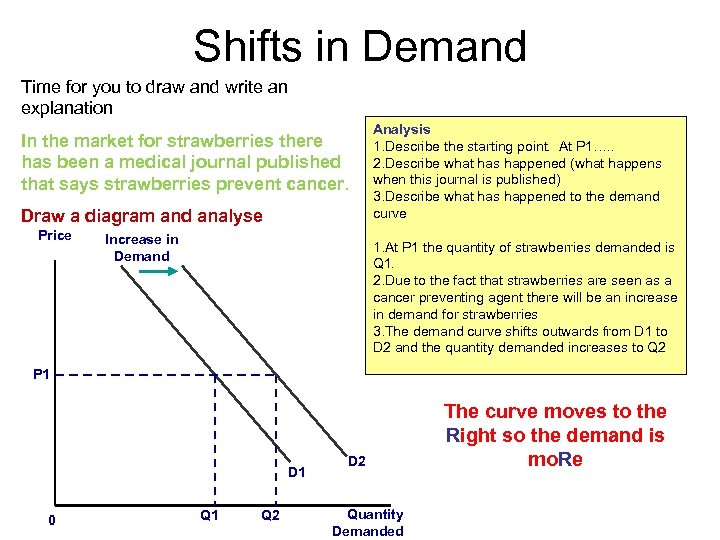
Shifts in Demand Time for you to draw and write an explanation In the market for strawberries there has been a medical journal published that says strawberries prevent cancer. Draw a diagram and analyse Price Increase in Demand Analysis 1. Describe the starting point. At P 1…. . 2. Describe what has happened (what happens when this journal is published) 3. Describe what has happened to the demand curve 1. At P 1 the quantity of strawberries demanded is Q 1. 2. Due to the fact that strawberries are seen as a cancer preventing agent there will be an increase in demand for strawberries 3. The demand curve shifts outwards from D 1 to D 2 and the quantity demanded increases to Q 2 P 1 D 1 0 Q 1 Q 2 D 2 Quantity Demanded The curve moves to the Right so the demand is mo. Re
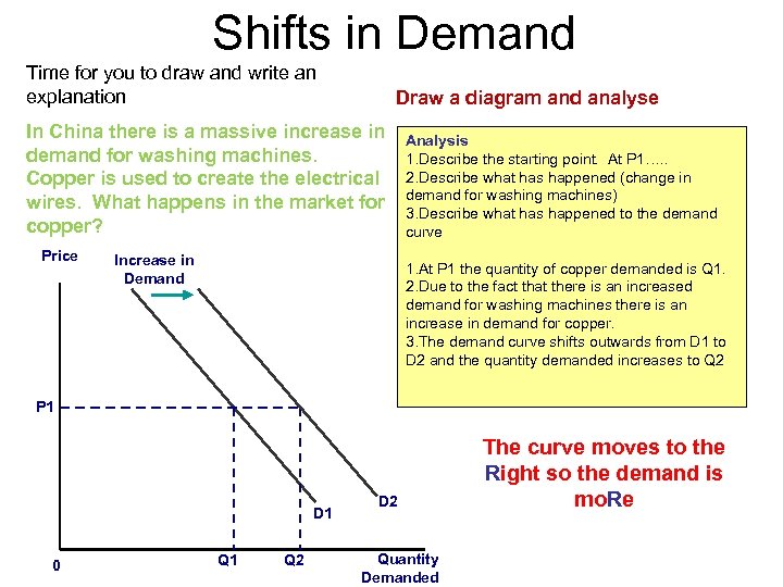
Shifts in Demand Time for you to draw and write an explanation Draw a diagram and analyse In China there is a massive increase in demand for washing machines. Copper is used to create the electrical wires. What happens in the market for copper? Price Increase in Demand Analysis 1. Describe the starting point. At P 1…. . 2. Describe what has happened (change in demand for washing machines) 3. Describe what has happened to the demand curve 1. At P 1 the quantity of copper demanded is Q 1. 2. Due to the fact that there is an increased demand for washing machines there is an increase in demand for copper. 3. The demand curve shifts outwards from D 1 to D 2 and the quantity demanded increases to Q 2 P 1 D 1 0 Q 1 Q 2 D 2 Quantity Demanded The curve moves to the Right so the demand is mo. Re
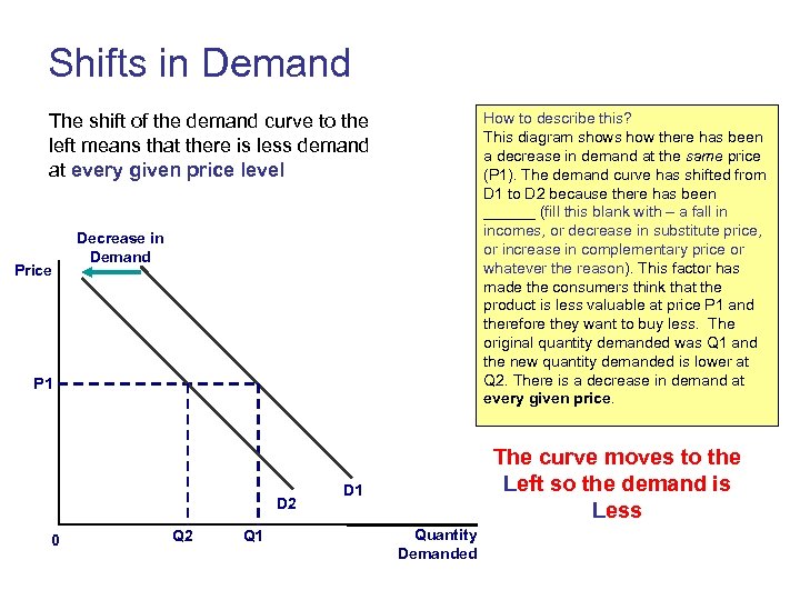
Shifts in Demand How to describe this? This diagram shows how there has been a decrease in demand at the same price (P 1). The demand curve has shifted from D 1 to D 2 because there has been ______ (fill this blank with – a fall in incomes, or decrease in substitute price, or increase in complementary price or whatever the reason). This factor has made the consumers think that the product is less valuable at price P 1 and therefore they want to buy less. The original quantity demanded was Q 1 and the new quantity demanded is lower at Q 2. There is a decrease in demand at every given price. The shift of the demand curve to the left means that there is less demand at every given price level Price Decrease in Demand P 1 D 2 0 Q 2 Q 1 The curve moves to the Left so the demand is Less D 1 Quantity Demanded
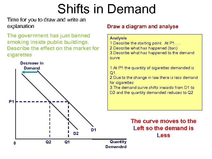
Shifts in Demand Time for you to draw and write an explanation Draw a diagram and analyse The government has just banned smoking inside public buildings. Describe the effect on the market for cigarettes Decrease in Demand Analysis 1. Describe the starting point. At P 1…. . 2. Describe what has happened (ban) 3. Describe what has happened to the demand curve 1. At P 1 the quantity of cigarettes demanded is Q 1. 2. Due to the change in law there is less demand for cigarettes 3. The demand curve shifts inwards from D 1 to D 2 and the quantity demanded reduces to Q 2 P 1 D 2 0 Q 2 Q 1 The curve moves to the Left so the demand is Less D 1 Quantity Demanded
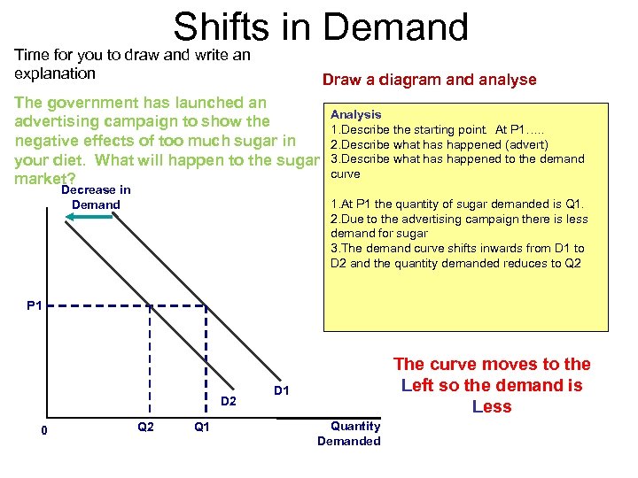
Shifts in Demand Time for you to draw and write an explanation Draw a diagram and analyse The government has launched an Analysis advertising campaign to show the 1. Describe the starting point. At P 1…. . negative effects of too much sugar in 2. Describe what has happened (advert) your diet. What will happen to the sugar 3. Describe what has happened to the demand curve market? Decrease in Demand 1. At P 1 the quantity of sugar demanded is Q 1. 2. Due to the advertising campaign there is less demand for sugar 3. The demand curve shifts inwards from D 1 to D 2 and the quantity demanded reduces to Q 2 P 1 D 2 0 Q 2 Q 1 The curve moves to the Left so the demand is Less D 1 Quantity Demanded
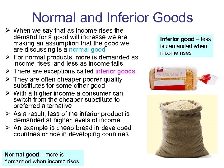
Normal and Inferior Goods Ø When we say that as income rises the demand for a good will increase we are making an assumption that the good we are discussing is a normal good Ø For normal products, more is demanded as income rises, and less as income falls Ø There are exceptions called inferior goods Ø They are often cheaper poorer quality substitutes for some other good Ø With a higher income a consumer can switch from the cheaper substitute to preferred alternative Ø As a result, less of the inferior product is demanded at higher levels of income Ø An example is cheap bread in developed countries or rice in developing countries Normal good – more is demanded when income rises Inferior good – less is demanded when income rises
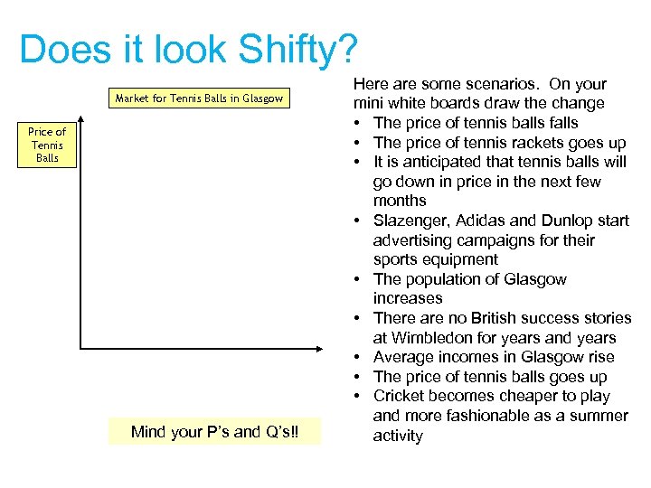
Does it look Shifty? Market for Tennis Balls in Glasgow Price of Tennis Balls Mind your P’s and Q’s!! Here are some scenarios. On your mini white boards draw the change • The price of tennis balls falls • The price of tennis rackets goes up • It is anticipated that tennis balls will go down in price in the next few months • Slazenger, Adidas and Dunlop start advertising campaigns for their sports equipment • The population of Glasgow increases • There are no British success stories at Wimbledon for years and years • Average incomes in Glasgow rise • The price of tennis balls goes up • Cricket becomes cheaper to play and more fashionable as a summer activity
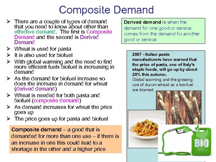
Composite Demand Ø There a couple of types of demand that you need to know about other than effective demand. The first is Composite Demand the second is Derived Demand Ø Wheat is used for pasta Ø It is also used for biofuel Ø With global warming and the need to find more efficient fuels biofuel is increasing in demand Ø As the demand for biofuel increase so does the increase in demand for wheat (derived demand) Ø Wheat is needed for both pasta and biofuel (composite demand) Ø As demand increases for wheat the price goes up Ø The price goes up for pasta and biofuel Composite demand – a good that is demanded for more than one use – if there is an increase in one this could lead to a shortage in the other and a higher price Derived demand is when the demand for one good or service comes from the demand for another good or service 2007 - Italian pasta manufacturers have warned that the price of pasta, one of Italy's staple foods, will go up by about 20% this autumn. Global warming and the growing use of durum wheat as a bio-fuel are blamed.
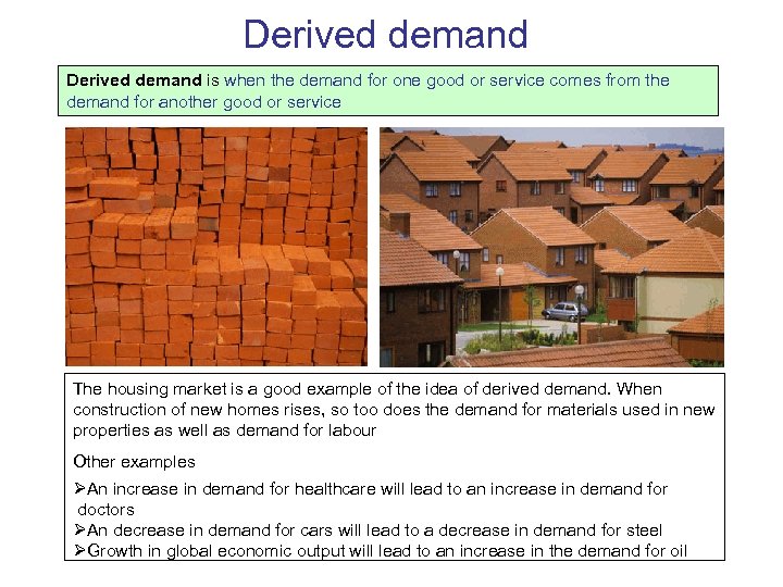
Derived demand is when the demand for one good or service comes from the demand for another good or service The housing market is a good example of the idea of derived demand. When construction of new homes rises, so too does the demand for materials used in new properties as well as demand for labour Other examples ØAn increase in demand for healthcare will lead to an increase in demand for doctors ØAn decrease in demand for cars will lead to a decrease in demand for steel ØGrowth in global economic output will lead to an increase in the demand for oil
Important to remember… ØWhen we talk about market forces (supply and demand) we are assuming that the market is perfectly competitive Øthere are lots of small firms that have no price making power Ø firms are price takers – they have to take their price from the market ØThe market price comes about because of supply and demand (market forces) ØThere is an invisible hand that sets the market price (Adam Smith) ØWhen you are describing a change in a market the change in demand comes first and the price changes as a result (not the other way around) ØMore about this later…… am d A th i m S
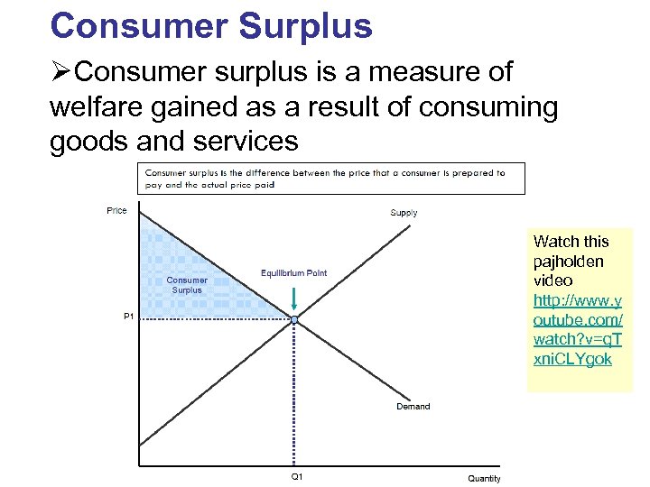
Consumer Surplus ØConsumer surplus is a measure of welfare gained as a result of consuming goods and services Watch this pajholden video http: //www. y outube. com/ watch? v=q. T xni. CLYgok
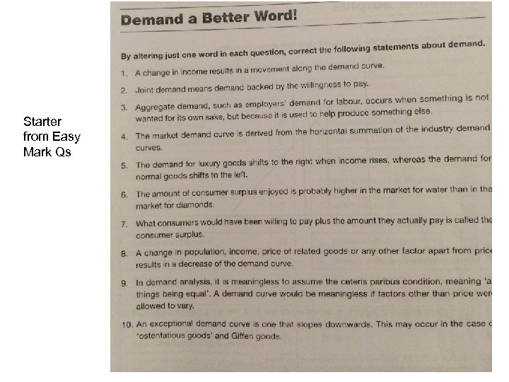
Starter from Easy Mark Qs
Ø Complete the following 2 questions Ø Remember to include Ø Definition/s Ø Diagram/s Ø Analysis (description of what is happening and the changes in the diagram) Ø get your wording right (look at the previous slides) Ø Label the diagram and refer to it e. g. “in figure 1 demand has……” Ø Example 1. Distinguish between a shift of the demand curve for a product and a movement along the product’s demand curve 2. With reference to two different determinants of demand explain why the demand for bicycles might increase

The HL Bit!
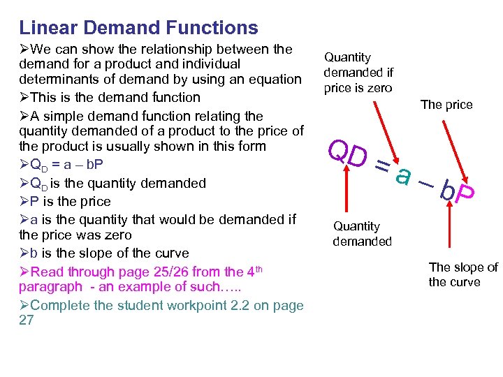
Linear Demand Functions ØWe can show the relationship between the demand for a product and individual determinants of demand by using an equation ØThis is the demand function ØA simple demand function relating the quantity demanded of a product to the price of the product is usually shown in this form ØQD = a – b. P ØQD is the quantity demanded ØP is the price Øa is the quantity that would be demanded if the price was zero Øb is the slope of the curve ØRead through page 25/26 from the 4 th paragraph - an example of such…. . ØComplete the student workpoint 2. 2 on page 27 Quantity demanded if price is zero The price QD =a – b. P Quantity demanded The slope of the curve
81bc78fd86c3d4cc396fdc9a2cbba0a8.ppt