4f970d3fbe181edb3d77839301e6836a.ppt
- Количество слайдов: 71
Data Presentation, Interpretation and Use

Learning objectives Participants will be able to: 1. Understand different ways of summarizing data 2. Choose the right table/graph for the right data and audience 3. Ensure that graphics are self-explanatory 4. Create graphs and tables that are attractive

Do you present yourself like this?

So why would you present your data like this?
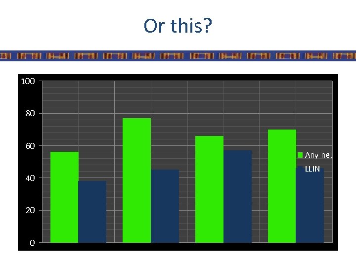
Or this? 100 80 60 40 20 0 Any net LLIN
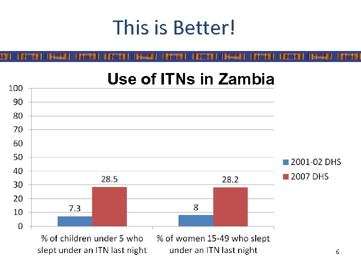
This is Better! Use of ITNs in Zambia 6
Effective presentation • • Clear Concise Actionable Attractive

Effective presentation • For all communication formats it is important to ensure that there is: – Consistency • Font, Colors, Punctuation, Terminology, Line/ Paragraph Spacing – An appropriate amount of information • Less is more – Appropriate content and format for audience • Scientific community, Journalist, Politicians
Summarizing data • Tables – Simplest way to summarize data – Data is presented as absolute numbers or percentages • Charts and graphs – Visual representation of data – Usually data is presented using percentages
Points to remember • Ensure graphic has a title • Label the components of your graphic • Indicate source of data with date • Provide number of observations (n=xx) as a reference point • Add footnote if more information is needed

Tips for Presenting Data in Power. Point • All text should be readable • Use sans serif fonts – Gill Sans (sans serif) – Times New Roman (serif) • • Use graphs or charts, not tables Keep slides simple Limit animations and special effects Use high contrast text and backgrounds 11

Choosing a Title • A title should express – Who – What – When – Where
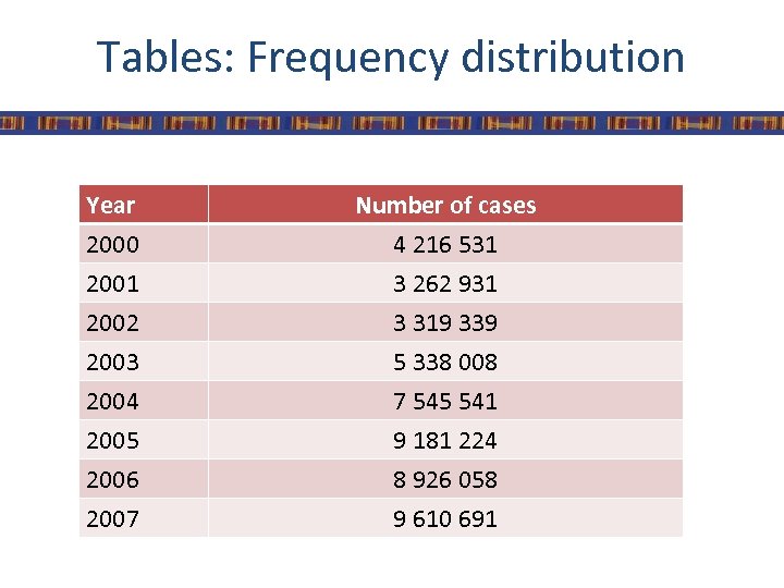
Tables: Frequency distribution Year 2000 2001 2002 Number of cases 4 216 531 3 262 931 3 319 339 2003 2004 2005 2006 2007 5 338 008 7 545 541 9 181 224 8 926 058 9 610 691
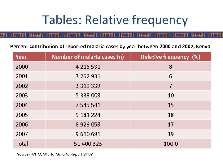
Tables: Relative frequency Percent contribution of reported malaria cases by year between 2000 and 2007, Kenya Year Number of malaria cases (n) Relative frequency (%) 2000 4 216 531 8 2001 3 262 931 6 2002 3 319 339 7 2003 5 338 008 10 2004 7 545 541 15 2005 9 181 224 18 2006 8 926 058 17 2007 9 610 691 19 Total 51 400 323 100. 0 Source: WHO, World Malaria Report 2009
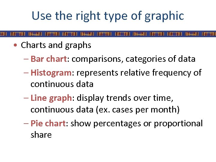
Use the right type of graphic • Charts and graphs – Bar chart: comparisons, categories of data – Histogram: represents relative frequency of continuous data – Line graph: display trends over time, continuous data (ex. cases per month) – Pie chart: show percentages or proportional share
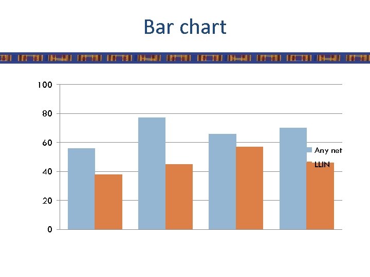
Bar chart 100 80 60 40 20 0 Any net LLIN
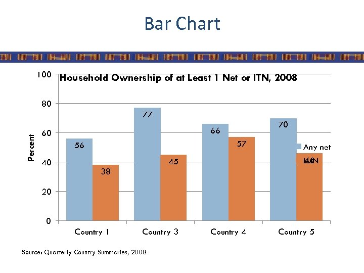
Bar Chart 100 Household Ownership of at Least 1 Net or ITN, 2008 80 Percent 77 60 57 56 40 70 66 45 Any net 46 LLIN 38 20 0 Country 1 Country 3 Source: Quarterly Country Summaries, 2008 Country 4 Country 5
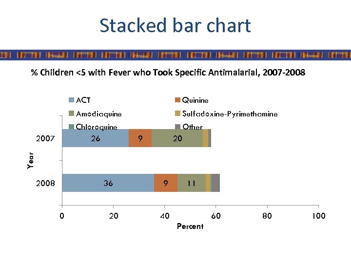
Stacked bar chart % Children <5 with Fever who Took Specific Antimalarial, 2007 -2008 ACT Amodiaquine Sulfadoxine-Pyrimethamine Chloroquine 26 Other 9 20 Year 2007 Quinine 2008 36 0 20 9 11 40 60 Percent 80 100
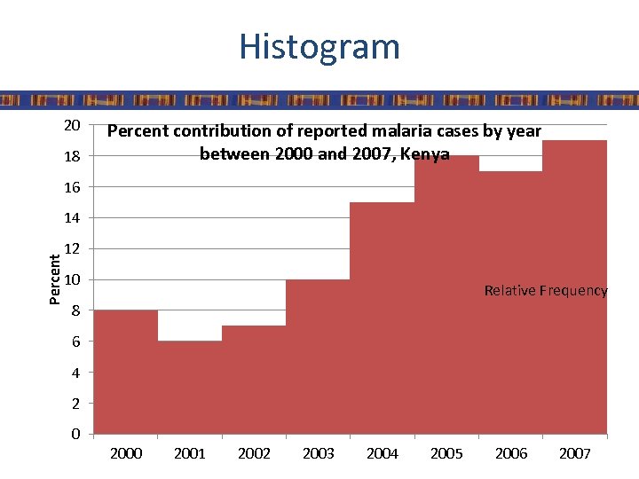
Histogram 20 18 Percent contribution of reported malaria cases by year between 2000 and 2007, Kenya 16 Percent 14 12 10 Relative Frequency 8 6 4 2 0 2001 2002 2003 2004 2005 2006 2007
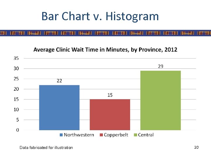
Bar Chart v. Histogram Data fabricated for illustration 20
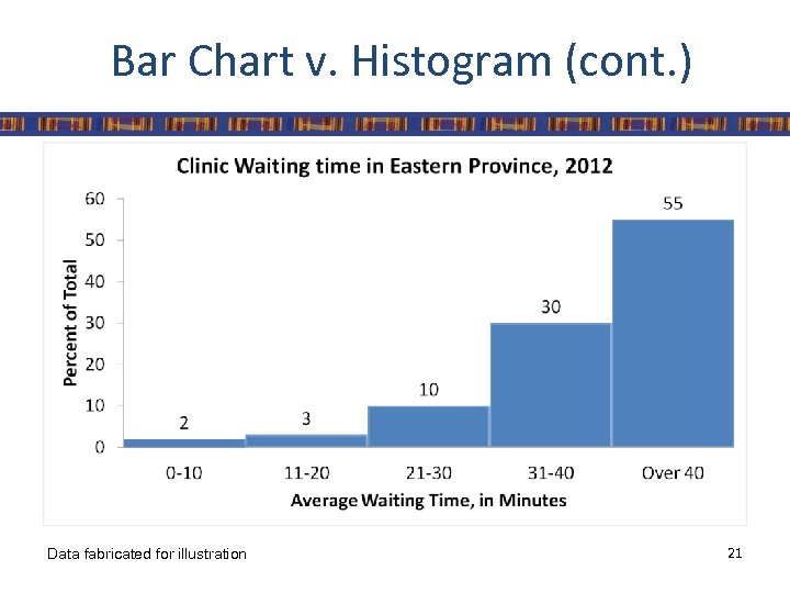
Bar Chart v. Histogram (cont. ) Data fabricated for illustration 21
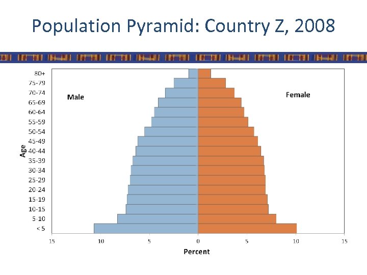
Population Pyramid: Country Z, 2008
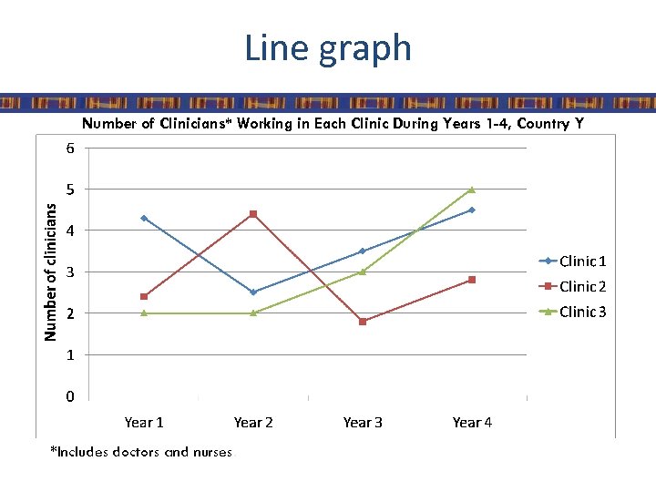
Line graph Number of Clinicians* Working in Each Clinic During Years 1 -4, Country Y *Includes doctors and nurses.
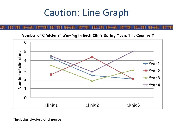
Caution: Line Graph Number of Clinicians* Working in Each Clinic During Years 1 -4, Country Y *Includes doctors and nurses.
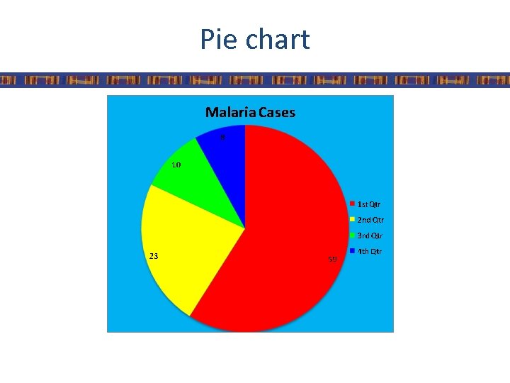
Pie chart
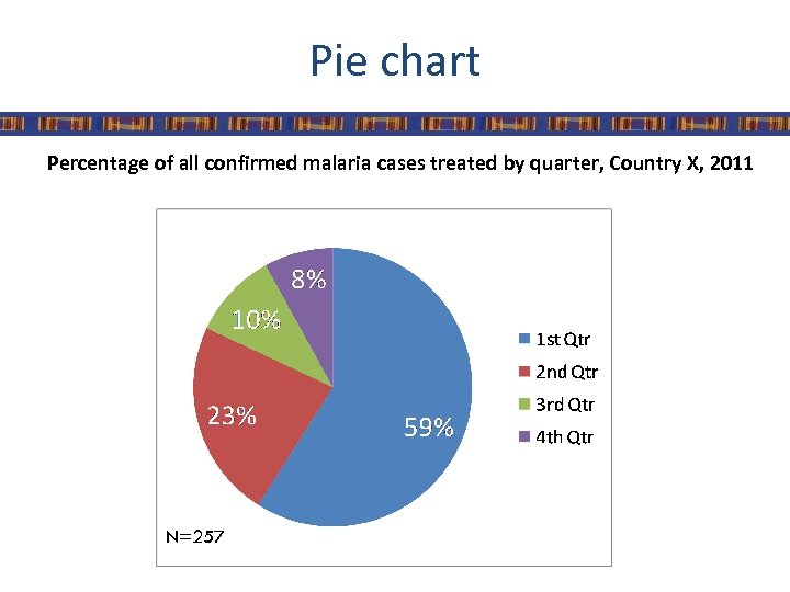
Pie chart Percentage of all confirmed malaria cases treated by quarter, Country X, 2011 N=257
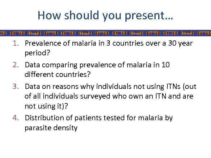
How should you present… 1. Prevalence of malaria in 3 countries over a 30 year period? 2. Data comparing prevalence of malaria in 10 different countries? 3. Data on reasons why individuals not using ITNs (out of all individuals surveyed who own an ITN and are not using it)? 4. Distribution of patients tested for malaria by parasite density
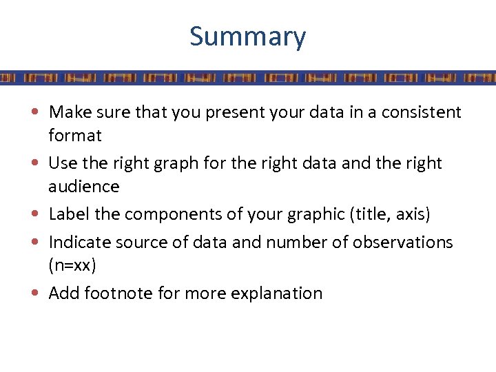
Summary • Make sure that you present your data in a consistent format • Use the right graph for the right data and the right audience • Label the components of your graphic (title, axis) • Indicate source of data and number of observations (n=xx) • Add footnote for more explanation

Creating Graphs
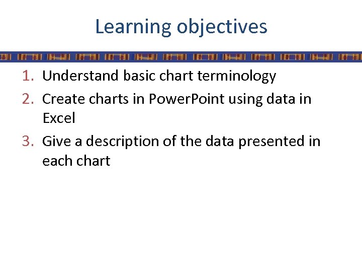
Learning objectives 1. Understand basic chart terminology 2. Create charts in Power. Point using data in Excel 3. Give a description of the data presented in each chart
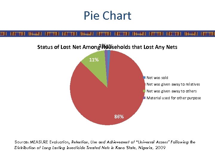
Pie Chart 1% 1% Status of Lost Net Among Households that Lost Any Nets 11% Net was sold Net was given away to relatives Net was given away to others Material used for other purpose 86% Source: MEASURE Evaluation, Retention, Use and Achievement of “Universal Access” Following the Distribution of Long Lasting Insecticide Treated Nets in Kano State, Nigeria, 2009
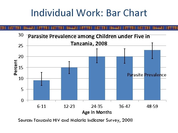
Individual Work: Bar Chart 30 Parasite Prevalence among Children under Five in Tanzania, 2008 25 Percent 20 15 Parasite Prevalence 10 5 0 6 -11 12 -23 24 -35 Age in Months 36 -47 Source: Tanzania HIV and Malaria Indicator Survey, 2008 48 -59
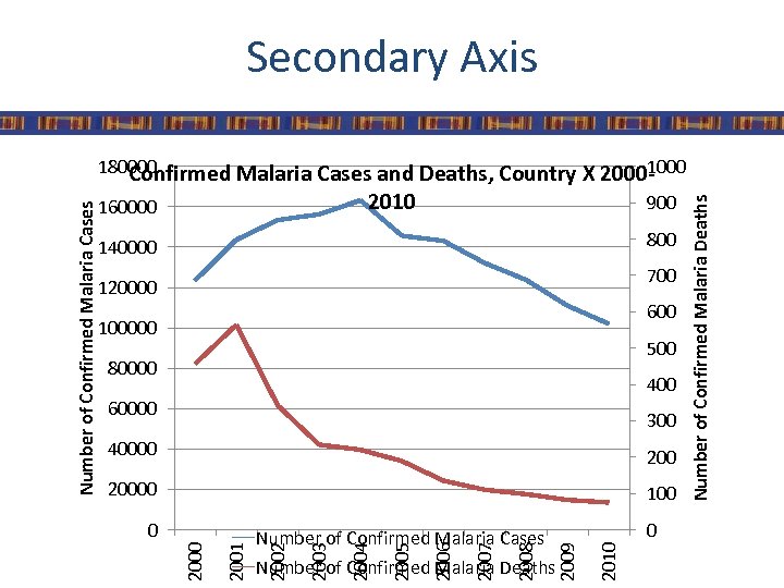
Secondary Axis 900 800 140000 700 120000 600 100000 500 80000 400 60000 300 40000 20000 100 Number of Confirmed Malaria Deaths 2010 0 2009 2008 2007 2006 2005 2004 2003 Number of Confirmed Malaria Cases 2002 2001 0 Number of Confirmed Malaria Deaths 2010 160000 2000 Number of Confirmed Malaria Cases 180000 1000 Confirmed Malaria Cases and Deaths, Country X 2000 -
Data Interpretation
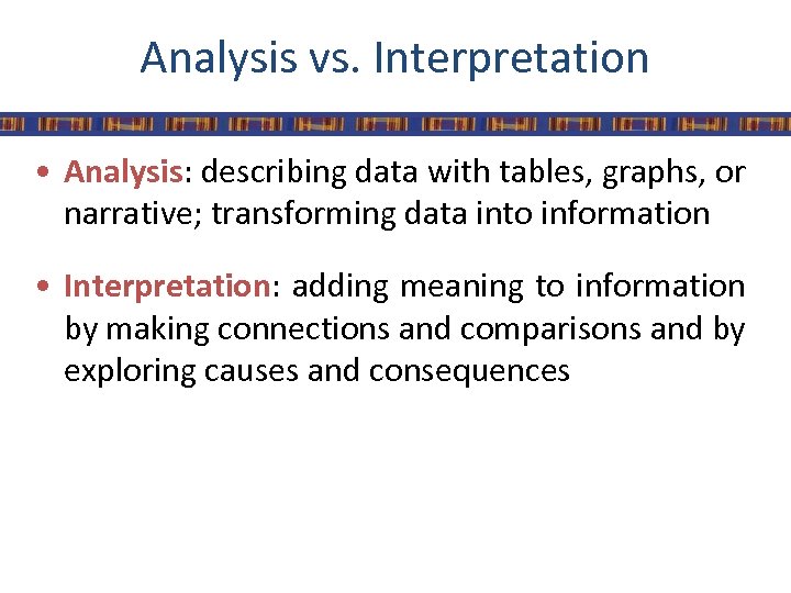
Analysis vs. Interpretation • Analysis: describing data with tables, graphs, or narrative; transforming data into information • Interpretation: adding meaning to information by making connections and comparisons and by exploring causes and consequences
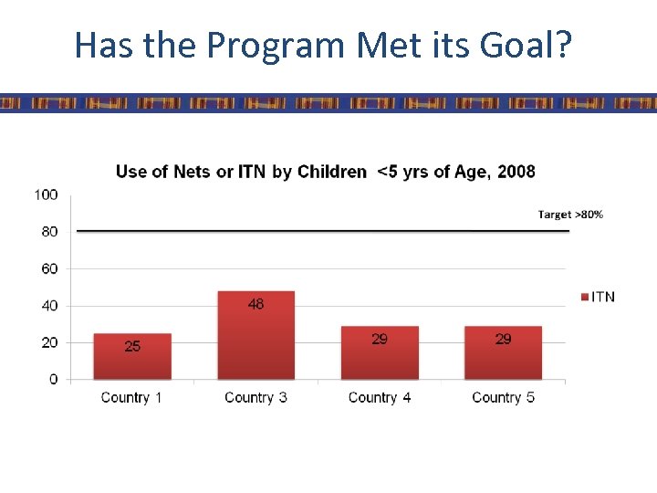
Has the Program Met its Goal?
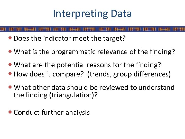
Interpreting Data Does the indicator meet the target? What is the programmatic relevance of the finding? What are the potential reasons for the finding? How does it compare? (trends, group differences) What other data should be reviewed to understand the finding (triangulation)? Conduct further analysis
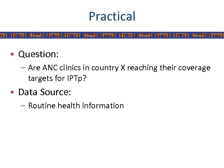
Practical • Question: – Are ANC clinics in country X reaching their coverage targets for IPTp? • Data Source: – Routine health information
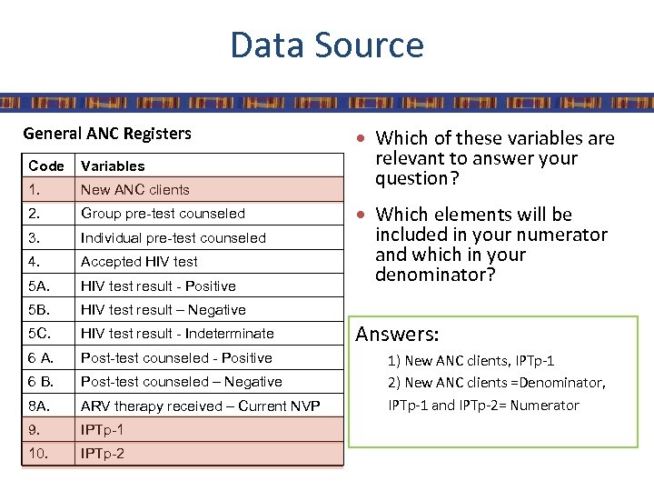
Data Source General ANC Registers Code Variables 1. New ANC clients 2. Group pre-test counseled 3. Individual pre-test counseled 4. Accepted HIV test 5 A. HIV test result - Positive 5 B. HIV test result - Indeterminate 6 A. Post-test counseled - Positive 6 B. Post-test counseled – Negative 8 A. ARV therapy received – Current NVP 9. IPTp-1 10. IPTp-2 relevant to answer your question? HIV test result – Negative 5 C. Which of these variables are Which elements will be included in your numerator and which in your denominator? Answers: 1) New ANC clients, IPTp-1 2) New ANC clients =Denominator, IPTp-1 and IPTp-2= Numerator
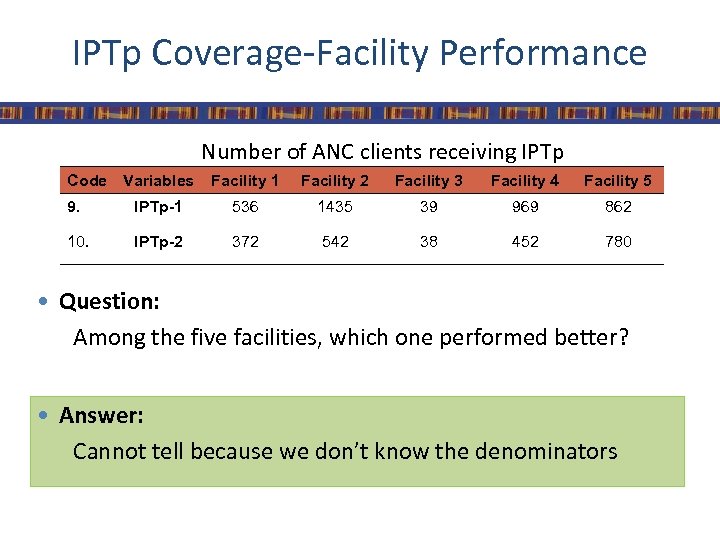
IPTp Coverage-Facility Performance Number of ANC clients receiving IPTp Code Variables Facility 1 Facility 2 Facility 3 Facility 4 Facility 5 9. IPTp-1 536 1435 39 969 862 10. IPTp-2 372 542 38 452 780 Question: Among the five facilities, which one performed better? Answer: Cannot tell because we don’t know the denominators
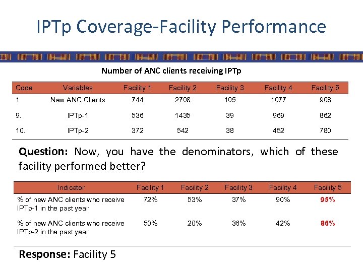
IPTp Coverage-Facility Performance Number of ANC clients receiving IPTp Code Variables Facility 1 Facility 2 Facility 3 Facility 4 Facility 5 1 New ANC Clients 744 2708 105 1077 908 9. IPTp-1 536 1435 39 969 862 10. IPTp-2 372 542 38 452 780 Question: Now, you have the denominators, which of these facility performed better? Indicator Facility 1 Facility 2 Facility 3 Facility 4 Facility 5 % of new ANC clients who receive IPTp-1 in the past year 72% 53% 37% 90% 95% % of new ANC clients who receive IPTp-2 in the past year 50% 20% 36% 42% 86% Response: Facility 5
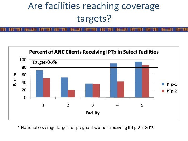
Are facilities reaching coverage targets? Target-80% * National coverage target for pregnant women receiving IPTp-2 is 80%.
Additional Questions • Which facility is performing better/worse than expected? • What is the trend over time for these facilities? • How would you assess each facility’s performance based on the data? • What other data or information should you consider in providing recommendations or guidance to the facilities?
Data Dissemination
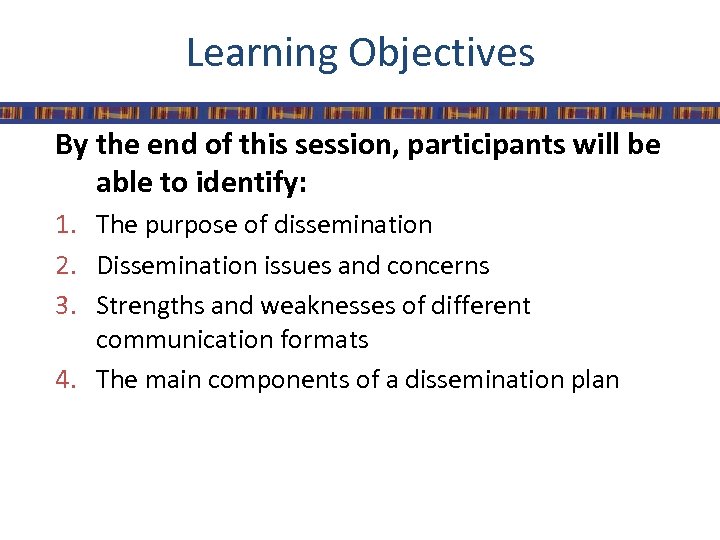
Learning Objectives By the end of this session, participants will be able to identify: 1. The purpose of dissemination 2. Dissemination issues and concerns 3. Strengths and weaknesses of different communication formats 4. The main components of a dissemination plan
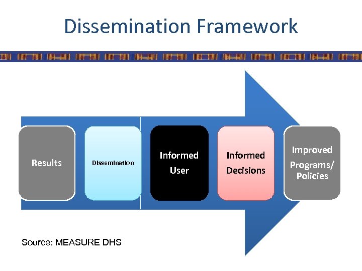
Dissemination Framework Results Dissemination Source: MEASURE DHS Informed User Decisions Improved Programs/ Policies
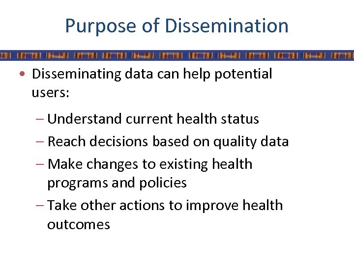
Purpose of Dissemination • Disseminating data can help potential users: – Understand current health status – Reach decisions based on quality data – Make changes to existing health programs and policies – Take other actions to improve health outcomes
Plan Materials Carefully • Use different formats if possible, including: – Print materials • HIS Reports, Success story, Posters, Key findings, Fact Sheet, Press Report – Power. Point presentations – CD-ROMS with datasets – Videos – Online media
Focus on a Specific Audience • Create different materials for different users: – Meet the audience’s needs – Translate materials into local languages – Produce reports on specific topics • Impact • LLINs • Case Management • IPTp – Match the medium to the audience
Make Sense of the Data • Help users make sense of the data: – Add policy recommendations and conclusions – Highlight key points – Break down findings by categories of interest • Province • Education • Wealth – Use maps and graphics to convey information
Put Findings in Context • Put survey findings in context: – Show trends over time – Make comparisons with other countries in the region – Link findings with national or regional programs and policies
Appropriate and Attractive Presentation • Provide an appropriate amount of information – Less is more – Try to identify the most important pieces of information and avoid overwhelming the user with too much data • Make materials appealing to look at whenever possible • Balance text and graphics – Use pictures and graphs
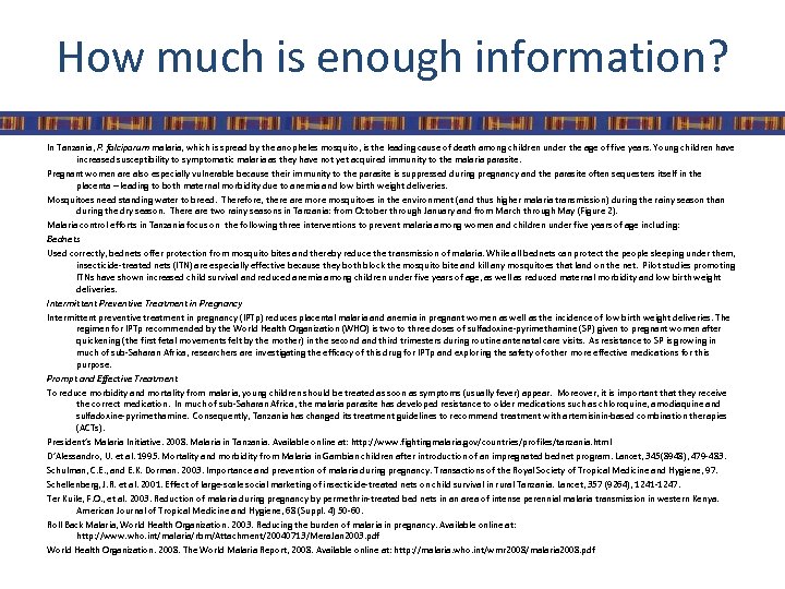
How much is enough information? In Tanzania, P. falciparum malaria, which is spread by the anopheles mosquito, is the leading cause of death among children under the age of five years. Young children have increased susceptibility to symptomatic malaria as they have not yet acquired immunity to the malaria parasite. Pregnant women are also especially vulnerable because their immunity to the parasite is suppressed during pregnancy and the parasite often sequesters itself in the placenta – leading to both maternal morbidity due to anemia and low birth weight deliveries. Mosquitoes need standing water to breed. Therefore, there are mosquitoes in the environment (and thus higher malaria transmission) during the rainy season than during the dry season. There are two rainy seasons in Tanzania: from October through January and from March through May (Figure 2). Malaria control efforts in Tanzania focus on the following three interventions to prevent malaria among women and children under five years of age including: Bednets Used correctly, bednets offer protection from mosquito bites and thereby reduce the transmission of malaria. While all bednets can protect the people sleeping under them, insecticide-treated nets (ITN) are especially effective because they both block the mosquito bite and kill any mosquitoes that land on the net. Pilot studies promoting ITNs have shown increased child survival and reduced anemia among children under five years of age, as well as reduced maternal morbidity and low birth weight deliveries. Intermittent Preventive Treatment in Pregnancy Intermittent preventive treatment in pregnancy (IPTp) reduces placental malaria and anemia in pregnant women as well as the incidence of low birth weight deliveries. The regimen for IPTp recommended by the World Health Organization (WHO) is two to three doses of sulfadoxine-pyrimethamine (SP) given to pregnant women after quickening (the first fetal movements felt by the mother) in the second and third trimesters during routine antenatal care visits. As resistance to SP is growing in much of sub-Saharan Africa, researchers are investigating the efficacy of this drug for IPTp and exploring the safety of other more effective medications for this purpose. Prompt and Effective Treatment To reduce morbidity and mortality from malaria, young children should be treated as soon as symptoms (usually fever) appear. Moreover, it is important that they receive the correct medication. In much of sub-Saharan Africa, the malaria parasite has developed resistance to older medications such as chloroquine, amodiaquine and sulfadoxine-pyrimethamine. Consequently, Tanzania has changed its treatment guidelines to recommend treatment with artemisinin-based combination therapies (ACTs). President’s Malaria Initiative. 2008. Malaria in Tanzania. Available online at: http: //www. fightingmalaria. gov/countries/profiles/tanzania. html D’Alessandro, U. et al. 1995. Mortality and morbidity from Malaria in Gambian children after introduction of an impregnated bednet program. Lancet, 345(8948), 479 -483. Schulman, C. E. , and E. K. Dorman. 2003. Importance and prevention of malaria during pregnancy. Transactions of the Royal Society of Tropical Medicine and Hygiene, 97. Schellenberg, J. R. et al. 2001. Effect of large-scale social marketing of insecticide-treated nets on child survival in rural Tanzania. Lancet, 357 (9264), 1241 -1247. Ter Kuile, F. O. , et al. 2003. Reduction of malaria during pregnancy by permethrin-treated bed nets in an area of intense perennial malaria transmission in western Kenya. American Journal of Tropical Medicine and Hygiene, 68 (Suppl. 4) 50 -60. Roll Back Malaria, World Health Organization. 2003. Reducing the burden of malaria in pregnancy. Available online at: http: //www. who. int/malaria/rbm/Attachment/20040713/Mera. Jan 2003. pdf World Health Organization. 2008. The World Malaria Report, 2008. Available online at: http: //malaria. who. int/wmr 2008/malaria 2008. pdf
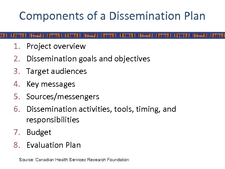
Components of a Dissemination Plan 1. 2. 3. 4. 5. 6. Project overview Dissemination goals and objectives Target audiences Key messages Sources/messengers Dissemination activities, tools, timing, and responsibilities 7. Budget 8. Evaluation Plan Source: Canadian Health Services Research Foundation
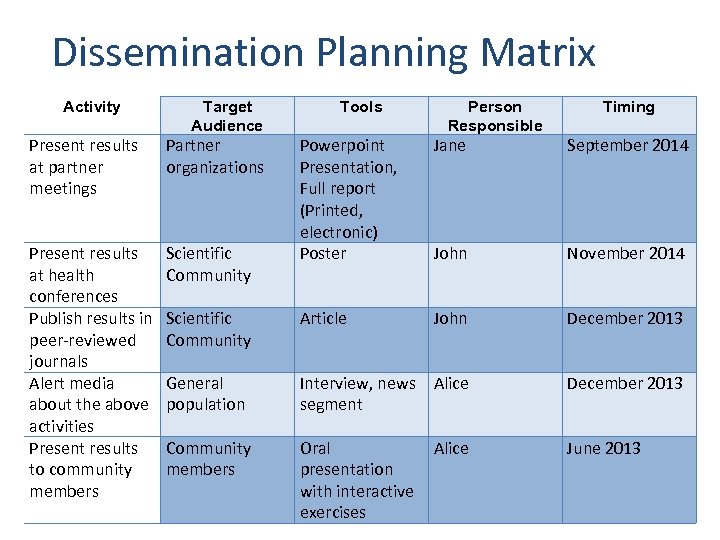
Dissemination Planning Matrix Activity Target Audience Present results at partner meetings Partner organizations Present results at health conferences Publish results in peer-reviewed journals Alert media about the above activities Present results to community members Scientific Community Tools Person Responsible Timing Powerpoint Presentation, Full report (Printed, electronic) Poster Jane September 2014 John November 2014 Scientific Community Article John December 2013 General population Interview, news Alice segment December 2013 Community members Oral presentation with interactive exercises June 2013 Alice
Engage in Capacity-building • Combine dissemination with capacity-building: – Help users understand context and terminology – Train users to read tables and charts – Provide exercises on using data – Always ask users to consider implications of the information for programs and policy
Dissemination Issues/Concerns • Data Literacy – Understanding terminology – Understanding concepts of sampling errors, confidence intervals – Reading tables – Comparing multiple data sources • National and regional data vs district planning • Timing of dissemination vs national planning cycle
Dissemination Issues/Concerns • Getting information out of the capital city • Extending dissemination beyond the immediate post-release period • Difficulty tracking and monitoring use

Tracking Information Use
Learning objectives By the end of this session, participants will be able to identify: 1. Methods of tracking data and information use 2. Opportunities for improving data production and use 3. Opportunities for feedback mechanisms 4. Points where analysis & data could support programmatic decision making
Methods of Tracking Information Use • Assessing coverage targets • Key information interviews • Meetings with staff
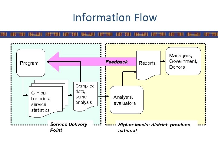
Information Flow Feedback Program Clinical histories, service statistics Compiled data, some analysis Service Delivery Point Reports Managers, Government, Donors Analysts, evaluators Higher levels: district, province, national
Information Use in Country X • Local health centers and hospitals report up through system • However, local facilities never received full reports • Identified opportunities for feedback through Information Use Map
Reasons to Assess Information Flow • Local data not used locally • Higher-level information does not return back to local level • Local data not assessed in broad context • Little incentive to produce high-quality data
Information Use Mapping • Purpose – Describe existing flow of health information to identify opportunities for improving its use • Description – Identifies gaps and opportunities for using information – Identifies opportunities for additional feedback mechanisms – Identifies points where analysis & data could support programmatic decision making
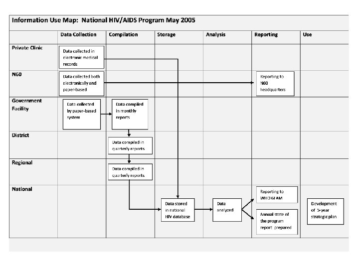
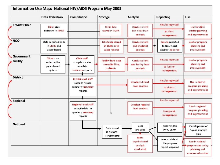
Key Messages • Actual flow of data and information can reveal barriers to improving data quality and use • Information Use Map can highlight intervention points

How does information flow through your organization?
References • Canadian Health Services Research Foundation. Developing a Dissemination Plan. Available at: http: //www. chsrf. ca/knowledge_transfer/pdf/dissemination_ plan_f. pdf • Laurie Liskin. “Dissemination and Data Use Tools”. MEASURE DHS. Power. Point Presentation. 17 June 2009 • MEASURE DHS. “Module 7: Disseminating and Using Data for Change”. Power. Point Presentation. Kenya, June 2010

MEASURE Evaluation is a MEASURE program project funded by the U. S. Agency for International Development (USAID) through Cooperative Agreement GHA-A-00 -08 -00003 -00 and is implemented by the Carolina Population Center at the University of North Carolina at Chapel Hill, in partnership with Futures Group International, John Snow, Inc. , ICF Macro, Management Sciences for Health, and Tulane University. Visit us online at http: //www. cpc. unc. edu/measure.
4f970d3fbe181edb3d77839301e6836a.ppt