6f2a3f6a6a555d60ccda0409ca7a6f2b.ppt
- Количество слайдов: 92
 CSCI 588 Excerpts From “Specification and Design of User Interface Software” On Visual Design Courtesy Steven M. Jacobs Fall 2007 1 -1
 Visual Design • Visual Design - Page Design - Content Design - Typography - Color - Icons - Guidelines - Visualization 1 -2
 Page Design Effective use of screen real estate • For example, a “Map site” with less than onehalf of page being the map, the rest menus, ads and unused white space Cross-platform design • User controlled navigation • Users accessing the web through devices or varying machine capability and resolution • Flexibility on font selection (otherwise may be unreadable) 1 -3
 Page Design (concluded) Graphical excellence graphics integrity and are discussed in Edward R. Tufte's book "The Visual Display of Quantitative Information", Graphics Press, Cheshire CT. He also published "Envisioning Information" and "Visual Explanations". He looks at theory of data graphics and presents some interesting examples of statistical charts, graphics and tables, with a detailed analysis of how to display quantitative data for quick, precise, effective analysis. 1 -4
 Links • Length and number of links subject to debate. • Use site maps • Don’t link everything. • Ordering of links is important and can speed navigation: - Sequencing (order) - Clustering (grouping) - Emphasis (highlighting) Click here 1 -5
 Links (concluded) • Design link titles appropriately. Careful when browsers pop up help text on what the link is. • Color the links: we have evolved blue links for to unvisited andreddish/purplefor visited • Some people limit links to keep you on their site. However, this violates what the web is about. • Associative links can be where you get $$$ for the referral. • Frames: “Just say No!” If you must, make them borderless. 1 -6
 Cascading Style Sheets • Tries to separate presentation and content • For every site, design the style sheets by a single design group • Majority of good website content creators will not be capable of writing or designing good style sheets without some training • Linked style sheets (kept in a separate file) vs. embedded (in the web page) is more maintainable • Use 1 -2 fonts • Do not use absolute font sizes • Avoid using “!important” feature to override user preferences • Use some CLASS names for the same concept when using multiple style sheets. 1 -7
 Page Design (response time issues) • Speed up downloads. • Indicate size (time or length of large downloads) • Even if data is downloaded from some external source, delays are delays. • Design with speed in mind. Use less pixels per inch on photos and graphics, i. e. conservative use of graphics. • Know page sizes - the sum of the file sizes for all elements that make up the page • The first screenful - look at what appears first: top of page, menu choices, text first. Avoid complex tables. 1 -8
 Visual Design • Visual Design - Page Design - Content Design - Typography - Color - Icons - Guidelines - Visualization 1 -9
 Content Design Ultimately, users visit web site for content • Be succinct • Write for scanability. • Reading screens is slower than paper. • Use hypertext to split up long information into multiple pages (page chunking), but avoid splitting long text into pieces that make it difficult to read or print. • Spellcheck and grammar check, too. • Welcome letter as a home page is poor idea. • Avoid cute. • OK to highlight important items to catch your eye. 1 -10
 Content Design (concluded) Nielsen, page 110, mentions Mainspring. com web page on case files where there is a timeline to visualize the product life-cycl they are describing. • Use plain language • Develop constructive, concise error messages. • Nielsen does not like “within page” links. • Avoid tall screens (some scroll 4 pages to see entire content) • Writing for the web is writing to be found • Every page should have a title • Write headlines. Same guidance as for journalists: write clearly, not cute, avoid teasers. Avoid “a” and “the” in page titles. First word important. • Legibility: black text on white background improves reading time than the opposite. • Color usage discussed in earlier chart. • Text should stand still. 1 -11
 Visual Design • Visual Design - Page Design - Content Design - Typography - Color - Icons - Guidelines - Visualization 1 -12
 Typography Typographic principles in "The Non-Designer's Design Book" by Robin Williams, Peachpit Press, Berkeley CA, covers four key principles of graphics design that apply to screen design: 1. Contrast The idea behind contrast is to avoid elements. on the page that are merely similar If the elements (type, color, . size, line thickness, shape, space, etc. ) are not the same, then make themvery different. Contrast is often the most important. visual attraction on a page. 2. Repetition Repeat visual elements of the design. throughout the piece. You can repeat color, shape, texture, spatial relationships, line thicknesses, sizes, etc. This helps develop the organization and strengthens the unity. 1 -13
 Typography 2 3. Alignment Nothing should be placed on the page. arbitrarily. Every element should have some visual connection with another element on the page. This creates a clean, sophisticated, fresh look. 4. Proximity Items relatingto each other should be grouped. close together. When several items are in close proximityto each other, they become one visual unit rather than several separate units. This helps organize information and reduces clutter. 1 -14
 Typography 3 Robin Williams and John Tollettdeveloped. The Non-Designer’s Web Bookwhich takes these Typographic and print media principles expanding them to “an easy guide to creating, designing, and posting your own web site”. • They cover typography issues and expand it for the web. • One pet peeve I have is that web designers forget the relationship of the printed web page vs. what is displayed. • Williams and. Tollettcover issues in a lucid format including checklists to recognize good and bad design (Page 152 -154 of their book). • They also address issues such as server selection, preparing images for the web, advanced tips and tricks. Lastly they address testing, revising, uploading and updating your web site. 1 -15
 Typography 4 In "Designing Visual Interfaces: Communications Oriented Techniques", by Kevin Mullet and Darrell Sano, Prentice-Hall, they examine techniques to enhance the visual quality of GUI's, data displays, and multimedia productions. They combine communication-oriented graphic design, industrial design, and architecture. Mullet and Sano cover six areas. . . 1 -16
 Typography 5 1. Elegance and simplicity. - Elegant solutions reduce the design to its essence and reveal an intimate understanding of the problem. - Simplicity is defined in three principles: * elements of the design must be unifiedto produce a coherent whole, * the parts (as well as the whole) must be refinedto focus the viewer's attention on their essential aspects, and * the fitnessof solution to the communication problem must be ensured at every level. Mullet & Sano discuss reducing a design to its essence, regularizing the elements of a design, and combining elements for maximum leverage. 1 -17
 Typography 6 2. Scale, Contrast and Proportion. - Scale is the relevant size or magnitude of a given design element in relation to other design elements and the composition as a whole. - Contrast results from noticeable differences along a common visual dimension that can be observed between elements in a composition. * Contrast proved the basis for visual distinctions. - Proportion deals in ratios rather than fixed sizes. Principles are clarity, harmony, activity and restraint. They discuss establishing perceptual layers, sharpening visual distinctions and integrating figure and ground. 1 -18
 Typography 7 3. Organization and Visual Structure. - Organization does not occurs naturally and must be induced by establishing relationships among components of the design. - Visual structure ties even highly disparate design elements together and allows them to work in concert toward a common communication goal. Principles are grouping, hierarchy, relationship and balance. They discuss using symmetry to ensure balance, using alignment to establish visual relationships, optical adjustment for human vision, and shaping the display with negative space. 1 -19
 Typography 8 4. Module and Program These are the development of. comprehensive systems of organization. Principles are focus, flexibility, and consistent application. They discuss reinforcing structure thorough repetition, establishing modular units, and creating grid-based layout programs. 1 -20
 Typography 9 5. Image and Representation. - Imagery is essential for communication. - Representations introduce meaning to the visual display. Principles are immediacy, generality, cohesiveness, characterization and communicability. They discuss selecting the right vehicle, refinement through progressive abstraction, and coordination to ensure visual consistency. 1 -21
 Typography 10 6. Style All the characteristics of a particular approach to. problem solving that distinguish one design from other solutions of the same problem. Principles are distinctiveness, integrity, comprehensiveness and appropriateness. They discuss mastering the style, working across styles, and extending and evolving the style. 1 -22
 Typography 11 Another Reference: “The Anatomy of Web Fonts” By Andy Hume http: // usabletype. com / http: // www. sitepoint. com /article/anatomy-web-fonts 1 -23
 • Visual Design – Color 1 -24
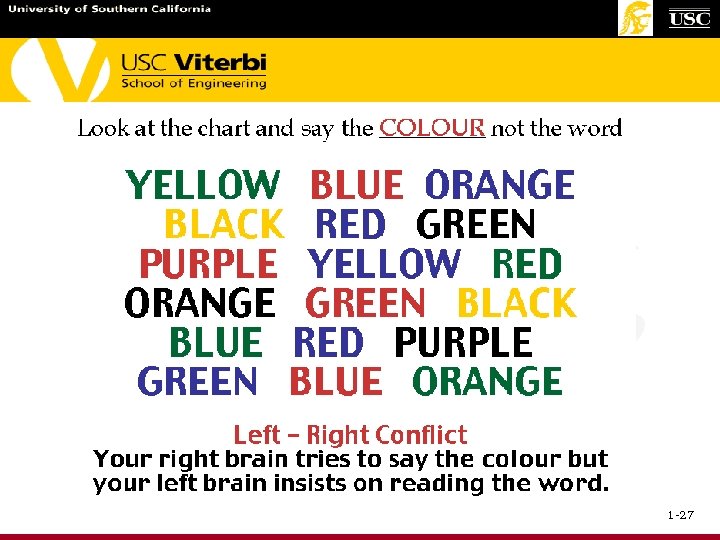
 Using Color in Textual Displays Design monochrome first. • • Basic spatial layout must make sense. User fonts, type size, inverse video, blinking. 8% of males are color deficient. Color displays are not always available. Use color to highlight and motivate. • Highlight specific features or fields. • Show relationship among fields. • Speed recognition with color coding. 1 -25
 Using Color in Textual Displays 2 Consider familiar conventions carefully. • Red: danger, stop, failure. • Yellow: warning, information. • Green: safe, go. User • • color conservatively. Excessive color is confusing. Incorrect colors are misleading. Non-colored relationships may be harder to spot. Blue text is hard to read. Robertson, IBM. 1 -26
 1 -27
1 -27
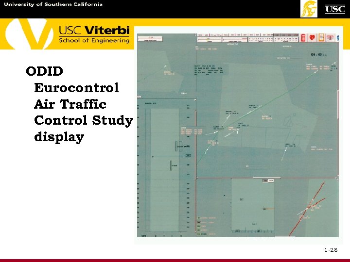 ODID Eurocontrol Air Traffic Control Study display 1 -28
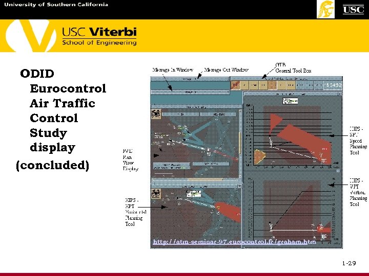 ODID Eurocontrol Air Traffic Control Study display (concluded) http: //atm-seminar-97. eurocontrol. fr/graham. htm 1 -29
 Color is - defined in terms of: Hue: spectral wavelength Value: lightness/darkness, a. k. a. intensity Chroma: purity, from gray to most vivid * Variation/mixture of these three factors result in what we see Color. . . highlights, identifies, differentiates, is appealing, shows quantity/status, can depict logic/relationships Color. . . disadvantages include color-deficient people (up to 8% Caucasian males) and can cause confusion and fatigue 1 -30
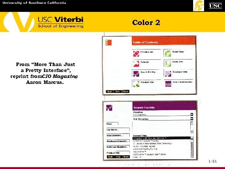 Color 2 From “More Than Just a Pretty Interface”, reprint from. CIO Magazine , Aaron Marcus. 1 -31
 Color 3 Aaron Marcus' 10 Commandments of Color 1. Use maximum 5 ± 2 colors 2. Use foveal (central) and peripheral colors appropriately, e. g. : - blue is a good background color - red/green in the center of the view - difficult to differentiate "close" colors 3. Use a color area that exhibits a minimum shift in color and/or size if the color area changes in size, e. g. : light letters on dark background, for slides and video 4. Do not use simultaneously high-chroma, spectrally extreme colors, e. g. : - can cause vibrations, illusion of shadows, or "after images" 1 -32
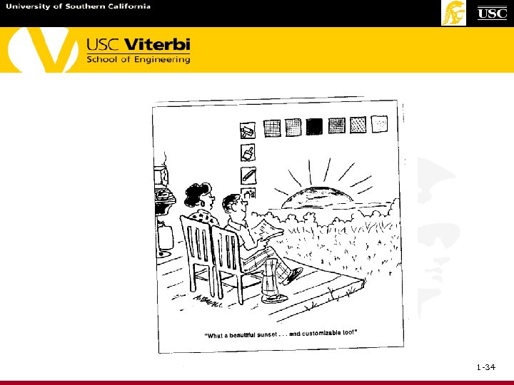
 Color 4 5. Use familiar, consistent color codings with appropriate references, e. g. : - red is stop - blue sky or background - yellow warning 6. Use the same color for grouping related elements 7. Use the same color code for training, testing, application and publication 8. Use high-value, high chroma colors to attract attention 9. Use redundant coding of shape, as well as color, if possible 10. Use color to enhance black-and-white information People don't learn more from a color display, but they think they do. Color is more enjoyable 1 -33
 1 -34
1 -34
 Screen Readability Factors Character formation. – – Upper vs. lower case. Proportional fonts. Point size, font design. Dot-matrix layout. Spacing. – Inter-character, inter-line. – Justification, margins. Perceptual issues. – Contrast, color, glare. – Distance, screen position. – Bloom, flicker, polarity. Presentation issues. – – Display rate, scrolling vs. paging. Smooth scrolling, scroll bars. User control, screen size. Search strategies, highlighting. 1 -35
 Screen Design Provide information to support the task. Create meaningful and consistent: – Field labels. – Groups. – Layout of each screen: titles, page numbers, command entry, windows, errors. – Sequencing through multiple screens. Offer error messages at chunk boundaries. Facilitate error correction: – Characters, fields, records, session. Provide lucid instructions and help. See Sid Smith’s Design Guidelines. MITRE, Bedford, MA. , 1 -36
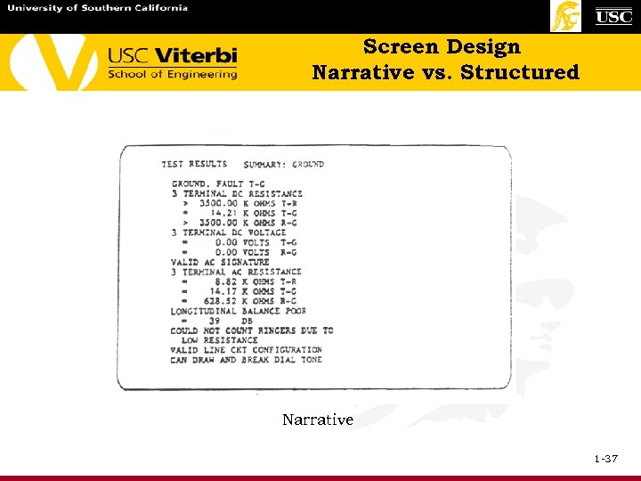 Screen Design Narrative vs. Structured Narrative 1 -37
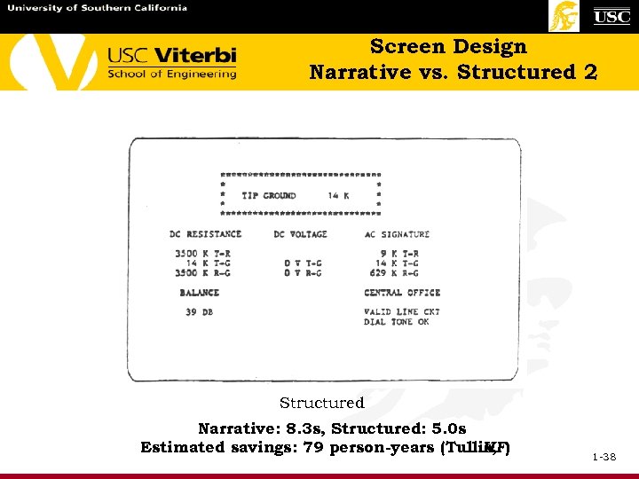 Screen Design Narrative vs. Structured 2 Structured Narrative: 8. 3 s, Structured: 5. 0 s Estimated savings: 79 person-years (Tullis, HF) 1 -38
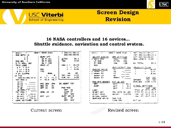 Screen Design Revision 16 NASA controllers and 16 novices… Shuttle guidance, navigation and control system. Current screen Revised screen 1 -39
 Screen Design Revision 2 Results of the Shuttle screen revision study: – Experts worked equally fast on both screens. – Novices worked faster with revised screen. – Experts and novices were more accurate with revised screen. – Novices performed like experts with the revised screen. Burns, Warren & Rudisill 1 -40
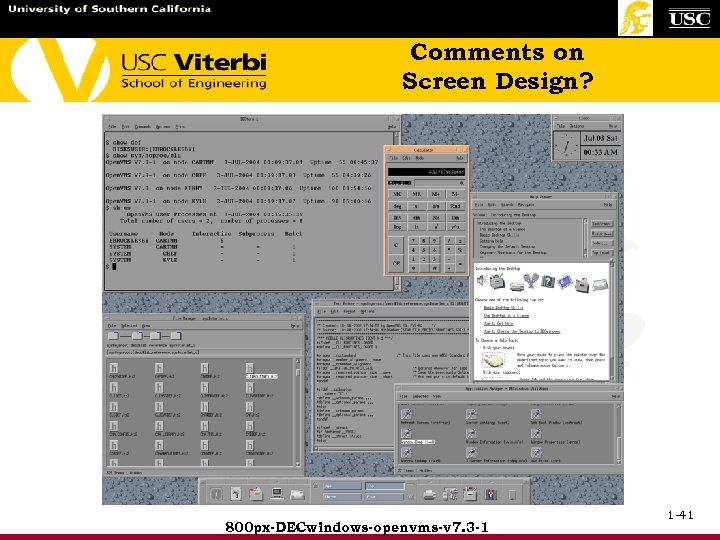 Comments on Screen Design? 800 px-DECwindows-openvms-v 7. 3 -1 1 -41
 • Visual Design – Icons 1 -42
 1 -43
1 -43
 Icons Symbolism includes signs, symbols, icons, cursors and other specialized graphics · · An icon is something that looks like it means Icons are clever and appealing Icons take less space than text Icons aid in comprehension · Design with consistency, clarity, simplicity, and familiarity. Design issues: - Lexical: size, attributes, color limits available on machine - Syntactic: size, color, patterns, orientation, location, and modular parts - Semantic: abstract/concrete objects - Pragmatic: recognition, esthetics, legibility 1 -44
 Icons (continued 2) • Guidelines for icons design: - Relate verbal and graphical terms/use - Sketch first - Sort into styles - Develop grid - Simplify appearance - Make objects recognizable - Use color with discretion. Design black & white first. - Evaluate designs with users • Icons represent ideas graphically using text identifiers (e. g “!”). Icon design is influenced by spatial arrangement, geometric properties, similarities, depth, borders, backgrounds, labels, etc. 1 -45
 Icons (continued 3) • Design an icon language, e. g. familiar folder open or closed or the famous recycle bin full or emptied • Watch international distinctions (part of internationalization discussion) and subtleties • Be aware of industry standard symbologies • Test the icons (usability test them) • Horton (Pg. 304) has a checklist to make sure icons are: understandable, unambiguous, informative, distinct, memorable, coherent, familiar, legible, few, compact, attractive and extensible References: - Graphic Design for Electronic Documents and User Interfaces Aaron Marcus , by - The Icon Book: Visual Symbols for Computer Systems and Documentation, by William Horton 1 -46
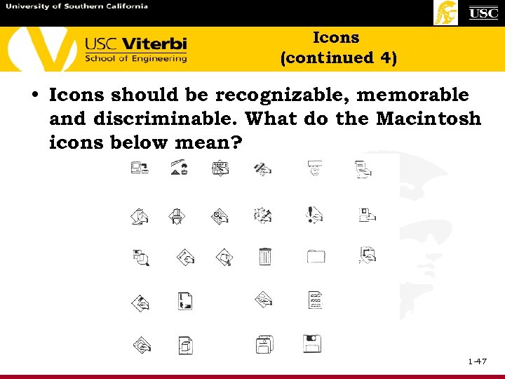 Icons (continued 4) • Icons should be recognizable, memorable and discriminable. What do the Macintosh icons below mean? 1 -47
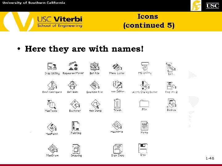 Icons (continued 5) • Here they are with names! 1 -48
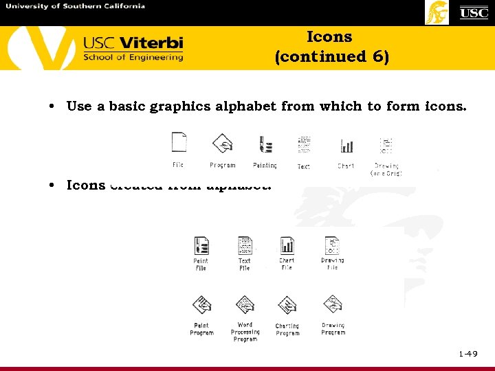 Icons (continued 6) • Use a basic graphics alphabet from which to form icons. • Icons created from alphabet: 1 -49
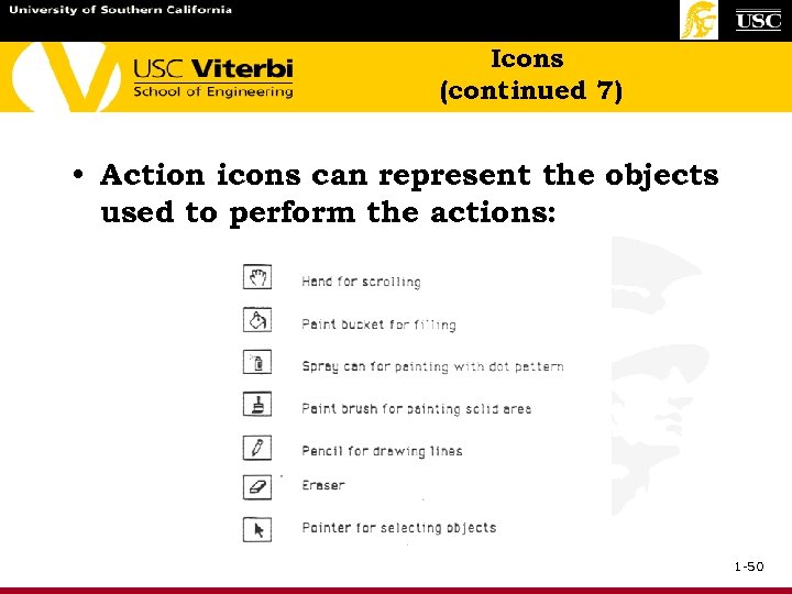 Icons (continued 7) • Action icons can represent the objects used to perform the actions: 1 -50
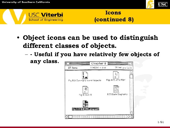 Icons (continued 8) • Object icons can be used to distinguish different classes of objects. – - Useful if you have relatively few objects of any class. 1 -51
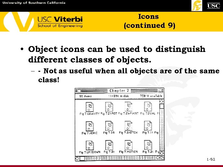 Icons (continued 9) • Object icons can be used to distinguish different classes of objects. – - Not as useful when all objects are of the same class! 1 -52
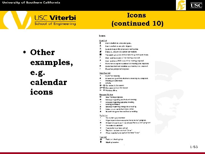 Icons (continued 10) • Other examples, e. g. calendar icons 1 -53
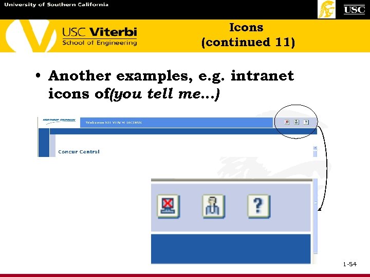 Icons (continued 11) • Another examples, e. g. intranet icons of(you tell me…) 1 -54
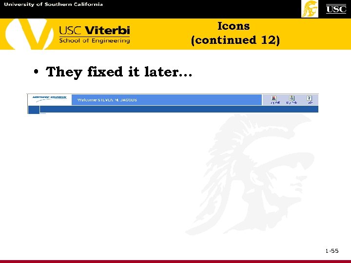 Icons (continued 12) • They fixed it later… 1 -55
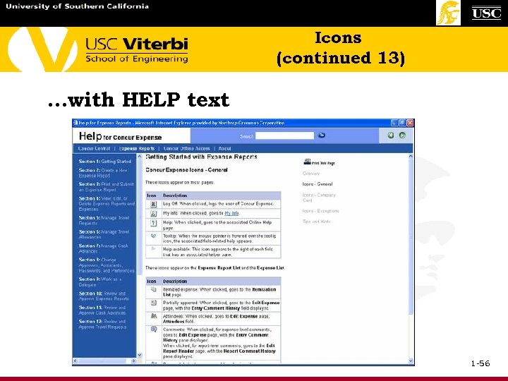 Icons (continued 13) …with HELP text 1 -56
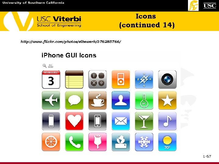 Icons (continued 14) http: //www. flickr. com/photos/elbewerk/376285766/ 1 -57
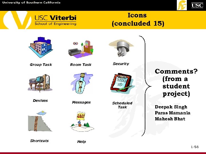 Icons (concluded 15) Group Task Room Task Security Comments? (from a student project) Devices Shortcuts Messages Scheduled Task Deepak Singh Paras Mamania Mahesh Bhat Help 1 -58
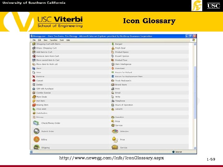 Icon Glossary http: //www. newegg. com/Info/Icon. Glossary. aspx 1 -59
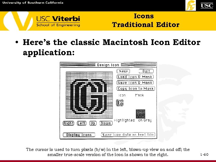 Icons Traditional Editor • Here’s the classic Macintosh Icon Editor application: The cursor is used to turn pixels (b/w) in the left, blown-up view on and off; the smaller true-scale version of the icon is shown to the right. 1 -60
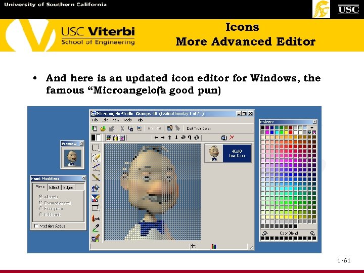 Icons More Advanced Editor • And here is an updated icon editor for Windows, the famous “Microangelo” good pun) (a 1 -61
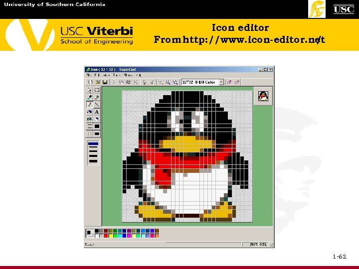 Icon editor From http: //www. icon-editor. net / 1 -62
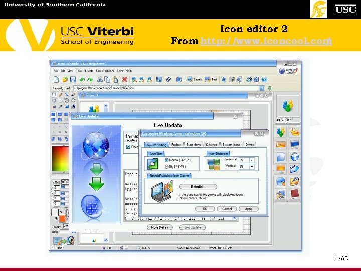 Icon editor 2 From http: // www. iconcool. com / 1 -63
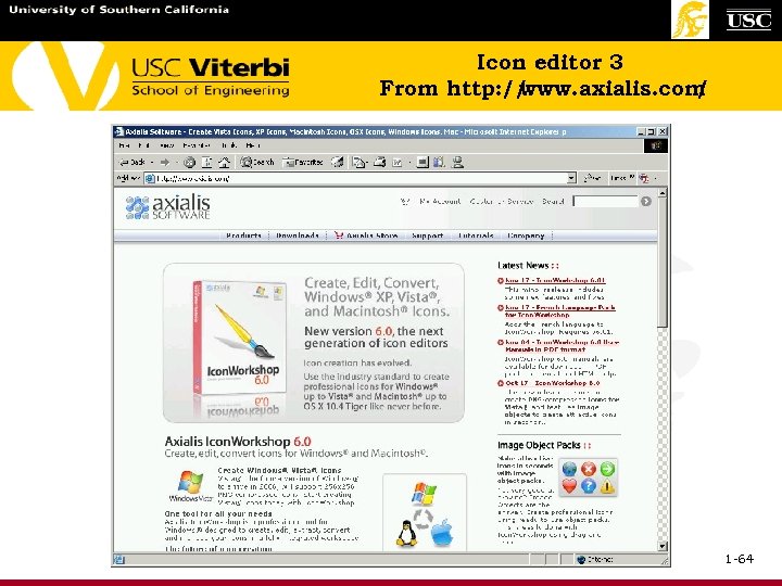 Icon editor 3 From http: // www. axialis. com / 1 -64
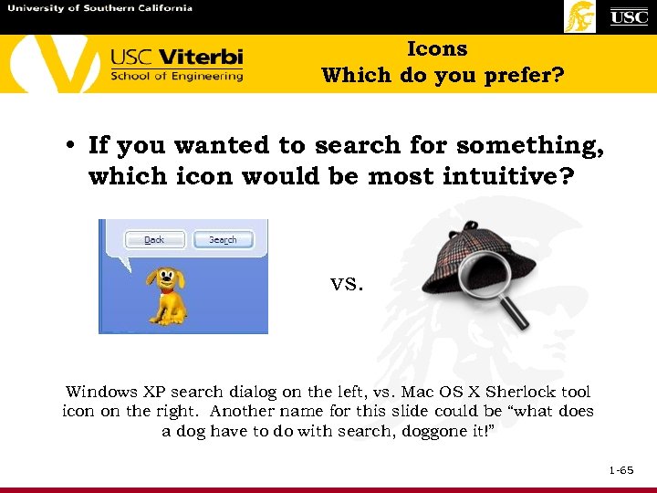 Icons Which do you prefer? • If you wanted to search for something, which icon would be most intuitive? vs. Windows XP search dialog on the left, vs. Mac OS X Sherlock tool icon on the right. Another name for this slide could be “what does a dog have to do with search, doggone it!” 1 -65
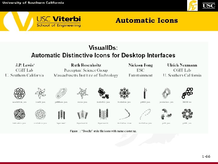 Automatic Icons 1 -66
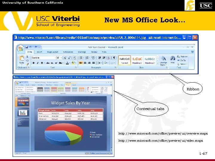 New MS Office Look… Ribbon Contextual tabs http: //www. microsoft. com/office/preview/ui/overview. mspx http: //www. microsoft. com/office/preview/ui/video. mspx 1 -67
 New MS Office Look… (continued) From Jakob Neilsen’s Alertbox e-newletter Oct. 10, 2005 on www. useit. com: • Macintosh-style WYSIWYG interaction design has reached its limits. • Displaying commands in menus, toolbars, and dialog boxes works with a limited number of elements. • Microsoft Word 2003 has 1, 500 commands, and users typically have no clue where to find most of them. • Another WYSIWYG downside is that it forces too much manual labor on users and requires a stretch of imagination to envision results in advance. 1 -68
 New MS Office Look… (concluded) • The next version of Microsoft Office (code-named "Office 12") will be based on a new interaction paradigm called the resultsoriented user interface. • The new interface displays galleries of possible end-states, each of which combine many formatting operations. • From this gallery, you select the complete look of your target -say an org chart or an entire document -- and watch it change shape as you mouse over the alternatives in the gallery. • The interaction paradigm has been reversed; it's now What You Get Is What You See, or WYGIWYS. 1 -69
 Auditory icons (ear cons) • Are everyday sounds designed to convey information about events (in the system) by analogy. • What are they good for? – Increased redundancy of the interface helps user learn and remember. – Can be parameterized to reflect relevant dimensions. E. g. File trash can. • Other issues in design of ear-cons – Mapping: How should sounds be mapped to events? – Annoyance: How can we use sounds without driving the users crazy? 1 -70
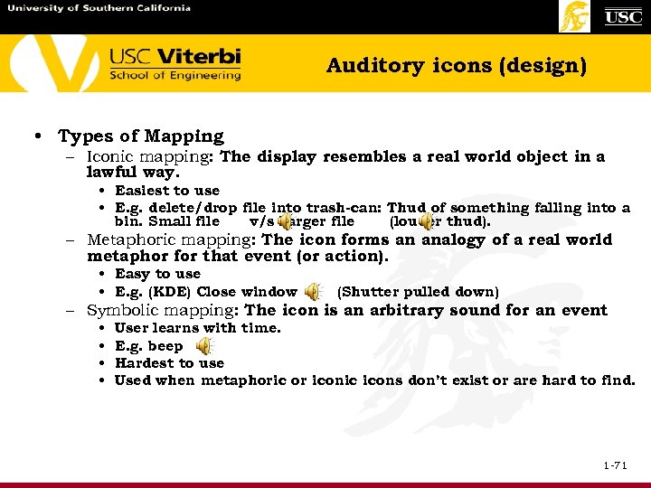 Auditory icons (design) • Types of Mapping – Iconic mapping: The display resembles a real world object in a lawful way. • Easiest to use • E. g. delete/drop file into trash-can: Thud of something falling into a bin. Small file v/s Larger file (louder thud). – Metaphoric mapping: The icon forms an analogy of a real world metaphor for that event (or action). • Easy to use • E. g. (KDE) Close window (Shutter pulled down) – Symbolic mapping: The icon is an arbitrary sound for an event • • User learns with time. E. g. beep Hardest to use Used when metaphoric or iconic icons don’t exist or are hard to find. 1 -71
 Auditory icons • UI for a voice based navigation aid system. • Provide directions to the user based on his chosen destination. • Visual senses of user are engaged in another activity. E. g. driving a car or a visually impaired person. • Tracks the user’s position continuously- act as a guide, comments about current location. • Provide user with information on current location and alert him of dangerous situations. • The main UI of the system will run on a handheld/portable device and isvoice based. • Another element of our UI will be sensor embedded with the a user. 1 -72
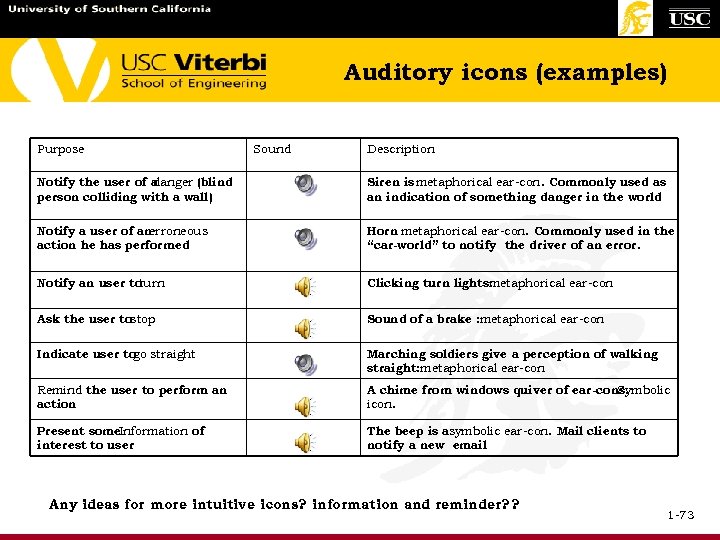 Auditory icons (examples) Purpose Sound Description Notify the user of a danger (blind person colliding with a wall) Siren is metaphorical ear-con. Commonly used as an indication of something danger in the world Notify a user of an erroneous action he has performed Horn metaphorical ear-con. Commonly used in the “car-world” to notify the driver of an error. Notify an user to turn Clicking turn lights: metaphorical ear-con Ask the user tostop Sound of a brake : metaphorical ear-con Indicate user to straight go Marching soldiers give a perception of walking straight: metaphorical ear-con Remind the user to perform an action A chime from windows quiver of ear-cons. Symbolic icon. Present some. Information of interest to user The beep is asymbolic ear-con. Mail clients to notify a new email Any ideas for more intuitive icons? information and reminder? ? 1 -73
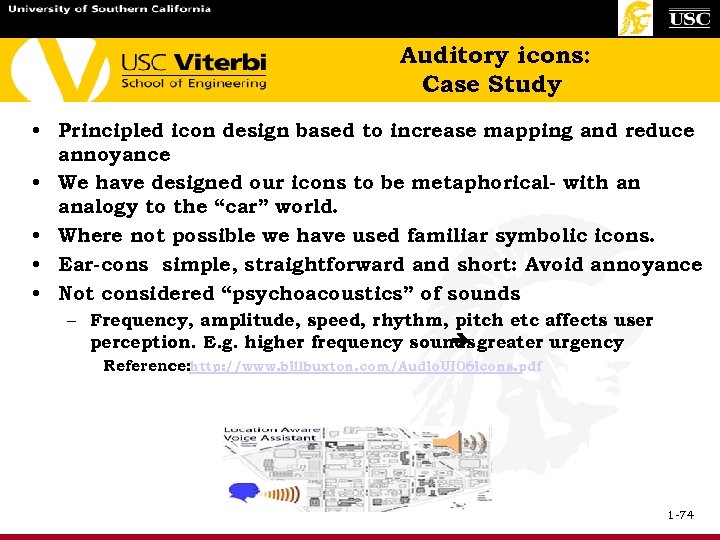 Auditory icons: Case Study • Principled icon design based to increase mapping and reduce annoyance • We have designed our icons to be metaphorical- with an analogy to the “car” world. • Where not possible we have used familiar symbolic icons. • Ear-cons simple, straightforward and short: Avoid annoyance • Not considered “psychoacoustics” of sounds – Frequency, amplitude, speed, rhythm, pitch etc affects user perception. E. g. higher frequency sounds greater urgency Reference: http: //www. billbuxton. com/Audio. UI 06 icons. pdf 1 -74
 Auditory icons (concluded) References 1. "AUDITORY INTERFACES: The Use of Non-Speech Audio at the Interface". Available at: http: // www. billbuxton. com/Audio. TOC. html 2. Ramakrishna Soma, discussion on “Auditory icons” from a former student team project & CSCI 588 T. A. 1 -75
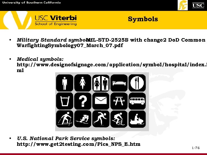 Symbols • Military Standard symbols: MIL-STD-2525 B with change 2 Do. D Common Warfighting. Symbology 07_March_07. pdf • Medical symbols: http: //www. designofsignage. com/application/symbol/hospital/index. h ml • U. S. National Park Service symbols: http: //www. get 2 testing. com/Pics_NPS_E. htm 1 -76
 1 -77
1 -77
 • • Site Design Website Performance Guidelines Visualization 1 -78
 Site Design Once users arrive at a page, they can usually figure out what to do there. If only they would take a little time. • One study: start from home page and solve a problem. Users had to find a specific page to get an answer on the web site. - They only could do it 42% of the time. Another study had an even lower score! Web site usability suffers once we leave the home page. The flagship of the site is designed differently from the remaining pages. 1 -79
 Site Design 2 Avoid splash screens. The site’s web pages should answer: “What does this site do? ” and provide: 1) summary of site and main contact areas 2) summary of important news and promotions 3) search For example, compare United Airlines and American Airlines home pages next. Metaphors can be overused. 1 -80
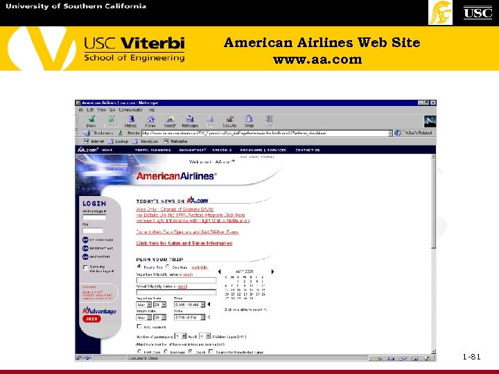 American Airlines Web Site www. aa. com 1 -81
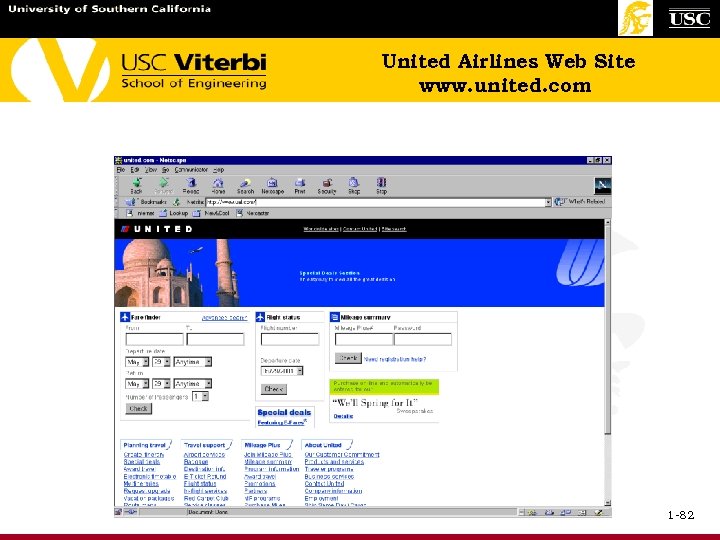 United Airlines Web Site www. united. com 1 -82
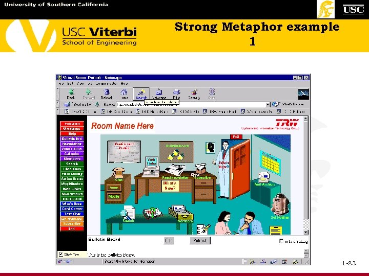 Strong Metaphor example 1 1 -83
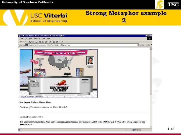 Strong Metaphor example 2 1 -84
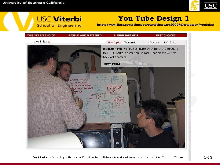 You Tube Design 1 http: //www. time. com/time/personoftheyear/2006/photoessay/youtube/ 1 -85
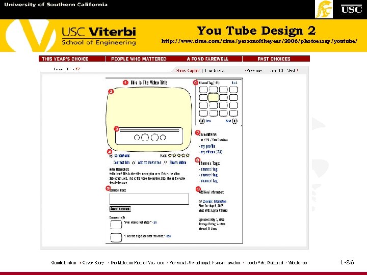 You Tube Design 2 http: //www. time. com/time/personoftheyear/2006/photoessay/youtube/ 1 -86
 Site Design Metaphors can be overused but we understand the concepts. e. g. a TV screen border around a video window or a shopping cart! Navigation comes up again in site design. You want to be able to quickly answer: Where am I? Where have I been? Where can I go? Site maps help 1 -87
 Site Design (concluded) Navigation breadth vs. depth Reducing navigation clutter - aggregation - summarization - filtering - truncation - example based representations Search improvements Design URL name Single item represents collection of smaller ones Can use visualization Show what is really necessary Show first few keywords Show examples Variety in style in search engines show that there is still room to grow 1 -88
 Web site performance trade -offs • 72 pixels/inch graphics OK. More pixels do not buy more clarity, but affect download. • Don’t put sound effects on the home page. • There are methods to get your site picked up by search engines better and faster. • Use simple graphics. • Use limited colors with, e. g. 216 colors on the palette, not special colors. • Pick color by number rather than by name (faster). • Specify graphic size so the system does not have to guess to display it. • Use graphic tools (Photo. Shop, Paintshop) to resize images. HTML tool shrink the image, not the file size. 1 -89
 Web site performance trade -offs 2 • Use colors consistently for product recognition, especially primary colors with high contrast. For some products you think of their color right away, like IBM blue, Sun Microsystems lavender or Kellogg’s red “K” • GIFs vs. JPGs (line art, buttons, etc. vs. more complex colors) • Be a bit bandit! Reduce number of colors to speed things up. • In animated GIFs (series of still pictures, reduce the number of layers of pictures. Watch the number of shots to improve performance). • Animation running a long time can be annoying. • Watch for “browser bloat”. One author strips out unnecessary text that HTML tools generators create. • Use HTML validators. 1 -90
 Web site performance trade -offs 3 • Type the last “/”. Speeds up the detection of the end of a URL • Use Netmechanic. com check performance. to • Cache graphics on clients machine. Use same filename for graphics used in multiple pages. • Pre-load graphics for frequently followed links. • The first line of page should include the !DOCTYPE tag to specify HTML version used in page. 1 -91
 1 -92
1 -92


