52d6852b259d51bb3c6d56e6d60775ec.ppt
- Количество слайдов: 36
 Clear Course Design & the Novice Online Learner A 2012 SVSLA Presentation by Kev Creech, NCVPS http: //www. communicorps. org/graphics/feature_imagiview/cc_iv_learning. jpg By the end of this presentation, you will have a broad idea how clear design guidelines and UDL theory supports effective online classroom design, and how clear course design is especially beneficial for the novice online learner. 1
 What is a Novice Online learner? For this presentation: • First-time online learner • Fully online or hybrid class • Teacher or co-teacher is remotely instructing http: //office. microsoft. com/en-us/images/results. aspx? qu=Academic#ai: MP 910220979| 2
 Module Warm-Up Four Questions Guidelines 1. You get about 20 seconds to read, think, and respond 2. For Q 1, answer “yes” or “no” in the chat box 3. Questions 2 -4, answer in ONE-to-THREE words ONLY in the chat box 4. Answer only ONCE per question; no amending or adding-to after you’ve posted 5. English teachers, don’t sweat the typos! 3
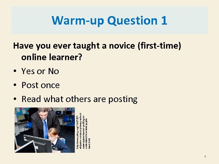 http: //www. prlog. org/11497307 shipston-on-stour-primary-schooluses-epace-learner-profiling-tounderstand-how-best-pupilslearn. html Warm-up Question 1 Have you ever taught a novice (first-time) online learner? • Yes or No • Post once • Read what others are posting 4
 Warm-up Question 2 During the first few weeks of online class, how would you describe a novice online learner? (online class can be hybrid or fully online) • 1 -3 words • Post once • Read what others are posting 5
 Warm-up Question 3 Think back to your first time taking an online course (hybrid or fully online). Describe your experience or your reaction during the first weeks of the course. • 1 -3 words • Post once • Read what others are posting 6
 Warm-up Question 4 What aspects of a commercial website would keep you from deciding to purchase something from it, even if you really wanted a particular item being sold on the site and the site was considered “safe”? • 1 -3 words • Post once • Read what others are posting 7
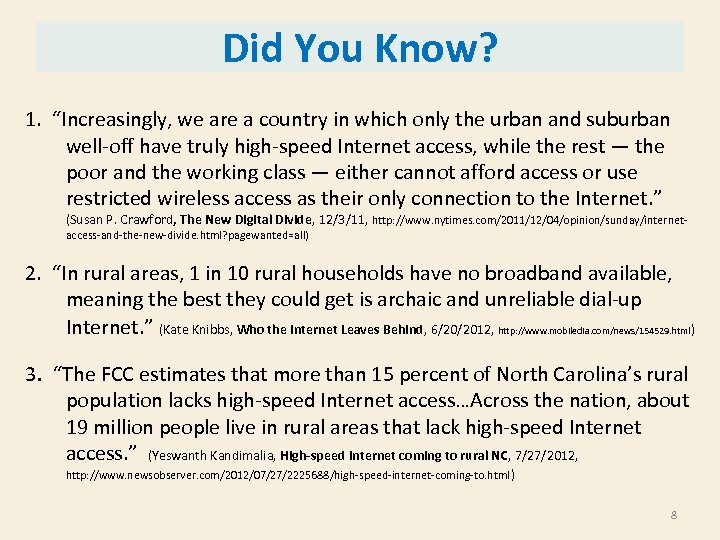 Did You Know? 1. “Increasingly, we are a country in which only the urban and suburban well-off have truly high-speed Internet access, while the rest — the poor and the working class — either cannot afford access or use restricted wireless access as their only connection to the Internet. ” (Susan P. Crawford, The New Digital Divide, 12/3/11, http: //www. nytimes. com/2011/12/04/opinion/sunday/internetaccess-and-the-new-divide. html? pagewanted=all) 2. “In rural areas, 1 in 10 rural households have no broadband available, meaning the best they could get is archaic and unreliable dial-up Internet. ” (Kate Knibbs, Who the Internet Leaves Behind, 6/20/2012, http: //www. mobiledia. com/news/154529. html) 3. “The FCC estimates that more than 15 percent of North Carolina’s rural population lacks high-speed Internet access…Across the nation, about 19 million people live in rural areas that lack high-speed Internet access. ” (Yeswanth Kandimalia, High-speed Internet coming to rural NC, 7/27/2012, http: //www. newsobserver. com/2012/07/27/2225688/high-speed-internet-coming-to. html ) 8
 Putting It Together When designing and teaching online classes, keep in mind the following: 1. 2. 3. 4. Your experience as a novice online learner Your experience with poorly designed websites Your observations about novice online students Your awareness that not all “millenials” have access to high-speed Internet; not all “millenials” are experienced computer users 9
 Tip 1: Find Out Early 1. Veteran or Novice Learner? 2. General computer experience- computer classes or certifications, gaming, etc? 3. Adult point-of-contact: administrator, counselor, teacher, parent, guardian? 4. Reliable computer access at home or only at school? 5. For at-home computer, Mac or PC? 6. For at-home computer, type of Internet- dial-up, high speed, air card, etc. ? 7. Class period/lab period for work or not? 8. Teacher, instructor, facilitator during work time or not? 9. Student’s general worries or perceived barriers? 10
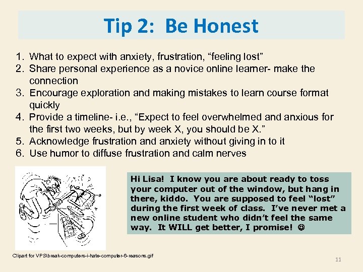 Tip 2: Be Honest 1. What to expect with anxiety, frustration, “feeling lost” 2. Share personal experience as a novice online learner- make the connection 3. Encourage exploration and making mistakes to learn course format quickly 4. Provide a timeline- i. e. , “Expect to feel overwhelmed anxious for the first two weeks, but by week X, you should be X. ” 5. Acknowledge frustration and anxiety without giving in to it 6. Use humor to diffuse frustration and calm nerves Hi Lisa! I know you are about ready to toss your computer out of the window, but hang in there, kiddo. You are supposed to feel “lost” during the first week of class. I’ve never met a new online student who didn’t feel the same way. It WILL get better, I promise! Clipart for VPSbreak-computers-i-hate-computer-6 -reasons. gif 11
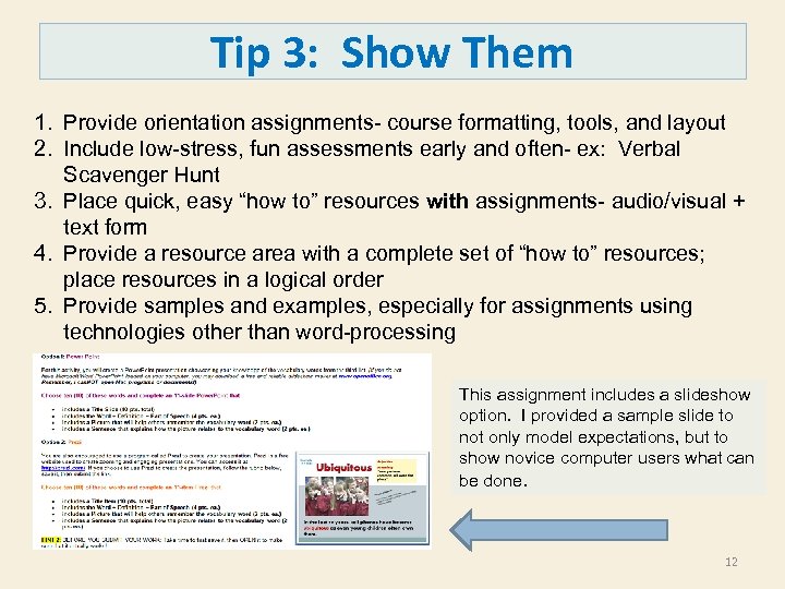 Tip 3: Show Them 1. Provide orientation assignments- course formatting, tools, and layout 2. Include low-stress, fun assessments early and often- ex: Verbal Scavenger Hunt 3. Place quick, easy “how to” resources with assignments- audio/visual + text form 4. Provide a resource area with a complete set of “how to” resources; place resources in a logical order 5. Provide samples and examples, especially for assignments using technologies other than word-processing This assignment includes a slideshow option. I provided a sample slide to not only model expectations, but to show novice computer users what can be done. 12
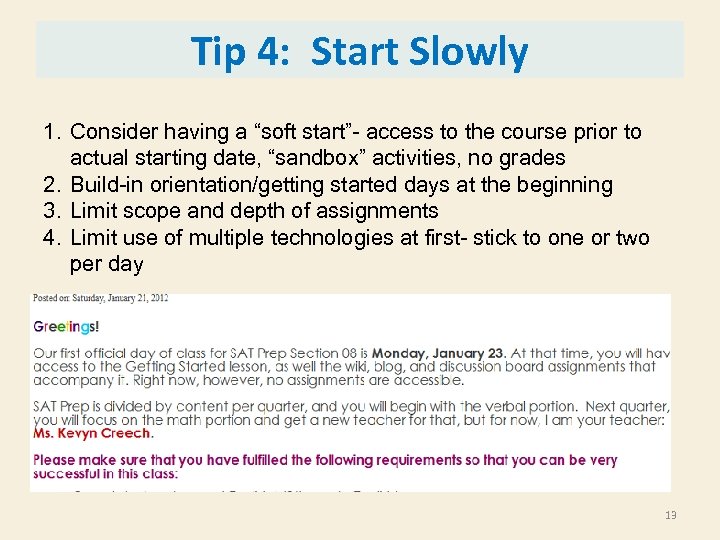 Tip 4: Start Slowly 1. Consider having a “soft start”- access to the course prior to actual starting date, “sandbox” activities, no grades 2. Build-in orientation/getting started days at the beginning 3. Limit scope and depth of assignments 4. Limit use of multiple technologies at first- stick to one or two per day 13
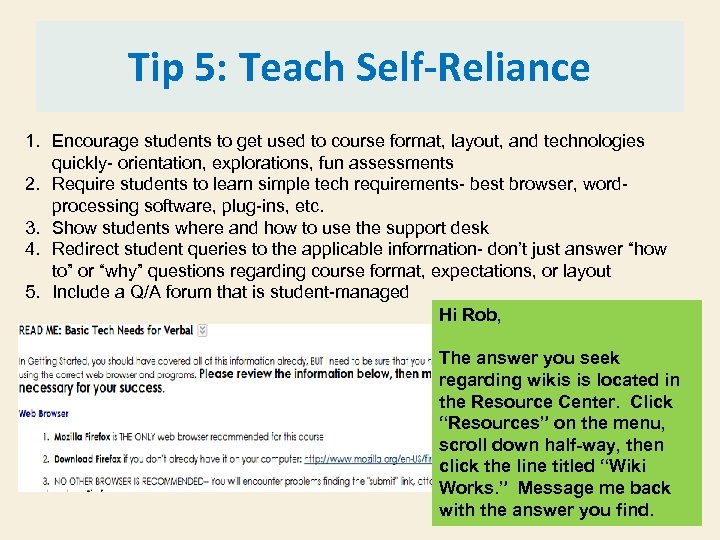 Tip 5: Teach Self-Reliance 1. Encourage students to get used to course format, layout, and technologies quickly- orientation, explorations, fun assessments 2. Require students to learn simple tech requirements- best browser, wordprocessing software, plug-ins, etc. 3. Show students where and how to use the support desk 4. Redirect student queries to the applicable information- don’t just answer “how to” or “why” questions regarding course format, expectations, or layout 5. Include a Q/A forum that is student-managed Hi Rob, The answer you seek regarding wikis is located in the Resource Center. Click “Resources” on the menu, scroll down half-way, then click the line titled “Wiki Works. ” Message me back with the answer you find. 14
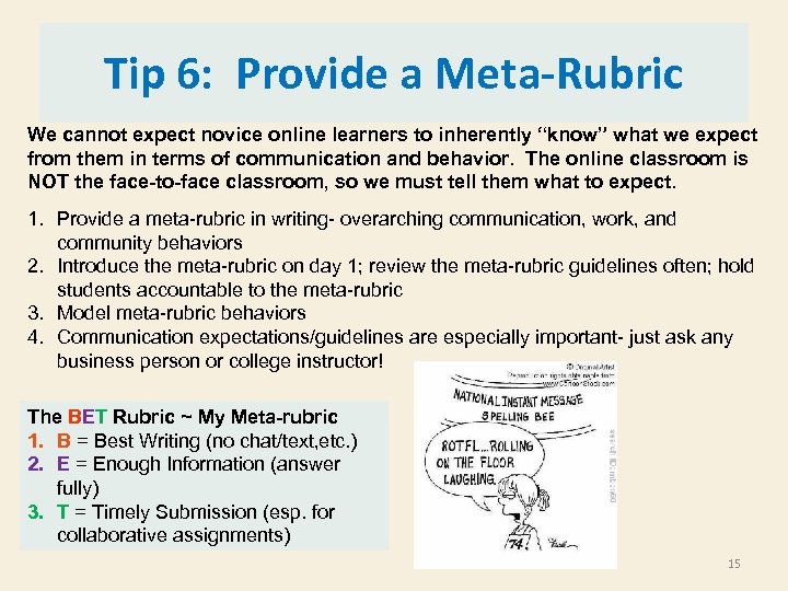 Tip 6: Provide a Meta-Rubric We cannot expect novice online learners to inherently “know” what we expect from them in terms of communication and behavior. The online classroom is NOT the face-to-face classroom, so we must tell them what to expect. 1. Provide a meta-rubric in writing- overarching communication, work, and community behaviors 2. Introduce the meta-rubric on day 1; review the meta-rubric guidelines often; hold students accountable to the meta-rubric 3. Model meta-rubric behaviors 4. Communication expectations/guidelines are especially important- just ask any business person or college instructor! The BET Rubric ~ My Meta-rubric 1. B = Best Writing (no chat/text, etc. ) 2. E = Enough Information (answer fully) 3. T = Timely Submission (esp. for collaborative assignments) 15
 Tip 7: Teach “Netiquette” Directly We cannot expect novice online learners to inherently “know” what we expect from them in terms of communication and behavior. The online classroom is NOT the face-to-face classroom, so we must tell them what to expect 1. Provide a list of “netiquette” rules for messaging and posting to wikis, discussion boards, and blogs 2. Model netiquette rules at all times 3. Nip bad netiquette in the bud early; remind often 4. Provide a place where students can relax netiquette rules- coffee shop forum; chat boards; etc. Some “Netiquette” Rules Novice Learners Don’t Know: • TYPING IN ALL CAPS IS TANTAMOUNT TO YELLING! • The subject box of a message/email should actually reflect the topic of the message/email • Never reply to an old message/email with a new topic • When in doubt, use an emoticon • Never email when angry or frustrated- wait, breathe, type, then read before sending! 16
 Tip 8: Check-in Early and Often “Perhaps the most common complaint of Virtual Students is that they feel isolated. They feel they are alone in their quest. ” (http: //www. virtualstudent. com/challengesof-getting-a-degree-online/) 1. Synchronous contact- Real-time contact through chat boards, texting, phone calls, etc. 2. General teacher presence- via Announcements, responding to posts, descriptive feedback for assignments, responding to student messages/emails quickly 3. Personal teacher presence- emails, messages, synchronous contact 4. Red flags- novices who are silent, absent, logging in but not working We can’t wait for the novice online learner to contact us. We must be proactive and check-in with novice learners first, and we must do this often during the first few weeks of class. IT IS OUR RESPONSIBILITY, not the novice online learner’s. 17
 Novice Learner Summary Online learning has its own inherent challenges and differences from traditional F 2 F learning. For novice learners, these challenges are amplified. Further, for those novice learners who are also novice computer users, online learning is ever more challenging, especially at first. To support our novice learners, online teachers must: 1. 2. 3. 4. 5. 6. 7. 8. Find out early Be honest Show them Start slowly Teach self-reliance Provide a meta-rubric Teach netiquette directly Check in early and often None of these guidelines matter, however, if the online course is not properly designed. 18
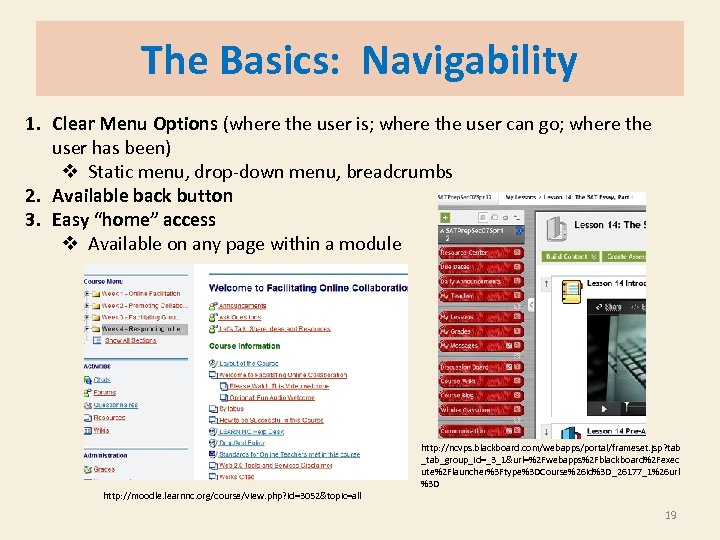 The Basics: Navigability 1. Clear Menu Options (where the user is; where the user can go; where the user has been) v Static menu, drop-down menu, breadcrumbs 2. Available back button 3. Easy “home” access v Available on any page within a module http: //moodle. learnnc. org/course/view. php? id=3052&topic=all http: //ncvps. blackboard. com/webapps/portal/frameset. jsp? tab _tab_group_id=_3_1&url=%2 Fwebapps%2 Fblackboard%2 Fexec ute%2 Flauncher%3 Ftype%3 DCourse%26 id%3 D_26177_1%26 url %3 D 19
 The Basics: Scan-ability = Format and layout of the webpage is linear, logical, and includes easily discerned headings, sub-headings, important words, and graphics. • For Sighted Users= Scan-ability means this user can quickly scan the page from left-to-right and top-to-bottom and come away with a broad (macro) idea about the content and a feel for the layout of information. • For Sight-Impaired Users= Scan-ability means this user’s Screen Reader moves easily from top-to-bottom and left-to-right. The format is linear and logical, with no unnecessary graphics or excess formatting as screen readers must include both content and format. 20
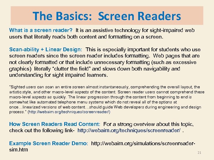 The Basics: Screen Readers What is a screen reader? It is an assistive technology for sight-impaired web users that literally reads both content and formatting on a screen. Scan-ability + Linear Design: This is especially important for students who use screen readers since the screen reader includes formatting. Web pages that are not clearly formatted or that include unnecessary formatting (such as excessive graphics) literally “clutter the field” and slows down both navigability and understanding for sight impaired learners. “Sighted users can scan an entire screen almost instantaneously, comprehending the overall layout, the artistic style, and other macro-level aspects of the content. Screen reader users cannot comprehend these macro-level aspects as quickly. The linear progression through the content from beginning to end is somewhat like automated telephone menu systems which do not reveal all of the options at once…linearized versions of web content…should guide Web developers during engineering and design process. ” (http: //webaim. org/techniques/screenreader/) How Screen Readers Read Content: For a strong overview about this topic, check out the following link- http: //webaim. org/techniques/screenreader/. Example Screen Reader Demo: http: //webaim. org/simulations/screenreadersim. htm 21
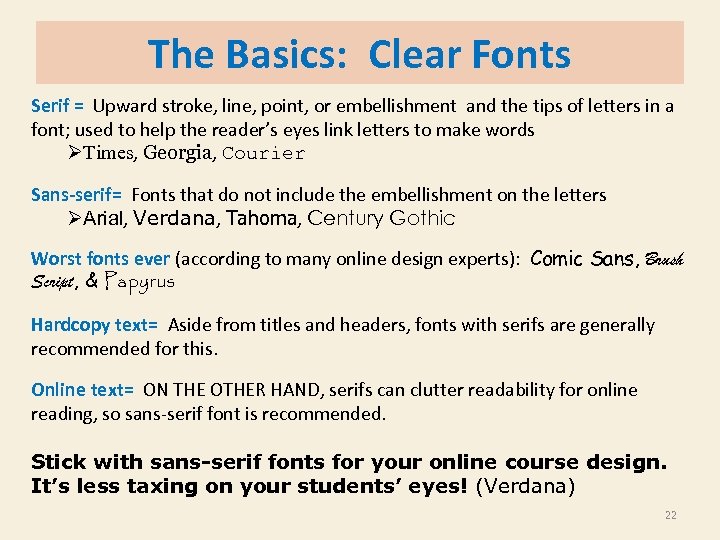 The Basics: Clear Fonts Serif = Upward stroke, line, point, or embellishment and the tips of letters in a font; used to help the reader’s eyes link letters to make words ØTimes, Georgia, Courier Sans-serif= Fonts that do not include the embellishment on the letters ØArial, Verdana, Tahoma, Century Gothic Worst fonts ever (according to many online design experts): Comic Sans, Brush Script, & Papyrus Hardcopy text= Aside from titles and headers, fonts with serifs are generally recommended for this. Online text= ON THE OTHER HAND, serifs can clutter readability for online reading, so sans-serif font is recommended. Stick with sans-serif fonts for your online course design. It’s less taxing on your students’ eyes! (Verdana) 22
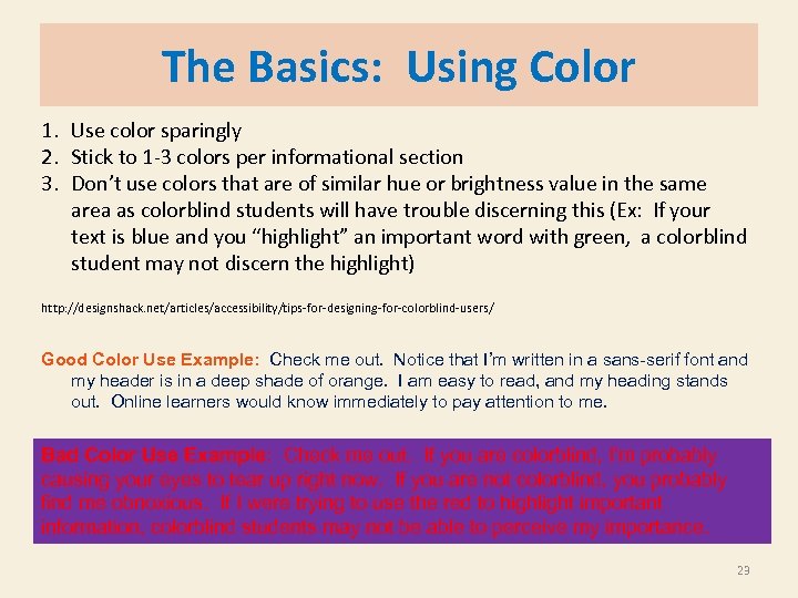 The Basics: Using Color 1. Use color sparingly 2. Stick to 1 -3 colors per informational section 3. Don’t use colors that are of similar hue or brightness value in the same area as colorblind students will have trouble discerning this (Ex: If your text is blue and you “highlight” an important word with green, a colorblind student may not discern the highlight) http: //designshack. net/articles/accessibility/tips-for-designing-for-colorblind-users/ Good Color Use Example: Check me out. Notice that I’m written in a sans-serif font and my header is in a deep shade of orange. I am easy to read, and my heading stands out. Online learners would know immediately to pay attention to me. Bad Color Use Example: Check me out. If you are colorblind, I’m probably causing your eyes to tear up right now. If you are not colorblind, you probably find me obnoxious. If I were trying to use the red to highlight important information, colorblind students may not be able to perceive my importance. 23
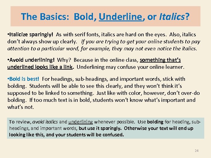 The Basics: Bold, Underline, or Italics? • Italicize sparingly! As with serif fonts, italics are hard on the eyes. Also, italics don’t always show up clearly. If you are trying to get your online students to pay attention to a particular word, for example, they may not even notice the italics. • Avoid underlining! Why? Because in the online class, something that’s underlined looks like a link. Underlining may confuse your online learner. • Bold is best! For headings, sub-headings, and important words, stick with bolding. Students will be able to see this clearly, and they won’t think it’s supposed to be linked to something. Just like with color, however, don’t over-do bolding. If too much text is in bold, students won’t know what’s important and what’s not. To review, avoid italics and underlining whenever possible. Use bolding for heading, subheadings, and important words, but use it sparingly. Otherwise your text will end up looking like this, and your students will be confused. 24
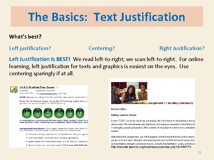 The Basics: Text Justification What’s best? Left justification? Centering? Right Justification? Left Justification Is BEST! We read left-to-right; we scan left-to-right. For online learning, left justification for texts and graphics is easiest on the eyes. Use centering sparingly if at all. http: //moodle. learnnc. org/mod/resource/view. php? id=464774 25
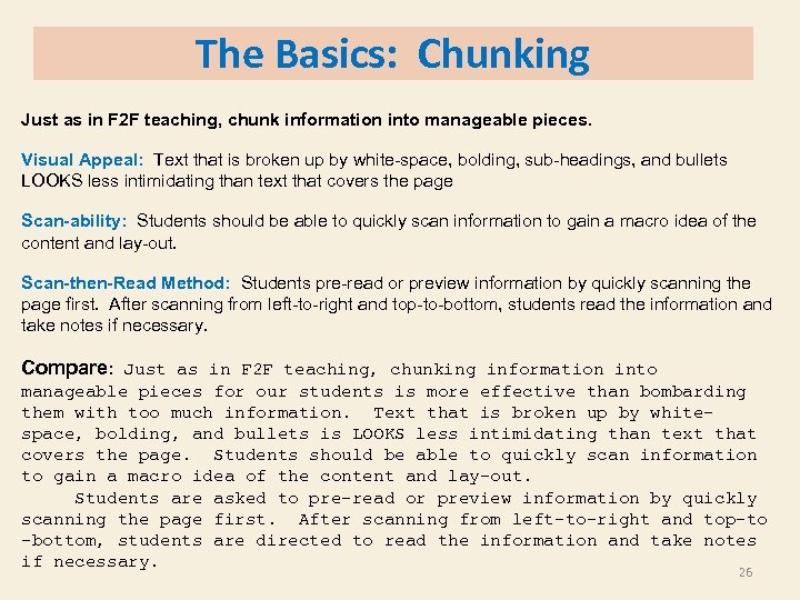 The Basics: Chunking Just as in F 2 F teaching, chunk information into manageable pieces. Visual Appeal: Text that is broken up by white-space, bolding, sub-headings, and bullets LOOKS less intimidating than text that covers the page Scan-ability: Students should be able to quickly scan information to gain a macro idea of the content and lay-out. Scan-then-Read Method: Students pre-read or preview information by quickly scanning the page first. After scanning from left-to-right and top-to-bottom, students read the information and take notes if necessary. Compare: Just as in F 2 F teaching, chunking information into manageable pieces for our students is more effective than bombarding them with too much information. Text that is broken up by whitespace, bolding, and bullets is LOOKS less intimidating than text that covers the page. Students should be able to quickly scan information to gain a macro idea of the content and lay-out. Students are asked to pre-read or preview information by quickly scanning the page first. After scanning from left-to-right and top-to -bottom, students are directed to read the information and take notes if necessary. 26
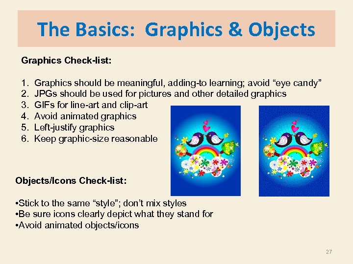 The Basics: Graphics & Objects Graphics Check-list: 1. 2. 3. 4. 5. 6. Graphics should be meaningful, adding-to learning; avoid “eye candy” JPGs should be used for pictures and other detailed graphics GIFs for line-art and clip-art Avoid animated graphics Left-justify graphics Keep graphic-size reasonable Objects/Icons Check-list: • Stick to the same “style”; don’t mix styles • Be sure icons clearly depict what they stand for • Avoid animated objects/icons 27
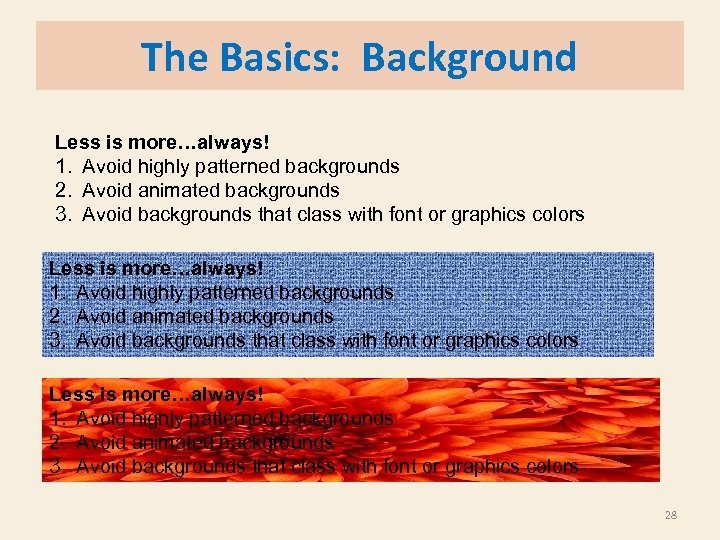 The Basics: Background Less is more…always! 1. Avoid highly patterned backgrounds 2. Avoid animated backgrounds 3. Avoid backgrounds that class with font or graphics colors 28
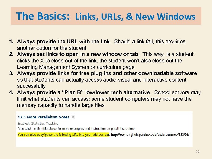 The Basics: Links, URLs, & New Windows 1. Always provide the URL with the link. Should a link fail, this provides another option for the student 2. Always set links to open in a new window or tab. This way, is a student clicks the X to close out of the link, the student won’t also close out the Learning Management System or curriculum page 3. Always provide links for free plug-ins and other downloadable software so that students can actually access audio-visual and interactive content successfully 4. Always provide a “Plan B” low/lower-tech alternative. School servers may limit what students can access; some student computers may not have the memory capacity to handle large files 29
 UDL= Universal Design for Learning is a set of principles for curriculum development that give all individuals equal opportunities to learn. - It is based on the neuroscience of learning. UDL provides a blueprint for creating instructional goals, methods, materials, and assessments that work for everyone--not a single, one-size-fits-all solution but rather flexible approaches that can be customized and adjusted for individual needs. http: //www. udlcenter. org/aboutudl/whatisudl 30
 UDL Quick & Dirty Overview UDL theory embraces the idea that all learners and teachers are highly variable, that the “typical” student and teacher does not really exist. Key Elements of UDL include: 1. Learner variability is normal- embrace it 2. Proactive design is best- design curriculum from the beginning to be as universal as possible; plan ahead to mitigate possible learning or technology barriers 3. Teaching and learning flexibility should be built in the curriculum • Choices and different learning paths must be included • Information should be represented in a variety of ways UDL Design Guidelines Are Based on Three Main Principles: I. Representation II. Action/Expression III. Engagement We are going to focus on Representation and Action/Expression 31
 UDL Design Guideline I Provide Multiple Means of Representation • Customize the display of information Ø High contrast options; display size; open in a new window • Provide alternatives for auditory information Ø Text scripts; text summaries; flow charts; blogs • Provide alternatives for visual information Ø Audio recordings Think to yourself: What are some pro-active design steps based on Multiple Means of Representation you might include if you were developing an online module for your students? 32
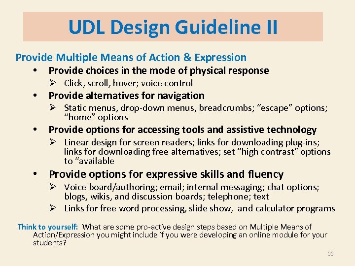 UDL Design Guideline II Provide Multiple Means of Action & Expression • Provide choices in the mode of physical response Ø Click, scroll, hover; voice control • Provide alternatives for navigation Ø Static menus, drop-down menus, breadcrumbs; “escape” options; “home” options • Provide options for accessing tools and assistive technology Ø Linear design for screen readers; links for downloading plug-ins; links for downloading free alternatives; set “high contrast” options to “available • Provide options for expressive skills and fluency Ø Voice board/authoring; email; internal messaging; chat options; blogs, wikis, and discussion boards; telephone; text Ø Links for free word processing, slide show, and calculator programs Think to yourself: What are some pro-active design steps based on Multiple Means of Action/Expression you might include if you were developing an online module for your students? 33
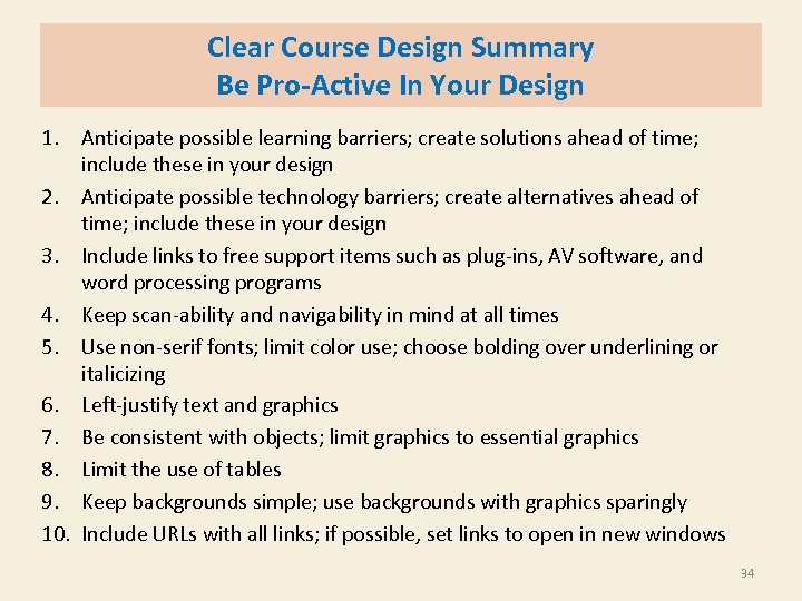 Clear Course Design Summary Be Pro-Active In Your Design 1. Anticipate possible learning barriers; create solutions ahead of time; include these in your design 2. Anticipate possible technology barriers; create alternatives ahead of time; include these in your design 3. Include links to free support items such as plug-ins, AV software, and word processing programs 4. Keep scan-ability and navigability in mind at all times 5. Use non-serif fonts; limit color use; choose bolding over underlining or italicizing 6. Left-justify text and graphics 7. Be consistent with objects; limit graphics to essential graphics 8. Limit the use of tables 9. Keep backgrounds simple; use backgrounds with graphics sparingly 10. Include URLs with all links; if possible, set links to open in new windows 34
 Citation Slide Citations listed in order of appearance 1. http: //www. communicorps. org/graphics/feature_imagiview/cc_iv_learning. jpg 2. http: //office. microsoft. com/en-us/images/results. aspx? qu=Academic#ai: MP 910220979| 3. http: //www. prlog. org/11497307 -shipston-on-stour-primary-school-uses-epace-learnerprofiling-to-understand-how-best-pupils-learn. html 4. Susan P. Crawford, The New Digital Divide, 12/3/11, http: //www. nytimes. com/2011/12/04/opinion/sunday/internet-access-and-the-newdivide. html? pagewanted=all 5. Kate Knibbs, Who the Internet Leaves Behind, 6/20/2012, http: //www. mobiledia. com/news/154529. html 6. break-computers-i-hate-computer-6 -reasons. gif 7. http: //ncvps. blackboard. com/webapps/portal/frameset. jsp? tab_group_id=_3_1&url =%2 Fwebapps%2 Fblackboard%2 Fexecute%2 Flauncher%3 Ftype%3 DCourse%26 id%3 D_26177_1%26 url%3 D 8. www. cartoonstock. com 9. http: //www. virtualstudent. com/challenges-of-getting-a-degree-online/ 10. http: //moodle. learnnc. org/course/view. php? id=3052&topic=all 11. http: //webaim. org/techniques/screenreader/ 12. http: //webaim. org/simulations/screenreader-sim. htm 13. http: //designshack. net/articles/accessibility/tips-for-designing-for-colorblind-users/ 14. http: //www. udlcenter. org/aboutudl/whatisudl 35
 Contact Me! Kevyn. creech@ncpublicschools. gov (919)434 -9520 or f s ! nk ng ha di T en tt a 36


