Charts Online Journalism.pptx
- Количество слайдов: 15
 Charts
 Why use charts? • visual representation of statistical data • data are represented by symbols such as bars or lines • one- or two-dimensional figure (such as a bar chart or a line chart)
 Use charts when: • Comparison: How much? Which item is bigger or smaller? • Changes over time: How does a variable evolve? • Frequency distribution: How are the items distributed? What are the differences? • Correlation: Are two variables linked? • Relative share of a whole: How does one item compare to the total?
 Checklist for designing a good chart 1. Define your target audience: What do they know about the issue? 2. Determine the message you want to communicate: What do the data show? Is there more than one message? 3. Determine the nature of your message: Do you want to compare items, show time trends or analyze relationships in your data?
 A good chart: • grabs the reader’s attention; • presents the information simply, clearly and accurately; • does not mislead; • displays the data in a concentrated way (e. g. one line chart instead of many pie charts); • facilitates data comparison and highlights trends and differences; • illustrates messages, themes or storylines in the accompanying text.
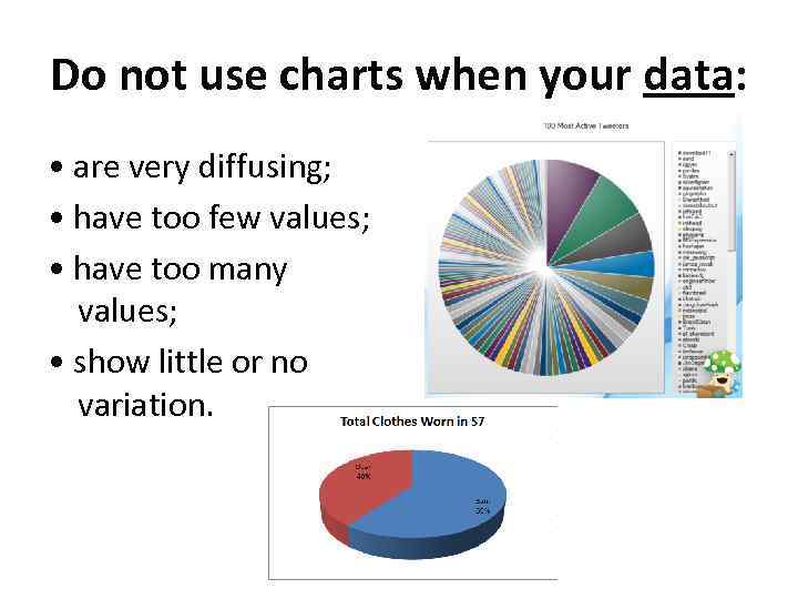 Do not use charts when your data: • are very diffusing; • have too few values; • have too many values; • show little or no variation.
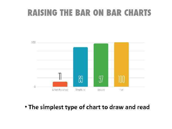 • The simplest type of chart to draw and read
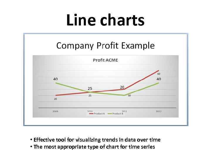 Line charts • Effective tool for visualizing trends in data over time • The most appropriate type of chart for time series
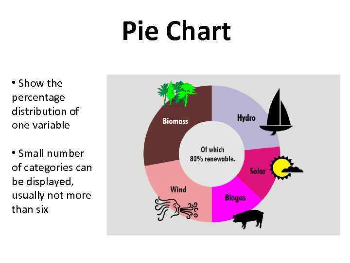 Pie Chart • Show the percentage distribution of one variable • Small number of categories can be displayed, usually not more than six
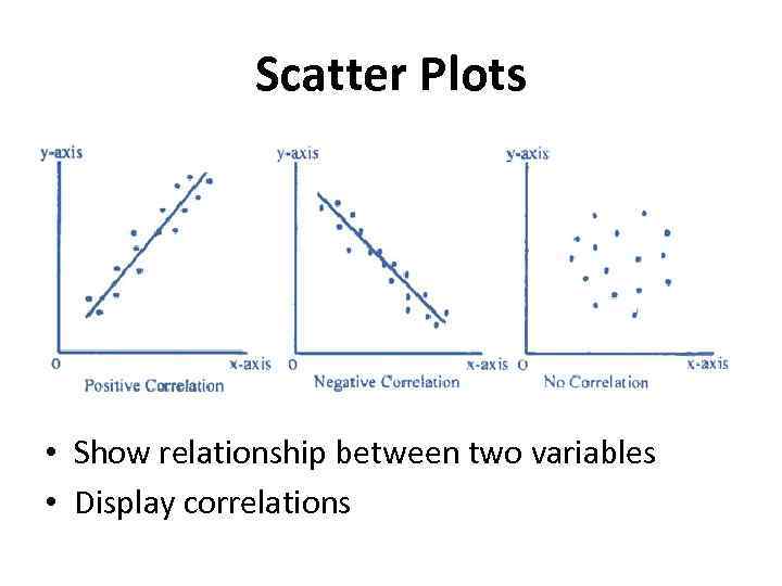 Scatter Plots • Show relationship between two variables • Display correlations
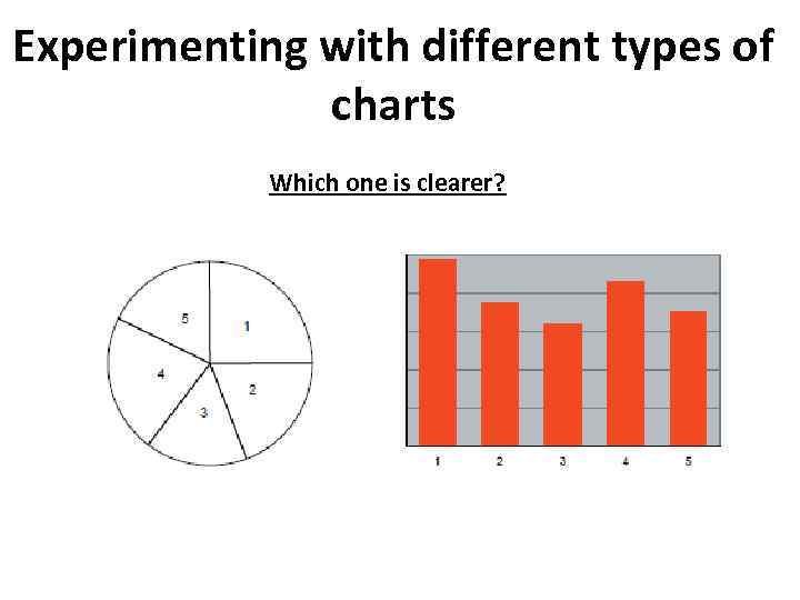 Experimenting with different types of charts Which one is clearer?
 What makes an effective chart Chart components fall into three categories: 1. Data components that represent the data: bars, lines, areas or points. 2. Support components that assist in understanding the data: title, legend, data labels, gridlines, footnotes and data source. 3. Decorative features that are not related to the data.
 Include the following support components: • The chart title should give a clear idea of what the chart is about. It has to be short and concise. You can have two types of titles: • An informative title provides all the information needed to understand the data. It should answer the three questions “what”, “where” and “when”. • A descriptive title is a caption that highlights the main pattern or trend displayed in the chart. It states in a few words the story that the chart illustrates.
 Include the following support components: • The axis labels are displayed horizontally on both axes. • The axis titles should identify the unit of measure of the data (e. g. “in thousands”, “%”, “age (in years)” • Gridlines can be added in bar and line charts to help users read and compare the values of the data. • The legend and data labels should identify the symbols, patterns or colors, used to represent the data in the chart, displayed on or next to the data components (bars, areas, lines) • A footnote may be used to provide definitions or methodological information. • The data source should be identified at the bottom of the chart.
 Make good charts!


