b870cad53ea585589aa5cdf321f080ad.ppt
- Количество слайдов: 70
 Chapter 6/7 Scatterplots, Association, and Correlation And Linear Regression Copyright © 2014, 2012, 2009 Pearson Education, Inc. 1
 Objectives (ch 6): Use a scatterplot to determine if a linear correlation is suggested between two variables and describe the association in terms of direction, form and strength (amount of scatter). 25. Compute the correlation of two variables and use it as part of the description of a scatterplot. 26. Identify and describe points that deviate from the overall pattern. 24. Slide 1 - 2 Copyright © 2014, 2012, 2009 Pearson Education, Inc. 2
 Objectives (ch 7): 27. 28. 29. 30. 31. 32. Compute a linear equation that models the relationship between two variables. Determine whether the slope of a regression line makes sense and interpret the slope in the context of the problem. Use regression to predict a value of y for a given x and discuss the issues associated with extrapolation. Find the residual for a given x. Know how to use a plot of residuals against predicted values to check the straight enough condition or look for outliers. (Optional… time 3 permitting) Slide 1 - 3 Copyright © 2014, 2012, 2009 Pearson Education, Inc.
 6. 1 Scatterplots Copyright © 2014, 2012, 2009 Pearson Education, Inc. 4
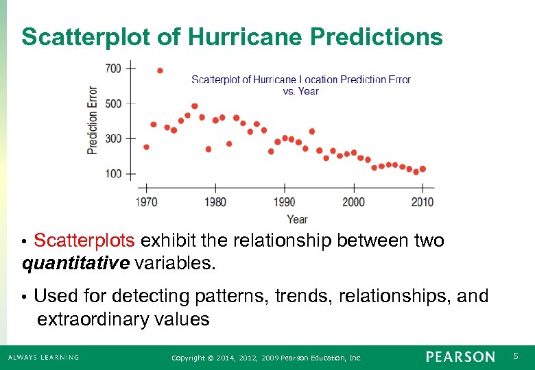 Scatterplot of Hurricane Predictions Scatterplots exhibit the relationship between two quantitative variables. • Used for detecting patterns, trends, relationships, and extraordinary values • Copyright © 2014, 2012, 2009 Pearson Education, Inc. 5
 Looking at Scatterplots (cont. ) When looking at scatterplots, we will look for direction, form, strength, and unusual features. Direction: • A pattern that runs from the upper left to the lower right is said to have a negative direction. • A trend running the other way has a positive direction. Form: in this class we are looking for a linear (straight line) relationship… curves are also possible Strength: Do the points follow a clear stream or are they widely scattered? Unusual Features include outliers or clumps in the data Slide 1 - 6 Copyright © 2014, 2012, 2009 Pearson Education, Inc. 6
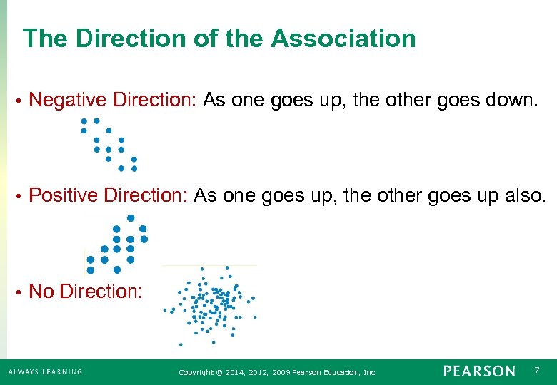 The Direction of the Association • Negative Direction: As one goes up, the other goes down. • Positive Direction: As one goes up, the other goes up also. • No Direction: Copyright © 2014, 2012, 2009 Pearson Education, Inc. 7
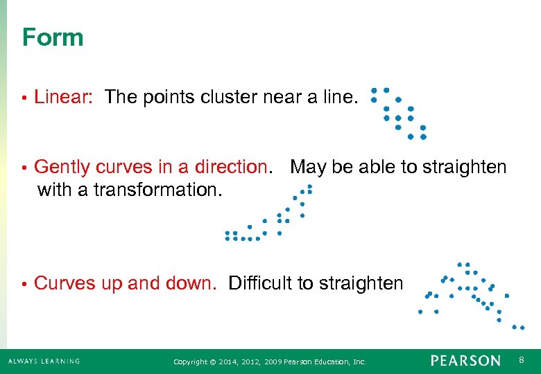 Form • Linear: The points cluster near a line. Gently curves in a direction. May be able to straighten with a transformation. • • Curves up and down. Difficult to straighten Copyright © 2014, 2012, 2009 Pearson Education, Inc. 8
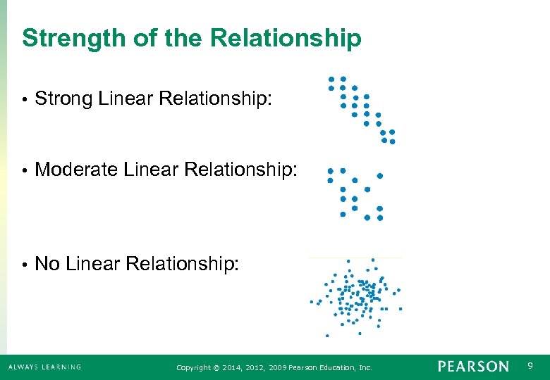 Strength of the Relationship • Strong Linear Relationship: • Moderate Linear Relationship: • No Linear Relationship: Copyright © 2014, 2012, 2009 Pearson Education, Inc. 9
 Unusual Features • Look for the unexpected. • Often the most interesting thing to see in a scatterplot is the thing you never thought to look for. • One example of such a surprise is an outlier standing away from the overall pattern of the scatterplot. • Clusters or subgroups should also raise questions. Slide 1 - 10 Copyright © 2014, 2012, 2009 Pearson Education, Inc. 10
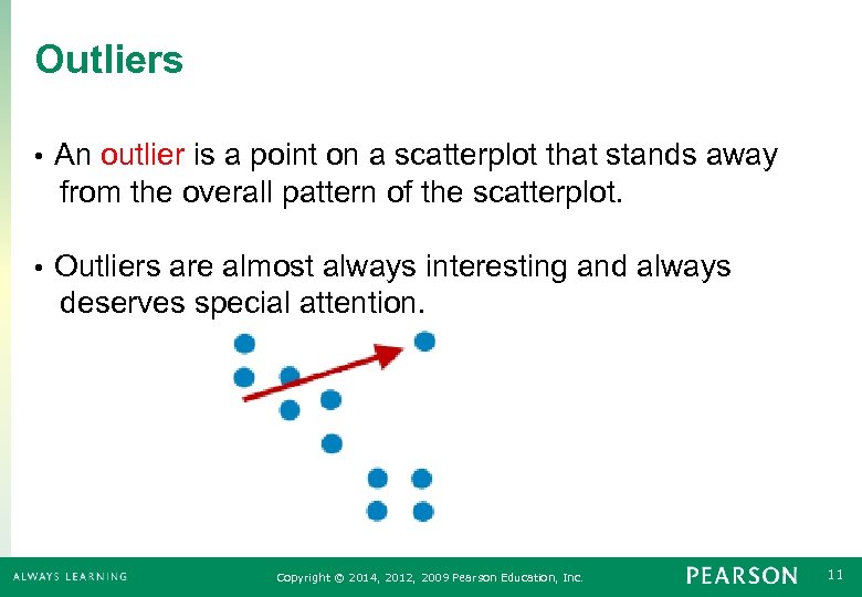 Outliers An outlier is a point on a scatterplot that stands away from the overall pattern of the scatterplot. • Outliers are almost always interesting and always deserves special attention. • Copyright © 2014, 2012, 2009 Pearson Education, Inc. 11
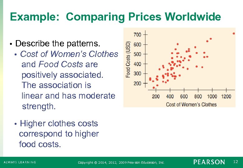 Example: Comparing Prices Worldwide • Describe the patterns. • Cost of Women’s Clothes and Food Costs are positively associated. The association is linear and has moderate strength. Higher clothes costs correspond to higher food costs. • Copyright © 2014, 2012, 2009 Pearson Education, Inc. 12
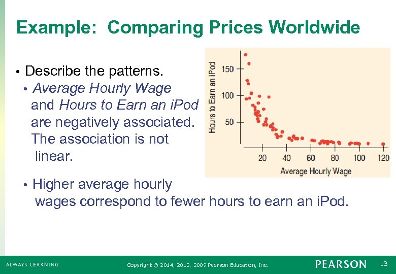 Example: Comparing Prices Worldwide • Describe the patterns. • Average Hourly Wage and Hours to Earn an i. Pod are negatively associated. The association is not linear. Higher average hourly wages correspond to fewer hours to earn an i. Pod. • Copyright © 2014, 2012, 2009 Pearson Education, Inc. 13
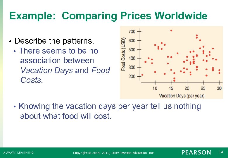 Example: Comparing Prices Worldwide • Describe the patterns. • There seems to be no association between Vacation Days and Food Costs. Knowing the vacation days per year tell us nothing about what food will cost. • Copyright © 2014, 2012, 2009 Pearson Education, Inc. 14
 Roles of Variables Response Variable (y): The variable of interest. It is what we want to predict. • Explanatory or Predictor Variable (x): The variable that we use to provide information or a prediction of the response variable. • Choosing the response variable and the explanatory variable depends on how we think about the problem. • Copyright © 2014, 2012, 2009 Pearson Education, Inc. 15
 Which is Response and Which is Explanatory? Do baseball teams that score more runs also sell more tickets? • Tickets = Response (y), Runs = Explanatory (x) • • Do students with higher SAT scores get better grades? • Grades = Response (y), SAT score = Explanatory (x) Can we estimate a person’s BMI by measuring their wrist size? • BMI = Response (y), Wrist Size = Explanatory (x) • Copyright © 2014, 2012, 2009 Pearson Education, Inc. 16
 Using TI-83 Creating a Scatterplot: 1. Press 2 ND->STAT PLOT and then press “ 1”. Make sure “On” is selected, the top left “Type” is selected, L 1 is selected as the “Xlist”, and L 2 is selected as the “Ylist”. 2. Enter your “X” data in L 1 3. Enter your “Y” data in L 2 4. Press ZOOM->Zoom. Stat Always create a scatterplot to determine if a linear model is appropriate BEFORE computing the correlation coefficient or linear model Slide 1 - 17 Copyright © 2014, 2012, 2009 Pearson Education, Inc. 17
 6. 2 Correlation Copyright © 2014, 2012, 2009 Pearson Education, Inc. 18
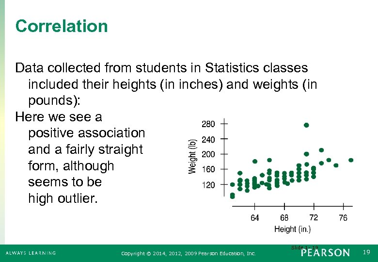 Correlation Data collected from students in Statistics classes included their heights (in inches) and weights (in pounds): Here we see a positive association and a fairly straight form, although there seems to be a high outlier. Slide 1 - 19 Copyright © 2014, 2012, 2009 Pearson Education, Inc. 19
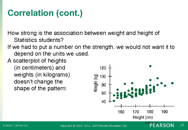 Correlation (cont. ) How strong is the association between weight and height of Statistics students? If we had to put a number on the strength, we would not want it to depend on the units we used. A scatterplot of heights (in centimeters) and weights (in kilograms) doesn’t change the shape of the pattern: Slide 1 - 20 Copyright © 2014, 2012, 2009 Pearson Education, Inc. 20
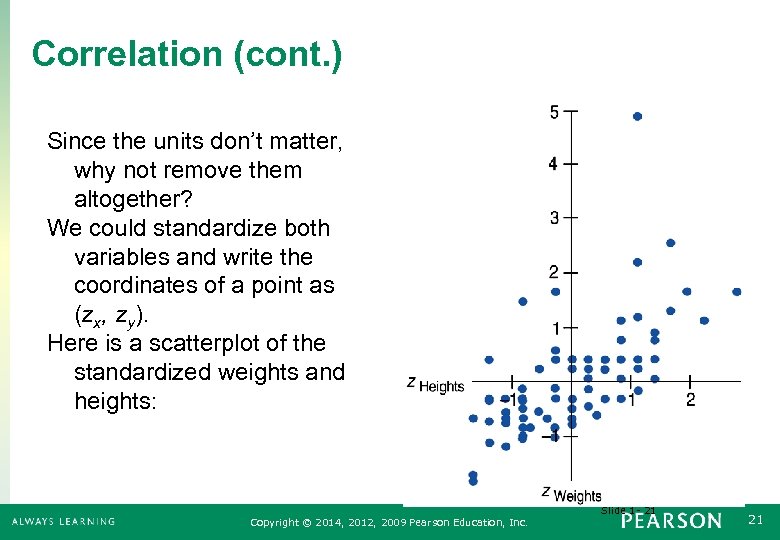 Correlation (cont. ) Since the units don’t matter, why not remove them altogether? We could standardize both variables and write the coordinates of a point as (zx, zy). Here is a scatterplot of the standardized weights and heights: Slide 1 - 21 Copyright © 2014, 2012, 2009 Pearson Education, Inc. 21
 Correlation (cont. ) Note that the underlying linear pattern seems steeper in the standardized plot than in the original scatterplot. That’s because we made the scales of the axes the same. Equal scaling gives a neutral way of drawing the scatterplot and a fairer impression of the strength of the association. Slide 1 - 22 Copyright © 2014, 2012, 2009 Pearson Education, Inc. 22
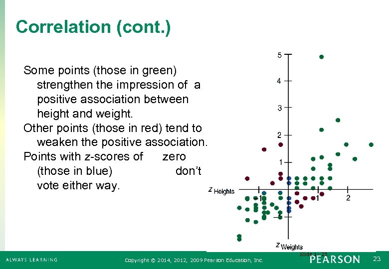 Correlation (cont. ) Some points (those in green) strengthen the impression of a positive association between height and weight. Other points (those in red) tend to weaken the positive association. Points with z-scores of zero (those in blue) don’t vote either way. Slide 1 - 23 Copyright © 2014, 2012, 2009 Pearson Education, Inc. 23
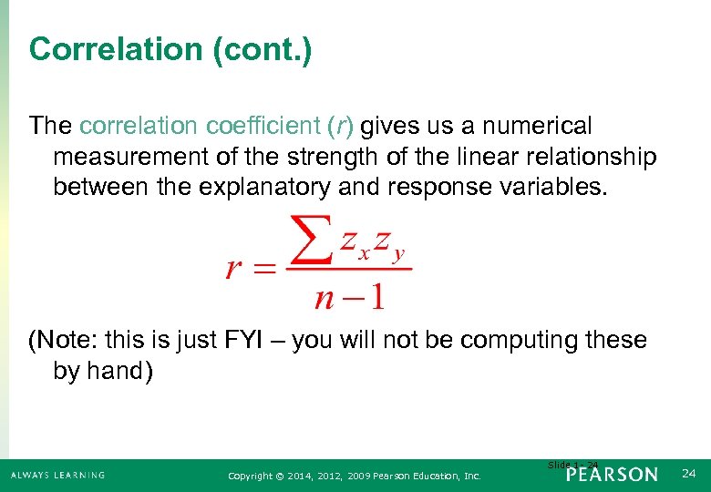 Correlation (cont. ) The correlation coefficient (r) gives us a numerical measurement of the strength of the linear relationship between the explanatory and response variables. (Note: this is just FYI – you will not be computing these by hand) Slide 1 - 24 Copyright © 2014, 2012, 2009 Pearson Education, Inc. 24
 Assumptions and Conditions for Correlation To use r, there must be a true underlying linear relationship between the two variables. • • The variables must be quantitative. The pattern for the points of the scatterplot must be reasonably straight. • Outliers can strongly affect the correlation. Look at the scatterplot to make sure that there are no strong outliers. • Copyright © 2014, 2012, 2009 Pearson Education, Inc. 25
 Properties of Correlation • r > 0 → positive association • r < 0 → negative association − 1 < r < 1, with r = − 1 only if the points all lie exactly on a negatively sloped line and r = 1 only if the points all lie exactly on a positively sloped line. • • Interchanging x and y does not change the correlation. • r has no units. Copyright © 2014, 2012, 2009 Pearson Education, Inc. 26
 Properties of Correlation Continued • Changing the units of x or y does not affect r. • Measuring in dollars, cents, or Euros will all produce the same correlation. Correlation measures the strength of the linear association between the two variables. • Correlation is sensitive to outliers. An extreme outlier can cause a dramatic change in r. • The adjectives weak, moderate, and strong can describe correlation, but there are no agreed upon boundaries. • Copyright © 2014, 2012, 2009 Pearson Education, Inc. 27
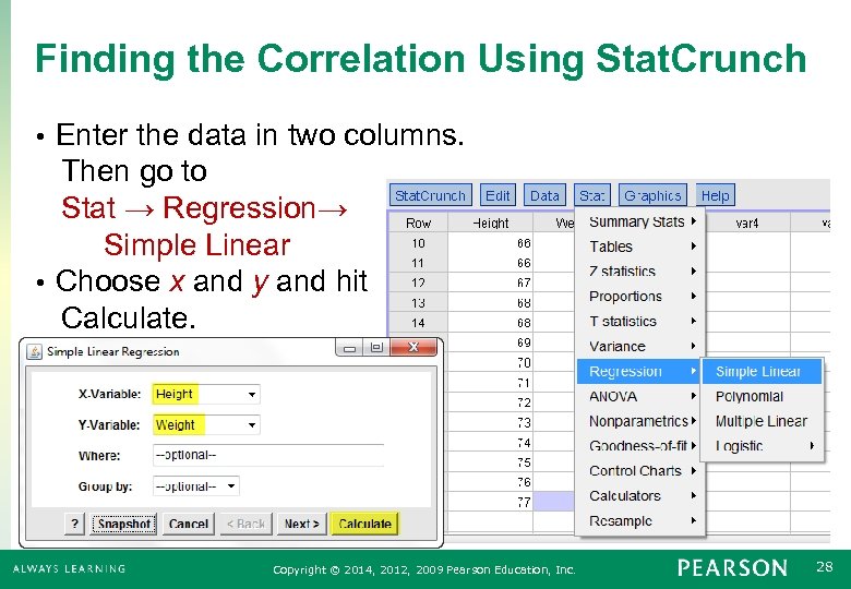 Finding the Correlation Using Stat. Crunch Enter the data in two columns. Then go to Stat → Regression→ Simple Linear • Choose x and y and hit Calculate. • Copyright © 2014, 2012, 2009 Pearson Education, Inc. 28
 Using the TI-83/84 You will need to turn on Diagnostic. On in order to get your calculator to report the correlation coefficient. Go to catalog (above the 0 key) and scroll down to Diagnostic. On. Hit enter twice so that your calculator says done. Slide 1 - 29 Copyright © 2014, 2012, 2009 Pearson Education, Inc. 29
 Using the TI-83/84 Calculating r and Linear Regression Slope & Y-intercept: 1. Enter your “X” data in L 1 2. Enter your “Y” data in L 2 3. Press STAT->CALC->Lin. Reg(ax+b) 4. Your calulator will display “Lin. Reg(ax+b) with a blinking cursor next to this message. 5. Type L 1, L 2 and press ENTER 6. “r” is the coefficient of correlation, “a” is the slope parameter for the linear regression equation, and “b” is the y-intercept parameter for the linear regression equation Slide 1 - 30 Copyright © 2014, 2012, 2009 Pearson Education, Inc. 30
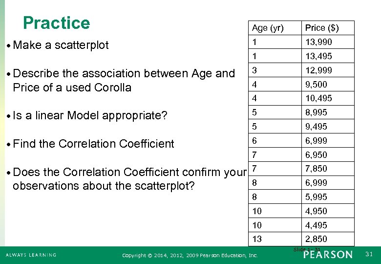 Practice Age (yr) Price ($) • Make a scatterplot 1 13, 990 1 13, 495 • Describe the association between Age and 3 12, 999 4 9, 500 4 10, 495 • Is a linear Model appropriate? 5 8, 995 5 9, 495 • Find the Correlation Coefficient 6 6, 999 7 6, 950 • Does the Correlation Coefficient confirm your 7 7, 850 Price of a used Corolla 8 6, 999 8 5, 995 10 4, 950 10 4, 495 13 observations about the scatterplot? 2, 850 Slide 1 - 31 Copyright © 2014, 2012, 2009 Pearson Education, Inc. 31
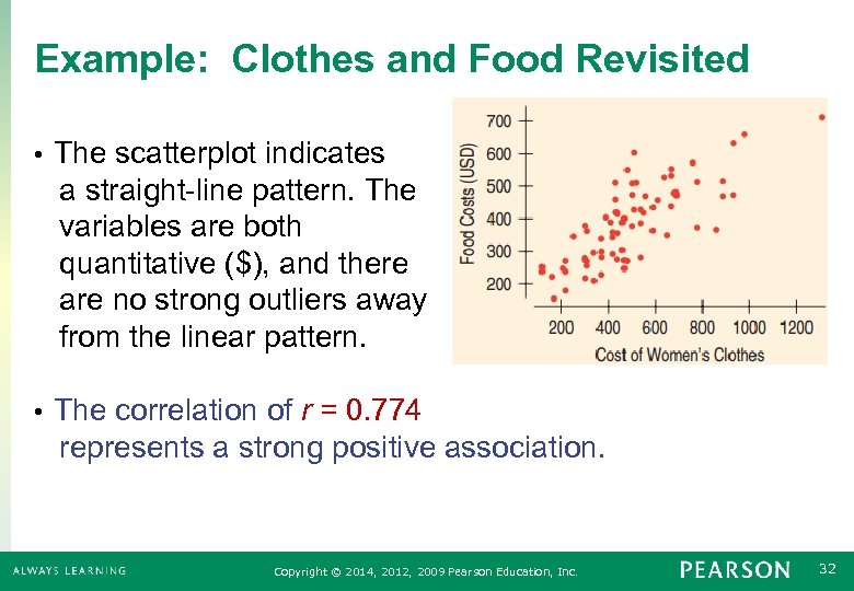 Example: Clothes and Food Revisited The scatterplot indicates a straight-line pattern. The variables are both quantitative ($), and there are no strong outliers away from the linear pattern. • The correlation of r = 0. 774 represents a strong positive association. • Copyright © 2014, 2012, 2009 Pearson Education, Inc. 32
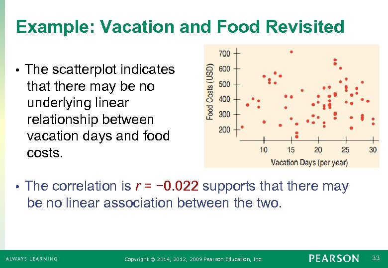 Example: Vacation and Food Revisited The scatterplot indicates that there may be no underlying linear relationship between vacation days and food costs. • The correlation is r = − 0. 022 supports that there may be no linear association between the two. • Copyright © 2014, 2012, 2009 Pearson Education, Inc. 33
 6. 3 Warning: Correlation ≠ Causation Copyright © 2014, 2012, 2009 Pearson Education, Inc. 34
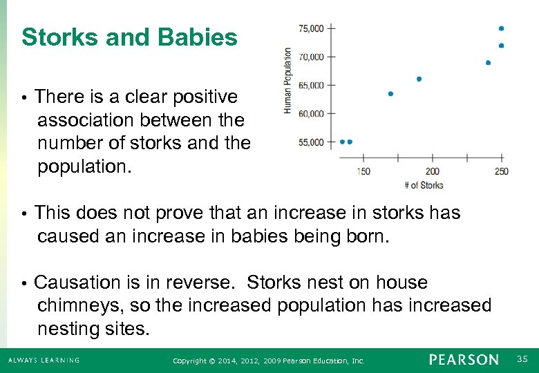 Storks and Babies There is a clear positive association between the number of storks and the population. • This does not prove that an increase in storks has caused an increase in babies being born. • Causation is in reverse. Storks nest on house chimneys, so the increased population has increased nesting sites. • Copyright © 2014, 2012, 2009 Pearson Education, Inc. 35
 Reasons for Correlation Causation is a possibility, but more must be done to prove causation. • • The causation could be in reverse (y causes x) • A lurking variable may cause both. • Number of gray hairs and number of wrinkles are strongly correlated, but dyeing hair black does not undo wrinkles. Age is the lurking variable that causes both to increase. Copyright © 2014, 2012, 2009 Pearson Education, Inc. 36
 How to Report Correlation Bad: Raising salaries increases productivity. Good: Employees with higher salaries tend to be more productive. • • Bad: r = − 0. 99. This proves that drinking more red wine lowers cholesterol. • Good: There is a strong negative association between red wine consumption and cholesterol level. • Bad: A child that has two educated parents will graduate from college. • Good: Children whose parents are educated are more likely to graduate from college. • Copyright © 2014, 2012, 2009 Pearson Education, Inc. 37
 What Can Go Wrong? • Don’t say “correlation” when you mean “association. ” • Correlation implies a linear relationship. Association means any relationship. • Don’t correlate categorical variables. • It makes no sense to say car model and personality type are correlated. • Don’t confuse correlation with causation. • Correlation only implies general tendencies. Copyright © 2014, 2012, 2009 Pearson Education, Inc. 38
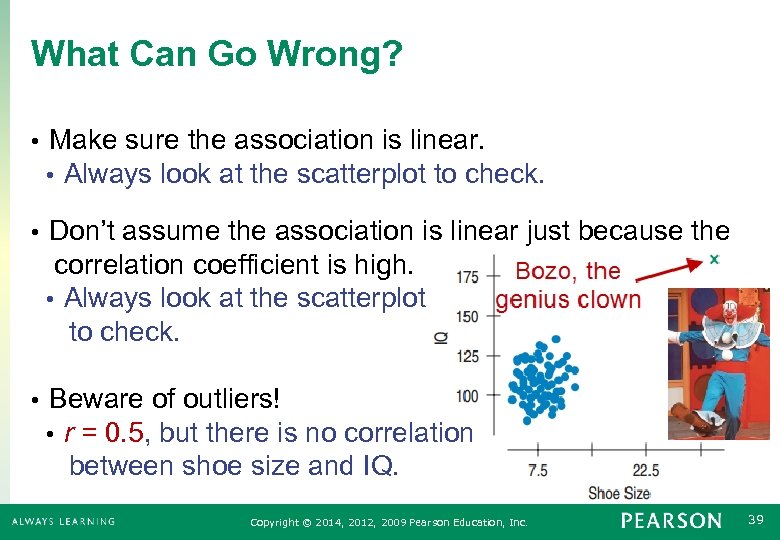 What Can Go Wrong? • Make sure the association is linear. • Always look at the scatterplot to check. Don’t assume the association is linear just because the correlation coefficient is high. • Always look at the scatterplot to check. • • Beware of outliers! • r = 0. 5, but there is no correlation between shoe size and IQ. Copyright © 2014, 2012, 2009 Pearson Education, Inc. 39
 Chapter 7 Linear Regression Copyright © 2014, 2012, 2009 Pearson Education, Inc. 40
 7. 1 Least Squares: The Line of “Best Fit” Copyright © 2014, 2012, 2009 Pearson Education, Inc. 41
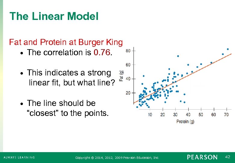 The Linear Model Fat and Protein at Burger King • The correlation is 0. 76. • This indicates a strong linear fit, but what line? • The line should be “closest” to the points. Copyright © 2014, 2012, 2009 Pearson Education, Inc. 42
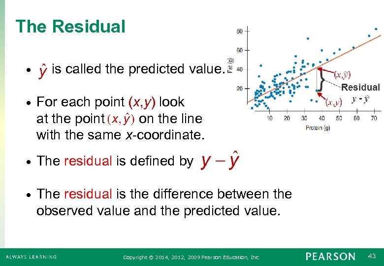 The Residual • is called the predicted value. • For each point (x, y) look at the point on the line with the same x-coordinate. • The residual is defined by • The residual is the difference between the observed value and the predicted value. Copyright © 2014, 2012, 2009 Pearson Education, Inc. 43
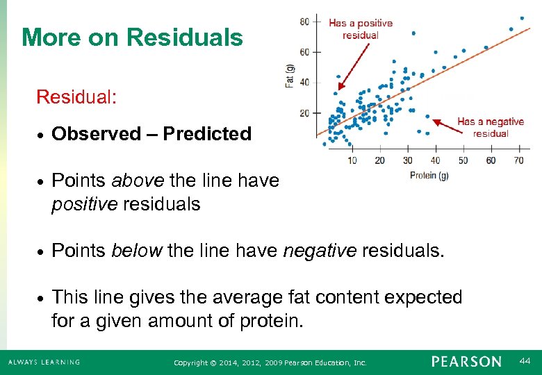 More on Residuals Residual: • Observed – Predicted • Points above the line have positive residuals • Points below the line have negative residuals. • This line gives the average fat content expected for a given amount of protein. Copyright © 2014, 2012, 2009 Pearson Education, Inc. 44
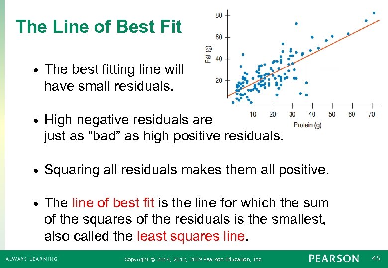 The Line of Best Fit • The best fitting line will have small residuals. • High negative residuals are just as “bad” as high positive residuals. • Squaring all residuals makes them all positive. • The line of best fit is the line for which the sum of the squares of the residuals is the smallest, also called the least squares line. Copyright © 2014, 2012, 2009 Pearson Education, Inc. 45
 7. 2 The Linear Model Copyright © 2014, 2012, 2009 Pearson Education, Inc. 46
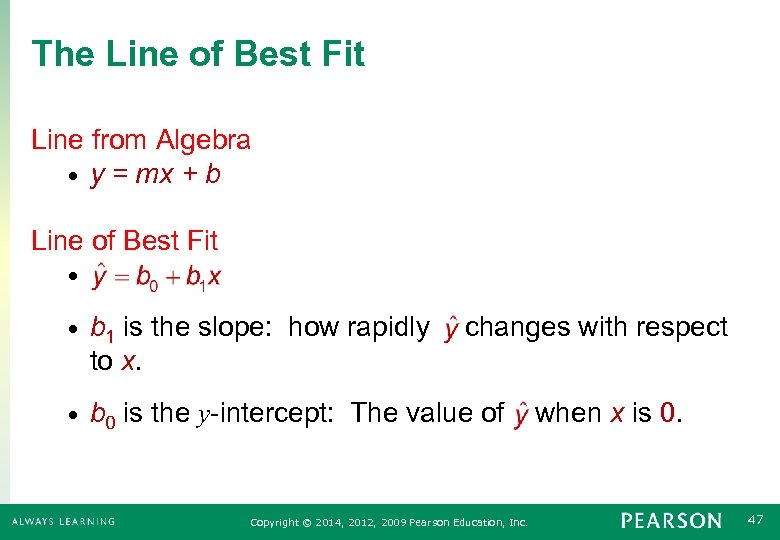 The Line of Best Fit Line from Algebra • y = mx + b Line of Best Fit • • b 1 is the slope: how rapidly changes with respect to x. • b 0 is the y-intercept: The value of when x is 0. Copyright © 2014, 2012, 2009 Pearson Education, Inc. 47
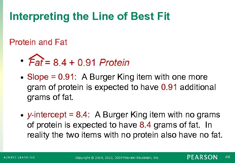 Interpreting the Line of Best Fit Protein and Fat • • Slope = 0. 91: A Burger King item with one more gram of protein is expected to have 0. 91 additional grams of fat. • y-intercept = 8. 4: A Burger King item with no grams of protein is expected to have 8. 4 grams of fat. In reality the two items with no protein also have no fat. Copyright © 2014, 2012, 2009 Pearson Education, Inc. 48
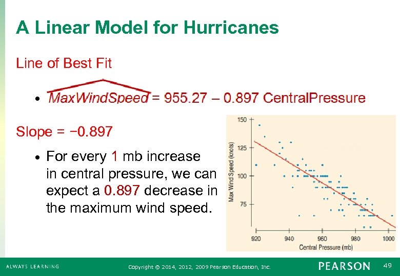 A Linear Model for Hurricanes Line of Best Fit • Slope = − 0. 897 • For every 1 mb increase in central pressure, we can expect a 0. 897 decrease in the maximum wind speed. Copyright © 2014, 2012, 2009 Pearson Education, Inc. 49
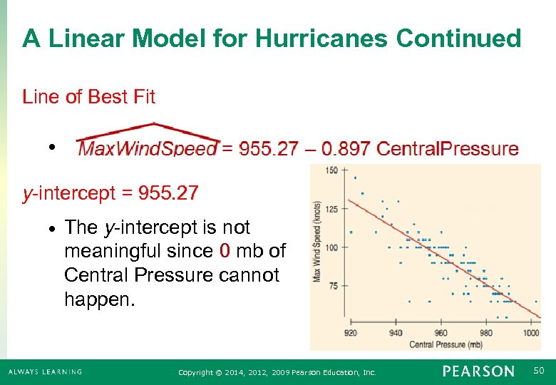 A Linear Model for Hurricanes Continued Line of Best Fit • y-intercept = 955. 27 • The y-intercept is not meaningful since 0 mb of Central Pressure cannot happen. Copyright © 2014, 2012, 2009 Pearson Education, Inc. 50
 7. 3 Finding the Least Squares Line Copyright © 2014, 2012, 2009 Pearson Education, Inc. 51
 Conditions for Using Regression The line of best fit is also called the least squares line or the regression line. Only use the regression line to make predictions if: • The variable must be Quantitative. • The relationship is Straight Enough. • There should be no Outliers. Copyright © 2014, 2012, 2009 Pearson Education, Inc. 52
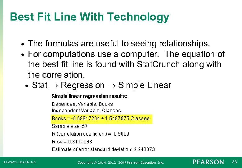 Best Fit Line With Technology • • The formulas are useful to seeing relationships. For computations use a computer. The equation of the best fit line is found with Stat. Crunch along with the correlation. • Stat → Regression → Simple Linear Copyright © 2014, 2012, 2009 Pearson Education, Inc. 53
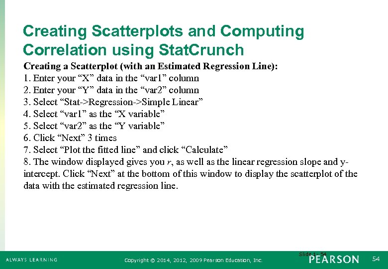 Creating Scatterplots and Computing Correlation using Stat. Crunch Creating a Scatterplot (with an Estimated Regression Line): 1. Enter your “X” data in the “var 1” column 2. Enter your “Y” data in the “var 2” column 3. Select “Stat->Regression->Simple Linear” 4. Select “var 1” as the “X variable” 5. Select “var 2” as the “Y variable” 6. Click “Next” 3 times 7. Select “Plot the fitted line” and click “Calculate” 8. The window displayed gives you r, as well as the linear regression slope and yintercept. Click “Next” at the bottom of this window to display the scatterplot of the data with the estimated regression line. Slide 1 - 54 Copyright © 2014, 2012, 2009 Pearson Education, Inc. 54
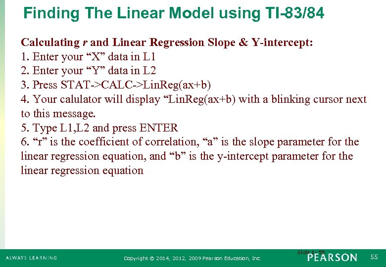 Finding The Linear Model using TI-83/84 Calculating r and Linear Regression Slope & Y-intercept: 1. Enter your “X” data in L 1 2. Enter your “Y” data in L 2 3. Press STAT->CALC->Lin. Reg(ax+b) 4. Your calulator will display “Lin. Reg(ax+b) with a blinking cursor next to this message. 5. Type L 1, L 2 and press ENTER 6. “r” is the coefficient of correlation, “a” is the slope parameter for the linear regression equation, and “b” is the y-intercept parameter for the linear regression equation Slide 1 - 55 Copyright © 2014, 2012, 2009 Pearson Education, Inc. 55
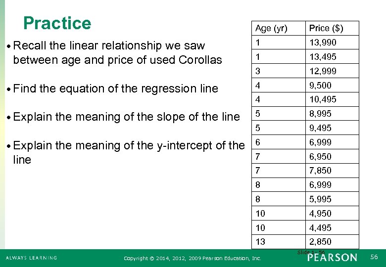 Practice Age (yr) Price ($) 1 13, 990 1 13, 495 3 12, 999 • Find the equation of the regression line 4 9, 500 4 10, 495 • Explain the meaning of the slope of the line 5 8, 995 5 9, 495 • Explain the meaning of the y-intercept of the 6 6, 999 • Recall the linear relationship we saw between age and price of used Corollas line 7 6, 950 7 7, 850 8 6, 999 8 5, 995 10 4, 950 10 4, 495 13 2, 850 Slide 1 - 56 Copyright © 2014, 2012, 2009 Pearson Education, Inc. 56
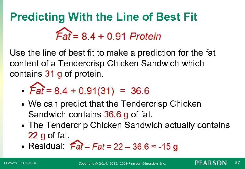 Predicting With the Line of Best Fit Use the line of best fit to make a prediction for the fat content of a Tendercrisp Chicken Sandwich which contains 31 g of protein. • We can predict that the Tendercrisp Chicken Sandwich contains 36. 6 g of fat. • The Tendercrip Chicken Sandwich actually contains 22 g of fat. • Residual: • Copyright © 2014, 2012, 2009 Pearson Education, Inc. 57
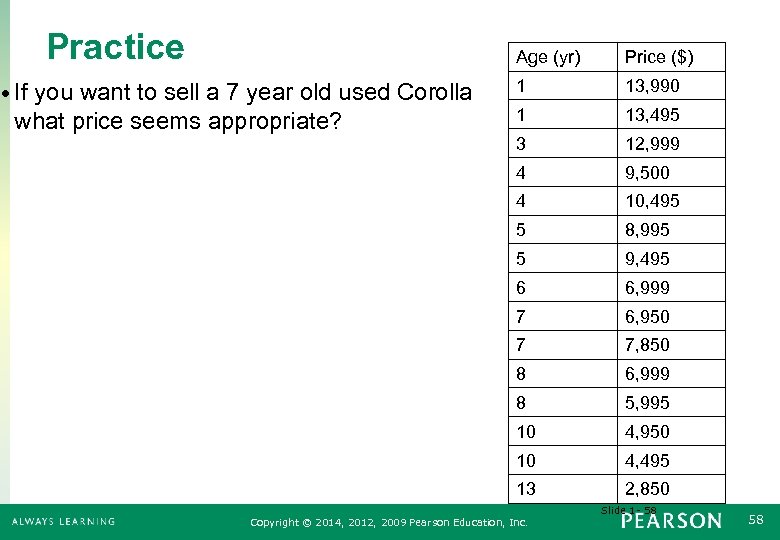 Practice Age (yr) 13, 990 1 13, 495 3 12, 999 9, 500 4 10, 495 5 8, 995 5 9, 495 6 6, 999 7 6, 950 7 7, 850 8 6, 999 8 5, 995 10 4, 950 10 4, 495 13 what price seems appropriate? 1 4 • If you want to sell a 7 year old used Corolla Price ($) 2, 850 Slide 1 - 58 Copyright © 2014, 2012, 2009 Pearson Education, Inc. 58
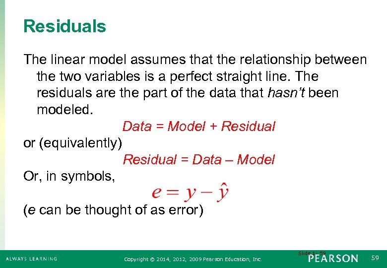 Residuals The linear model assumes that the relationship between the two variables is a perfect straight line. The residuals are the part of the data that hasn’t been modeled. Data = Model + Residual or (equivalently) Residual = Data – Model Or, in symbols, (e can be thought of as error) Slide 1 - 59 Copyright © 2014, 2012, 2009 Pearson Education, Inc. 59
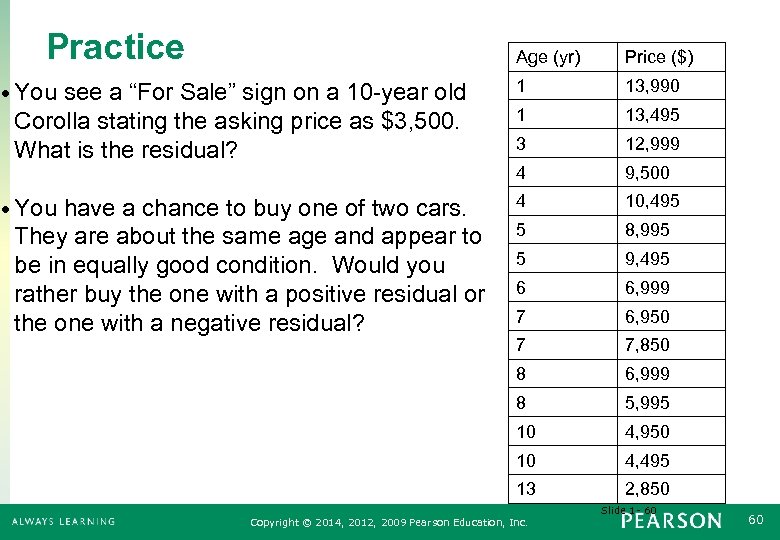 Practice Age (yr) Price ($) • You see a “For Sale” sign on a 10 -year old 1 13, 990 Corolla stating the asking price as $3, 500. What is the residual? 1 13, 495 3 12, 999 4 9, 500 • You have a chance to buy one of two cars. 4 10, 495 5 8, 995 5 9, 495 6 6, 999 7 6, 950 7 7, 850 8 6, 999 8 5, 995 10 4, 950 10 4, 495 13 2, 850 They are about the same age and appear to be in equally good condition. Would you rather buy the one with a positive residual or the one with a negative residual? Slide 1 - 60 Copyright © 2014, 2012, 2009 Pearson Education, Inc. 60
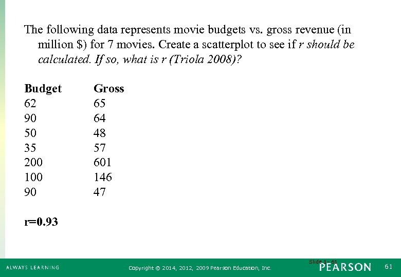 The following data represents movie budgets vs. gross revenue (in million $) for 7 movies. Create a scatterplot to see if r should be calculated. If so, what is r (Triola 2008)? Budget 62 90 50 35 200 100 90 Gross 65 64 48 57 601 146 47 r=0. 93 Slide 1 - 61 Copyright © 2014, 2012, 2009 Pearson Education, Inc. 61
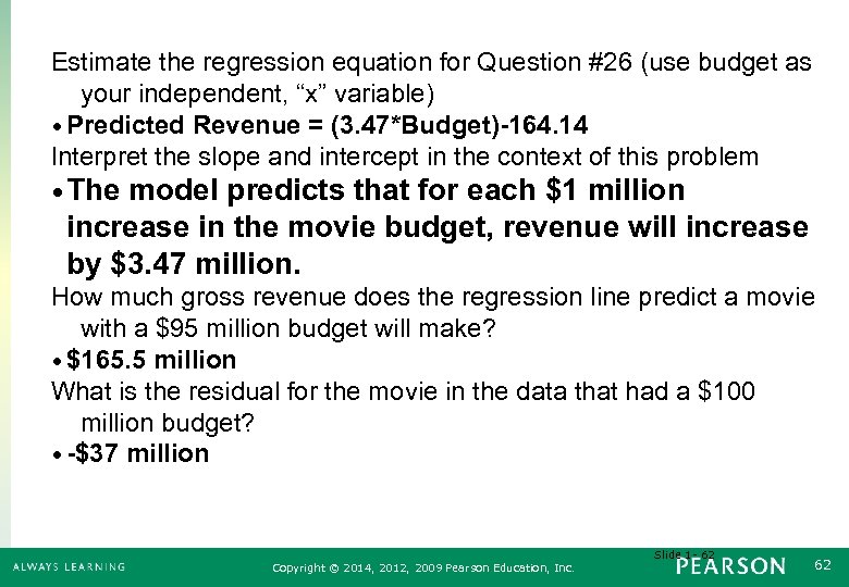 Estimate the regression equation for Question #26 (use budget as your independent, “x” variable) • Predicted Revenue = (3. 47*Budget)-164. 14 Interpret the slope and intercept in the context of this problem • The model predicts that for each $1 million increase in the movie budget, revenue will increase by $3. 47 million. How much gross revenue does the regression line predict a movie with a $95 million budget will make? • $165. 5 million What is the residual for the movie in the data that had a $100 million budget? • -$37 million Slide 1 - 62 Copyright © 2014, 2012, 2009 Pearson Education, Inc. 62
 7. 6 R 2 - The Variation Accounted for by the Model Copyright © 2014, 2012, 2009 Pearson Education, Inc. 71
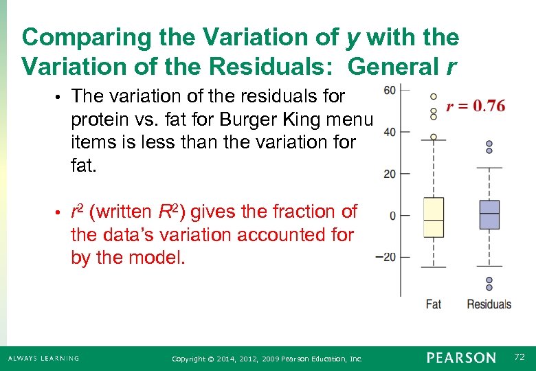 Comparing the Variation of y with the Variation of the Residuals: General r • The variation of the residuals for protein vs. fat for Burger King menu items is less than the variation for fat. • r 2 (written R 2) gives the fraction of the data’s variation accounted for by the model. Copyright © 2014, 2012, 2009 Pearson Education, Inc. 72
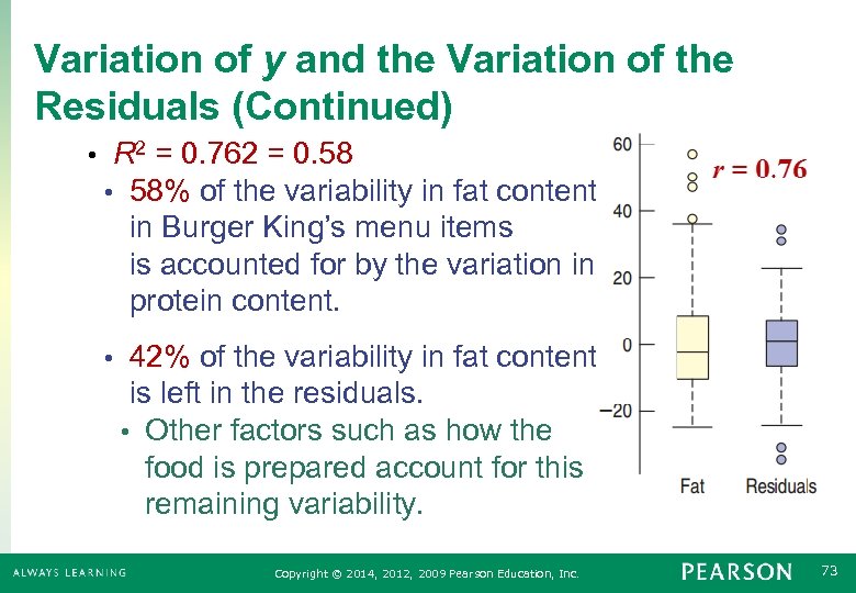 Variation of y and the Variation of the Residuals (Continued) • R 2 = 0. 762 = 0. 58 • 58% of the variability in fat content in Burger King’s menu items is accounted for by the variation in the protein content. • 42% of the variability in fat content is left in the residuals. • Other factors such as how the food is prepared account for this remaining variability. Copyright © 2014, 2012, 2009 Pearson Education, Inc. 73
 When is R 2 Big Enough • R 2 provides us with a measure of how useful the regression line is as a prediction tool. • If R 2 is close to 1, then the regression line is useful. • If R 2 is close to 0, then the regression line is not useful. • What “close to” means depends on who is using it. • Good Practice: Always report R 2 and let the researcher decide. Copyright © 2014, 2012, 2009 Pearson Education, Inc. 74
 Beware of Just Switching x and y • Switching x and y in the regression equation and solving for x does not give the equation of the regression line in reverse. • Instead, you must start over with all the computations. • This is no big deal if you use a computer or calculator, since the data is already entered. Copyright © 2014, 2012, 2009 Pearson Education, Inc. 75
 Reality Check Always Check to See if the Prediction is Reasonable • Is it reasonable to believe that a serving of cereal could have about 2. 50 calories for each additional gram of sugar? • Checking a few actual boxes of cereal would be a good idea to see if this slope is reasonable. Copyright © 2014, 2012, 2009 Pearson Education, Inc. 76
 Causation and Regression Never report out a cause and effect relationship based solely on regression analysis. • Even though the correlation was high and the model was reasonably linear for pressure vs. wind in the hurricane data, we would need a scientific explanation to conclude cause and effect. Regression analysis alone can never prove cause and effect. Copyright © 2014, 2012, 2009 Pearson Education, Inc. 77
 What Can Go Wrong? • Don’t fit a straight line to a nonlinear relationship. • If there are curves and bends in the scatterplot, don’t use regression analysis. • Don’t ignore outliers. • Instead report them out and think twice before using regression analysis. • Don’t invert the regression. • Switching x and y does not mean just solving for x in the least squares line. You must start over. Copyright © 2014, 2012, 2009 Pearson Education, Inc. 78


