01ee69d7631e3299913e4c2f339fd3d0.ppt
- Количество слайдов: 58
 Chapter 3 – Data Visualization Data Mining for Business Intelligence Shmueli, Patel & Bruce 1 © Galit Shmueli and Peter Bruce 2010
 Graphs for Data Exploration Basic Plots Line Graphs Bar Charts Scatterplots 2 © Galit Shmueli and Peter Bruce 2010 Distribution Plots Boxplots Histograms
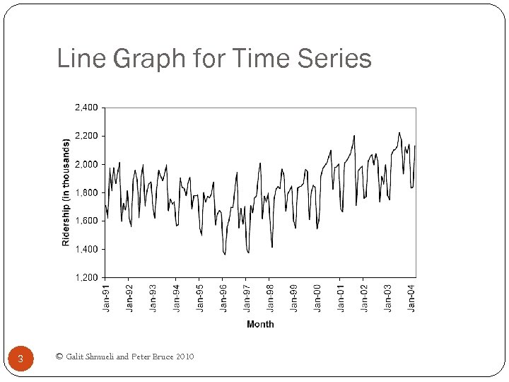 Line Graph for Time Series 3 © Galit Shmueli and Peter Bruce 2010
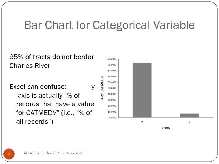 Bar Chart for Categorical Variable 95% of tracts do not border Charles River Excel can confuse: y -axis is actually “% of records that have a value for CATMEDV” (i. e. , “% of all records”) 4 © Galit Shmueli and Peter Bruce 2010
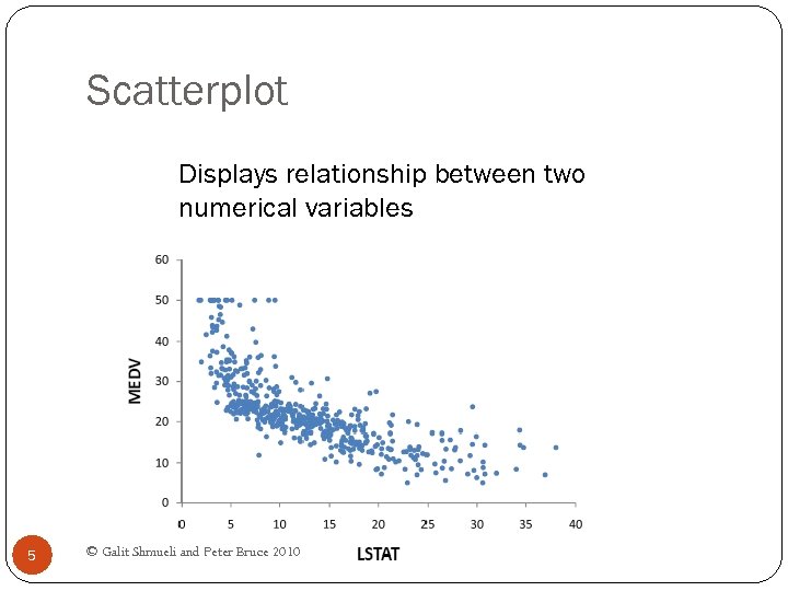 Scatterplot Displays relationship between two numerical variables 5 © Galit Shmueli and Peter Bruce 2010
 Distribution Plots Display “how many” of each value occur in a data set Or, for continuous data or data with many possible values, “how many” values are in each of a series of ranges or “bins” 6 © Galit Shmueli and Peter Bruce 2010
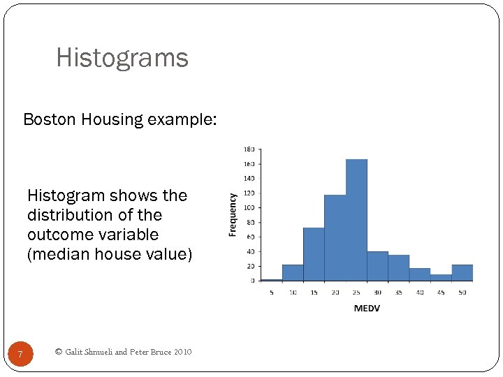 Histograms Boston Housing example: Histogram shows the distribution of the outcome variable (median house value) 7 © Galit Shmueli and Peter Bruce 2010
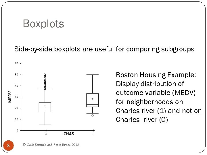 Boxplots Side-by-side boxplots are useful for comparing subgroups Boston Housing Example: Display distribution of outcome variable (MEDV) for neighborhoods on Charles river (1) and not on Charles river (0) 8 © Galit Shmueli and Peter Bruce 2010
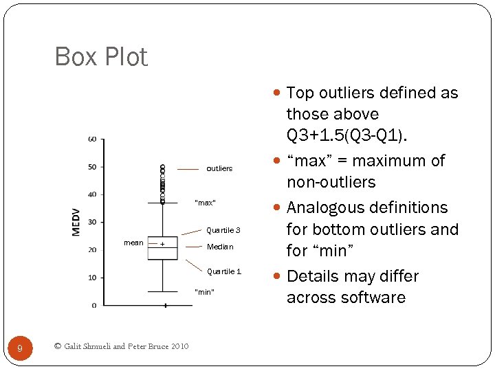 Box Plot Top outliers defined as outliers “max” Quartile 3 mean Median Quartile 1 “min” 9 © Galit Shmueli and Peter Bruce 2010 those above Q 3+1. 5(Q 3 -Q 1). “max” = maximum of non-outliers Analogous definitions for bottom outliers and for “min” Details may differ across software
 Heat Maps Color conveys information In data mining, used to visualize Correlations Missing Data 10 © Galit Shmueli and Peter Bruce 2010
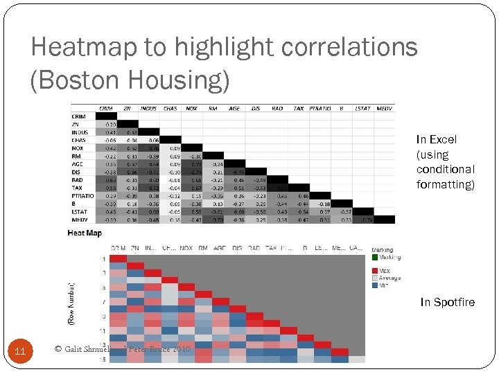 Heatmap to highlight correlations (Boston Housing) In Excel (using conditional formatting) In Spotfire 11 © Galit Shmueli and Peter Bruce 2010
 Multidimensional Visualization 12 © Galit Shmueli and Peter Bruce 2010
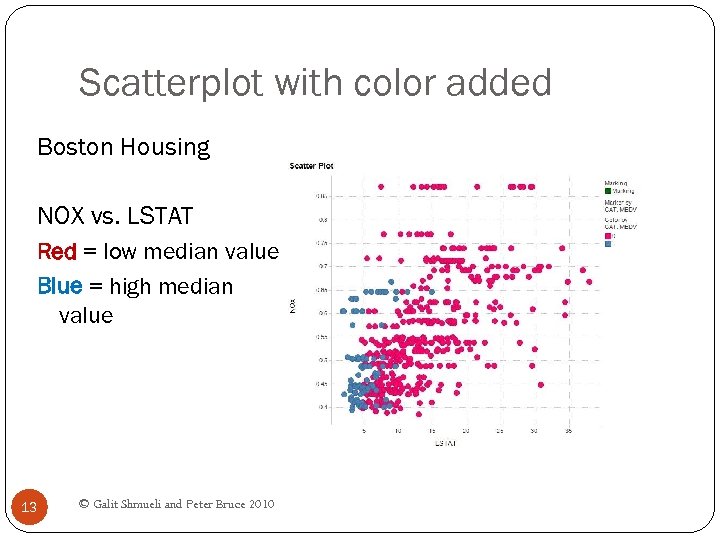 Scatterplot with color added Boston Housing NOX vs. LSTAT Red = low median value Blue = high median value 13 © Galit Shmueli and Peter Bruce 2010
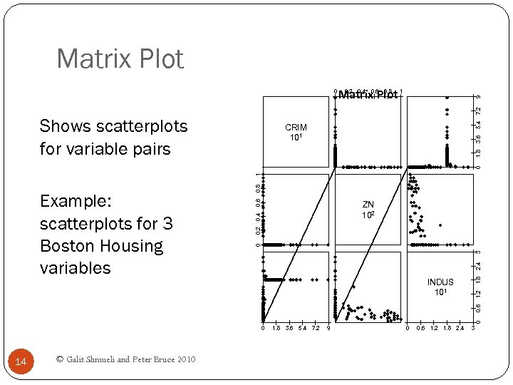 Matrix Plot 9 0. 2 0. 4 0. 6 0. 8 Matrix Plot 1 Shows scatterplots for variable pairs 5. 4 7. 2 0 0. 6 0. 2 0. 4 ZN 102 1. 8 2. 4 3 0 1. 2 INDUS 101 0 0. 6 Example: scatterplots for 3 Boston Housing variables 0. 8 1 0 1. 8 3. 6 CRIM 101 0 14 © Galit Shmueli and Peter Bruce 2010 1. 8 3. 6 5. 4 7. 2 9 0 0. 6 1. 2 1. 8 2. 4 3
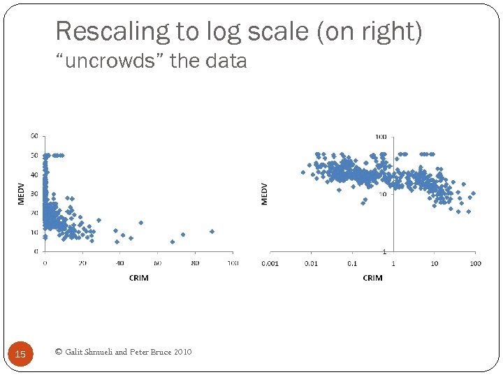 Rescaling to log scale (on right) “uncrowds” the data 15 © Galit Shmueli and Peter Bruce 2010
 Aggregation 16 © Galit Shmueli and Peter Bruce 2010
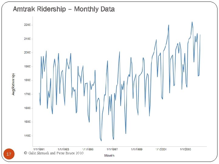 Amtrak Ridership – Monthly Data 17 © Galit Shmueli and Peter Bruce 2010
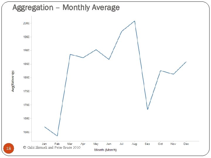 Aggregation – Monthly Average 18 © Galit Shmueli and Peter Bruce 2010
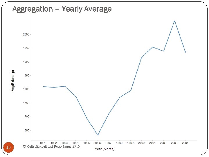 Aggregation – Yearly Average 19 © Galit Shmueli and Peter Bruce 2010
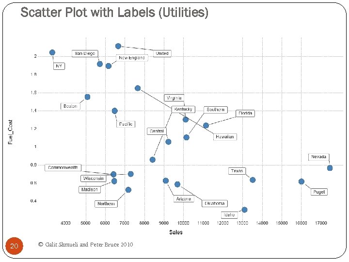 Scatter Plot with Labels (Utilities) 20 © Galit Shmueli and Peter Bruce 2010
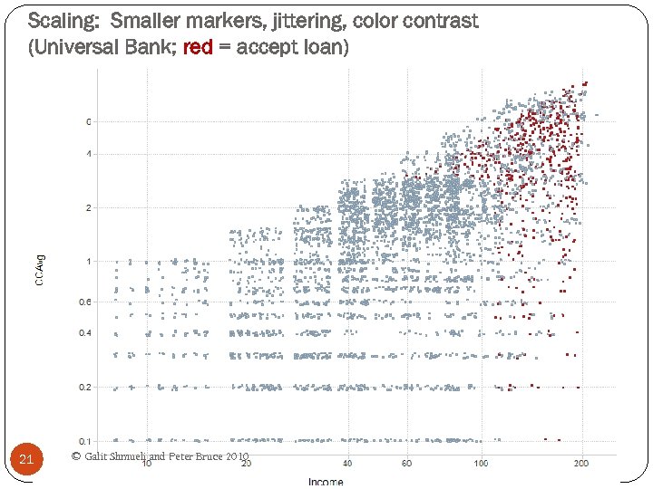 Scaling: Smaller markers, jittering, color contrast (Universal Bank; red = accept loan) 21 © Galit Shmueli and Peter Bruce 2010
 Jittering Moving markers by a small random amount Uncrowds the data by allowing more markers to be seen 22 © Galit Shmueli and Peter Bruce 2010
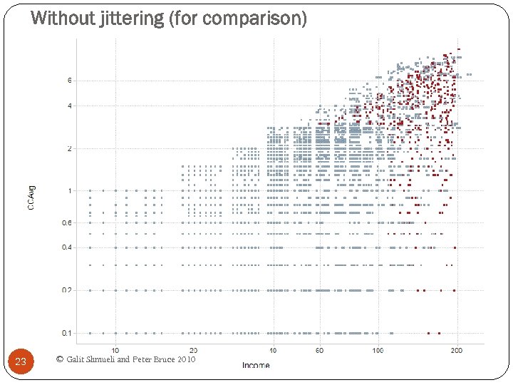 Without jittering (for comparison) 23 © Galit Shmueli and Peter Bruce 2010
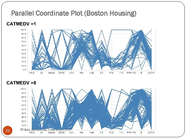 Parallel Coordinate Plot (Boston Housing) CATMEDV =1 CATMEDV =0 Filter Settings - CAT. MEDV: (1) 24 © Galit Shmueli and Peter Bruce 2010
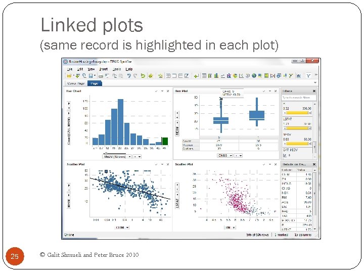 Linked plots (same record is highlighted in each plot) 25 © Galit Shmueli and Peter Bruce 2010
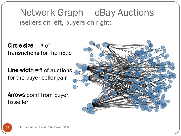 Network Graph – e. Bay Auctions (sellers on left, buyers on right) Circle size = # of transactions for the node Line width =# of auctions for the buyer-seller pair Arrows point from buyer to seller 26 © Galit Shmueli and Peter Bruce 2010
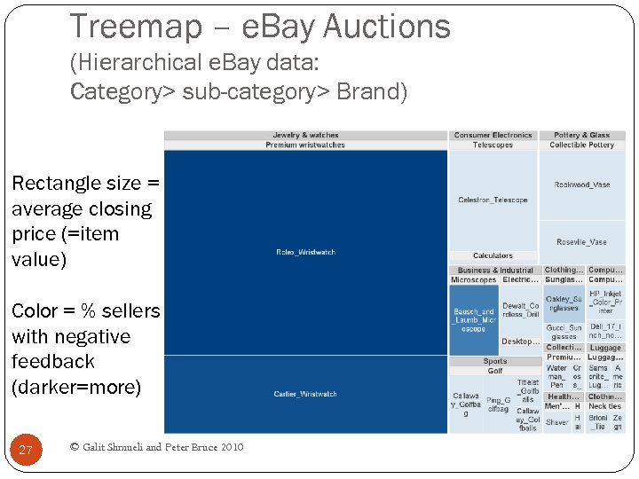 Treemap – e. Bay Auctions (Hierarchical e. Bay data: Category> sub-category> Brand) Rectangle size = average closing price (=item value) Color = % sellers with negative feedback (darker=more) 27 © Galit Shmueli and Peter Bruce 2010
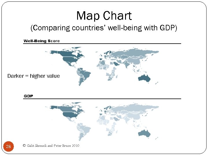 Map Chart (Comparing countries’ well-being with GDP) Darker = higher value 28 © Galit Shmueli and Peter Bruce 2010
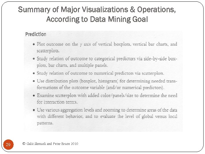 Summary of Major Visualizations & Operations, According to Data Mining Goal 29 © Galit Shmueli and Peter Bruce 2010
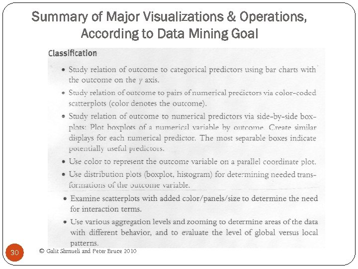 Summary of Major Visualizations & Operations, According to Data Mining Goal 30 © Galit Shmueli and Peter Bruce 2010
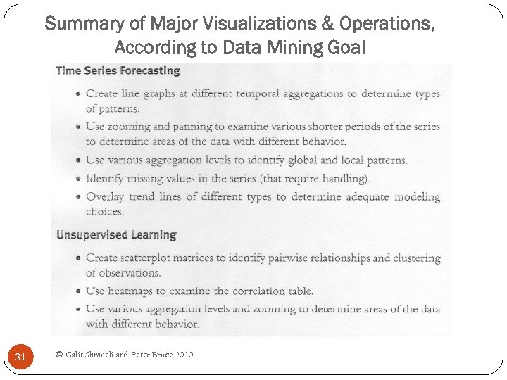 Summary of Major Visualizations & Operations, According to Data Mining Goal 31 © Galit Shmueli and Peter Bruce 2010
 Chapter 4 –Dimension Reduction Data Mining for Business Intelligence Shmueli, Patel & Bruce 32 © Galit Shmueli and Peter Bruce 2010
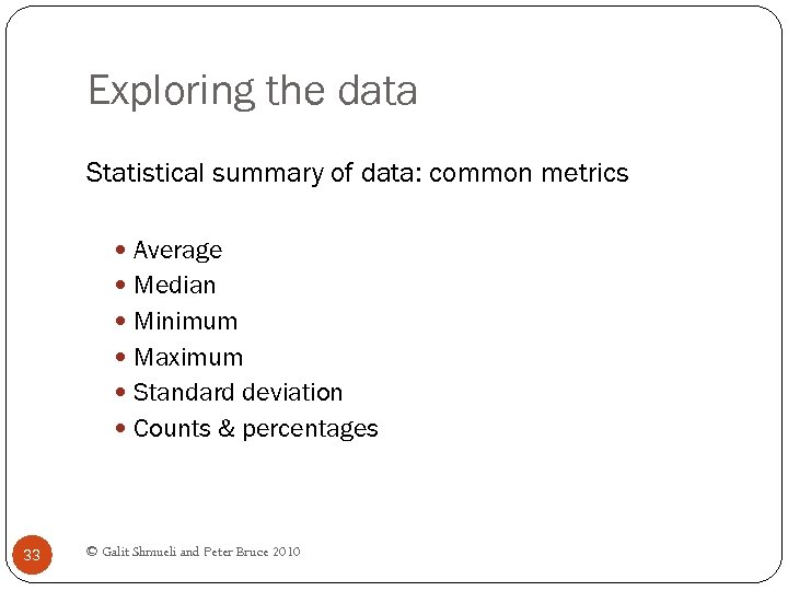 Exploring the data Statistical summary of data: common metrics Average Median Minimum Maximum Standard deviation Counts & percentages 33 © Galit Shmueli and Peter Bruce 2010
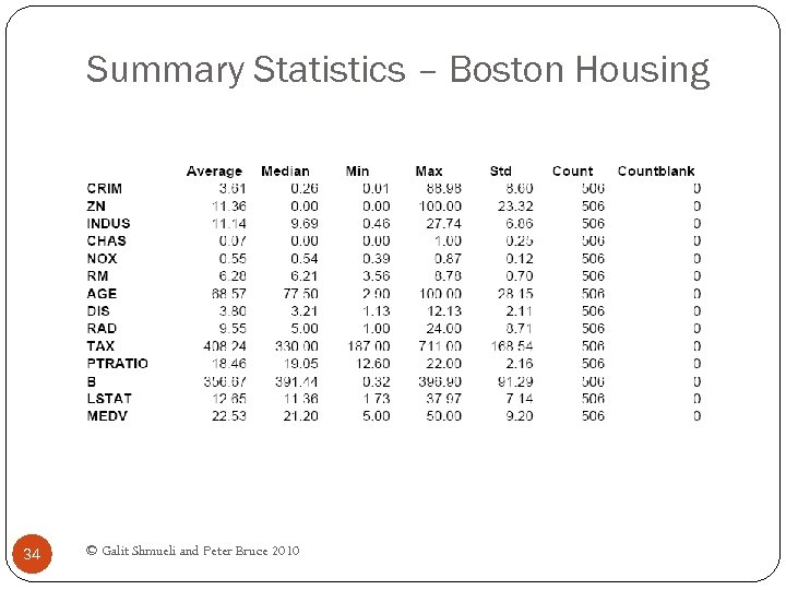 Summary Statistics – Boston Housing 34 © Galit Shmueli and Peter Bruce 2010
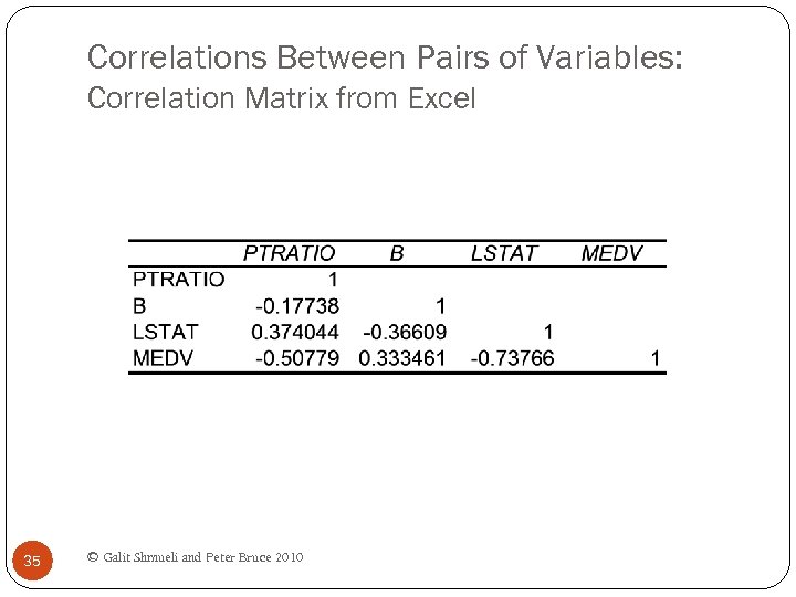 Correlations Between Pairs of Variables: Correlation Matrix from Excel 35 © Galit Shmueli and Peter Bruce 2010
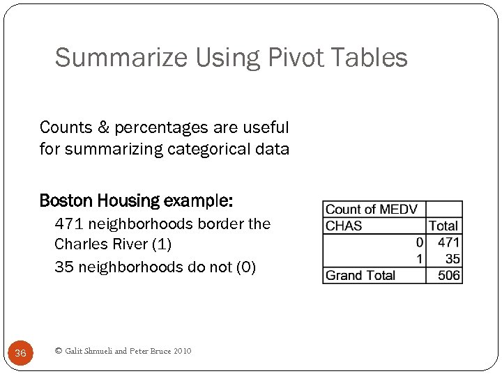 Summarize Using Pivot Tables Counts & percentages are useful for summarizing categorical data Boston Housing example: 471 neighborhoods border the Charles River (1) 35 neighborhoods do not (0) 36 © Galit Shmueli and Peter Bruce 2010
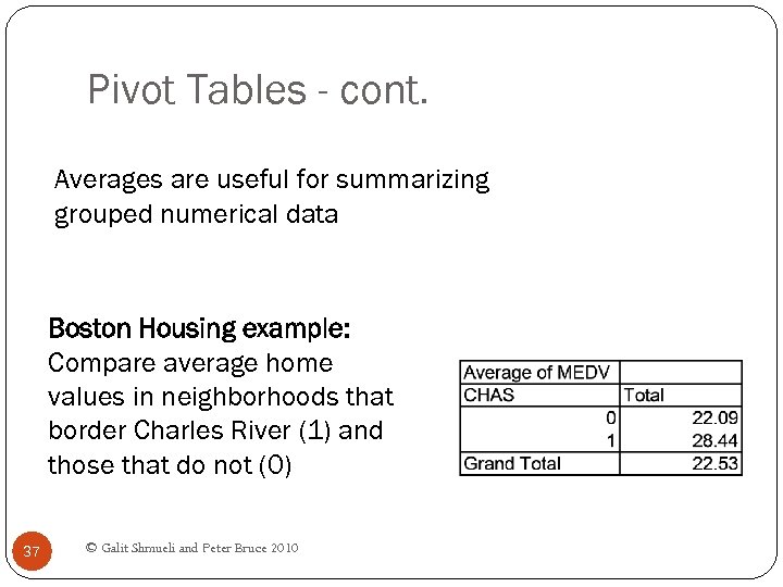 Pivot Tables - cont. Averages are useful for summarizing grouped numerical data Boston Housing example: Compare average home values in neighborhoods that border Charles River (1) and those that do not (0) 37 © Galit Shmueli and Peter Bruce 2010
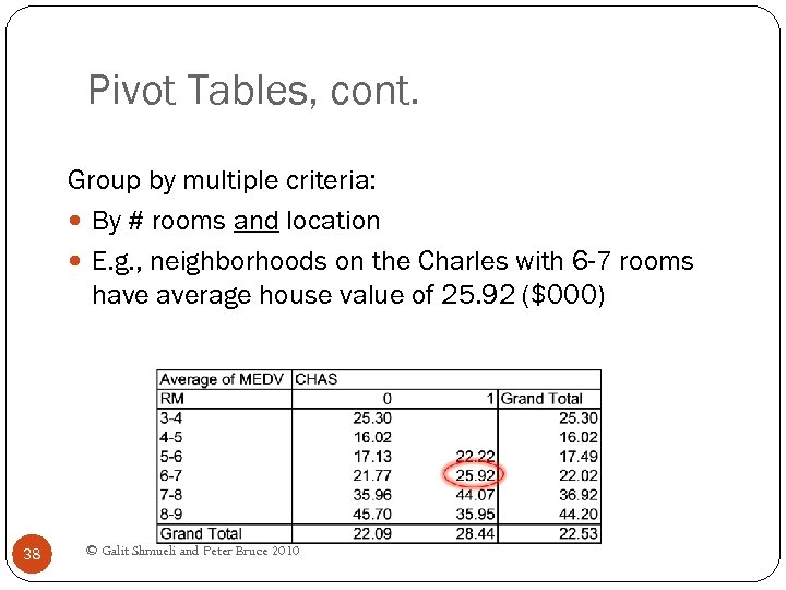 Pivot Tables, cont. Group by multiple criteria: By # rooms and location E. g. , neighborhoods on the Charles with 6 -7 rooms have average house value of 25. 92 ($000) 38 © Galit Shmueli and Peter Bruce 2010
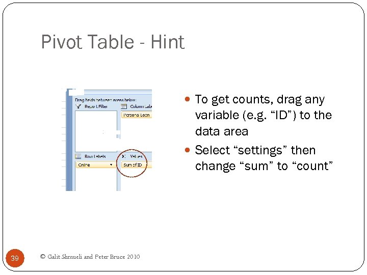 Pivot Table - Hint To get counts, drag any variable (e. g. “ID”) to the data area Select “settings” then change “sum” to “count” 39 © Galit Shmueli and Peter Bruce 2010
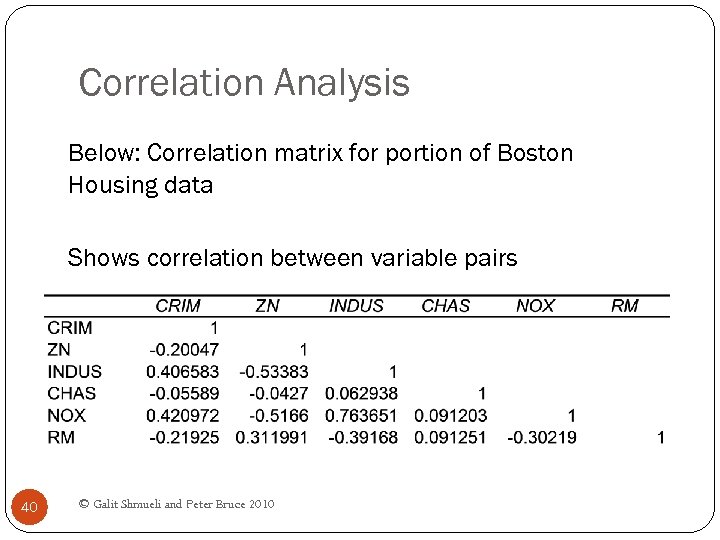 Correlation Analysis Below: Correlation matrix for portion of Boston Housing data Shows correlation between variable pairs 40 © Galit Shmueli and Peter Bruce 2010
 Reducing Categories A single categorical variable with m categories is typically transformed into m-1 dummy variables Each dummy variable takes the values 0 or 1 0 = “no” for the category 1 = “yes” Problem: Can end up with too many variables Solution: Reduce by combining categories that are 41 close to each other Use pivot tables to assess outcome variable sensitivity to the dummies Exception: Naïve Bayes can handle categorical © Galit Shmueli and Peter Bruce 2010 transforming them into dummies variables without
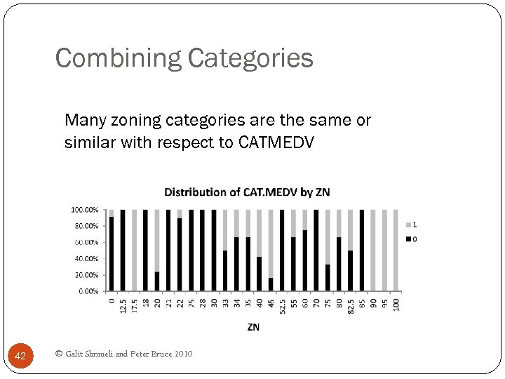 Combining Categories Many zoning categories are the same or similar with respect to CATMEDV 42 © Galit Shmueli and Peter Bruce 2010
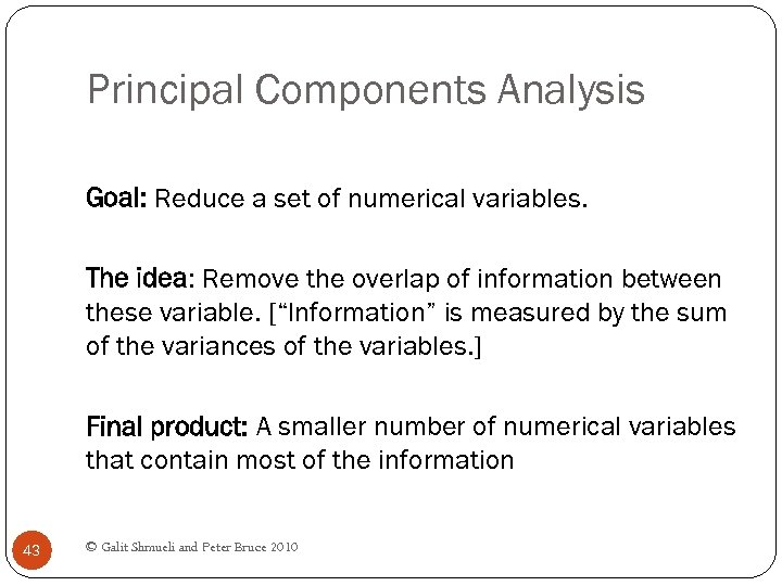 Principal Components Analysis Goal: Reduce a set of numerical variables. The idea: Remove the overlap of information between these variable. [“Information” is measured by the sum of the variances of the variables. ] Final product: A smaller number of numerical variables that contain most of the information 43 © Galit Shmueli and Peter Bruce 2010
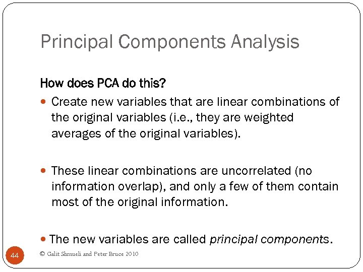 Principal Components Analysis How does PCA do this? Create new variables that are linear combinations of the original variables (i. e. , they are weighted averages of the original variables). These linear combinations are uncorrelated (no information overlap), and only a few of them contain most of the original information. The new variables are called principal components. 44 © Galit Shmueli and Peter Bruce 2010
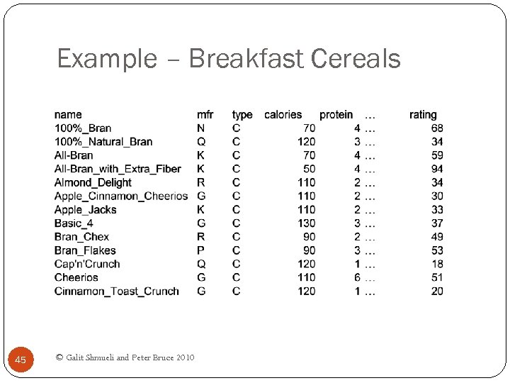 Example – Breakfast Cereals 45 © Galit Shmueli and Peter Bruce 2010
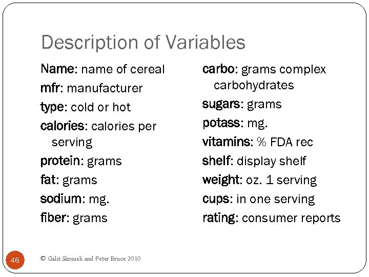 Description of Variables Name: name of cereal mfr: manufacturer type: cold or hot calories: calories per serving protein: grams fat: grams sodium: mg. fiber: grams 46 © Galit Shmueli and Peter Bruce 2010 carbo: grams complex carbohydrates sugars: grams potass: mg. vitamins: % FDA rec shelf: display shelf weight: oz. 1 serving cups: in one serving rating: consumer reports
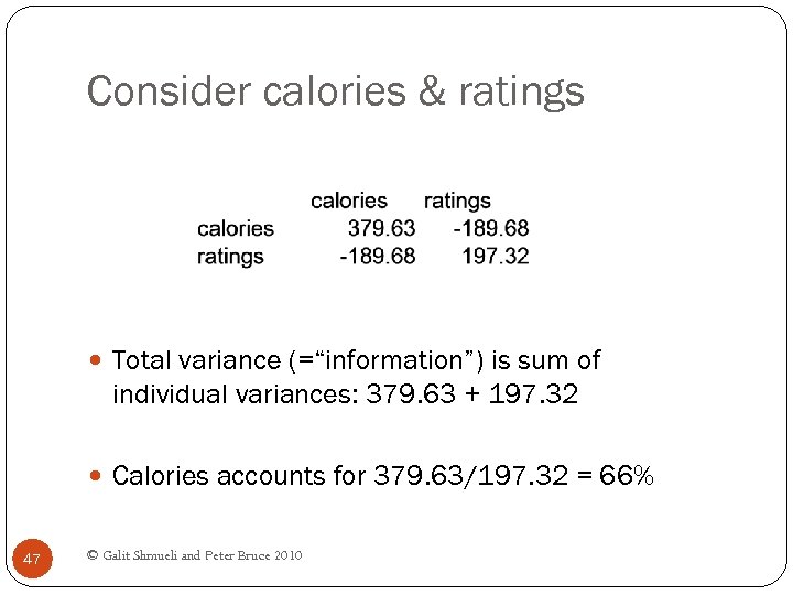 Consider calories & ratings Total variance (=“information”) is sum of individual variances: 379. 63 + 197. 32 Calories accounts for 379. 63/197. 32 = 66% 47 © Galit Shmueli and Peter Bruce 2010
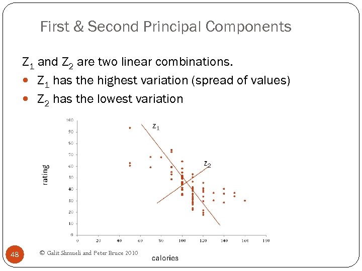 First & Second Principal Components Z 1 and Z 2 are two linear combinations. Z 1 has the highest variation (spread of values) Z 2 has the lowest variation 48 © Galit Shmueli and Peter Bruce 2010
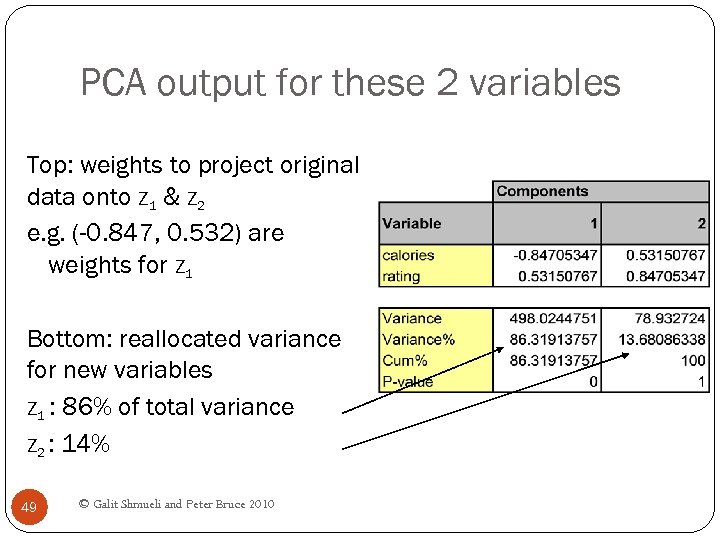 PCA output for these 2 variables Top: weights to project original data onto Z 1 & Z 2 e. g. (-0. 847, 0. 532) are weights for Z 1 Bottom: reallocated variance for new variables Z 1 : 86% of total variance Z 2 : 14% 49 © Galit Shmueli and Peter Bruce 2010
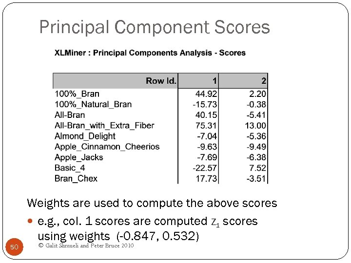 Principal Component Scores Weights are used to compute the above scores e. g. , col. 1 scores are computed Z 1 scores using weights (-0. 847, 0. 532) 50 © Galit Shmueli and Peter Bruce 2010
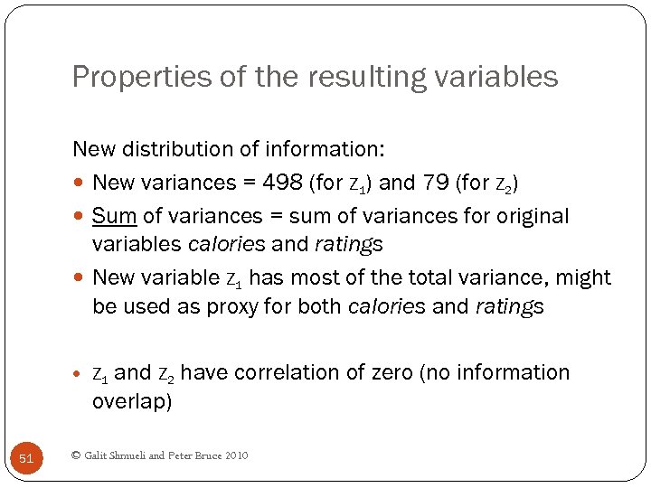 Properties of the resulting variables New distribution of information: New variances = 498 (for Z 1) and 79 (for Z 2) Sum of variances = sum of variances for original variables calories and ratings New variable Z 1 has most of the total variance, might be used as proxy for both calories and ratings and Z 2 have correlation of zero (no information overlap) Z 1 51 © Galit Shmueli and Peter Bruce 2010
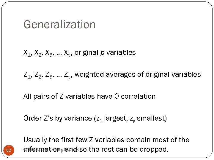 Generalization X 1, X 2, X 3, … Xp, original p variables Z 1, Z 2, Z 3, … Zp, weighted averages of original variables All pairs of Z variables have 0 correlation Order Z’s by variance (z 1 largest, Zp smallest) 52 Usually the first few Z variables contain most of the © Galit Shmueli and Peter Bruce 2010 information, and so the rest can be dropped.
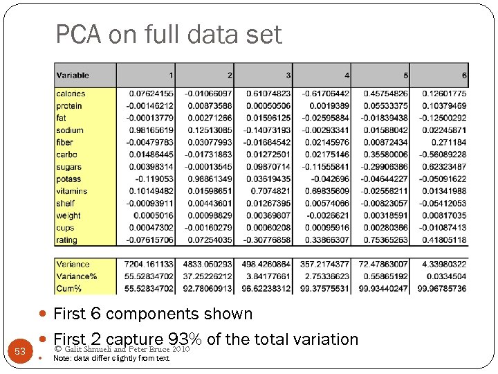 PCA on full data set First 6 components shown 53 First. Shmueli and Peter Bruce 93% of the total variation 2 capture 2010 © Galit Note: data differ slightly from text
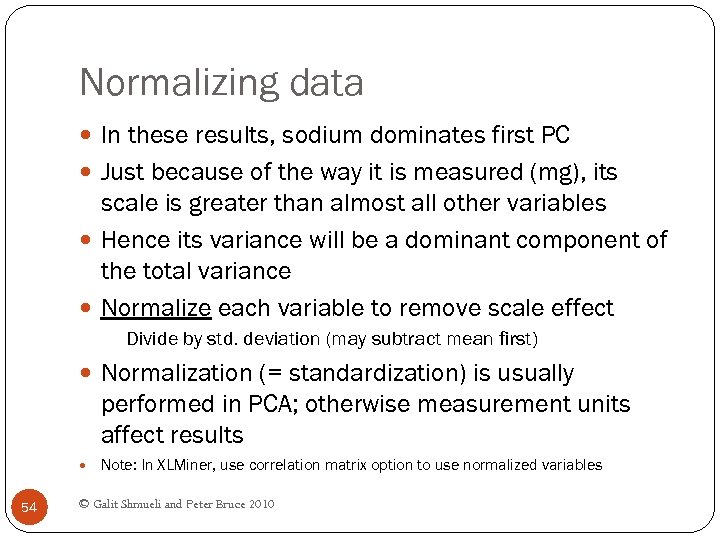 Normalizing data In these results, sodium dominates first PC Just because of the way it is measured (mg), its scale is greater than almost all other variables Hence its variance will be a dominant component of the total variance Normalize each variable to remove scale effect Divide by std. deviation (may subtract mean first) Normalization (= standardization) is usually performed in PCA; otherwise measurement units affect results Note: In XLMiner, use correlation matrix option to use normalized variables 54 © Galit Shmueli and Peter Bruce 2010
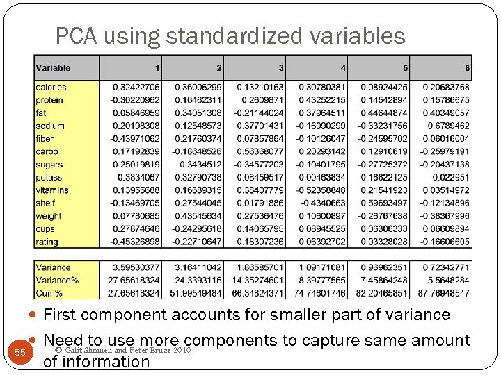 PCA using standardized variables First component accounts for smaller part of variance 55 Need Shmueli and Peter Bruce 2010 to use more components to capture same amount © Galit of information
 PCA in Classification/Prediction Apply PCA to training data Decide how many PC’s to use Use variable weights in those PC’s with validation/new data This creates a new reduced set of predictors in validation/new data 56 © Galit Shmueli and Peter Bruce 2010
 Regression-Based Dimension Reduction Multiple Linear Regression or Logistic Regression Use subset selection Algorithm chooses a subset of variables This procedure is integrated directly into the predictive task 57 © Galit Shmueli and Peter Bruce 2010
 Summary Data summarization is an important for data exploration Data summaries include numerical metrics (average, median, etc. ) and graphical summaries Data reduction is useful for compressing the information in the data into a smaller subset Categorical variables can be reduced by combining similar categories Principal components analysis transforms an original set of numerical data into a smaller set of weighted averages of the original data that contain most of the original information in less variables. 58 © Galit Shmueli and Peter Bruce 2010


