52b140e767868690866ebe035f74ecdc.ppt
- Количество слайдов: 11
Better saved than sorry: Treasury’s position on NZ’s savings performance © The Treasury
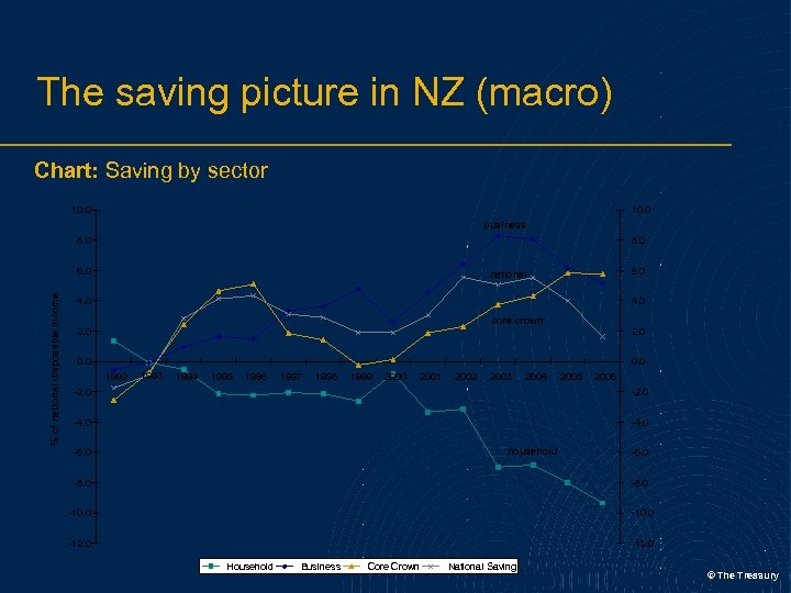
The saving picture in NZ (macro) Chart: Saving by sector 10. 0 business 8. 0 % of national disposable income 6. 0 national 4. 0 core crown 2. 0 0. 0 1992 1993 1994 1995 1996 1997 1998 1999 2000 2001 2002 2003 2004 2005 2006 -2. 0 -4. 0 household -6. 0 -8. 0 -10. 0 -12. 0 Household Business Core Crown National Saving © The Treasury
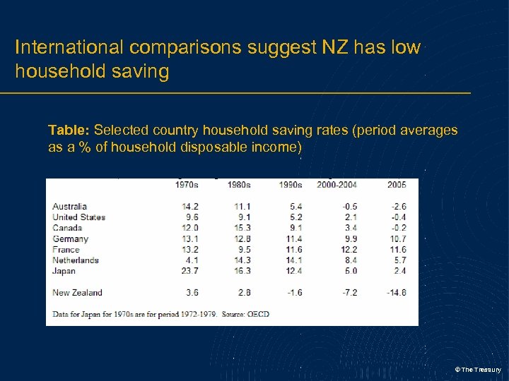
International comparisons suggest NZ has low household saving Table: Selected country household saving rates (period averages as a % of household disposable income) © The Treasury
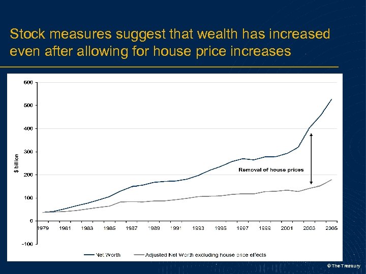
Stock measures suggest that wealth has increased even after allowing for house price increases © The Treasury
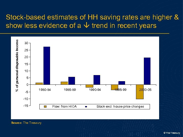
% of personal disposable income Stock-based estimates of HH saving rates are higher & show less evidence of a trend in recent years 30 25 20 15 10 5 0 -5 1980 -84 1985 -89 1990 -94 1995 -99 2000 -05 -10 -15 Flow: from HIOA Stock excl. house price changes Source: The Treasury © The Treasury
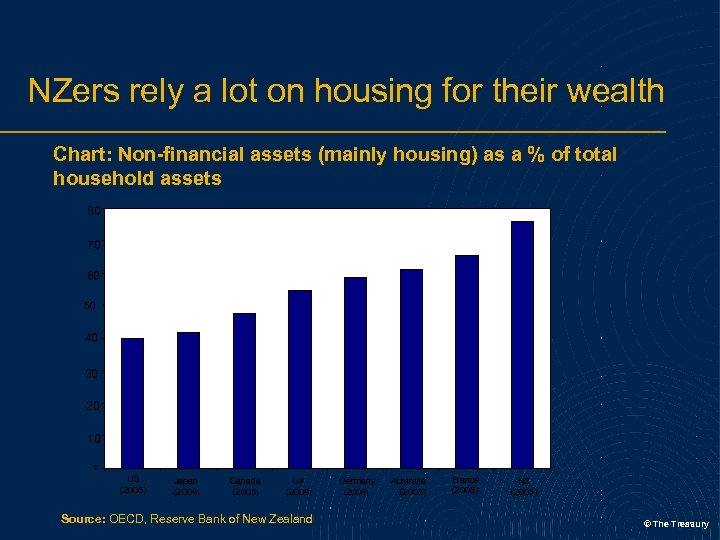
NZers rely a lot on housing for their wealth Chart: Non-financial assets (mainly housing) as a % of total household assets 80 70 60 50 40 30 20 10 0 US (2005) Japan (2004) Canada (2005) UK (2004) Source: OECD, Reserve Bank of New Zealand Germany (2004) Australia (2005) France (2005) NZ (2005) © The Treasury
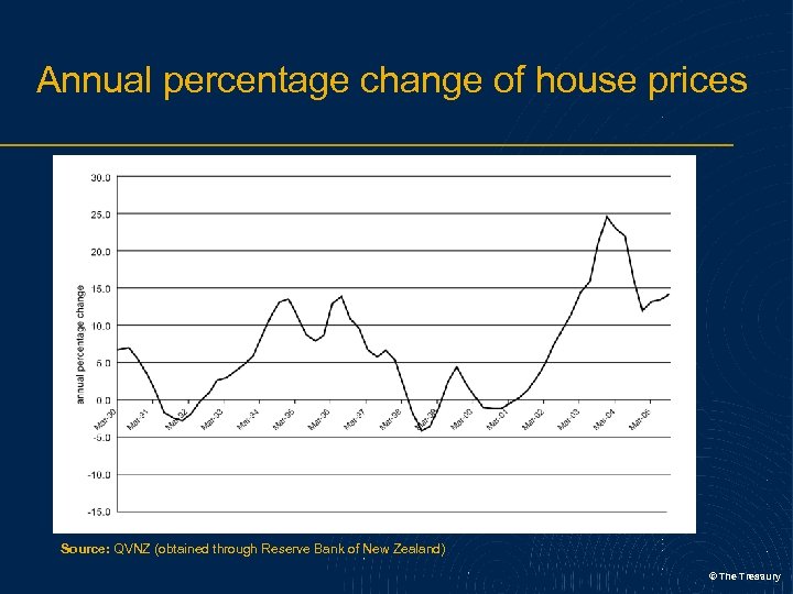
Annual percentage change of house prices Source: QVNZ (obtained through Reserve Bank of New Zealand) © The Treasury
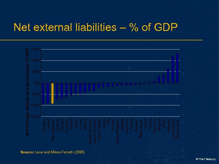
Net Foreign Assets as a percentage of GDP -150% Hungary Iceland New Zealand Greece Portugal Australia Poland Spain Turkey Mexico Slovak Republic Czech Republic United States Ireland Italy Austria United Kingdom Canada Denmark Finland Sweden Netherlands Korea France Germany Belgium Japan Norway Luxembourg Switzerland Net external liabilities – % of GDP 150% 100% 50% 0% -50% -100% Source: Lane and Milesi-Ferretti (2006) © The Treasury
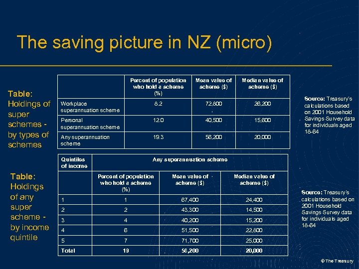
The saving picture in NZ (micro) Table: Holdings of any super scheme by income quintile Mean value of scheme ($) Median value of scheme ($) Workplace superannuation scheme 8. 2 72, 800 26, 200 Personal superannuation scheme 12. 0 40, 500 15, 600 Any superannuation scheme 19. 3 56, 200 20, 000 Quintiles of income Table: Holdings of super schemes by types of schemes Percent of population who hold a scheme (%) Any superannuation scheme Percent of population who hold a scheme (%) Mean value of scheme ($) 1 1 67, 400 24, 400 2 2 43, 300 14, 500 3 4 40, 200 15, 200 4 6 51, 500 22, 800 5 7 71, 700 25, 000 Total 19 56, 200 Source: Treasury’s calculations based on 2001 Household Savings Survey data for individuals aged 18 -64 Median value of scheme ($) 20, 000 Source: Treasury’s calculations based on 2001 Household Savings Survey data for individuals aged 18 -64 © The Treasury
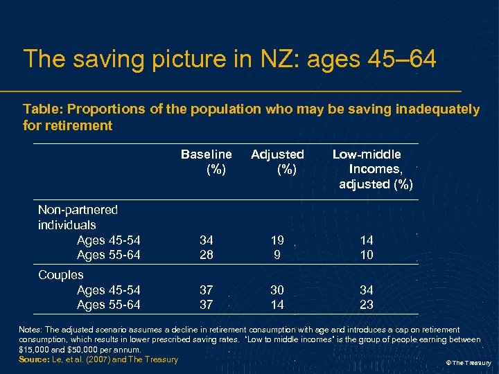
The saving picture in NZ: ages 45– 64 Table: Proportions of the population who may be saving inadequately for retirement Baseline (%) Adjusted (%) Low-middle Incomes, adjusted (%) Non-partnered individuals Ages 45 -54 Ages 55 -64 34 28 19 9 14 10 Couples Ages 45 -54 Ages 55 -64 37 37 30 14 34 23 Notes: The adjusted scenario assumes a decline in retirement consumption with age and introduces a cap on retirement consumption, which results in lower prescribed saving rates. “Low to middle incomes” is the group of people earning between $15, 000 and $50, 000 per annum. Source: Le, et al. (2007) and The Treasury © The Treasury

Better saved than sorry: Treasury’s position on NZ’s savings performance © The Treasury
52b140e767868690866ebe035f74ecdc.ppt