2c3af37c31fcacc83a2da3a986fdb1ee.ppt
- Количество слайдов: 70
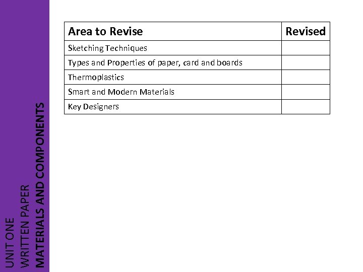 Area to Revise Sketching Techniques Types and Properties of paper, card and boards Thermoplastics UNIT ONE WRITTEN PAPER MATERIALS AND COMPONENTS Smart and Modern Materials Key Designers Revised
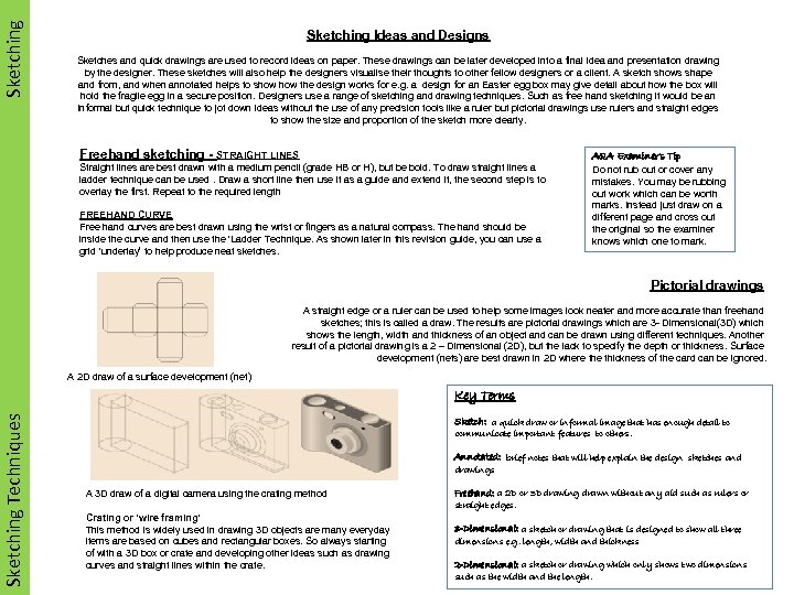 Sketching Ideas and Designs Sketches and quick drawings are used to record ideas on paper. These drawings can be later developed into a final idea and presentation drawing by the designer. These sketches will also help the designers visualise their thoughts to other fellow designers or a client. A sketch shows shape and from, and when annotated helps to show the design works for e. g. a design for an Easter egg box may give detail about how the box will hold the fragile egg in a secure position. Designers use a range of sketching and drawing techniques. Such as free hand sketching it would be an informal but quick technique to jot down ideas without the use of any precision tools like a ruler but pictorial drawings use rulers and straight edges to show the size and proportion of the sketch more clearly. Freehand sketching - STRAIGHT LINES Straight lines are best drawn with a medium pencil (grade HB or H), but be bold. To draw straight lines a ladder technique can be used. Draw a short line then use it as a guide and extend it, the second step is to overlay the first. Repeat to the required length FREEHAND CURVE Free hand curves are best drawn using the wrist or fingers as a natural compass. The hand should be inside the curve and then use the ‘Ladder Technique. As shown later in this revision guide, you can use a grid ‘underlay’ to help produce neat sketches. AQA Examiner’s Tip Do not rub out or cover any mistakes. You may be rubbing out work which can be worth marks. Instead just draw on a different page and cross out the original so the examiner knows which one to mark. Pictorial drawings A straight edge or a ruler can be used to help some images look neater and more accurate than freehand sketches; this is called a draw. The results are pictorial drawings which are 3 - Dimensional(3 D) which shows the length, width and thickness of an object and can be drawn using different techniques. Another result of a pictorial drawing is a 2 – Dimensional (2 D), but the lack to specify the depth or thickness. Surface development (nets) are best drawn in 2 D where thickness of the card can be ignored. A 2 D draw of a surface development (net) Sketching Techniques Key Terms Sketch: a quick draw or informal image that has enough detail to communicate important features to others. Annotated: brief notes that will help explain the design sketches and drawings A 3 D draw of a digital camera using the crating method Crating or ‘wire framing’ This method is widely used in drawing 3 D objects are many everyday items are based on cubes and rectangular boxes. So always starting of with a 3 D box or crate and developing other ideas such as drawing curves and straight lines within the crate. Freehand: a 2 D or 3 D drawing drawn without any aid such as rulers or straight edges. 3 -Dimensional: a sketch or drawing that is designed to show all three dimensions e. g. length, width and thickness 2 -Dimensional: a sketch or drawing which only shows two dimensions such as the width and the length.
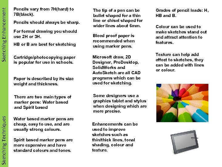 Sketching Enhancement Pencils vary from 7 H(hard) to 7 B(black). Pencils should always be sharp. For formal drawing you should use 2 H or 3 H. HB or B are best for sketching Cartridge/photocopying paper is popular for use in schools. Paper is described by its size weight and thickness. Sketching Techniques There are two main types of marker pens: Water based and Spirit based Water based marker pens are cheap, easy to use, and are usually strong colours. Spirit based marker pens are more expensive and have standard colours and tones. The tip of a pen can be bullet shaped for a thin line or chisel shaped for wider lines about 6 mm. Bleed proof paper is recommended when using marker pens. Microsoft draw, 2 D Designer, Pro. Desktop, Solid. Works and Auto. Sketch are all CAD programs which can be used for sketching. Some designers use a graphics tablet and stylus when designing which are more precise. Enhancements can be used to improve sketches such as thin/thick lines, tonal shading, colour and texture. Grades of pencil leads: H, HB and B. Colour can be used to make sketches stand out and attract attention to features. Texture can help add effect to sketches, they can be added with lines or colour.
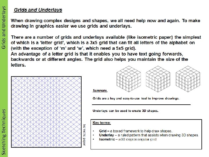 Sketching Techniques Grids and Underlays
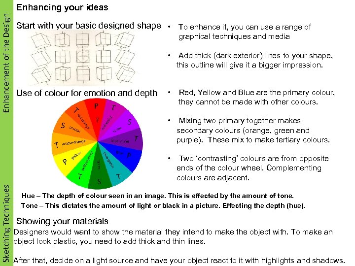 Enhancement of the Design Enhancing your ideas Start with your basic designed shape • To enhance it, you can use a range of graphical techniques and media • Red, Yellow and Blue are the primary colour, they cannot be made with other colours. Mixing two primary together makes secondary colours (orange, green and purple). These mix to make tertiary colours. • Use of colour for emotion and depth Add thick (dark exterior) lines to your shape, this outline will give it a bigger impression. • Sketching Techniques • Two ‘contrasting’ colours are from opposite ends of the colour wheel. Complementing colours are adjacent. Hue – The depth of colour seen in an image. This is effected by the amount of tone. Tone – This dictates the amount of light or black in a picture. Effecting the depth (hue). Showing your materials Designers would want to show the material they intend to make the object with. To make an object look plastic, you need to add thick and thin lines. After that, decide on a light source and have your object react to it with highlights and shadows.
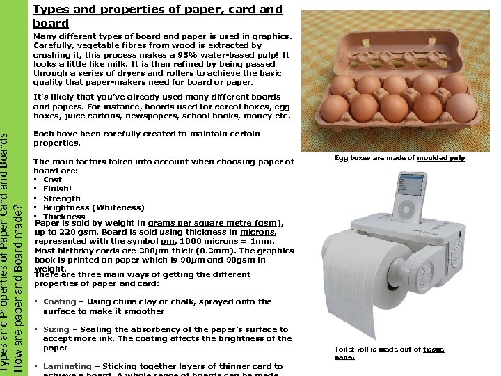 Types and Properties of Paper Card and Boards How are paper and Board made? Types and properties of paper, card and board Many different types of board and paper is used in graphics. Carefully, vegetable fibres from wood is extracted by crushing it, this process makes a 95% water-based pulp! It looks a little like milk. It is then refined by being passed through a series of dryers and rollers to achieve the basic quality that paper-makers need for board or paper. It’s likely that you’ve already used many different boards and papers. For instance, boards used for cereal boxes, egg boxes, juice cartons, newspapers, school books, money etc. Each have been carefully created to maintain certain properties. The main factors taken into account when choosing paper of board are: • Cost • Finish! • Strength • Brightness (Whiteness) • Thickness Paper is sold by weight in grams per square metre (gsm), up to 220 gsm. Board is sold using thickness in microns, represented with the symbol μm, 1000 microns = 1 mm. Most birthday cards are 300μm thick (0. 3 mm). The graphics 300μ book is printed on paper which is 90μm and 90 gsm in 90μ weight. There are three main ways of getting the different properties of paper and card: Egg boxes are made of moulded pulp • Coating – Using china clay or chalk, sprayed onto the surface to make it smoother • Sizing – Sealing the absorbency of the paper’s surface to accept more ink. The coating affects the brightness of the paper • Laminating – Sticking together layers of thinner card to Toilet roll is made out of tissue paper
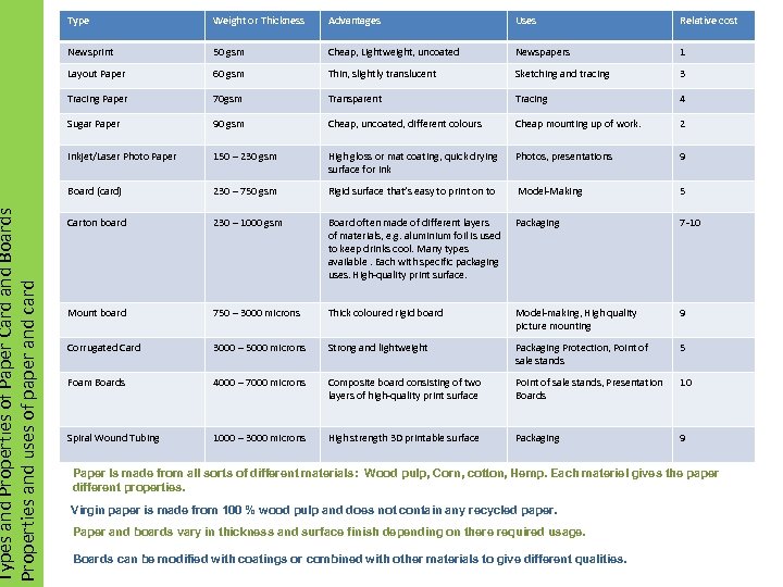 Plastics Types and Properties of Paper Card and Boards Materials Properties and uses of paper and card Type Weight or Thickness Advantages Uses Relative cost Newsprint 50 gsm Cheap, Lightweight, uncoated Newspapers 1 Layout Paper 60 gsm Thin, slightly translucent Sketching and tracing 3 Tracing Paper 70 gsm Transparent Tracing 4 Sugar Paper 90 gsm Cheap, uncoated, different colours Cheap mounting up of work. 2 Inkjet/Laser Photo Paper 150 – 230 gsm High gloss or mat coating, quick drying surface for ink Photos, presentations 9 Board (card) 230 – 750 gsm Rigid surface that’s easy to print on to Model-Making 5 Carton board 230 – 1000 gsm Board often made of different layers of materials, e. g. aluminium foil is used to keep drinks cool. Many types available. Each with specific packaging uses. High-quality print surface. Packaging 7 -10 Mount board 750 – 3000 microns Thick coloured rigid board Model-making, High quality picture mounting 9 Corrugated Card 3000 – 5000 microns Strong and lightweight Packaging Protection, Point of sale stands 5 Foam Boards 4000 – 7000 microns Composite board consisting of two layers of high-quality print surface Point of sale stands, Presentation Boards 10 Spiral Wound Tubing 1000 – 3000 microns High strength 3 D printable surface Packaging 9 Paper Is made from all sorts of different materials: Wood pulp, Corn, cotton, Hemp. Each materiel gives the paper different properties. Virgin paper is made from 100 % wood pulp and does not contain any recycled paper. Paper and boards vary in thickness and surface finish depending on there required usage. Boards can be modified with coatings or combined with other materials to give different qualities.
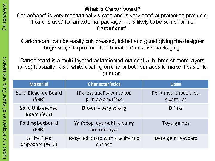 Plastics Cartonboard What is Cartonboard? Cartonboard is very mechanically strong and is very good at protecting products. If card is used for an external package – it is likely to be some form of Cartonboard. Sustainability Types and Properties of Paper Card and Boards Cartonboard can be easily cut, creased, folded and glued giving the designer huge scope to produce functional and creative packaging. Cartonboard is a multi-layered or laminated material with three or more layers (plies) It usually has a white coating on one or both surfaces to make it easier to print on. Material Characteristics Uses Solid Bleached Board (SBB) Highest quality white top printable surface Perfumes, chocolates, cigarettes Solid Unbleached Board (SUB) Brown – very strong Drinks Folding boxboard (FBB) Whit top layer with creamy bottom layer Toys, games White lined chipboard (WLC) Recycled board with a white top surface Detergent powders
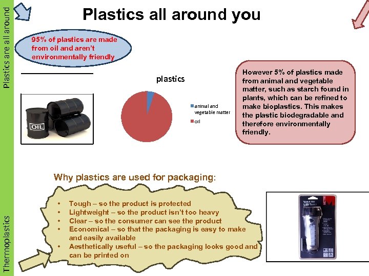 Plastics are all around Plastics all around you 95% of plastics are made from oil and aren’t environmentally friendly plastics animal and vegetable matter oil However 5% of plastics made from animal and vegetable matter, such as starch found in plants, which can be refined to make bioplastics. This makes the plastic biodegradable and therefore environmentally friendly. Thermoplastics Why plastics are used for packaging: • • • Tough – so the product is protected Lightweight – so the product isn’t too heavy Clear – so the consumer can see the product Economical – so that the packaging is easy to make and easily available Aesthetically useful – so the packaging looks good and can be printed on
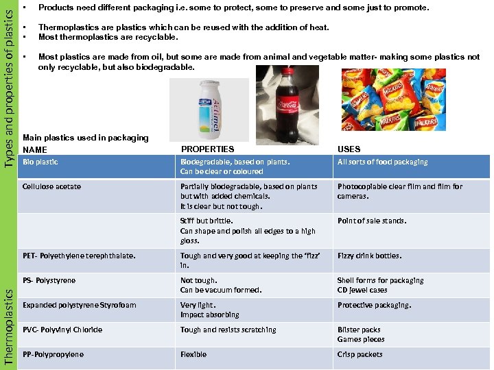 Types and properties of plastics Smart Materials • Products need different packaging i. e. some to protect, some to preserve and some just to promote. • • Thermoplastics are plastics which can be reused with the addition of heat. Most thermoplastics are recyclable. • Most plastics are made from oil, but some are made from animal and vegetable matter- making some plastics not only recyclable, but also biodegradable. Main plastics used in packaging NAME Bio plastic PROPERTIES Biodegradable, based on plants. Can be clear or coloured USES Partially biodegradable, based on plants but with added chemicals. It is clear but not tough. Photocopiable clear film and film for cameras. Stiff but brittle. Can shape and polish all edges to a high gloss. Point of sale stands. PET- Polyethylene terephthalate. Tough and very good at keeping the ‘fizz’ in. Fizzy drink bottles. PS- Polystyrene Not tough. Can be vacuum formed. Shell forms for packaging CD jewel cases Expanded polystyrene Styrofoam Very light. Impact absorbing Protective packaging. PVC- Polyvinyl Chloride Tough and resists scratching Blister packs Games pieces PP-Polypropylene Flexible Crisp packets Thermoplastics Materials Cellulose acetate All sorts of food packaging
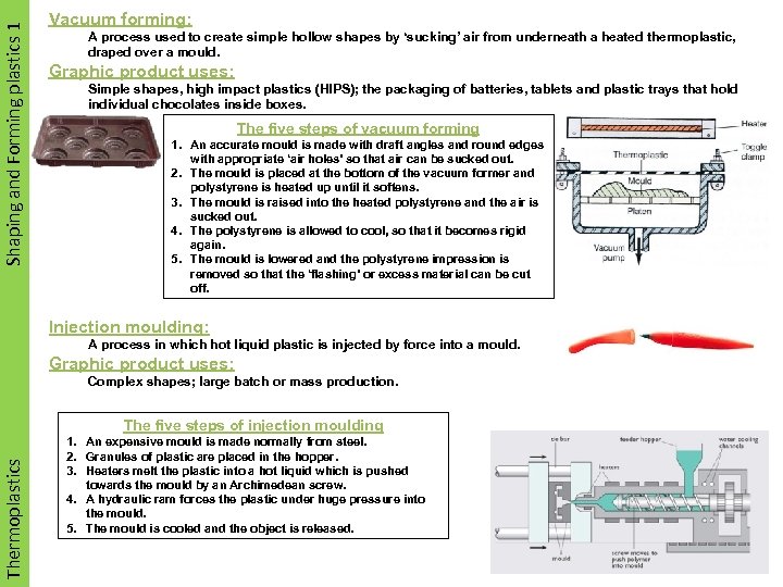 Shaping and Forming plastics 1 Smart Materials Vacuum forming: A process used to create simple hollow shapes by ‘sucking’ air from underneath a heated thermoplastic, draped over a mould. Graphic product uses: Simple shapes, high impact plastics (HIPS); the packaging of batteries, tablets and plastic trays that hold individual chocolates inside boxes. The five steps of vacuum forming 1. An accurate mould is made with draft angles and round edges with appropriate ‘air holes’ so that air can be sucked out. 2. The mould is placed at the bottom of the vacuum former and polystyrene is heated up until it softens. 3. The mould is raised into the heated polystyrene and the air is sucked out. 4. The polystyrene is allowed to cool, so that it becomes rigid again. 5. The mould is lowered and the polystyrene impression is removed so that the ‘flashing’ or excess material can be cut off. Injection moulding: A process in which hot liquid plastic is injected by force into a mould. Graphic product uses: Complex shapes; large batch or mass production. Thermoplastics Materials The five steps of injection moulding 1. An expensive mould is made normally from steel. 2. Granules of plastic are placed in the hopper. 3. Heaters melt the plastic into a hot liquid which is pushed towards the mould by an Archimedean screw. 4. A hydraulic ram forces the plastic under huge pressure into the mould. 5. The mould is cooled and the object is released.
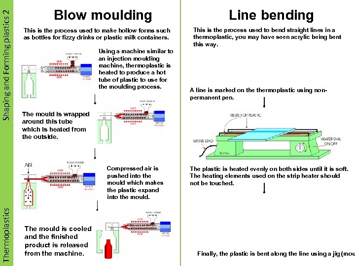 Shaping and Forming plastics 2 Smart Materials Blow moulding This is the process used to make hollow forms such as bottles for fizzy drinks or plastic milk containers. Using a machine similar to an injection moulding machine, thermoplastic is heated to produce a hot tube of plastic to use for the moulding process. This is the process used to bend straight lines in a thermoplastic, you may have seen acrylic being bent this way. A line is marked on thermoplastic using nonpermanent pen. The mould is wrapped around this tube which is heated from the outside. Compressed air is pushed into the mould which makes the plastic expand into the mould. Thermoplastics Materials Line bending The mould is cooled and the finished product is released from the machine. The plastic is heated evenly on both sides until it is soft. The heating elements used on the strip heater should not be touched. Finally, the plastic is bent along the line using a jig (mou
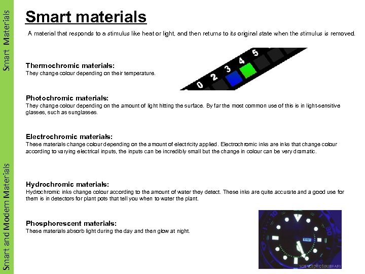 Smart Materials Smart materials A material that responds to a stimulus like heat or light, and then returns to its original state when the stimulus is removed. Thermochromic materials: They change colour depending on their temperature. Photochromic materials: They change colour depending on the amount of light hitting the surface. By far the most common use of this is in light-sensitive glasses, such as sunglasses. Electrochromic materials: Smart and Materials Modern Materials These materials change colour depending on the amount of electricity applied. Electrochromic inks are inks that change colour according to varying electrical inputs, the inputs can be incredibly small but the change in colour can be very dramatic. Hydrochromic materials: Hydrochromic inks change colour according to the amount of water they detect. These inks are quite accurate and a good use for them is in detectors for plant pots that tell you when to water the plant. Phosphorescent materials: These materials absorb light during the day and then glow at night.
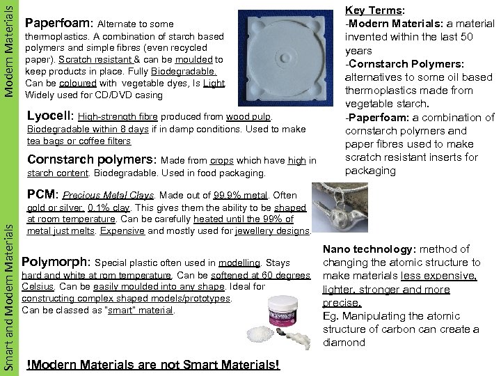 Modern. Materials Smart Materials Paperfoam: Alternate to some thermoplastics. A combination of starch based polymers and simple fibres (even recycled paper). Scratch resistant & can be moulded to keep products in place. Fully Biodegradable. Can be coloured with vegetable dyes, Is Light. Widely used for CD/DVD casing Lyocell: High-strength fibre produced from wood pulp. Biodegradable within 8 days if in damp conditions. Used to make tea bags or coffee filters Cornstarch polymers: Made from crops which have high in starch content. Biodegradable. Used in food packaging. Key Terms: -Modern Materials: a material invented within the last 50 years -Cornstarch Polymers: alternatives to some oil based thermoplastics made from vegetable starch. -Paperfoam: a combination of cornstarch polymers and paper fibres used to make scratch resistant inserts for packaging Smart and Materials Modern Materials PCM: Precious Metal Clays. Made out of 99. 9% metal. Often gold or silver. 0. 1% clay. This gives them the ability to be shaped at room temperature. Can be carefully heated until the 99% of metal just melts. Expensive and mostly used for jewellery designs. Polymorph: Special plastic often used in modelling. Stays hard and white at rom temperature. Can be softened at 60 degrees Celsius. Can be easily moulded into any shape. Ideal for constructing complex shaped models/prototypes. Can be classed as “smart” material. !Modern Materials are not Smart Materials! Nano technology: method of changing the atomic structure to make materials less expensive, lighter, stronger and more precise. Eg. Manipulating the atomic structure of carbon can create a diamond
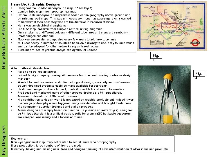 Harry Beck and Alberto Alessi Smart Materials Key Designers Materials Harry Beck: Graphic Designer • • • Designed the London underground map in 1933 (fig. 1) London tube map = non geographical map Before Beck, underground maps were based on the geography above ground and on existing road maps. This was un-necessary though as passengers only wanted to know what their next stop was not the distance in between stations. Harry was an electrical draughtsman His tube map idea was from simple electrical wiring diagrams. On his tube map: different colours = different tube lines and standard symbols = interchanges and stations Map was successful and updated every few years to add new tube lines Still used today in number of countries because it is easy to use, easy to understand can be adopted for other networks e. g air travel routes Tube map = icon of graphic design and symbol of London Fig. 1 Alberto Alessi: Manufacturer • Italian and trained as lawyer • Joined family company making kitchenware for hotel and catering trades as design manager. • Wanted to combine mass production with good design, creativity and craftsmanship so well-designed products could be made available for everyone. • He did not design products himself, made it possible for others to be creative • Produced and marketed many of other peoples designs e. g Philippe Starck, Alessandro Mendini and Stefano Giovannoni • His contribution to design world is not based on graphic products but instead it was his design philosophy which triggered many new debates and brought fresh ideas. • His company = superior designed and stylish products • Alessi designs not simply based on function… e. g lemon squeezer (fig. 2) designed by Philippe Starck. It is a brilliant design, sells for around £ 50 but basic squeezers are cheaper, less messy and a lot easier to use. Key terms: Non – geographical map: map not related to actual landscape or topography Mass production: large numbers of items are made Creativity: having and making new ideas and designs, thinking of new interpretations of older ideas and products Fig. 2
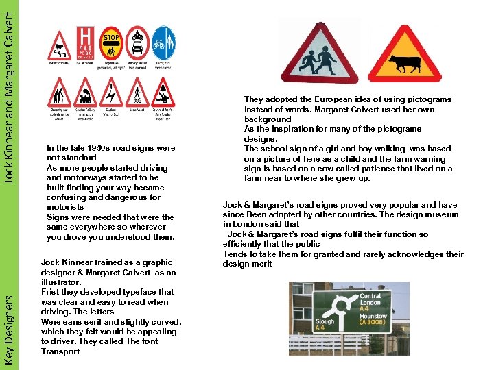 Jock Kinnear and Margaret Calvert Smart Materials Key Designers Materials In the late 1950 s road signs were not standard As more people started driving and motorways started to be built finding your way became confusing and dangerous for motorists Signs were needed that were the same everywhere so wherever you drove you understood them. Jock Kinnear trained as a graphic designer & Margaret Calvert as an illustrator. Frist they developed typeface that was clear and easy to read when driving. The letters Were sans serif and slightly curved, which they felt would be appealing to driver. They called The font Transport They adopted the European idea of using pictograms Instead of words. Margaret Calvert used her own background As the inspiration for many of the pictograms designs. The school sign of a girl and boy walking was based on a picture of here as a child and the farm warning sign is based on a cow called patience that lived on a farm near to where she grew up. Jock & Margaret’s road signs proved very popular and have since Been adopted by other countries. The design museum in London said that Jock & Margaret’s road signs fulfil their function so efficiently that the public Tends to take them for granted and rarely acknowledges their design merit
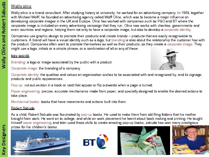 Wally Olins and Robert Sabuda Wallly olins Wally olins is a brand consultant. After studying history at university, he worked for an advertising company. In 1965, together with Michael Wolff, he founded an advertising agency called Wolff Olins, which was to become a major influence on developing corporate images in the UK and Europe. Olins has worked with companies such as P&O and BT where the corporate image is included on every advertising campaign that they run. Olins now works with charities, governments and even countries and regions, helping them not only to have a corporate image, but also to develop a corporate identity. Companies use graphic design to promote their products and create brands – products that are easily recognisable to customers. A brand will have a visual identity such as a logo, but branding is also about the relationship the customer has with the product. Companies often want to promote themselves as well as their products, so they create a corporate image. They might use a logo, initials or a simple phrase, or a combination of all or any of these. key words Branding: a logo or image associated by the public with a product. Corporate image: the branding of a company Corporate identity: the qualities and values an organisation wishes to be associated with and recognised by, and its signage, products and public appearances. Pop-up: cut-out section in a book or card that appear or flip outwards when a page is turned. Paper engineering: precise, accurate mechanisms made from paper, and specially designed to enable the desired actions to take place. Mechanical books: books that have movements and actions built into them. Key Designers Robert Sabuda As a child, Robert Sabuda was fascinated by pop-up books. He used to make them from old filing folders that his mother brought from work. He went on to college, and while on work placement he learnt about book making and printing. He taught himself paper engineering, and later used these skills to create amazing pop-up books, sabuda has won many prestigious prizes for his children’s books.
 WRITTEN PAPER PROCESSES AND MANUFACTURE Area to Revise Techniques and Processes Presentation Pictorial Drawings Working Drawings Surface Nets or Developments Information Drawings Paper Engineering and bought in components Products and Applications Evaluation Techniques Moral, Social, Cultural, Environmental, Economic and Sustainability Issues ICT Health and Safety Revised
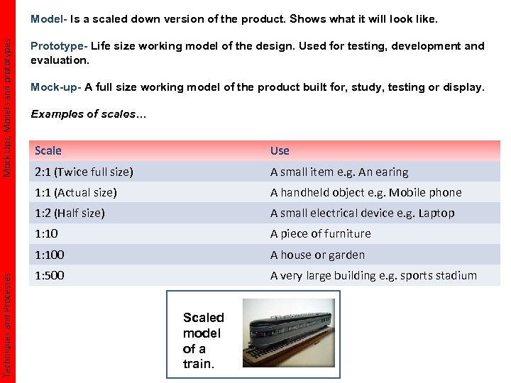 Mock Ups, Models and prototypes Model- Is a scaled down version of the product. Shows what it will look like. Prototype- Life size working model of the design. Used for testing, development and evaluation. Mock-up- A full size working model of the product built for, study, testing or display. Examples of scales… Use 2: 1 (Twice full size) A small item e. g. An earing 1: 1 (Actual size) A handheld object e. g. Mobile phone 1: 2 (Half size) A small electrical device e. g. Laptop 1: 10 A piece of furniture 1: 100 Techniques and Processes Scale A house or garden 1: 500 A very large building e. g. sports stadium Scaled model of a train.
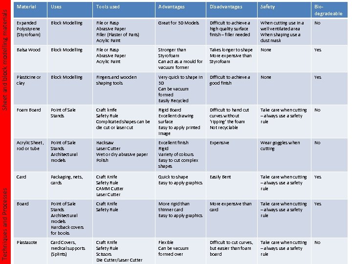 Tools used Advantages Disadvantages Safety Biodegradeable Expanded Polystyrene (Styrofoam) Block Modelling File or Rasp Abrasive Paper Filler (Plaster of Paris) Acrylic Paint Great for 3 D Models Difficult to achieve a high quality surface finish – filler needed When cutting use in a well ventilated area When shaping use a dust mask No Balsa Wood Block Modelling File or Rasp Abrasive Paper Acrylic Paint Stronger than Styrofoam Can act as a mould for vacuum former Takes longer to shape More expensive than Styrofoam None Yes Plasticine or clay Block Modelling Fingers and wooden shaping tools Very quick to shape in 3 D Can be vacuum formed Easily Recycled Difficult to achieve a good finish None Yes Foam Board Point of Sale Stands Craft knife Safety Rule Complicated shapes can be die cut or laser cut Rigid Board Excellent drawing surface Easy to apply printed image Difficult to hand cut curves without ‘ripping’ the foam Not recyclable Take care when cutting – always use a safety rule No Point of Sale Stands Architectural models Hacksaw Laser Cutter Wet or dry abrasive paper Polish Excellent finish Rigid Variety of colours Easy to cut complex shapes Expensive Wear goggles when cutting No Card Sheet and block modelling materials Uses Acrylic Sheet, rod or tube Techniques and Processes Material Packaging, nets, cards Craft Knife Safety Rule CAMM Cutter Laser Cutter Quick to shape Easy to apply graphics Easily Bent Take care when cutting – always use a safety rule Yes Board Point of Sale Stands Architectural models Hardback covers for books Craft Knife Safety Rule More rigid than thinner card Easy to apply graphics More expensive than card Take care when cutting – always use a safety rule Yes Plastazote Card Covers, medical supports (Splints) Craft Knife Safety Rule Scissors DIe Cutter/Laser Cutter Flexible Can be vacuum formed over Difficult to cut curves, but easier than foam board Take care when cutting – always use a safety rule No
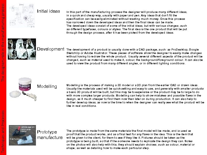 The designers role in the manufacturing process Initial ideas Development In this part of the manufacturing process the designer will produce many different ideas, in a quick and cheap way, usually with paper and pen. Any ideas that don’t fit the specification can be easily eliminated without wasting much money. Once this process has narrowed down the developed ideas and then the final ideas can be made. The developed ideas consist of some of the initial ideas, but with various changes; such as different typefaces, colours or styles. The final idea is the one product that will be put through the design process, after it has been picked from the developed ideas. The development of a product is usually done with a CAD package, such: as Pro. Desktop, Google Sketch. Up or Adobe Illustrator. These pieces of software allow the designer to easily make changes without having to redraw the whole product. Usually several different aspects of the product will be changed, such as material used to make it, colour, the background/foreground colour. It can also be used to view the product from many different angles, or in different lighting conditions. Techniques and Processes Modelling is the process of making a 3 D model or a 2 D plan from the earlier CAD or drawn ideas. Usually the materials used will be quick setting and easy to use, and generally with smaller products a basic 3 D product will be built, but this may be to expensive or the product may be to large to do with more complex larger products. Modelling can help to show mistakes and possible flaws in the design, as it much cheaper to find them now then later on during production. It can also help to further develop ideas, as now is the time to when the designer can really see what the product will be like in real conditions. Prototype manufacture The prototype is made from the same materials the final model will be made, and is used as proof that the product works, and as a final test for any flaws in the idea. This is the item that will be given to the client, for them to see if they like it. Pictures should be taken as the prototype is being built, so that if the someone needs to replicate the design they can. Notes on the photos will also help with this, they should explain choices; such as colour, material or shape; as well as detailing how to make each particular step.
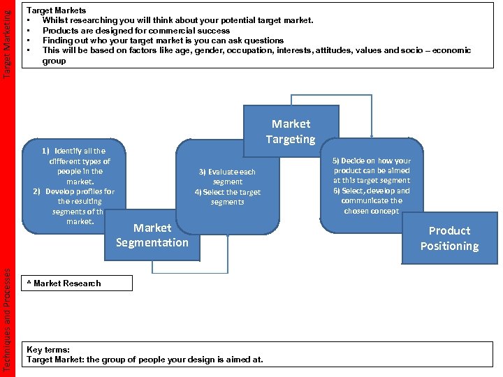 Target Marketing Target Markets • Whilst researching you will think about your potential target market. • Products are designed for commercial success • Finding out who your target market is you can ask questions • This will be based on factors like age, gender, occupation, interests, attitudes, values and socio – economic group Techniques and Processes 1) Identify all the different types of people in the market. 2) Develop profiles for the resulting segments of the market. Market Targeting 3) Evaluate each segment 4) Select the target segments Market Segmentation ^ Market Research Key terms: Target Market: the group of people your design is aimed at. 5) Decide on how your product can be aimed at this target segment 6) Select, develop and communicate the chosen concept Product Positioning
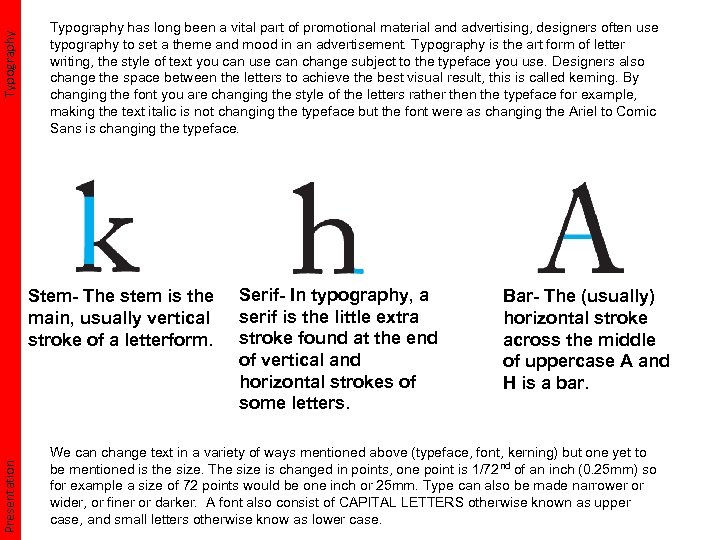 Typography has long been a vital part of promotional material and advertising, designers often use typography to set a theme and mood in an advertisement. Typography is the art form of letter writing, the style of text you can use can change subject to the typeface you use. Designers also change the space between the letters to achieve the best visual result, this is called kerning. By changing the font you are changing the style of the letters rather then the typeface for example, making the text italic is not changing the typeface but the font were as changing the Ariel to Comic Sans is changing the typeface. Presentation Stem- The stem is the main, usually vertical stroke of a letterform. Serif- In typography, a serif is the little extra stroke found at the end of vertical and horizontal strokes of some letters. Bar- The (usually) horizontal stroke across the middle of uppercase A and H is a bar. We can change text in a variety of ways mentioned above (typeface, font, kerning) but one yet to be mentioned is the size. The size is changed in points, one point is 1/72 nd of an inch (0. 25 mm) so for example a size of 72 points would be one inch or 25 mm. Type can also be made narrower or wider, or finer or darker. A font also consist of CAPITAL LETTERS otherwise known as upper case, and small letters otherwise know as lower case.
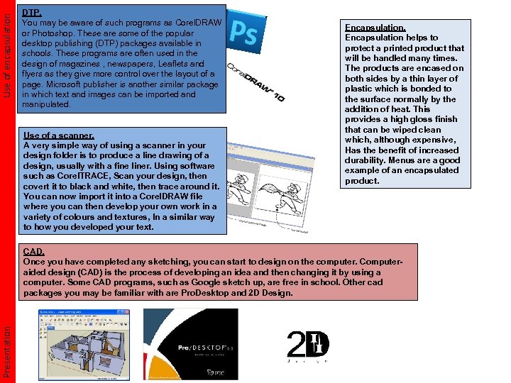 Use of encapsulation DTP. You may be aware of such programs as Corel. DRAW or Photoshop. These are some of the popular desktop publishing (DTP) packages available in schools. These programs are often used in the design of magazines , newspapers, Leaflets and flyers as they give more control over the layout of a page. Microsoft publisher is another similar package in which text and images can be imported and manipulated. Use of a scanner. A very simple way of using a scanner in your design folder is to produce a line drawing of a design, usually with a fine liner. Using software such as Corel. TRACE, Scan your design, then covert it to black and white, then trace around it. You can now import it into a Corel. DRAW file where you can then develop your own work in a variety of colours and textures, In a similar way to how you developed your text. Encapsulation helps to protect a printed product that will be handled many times. The products are encased on both sides by a thin layer of plastic which is bonded to the surface normally by the addition of heat. This provides a high gloss finish that can be wiped clean which, although expensive, Has the benefit of increased durability. Menus are a good example of an encapsulated product. Presentation CAD. Once you have completed any sketching, you can start to design on the computer. Computeraided design (CAD) is the process of developing an idea and then changing it by using a computer. Some CAD programs, such as Google sketch up, are free in school. Other cad packages you may be familiar with are Pro. Desktop and 2 D Design.
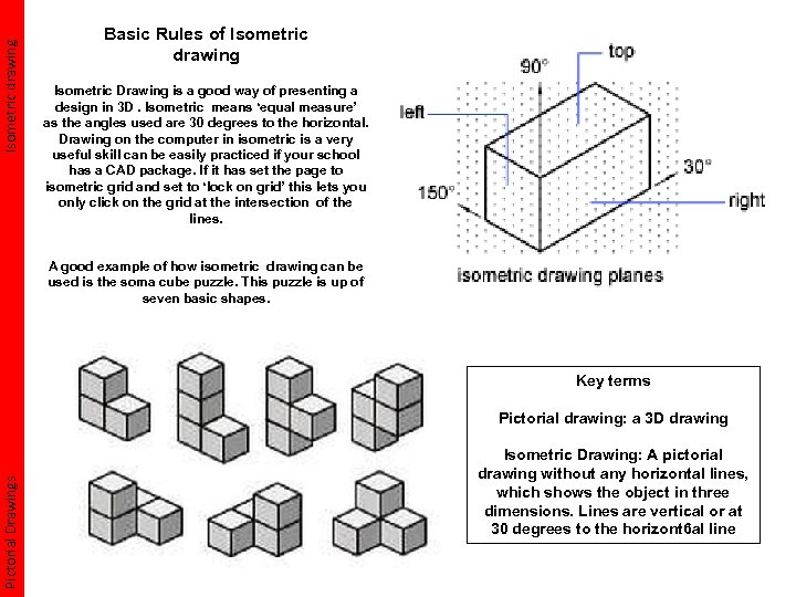 Isometric drawing Basic Rules of Isometric drawing Isometric Drawing is a good way of presenting a design in 3 D. Isometric means ‘equal measure’ as the angles used are 30 degrees to the horizontal. Drawing on the computer in isometric is a very useful skill can be easily practiced if your school has a CAD package. If it has set the page to isometric grid and set to ‘lock on grid’ this lets you only click on the grid at the intersection of the lines. A good example of how isometric drawing can be used is the soma cube puzzle. This puzzle is up of seven basic shapes. Key terms Pictorial Drawings Pictorial drawing: a 3 D drawing Isometric Drawing: A pictorial drawing without any horizontal lines, which shows the object in three dimensions. Lines are vertical or at 30 degrees to the horizont 6 al line
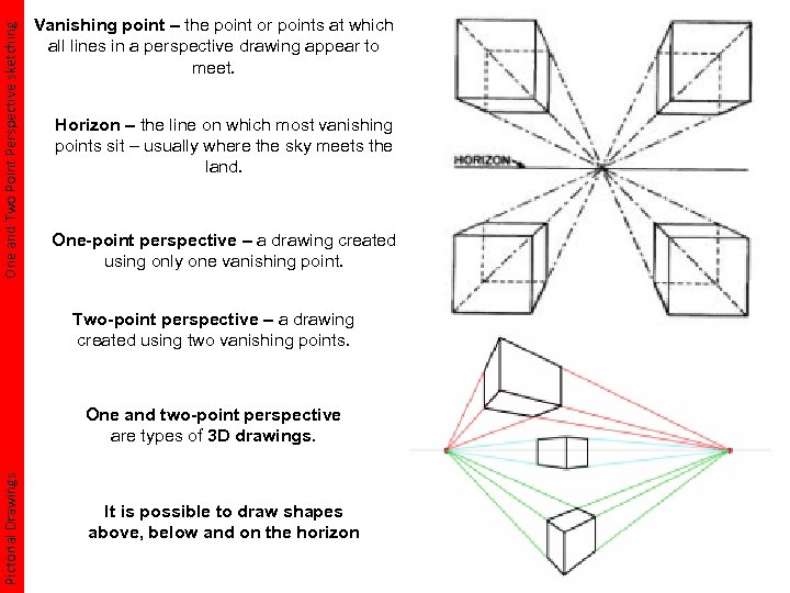 One and Two Point Perspective sketching Vanishing point – the point or points at which all lines in a perspective drawing appear to meet. Horizon – the line on which most vanishing points sit – usually where the sky meets the land. One-point perspective – a drawing created using only one vanishing point. Two-point perspective – a drawing created using two vanishing points. Pictorial Drawings One and two-point perspective are types of 3 D drawings. It is possible to draw shapes above, below and on the horizon
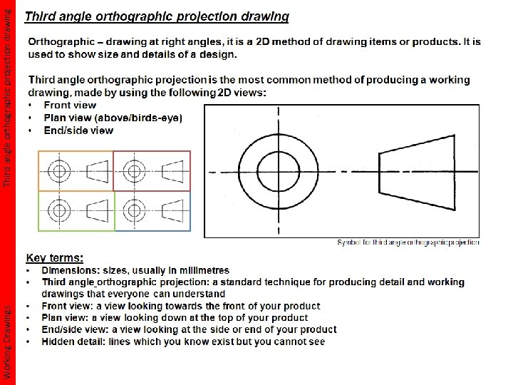 Working Drawings Third angle orthographic projection drawing
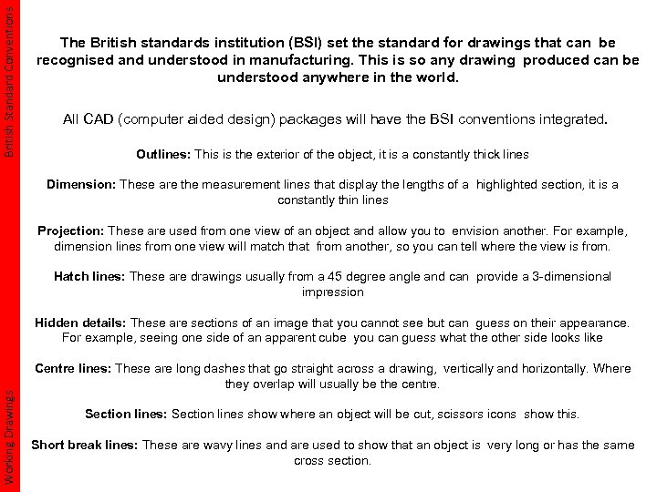 British Standard Conventions The British standards institution (BSI) set the standard for drawings that can be recognised and understood in manufacturing. This is so any drawing produced can be understood anywhere in the world. All CAD (computer aided design) packages will have the BSI conventions integrated. Outlines: This is the exterior of the object, it is a constantly thick lines Dimension: These are the measurement lines that display the lengths of a highlighted section, it is a constantly thin lines Projection: These are used from one view of an object and allow you to envision another. For example, dimension lines from one view will match that from another, so you can tell where the view is from. Hatch lines: These are drawings usually from a 45 degree angle and can provide a 3 -dimensional impression Working Drawings Hidden details: These are sections of an image that you cannot see but can guess on their appearance. For example, seeing one side of an apparent cube you can guess what the other side looks like Centre lines: These are long dashes that go straight across a drawing, vertically and horizontally. Where they overlap will usually be the centre. Section lines: Section lines show where an object will be cut, scissors icons show this. Short break lines: These are wavy lines and are used to show that an object is very long or has the same cross section.
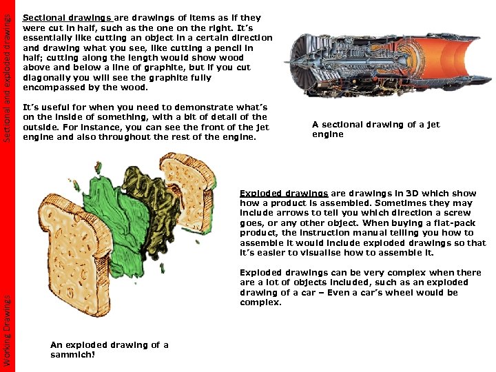 Sectional and exploded drawings Sectional drawings are drawings of items as if they were cut in half, such as the on the right. It’s essentially like cutting an object in a certain direction and drawing what you see, like cutting a pencil in half; cutting along the length would show wood above and below a line of graphite, but if you cut diagonally you will see the graphite fully encompassed by the wood. It’s useful for when you need to demonstrate what’s on the inside of something, with a bit of detail of the outside. For instance, you can see the front of the jet engine and also throughout the rest of the engine. A sectional drawing of a jet engine Working Drawings Exploded drawings are drawings in 3 D which show a product is assembled. Sometimes they may include arrows to tell you which direction a screw goes, or any other object. When buying a flat-pack product, the instruction manual telling you how to assemble it would include exploded drawings so that it’s easier to visualise how to assemble it. Exploded drawings can be very complex when there a lot of objects included, such as an exploded drawing of a car – Even a car’s wheel would be complex. An exploded drawing of a sammich!
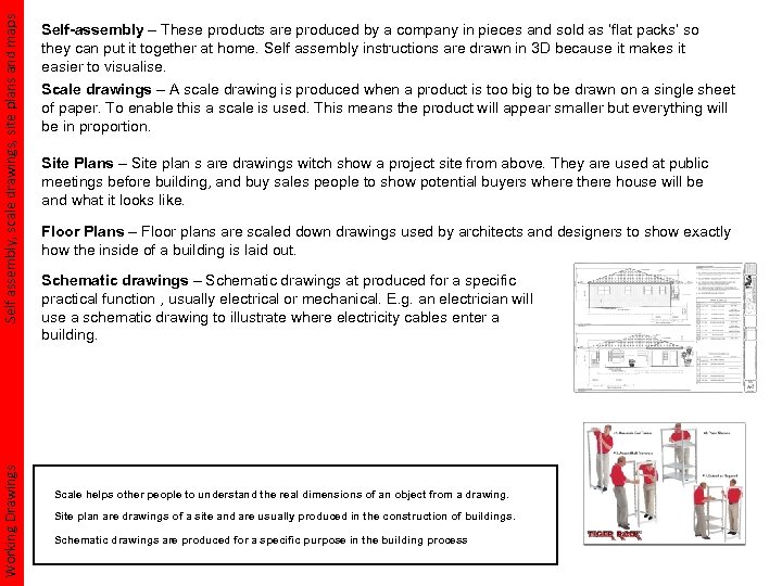 Self assembly, scale drawings, site plans and maps Working Drawings Self-assembly – These products are produced by a company in pieces and sold as ‘flat packs’ so they can put it together at home. Self assembly instructions are drawn in 3 D because it makes it easier to visualise. Scale drawings – A scale drawing is produced when a product is too big to be drawn on a single sheet of paper. To enable this a scale is used. This means the product will appear smaller but everything will be in proportion. Site Plans – Site plan s are drawings witch show a project site from above. They are used at public meetings before building, and buy sales people to show potential buyers where there house will be and what it looks like. Floor Plans – Floor plans are scaled down drawings used by architects and designers to show exactly how the inside of a building is laid out. Schematic drawings – Schematic drawings at produced for a specific practical function , usually electrical or mechanical. E. g. an electrician will use a schematic drawing to illustrate where electricity cables enter a building. Scale helps other people to understand the real dimensions of an object from a drawing. Site plan are drawings of a site and are usually produced in the construction of buildings. Schematic drawings are produced for a specific purpose in the building process
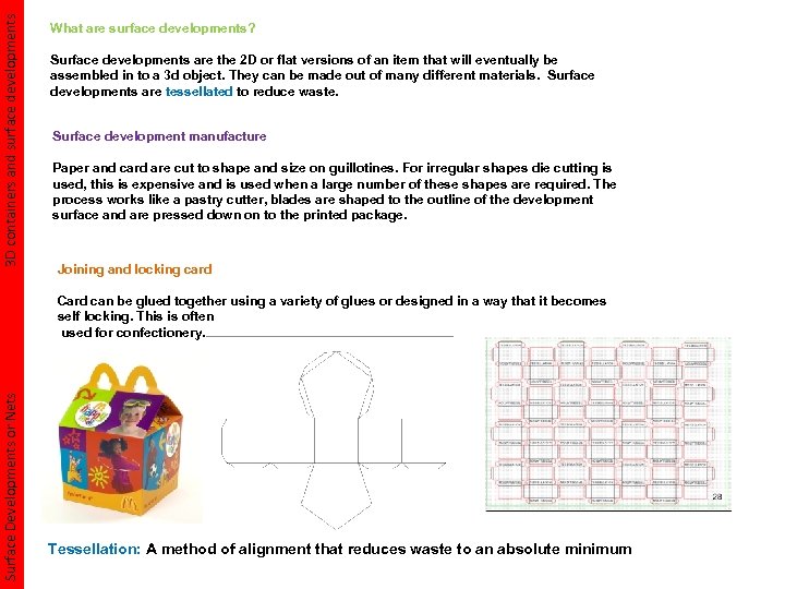 3 D containers and surface developments What are surface developments? Surface developments are the 2 D or flat versions of an item that will eventually be assembled in to a 3 d object. They can be made out of many different materials. Surface developments are tessellated to reduce waste. Surface development manufacture Paper and card are cut to shape and size on guillotines. For irregular shapes die cutting is used, this is expensive and is used when a large number of these shapes are required. The process works like a pastry cutter, blades are shaped to the outline of the development surface and are pressed down on to the printed package. Joining and locking card Surface Developments or Nets Card can be glued together using a variety of glues or designed in a way that it becomes self locking. This is often used for confectionery. Tessellation: A method of alignment that reduces waste to an absolute minimum
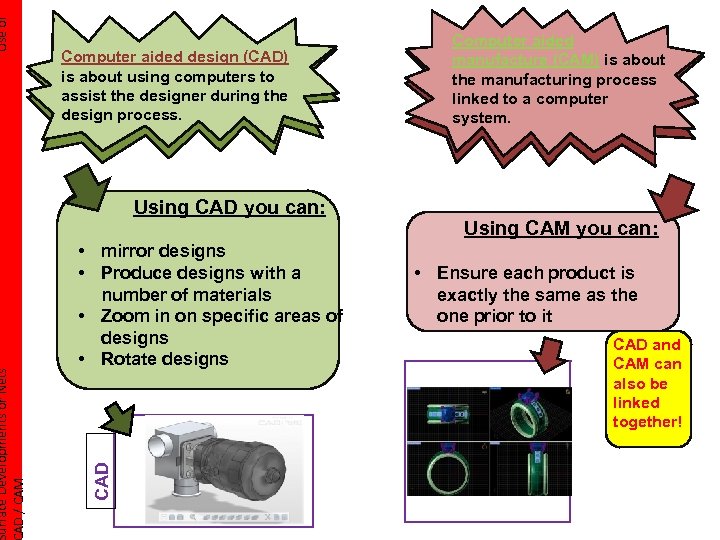 Using CAD you can: • mirror designs • Produce designs with a number of materials • Zoom in on specific areas of designs • Rotate designs CAD Use of urface Developments or Nets AD / CAM Computer aided design (CAD) is about using computers to assist the designer during the design process. Computer aided manufacture (CAM) is about the manufacturing process linked to a computer system. Using CAM you can: • Ensure each product is exactly the same as the one prior to it CAD and CAM can also be linked together!
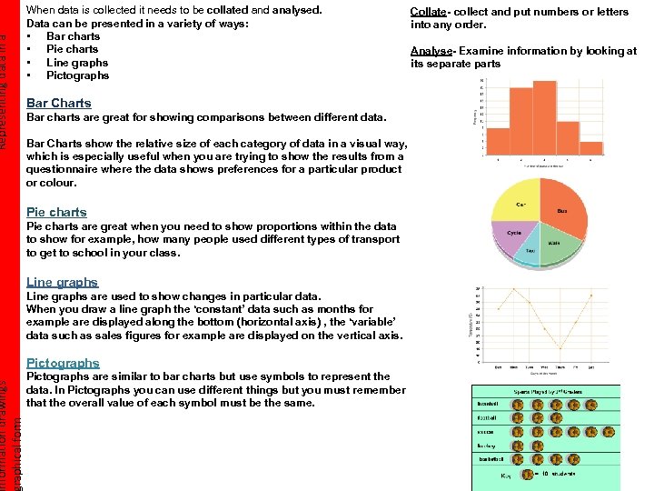 Representing data in a nformation drawings raphical form When data is collected it needs to be collated analysed. Data can be presented in a variety of ways: • Bar charts • Pie charts • Line graphs • Pictographs Bar Charts Bar charts are great for showing comparisons between different data. Bar Charts show the relative size of each category of data in a visual way, which is especially useful when you are trying to show the results from a questionnaire where the data shows preferences for a particular product or colour. Pie charts are great when you need to show proportions within the data to show for example, how many people used different types of transport to get to school in your class. Line graphs are used to show changes in particular data. When you draw a line graph the ‘constant’ data such as months for example are displayed along the bottom (horizontal axis) , the ‘variable’ data such as sales figures for example are displayed on the vertical axis. Pictographs are similar to bar charts but use symbols to represent the data. In Pictographs you can use different things but you must remember that the overall value of each symbol must be the same. Collate- collect and put numbers or letters into any order. Analyse- Examine information by looking at its separate parts
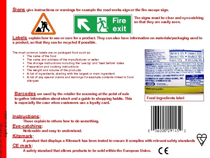 nformation drawings Signs and labels Signs give instructions or warnings for example the road works sign or the fire escape sign. The signs must be clear and eye-catching so that they are easily seen. Labels explain how to use or care for a product. They can also have information on materials/packaging used in a product, so that they can be recycled if possible. The most common labels are on packaged food such as: • The name of the food • The name and address of the manufacturer or seller • The storage instructions including the ‘use by’ and ‘best before’ dates • Preparation and cooking instructions • The weight and volume of the products. • A list of ingredients, starting with the largest or main ingredient • A list of any special claims and warnings for example contents linked to food allergies Barcodes are used by the retailer for scanning at the point of sale to gather information about stock and a guide to shopping habits. This is especially the case when customers use a loyalty card. Food ingredients label Instructions: These explain to others how to do something. Eye-catching: Noticeable and easy to understand. Kitemark: A product that displays a Kitemark has been tested to ensure it complies with relevant safety standards. CE mark: A safety standard that allows products to be sold within the European Union.
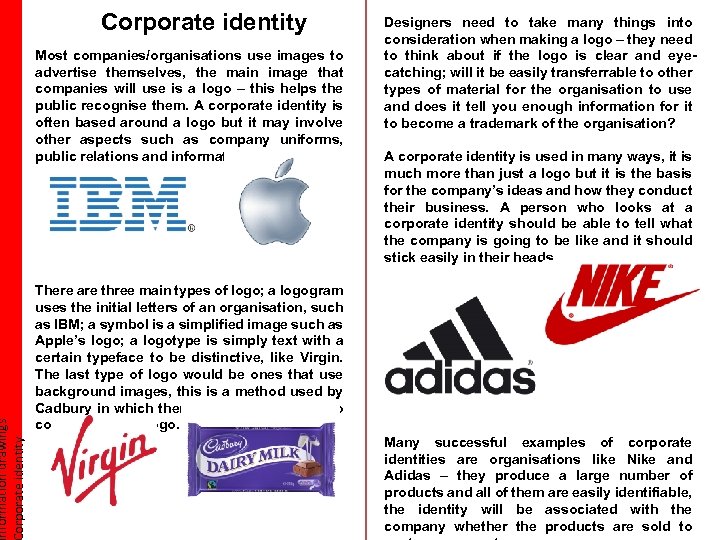 nformation drawings orporate identity Corporate identity Most companies/organisations use images to advertise themselves, the main image that companies will use is a logo – this helps the public recognise them. A corporate identity is often based around a logo but it may involve other aspects such as company uniforms, public relations and information. Designers need to take many things into consideration when making a logo – they need to think about if the logo is clear and eyecatching; will it be easily transferrable to other types of material for the organisation to use and does it tell you enough information for it to become a trademark of the organisation? A corporate identity is used in many ways, it is much more than just a logo but it is the basis for the company’s ideas and how they conduct their business. A person who looks at a corporate identity should be able to tell what the company is going to be like and it should stick easily in their heads. There are three main types of logo; a logogram uses the initial letters of an organisation, such as IBM; a symbol is a simplified image such as Apple’s logo; a logotype is simply text with a certain typeface to be distinctive, like Virgin. The last type of logo would be ones that use background images, this is a method used by Cadbury in which there are glasses of milk to complement the logo. Many successful examples of corporate identities are organisations like Nike and Adidas – they produce a large number of products and all of them are easily identifiable, the identity will be associated with the company whether the products are sold to
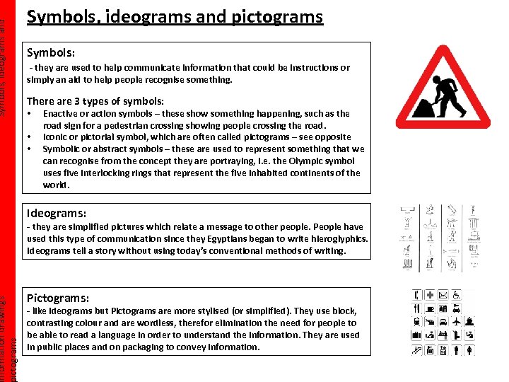 Symbols, ideograms and nformation drawings ictograms Symbols, ideograms and pictograms Symbols: - they are used to help communicate information that could be instructions or simply an aid to help people recognise something. There are 3 types of symbols: • • • Enactive or action symbols – these show something happening, such as the road sign for a pedestrian crossing showing people crossing the road. Iconic or pictorial symbol, which are often called pictograms – see opposite Symbolic or abstract symbols – these are used to represent something that we can recognise from the concept they are portraying, i. e. the Olympic symbol uses five interlocking rings that represent the five inhabited continents of the world. Ideograms: - they are simplified pictures which relate a message to other people. People have used this type of communication since they Egyptians began to write hieroglyphics. Ideograms tell a story without using today’s conventional methods of writing. Pictograms: - like ideograms but Pictograms are more stylised (or simplified). They use block, contrasting colour and are wordless, therefor elimination the need for people to be able to read a language in order to understand the information. They are used in public places and on packaging to convey information.
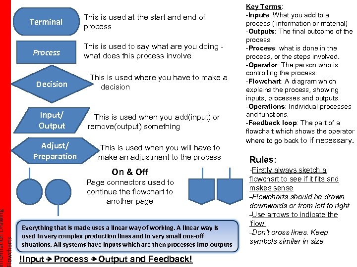 nformation Drawing lowcharts Terminal Process This is used at the start and end of process This is used to say what are you doing what does this process involve This is used where you have to make a decision Decision Input/ Output This is used when you add(input) or remove(output) something Adjust/ Preparation This is used when you will have to make an adjustment to the process On & Off Page connectors used to continue the flowchart to another page Everything that is made uses a linear way of working. A linear way is used in very complex production lines and in very small one-off situations. All systems have inputs which are then processes into outputs !Input Process Output and Feedback! Key Terms: -Inputs: What you add to a process ( information or material) -Outputs: The final outcome of the process. -Process: what is done in the process, or the steps involved. -Operator: The person who is controlling the process. -Flowchart: A diagram which explains the process, showing inputs, processes and outputs. -Operations: Individual processes and functions. -Feedback loop: The part of a flowchart which shows the operator where to go back to if necessary. Rules: -Firstly always sketch a flowchart to see if it fits and makes sense -Flowcharts should be drawn downwards or from left to right -Use arrows to indicate the ‘flow’ -Don’t cross lines. Keep symbols similar in size
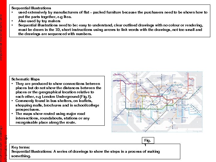 Sequential illustrations and nformation drawings chematic maps Sequential Illustrations • used extensively by manufacturers of flat – packed furniture because the purchasers need to be shown how to put the parts together, e. g Ikea. • Also used by toy makers • Sequential illustrations need to be: easy to understand, clear outlined drawings with no colour or rendering, must be drawn in the 3 D, short instructions using arrows to link words with the drawings, not too small and the drawings are sequenced with numbers. Schematic Maps • They are produced to show connections between places but do not show the distances between the places or the geographical location relative to each other, e. g London Underground (Fig. 1). • Commonly found in bus shelters, on leaflets, shopping malls, brochures and in school/college prospectuses. • The maps show routed using major road intersections, roundabouts, stations or any recognisable place along the route. Fig. 1 Key terms: Sequential Illustrations: A series of drawings to show the steps in a process of making something.
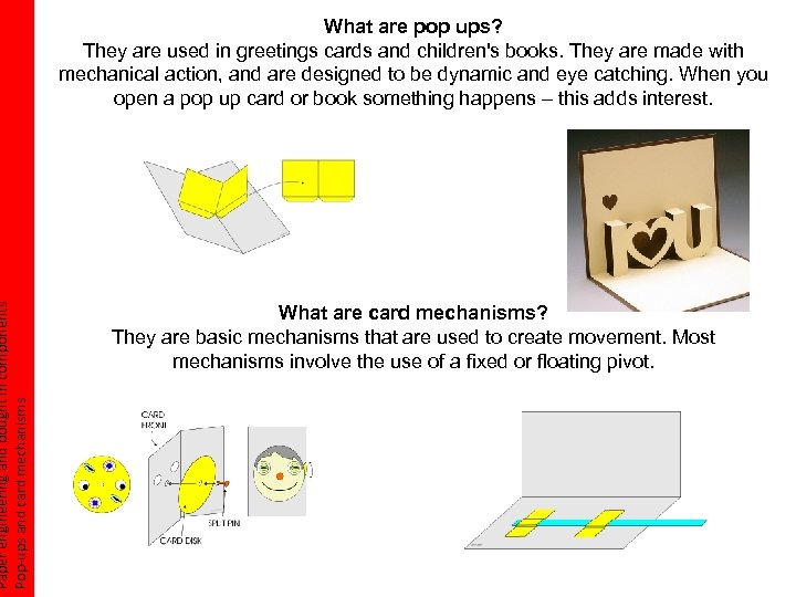 Paper engineering and bought in components Pop-ups and card mechanisms What are pop ups? They are used in greetings cards and children's books. They are made with mechanical action, and are designed to be dynamic and eye catching. When you open a pop up card or book something happens – this adds interest. What are card mechanisms? They are basic mechanisms that are used to create movement. Most mechanisms involve the use of a fixed or floating pivot.
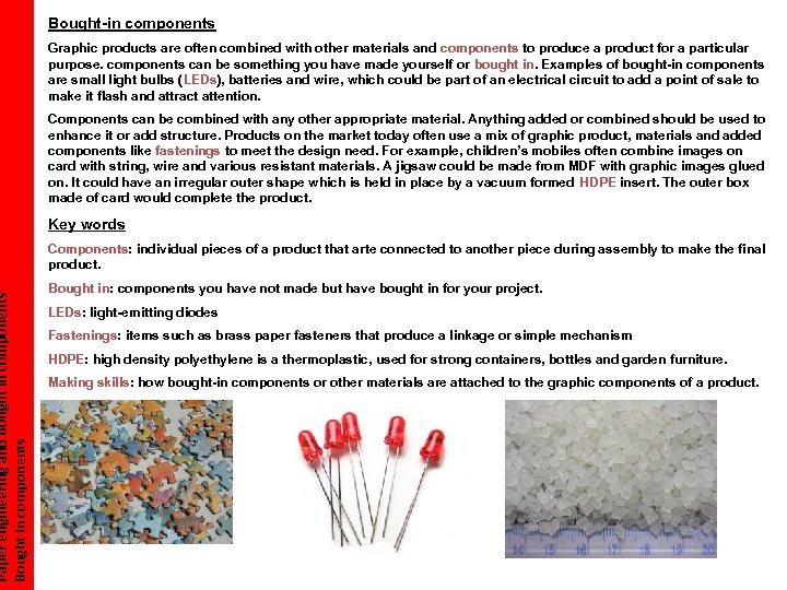 Paper engineering and bought in components Bought-in components Graphic products are often combined with other materials and components to produce a product for a particular purpose. components can be something you have made yourself or bought in. Examples of bought-in components are small light bulbs (LEDs), batteries and wire, which could be part of an electrical circuit to add a point of sale to make it flash and attract attention. Components can be combined with any other appropriate material. Anything added or combined should be used to enhance it or add structure. Products on the market today often use a mix of graphic product, materials and added components like fastenings to meet the design need. For example, children’s mobiles often combine images on card with string, wire and various resistant materials. A jigsaw could be made from MDF with graphic images glued on. It could have an irregular outer shape which is held in place by a vacuum formed HDPE insert. The outer box made of card would complete the product. Key words Components: individual pieces of a product that arte connected to another piece during assembly to make the final product. Bought in: components you have not made but have bought in for your project. LEDs: light-emitting diodes Fastenings: items such as brass paper fasteners that produce a linkage or simple mechanism HDPE: high density polyethylene is a thermoplastic, used for strong containers, bottles and garden furniture. Making skills: how bought-in components or other materials are attached to the graphic components of a product. POS; point of sale
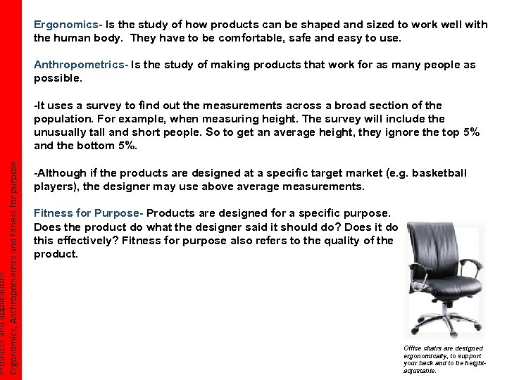 Products and applications Ergonomics, Anthropometrics and fitness for purpose Ergonomics- Is the study of how products can be shaped and sized to work well with the human body. They have to be comfortable, safe and easy to use. Anthropometrics- Is the study of making products that work for as many people as possible. -It uses a survey to find out the measurements across a broad section of the population. For example, when measuring height. The survey will include the unusually tall and short people. So to get an average height, they ignore the top 5% and the bottom 5%. -Although if the products are designed at a specific target market (e. g. basketball players), the designer may use above average measurements. Fitness for Purpose- Products are designed for a specific purpose. Does the product do what the designer said it should do? Does it do this effectively? Fitness for purpose also refers to the quality of the product. Office chairs are designed ergonomically, to support your back and to be heightadjustable.
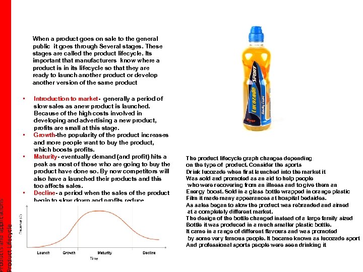 roducts and applications roduct Lifecycle When a product goes on sale to the general public it goes through Several stages. These stages are called the product lifecycle. Its important that manufacturers know where a product is in its lifecycle so that they are ready to launch another product or develop another version of the same product • • Introduction to market- generally a period of slow sales as anew product is launched. Because of the high costs involved in developing and advertising a new product, profits are small at this stage. Growth-the popularity of the product increases and more people want to buy the product, which boosts profits. Maturity- eventually demand (and profit) hits a peak as most of those who are going to buy the product have done so. By now competitors will also have a launched their products and this too affects sales. Decline- a period when the sales of the product begin to slow down and profits reduce. The product lifecycle graph changes depending on the type of product. Consider the sports Drink lucozade when first launched into the market it Was sold and promoted as an aid to help people who were recovering from an illness and to give them an Energy boost. Sold in a glass bottle wrapped in orange plastic Film it made many appearances at hospital bedsides. As sales began to slow the product was rebranded and aimed at a completely different market. The design of the bottle changed instead of a large family sized Bottle it was produced in a much smaller plastic bottle. It came in a range of different flavours and was promoted by some very famous people. It became known as lucozade sport And professional sports people were seen drinking it
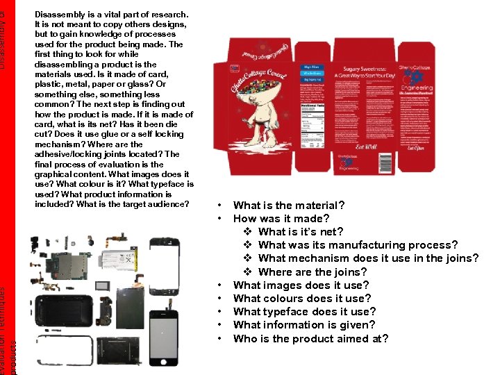 Disassembly of valuation Techniques roducts Disassembly is a vital part of research. It is not meant to copy others designs, but to gain knowledge of processes used for the product being made. The first thing to look for while disassembling a product is the materials used. Is it made of card, plastic, metal, paper or glass? Or something else, something less common? The next step is finding out how the product is made. If it is made of card, what is its net? Has it been die cut? Does it use glue or a self locking mechanism? Where are the adhesive/locking joints located? The final process of evaluation is the graphical content. What images does it use? What colour is it? What typeface is used? What product information is included? What is the target audience? • • What is the material? How was it made? v What is it’s net? v What was its manufacturing process? v What mechanism does it use in the joins? v Where are the joins? What images does it use? What colours does it use? What typeface does it use? What information is given? Who is the product aimed at?
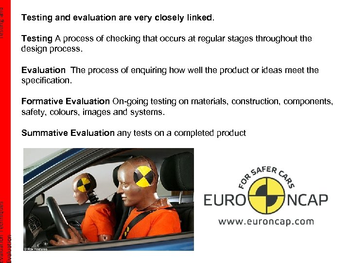 Testing and valuation Techniques valuation Testing and evaluation are very closely linked. Testing A process of checking that occurs at regular stages throughout the design process. Evaluation The process of enquiring how well the product or ideas meet the specification. Formative Evaluation On-going testing on materials, construction, components, safety, colours, images and systems. Summative Evaluation any tests on a completed product
 Evaluation against your valuation Techniques pecification Original specification When you write your initial product specification you should use the headings: During the design process you need to produce detailed list of what your product needs to have. This detailed list is called the design specification, it should reflect some of the information you have found during you're research. Its easier if you right each of these as bullet points with a simple sentence after each. Always refer to each point in your final evaluation against specification. Target market, function, finish, size, Evaluation your product weight, product materials, Once you have completed your product you should test it against aesthetics, your original specification. Remember not to mistake of ergonomics, evaluation your process rather then your product. cost, health and safety, environmental issues and manufacture. Changed for commercial production Although you may only manufacture one final product from your design, it is important that you are aware of the various possible methods of production and how yours could be commercially produced. Standardised design involves designing products to be as similar as possible so that the can easily be mass-produced. Think about how your design would be manufactured on a commercial scale: • Would they use the same materials as you have used for your prototype? • Would the printing methods change for a commercially manufacture product? • Would the construction methods be the same? • Could design changes be made to reduce cost? • Could you reduce the number of parts or different components in your design.
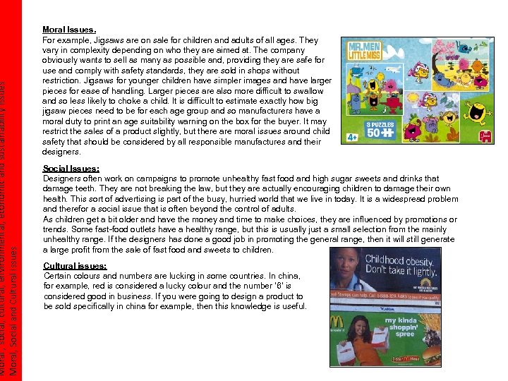 Moral , social, cultural, environmental, economic and sustainability issues Moral, Social and Cultural issues Moral Issues. For example, Jigsaws are on sale for children and adults of all ages. They vary in complexity depending on who they are aimed at. The company obviously wants to sell as many as possible and, providing they are safe for use and comply with safety standards, they are sold in shops without restriction. Jigsaws for younger children have simpler images and have larger pieces for ease of handling. Larger pieces are also more difficult to swallow and so less likely to choke a child. It is difficult to estimate exactly how big jigsaw pieces need to be for each age group and so manufacturers have a moral duty to print an age suitability warning on the box for the buyer. It may restrict the sales of a product slightly, but there are moral issues around child safety that should be considered by all responsible manufactures and their designers. Social Issues: Designers often work on campaigns to promote unhealthy fast food and high sugar sweets and drinks that damage teeth. They are not breaking the law, but they are actually encouraging children to damage their own health. This sort of advertising is part of the busy, hurried world that we live in today. It is a widespread problem and therefor a social issue that is often beyond the control of adults. As children get a bit older and have the money and time to make choices, they are influenced by promotions or trends. Some fast-food outlets have a healthy range, but this is usually just a small selection from the mainly unhealthy range. If the designers has done a good job in promoting the general range, then it will still generate a large profit from the sale of fast food and sweets to children. Cultural issues: Certain colours and numbers are lucking in some countries. In china, for example, red is considered a lucky colour and the number ‘ 6’ is considered good in business. If you were going to design a product to be sold specifically in china for example, then this knowledge is useful.
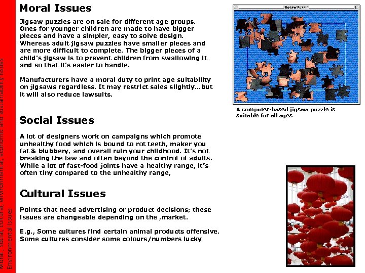 Moral , social, cultural, environmental, economic and sustainability issues Environmental Issues Moral Issues Jigsaw puzzles are on sale for different age groups. Ones for younger children are made to have bigger pieces and have a simpler, easy to solve design. Whereas adult jigsaw puzzles have smaller pieces and are more difficult to complete. The bigger pieces of a child's jigsaw is to prevent children from swallowing it and so that it’s easier to handle. Manufacturers have a moral duty to print age suitability on jigsaws regardless. It may restrict sales slightly…but it will also reduce lawsuits. Social Issues A lot of designers work on campaigns which promote unhealthy food which is bound to rot teeth, maker you fat & blubbery, and overall ruin your childhood. It’s not breaking the law and often beyond the control of adults. While a lot of fast-food joints have a healthy range, it’s often tiny compared to the unhealthy range, Cultural Issues Points that need advertising or product decisions; these issues are changeable depending on the , market. E. g. , Some cultures find certain animal products offensive. Some cultures consider some colours/numbers lucky A computer-based jigsaw puzzle is suitable for all ages
 Moral , social, cultural, environmental, economic and sustainability issues Sustainability Issues How can we be friendlier to the environment? The six R’s • Rethink- Designing the packaging to make it as ‘green’ as possible and deciding weather packing is needed or not. • Refuse- When your product becomes old and outdated, you have the choice weather to buy a new one or not. • Reduce- Consumers should consider buying products that use less energy, therefore buying in bulk as it avoids the extra packaging in smaller amounts. • Re-use – Products should be designed to be re-used for example milk cartons and plastic bags. • Repair- It is often cheaper to buy a new product than repair it. Nowadays, electrical components are designed to fail after a few years so you will buy the manufacturers new products so they make more of a profit. This is called built in obsolescence. • Recycle- Is a way of recovering materials. It is more energy efficient to recycle than produce it from the beginning although it can sometimes be more expensive.
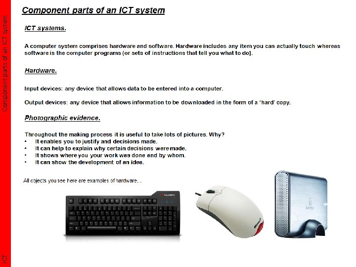 ICT Component parts of an ICT system
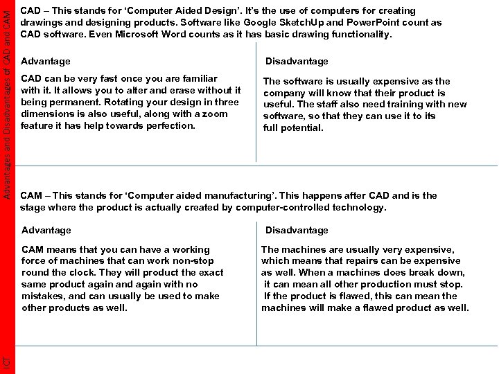 Advantages and Disadvantages of CAD and CAM CAD – This stands for ‘Computer Aided Design’. It’s the use of computers for creating drawings and designing products. Software like Google Sketch. Up and Power. Point count as CAD software. Even Microsoft Word counts as it has basic drawing functionality. Advantage Disadvantage CAD can be very fast once you are familiar with it. It allows you to alter and erase without it being permanent. Rotating your design in three dimensions is also useful, along with a zoom feature it has help towards perfection. The software is usually expensive as the company will know that their product is useful. The staff also need training with new software, so that they can use it to its full potential. CAM – This stands for ‘Computer aided manufacturing’. This happens after CAD and is the stage where the product is actually created by computer-controlled technology. Advantage ICT CAM means that you can have a working force of machines that can work non-stop round the clock. They will product the exact same product again and again with no mistakes, and can usually be used to make other products as well. Disadvantage The machines are usually very expensive, which means that repairs can be expensive as well. When a machines does break down, it can mean all other production must stop. If the product is flawed, this can mean the machines will make a flawed product as well.
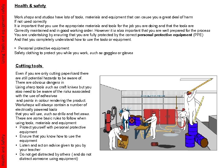 Using Tools and equipment safely Health and Safety Health & safety Work shops and studios have lots of tools, materials and equipment that can cause you a great deal of harm If not used correctly It is important that you use the appropriate materials and tools for the job you are doing and that the tools are Correctly maintained and in good working order. However it is also important that you are well prepared for the process You are undertaking by ensuring that you are fully protected by the correct personal protective equipment (PPE) And that you completely understand how to use the tools or equipment. • Personal protective equipment: Safety clothing to protect you while you work, such as goggles or gloves Cutting tools Even if you are only cutting paper/card there are still potential hazards to be aware of. There are obvious dangers in Using sharp tools such as craft knives but you also need to be aware of the risks associated with the use of adhesives and paints in colour rendering the product. Workshops will always contain a number of electrically powered tools that you will use, such as drills and fret saws. These are some basic rules to follow when using tools, materials and equipment • Protect yourself with personal protective equipment • Ensure that you know how to use the equipment • Listen and act on advice given to you by your teacher • Do not get distracted by others ( and do not distract someone using equipment)
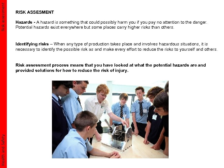 Risk assessment RISK ASSESMENT Hazards - A hazard is something that could possibly harm you if you pay no attention to the danger. Potential hazards exist everywhere but some places carry higher risks than others. Identifying risks – When any type of production takes place and involves hazardous situations, it is necessary to identify the possible risk as and make every effort to reduce the risks to yourself and others. Health and Safety Risk assessment process means that you have looked at what the potential hazards are and provided solutions for how to reduce the risk of injury.
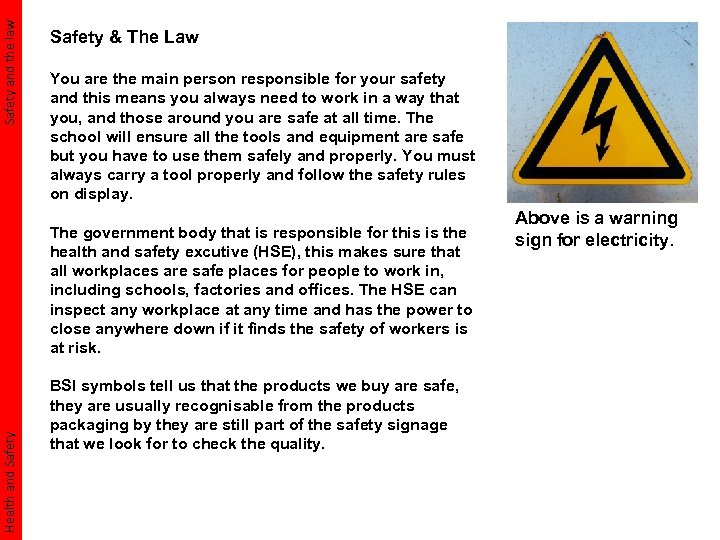 Safety and the law Safety & The Law You are the main person responsible for your safety and this means you always need to work in a way that you, and those around you are safe at all time. The school will ensure all the tools and equipment are safe but you have to use them safely and properly. You must always carry a tool properly and follow the safety rules on display. Health and Safety The government body that is responsible for this is the health and safety excutive (HSE), this makes sure that all workplaces are safe places for people to work in, including schools, factories and offices. The HSE can inspect any workplace at any time and has the power to close anywhere down if it finds the safety of workers is at risk. BSI symbols tell us that the products we buy are safe, they are usually recognisable from the products packaging by they are still part of the safety signage that we look for to check the quality. Above is a warning sign for electricity.
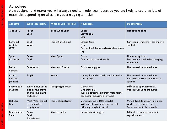 Joining Materials Adhesives As a designer and maker you will always need to model your ideas, so you are likely to use a variety of materials, depending on what it is you are trying to make. What does it join> What does it look like? Advantage Disadvantage Glue Stick Paper Card Solid White Stick Cheap Easy to use Safe Not a strong bond Polyvinyl Acetate (PVA) Card Wood Thick White Liquid Strong Bond Safe Sets within 2 hours and colourless when dry Can ‘ripple; thin card if too much is applied Spray Adhesive Paper Card Clear Spray Quick Can reposition work easily Not a strong bond Must wear a mask when spraying Expensive Balsa Cement Balsa Wood Clear and Smelly Quick Setting glue Use in a well ventilated area Acrylic Cement (Tensol) Acrylic Water Very quick and normally applied with a thin syringe Use in a well ventilated area Can leave marks where excess is applied Epoxy Resin (Araldite) Health and Safety Adhesive Everything, but the glue always shows and will stain card and paper Gloopy light blown Very Strong 2 hours to set Will join together different materials to each other e. g. acrylic to wood Difficult to aplly as so thick Use in a well ventilated area Hot Glue Gun Most Materials but not expanded polystyrene Thick, clear, stringy Very quick to set (10 seconds) Will join different materials to each other e. g. acrylic to wood Very difficult to use on fine model work as is so quick to set Take care not to burn hands Double Sided Tape Paper Card Foam Board Clear or white Immediate strong join Difficult to use as you cannot reposition work
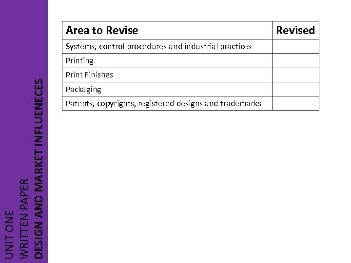 Area to Revise Systems, control procedures and industrial practices UNIT ONE WRITTEN PAPER DESIGN AND MARKET INFLUENECES Printing Print Finishes Packaging Patents, copyrights, registered designs and trademarks Revised
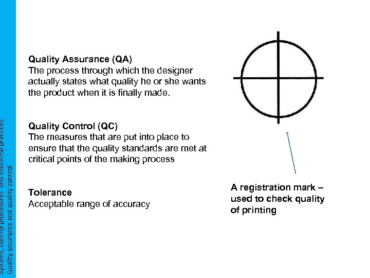 Systems, control procedures and industrial practices. Quality assurance and quality control Quality Assurance (QA) The process through which the designer actually states what quality he or she wants the product when it is finally made. Quality Control (QC) The measures that are put into place to ensure that the quality standards are met at critical points of the making process Tolerance Acceptable range of accuracy A registration mark – used to check quality of printing
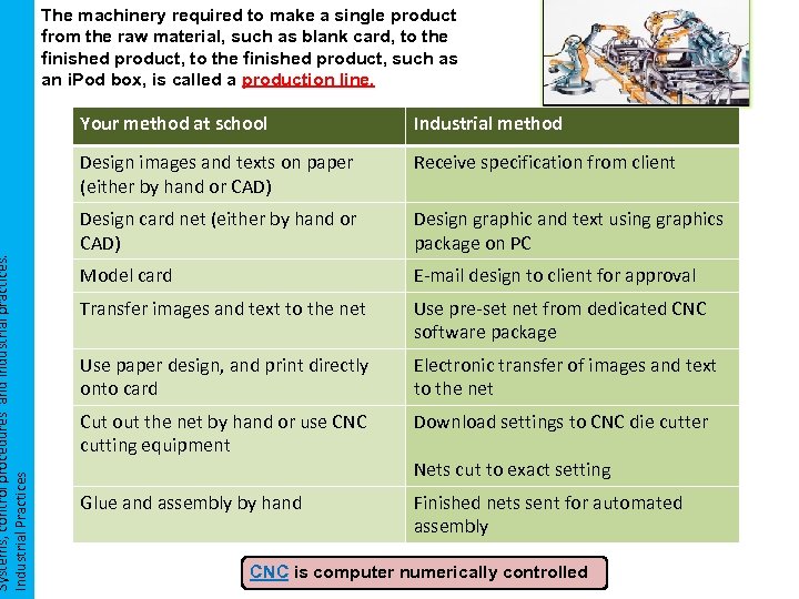 Systems, control procedures and industrial practices. Industrial Practices The machinery required to make a single product from the raw material, such as blank card, to the finished product, such as an i. Pod box, is called a production line. Your method at school Industrial method Design images and texts on paper (either by hand or CAD) Receive specification from client Design card net (either by hand or CAD) Design graphic and text using graphics package on PC Model card E-mail design to client for approval Transfer images and text to the net Use pre-set net from dedicated CNC software package Use paper design, and print directly onto card Electronic transfer of images and text to the net Cut out the net by hand or use CNC cutting equipment Download settings to CNC die cutter Glue and assembly by hand Finished nets sent for automated assembly Nets cut to exact setting CNC is computer numerically controlled
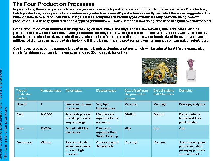 Systems, control procedures and industrial practices. The four production processes The Four Production Processes In production, there are generally four main processes in which products are made through – these are ‘one-off’ production, batch production, mass production, continuous production. ‘One-off’ production is exactly just what the name suggests – it is when an item is only produced once, things such as sculptures or certain types of vehicles may be made using one-off production. It is usually quite rare as this type of production will mean that the items being produced are quite expensive to do. Batch production often involves a factory making an item from a few days up till a few months, this is for items such as perfume bottles which aren’t fully mass production but they require a large amount – items such as books will also be made using batch production. Mass production is a step up from batch production, this is when hundreds of thousands or even millions of the item are made and the factory will likely be making the product for a year or more, such examples include cars. Continuous production is commonly used to make blank packaging products which will be printed for different companies, this is for things such as aluminium cans and the 25 cl tetrapak for drinks. Type of production method Numbers made Advantages Disadvantages Cost of setting up the production process Cost of making individual item Examples One-off 1 Easy to set up, easy to change Very high individual cost Very low Very high Paintings, sculpture Batch 1 -10, 000 Adaptable process of making so quite easy to change Machines are expensive to buy and set up Medium Books, perfume bottles and their point of sales Mass 10, 000+ Cost of individual item is low Even more expensive than ‘batch’ to set up High Low Cars Continuous Millions Easy to make the same item cheaply to a very high standard Cannot change if demand falls Very high Very low Glass making, paper production, blank packaging products such as cans etc.
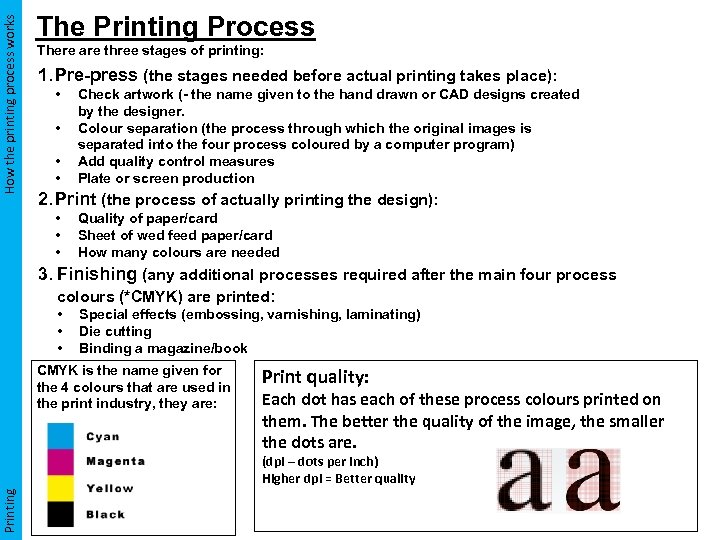 How the printing process works The Printing Process There are three stages of printing: 1. Pre-press (the stages needed before actual printing takes place): • • Check artwork (- the name given to the hand drawn or CAD designs created by the designer. Colour separation (the process through which the original images is separated into the four process coloured by a computer program) Add quality control measures Plate or screen production 2. Print (the process of actually printing the design): • • • Quality of paper/card Sheet of wed feed paper/card How many colours are needed 3. Finishing (any additional processes required after the main four process colours (*CMYK) are printed: • • • Special effects (embossing, varnishing, laminating) Die cutting Binding a magazine/book CMYK is the name given for the 4 colours that are used in the print industry, they are: Print quality: Each dot has each of these process colours printed on them. The better the quality of the image, the smaller the dots are. Printing (dpi – dots per inch) Higher dpi = Better quality
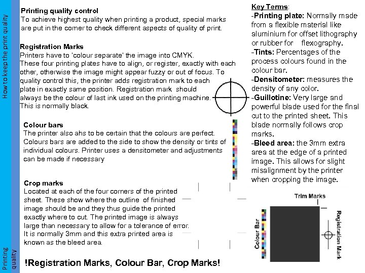 How to keep the print quality How to keep the print Printing quality control To achieve highest quality when printing a product, special marks are put in the corner to check different aspects of quality of print. Registration Marks Printers have to ‘colour separate’ the image into CMYK. These four printing plates have to align, or register, exactly with each other, otherwise the image might appear fuzzy or out of focus. To quality control this, the printer adds registration mark to each plate in exactly same position. Registration mark should always be the colour of last ink used on the printing machine. This is normally black. Colour bars The printer also ahs to be certain that the colours are perfect. Colours bars are added to the side to show the density or tints of individual colours. Printer uses a densitometer and adjustments can be made if necessary Printing quality Crop marks Located at each of the four corners of the printed sheet. These show where the outline of finished image should be and they thus guide the printed exactly where to cut. The printed image is always large than necessary to allow for a tolerance of error. It is normally 3 mm and this extra printed area is known as the bleed area. !Registration Marks, Colour Bar, Crop Marks! Key Terms: -Printing plate: Normally made from a flexible material like aluminium for offset lithography or rubber for flexography. -Tints: Percentages of the process colours found in the colour bar. -Densitometer: measures the density of any color. -Guillotine: Very large and powerful blade used for the final cut to the printed sheet. This blade normally follows crop marks. -Bleed area: the 3 mm extra area at the edge of a printed image. This allows for slight misalignment by the printer when cropping the image.
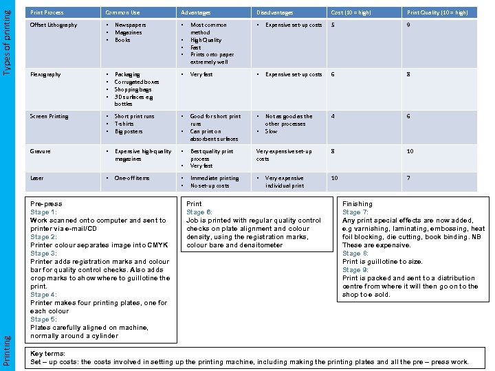 Common Use Advantages Disadvantages Cost (10 = high) Print Quality (10 = high) Offset Lithography • • • Newspapers Magazines Books • Most common method High Quality Fast Prints onto paper extremely well • Expensive set-up costs 5 9 Flexography • • Packaging Corrugated boxes Shopping bags 3 D surfaces e. g bottles • Very fast • Expensive set-up costs 6 8 Screen Printing Types of printing Print Process • • • Short print runs T-shirts Big posters • Good for short print runs Can print on absorbent surfaces • Not as good as the other processes Slow 4 6 • Expensive high-quality magazines • Very expensive set-up costs 8 10 • Best quality print process Very fast One-off items • • Immediate printing No set-up costs • 10 7 Gravure Printing Laser • Pre-press Stage 1: Work scanned onto computer and sent to printer via e-mail/CD Stage 2: Printer colour separates image into CMYK Stage 3: Printer adds registration marks and colour bar for quality control checks. Also adds crop marks to show where to guillotine the print. Stage 4: Printer makes four printing plates, one for each colour Stage 5: Plates carefully aligned on machine, normally around a cylinder • • • Very expensive individual print Print Stage 6: Job is printed with regular quality control checks on plate alignment and colour density, using the registration marks, colour bare and densitometer Finishing Stage 7: Any print special effects are now added, e. g varnishing, laminating, embossing, heat foil blocking, die cutting, book binding. NB These are expensive. Stage 8: Print is guillotine to size. Stage 9: Print is packed and sent to a distribution centre from where it will then go on to the shop to e sold. Key terms: Set – up costs: the costs involved in setting up the printing machine, including making the printing plates and all the pre – press work.
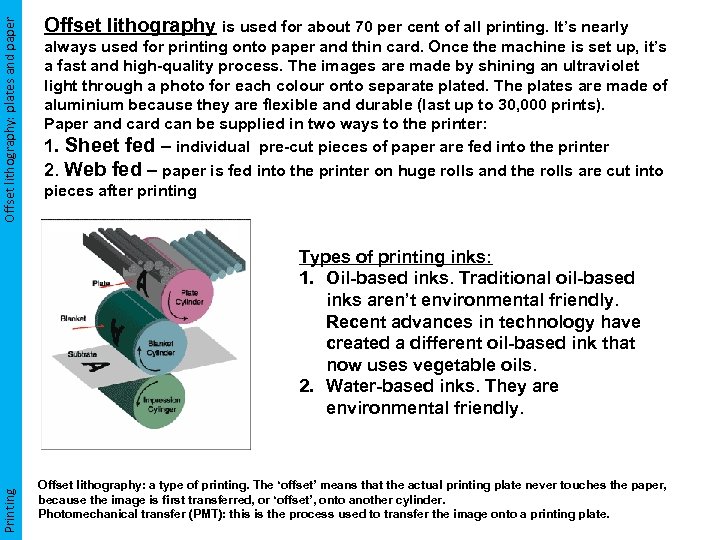 Offset lithography: plates and paper Offset lithography is used for about 70 per cent of all printing. It’s nearly always used for printing onto paper and thin card. Once the machine is set up, it’s a fast and high-quality process. The images are made by shining an ultraviolet light through a photo for each colour onto separate plated. The plates are made of aluminium because they are flexible and durable (last up to 30, 000 prints). Paper and card can be supplied in two ways to the printer: 1. Sheet fed – individual pre-cut pieces of paper are fed into the printer 2. Web fed – paper is fed into the printer on huge rolls and the rolls are cut into pieces after printing Printing Types of printing inks: 1. Oil-based inks. Traditional oil-based inks aren’t environmental friendly. Recent advances in technology have created a different oil-based ink that now uses vegetable oils. 2. Water-based inks. They are environmental friendly. Offset lithography: a type of printing. The ‘offset’ means that the actual printing plate never touches the paper, because the image is first transferred, or ‘offset’, onto another cylinder. Photomechanical transfer (PMT): this is the process used to transfer the image onto a printing plate.
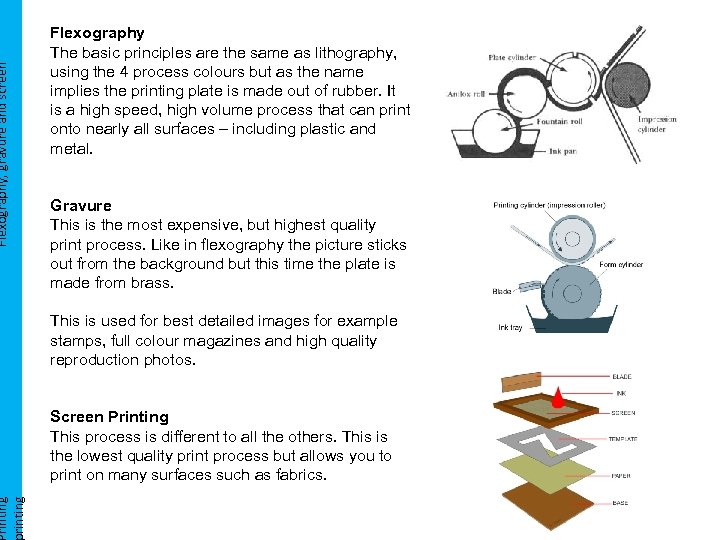 Flexography, gravure and screen rinting Flexography The basic principles are the same as lithography, using the 4 process colours but as the name implies the printing plate is made out of rubber. It is a high speed, high volume process that can print onto nearly all surfaces – including plastic and metal. Gravure This is the most expensive, but highest quality print process. Like in flexography the picture sticks out from the background but this time the plate is made from brass. This is used for best detailed images for example stamps, full colour magazines and high quality reproduction photos. Screen Printing This process is different to all the others. This is the lowest quality print process but allows you to print on many surfaces such as fabrics.
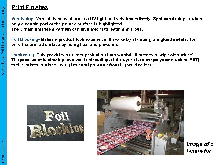 Varnishing, foil blocking and laminating Print Finishes Varnishing- Varnish is passed under a UV light and sets immediately. Spot varnishing is where only a certain part of the printed surface is highlighted. The 3 main finishes a varnish can give are: matt, satin and gloss. Foil Blocking- Makes a product look expensive! It works by stamping pre glued metallic foil onto the printed surface by using heat and pressure. Laminating- This provides a greater protection than varnish, it creates a ‘wipe-off surface’. The process of laminating involves heat sealing a thin layer of a clear polymer (such as PET) to the printed surface, using heat and pressure from big steel rollers. Image of a laminator
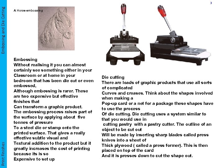 Embossing and Die Cutting Print Finishes A Horse embossing Embossing Without realising it you can almost certainly see something either in your Classroom or at home in your bedroom that has been die cut or even embossed, Although embossing is rarer. These are two expensive but effective finishes that Can transform a graphic product. The embossing process raises part of the surface by applying about five tonnes of pressure To a steel die or stamp onto the printed surface. That gives a really effective subtle visual and Textural addition to the product but it greatly increases the cost of printing because its is so Expensive to set up Die cutting There are loads of graphic products that use all sorts of complicated Curves and creases. Think about the shapes involved when making a Pop-up card or a net for a package these shapes have to use the process Of die cutting. Die cutting uses a system similar to that you would use in cutting pastry with a pastry cutter. The outline of an object to be cut out Will be made by inserting sharp blades called press knives into a sheet of Thick plywood ( called a press former). This is then placed on top of the card And it is presses down to cut the shape out.
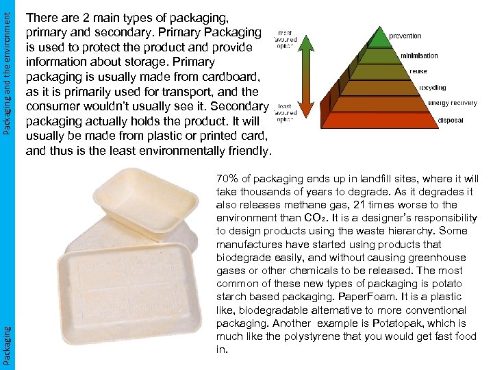 Packaging and the environment Packaging There are 2 main types of packaging, primary and secondary. Primary Packaging is used to protect the product and provide information about storage. Primary packaging is usually made from cardboard, as it is primarily used for transport, and the consumer wouldn’t usually see it. Secondary packaging actually holds the product. It will usually be made from plastic or printed card, and thus is the least environmentally friendly. 70% of packaging ends up in landfill sites, where it will take thousands of years to degrade. As it degrades it also releases methane gas, 21 times worse to the environment than CO₂. It is a designer’s responsibility to design products using the waste hierarchy. Some manufactures have started using products that biodegrade easily, and without causing greenhouse gases or other chemicals to be released. The most common of these new types of packaging is potato starch based packaging. Paper. Foam. It is a plastic like, biodegradable alternative to more conventional packaging. Another example is Potatopak, which is much like the polystyrene that you would get fast food in.
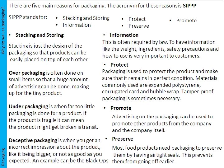 Packaging Why do we use packaging?
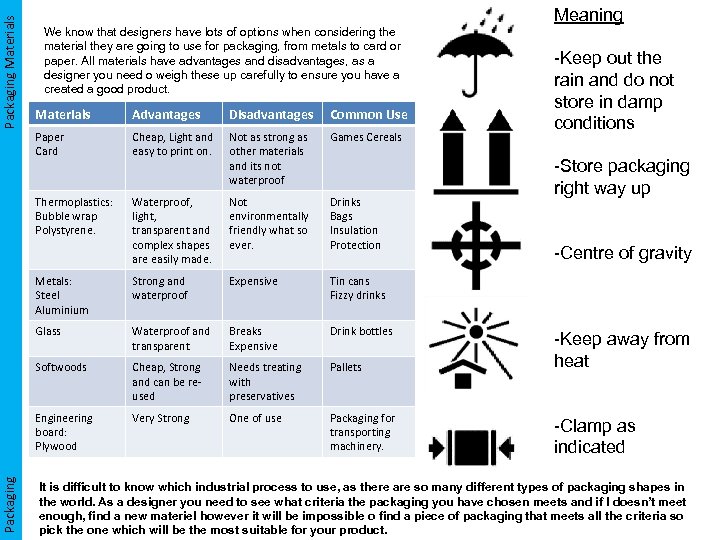 Packaging Materials Meaning We know that designers have lots of options when considering the material they are going to use for packaging, from metals to card or paper. All materials have advantages and disadvantages, as a designer you need o weigh these up carefully to ensure you have a created a good product. -Keep out the rain and do not store in damp conditions Advantages Disadvantages Common Use Paper Card Cheap, Light and easy to print on. Not as strong as other materials and its not waterproof Games Cereals Thermoplastics: Bubble wrap Polystyrene. Waterproof, light, transparent and complex shapes are easily made. Not environmentally friendly what so ever. Drinks Bags Insulation Protection Metals: Steel Aluminium Strong and waterproof Expensive Tin cans Fizzy drinks Glass Waterproof and transparent Breaks Expensive Drink bottles Softwoods Cheap, Strong and can be reused Needs treating with preservatives Pallets -Keep away from heat Engineering board: Plywood Packaging Materials Very Strong One of use Packaging for transporting machinery. -Clamp as indicated -Store packaging right way up -Centre of gravity It is difficult to know which industrial process to use, as there are so many different types of packaging shapes in the world. As a designer you need to see what criteria the packaging you have chosen meets and if I doesn’t meet enough, find a new materiel however it will be impossible o find a piece of packaging that meets all the criteria so pick the one which will be the most suitable for your product.
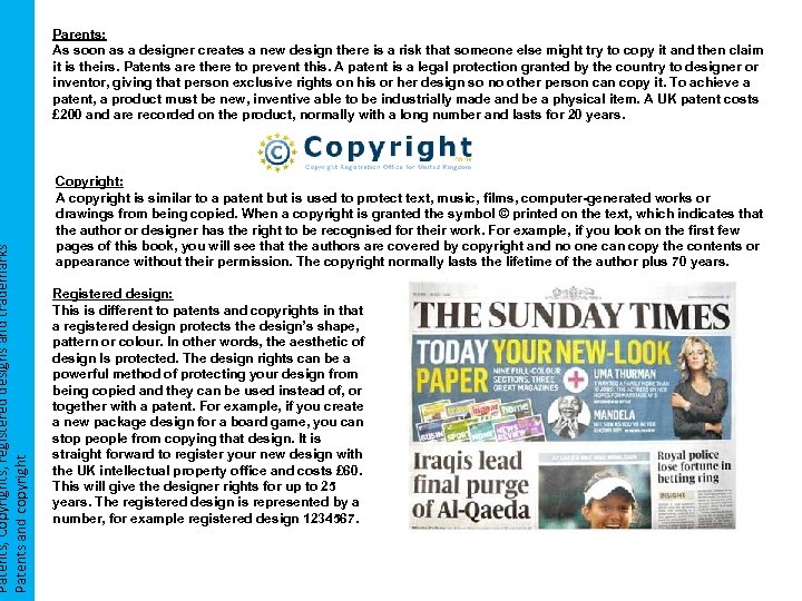 Patents, Copyrights, registered designs and trademarks Patents and copyright Parents: As soon as a designer creates a new design there is a risk that someone else might try to copy it and then claim it is theirs. Patents are there to prevent this. A patent is a legal protection granted by the country to designer or inventor, giving that person exclusive rights on his or her design so no other person can copy it. To achieve a patent, a product must be new, inventive able to be industrially made and be a physical item. A UK patent costs £ 200 and are recorded on the product, normally with a long number and lasts for 20 years. Copyright: A copyright is similar to a patent but is used to protect text, music, films, computer-generated works or drawings from being copied. When a copyright is granted the symbol © printed on the text, which indicates that the author or designer has the right to be recognised for their work. For example, if you look on the first few pages of this book, you will see that the authors are covered by copyright and no one can copy the contents or appearance without their permission. The copyright normally lasts the lifetime of the author plus 70 years. Registered design: This is different to patents and copyrights in that a registered design protects the design’s shape, pattern or colour. In other words, the aesthetic of design Is protected. The design rights can be a powerful method of protecting your design from being copied and they can be used instead of, or together with a patent. For example, if you create a new package design for a board game, you can stop people from copying that design. It is straight forward to register your new design with the UK intellectual property office and costs £ 60. This will give the designer rights for up to 25 years. The registered design is represented by a number, for example registered design 1234567.
 UNIT ONE WRITTEN PAPER DESIGN AND MAKING PRACTICE Area to Revise Key Words Revised


