 AM R EW SK -T D AG I
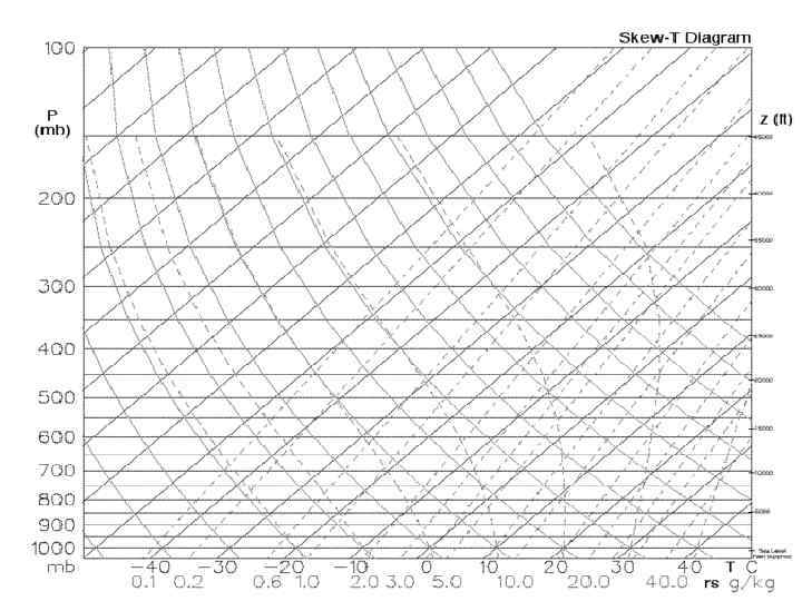
 The standard Skew-T, Log-P diagram for general use is a large, multi-colored (brown, green, and black) chart with numerous scales and graphs superimposed upon each other.
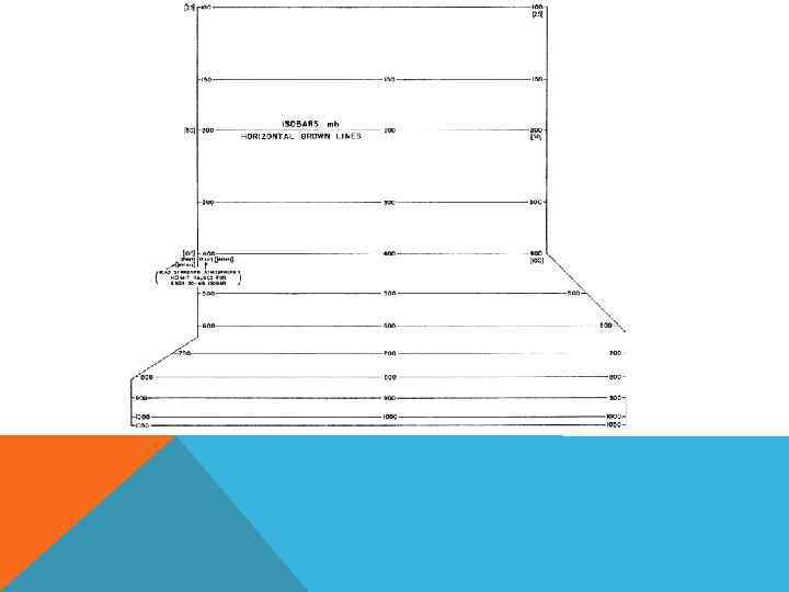
 ISOBARS Isobars, are horizontal, solid, brown lines spaced logarithmically for 10 -mb intervals. Pressure-value labels are printed at both ends and in the center of the chart for each 50 -mb interval.
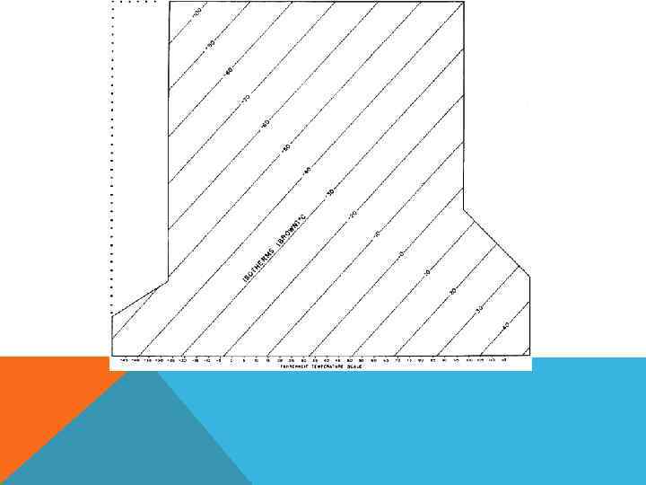
 ISOTHERMS Isotherms are the straight, solid, brown lines sloping from the lower left to the upper right with the spacing equal throughout the diagram. Isotherms are labeled for 5°C intervals, with alternate 10°C temperature bands tinted green. A Fahrenheit temperature scale is printed along the bottom edge of the chart to coincide with the appropriate Celsius isotherms.
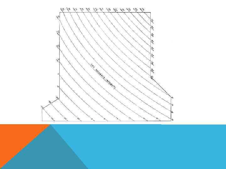
 DRY ADIABATS (ΓD) OR LINES OF CONSTANT POTENTIAL TEMPERATURE Dry adiabats are the slightly curved, solid, brown lines that slope from the lower right to the upper left. They indicate the rate of temperature change in a parcel of dry air which is rising or descending adiabatically when no change of state is occurring with water; e. g. , no moisture is changing from vapor to liquid or solid, or solid to liquid to vapor, i. e. with no loss or gain of heat by the parcel.
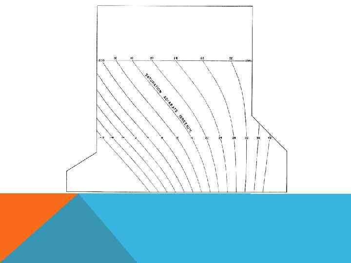
 SATURATION ADIABATS (ΓS) Saturation adiabats, also called moist or wet adiabats are the slightly curved, solid, green lines sloping from the lower right to the upper left, except those on the extreme right. They indicate the temperature change experienced by a saturated parcel of air rising pseudo-adiabatically through the atmosphere. Pseudoadiabatic means all the condensed water vapor is assumed to fall out (precipitate) immediately as the air rises.
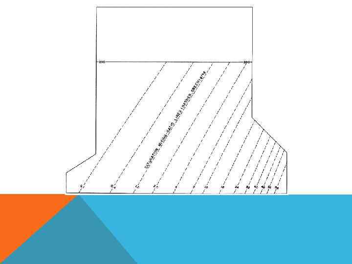
 SATURATION MIXING-RATIO LINES (ΩS) Saturation mixing-ratio lines, are the slightly curved, dashed, green lines sloping from the lower left to the upper right. Saturation mixing-ratio lines are labeled in parts of water vapor per 1000 parts of dry air (grams/kilogram). Values are printed in green between the 1000 -mb line and the 950 -mb line.
 THE SKEW-T, LOG-P DIAGRAM IS PREFERRED BECAUSE: • most of the important isopleths are straight rather than curved; • the angle between the adiabats and isotherms is large enough to facilitate estimates of the stability; • the ratio of area on the chart to thermodynamic energy is the same over the whole diagram; • the isobars are plotted to a logarithmic scale and pressure in the atmosphere decreases nearly logarithmically with height; • an entire sounding to levels in the stratosphere can be plotted on one chart.
 WHY IS IT The major use for skew-T log-P diagrams is the plotting of radiosonde soundings, which give a vertical profile of the temperature and dew point through the atmosphere above a certain point on the ground. The isopleths on the diagram can then be used to simplify many tedious calculations involved, which were previously performed by hand or not at all.
 RESOURCES: • http: //www. atmos. washington. edu • http: //www. meted. ucar. edu • http: //en. wikipedia. org/
 THANK YOU!


