Alice Morgun

At the brand’s core is the Starbucks siren. The bare-breasted, twotailed mermaid, or siren, is intended to be as seductive as the coffee itself. It is based on an old sixteenthcentury Norse woodcut.

“Starbucks wanted the new logo and visual identity system to say as much about its future as it did about its past. Past the logo, they wanted a program that afforded them the freedom and flexibility to explore new product, regional and experience opportunities, while keeping them in step with their current and future customers. ”

Each visual approach included direction for logo usage, pattern, graphic, typography, illustration, imagery, color, form, material, layout and language.
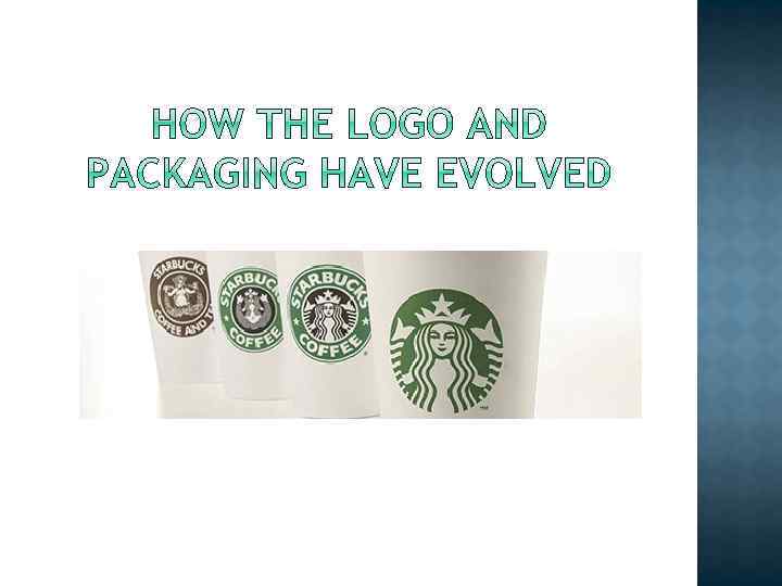

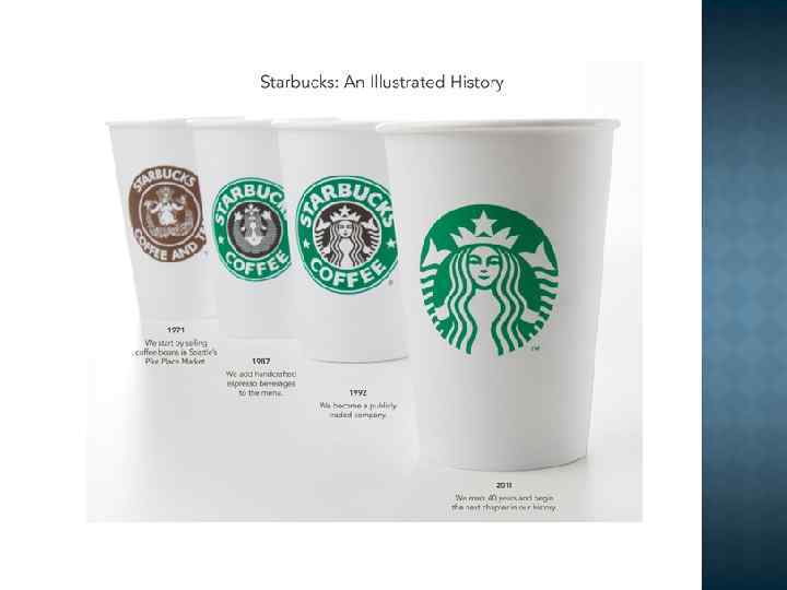
In 1986, Howard Schultz started his own company, called Il Giornale. Their original logo still serves as inspiration in Starbucks’ logo today.

The Starbucks siren remained, but was cleaned up, made more contemporary, and featured in front of a black background, allowing it to jump to the forefront.

In 2008, Starbucks attempted to take a leap into the future, but instead, fell further into the past.
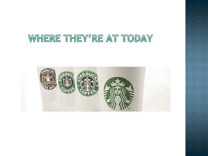

In 2011, Starbucks introduced a new identity, branding, and logo, going back to their original green success.

Today, the coffeehouse offers much more than just coffee. Their teas, handcrafted beverages, ice creams, fresh food, packaged goods, consumer products, and merchandise have amassed a multi-billion dollar empire.